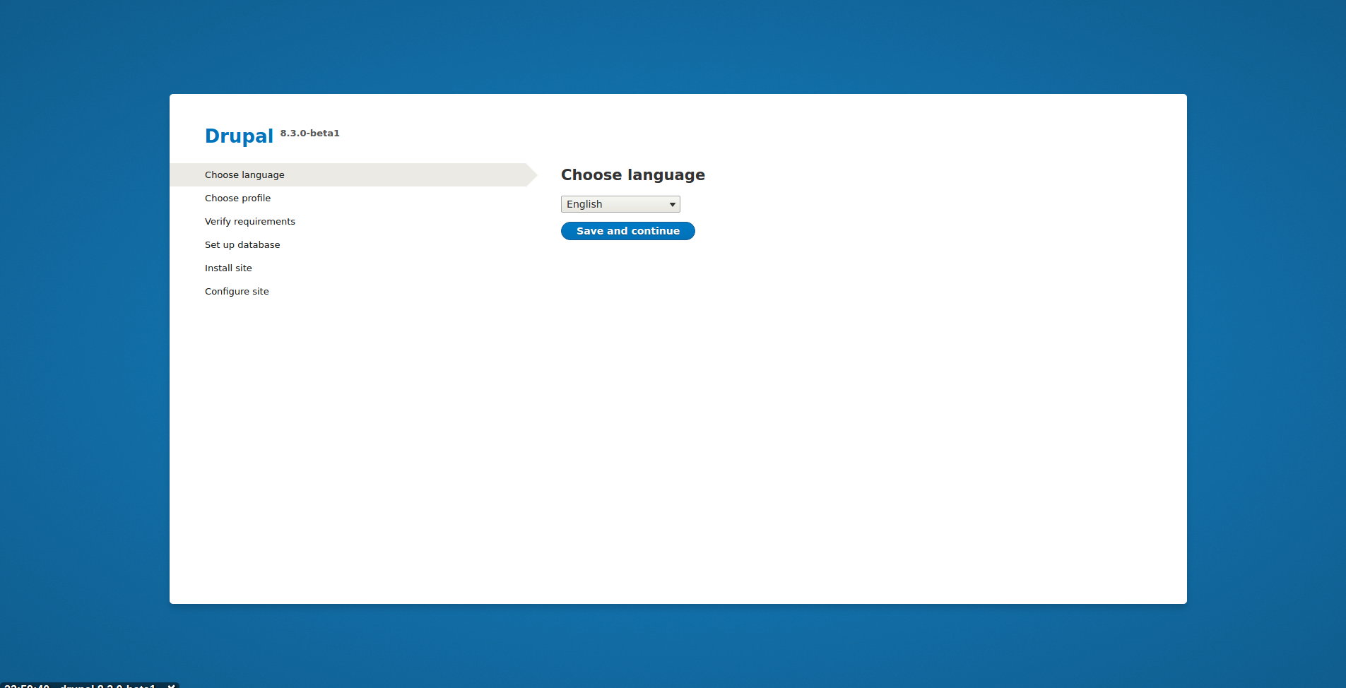
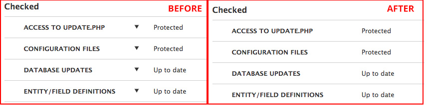
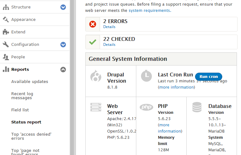
| #487 | install-screen-after.png | 855.6 KB | chi |
| #487 | install-screen-before.png | 1.52 MB | chi |
| #476 | redesign_status_report-665790-476.patch | 75.49 KB | chrisrockwell |
| #476 | interdiff-665790-474-476.txt | 1.34 KB | chrisrockwell |
| #474 | redesign_status_report-665790-474.patch | 75.13 KB | Anonymous (not verified) |
| #473 | after.png | 18.69 KB | Anonymous (not verified) |
| #473 | before.png | 26.57 KB | Anonymous (not verified) |
| #473 | cron_br.gif | 82.51 KB | Anonymous (not verified) |
| #473 | interdiff-468-473.txt | 2.79 KB | Anonymous (not verified) |
| #473 | redesign_status_report-665790-473.patch | 120.98 KB | Anonymous (not verified) |
| #472 | system-status-icon-size-mobile-after.png | 19.28 KB | wturrell |
| #472 | system-status-icon-size-mobile-before.png | 30.12 KB | wturrell |
| #472 | system-status-counter-mobile-size-665790-472-interdiff.txt | 553 bytes | wturrell |
| #468 | redesign_status_report-665790-468.patch | 74.89 KB | chrisrockwell |
| #467 | redesign-status-report_665790-467.patch | 74.89 KB | chrisrockwell |
| #467 | interdiff-665790-460-467.txt | 14.8 KB | chrisrockwell |
| #467 | Screen Shot 2017-02-01 at 2.21.01 PM.png | 52.87 KB | chrisrockwell |
| #467 | Screen Shot 2017-02-01 at 2.21.06 PM.png | 40.67 KB | chrisrockwell |
| #467 | Screen Shot 2017-01-31 at 11.16.27 PM.png | 25.63 KB | chrisrockwell |
| #466 | interdiff-460-466.txt | 4.02 KB | leahtard |
| #466 | core-status-page-665790-466.patch | 72.82 KB | leahtard |
| #461 | core-status-page-665790-460.patch | 72.48 KB | chrisrockwell |
| #459 | status-before-after.jpg | 62 KB | leahtard |
| #459 | interdiff-458-459.txt | 1.67 KB | leahtard |
| #459 | core-status-page-665790-459.patch | 72.48 KB | leahtard |
| #458 | core-status-page-665790-458.patch | 72.14 KB | nod_ |
| #458 | interdiff.txt | 1.98 KB | nod_ |
| #446 | interdiff-437-446.txt | 1.44 KB | Anonymous (not verified) |
| #446 | redesign_the_status-665790-446.patch | 72.01 KB | Anonymous (not verified) |
| #443 | redesign_the_status-665790-437.patch | 70.56 KB | chrisrockwell |
| #441 | redesign_the_status-665790-437.patch | 70.56 KB | chrisrockwell |
| #438 | redesign_the_status-665790-437.patch | 70.56 KB | chrisrockwell |
| #438 | interdiff-665790-437.txt | 7.9 KB | chrisrockwell |
| #431 | redesign_the_status-665790-430.patch | 64.46 KB | chrisrockwell |
| #428 | Status_report___d8.png | 58.97 KB | chrisrockwell |
| #428 | redesign_the_status-665790-428.patch | 61.94 KB | chrisrockwell |
| #427 | details-elements.mov | 1.06 MB | tkoleary |
| #424 | contrib-modules-message.png | 110.36 KB | ckrina |
| #422 | bartik-error-page-status.png | 63.57 KB | ckrina |
| #420 | redesign_the_status-665790-420.patch | 56.69 KB | chrisrockwell |
| #419 | bartik-error-page-statusproposal4.png | 114.79 KB | ckrina |
| #419 | bartik-error-page-statusproposal3.png | 116.37 KB | ckrina |
| #419 | bartik-error-page-statusproposal2.png | 116.08 KB | ckrina |
| #419 | bartik-error-page-statusproposal1.png | 112.24 KB | ckrina |
| #419 | status-report-page-665790-419.png | 118.09 KB | ckrina |
| #414 | redesign_the_status-665790-414.patch | 55.58 KB | chrisrockwell |
| #411 | redesign_the_status-665790-411.patch | 51.53 KB | chrisrockwell |
| #408 | redesign_the_status-665790-408.patch | 122.65 KB | chrisrockwell |
| #405 | Screen Shot 2016-12-06 at 8.12.10 AM.png | 492.74 KB | chrisrockwell |
| #404 | c20161206_203252.png | 67.98 KB | droplet |
| #401 | Status report | drupal 8.2.3 2016-12-06 09-00-06.png | 198.19 KB | gábor hojtsy |
| #400 | Screen Shot 2016-12-05 at 5.07.20 PM.png | 122.39 KB | chrisrockwell |
| #399 | redesign_the_status-665790-399.patch | 131.99 KB | chrisrockwell |
| #399 | interdiff-665790-399-385.txt | 7.62 KB | chrisrockwell |
| #390 | D5.png | 12.86 KB | droplet |
| #390 | D3.png | 63.56 KB | droplet |
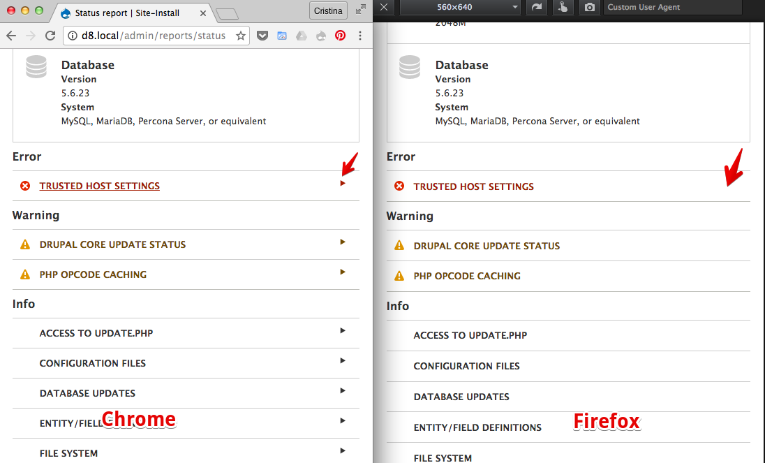
| #386 | Screen Shot 2016-12-05 at 8.20.54 AM.png | 193.38 KB | chrisrockwell |
| #385 | interdiff.txt | 3.55 KB | kostyashupenko |
| #385 | redesign_the_status-665790-384.patch | 139.08 KB | kostyashupenko |
| #377 | redesign_status_report-665790-377.patch | 140.18 KB | chrisrockwell |
| #377 | interdiff-665790-367-377.txt | 3.32 KB | chrisrockwell |
| #375 | interdiff-665790-367-375.txt | 3.92 KB | chrisrockwell |
| #375 | redesign_status_report-665790-375.patch | 141.06 KB | chrisrockwell |
| #374 | redesign_status_report-665790-373.patch | 141.14 KB | chrisrockwell |
| #374 | interdiff-665790-367-373.txt | 4.14 KB | chrisrockwell |
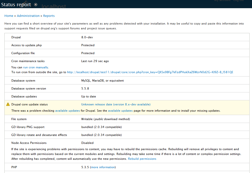
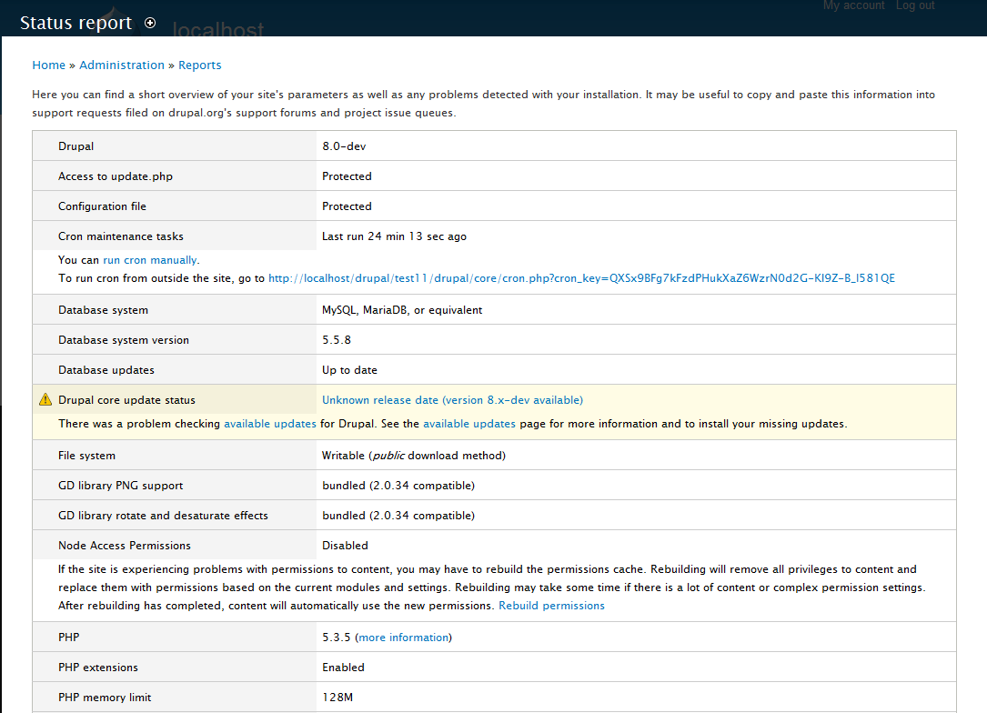
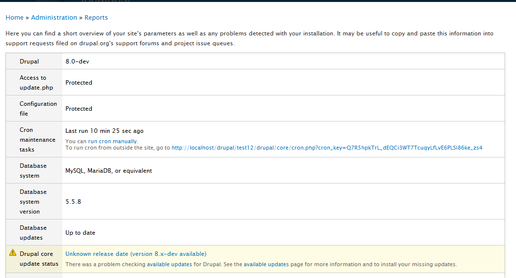
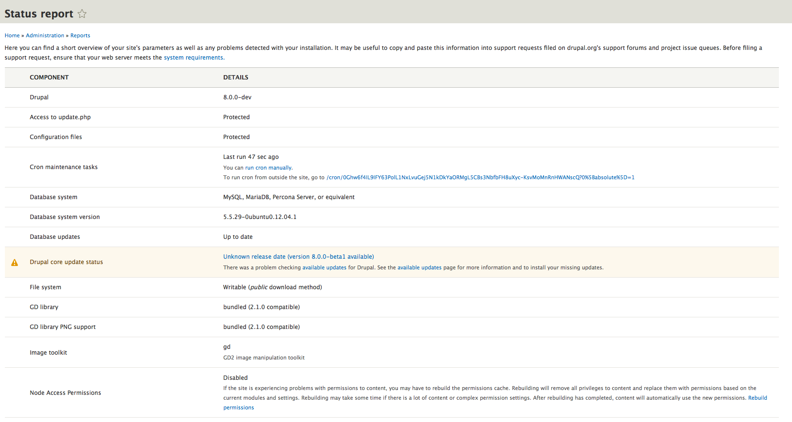
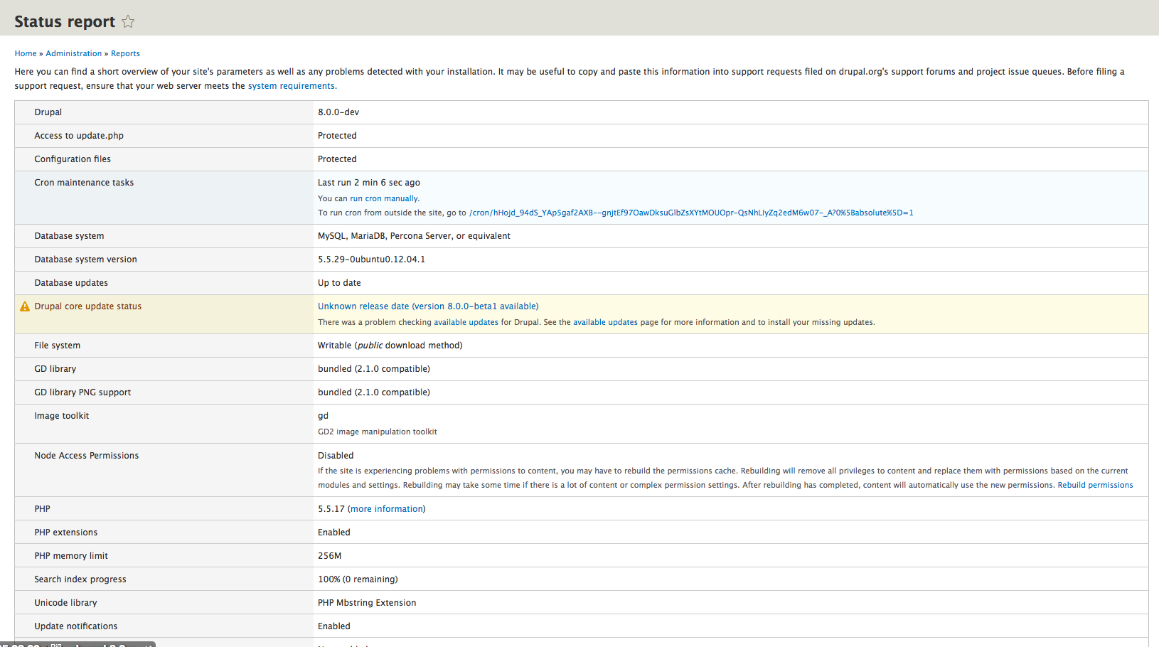
| #370 | redesign-test-665790-370.gif | 186.62 KB | ckrina |
| #367 | redesign_the_status-665790-367.patch | 139.55 KB | chrisrockwell |
| #367 | interdiff-665790-364-367.txt | 2.29 KB | chrisrockwell |
| #365 | interdiff-665790-357-364.txt | 2.09 KB | chrisrockwell |
| #364 | redesign_the_status-665790-364.patch | 68.57 KB | pguillard |
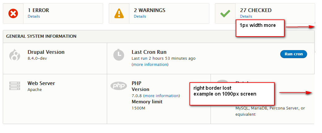
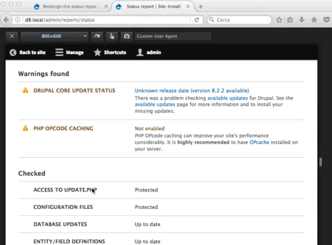
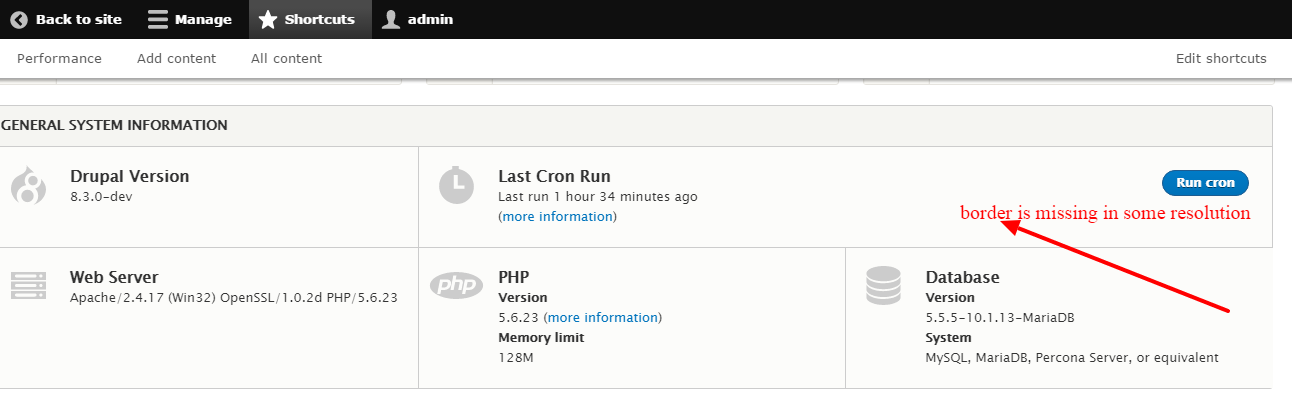
| #361 | border-missing.png | 47.82 KB | Sumit kumar |
| #357 | interdiff-665790-352-357.txt | 4.83 KB | chrisrockwell |
| #357 | redesign_the_status-665790-357.patch | 69.09 KB | chrisrockwell |
| #352 | interdiff.txt | 482 bytes | lauriii |
| #352 | redesign_the_status-665790-352.patch | 68.91 KB | lauriii |
| #349 | interdiff.txt | 5.89 KB | lauriii |
| #349 | redesign_the_status-665790-349.patch | 68.87 KB | lauriii |
| #347 | interdiff.txt | 1.47 KB | lauriii |
| #347 | redesign_the_status-665790-337.patch | 68 KB | lauriii |
| #345 | interdiff.txt | 19.59 KB | lauriii |
| #345 | redesign_the_status-665790-334.patch | 67.55 KB | lauriii |
| #341 | interdiff.txt | 16.41 KB | lauriii |
| #341 | redesign_the_status-665790-341.patch | 64.99 KB | lauriii |
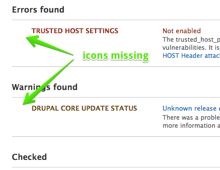
| #340 | status-report-missing-icons.png | 38.52 KB | ckrina |
| #332 | interdiff.txt | 2.25 KB | lauriii |
| #332 | redesign_the_status-665790-332.patch | 60.4 KB | lauriii |
| #329 | interdiff.txt | 393 bytes | lauriii |
| #329 | redesign_the_status-665790-329.patch | 59.62 KB | lauriii |
| #327 | interdiff.txt | 61.23 KB | lauriii |
| #327 | redesign_the_status-665790-327.patch | 60.15 KB | lauriii |
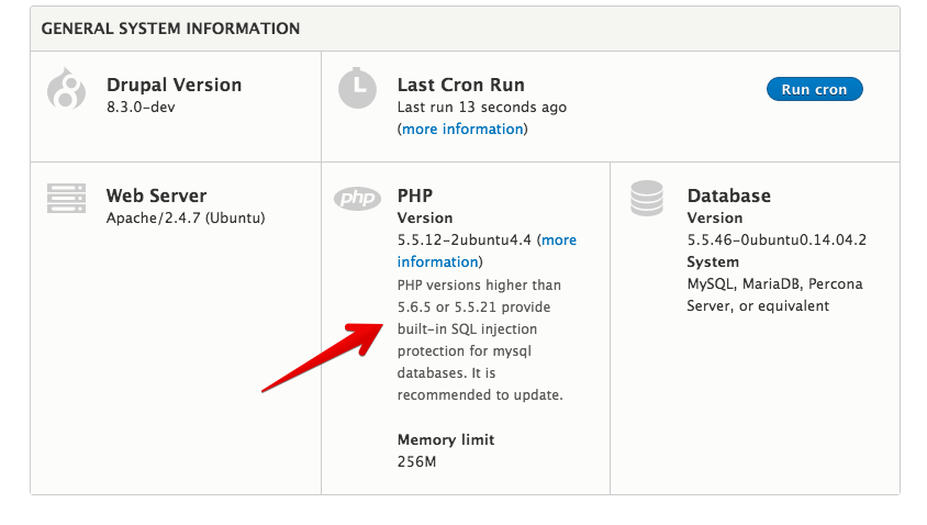
| #322 | php-info.png | 68.88 KB | ckrina |
| #317 | redesign_the_status-665790-317.patch | 57.94 KB | vulcanr |
| #313 | redesign_the_status-665790-313.patch | 17.59 KB | Sumit kumar |
| #313 | interdiff.txt | 1.11 KB | Sumit kumar |
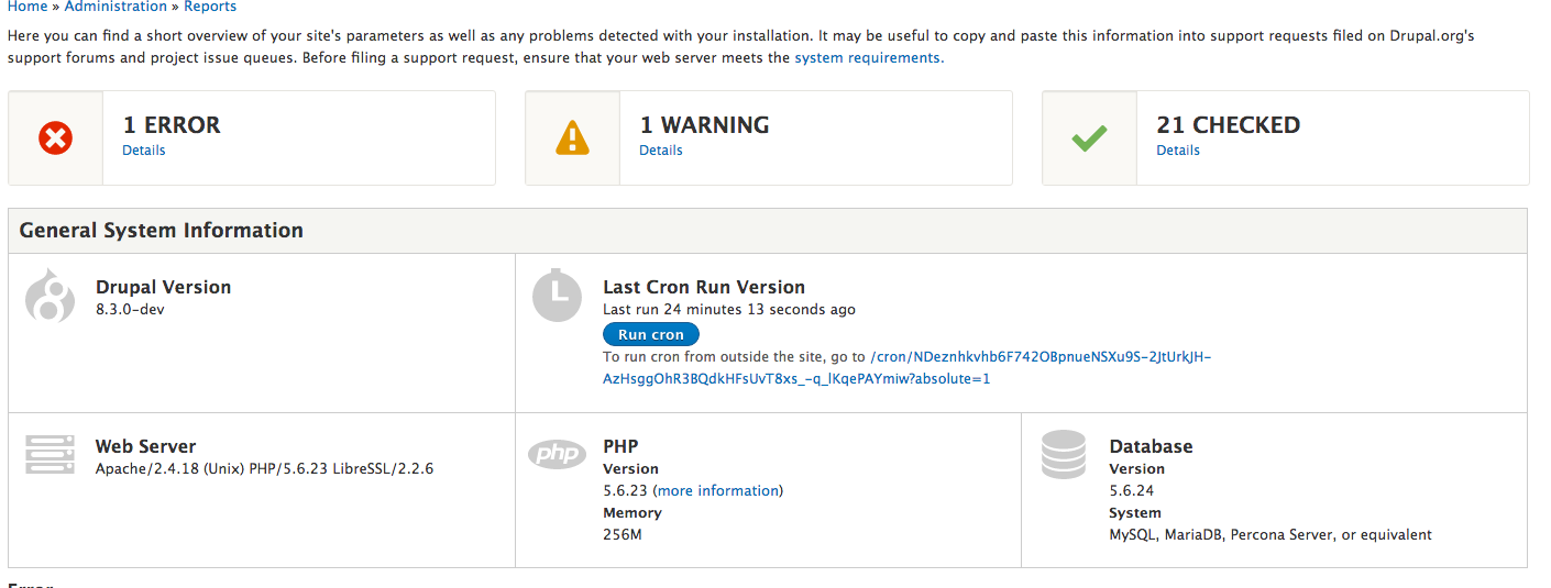
| #311 | Status report | drupal 8.3.x 2016-10-05 09-43-06.png | 116.89 KB | gábor hojtsy |
| #311 | Status report | drupal 8.3.x 2016-10-05 09-41-22.png | 212.48 KB | gábor hojtsy |
| #306 | interdiff-293-305.txt | 1.66 KB | manuel garcia |
| #305 | redesign_the_status-665790-305.patch | 43.04 KB | vulcanr |
| #299 | redesign_the_status-665790-299.patch | 16.99 KB | vulcanr |
| #298 | no-tool-bar.png | 264.92 KB | vulcanr |
| #298 | with-toolbar.jpg | 204.19 KB | vulcanr |
| #298 | with-toolbar-1440.jpg | 300.82 KB | vulcanr |
| #298 | no-toolbar-1440.jpg | 236.33 KB | vulcanr |
| #296 | counters.png | 97.46 KB | lauriii |
| #296 | button.png | 2.94 KB | lauriii |
| #296 | gap.png | 41.08 KB | lauriii |
| #295 | d12jj.ply_.st-admin-reports-status(iPhone 5).png | 80.23 KB | vulcanr |
| #293 | interdiff.txt | 747 bytes | manuel garcia |
| #293 | redesign_the_status-665790-293.patch | 43.27 KB | manuel garcia |
| #292 | status-page-665790.png | 118.72 KB | ckrina |
| #286 | interdiff.txt | 1.97 KB | joelpittet |
| #286 | redesign_the_status-665790-286.patch | 43.29 KB | joelpittet |
| #1 | statusreport-after.png | 111.04 KB | yoroy |
| #1 | statusreport-before.png | 133.01 KB | yoroy |
| #3 | statusreportcleanup-part1.patch | 1.57 KB | yoroy |
| #12 | statusreport2.patch | 2.24 KB | yoroy |
| #18 | statusreport.patch | 1.91 KB | yoroy |
| #23 | Selection_020.png | 40.14 KB | cosmicdreams |
| #36 | drupal8.requirement-ui.36.patch | 8.14 KB | sun |
| #37 | Table-clean.png | 65.16 KB | Bojhan |
| #38 | drupal8.requirement-ui.38.patch | 9.92 KB | sun |
| #39 | cleaner-status-report-even-more.png | 74.42 KB | Bojhan |
| #43 | status-report.png | 60.03 KB | sun |
| #43 | drupal8.requirement-ui.42.patch | 11.15 KB | sun |
| #46 | status-report-icons.png | 105.29 KB | sun |
| #46 | drupal8.requirement-ui.44.patch | 12.89 KB | sun |
| #47 | drupal8.requirement-ui.47.patch | 12.81 KB | sun |
| #50 | drupal8.requirement-ui.42.patch | 11.15 KB | aspilicious |
| #51 | first-column-too-narrow.png | 44.34 KB | Bojhan |
| #52 | drupal8.requirement-ui.52.patch | 11.13 KB | aspilicious |
| #53 | status-report-seven-rtl.png | 57.83 KB | sun |
| #53 | status-report-seven.png | 56.21 KB | sun |
| #53 | status-report-stark-rtl.png | 75.82 KB | sun |
| #53 | status-report-stark.png | 76.82 KB | sun |
| #53 | interdiff.txt | 1.97 KB | sun |
| #53 | drupal8.requirement-ui.53.patch | 11.34 KB | sun |
| #65 | status-report-d8.png | 120.08 KB | David_Rothstein |
| #65 | status-report-d7.png | 98.06 KB | David_Rothstein |
| #74 | status-report-665790-74.patch | 3.12 KB | David_Rothstein |
| #75 | status-report-installer.png | 69.01 KB | David_Rothstein |
| #75 | status-report-with-problems.png | 130.52 KB | David_Rothstein |
| #75 | status-report-without-problems.png | 132.65 KB | David_Rothstein |
| #83 | super_obv_status.png | 78.48 KB | adammalone |
| #83 | more_obvious_pics.png | 80.8 KB | adammalone |
| #85 | whitebackground.png | 89.91 KB | adammalone |
| #88 | godaddy-green.png | 10.73 KB | webkenny |
| #88 | symfony2-green.png | 18.5 KB | webkenny |
| #96 | 665790-status-report-styleguide1.png | 129.6 KB | tompagabor |
| #96 | 665790-statusreport-styleguide-96.patch | 3.15 KB | tompagabor |
| #100 | 665790-statusreport-100.patch | 2.98 KB | tompagabor |
| #109 | 665790-statusreport-109.patch | 2.82 KB | rootwork |
| #109 | interdiff-665790-100-109.txt | 3.72 KB | rootwork |
| #111 | After-Status-report.png | 149.92 KB | mgifford |
| #111 | Before-Status-report.png | 171.66 KB | mgifford |
| #126 | Screen Shot 2016-05-09 at 10.18.37.png | 5.86 MB | Bojhan |
| #126 | Screen Shot 2016-05-09 at 10.33.56.png | 2.79 MB | Bojhan |
| #126 | Screen Shot 2016-05-09 at 10.37.09.png | 285.81 KB | Bojhan |
| #126 | Screen Shot 2016-05-09 at 10.38.32.png | 400.46 KB | Bojhan |
| #130 | 130-status-page-errors.png | 49.4 KB | ckrina |
| #130 | 130-status-page-no-errors.png | 35.46 KB | ckrina |
| #130 | 130-status-page-mobile.png | 28.53 KB | ckrina |
| #135 | error-page-01.png | 102.87 KB | ckrina |
| #136 | error-page-02.png | 100.82 KB | ckrina |
| #136 | error-page-03.png | 58.57 KB | ckrina |
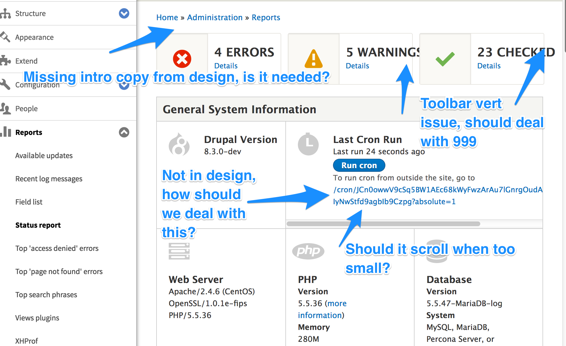
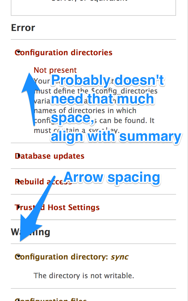
| #136 | error-page-04.png | 63.36 KB | ckrina |
| #138 | error-page-05.png | 107.12 KB | ckrina |
| #138 | error-page-06.png | 118.14 KB | ckrina |
| #138 | error-page_no-errors.png | 63.86 KB | ckrina |
| #142 | status-page-665790-142-01.png | 107.17 KB | ckrina |
| #142 | status-page-665790-142-02.png | 103.49 KB | ckrina |
| #142 | status-page-665790-142-03.png | 66.88 KB | ckrina |
| #142 | status-page-665790-142-04.png | 104.65 KB | ckrina |
| #142 | status-page-665790-142-05.png | 104.84 KB | ckrina |
| #146 | statusreportcleanup-code.patch | 8.38 KB | Sumit kumar |
| #148 | status-report-patch.jpeg | 245.06 KB | yoroy |
| #152 | statusreportcode.patch | 3.11 KB | Sumit kumar |
| #154 | statusreportcode151.patch | 3.23 KB | Sumit kumar |
| #161 | 160_status-page_errors_collapsible.png | 108.8 KB | ckrina |
| #161 | 160_status-page_errors.png | 108.46 KB | ckrina |
| #161 | 160_status-page_mobile_collapsible.png | 77.15 KB | ckrina |
| #161 | 160_status-page_mobile.png | 64.8 KB | ckrina |
| #161 | 160_status-page_no-errors.png | 66.11 KB | ckrina |
| #162 | svg.zip | 5.85 KB | ckrina |
| #166 | New-design-implementation.png | 186.23 KB | Sumit kumar |
| #175 | redesign-status-report_172.patch | 1007 bytes | Sumit kumar |
| #175 | redesign-status-report_172.patch | 1007 bytes | Sumit kumar |
| #178 | redesign-status-report_173.patch | 6.86 KB | Sumit kumar |
| #182 | commit.png | 93.03 KB | yesct |
| #189 | redesign-status-report_188.patch | 8.8 KB | Sumit kumar |
| #190 | 665790-190.patch | 10.41 KB | gábor hojtsy |
| #190 | interdiff.txt | 10.23 KB | gábor hojtsy |
| #191 | StatusReporyResponsiveIssue.png | 13.32 KB | gábor hojtsy |
| #193 | redesign_the_status-665790-193.patch | 10.75 KB | lauriii |
| #193 | interdiff.txt | 15.08 KB | lauriii |
| #198 | redesign_the_status-with-new-file665790-197_0.patch | 11.43 KB | Sumit kumar |
| #200 | interdiff-193-198.txt | 4.92 KB | joelpittet |
| #201 | interdiff-193-198-for-real.txt | 6.16 KB | joelpittet |
| #202 | 665790-202.patch | 11.25 KB | joelpittet |
| #202 | interdiff-198-202.txt | 14.7 KB | joelpittet |
| #204 | interdiff-202-204.txt | 25.11 KB | joelpittet |
| #204 | 665790-204.patch | 21.26 KB | joelpittet |
| #206 | 665790-206.patch | 21.85 KB | joelpittet |
| #206 | interdiff-204-206.txt | 7.39 KB | joelpittet |
| #207 | 665790-207.patch | 24.17 KB | joelpittet |
| #207 | interdiff-206-207.txt | 5.49 KB | joelpittet |
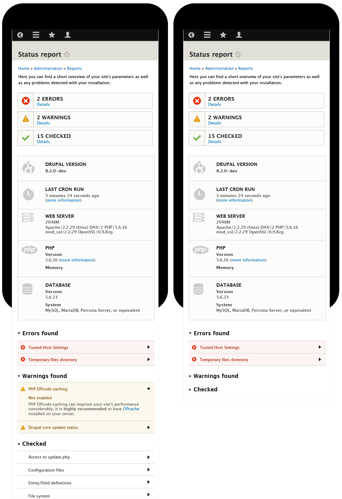
| #207 | Status_report___desktop.png | 99.14 KB | joelpittet |
| #207 | Status_report___mobile.png | 68.33 KB | joelpittet |
| #208 | interdiff-207-208.txt | 6.68 KB | joelpittet |
| #208 | 665790-208.patch | 26.04 KB | joelpittet |
| #208 | Status_report___desktop.png | 101.49 KB | joelpittet |
| #214 | status-page__desktop--toggle-left.png | 119.02 KB | ckrina |
| #214 | status-page__mb--toggle-left.png | 76.2 KB | ckrina |
| #216 | interdiff-665790-208-216.txt | 15.52 KB | chrisrockwell |
| #216 | 665790-216.patch | 37.68 KB | chrisrockwell |
| #216 | Screen Shot 2016-09-09 at 9.53.35 AM.png | 113.19 KB | chrisrockwell |
| #216 | Screen Shot 2016-09-09 at 9.53.49 AM.png | 82.57 KB | chrisrockwell |
| #219 | 665790-219.patch | 37.29 KB | chrisrockwell |
| #222 | 665790-222.patch | 38.98 KB | chrisrockwell |
| #222 | interdiff-665790-219-222.txt | 5.22 KB | chrisrockwell |
| #224 | interdiff-665790-222-224.txt | 2.22 KB | chrisrockwell |
| #224 | 665790-224.patch | 40.59 KB | chrisrockwell |
| #226 | interdiff-665790-224-226.txt | 3.7 KB | chrisrockwell |
| #226 | 665790-226.patch | 40.5 KB | chrisrockwell |
| #227 | Status_report___tablet.png | 357.2 KB | joelpittet |
| #227 | Status_report___mobile.png | 136.26 KB | joelpittet |
| #229 | Desktop_details-element.png | 154.62 KB | chrisrockwell |
| #229 | Mobile_details-element.png | 88.14 KB | chrisrockwell |
| #230 | 665790-229.patch | 41.27 KB | chrisrockwell |
| #230 | interdiff-665790-226-229.txt | 2.96 KB | chrisrockwell |
| #231 | 665790-231.patch | 43.66 KB | chrisrockwell |
| #231 | 665790-interdiff-229-231.txt | 4.69 KB | chrisrockwell |
| #234 | 665790-234.patch | 41.89 KB | chrisrockwell |
| #234 | 665790-interdiff-231-234.txt | 4.54 KB | chrisrockwell |
| #237 | Status_report-mobile-237.png | 120.2 KB | chrisrockwell |
| #237 | Status_report-desktop-237.png | 208.55 KB | chrisrockwell |
| #237 | 665790-237.patch | 42.35 KB | chrisrockwell |
| #237 | interdiff-665790-231-237.txt | 4.84 KB | chrisrockwell |
| #242 | double-cron-button.png | 91.89 KB | lauriii |
| #242 | status-report-rtl.png | 83.29 KB | lauriii |
| #242 | status-report-rtl-info.png | 74.84 KB | lauriii |
| #246 | interdiff-237-245.txt | 15.25 KB | joelpittet |
| #246 | redesign_the_status-665790-245.patch | 44.01 KB | joelpittet |
| #248 | interdiff-245-248.txt | 3.31 KB | joelpittet |
| #248 | redesign_the_status-665790-248.patch | 44.38 KB | joelpittet |
| #248 | interdiff-245-248.txt | 3.31 KB | joelpittet |
| #256 | 665790-255.patch | 44.72 KB | chrisrockwell |
| #256 | interdiff-665790-248-255.txt | 15.08 KB | chrisrockwell |
| #261 | status-report-details-title-rtl.png | 39.37 KB | lauriii |
| #261 | status-report-vertical-align.png | 42.48 KB | lauriii |
| #262 | 665790-262.patch | 44.9 KB | chrisrockwell |
| #262 | interdiff-665790-255-262.txt | 1.82 KB | chrisrockwell |
| #263 | interdiff-665790-262-263.txt | 6.42 KB | chrisrockwell |
| #263 | 665790-263.patch | 45.44 KB | chrisrockwell |
| #264 | 665790-264.patch | 45.51 KB | chrisrockwell |
| #264 | interdiff-665790-263-264.txt | 1.16 KB | chrisrockwell |
| #272 | interdiff-665790-264-272.txt | 3.11 KB | chrisrockwell |
| #272 | 665790-272.patch | 45.49 KB | chrisrockwell |
| #273 | Status report Local host.png | 55.56 KB | Sumit kumar |
| #275 | 665790-275.patch | 16.62 KB | Sumit kumar |
| #275 | correct-Statu-report-Local host.png | 136.94 KB | Sumit kumar |
| #279 | 665790-279.patch | 45.69 KB | chrisrockwell |
| #279 | interdiff-264-279.txt | 640 bytes | chrisrockwell |
| #283 | 665790-283.png | 37.15 KB | ckrina |
| #283 | 665790-283.patch | 16.62 KB | ckrina |
| #283 | interdiff-665790-279-283.txt | 13.17 KB | ckrina |


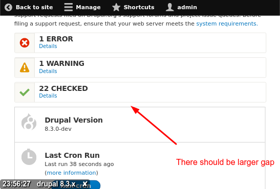
Comments
Comment #1
yoroy commentedCurrently:

First iteration after:

What this does:
- Remove all the green. Don't make the parts that are ok so explicit, it competes too much with the yellow and red parts, which is where you want the attention to focus on.
- Remove the icons for ok as well. again, to focus attention on the parts that do need your attention.
- Brings the explanation texts into the right column, as they expand on the info in the right hand cell. (I assume this was originally done because of the available space, Garland for example has to account for possible blocks in both left and right sidebars. Seven theme doesn't have these)
- If you compare the 'Configuration file' error messages, you'll see that the 'after' screenshot makes it more clear that these are two seperate messages by making each start on a new line.
Not sure yet if the right side cells should be completely white or the light grey.
Comment #2
yoroy commentedOh, and we probably want to remove the use of blue for '.info' (see first row) as well.
Comment #3
yoroy commentedHere's a first round, removing colrs form the different stylesheets. I kept selectors that have empty statement blocks in for now, like
, because might want to add things back in to some.
Somebody else will have to adjust the php part responsible for the actual html output of the table.
This patch should bring us to this look: http://img.skitch.com/20091222-bykufdjreifpyqju32ecug5ggn.png
Comment #4
Bojhan commentedGreat, subscribing
Comment #5
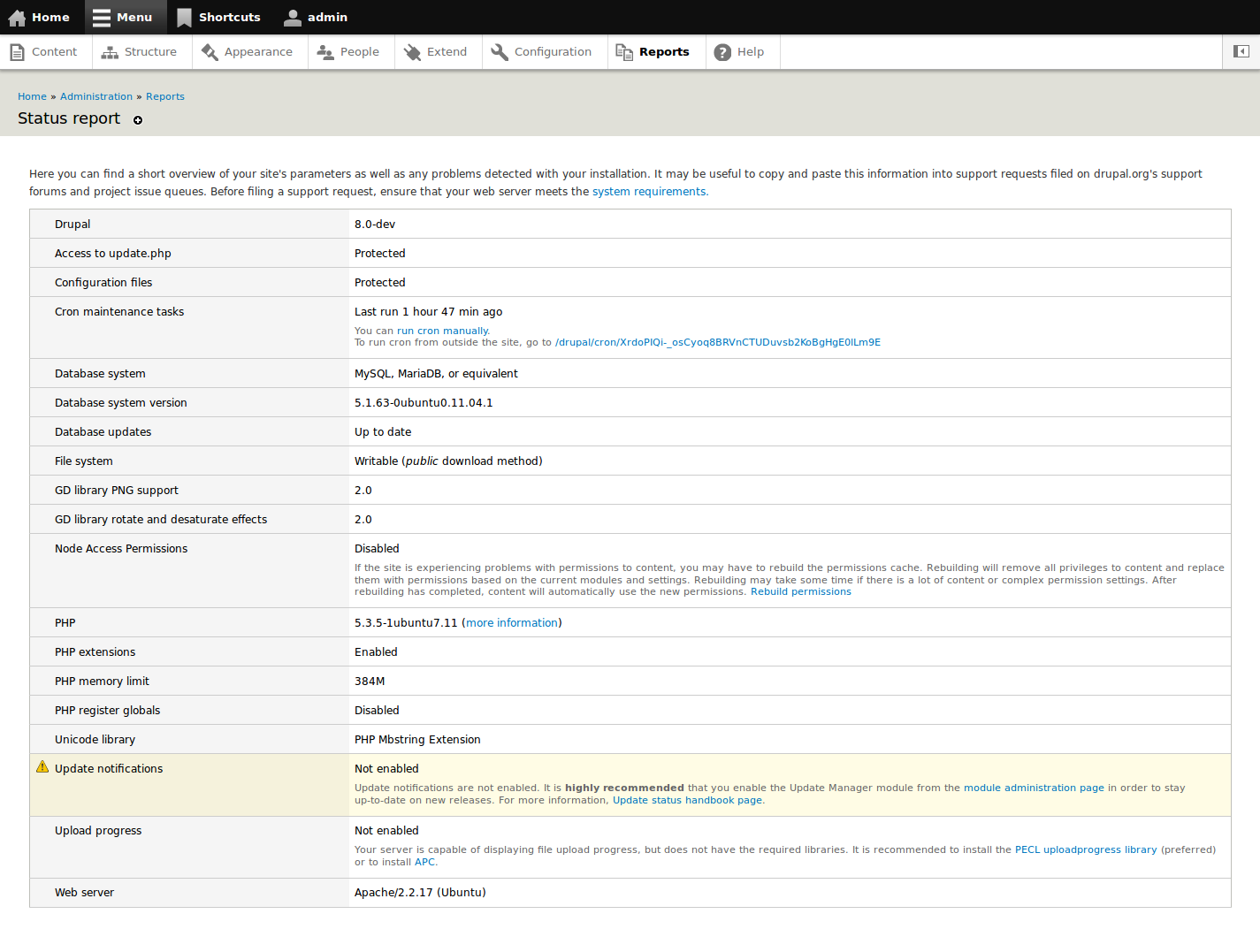
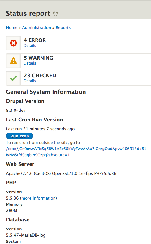
kika commentedGreat initiative, just 2 things:
- it seems gray-and-white zebra row striping and color-coded rows do not mix too well. If light yellow and pink try to convey a message, gray and white row color feels totally random. Why "database updates" and "file system" are on white, "access", "cron", "gd" on gray? Can we make an exception and disable zebra-striping here?
- I can not wait for fresh icon replacements here, drupal 4.5 is still haunting us ;)
Comment #6
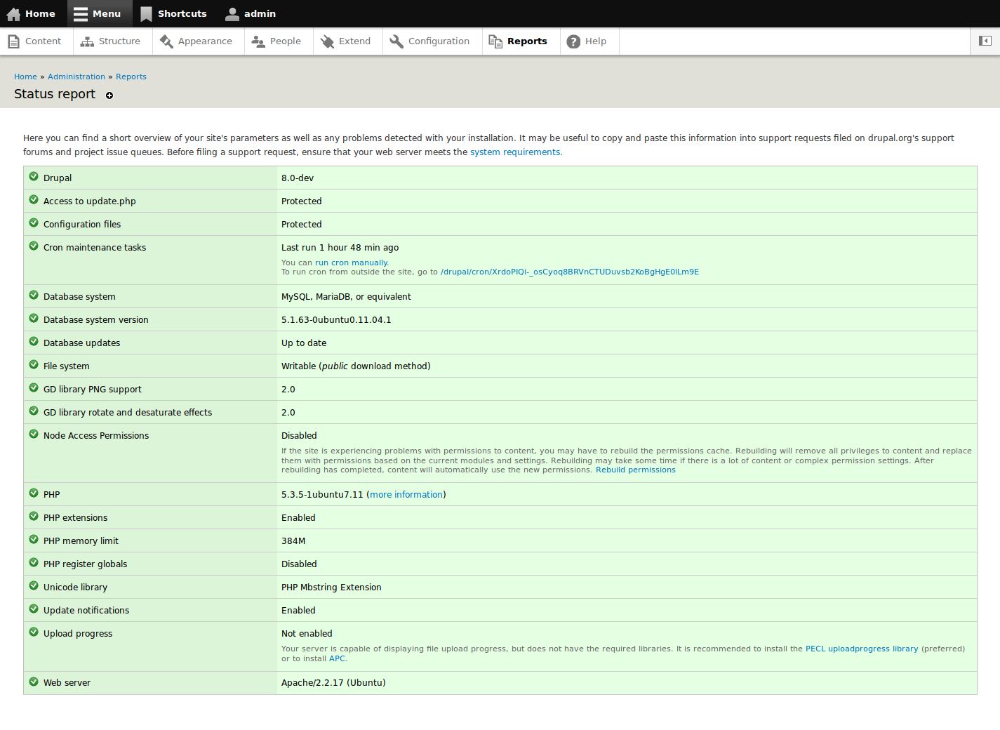
yoroy commented- Good point on the zebra thing. Yes, we'll have to remove it for this table or override it through CSS
- Icons: have you seen #606490: Drupal GPL icons - a softfacade initiative ?
Comment #7
wretched sinner - saved by grace commentedWhat are the thoughts on leaving in the green ticks for items that are ok? I agree that it could be a bit more distracting, but nothing quite beats looking down the list to see all green ticks and to know everything is running well...
Comment #8
dww- Generally, I'm in favor. This is similar to the direction we recently took the d.o project node UI...
- The status report is handled by system.module, and populated by every module that implements hook_requirements(). This isn't specific to update.module at all. Moving to the "base system" component (not sure, maybe system.module would be more appropriate?).
- I'm drawn to wretched sinner's position in #7. I had a hard time letting go of the icons *and* colors as we worked on the project UI. It's nice to have *some* indication that "everything's cool", especially on a page like the status report. Yeah, it doesn't have to SCREAM that to you in every possible way, but I agree it's nice to have something to explicitly mark that a given row is happy, instead of just having a neutral white background and expecting users to either read all the text to know it's okay, or just tune it out. If we expect them to tune out all text in a white background, that seems to set a dangerous precedent. In that case, why display it at all? :/
Comment #9
yoroy commentedThanks dww, component wise, I'm always just guessing.
I always start with the most rigorous dress-down, leaves me with small change further down the road ;-)
Will return to this after xmas etc.
Comment #11
yoroy commentedneeds review now that testbot is back…
Comment #12
yoroy commentedNext round…
Exploration in gray, weighting the warning levels a bit against eachother. I don't mind showing checkmarks, but they should speak very softly:
http://skitch.com/yoroy/np2cm/status-report-d7
Current CSS-only patch makes it go like this:
http://skitch.com/yoroy/np2cq/status-report-d7
Comment #13
dries commentedTagging this beauty.
Comment #14
mrfelton commentedCan I ask why we are using light yellow and pink 'pastel shades' whilst normal site error messages are displayed in a vivid orange/red/green? Shouldn't we try and be consistent with the rest of the site? I find that these light shades blend in with the surrounding grey too much and it all just looks a little wishy-washy, like we are scared to alert the user to these problems so instead of plainly telling them they have a problem with a bright orange, we gently break it to them with a washed out yellow.
Comment #15
yoroy commentedHave to make sure that any changes to how this table gets rendered should apply to other instances as well, like here:
Comment #16
yoroy commentedmrfelton: haven't looked at the colors at all, yet. Thanks for pointing it out.
Comment #17
yoroy commented#12: statusreport2.patch queued for re-testing.
Comment #18
yoroy commentedPrevious patch did not apply anymore
Comment #19
moshe weitzman commentedso, we need a developer to do the table rendering changes?
Comment #20
yoroy commentedYes please.
Comment #21
cosmicdreams commentedSubscribing so I can test / contribute to this tomorrow.
Comment #22
marcvangendMarked #753764: Duplicate and incorrect error messages during install as duplicate.
In that issue, my point (besides another that has already been fixed) was: The status report and the system messages should be more consistent in their use of color. I think the consistent use of the same colors (for example: http://drupal.org/files/issues/system-status-colors-admin.png) will create a better UX. Also, when an error message is shown on the same page as the status report (screenshot: http://drupal.org/files/issues/d7-install-error_1.png) the combination of colors is just plain ugly.
On a sidenote, I'm a little surprised that #538666: Seven theme not right with the status report screen hasn't been mentioned here before. Although the focus over there is a little more on accessibility, it's basically a duplicate of this one.
Comment #23
cosmicdreams commentedThis patch needs a little more work. see how the formatting is inconsistent? Some left-hand table cells are "open" and others are almost closed. See screenshot.
Comment #24
cosmicdreams commentedComment #25
yoroy commentedCorrect. I don't know how to handle the rendering of rows that have descriptions (see #3).
Comment #26
cosmicdreams commentedWhen dealing with the table markup the answer might be similar to what I found in #746678: Markup issue with tables (admin/appearance/update)
Comment #27
cosmicdreams commentedAlso, I think someone might have brought this up before, the yellow used for warnings appears to light in IE on my screen. I have to look very closely to see a difference between the light yellow and the white on my screen. The end result is very displeasing to my eyes.
Comment #28
amc commentedsubscribing
Comment #29
mgiffordOk, so I'm looking at this issue & wanting to look for places where this messaging color background is being implemented. In talking to Bojhan & yoroy on IRC it seems important to look for places where the pattern is being implemented:
It's being implemented here - admin/reports/dblog
with - modules/dblog/dblog.css
It's being implemented here - admin/reports/dblog
with - modules/dblog/dblog.css
Status Report - admin/reports/status
with - modules/system/admin.css
Available Updates -
with - modules/update/update.css
And the install.php
with - ?? I'm not sure how to call up and compare those tables..
In Seven's error messages
with - themes/seven/style.css
It's also in Bartik & Garland I think:
themes/bartik/css/style.css
themes/garland/style.css
Are there others that are missing?
Comment #30
mgiffordI added a patch here that touches on this issue http://drupal.org/node/639368#comment-3211194
Comment #31
mcrittenden commentedSub.
Comment #32
markabur commentedAlso see #906738: Status report need identifying icons (WCAG 2.0), which does some cleanup by removing the icon on "OK" rows.
Comment #33
yoroy commentedBadump.
Comment #34
Bojhan commentedComment #35
sunThis totally makes sense.
It does not make sense to show everything in green on the Status report page. The positive state on the Status report is informational only.
So the Status report output should use the .info state instead of the .ok state for positive assertions (met requirements).
And that leads to the subsequent issue: Using a blue color for neutral information (.info state) is inane. The .info state should just be grey (or even more simple, use the theme's default table row background - but yet, provide a dedicated CSS class so that themes are able to target that special table row case, if they want).
However, implementation-wise, I'm not OK with removing the .ok CSS classes that visualize a green/good state. There are use-cases for visualizing an OK/good state; e.g., to highlight a positive state after performing an action.
I'm also a bit on the fence, whether this should be applied to the installer. In the installer's case, the green .ok state is actually used in the context of a confirmation (as mentioned above). As a user installing Drupal, it's good to see which requirements are positive and which are negative. So I'd say that requirements rows on Status report != Installer. I'm not sure whether we use the same code for both, but if we do, then this would boil down to something like this per table row:
Comment #36
sunAttached patch implements just that.
Comment #37
Bojhan commentedWhoa, interesting - I actually had my status report open and refreshing it with this patch applied created so much more calmness.
I agree that using the blue color for neutral information is insane, we have a special signal for it being "nothing". I always thought white was neutral :). I do agree that we need to be cautious just adding this to the installer, the green is a good emotional way of signifying that they are almost there. I am open to discussing it more, because removing the green also makes it more of a "see this rainbow of things you did good and didn't".
I do think we should try to use the gray color for the left column. The scanability of this table is determined by your ability to match label on the far left in the left column to the description in the right column. By using color you create proximity, this allows the eye to use the left gray bar as a "landmark" to move down from - visually each item becomes more a "chuck" than by using no color.
Comment #38
sunRe-introduced the visualization of the vertical (instead of horizontal) table header column.
Comment #39
Bojhan commentedYoroy can you give this a review?
Comment #40
marcvangendThis looks pretty good.
The only thing I'm not sure about, is the way the descriptions (e.g. under "Node Access Permissions" in Bojhan's screenshot) are displayed. IMHO the descriptions break the vertical rhythm, make the lay-out look broken and take up to much space compared to their importance. Especially the description under "Node Access Permissions" reads like a help text rather than details of a status report. Can we think of a way to make them less intrusive?
Comment #41
yoroy commentedThanks for this. Overall a much cleaner look with clearer focus on what needs your attention. I agree with the long descriptions breaking the flow. I figured this approach would make it easier to accomodate these descriptions but doing it like this drives unneccessary attention to the rows with description, just because they have one. So that was not such a good idea after all :)
We can also look into shortening the descriptions, happy to look into that.
Comment #42
Bojhan commented#1463956: Shorten and clean up status report messages
Comment #43
sunThe actual descriptions shouldn't be touched in this issue; instead, see #1463956: Shorten and clean up status report messages.
To resolve the vertical rhythm issue (which I agree with), I'd propose to remove the colspan over the entire table width, and instead, put the description in the "right" value column only.
I.e., this: :)
Comment #44
yoroy commentedVery nice. If bot approves and code gets another lookover its rtbc imo. Design-wise this is ready to go.
Comment #45
marcvangendYes, thank you, much better!
Comment #46
sunAttached patch additionally fixes the vertical alignment of the icons (by removing the separate icon column and sneaking a new .icon style into core through this patch :-D)
Comment #47
sunAdditionally resolved that "todo" ;) by simply switching the icon markup from DIV to SPAN.
Comment #48
markabur commentedThe line spacing in those descriptions has become really tight.
Comment #49
aspilicious commentedI rly rly love this patch but it's back to needs work
Comment #50
aspilicious commentedIt's dangerous to touch .icon in here it is used in other places around core.
After discussion with Sun we agreed to use the pathc in #43.
I tested that one (also in RTL), and it is RTBC.
Reuploading to ensure the right patch gets pushed.
Comment #51
Bojhan commentedChrome on Windows 7 and the first column is too narrow, I am not enough of a CSS guru to figure out what it is.

Comment #52
aspilicious commentedComment #53
sunRe-rolled against HEAD. (Also note that this code lives in the platform-statusreport-665790-sun branch now)
Attaching a full stack of screenshots, including RTL output.
This looks ready to fly for me.
Comment #54
Bojhan commentedLet it fly then!
Comment #55
Tor Arne Thune commentedDefinitely an improvement.
Comment #56
marcvangendRe #53: What happened to the toolbar position in status-report-seven.png? Is it safe to assume it has nothing to do with this patch?
Comment #57
sunyes, that's not toolbar but admin_menu_toolbar, and I apparently did not have the position:fixed option enabled and wasn't at the top of the page when doing that screenshot ;)
Comment #58
marcvangendOK. No further questions, your honor. :-)
Comment #59
sunBriefly discussed this with @jacine and created a follow-up issue for #1591744: Clean up CSS and markup for status report
This change should land regardless of that, as it's a definite improvement over now.
Furthermore, the removal of the default severity REQUIREMENTS_INFO/_OK from hook_requirements() should be announced and documented as a change notice.
Comment #60
cosmicdreams commentedLooks great, +1 for RTBC
Comment #61
catchCommitted/pushed to 8.x.
Leaving open for the change notice.
Comment #62
yoroy commentedThanks for seeing this through folks, glad to see this made it in.
Comment #63
sunCreated the change notice: http://drupal.org/node/1600936
Comment #65
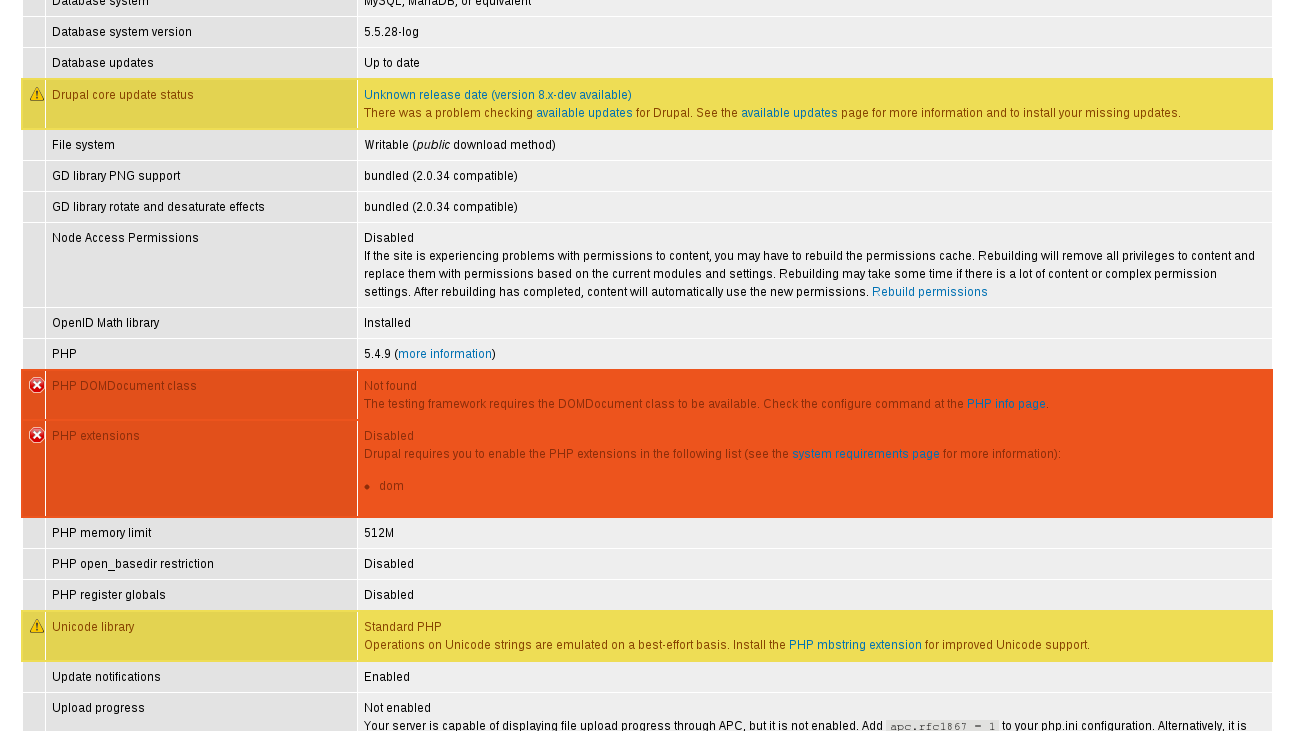
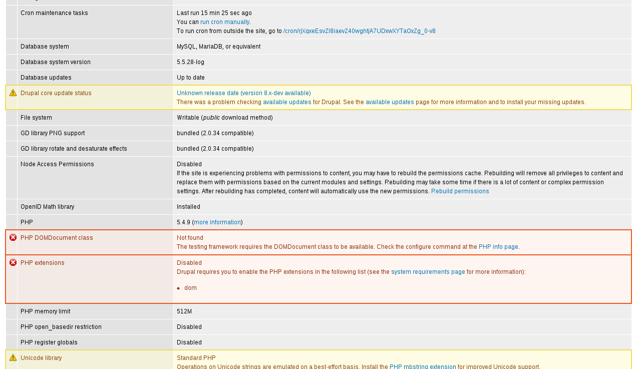
David_Rothstein commentedThis issue was a great improvement in the case where your status report actually contains a warning or error.
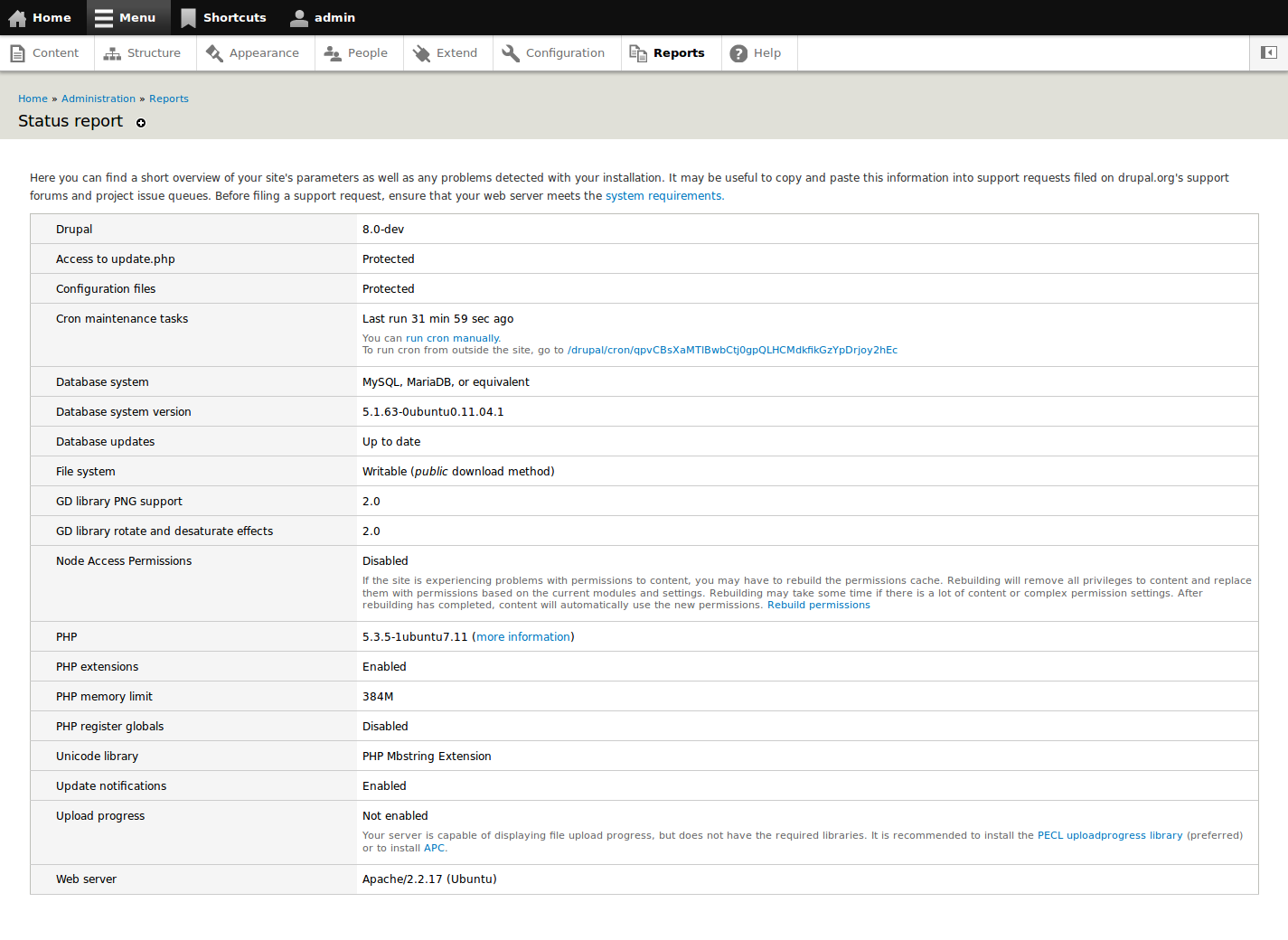
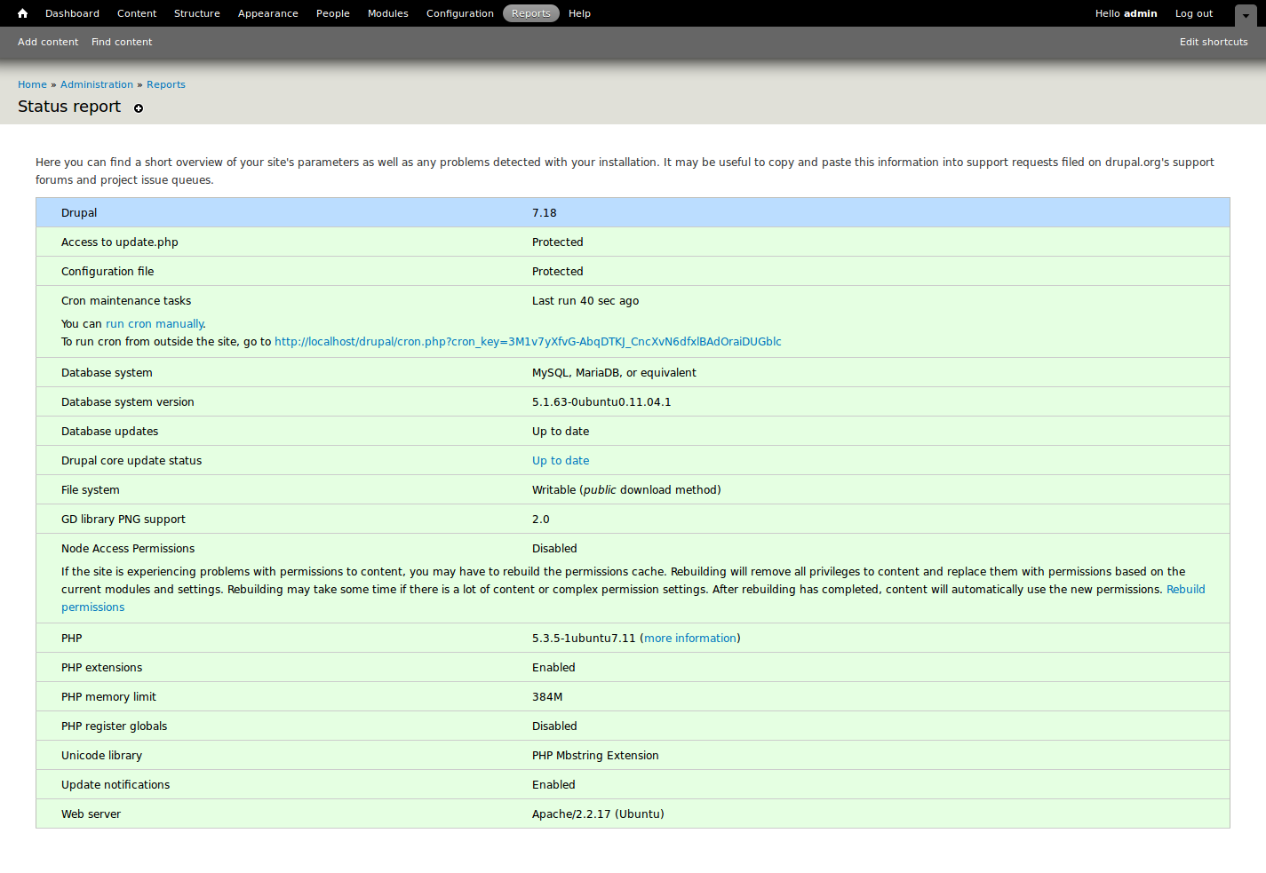
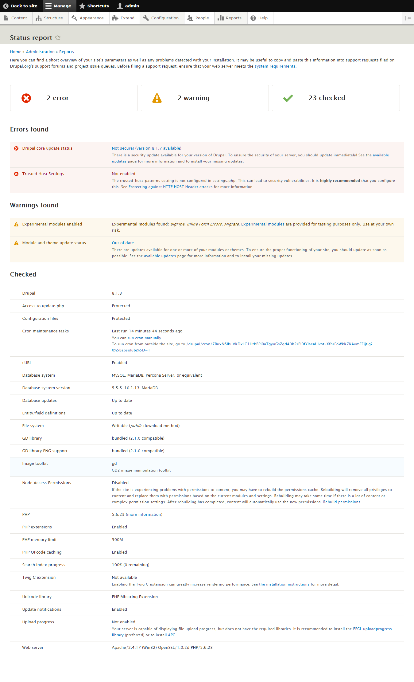
But what about the case where everything is OK? That was barely mentioned in the comments above, and none of the screenshots either.
It seems like it might be a regression to me so I thought I'd post some comparison screenshots for comment.
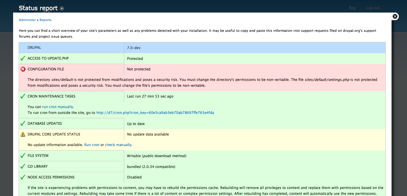
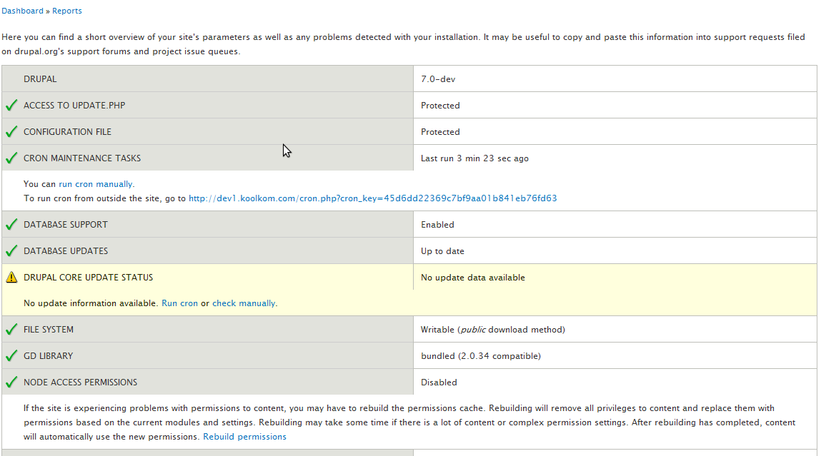
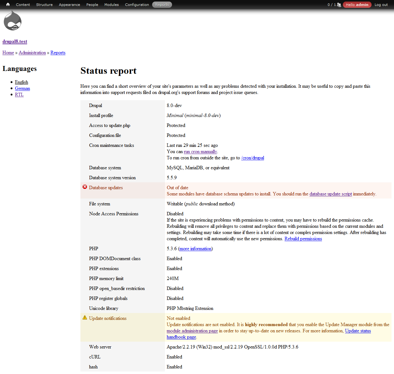
In Drupal 7, your eyes scan down the list and see everything is green, which is a quick visual indication that everything with your site is OK (actually would be better in this case if the checkboxes were on each row too, but those seem to have disappeared at some point in the D7 dev cycle):
In Drupal 8, everything is white, and there is no visual indication that your site is OK. If you're not familiar with how this page works, you'd basically have to read the entire page to know that things are going well with your site:
So, I'm wondering if we should consider improving the "everything is OK" case. Possibilities include:
Any thoughts?
Comment #66
markabur commentedI agree -- "All OK" is a critical message to convey, but the status screen leaves you to infer that for yourself. We give clear feedback when you do the wrong thing but then go silent when you get it right.
Looking at the D8 screen above it's impossible to tell if any of the settings ought to change. Is the file system *supposed* to be writable? Is the "Not enabled" status for Upload progress something that needs fixing?
With that in mind, I like the idea of #2 better. A single message at the top of the screen is easy to miss, especially on small screens, and would leave me less confident about particular line items such as "Not enabled" for Upload Progress being OK as-is.
Comment #67
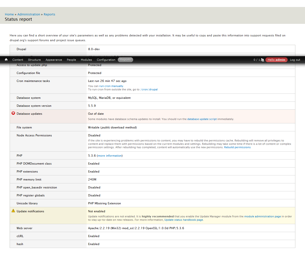
sunI don't think that coloring everything in green is appropriate, because as you can see in the screenshots in #65, there are status report rows that are actually not fully OK (e.g., the second to last "Upload progress" row).
If really absolutely needed, then I'd rather opt for injecting a first additional row into the table that says:
"Overall status: (OK|Warnings|Errors)"
However, I don't think we need any kind of positive visual confirmation here in the first place. The committed patch explicitly kept the positive confirmation for the Requirements pages in the installer and update.php, because in both cases, we actually want to communicate all table rows as individual steps that have to be successful. The Status report page is not involved in a user task that checks whether requirements are met; it's a pure report, which you are free to ignore.
In case the concerns are based around the discovery of warnings and errors in a potentially larger report page, then IMHO the proper answer to that would be to sort the table rows before output, so errors come first, warnings second, and everything else after.
Comment #68
aspilicious commentedI think this looks damn good now. I don't think there would be many users panicking because they don't see any green. Users "panic" if they see red or yellow.
Yes we could add a new line that says "OK, warnings, errors". But what colour do you give that message when there are actually errors...
Comment #69
Bojhan commentedI am not sure either, you have to get used to the idea that - if nothing is indicated, all is good. However I think @David is correct in stating, that might not be obvious. I am on the fence about this one, lets see what more feedback brings us :)
Comment #70
mrfelton commentedMy 2c.. I think that green clearly indicates all is good, red clearly indicates there is an issue, and no color doesn't really give anything away. The page looks nice white (I personally prefer the look), but it also looks ok when all items are green. But I do think using green for each item to indicate that everything is ok is actually more useful to users, and it also makes them feel good in the knowledge that their Drupal setup has all checklist items passing.
Comment #71
Bojhan commented@mrfelton So, the reason we removed it - and you can get that from the information in the discussion above is that by making everything "green" you introduce this "rainbow of color" this is hard to explain, but essentially creates an effect where because you are using color so extensively to communicate meaning the real important messages like errors/warnings are very hard to scan for, and if they occur the page feels visually very heavy/overwhelming. So I am not inclined to agree, with going back to the original state - because its exactly that sense of overwhelming we want to remove from this page so people actually end up looking at it.
Comment #72
mrfelton commentedYes, I sort of agree with that, when you have a mixture of errors and passes the green and red clash and look pretty horrible together (not sure if I agree that the really important messages like errors/warnings are very hard to scan though - it's still bloody obvious that red items have a problem, and green ones do not). What about making all the items show as green if everything passes, and if there are one or more errors leave everything white with just the errors being highlighted in red (I think thats what David_Rothstein was suggesting in #65.2). When there are no erros on the page, that needs to be communicated to people somehow.
Comment #73
markabur commentedAt the very least, the text at the top should say this.
Comment #74
David_Rothstein commentedYup, exactly. The attached patch implements that, so we can see how it behaves and are all on the same page.
I don't think it actually makes sense to have "informational" messages as a separate category from "OK" messages. Either something is OK or not, and if it's not OK, it should be a warning. (If we want to additionally have a visual indicator for "here is how to make your site even better" that could be a separate indicator, but it doesn't change the fact that it's OK as is and should be fine to color it green. "OK" just implies good enough; it does not imply 100% perfectly ideal :)
So in short, I'd like to see REQUIREMENT_INFO go away entirely, since it would simplify both the code and concepts here. But that would get into some other problems, so I'm not proposing it as part of this patch.
In the particular case of "Upload progress", I think the problem there is that it's worded almost like a warning but then isn't one? Probably the module needs to decide which it is, and change the wording accordingly.
Comment #75
David_Rothstein commentedScreenshots of the above patch. The only thing that is different from current core is the first screenshot (the "everything is OK" case). The others are unchanged from what's currently in Drupal 8.
1. Status report when everything is OK (the green rows and checkboxes help you quickly scan the page and understand your site is doing fine):
2. Status report when everything is not OK (the green colors and checkboxes disappear to help you focus on what's wrong):
3. Installation requirements page (the green colors are there to indicate your progress, but the green checkboxes are not, to avoid conflicting too much with the "error" icon in the row that does indicate a problem):
Comment #76
sun1) The OK icons in the first screenshot don't make any sense to me. I also don't understand why the entire page is in green, because I did not perform any action that would need confirmation.
2) The sudden disappearance of the formerly green rows confuses me. I guess something must be wrong with them, so I better check all of the text information to be sure, and after doing so, I still won't understand why they are no longer green.
3) In the 3rd screenshot (the install/update requirements pages), I expected the OK icons from the 1st screenshot, since this is an actual task/check list.
4) The patch removes support for info status entirely, which I strongly disagree with.
Comment #77
yoroy commentedUgh. This basically brings us back to the situation for which this issue was opened in the first place :-(
I can understand the need to have a signal somewhere that everything is ok. Plastering the green back all over the page is not the way to do it. Signal the anomalies, not the default state.
Comment #78
David_Rothstein commentedOK, it sounds like people would prefer the solution in #65.1. Any thoughts on what that should look like exactly? I'm having trouble picturing it.
It's almost like a standard Drupal status message (something green with words in it that gets displayed near the top of the page) but I'm not sure a message is really the right concept here.
Comment #79
Bojhan commentedI would imagine its a column on the top of the table "Overall status" or something silly like that.
Comment #80
klonosNope, ...if nothing is indicated, you need to assume that all is good. If we needed the ok/green out of the way, then we'd better hide the ok entries completely out of view. But this then would convert this from a "status" page to a "problems" page, which is what I see one side of people suggesting here.
I've been monitoring this issue here almost since the day it got filed and I'd like to say that I really like how currently (in D7) everything is green when everything is ok. I never heard anyone complain about too much green "overwhelming" them in check lists and this is a check list (a check list in order to have your Drupal site running as smoothly as possible). On the contrary, I think that green gives people the sense of accomplishment and that it communicates that everything is running smoothly. This is a status page and we need to see everything that might matter and their respective status clearly indicated. This to me (generally as an IT admin - not only within the Drupal context) translates to red for problems, yellow/orange for warnings, gray/blue for info and green for ok.
To this end, I see the following entries as info:
- Drupal version
- DB system/version
- GD library version
- PHP version
- Web server version
Now (with the exception of GD lib) I cannot imagine a situation where any of these would be shown as either red or yellow. If that were the case, than something would be seriously wrong with the server and the site wouldn't work. So, I wouldn't be able to see the status page in the first place. I'd consider these entries purely info, have them shown at the top of the status page and group them in a neutral color (gray/blue). I believe that this would reduce the chances of having lots of various colors shown "randomly", "all over the place" and thus would prevent most of the confusion or the overwhelming feeling some complain about. So, I need to ask: is there any serious usability case that dictated that all the entries in the status page are listed alphabetically instead of being grouped together in "logic" groups?
BTW, if it were up to me, I'd even go as far as merging the "Drupal" version entry with the "Drupal core update status" one. Perhaps only then having this row in green/yellow/red would make sense.
Comment #81
David_Rothstein commentedSlightly off-topic, but yes; see #309040-10: Add hook_requirements_alter() (I think it would require that issue).
Comment #82
sunLet's do #67 / #79 then; i.e., simply a first table row that says:
"Overall status: (OK|Warnings|Errors)"
and which is colored accordingly (green|yellow|red).
REQUIREMENTS_INFO severities/rows should be ignored for the overall status condition/calculation; i.e., if there are no warnings and no errors, then the overall status is OK/green.
Furthermore, the additional row should only be generated and output on the Status report page. Not in the requirements check of the installer or update.php.
[Speaking of, this is one of the tables we want to convert to the new render element #type 'table', and doing so might be the only way to inject the Overall status row on the Status report page only [not verified].)
Comment #83
adammaloneThis issue reminded me of the output received when running tests. (x failed, y warnings, z pass) kind of thing.
My instant reaction when greeted with an all white/light grey status report is that I am unsure about whether everything is alright. To some extent the ticks down the left hand side or the "status ok" message at the top already suggested, or a message similar to a simpletest report would make things more instantly that everything is ok at a glance.
Or to put it in other words - the page needs more green.
The other thing I've noticed with the lack of green filling up the table, is the lack of contrast available for the red and yellow messages. If the green background is gone (which I fully agree with) then as #14 states, the remaining colours should be a lot stronger to stand out more.
I've mocked up a couple of really rough examples.
The first uses the same border drupal_set_message gives to error and warning messages.

The second uses the border colour for the background colour.

The colours can of course be changed so think not of how terrible/clashing they are, but rather of how much more they stand out. The status report now says "YOU HAVE AN ERROR" rather than "you may have an error but it's not going to jump out at you"
My disclaimer that I'm not a designer likely does not need mentioning.
Comment #84
sun@typhonius: IMHO the actual bug there is that Bartik uses a (dark) grey background color for all tables, which inherently deemphasizes the contrast/visibility of colored rows. I don't know why Bartik is doing that. Perhaps it's just because Drupal core contained default styles for all tables since ~2004 or so. I removed those default styles in #1813792: Remove ugly default CSS styles for table only very recently. If you'd ask me, then we should remove that background color for tables in Bartik, too. That's a separate issue though.
Comment #85
adammalone@sun: I agree the background in the bartik table does dilute the colour. Removing from bartik wouldn't be a bad idea at all.
Checking white background for the right side of the table:

I can't decide if the colours are still washed out or vivid enough to be seen; I think I've been staring at it too long.
Comment #86
tsvenson commentedLate to the game, but the Status report page just created an itch for me. Glad to see the progress being made on beautification. However I have two questions:
To answer my own questions.
1, Yes, it would be an UX improvement if we instead of alphabetic order of all items can create logical groups of items. For example:
These groups needs to be static, that is - modules can't invent new groups like is done using the "package" keyword for modules.
Also, when possible there need to be info/link to the feature/module that the report item belongs to for added readability.
It should also become good practice that modules that for example adds third party integration add a report item here. Disqus is one such integration that currently does not report here. Then Media YouTube/Flicker/Vimeo etc are other good candidates to.
The items in the groups can be alphabetically listed, that OK.
2, a big switch at the top that simply hides all "green" items except the Drupal core group at the top.
Could also be complemented with a drop-down jump-list with the group names. Useful as the list will get longer on many sites as more projects does the right thing and adds a reporter here.
I think these improvements, together with those already discussed in this thread will make this page both easier to read and more useful at the same time.
Comment #87
tsvenson commentedOh, and a third question:
3, How come there is no option for alerting admin about when something covered on the status report needs attention?
Currently only the version check on Drupal core and modules/themes does that here.
But that is probably better to discuss in a new issue?!
Comment #88
webkenny commentedThis is really a great issue because the design of the Status Report was always a "needs work", in my mind. With that said, I don't think we need to reinvent the wheel here but I do think we are going against practiced axioms of computer science by removing any indication that things are "Ok" . Green is the universal indicator on all levels that something is "Good" - Your light on your very first PC Tower, your Macbook power adapter, most other electronic devices in the world. Let me clarify that:
On the command line, and I'm borrowing from Symfony2 only because it's handy - if I run a check on my install I get something like this:
Even when downloading packages via your favorite package managers, you get some indication of all clear via
[OK]when, for example, compiling.Now on the web UI side... again Symfony2 only because it's handy... does something like this:
GoDaddy (and other DNS providers) also provide some kind of green all clear:
I guess we should start gravitating toward some of these accepted practices and not away; Also, I'm not sure why we hate the color green. ;)
I don't think having a ton of green checks is useful but I do think a "No problems found" on the Status report at the very top would make a user a very happy camper. Don't make me think about what is in each row if I don't care. Just tell me it's fine and let me get back to my content.
The very words, "Status Report" means you're looking for a "status" -You want to know if your status is green, red, or yellow like you're used to hearing in your job every day. (Boss: "Jones! What is the status report on that project?!" Jones: "Green, boss!")
What sun proposes in #82 makes the most sense to me. Maybe not even a row. Maybe nice little flag from behind the table that is colored appropriately and reads the adjective we want to give it.
Comment #89
adammalonedrupal_set_message could be used here to give an overall status of the system. If there are ANY errors the status is error. If there are no errors but there are warnings then the status should be warning. If there are no errors or warnings then the status can be status/green!
Perhaps the entire status table should be hidden if it's all green with an option for the user to expand and view should they require.
I initially didn't like what tsvenson said in #86 about only showing non-green items by default but the thought has grown on me. There will be absolutely no mistaking what is causing the issue then.
Comment #90
webkenny commentedMe and my flags. +1 to drupal_set_message() :)
Comment #91
sunA
dsm()doesn't work for me, since the process that generates the status report page could trigger status/error messages on its own, which in turn could easily lead to conflicting error messages in the messages area; i.e., one saying error/warning, and another saying "All is OK my friend." (which would be a lie in that case ;))Comment #92
webkenny commentedGood point, sun. So perhaps my flag behind the table would be a workable solution after all. I was thinking something like a little square div on the right hand top of the table. Something that would say either [OK - Checkmark] or [Warnings: 5 Found] or [Errors: 2 Found] depending on the state. This way, we only draw the user to what they need to see.
I should have some time today to roll a patch for my crazy idea.
Comment #93
markabur commentedCouldn't the status report include that sort of message as part of the report, in a non-confusing way? ("Additionally, there was 1 error while generating the status report: [...]"). If I am interested in the status of the site, then I am also interested in the fact that the status report generation process produces errors -- so this sort of message really ought to be a formal part of the report if possible.
Comment #94
adammalonePerhaps indeed the very first line of the status report is a 'system summary' which is coloured green/yellow/red depending on whether there are errors/warnings etc.
This could remain always visible with errors/warnings also visible underneath. Should the user wish to see the full report they may click something to unhide the remaining status rows.
Comment #95
lewisnymanWe should align this design with the visual consistencies introduced in the new style guide: #1986434: New visual style for Seven
Comment #96
tompagabor commentedNow its use the new style guide.
Comment #98
longwaveFailed due to unrelated segmentation fault, which is being tracked down in #2226351: Segmentation fault in Drupal\image\Tests\ImageStylesPathAndUrlTest
96: 665790-statusreport-styleguide-96.patch queued for re-testing.
Comment #99
lewisnymanThere is some whitespace here and I'm a bit apprehensive about adding a new class, can we move it below the .invisible class and rename it to hide-text? Just so it's not easily confused with visually-hidden.
Comment #100
tompagabor commentedChange class to hide-text as recommended.
Comment #101
lewisnymanWe now have some empty selectors, we can just delete them now.
We not have some empty selectors, we can delete these as well.
Do we need to set the background to transparent? Aren't they always transparent when there is no hover?
I think we can get rid of the text colour as well. Which means can just delete all of this CSS?
Comment #102
sun@tompagabor et al: Can you move that Seven-specific restyling patch into a new issue, please? This issue has actually seen a commit (a very long time ago) already and was only re-opened, because some concerns were raised later on.
We should actually move that follow-up discussion on exposing an overall status indicator into a new issue, too.
Comment #103
lewisnyman@sun Sure #2227401: Apply the seven style guide to the status report
Comment #105
rootworkIs this really still active then?
Comment #106
Bojhan commentedWell yhea.
Comment #107
mgiffordOk, then it needs a re-roll + improvements as per #101.
Comment #109
rootworkDone.
Comment #111
mgiffordFor the next few hours
http://s53f2f84b1518779.s3.simplytest.me/admin/reports/status
Comment #113
realityloop commentedBefore:

After:

Comment #115
Bojhan commentedCan this pattern be documented?
Comment #116
Bojhan commented#2227401: Apply the seven style guide to the status report Fixing everything in this issue. I thought the other one just did Seven, but I see it did more.
Comment #117
mgiffordSorry Bojhan, thought this had already gone through you.
Comment #118
rootworkYeah that's why I asked ;) Ah well.
Comment #119
yoroy commentedehm :)
Comment #120
David_Rothstein commentedFixing title and status. The recent patches here were for something else, but there was a commit here in #61 and then the issue was reopened again in #65 to reconsider that design.
In the "your site is all OK" case, Drupal 8 is definitely still missing a clear indication to the site administrator of that fact, compared to Drupal 7.
This could be moved to a separate issue, but there is a lot of good discussion about that followup above so it's probably better to just leave it here.
There seems to be a fair amount of consensus here for a solution similar to #82 - a row at the top of the table, or some other visual indicator at the top of the page, which provides the administrator with a clear visual indication of the overall site status (OK/Warnings/Errors).
Comment #121
longwaveThis will go into 8.1.x at the earliest.
Comment #123
Bojhan commentedComment #124
Bojhan commentedUpdated the issue summary. While this is cleaner - its not really appealing. I've added some examples of interesting status report pages.
Comment #125
catch@Bojhan it doesn't look like the examples made it in the issue summary update.
Comment #126
Bojhan commentedWe are looking to redesign, here is some inspiration.
Comment #127
yoroy commentedCompare the above with the current state:
Comment #128
yoroy commentedComment #129
mgiffordThose are so nice! Thanks @Bojhan & @yoroy would be great to see those in place in some form!
Comment #130
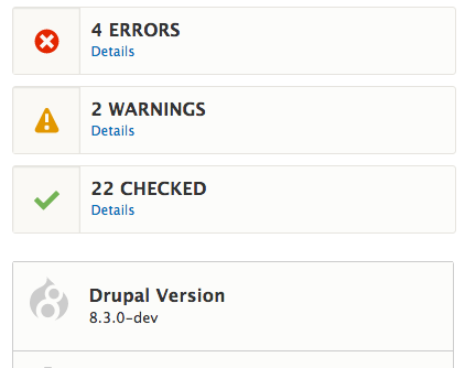
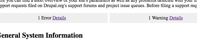
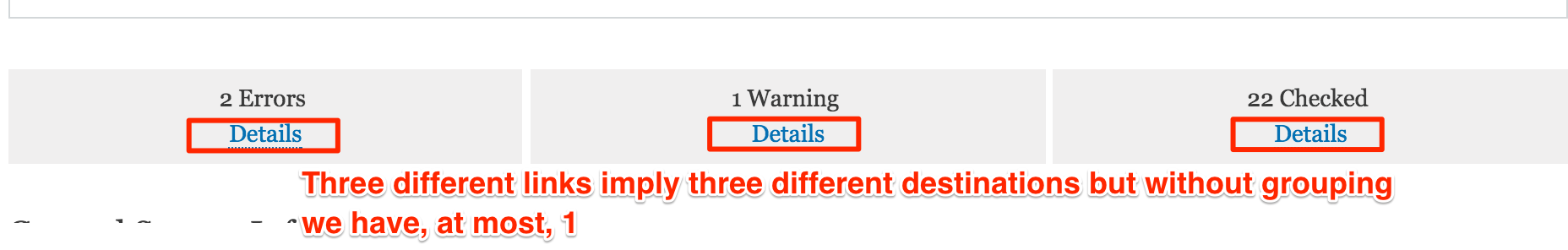
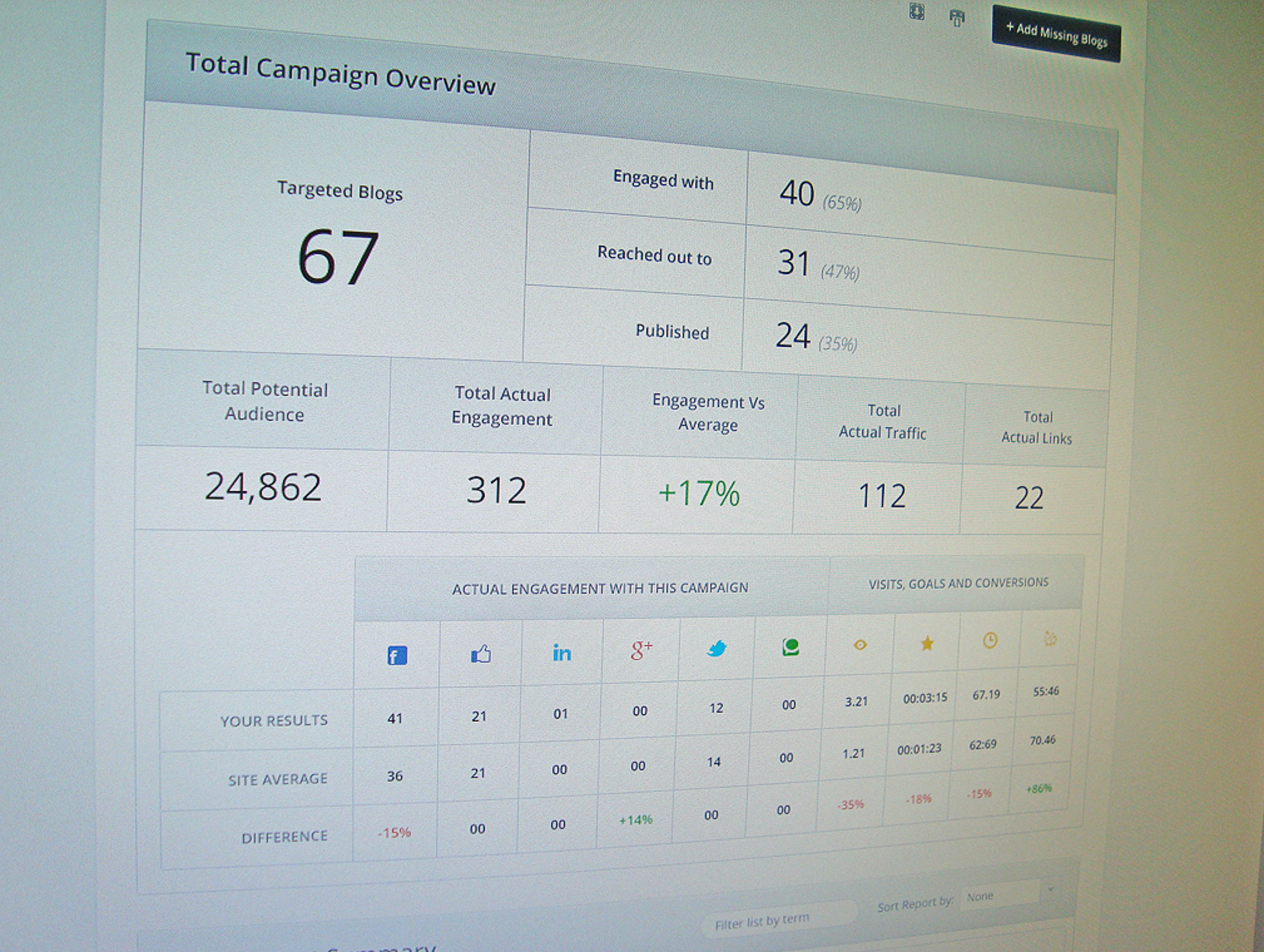
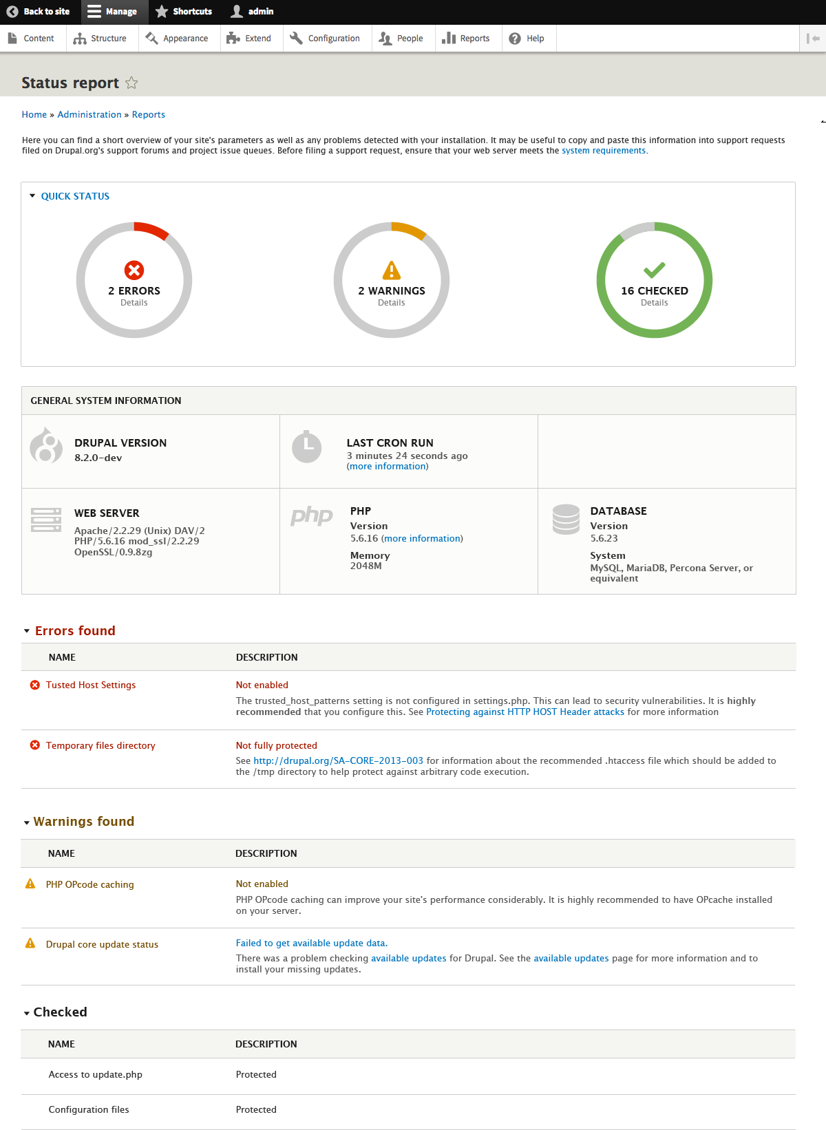
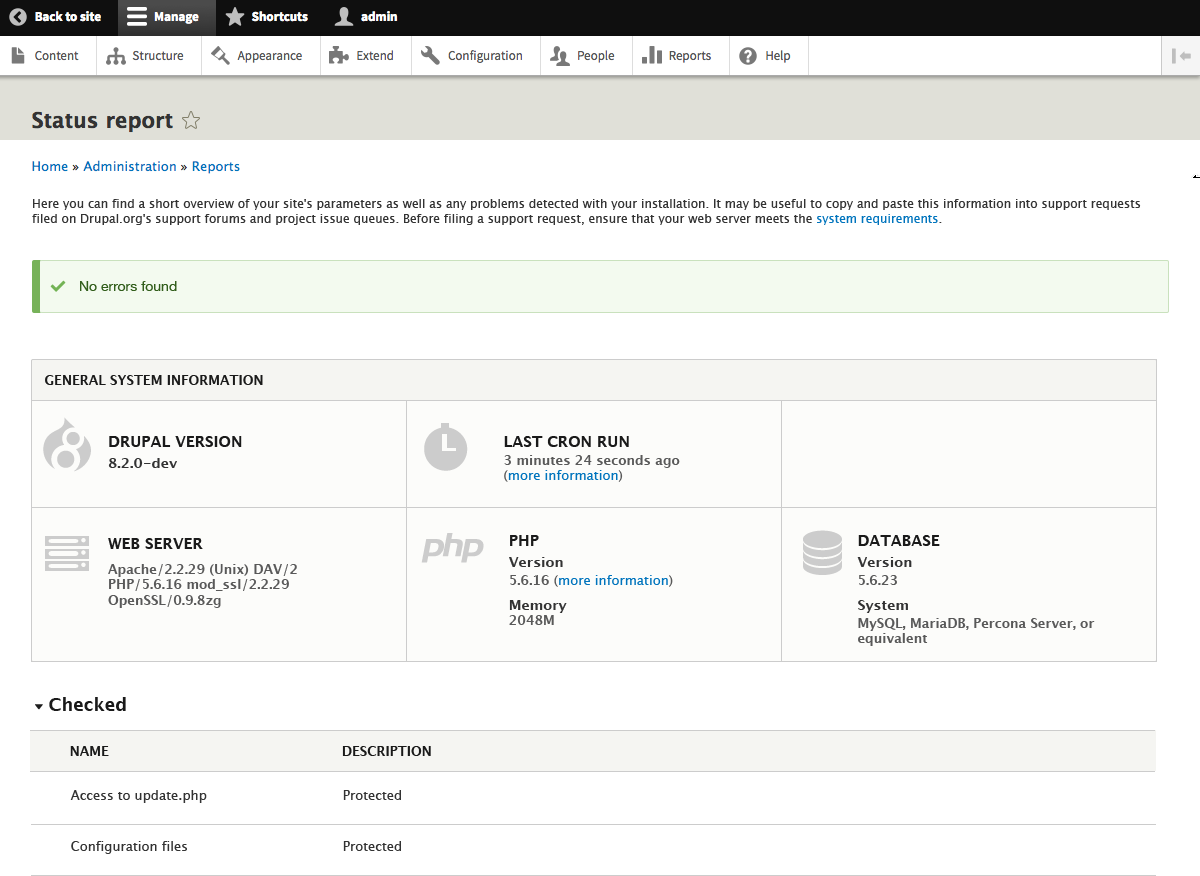
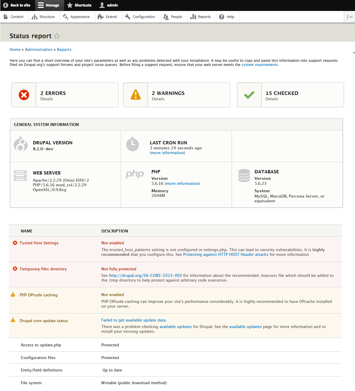
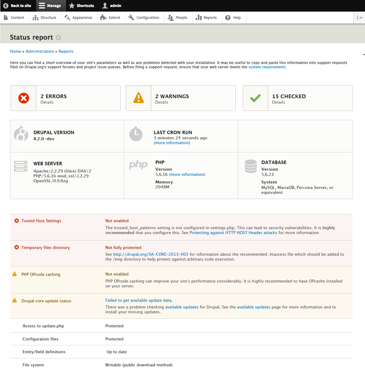
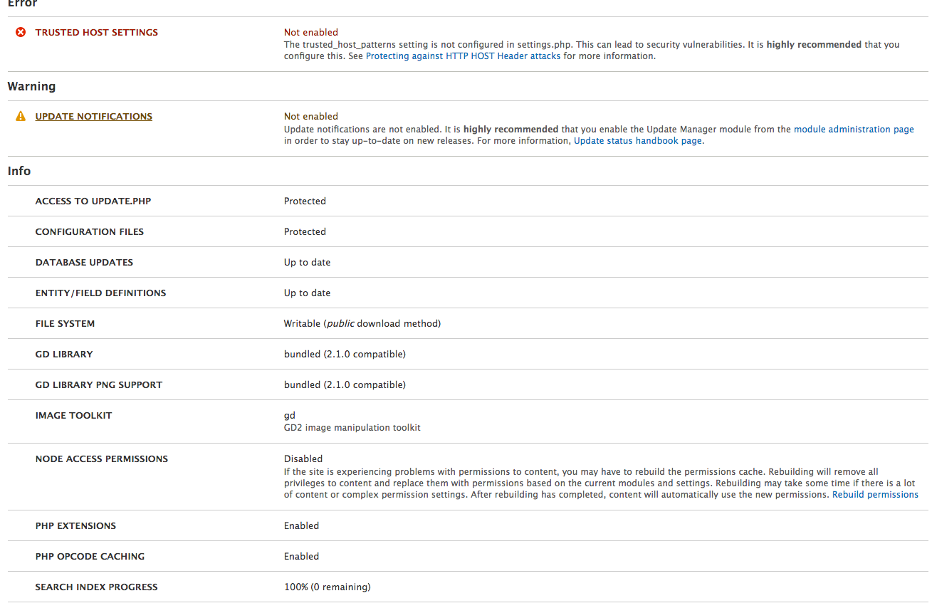
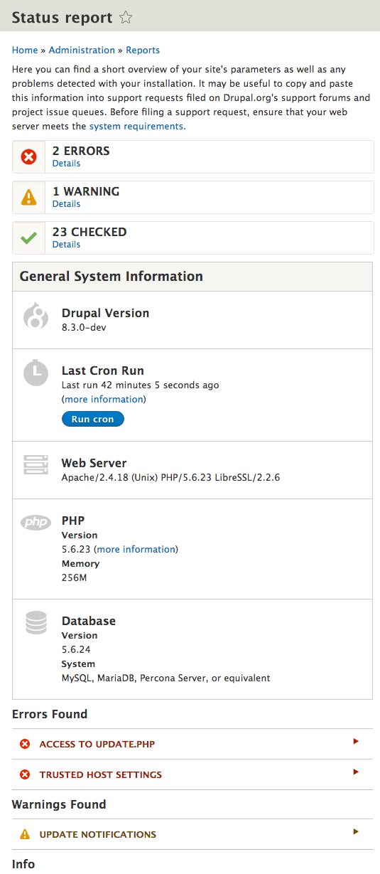
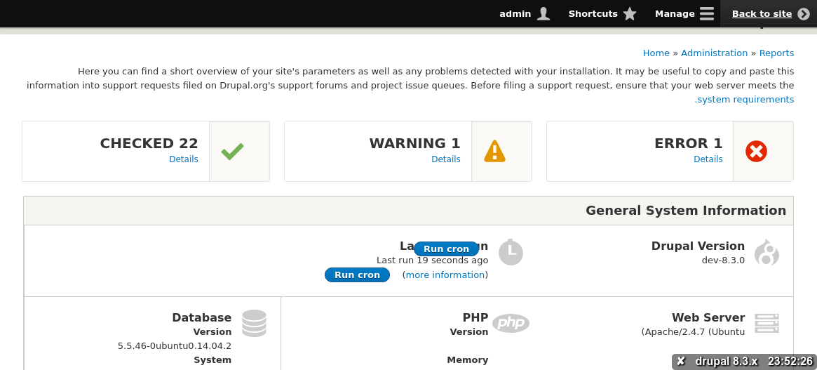
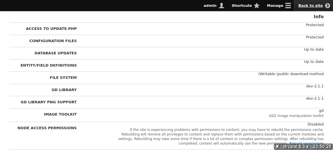
ckrinaI prepared some fast proposals to decide what information we need/want before jumping to the visual design.
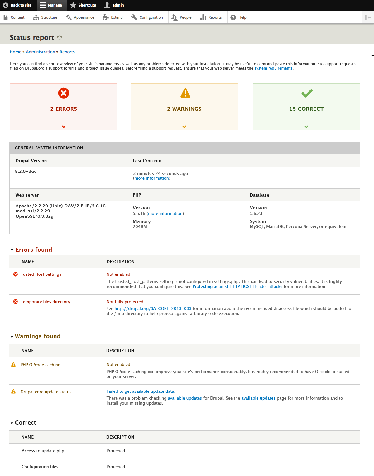
1. Quick summary with a counter for errors, warning and things that are already ok. It can be also helpful a link to the detailed list of errors/warnings/already done things (2b). In the case that there are no errors, but we still have some warnings, I would maintain the 3 counters. In the case that everything is fine, my proposal is to hide the counter component and show only a message saying that everything is ok. Do you agree with hiding the counter? And, do you agree on maintaining the 3 counters even 1 ore them is 0?
2. Summary with general system information like Drupal version, Database version, etc. Only information that is just informative. A good way to decide what information we need here could be: add only the minimum information we need to paste into an issue to explain what is our development environment. What kind of information do you think it would be interesting to have here?
3. I would suggest also a separated list for errors, warnings and things that are already ok. On small devices, we could show only the name, and open/hide it with a toggle because there are some items that have a lot of text. Do you agree on that?
Comment #131
rootworkThese look fantastic, thanks @ckrina!
Personally, yes, I agree with hiding the counter if all are 0, and I agree on showing all three if just one or two is 0.
I took a look at the current 8.2.x status page. Here are the items I think we should at a minimum include in this summary:
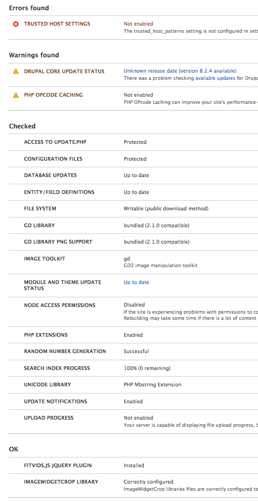
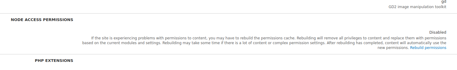
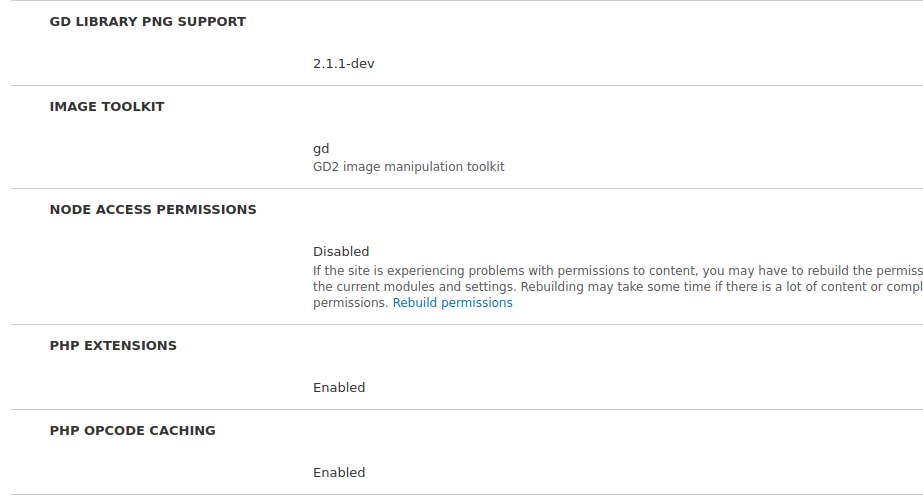
I think the PHP extensions and PHP OPcode caching, which are either enabled or disabled, could be moved to your third section of notifications, unless it seems confusing to divorce it from the line about PHP in the summary, in which case that could live in the more info link.
I definitely agree on only showing the name, with an open/close toggle on small devices.
I basically agree on separate lists for errors, warnings, and a third list. But the third list is a bit more complicated than "things that are already OK." The third list really includes both:
Contrib modules also add lots of informational items too. So I'm not sure if it makes sense to actually have four lists (I think probably not) or just be aware that we're actually jumbling two different types of things together (as we do already, of course).
But overall, I really really like this!
Comment #132
yoroy commentedI had a chance to review this at frontend united with @ckrina. There's some more details to flesh out but, I'm really happy with this direction. Thanks for working on this @ckrina!
Thanks @rootwork for constructive feedback. Could you list some examples of what contrib adds to this page?
Comment #133
rootwork@yoroy Here's a few examples of contrib modules in 8.2.x:
So there's a few examples from roughly the top 30 modules for D8. I can collect more if that would be helpful.
Comment #134
yoroy commentedThanks! That's good enough for now :)
Comment #135
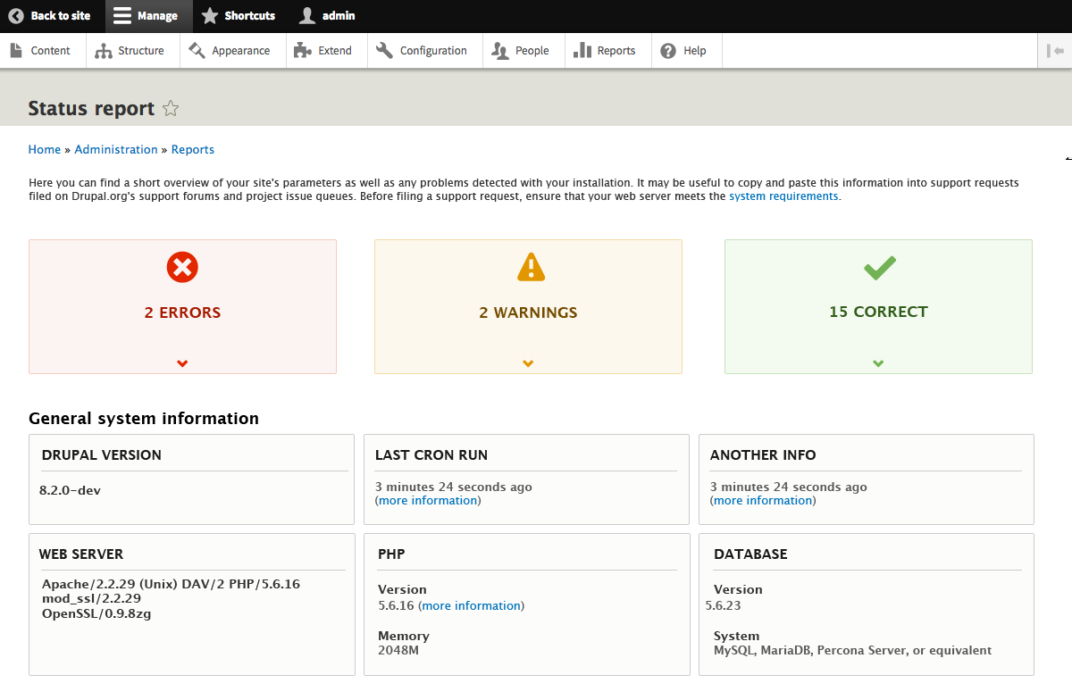
ckrinaHere are some first visual proposals for the status page.
For now, the difference between them is on the "General system information". The idea is to find out if adding icons looks like a good improvement.
Comment #136
ckrinaComment #137
rootworkI think the icons are great! And if we didn't use icons, I'd prefer the two-section layout for general system info (option 2) rather than one-section (option 1) or a separate section for each item (option 3). I think the two-section layout has the right balance for scanning.
But really, I think the icons would be helpful and also make a sometimes-scary page more friendly.
The other parts all seem good, but I again just want to highlight the third section, marked "Correct" — this would be both things that are "correct" and things that are just informational. I wonder if we could come up with another label for that section.
Comment #138
ckrinaThank you for the feedback @rootwork! I also prefer the icons version mainly for the same reason: it makes the information more “digestible”.
I also changed the “correct” label for “checked”. Anyway, it’s completely open to suggestions.
I’ve also updated 2 proposals for the quick summary with some visual changes. One of them tries to add a visual style closer to the current Seven style guide.
The other one is to discuss the idea of having some graphics to enrich the information and make it more friendly. Going for it, I would say that we are using a “graphic” as icon in the “status” menu item in the toolbar. The problem with that is we are complicating the development.
Which one do you prefer? Graphics or not?
I've also updated a version of the status page without errors.
Comment #139
rootworkLooking great!
nit: The cron section should also have the link to run cron, in my opinion (i.e. don't bury that link in the more info)
I'm of two minds on the circular graphics. On the one hand, I can see how some people would interpret that as looking more "friendly." On the other, to me it just seems like superfluous noise -- the sizes of the items within the circle are only dependent on the count of notices on the status page, which doesn't really represent anything. In other words, a 100% "full" circle doesn't mean a whole lot, and a 10% "full" circle when there are 25 notices means something different than a 10% "full" circle when there are only 10 notices. And, of course, not all errors are equal in severity.
The graphics also push down the page a bit more. Aside: What does this page look like in mobile? Stacked up? If so then these graphics would really push things down.
So I guess I can be convinced, but they don't jump out at me as necessary.
On the everything's-fine status page, can we use the same graphic and checkmark as the others -- whether that ends up being the first boxed version or the percentage-circle version -- rather than the standard Drupal success message? At least in my opinion that would be better -- a big checkmark saying everything is good :)
Comment #140
Bojhan commentedWe've discussed this at the UX team hour, and reached consensus that this is a good direction. Visually splitting information; separating basic information, highlighting the different statuses and counts, and ability to go to them.
For this to reach completion and ready for patching, we think that we need to explore a few more ideas:
- Find what could fit in the 6th box :)
- Explore placing the basic information at the top, and the "warning", "error", "checked" below this.
- Explore using one table, instead of a separated table.
- How do we deal with error states on the Drupal version, last cron run, etc.
- Design the mobile version of this page.
Comment #141
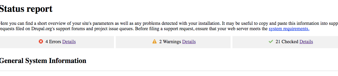
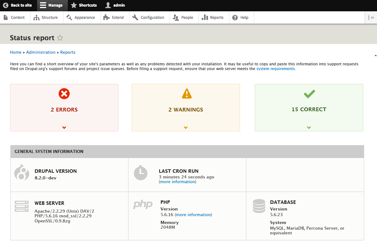
gábor hojtsyComment #142
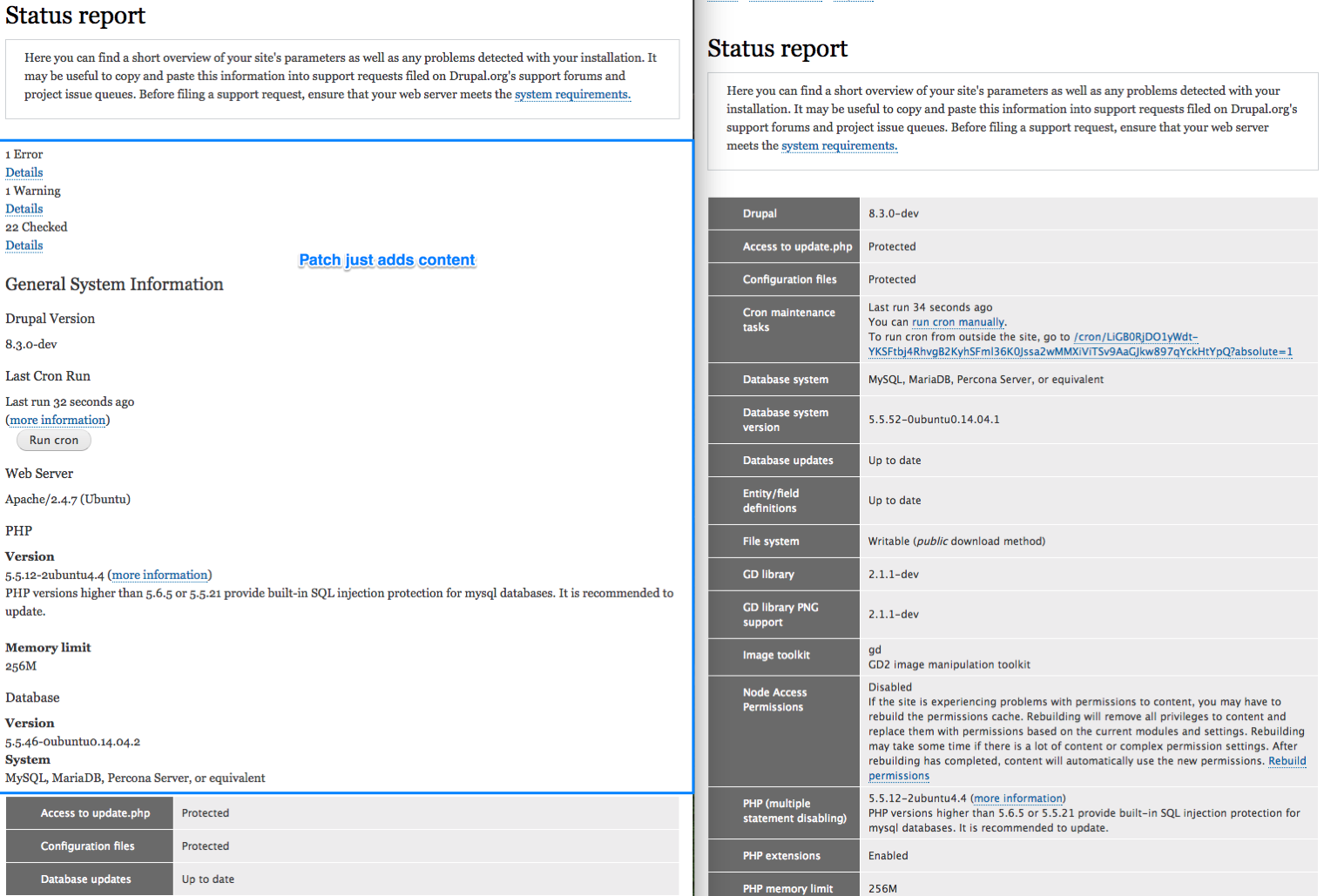
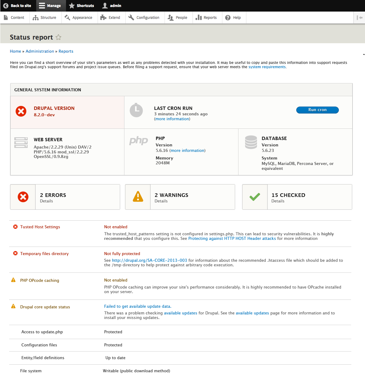
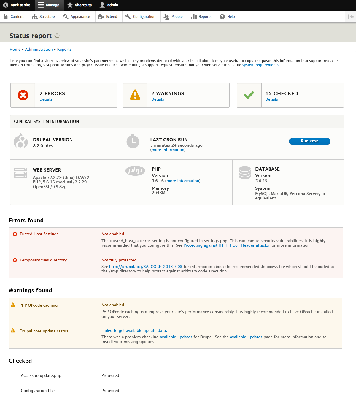
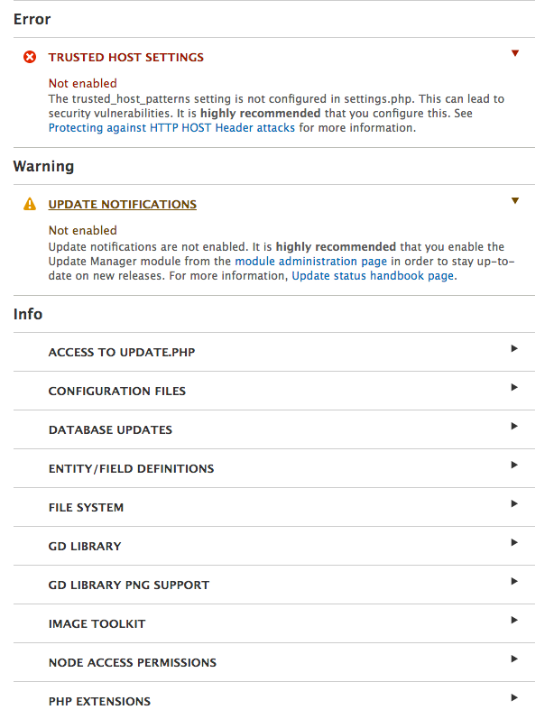
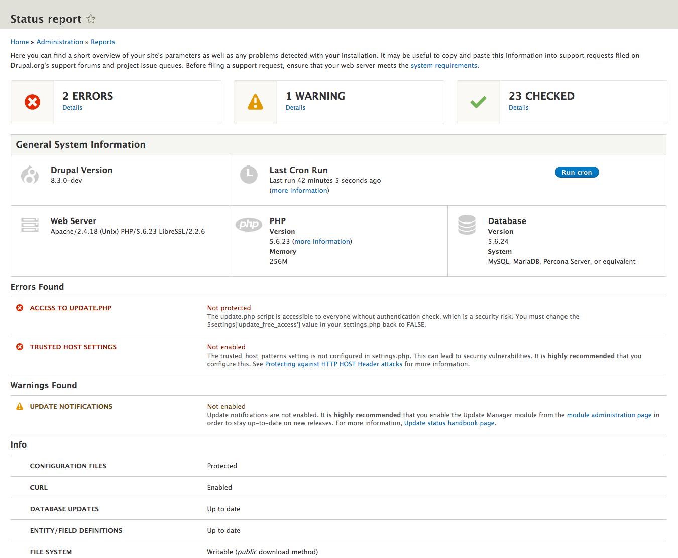
ckrinaHere is a version using one table instead dividing by king of message (error, warning, others). To show the differences between them I’ve used the same background color that is used today for errors and warnings.
I’ve also uploaded a version without title in the table, and also without title in the Basic info section.
Here is a version of the status page without error or warnings as @rootwork suggested (thanks for the feedback!), changing the regular message with another one styled like the ones in the group error, warning + checked recap region.
Here, I’ve also added a “run cron” primary button to fit the 6th box. I would prefer to use another information instead of using a button because it’s not the same kind of information.
I’ve uploaded this other version with several explorations:
- One of the items in the Basic info section in red when there is an error related to it. I added the red background and changed the icon. It clearly shows that there is an error, but if we don’t add it there it might be confusing. And adding all the information there would break completely the design. Maybe we could convert it to a link to the error?
Here are also 2 proposals for the mobile version. The difference between them are:

- In one of them the icons in the Basic info section are hidden. It can help placing more information in less space.
- The table not speared in Errors/warnings, checked messages. I think it's better this way in mobile.
- The table does not have the title. I helps saving space also.
Comment #143
Sumit kumar commented@prabhu9484 told me about this issue. The design is cool @ckrina, we need to change the html structure of status report page according to this design. Is this fine ? Request @Gábor Hojtsy @Yoroy, @Bojhan to confirm.
Comment #144
yoroy commentedConfirmed that yes, this will be a new implementation of this page and we can change the HTML to make this design possible.
Comment #145
Sumit kumar commented@yoroy we have requirements array in which i have got length of array 25. So we need to print that array value one by one because the order of that value are not according to design. i need your confirmation to do this?
If You want to suggest any thing else then i will try that too.
Comment #146
Sumit kumar commentedSo i have submitted a patch for status report as per the status-page-665790-142-04.png. I could find all field except "checked". What does this field signify? @prabhu9484 will join the call today to clarify the patch.
Comment #148
yoroy commentedLooks like only the html output was changed and no styling was added:
Comment #149
prabhu9484 commentedyes - we created the HTML structure - wanted to confirm if it is ok before proceeding with the styling
we could not understand "checked" field - we could not find it in the array
Comment #150
gábor hojtsyCopied from slack for reference:
Comment #151
webchickWe discussed this issue/patch in UX meeting today. Here's what I remember (all comments in relation to #142):
- Because it's the more frequently changing information, start with the error/warning/status summary, followed by the Drupal/database/PHP stuff.
- For mobile view, the version on the right with headings seem better, since there's something to link to from above.
- However, the "Details" links to jump down should actually be links; else they look like text descriptions just like those in the table below.
- We also discussed whether there was a need to colour the details row backgrounds and/or the headings, and decided there was not.
- The mock to change Drupal icon to a red, flaming error is actually great, but probably needs more discussion since this involves logic and we might want to have a head-to-head about what constitutes a "warning" vs. "error" for cron, for example.
On the patch itself (#146), I didn't initially understand why the change was being made from tables to divs/spans; but it was explained that this is because we want the responsive tables in mobile. I'm not actually familiar enough with the markup standards there to confirm this one way or another, so tagging for markup review.
There is a lot of copy/paste code in here, which was stated that the reason we need that is because the elements are being done out of order. 19, then 24, then 3, etc. Those numeric indexes also greatly reduce the readability of the code. I would suggest instead building the array you actually want in system_status_preprocess(), like $system['drupal'], $system['db'], etc. and then using foreach() loops to cut down on the boilerplate. This also helps prevent a scenario where 19 is database on one site but 19 is PHP on another because of different modules being installed.
Comment #152
Sumit kumar commentedComment #154
Sumit kumar commentedComment #155
Sumit kumar commentedComment #157
gábor hojtsyHow do you tell that these keys mean something special? Did you try adding a few contributed modules and seeing if indexes 14 and 24 still display what you think they do?
Comment #158
prabhu9484 commentedThanks Gabor - as discussed inthe UX call yesterday, can you post an example code snippet we can refer to ?
Comment #159
gábor hojtsySo if you look at where this template is used, in SystemInfoController:
which points to SystemManager:
So what this does is it lists the requirements results by weight. Which means their numbers can be anything. But the data is collected from hook_requirements() (if you look at ModuleHandler's invokeAll()). That is defined as:
So there is no key to identify the important parts. You cannot tell if an item needs to be pulled into that table based on its description, value or title. I would introduce a new key here for those elements. Something like
"highlight priority" => 4where 4 is the number of the slot from the special table (assuming we numbered the slots sequentially). Or"highlight" => "database"where we name each slot based on what we want to display there and the names would correspond to the cell names. Maybe the second one is nicer.Then the values from the SystemInfoController status() method are converted further for display in the theme preprocess hook in system.admin.inc's template_preprocess_status_report(). That function would turn the elements with "highlight" keys to its own array or individual elements with those names, eg. "database" to display in the right table cells.
That way the source tells us which target highlight the information goes to in the standard data format extended with a new key while the preprocess function places it in convenient variables for the theme to display.
I would approach it that way. Does that make sense?
Comment #160
Sumit kumar commentedThanks @Gábor Hojtsy sound like a good plan, I have some time to look into this will let you know.
Comment #161
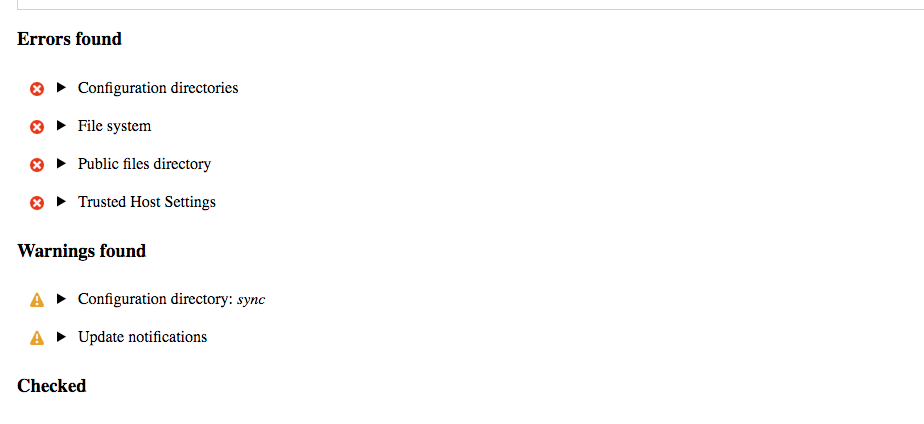
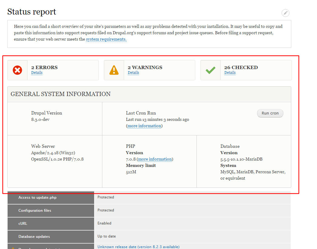
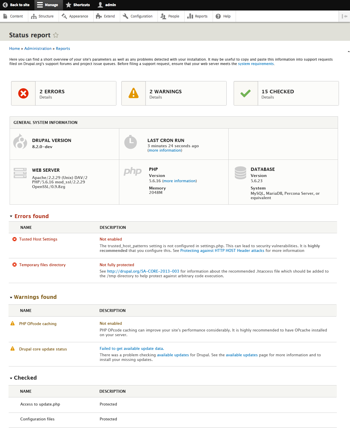
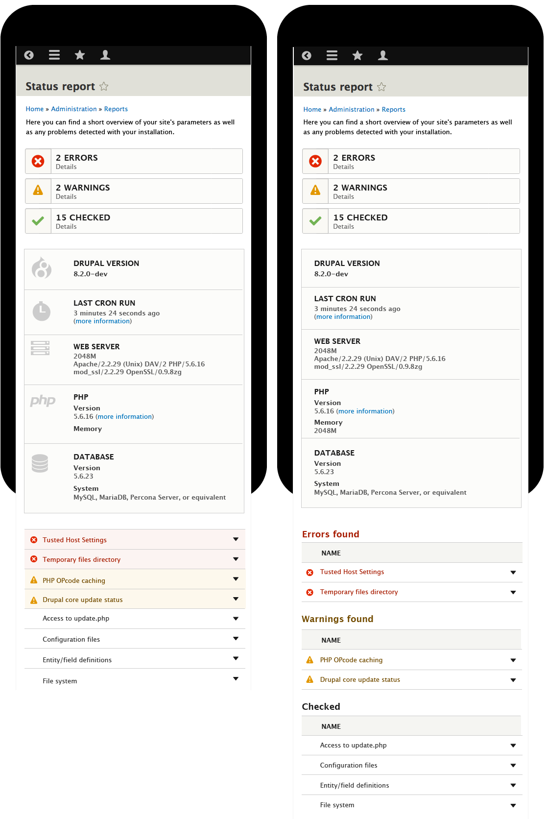
ckrinaHere are the designs after the decisions made on june 28 UX meeting:
Error re-count at top.
General system information table with 6 pieces:
List of all checked items ordered by errors/warnings/checked.
No collapsible:
No errors
With errors
Mobile
Collapsible:
With errors
Mobile
Comment #162
ckrinaI attach also the svg for the General system information table. Sumit kumar: do you still need the Illustrator files?
Comment #163
Sumit kumar commentedthanks @ckrina the design is fantastic. Yes it would we nice if u send illustrator files.
Comment #164
gábor hojtsy@ckrina: I think the updated designs look great. Reviewing now since we did not have time to review in the Ux meeting. Only two comments:
@Sumit: any progress with the patch? Do you need help?
Comment #165
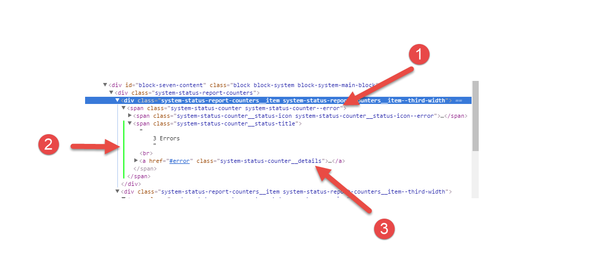
Sumit kumar commentedHi @Gábor Hojtsy so i have implement the new design for counter of error, warning and checked and also so list of found error, warning and checkd in attached png (for more reference see the new-design-implementation.png ). So only one part is left and that is Genral system information. So i am stuck with this ,so i need your help to resolve this.
For counter and listing for found error here is the code
So i have write this code to print counter and listing of founded error, warning or checked.
@Gábor Hojtsy Please let me correct if it is wrong way or give me direction.
Comment #166
Sumit kumar commented@Gábor Hojtsy this is the png for referance.
Comment #167
gábor hojtsyPutting on usability sprint. Will respond to Sumit later, sorry, not yet.
Comment #168
gábor hojtsy@Sumit: 2 key points of feedback:
As for how to proceed with the general information section, I provided guidance on that above. I would update hook_requirements() with a new key to place concrete status report items in specific categories and then use again the preprocess function (template_preprocess_status_report() in system.admin.inc) to put these into variables for the theme for easy use.
Given that you seem to be looking at a nicely themed colorful page already, if you could fix these, then it would all be down to markup and CSS review I think where I would need to pass on the helper flag to someone else more knowledgable/opinionated in that area.
Comment #169
Sumit kumar commentedThanks @Gober for your feed back.
Comment #170
gábor hojtsy@Sumit: are you still continuing working on this? There is about a week to get this in for 8.2 and it would probably need to go through some review rounds :)
Comment #171
Sumit kumar commentedYes @Gobor i am working on counter part of this task.
Comment #172
ckrinaGábor thanks for the feedback!
I've updated the designs with #150 @webchicks' annotation, about the decision we made regarding the row backgrounds and I forgot.
I've also updated the summary. Feel free to change/correct anything.
Comment #173
ckrinaAlso @sumit here is the Illustrator source file.
Comment #174
ckrinaFixed summary images. Sorry for adding more comments. :-)
Comment #175
Sumit kumar commentedComment #177
gábor hojtsyYou can just foreach() on the requirements I think.
$variables[] would need the new keys for error, warning, etc. added. Here you are incrementing the same number also for all the cases, which is not good.
Also I think you had CSS as well which you did not yet post. Would be nice to get all the twig, PHP and CSS and see it together as a patch. So they all can be reviewed while you work out the PHP.
Comment #178
Sumit kumar commentedadded patch with css
Comment #181
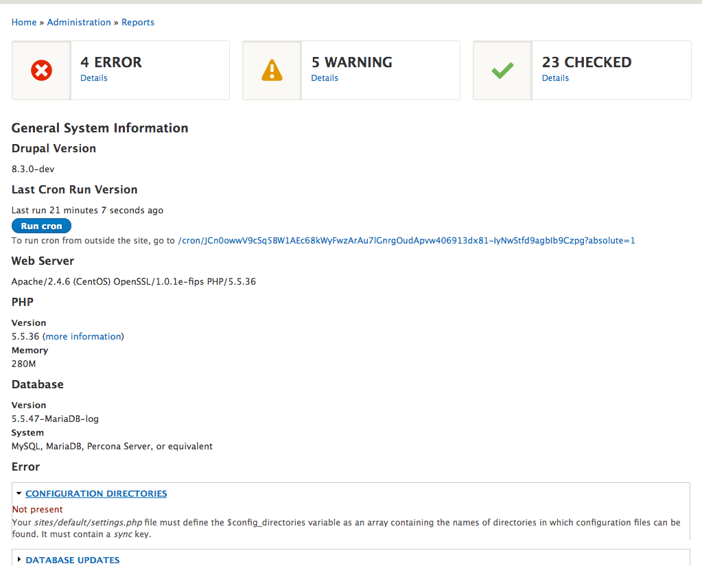
hedrickbt commentedI am at DrupalCorn sprint looking at this. I see notes from @catch about a commit, but I didn't see the changes until I applied the patch.
Here's how I cloned
git clone git clone --branch 8.3.x https://git.drupal.org/project/drupal.git
Here's how I patched
patch -p1 < ./redesign-status-report_173.patch
Comment #182
yesct commented@hedrickbt #179 (180) seem to be an artifact of an old commit from May 2012 (#61)
So the most recent work since then (for example patch in #178) has not been committed. :)
I investigated by asking around and clicking on the commit hash (180) :)
Comment #183
hedrickbt commentedCaught up on reading the ticket and it looks like the last patch is current with suggestions around the 3 status items.
I am reviewing core/themes/stable/templates/admin/status-report.html.twig. I am trying to understand the if conditions and I am confused about how we can ever get past the 3 or condition initial if... when the other conditions that are on the ...else side would also be met by the same criteria.
Maybe the or conditions need to be changed to and. I need to test each of the individual combinations to make sure they are working as expected.
I am hoping to get back to this some time later in the week.
Comment #184
gábor hojtsyGetting there in term of logic AFAIS. I think the counting happens at the right place now. Lots of cosmetic things to fix though to make it easier to review for markup and CSS (two of which I am not proficient in, so cannot help with). The cosmetic fixes to do though are:
Please watch your code style, several line ending spaces are here, as well as indentation with 4 spaces instead of 2 all around the foreach.
... and several others. These are not required changes and just make the patch harder to review.
Please add a newline at the end of the file.
Should spans be between the table and tbody? That looks odd to me. These should be above the table, no?
Also, watch your indentation here too, compare to indents used in the file.
Comment #185
rdellis87 commentedAttended my first Drupalcorn Drupal Camp and my first Sprint. Looked into this with hedrickbt at the Sprint.
Comment #186
Sumit kumar commented@Gábor Hojtsy,@hedrickbt Thanks for reviewing my patch. I am working on it and will resubmit patch with correct indentation.
@hedrickbt,@Gábor Hojtsy Please suggest me if there any other way to do this code better.
waiting for your inputs.
Thanks in advance.
Comment #187
gábor hojtsyYeah, @hedrickbt is right. The last two conditions would match even if only one of the two is non-zero, eg. only the items checked is non-zero and the errors and warnings are 0. I think you wanted and conditions. For the first case if all three are non-zero, for the second two cases if there is an error or there is a warning on top of checked items and the last one is the else case.
Comment #189
Sumit kumar commentedComment #190
gábor hojtsy@Sumit kumar: it would be important to post interdiffs, so we can see what changed in your work. See https://www.drupal.org/documentation/git/interdiff
Attached are some direct fixes.
1. Simplified the PHP code, since we are already doing a loop on the requirements, we can just use that.
2. Renamed 'checked' to 'info' in terms of internal variable naming since that is what it is in the existing API, we still report it as 'checked' on the UI.
3. Added docs on new variables to the twig file.
4. Fixed the twig logic. As multiple people pointed out, all the 'or' should have been 'and'.
5. Fixed the CSS indentations that are inadvertently added. I pointed this out in #184 and it was not fixed.
6. Added the /* LTR */ marker to things that were missing them.
7. Added one missing RTL style.
8. Also added the twig updates to the base module style.
I am not sure twig file changes like this are allowed, it certainly does not conform to stable being stable if we are making changes like this. So we may need to rename the stylesheet and start using a new one.
The highlight items are still not implemented but should be. Also CSS needs serious review, classes like "all-exits" don't seem right to me.
Comment #191
gábor hojtsyThe summary looks good even in responsive settings. The responsive behavior has some issues when the toolbar menu is open on the side though:
Comment #192
lauriiiI'm working on a small clean up for the frontend implementation
Comment #193
lauriiiWhat I did on my patch:
Comment #194
Sumit kumar commentedI have review patch #193 and its working fine. @lauriii i have concern only with one that is "counter". if we can replace it with "system-status-report_counter" then its fine i think.
Comment #195
lauriii@Sumit kumar Thank you for the review! I liked at first the idea of using simply the counter as a name for the component but I do understand your concern about using that name because it is quite generic. How would you like if we simply just rename counter to "system-status-counter"?
Comment #196
dawehnerSorry for the noise. I totally love the initiative to make that, quite often used, page nicer and easier to understand.
Comment #197
Sumit kumar commentedyes @laurii we can proceed with it.
Comment #198
Sumit kumar commentedAdded @laurii patch and cloned the status-report.html.twig and name in status-report-summay.html.twig in both place(one is core\modules\system\templates and another is in core\themes\stable\templates\admin).
Comment #200
joelpittet@sumit kumar, I agree with @lauriii and you, the name "counter" may be a bit too generic for the component and his name "system-status-counter" makes sense. Here's an interdiff (the changes between the patch in #193 and one #198).
Please put those up so we can all follow the changes easier. If you haven't made one before as Gabor mentioned in #190 refer to https://www.drupal.org/documentation/git/interdiff
Here's an interdiff for between #193 and #198 on your behalf.
Regarding the testbot failure in #198, it looks just to be a library change caused that, you've added the
css/components/system-status-report-counters.cssandcss/components/counter.cssto the libraries file but the actual files missed it into the patch. Could you add them please?Just spotted this issue, this looks amazing, nice work all!
Comment #201
joelpittetSorry had a .gitignore issue(was accidentally excluding paths with themes/ in them) for that interdiff, bad example to show you, this one would be more accurate.
Comment #202
joelpittet@Sumar kumar, not sure about the template name change, if we can avoid that it would be better. I reverted that change to get the styles working again, can you explain the need for that a bit more as I didn't see anything mentioned about that until your change?
Here's the class name change hope that is getting on the right track? The styles look the same as they did in #193.
Hopefully will pass tests.
I'm going to try to get more of the styles into
status-report.html.twigComment #203
joelpittetComment #204
joelpittetUsing #172 as reference I started splitting variables up.
I addressed
further from @lauriii in #193 by moving all the markup changes from system/stable to Seven theme.
system.admin.cssby overriding stable's version in Seven and moving all but the "Status report" section that was removed in previous patches.Feel free to take this further, @Gábor Hojtsy's comment from #191 still need some addressing and there is much more stuff to style now from the design.
@ckrina, the design change between mobile togglable details and desktop not, may be a bit tricky and the arrows on the right are different from the rest of the details which have arrows on the left, any chance you can make a tweak there to make the implementation a bit easier?
Hope that helps move this along.
Comment #206
joelpittetNot sure what to do with the 'ok' status, just added it to the group sorting to appease the testbot.
The trouble with #191 is that the toolbar adds 240px when it's not fixed and vertical, which is kind of a PITA.
Comment #207
joelpittetHere is the button for "Run cron" added and slightly styled. Also tried to add that box-shadow and icon background pale yellowish color like the comps.
Add some screenshots of the state it's in so far:
Mobile
Desktop
Comment #208
joelpittetPlaying with flexbox a bit:) A bit closer...
Ok I'm tapping out.
Still missing:
Comment #209
joelpittetFeel free to continue working on and discussing the missing items from #208
Comment #210
yoroy commentedThanks for pushing this forward @joelpittet! Who's next? :-)
Comment #211
ckrina@joel sorry I missed the message. I think what you did in your last commit is the best solution to make it easier to implement: moving the arrow to the left and removing the icon. There is still the text color to pick out the kind of message, and they are also separated. So it's still easy to see the difference.
And removing the behaviour on desktop I don't think is necessary. I just added it to make the behaviour simpler, but clearly it doesn't worth so much work because it does little.
I totally agree with the change, so I will update the designs to keep the summary updated.
Comment #212
joelpittetThanks ckrina, that will help implementation a bunch I'm sure!
Comment #213
dscoop commentedThis update will be appreciated so much by a lot of people! Really cool!
Comment #214
ckrinaUpdated summary designs.
Comment #215
marcvangendReally nice to see the progress here, thanks all!
Minor nitpick: in status-page__mb--toggle-left.png (the mobile status page) the string "2048M" was accidentally placed under WEB SERVER instead of PHP>Memory.
Comment #216
chrisrockwell commentedTaking a stab at this. Hopefully I didn't mess up the interdiff/patch, first time trying an interdiff.
I started with the icons in the general info section.
A couple things I noticed (I did attempt to follow all the comments, hope I'm not being redundant here):
I'm also attaching screenshots of what the differences are.
Comment #217
chrisrockwell commentedI guess I set this to Needs Review so tests can run, then set back to Needs Work?
Comment #219
chrisrockwell commentedNot sure how the .gitignore got in there, sorry about that. Trying again.
Comment #222
chrisrockwell commentedThis one adds icons, background colors, and bottom borders to the status report entries. I've also added a wrapper around each section of entries (each section contains 1 h3 and 1+ details elements).
I found that the background colors were removed from colors.css. To match the mockups I needed to add them in, but I just did it in system-status-report.css - are they better in colors.css?
Finally (and I'm working off of Joel's list in 208), I can knock out the details being open on desktop but I wanted to make sure I went about it the correct way. As a d8 newb I think what I should do is add another library (drupal.details-open), attach it within the twig template, and using something along the lines of (done properly, within an attach method on a behavior of course):
I appreciate any feedback/guidance/suggestions. Thanks!
Comment #224
chrisrockwell commentedThis one is the JS for opening/closing the details based on screen size. I do have a couple questions about the UX:
Right now, on resize, any with "aria-pressed=true" will not close. However, I'm not sure how to handle this on desktop - it currently just opens them all, even if a user had explicitly opened one or more. I could see this causing confusion when A browser window is narrow, THEN user clicks to open one with lots of information (e.g. node access permissions), and drags the window out. One solution might be to not open any when the screen is widened *if* the user has already taken an action to open any of them.
Thanks!
Comment #225
joelpittet@chrisrockwell, thanks for picking this up!
Re #222 The background colors were removed on purpose from colors, see screenshots from ckrina in #214.
The attaching another JS behavior totally sounds like the right way to do that, give it a shot:)
Re #216
Icons are looking great!
Comment #226
chrisrockwell commentedThanks @joelpittet - the %trans% seems to be working great. I went right over the color changes, sorry about that, so I've moved it out.
This is more of a cleanup patch with one exception:
Comment #227
joelpittetlol
This is looking great, thanks for the improvements. I made some notes in the following screenshots:


I'm kind of hoping we don't need the intro copy.
The biggest thing that needs a bit of help is the arrow to summary spacing.
Would like some direction from @ckrina on the scrolling cron info, and the top right positioned button and that cron link which is not in the design.
Comment #228
ckrinaWhat I thought about that long cron link is to not repeat it here since we already have it on the cron page. I was thinking in a link to that cron page (just like the one in PHP) with the text "more information".
There were so many things to decide it went unnoticed that just now I realized we didn't talk about it.
What I proposed is to not repeat here this information because this box should be something quick to read, with a minimum of info/text. And that link is just one click away.
Another option would be to create some kind or collapsible behaviour, but once it's opened it would create the scroll anyway.
And about the "Run cron button", it's on the right because it fills the gap on the left by created by not having the third column in this row. Is that too difficult to archive? Should I search another place for it?
Comment #229
chrisrockwell commented@joelpittet Thanks for your notes. Re: the collapsible elements - I failed to check browsers that need the poly-fill. The attached patch addresses that (not sure if I should just hide #224).
This is what it should look like:
@ckrina I'm new to this issue (and not sure overall of the process of deciding whether to remove information or not), but I love your idea of not displaying the additional info here and adding the "(more information)" link. Positioning the cron button is easy enough to do.
I'm going to keep working through the list, which I'll update here (items with strikethrough may still need to be reviewed, but they're represented in patches):
grey SVG icons in general infoThe error and warning icons on the detail summariesDisable details toggling on desktopThanks!
Comment #230
chrisrockwell commentedForgot the patch and interdiff.
Comment #231
chrisrockwell commentedThis one addresses "The word 'found' after warning and errors" and "Cron positioning for desktop".
I used seven_preprocess_status_report() to change up the cron text object. Now I see that the link was added to system.install within this issue. This would be much cleaner if we can just change it in system.install to make the link available as it's own variable (system.run_cron is what I'm using now). I'm only realizing this (that it was added in this issue) now but when I first analyzed this task I thought, "if I could just change it in system.install this would be much faster; BUT, what other themes are depending on it being there?" Now I realize the answer is very likely, "zero". Hindsight and all that.
@joelpittet I see the Intro text on my install, it's within the help region though, and not being displayed within status-report.twig.
Comment #233
chrisrockwell commentedI'm not going to make the test pass before hearing back on whether or not we can just change system.install
Comment #234
chrisrockwell commentedCan't resist. It's so much better without the preprocess stuff.
Comment #236
oriol_e9gwidht 100% and max-width 80%? :p
Comment #237
chrisrockwell commentedThanks @oriol_e9g, I've removed it :).
The attached patch adds the (more information) link to the Cron section by creating another variable in the cron render. Right now, I'm hiding the description via .visually-hidden - I think this is a good way to go.
This patch is failing locally for me, I'm assuming it will fail here as well, but I'm hoping someone can take a look at the system.install interdiff and tell me why the "Run cron" link, which is tested on line 124 of Drupal\system\Tests\System\CronRunTest->testManualCron() is failing.
Comment #239
chrisrockwell commentedAdding to-do list to Remaining tasks
Comment #241
oriol_e9gI think that the text "Memory" should be "Memory limit", it's a text more accurated and according with our help pages like: https://www.drupal.org/docs/7/managing-site-performance-and-scalability/...
Comment #242
lauriiiOh wow! This is starting to look amazing! Good work everyone!
Nitpick: Unnecessary double line change
Could we add class for the h3 element so we don't need to do unnecessary nesting?
Is there a reason why we specify that details-title has to be an a element?
I couldn't find the .details-title class anywhere, could someone help we figuring out where can I find it?
Why are we adding styles for modules page here?
We could add some documentation according to the Javascript API documentation standards: https://www.drupal.org/node/2183405
We should ask one of the JS maintainers to take a quick look on this
For some reason, there is two cron buttons visible for me
On RTL the cron buttons don't float nicely. Also the Icons on the counters are aligned a bit awkwardly when using RTL.
Also the system status tables are not floating correctly on the RTL
Comment #243
gábor hojtsyI made some important remarks about this two months ago in comment #159. I don't think switching by title is a good way to go since the titles may be altered. It would be more practical to introduce a new highlight key in the requirements array with these names 'version', 'cron', etc. and pick them out based on that instead of the more fragile title matching. If we decide to simplify the title of some in the future, it may break the status page otherwise for example.
Comment #244
joelpittet@chrisrockwell re #234
I agree, and thanks for adding the tasks to the summary.
@oriol_e9g re #241 I agree, I'll add limit in the next patch.
@lauriii re #242 thanks for the review. Responses:
@Gábor Hojtsy re #243 I agree, a key would be better, I'll see what I can do.
Comment #245
chrisrockwell commentedI was stopping for the night but I see @joelpittet's comment - before you put in any effort please see if you can use anything from the attached interdiff (between 234 and now) - I was working from @lauriii's comments. and have the rtl stuff worked out (I think) along with a start on the JS comments.
Here are the comments I was tracking during work, they should map to @lauriii's feedback.
I'll be back tomorrow!
Comment #246
joelpittet@ckrina re #228 That seems logical to not repeat it, it was kind of handy but the logic you put forth seems reasonable so let's go with it until someone says otherwise.
@chrisrockwell re #231 thanks for the detail about the help, I had help module turned off.
calc()instead of percentage to bring the summary labels closer to the text, hope that's ok @chrisrockwell? or should we revert that?Comment #247
joelpittet@chrisrockwell sorry cross-posted with you! I'll try to merge stuff if possible
Comment #248
joelpittet@chrisrockwell, sorry again, here's an interdiff with all the things I could merge. Hope I got them all, your responsive changes covered them much better than mine.
Didn't mean to step on stuff you were doing, just trying to get that error out of the way (which is because we removed button from the description which breaks other themes), and that item @Gábor Hojtsy mentioned about titles as switch. I was just doing the CSS in passing. Feel free to continue kicking ass on this @chrisrockwell!
Comment #249
yoroy commentedJust a note to say I'm really happy to see this friendly and constructive back and forth. At almost 250 comments in that is no small feat :-)
Thanks for pushing this forward all!
Comment #250
borisson_I have nitpicks, sorry.
This seems an unrelated change, let's revert that part.
The svg's here seem to have tabs in them, should those be replaced with spaces? Not sure if that's needed as they are probably generated.
Comment #251
ckrina@joelpittet I don't think the "found" word is a critical thing. I just added it to give some context and make it easier to understand what kind of info shows. But I think it's easy to understand anyway, so removing it seems reasonable for me.
Comment #252
chrisrockwell commentedComment #253
chrisrockwell commentedNo problem at all, just didn't want you to reproduce anything that you could copy/paste. Thanks for explaining the error, I wasn't thinking about other themes.
I'll take a look at the vertical toolbar issue. I took a stab at it the other day and I think the easiest fixes would be to either a) decrease the font size or b) kick the media query in a bit sooner. Unless someone can get element queries through quickly :).
Comment #254
chrisrockwell commented@borisson_ I think that's me, I copied them into that folder.
Comment #255
joelpittet@ckrina, thanks, the word found could be done, just needs to be done with plural forms, and my brain isn't remembering the best way to do that. @chrisrockwell, if you know, feel free to add it back in.
@borisson_ regarding 1), I did that because I didn't want people to think it was an integer anymore and that it was an associative key as originally defined, it's not totally necessary and we can revert if you think that's over-reaching?
@chrisrockwell, I won't step on the patch tonight, feel free to tackle borrison's feedback. And the vertical toolbar issue I wouldn't want to hold this up because of that, so we can make that a follow-up and get it close enough there. Maybe kick the media query in a bit sooner and call it a day/till next time? Element queries FTW, let's fix the browsers too!
Comment #256
chrisrockwell commentedThis fixes up the svg's and the issue with the counters when the vertical toolbar is open. I'll be the first to admit I'm not thrilled about the solution because it uses the toolbar classes. I didn't want to blanket lower the font size just for the times the toolbar is open (I am pretty diligent about closing it, not sure about the majority of users).
I haven't reverted #2 in @borisson_'s feedback only because, in my newb opinion, that work made it easier to follow along with what is going on, and $key is more representative of what is happening. I'm happy to create another patch reverting it though - just let me know.
I think we still need:
Joel - we cross-posted again, I'll take a stab at the "found" tomorrow if it's decided to be better.
Comment #257
chrisrockwell commentedComment #258
chrisrockwell commentedComment #259
nod_Comment #260
nod_Missing a couple of things in the JS:
.system-status-report__entry, we could usedetailsafter all it's just on this page that we mess with this. If an attribute is needed usedata-drupal-selectorlike:<details data-drupal-selector="status-report-details">$(window).once('responsive-details')core/jquery.oncein JS dependencies.Sorry to put that NW but the selector thing is an issue see #1090592: [meta] Use HTML5 data-drupal-* attributes instead of #ID selectors in Drupal.settings for context.
Comment #261
lauriiiI put a little bit more effort to review the RTL this time. Good work everyone, especially @chrisrockwell and @joelpittet are rocking this issue right now ;)
I was wondering in general, how closely do we want to follow SMACSS standards in Drupal core? Do we want to separate the colors etc under the theme category?
According to Drupal CSS coding standards, colors should be always written in lowercase https://www.drupal.org/node/1887862#properties
I'm not pointing out all the places where this is wrong but I think we need to convert all the px units to rems and use the px as a fallback. More information: https://www.drupal.org/node/1887862#properties
Newline missing from the end of file
This is missing RTL
Missing LTR comment
Why are we using different selector for the RTL styles here? It would be also nice if the RTL styles would be placed right after the LTR styles
This is missing LTR comment
Missing LTR comment
These could be optimized to one selector. We should also add the LTR comment.
These could be also optimized to one statement
This looks like something that would break very easily when something is being refactored. If there is no other way to do this, could we at least add comment what is the expected behavior.
Missing LTR comment
Should we also add RTL styles for the margin?
Missing LTR comment
Why are we using ch here? According to our CSS formatting guidelines we should be using rem
Nitpick: Double space before the comment
There is still some issues with the titles on the rtl mode. I think the title should be on right.
The text on the list items is not aligned properly vertically
Comment #262
chrisrockwell commentedThe JS stuff is new to me so I'm trying to wrap my head around it. I looked at several implementations of
once()and it seems like using it on$statusDetailswould be that right way. @nod_ - was it your intention that it was used how you put it in your comment?Regarding aria-* I took a look at the specs on those as well. What this patch does is set
aria-expanded=truebut does not use a click. The reason I chose this way is because using a click also setsaria-pressed=truewhich isn't accurate, as far as I understand the intention.I am passing debounce into the function now, as I found that was a pattern being used throughout other core js files.
I'll work on the CSS feedback from @lauriii as well, but I wanted to separate these two out due to my inexperience with js in d8. Looking forward to feedback!
Comment #263
chrisrockwell commented@lauriii I have tried to address all of the feedback but it's possible I missed something. I have a couple comments/questions:
3. Does this apply to dimensions as well?
7. Because different styles are applied for rtl based on whether the polyfill is used:
10, 11. When I originally did this I thought the same thing, but I couldn't get it to work. When I tried to use comma separated selectors the poly-filled version wouldn't work.
12. I'm going to come back to this one. I believe this is a standard way of making sure elements work cross browser but I'll need to look more.
16. I had to lookup what
chwas when I saw it in there :) It solved the problem so I'll let someone with more knowledge than me comment :)19. I can't reproduce this, what browser is this happening in?
I really appreciate your feedback - it's helping me dig into the docs and standards more - but I will need your eyes on this again to make sure I covered everything that hasn't been noted above. Thanks!
Comment #264
chrisrockwell commentedRe: 12 in #261..In my testing this is necessary for poly-filled
detailsand elements to behave correctly so I added a comment and some spacing around it.Re: 18 in #261 I have changed it to rem. I'm wondering, do we even need px fallbacks for rem units anymore? http://caniuse.com/#feat=rem
Re: #19 @lauriii are you using IE 11 there? Apparently it calculates differently than other browsers: http://caniuse.com/#search=ch
Comment #265
oriol_e9gUltraminor:
Duplicated width:
Three diferent units in a operation is dificult for me to understand the result.
Comment #266
lauriii#263.3 I'm pretty sure it applies to font-sizes only
#264.18 This would be a good discussion. Probably we should bring that up somewhere to get rid of that requirement. For now I still think we need it.
#264.19 I'm using Chrome but I couldn't reproduce the problem with the latest patch anymore. Something must have fixed it in the meanwhile.
We should still address #263.16. I tested the latest patch and both, LTR and RTL modes are working! Thanks @chrisrockwell for sticking around! It's amazing to have this moving forward. Good work!
I'm removing some tags that are not relevant anymore.
We still need accessibility review on this as @nod_ mentioned in #260.
I'd like to do another code review for this one still. I don't think it's necessarily hard blocking this issue since we are still waiting for the accessibility review. I will try to find some time to do it this week.
Comment #267
mgiffordWe're just linking to 'Details' 3 times. Let's make sure this is pronounced correctly to screen readers by using this instead:
I'd also like to see this text:
<div class="description">There was a problem checking <a href="/admin/reports/updates">available updates</a> for Drupal. See the <a href="/admin/reports/updates/update">available updates</a> page for more information and to install your missing updates.</div>Go to something like this:
<div class="description">There was a problem checking <a href="/admin/reports/updates">available updates</a> for Drupal. See the <a href="/admin/reports/updates/update">available updates page</a> for more information and to install your missing updates.</div>So again we aren't using the same text to link to two different places. I'm not sure that this is the best way to summarize this, and it's probably something that is out of scope, but thought I'd raise it.
Mostly I'd like to say that this looks like a great improvement!
Comment #268
chrisrockwell commentedThanks all!
Next up we have:
ch#265, #263.16 (I'm going to suggest we just take it out but, again, I wasn't aware of the unit until thisI'm going to wait on another review from @lauriii but if you don't find time later in the week I'll update the patch to address the above.
Comment #269
Sumit kumar commentedHi @chrisrockwell Thanks for contribution i had reviewed your patch. Need to add vendor prefixes for box-sizing.
box-sizing: border-boxThanks
Comment #270
joelpittetMy thoughts on
chwas that it's a good unit if your aiming for rough character count. The mixedcalcwas(100% - rough size of the box - margin/padding). I'm not married to it, was showing off:P@Sumit kumar, I don't think we need vendor prefixes, which one needs support that we are missing? http://caniuse.com/#feat=css3-boxsizing
Assigning to Lauri for review
Comment #271
manjit.singhComment #272
chrisrockwell commentedThis patch addresses #265 by removing duplicate width (found in other places as well) and simplifying the
calc(). I also removed thechunit. Finally, I implemented #267.1 but didn't do #2 yet. @mgifford mentioned it might be out of scope and it's in update.module, which hasn't been modified in this issue, so I'll leave it to someone more knowledgable than me to give the go-ahead.I don't think prefixes are needed on box-sizing either, I'm checking caniuse.com and http://shouldiprefix.com/ (which might use caniuse.com)
Hope everyone that is in Dublin, is enjoying it! And everyone that's not, is enjoying their time also :)
Comment #273
Sumit kumar commented@chrisrockwell i found one issue. Please see the attachment
Comment #275
Sumit kumar commentedFixed the issue i have added this code. In system-status-report.css file.
Comment #279
chrisrockwell commentedThanks @Sumit kumar. I'm attaching a re-rolled patch with your changes along with an interdiff. Maybe your work wasn't applied against the latest patch.
Comment #280
Sumit kumar commentedThanks @chrisrockwell yes my changes are there.
Comment #281
Sumit kumar commentedReviewed the patch working fine.
Comment #282
vulcanr commentedThe patch above is working fine, but if I'm asked, I really think that for mobile we can really push a little bit more, some details (since we are already working on this and is not too much work to get there):
- Hide the Title of the Blocks (General System Information)
- Reduce the fonts a little bit, I think that the font is a little bit overwhelming on the titles.
That's it.
Comment #283
ckrinaI'm attaching a patch with new SVG version already compressed and some minor fixes. Also I think is good to say here that I made the icons for the server.svg, the database.svg and the clock.svg and you can use/modify/whatever for whatever you need (https://opensource.org/licenses/MIT). The other ones are the D8 logo and the PHP logo (license here).
I also found a minor issue on the CSS regarding to Run cron button:

The padding comes from the class
.no-touchevents .button--small, and maybe we could just avoid the padding completely.Thank you @vulcanr for your comments. I agree with you that hiding the Title of the Block (General System Information) is a good improvement. We would have less information in small displays.
And I also agree about changing the font sizes, but I think it should be addressed on another issue because it should happen around the site. If we change the font sizes only here we wouldn't be maintaining the consistency across the site, so I vote for moving forward with this issue and addressing it in another one. But it's a really good point to keep in mind.
And it's exiting how the issue is moving forward! Thank you all for the work :)
Comment #284
joelpittetGoing to tackle the JS/CSS toggling and button style.
Comment #286
joelpittetThis addresses the button left/right margin by removing it, adds an event handler to prevent the click toggle for details, and hid the "General System Information" title.
Comment #288
vulcanr commented@ckrina absolutely in regards to the font size (need another issue for that, hope can be tackled quite fast - I could take care of that here in Dublin).
Going to test now the patch, will let you know in a few minutes about it.
Comment #289
vulcanr commentedThe patch 286 works fine for me. I will change the Status to "Need Review" someone else can test it again and change the status.
FYI @ckrina @joelpittet
Comment #291
manuel garcia commentedPatch is looking really nice, good work @all!
JS is good to go imho.
I've not reviewed all the css although it looked fine at a first glance.
Small nitpick on the PHP side:
Can we avoid the else statement by initializing
$severityto be$severities[REQUIREMENT_INFO];by default - Just makes it easier to followComment #292
ckrinaI think now we have a problem with the Details & Summary elements because they aren't working properly on the last Firefox release (49) and IE/Edge: http://caniuse.com/#search=details. The arrow to point the details can be opened just disappeared.
So, we could just move forward anyway and hope this browsers start supporting this in a short time or we could hide the default webkit arrow and add another one with CSS. Even it only appears on small sizes and IE/Edge/Firefox and they are not that popular in smaller devices, I would go for this last one. I think it is a necessary visual pointer to show there is more information, otherwise some users may lose it.
Just to point it, I used the twistie-down.svg icon from Stable theme in the design and converted it to black.
Comment #293
manuel garcia commentedAddressing #291
Comment #294
vulcanr commented@ckrina can we add instead of svg icons, I think we could play around with ::after elements in both browsers. Just an idea.
Comment #295
vulcanr commentedJust tested both Chrome&Firefox, and I can see the arrows in both of them mobile.
And as #291 (Manuel) said, the patch works fine, look&feel fine.
I think that for a next issue (really low priority, and could be a Novice issue for Tomorrow - Mentored Sprints) we could remove the underlined text when the box is open.
Comment #296
lauriiiGreat work with this issue. I'm sorry to say but I think there's still some things that might need some work. Anyway I'm happy to help with this!
We will need to figure out how do we manage the counters when the admin toolbar is on the side. Currently, we change the counter component styling depending on whether the toolbar is open or not. I would suggest that all elements are as self-contained as possible, and they shouldn't be affected by other elements. For that reason, it would be good to create some other way to manage the open toolbar scenario.
It would be good to see some pictures taken on IE 11 since flex is only partially supported there. See: http://caniuse.com/#feat=flexbox
The selector is wrong for this RTL selector. It doesn't need to be more specific than the selector for LTR styles. The LTR styles should be also followed directly by the RTL styles.
Is there a reason for this specific selectors? I feel like we could use way less specific selectors on this.
Could we always set this styling for the summary element instead of setting it for different element depending on whether there is polyfill or not?
Is there a reason for using this specific selectors here?
This comment should answer for the question "why?"
I'm really worried about how complicated the status_report related things are since we are actually ouputting multiple things inside one template. The template is very complicated.
We should create new templates for counters, general system information and the table.
This all could be put together inside a render element or something.
I'm very sorry to bring this up this late, but I'm not comfortable with this at all. This is not a good example for anyone looking at how to do these things themself. I'm also happy to help fixing this.
Comment #297
vulcanr commentedFront End table working on this at DrupalCon Dublin 2016
Comment #298
vulcanr commentedHere are a couple of screenshots in different resolutions (1920 and 1440) with the toolbar open and closed. I set the font size when the toolbar is open and when it's closed. I find it a little bit "glitchy" to see the size of the font change when opening the toolbar.
Note: Adding the patch in the next comment.
Comment #299
vulcanr commentedAdding the patch.
Comment #302
vulcanr commentedGood thing the test didnt pass :) (didnt finish cleaning up the code)...
Anyways the patch contains font-size: 16px all the time, toolbar shown or not, it's 16px. I agree with lauriii @ #296, shouldn't be different.
I will assing this task to myself, just waiting input from ckrina in regards to design.
Comment #303
ckrinaI'm trying this last patch but it looks like something is missing. I guess so also because @Manuel Garcia's patch was 43.27 KB and the last one is only 16.99 KB. @vulcanr is that possible that you didn't add all the files in this last one?
Comment #304
vulcanr commentedI will try to reproduce it, and will let you know @ckrina
Comment #305
vulcanr commentedAdded the new patch for this.
Had to recreate again the fixes i implemented before (maybe i forgot to add the files, to be honest can't recall it).
Comment #306
manuel garcia commentedThank you @vulcanr!
Here is an interdiff between previous patch and #305.
Comment #307
prabhu9484 commented@vulcanr - please attach the interdiff for the above patch
Comment #308
vulcanr commented@prabhu9484, Manuel already added the interdiff in the comment above.
Comment #309
gábor hojtsyAll the styling/template changes are in seven, why are the SVGs in stable? AFAIS they should be in Seven, no?
Comment #310
lauriii#309 +1, that way we can also keep them as internal and re-iterate easily on them at any point
Comment #311
gábor hojtsyTested the patch found these three problem:
1. The header text is not as designed:
2. I see there is a hover underscore behavior on the info when on a small screen. This somehow happens on a wide screen too under some circumstances, eg. when hovering over the header (I did not find this consistently reprodusible after resizing the screen multiple times though):
3. The anchors work well for error/warning/info, BUT unfortunately the header and the first info is hidden behind the toolbar when the anchor jumps there because the anchored point is obviously the top of the screen. Not sure what to do about this or if we can do something simple about this, but its confusing for sure.
Comment #312
ckrinaAbout #311 and the anchors point 3: we found that issue during the DrupalCon with @joelpittet. We created another issue #2808699: Offset the html anchor to adjust for Toolbar to try to solve it independently, but it looks like it's not that simple. Anyway, I wouldn't try to solve it here because it is caused by the Toolbar.
Comment #313
Sumit kumar commented@Gábor Hojtsy point number 1 and 2 is done submit patch and interdiff file
Comment #315
vulcanr commentedHi all, sorry didn't have time to answer.
I will take care of this issue during the weekend. Hope to have some early feedbacks next week.
@ckrina +1 i think the toolbar is another issue, from this issue, we can (already did) guarantee the look of the report with the toolbar open/closed (when it's on the side on small resolutions).
@#311 to be honest, didn't take a look to the rest of the report, just realized what people commented about the top part, mainly on the 3 blocks where the issues are and the mobile polishing. But is not going to be a big deal to fix that (thanks for the feedback).
I will move the folder for the icons (#cccccc) to the seven folder (no problem).
Cheers guys!
Comment #316
gábor hojtsy@Sumit: I don't think you changed all three labels. Also the ones you did change do not use the text from the design. Apparently the existing labels are also tested, so the tests need to be adjusted too.
Comment #317
vulcanr commentedOk guys, new patch added, in this patch I think are covered the missing styles for this report page:
- Relocated the icons folder inside the Seven Theme.
- Added background color for the status blocks and for the general system information.
- Added background colors for the status on "Errors found" and "Warnings found"
- Edited the strings for both cases "Errors found" and "Warnings found"
- Increased the padding between the Errors, Warnings and Checked blocks.
- I don't know if I'm the only one that saw this, but the General System Information has some border radius at the top of it.
- Changed the font-size for the General System Information header.
If something else is missing. Let me know!
Br.
Comment #319
vulcanr commentedGabor, in regards to #316, I think that a different font was used in the design and there is a discussion at #1986082: Add a webfont version of Source Sans Pro font that mentions a font change in Seven. I don't think that it's smart mix those 2 things. In the entire design the font is different than in the 'patch' for example. Just adjusted font-sizes to make it look similar.
Maybe @ckrina or @lauriii could give us some light in here.
Comment #320
Sumit kumar commented@vulcanr thanks Request to attach interdiff file.
Comment #321
lauriii@vulcanr: I think there are some unrelated changes in the patch on #317. Would you by any chance be able to remove them?
I agree with #319. Let's not touch the font-family for now.
Comment #322
ckrinaI agree with #319 & #321 on keeping font decisions outside this issue. Just as information, I used Lucida Grande on the design because it's what is being used now.
What I'm realising now is that there is more information in the general info block:
This block is intended to be a "quick info" block, so adding too many text there makes it difficult to get quickly the most relevant information (PHP version). It also makes it more difficult to copy/paste this info to any issue to give quick info about the current installation (#130).
I would suggest to move the text "PHP versions higher than 5.6.5 or 5.5.21 provide built-in SQL injection protection for mysql databases. It is recommended to update." to the bottom list with all the other text/messages.
Comment #323
gábor hojtsyHuh, where did I write in #316 that a different FONT should be used? All I pointed out was that #313 did not change the label "Info" and the "Warning found" and "Error found" text was neither as designed. Where did I talk about fonts?
Comment #324
gábor hojtsyThe design still says "Checked" for these ones, not "Info".
Its not clear to me what happens with these ones in the patch?
Comment #325
vulcanr commentedSorry I missunderstood your words, I saw your comment in #311 and supposed you were targeting on the String of text that didnt match the design (I thought mentioning design you wanted to reffer to the font as well - my bad).
Comment #326
lauriiiI'm working on this
Comment #327
lauriiiI did a major refactoring on the way the markup is created. I also fixed some reported issues and reverted the fonts back.
In this patch I have addressed at least:
We will still need to figure out, what to do with class soup in system-status-report.css.
Comment #328
lauriiiFeel free to grab this, I'm not hammering on this actively now
Comment #329
lauriiiThis doesn't belong to this patch
Comment #332
lauriiiComment #334
droplet commentedI'd suggest move width:33% value in CSS to helper classes. There're 1 column, 2 cols, and 3 cols max. It's more simple & extendable for custom modules.
It's same to buttons inside the grids. Make a standard class and positions for it.
also .system-status-general-info needs overflow:hidden for sub-pixels problem in last col border in particular windows size.
In my point of view, Last Cron Run is more important than Drupal Version in Status Page. I'd place it in first column.
I don't know if anyone interests to place a link or Performance Info / Search Index sections into Status Page. It's more handy tho.
So that,
General System Information - tending to show serverside status (drupal version, web server, php ..etc)
Another Actionable/Site status Section - show the actionable site's status (search index, caching, cron...etc.. It will be extenable to show advanced info, for example using Memcached with action button to clear cache, Using CloudFlare with clear cache button, show site analytics)
Comment #335
lauriii@droplet thanks for the comment.
The design has been pretty much decided so I'd rather not change it at this point anymore. If you feel like making some further changes for the design / functionality, feel free to open up a follow-up issue once this issue is finished. :)
I agree that it makes sense to create some generic classes for the most popular use cases.
Comment #336
droplet commentedAlso, let's prepare a response section for Ajax actions on Buttons (if we intend to do it soon)
** Making it ajaxable is out of the scope of this issue but I think design the UI should be done here.
EDITED: I commented before reading #335
Comment #337
droplet commented@lauriii,
I think the design team could make a quick evaluation. If my new idea is cool and workable. It's good to change it now. We needed a pattern & decision on new UI changes than keeping open new follow-up to revise a new UI in next release. I don't think Durpal is a MVP.
Comment #338
gábor hojtsy@droplet: thanks for your feedback, the sooner we get this in people's hands, the sooner we can get wider feedback which can help refine the design later based on wider feedback vs. those few people who read the issue. This issue is nearing its 7th birthday :)
Comment #339
droplet commentedYeah. It's comment #339. But nothing can block Good UI & Code, right? It just meaningless to do the same UI with 7 years old efforts twice within a month or so.
If our Core Developers on this issue able to do a quick evaluation, we will save another 7 years on next UI update. We settle it down as an MUST-DO follow-up than a random idea from a developer. (And more important is.. the developers on this issue willing to handle the patch in follow-up than the developer giving the idea).
In this case, I think the Status Page's UI still controllable and predictable. We design future-proof solid patterns :) Then, the Drupal Core Pattern will be another Bootstrap & Zurb Foundation, the Google Material design.
EDITED:
The UI/UX/AI teams knows what they wanted to put on Status Page and don't. I hope it won't spend them a lot of time...
Comment #340
ckrina@droplet: thank you for your feedbacks and ideas. I've already heard/read some suggestions/improvements about the current design that could make it much better. But I also think that we should try to finish a minimum viable product and then iterate on it with all the feedback we can get.
@lauriii some icons are missing on the last patches. They were on the #317 patch, and gone on the #327.

Comment #341
lauriiiThis should address #340.
Comment #343
joelpittet@lauriii, sorry I've not reviewed and responded sooner. The ideas you had were worth discussing but IMO implementing #296.10 derailed the issue a bit, which is on me for not being clear when we discussed it in person at DrupalCon. Since that is quite a huge change in direction it needs more discussion and I'd like to discuss more in IRC/Slack or in person next week? In the meantime could you revert that change and keep your other changes?
Reasons:
#typeand moving it into Stable is a pretty cool trick but needs extra testing and not needed if we work with what we have.status-report-general-info.html.twighardcodes the variables into the template where as with one template this could be changed to cover @droplets hierarchy/order concerns very easily and even grab different variables from the list to promote themstatus-report-counter.html.twiganchors are linked in a completely different file, which seems super fragile if we don't know what template those#ids are refering to and visaversa.I've notes from all the comments from my last patch in #286 to the latest code but would rather post when I can confirm and test the changes if/when reverted template split.
Hopefully those are reasons enough, don't mean to be a downer:(
Comment #344
lauriiiThanks for the review @joelpittet!
Also, this template is already being re-used by core on the updater, so we have to be careful with the changes we make. The approach of having all in one template is also very much against the more component based approach we are trying to take in Drupal core. Even though this is not component-based theming, I'd like to try not to make it the opposite of that.
Also, these elements are very self-contained on the front-end so they shouldn't break each other very easily.
Anyway, not depending on which approach we take, we have to be able to cover other use cases this is used for. That's why I'd like to suggest that we create a new status-report-page template which would load all these 3 elements. It could be done either using includes or theme implementations. Then we could keep the status report template itself reusable.
Comment #345
lauriiiDiscussed this issue with @joelpittet and @Cottser and we agreed that we want to have separation between status report page and the requirements table because the requirements table is being re-used in core. I created another render element which is called status_report_page which does the status report page specific lifting.
Comment #347
lauriiiThe same table and Seven styles are applied for update.php requirements table also. I changed the update.php styles slightly but this might need some more work.
Comment #349
lauriiiWe will also need to figure out what to do with the installer. It also uses the status report table from Seven.
Comment #352
lauriiiComment #353
chrisrockwell commentedFrom the perspective of a user I've tested this pretty thoroughly and it seems to be excellent - I do like the separation. The only issue I could find is that the details element marker is no longer present in Firefox 49 (currently 49.0.2) because they added support for
detailsso no more polyfill (!). More info on that in #2821525: Update normalize.css to the most recent version. Not sure if we want to add that normalize.css fix in now or wait to see if #2821525 makes it in.All that being said, we'll need to style the Firefox details marker to match the design, we have
::-moz-list-bulletto do that with.If anyone has insight on how to position the ::moz-list-bullet please chime in - I'm unable to get it to move :). In order to achieve consistency cross-browser we may need to use a background image for the details list-item marker.
Comment #354
droplet commentedNeeds namespaced with seven theme than global.
Considered listen on Media Query than resize event.
missing collapse.js
Comment #355
manuel garcia commentedCan we avoid using this else statement by initiating the
$severity variablebefore the if / elseif? (nitpick, but easier to read)$severity = $severities[REQUIREMENT_INFO];Comment #356
chrisrockwell commentedMisspelling? Maybe should be
getSeverities()Same misspelling
Any interest in styling for the toolbar instead of negation?
Can we use
StatusReport::getServerities()instead?I can drop the suggested changes into a patch with interdiff if no one is actively working on this.
Comment #357
chrisrockwell commentedI'm working on this..the attached patch addresses
StatusReport::getSeverities()Comments:
elseif() {}is necessary _and_ a fallback will be set, it's easier to read if finalelse {}sets the default.Comment #358
chrisrockwell commentedRemove debug code
Comment #359
droplet commenteddebounce is a performance trick to reduce the callbacks on resize. Just a suggestion and I don't have a strong opinion on it. We will never hit bottleneck in current usage
the event name needs namespaced, e.g.:
resize.detailthis is a new script. I'd say this also needed namespaced.
this func should move out of `attach` also
Comment #360
manuel garcia commentedRe: #357 on #355 - fair enough
Comment #361
Sumit kumar commentedI have tested patch no #357 So i found one issue regarding to border right for more detail see the attachment. I have test this issue on 1366 with normal mode(100%).
Thanks
Comment #362
chrisrockwell commentedComment #363
chrisrockwell commentedNo reason to hide the most recent patches, I don't think.
Comment #364
pguillard commentedApplied suggestions at #368 and #359-2 (Don't see what #359-2 means)
Concerning #361, yes, border-right is missing in some short intervals, but globally it is there for mobile/desktop/tablet normal resolutions.
Comment #365
chrisrockwell commentedAttaching an interdiff between #357 and #364. There was a regression in JS as the details no longer close correctly at the breakpoint. Have to run now but I'll take a look when I get back.
Thanks!
Comment #366
chrisrockwell commentedI'm not sure it's a good idea to try to disable or otherwise change the default behavior even if on wide screens.
I'm not sure why we're messing with the events here. I *think* it's intended to disable the behavior on wide screens but I don't see any benefit in that. It ends up causing buggy behavior if a user:
- On narrow screen opens a details element
- makes screen wide
- makes screen narrow
- tries to close it - it won't close
Granted, probably a .0001% edge case, but still buggy.
Comment #367
chrisrockwell commentedThis patch addresses the JS regression and is refactored to be more consistent with nav-tabs.js. I also added changes for my comments in #366.
Comment #368
chrisrockwell commentedComment #369
Sumit kumar commentedHi i have tested patch #367 and its working fine.
Comment #370
ckrinaSorry, I've found a little issue in larger screens: there's an overlap of status titles/elements when we click to open them. I attach a gif to show it.
Comment #371
chrisrockwell commentedThanks @ckrina.
This looks like an easy fix but I'll also note that @joelpittet brought up in slack that work here was causing issues in the installer with the seven theme and there was, I think, talk about stripping out some of the
detailscustomizations here. I think I can find time today/tomorrow to test it out there and try to come up with a plan - I'll report back.Comment #372
gábor hojtsyWhere do we have the list of outstanding tasks? The issue summary has all crossed over. It would be nice to get this in sooner than later. Its nice that we are making it super-perfect, but at the same time IMHO we need to ask the question if the patch is making the status page worse or better and if its better, will it be carved in stone or still improved later on? If it can be improved later too, then why hold up a positive change? :)
Note that I do agree to fix known bugs with the new implementation but perfecting it to death does not help much :)
Does the "Needs markup review" tag still stand, does this need markup review?
Does the "Needs accessibility review" tag still stand, does this need accessibility review still?
Comment #373
lauriiiI removed needs markup & accessibility review tags since we are not ready yet for these reviews to happen.
I updated some of the points I know we still need to fix before this is ready to the issue summary.
@joelpittet: I remember you had a great list of outstanding issues so maybe you could check if you some extra points that still needs to be solved.
Comment #374
chrisrockwell commentedThis patch only addresses #349 because I don't know if this is the right way to do it, so I want to isolate it.
The jist of it: use preprocess to set a variable if we're currently in the install_verify_requirements state and then set some classes in status-report.html.twig.
Setting to Needs Review so the tests can run, but need to switch it back to Needs Work even if they pass.
Comment #375
chrisrockwell commented@pierremarcel brought it to my attention in Twig slack channel that 8.3.x had the `create_attribute` function added (Change record: #2818293: New Twig function added to allow instantiating Attribute objects inside templates). That is a better solution than using
removeAttribute().addAttribute().Comment #376
chrisrockwell commentedDue to needing to make adjustments on the update page also I'm torn between how to do this. AFAIK we'd need two preprocess hooks (1 for install, 1 for update) to add relevant modifier classes for this.
Would it be better to change system.module, line 207 to this:
And then the other places that need the status report can use:
Another option is to key down on the maintenance-page and then use just one preprocessor - I haven't figured out if that's feasible.
Comment #377
chrisrockwell commentedI found the simplest solution I could for fixing the display of
<details>elements on install and update. I believe this patch addresses #349, #370, and #371 (at least to the extent of the information I have on them).This does not address:
Comment #379
ckrinaI've tested it and the open/close behaviour for details has appeared again in the Status Page itself on desktop devices. It starts on the patch from #367.
Comment #380
chrisrockwell commentedThanks @ckrina. I was resolving the buggy behavior in your gif on #370. I specifically added back in the details behavior, see my comment in #366. If it should be there I can add it back, but I don't see a reason to disable default functionality in this case.
Comment #381
ckrinaSorry @chrisrockwell, I didn't noticed your comment in #366. I added the difference in the behaviour during the first design because I supposed it is useless on big screens. I updated the designs on #211 because I don't think it's a really important thing, but someone came up with a solution at some point. But if it's adding some buggy behaviour I'm with you on removing it so we can have an MPV soon.
Comment #382
gábor hojtsyOk there seem to be two tasks left in the issue summary:
Who can help with these? It would be a really big shame to throw out the work that went into this by neglecting this issue and letting it die because it was not 100% perfect.
Comment #383
kostyashupenkoComment #384
chrisrockwell commentedThanks again @ckrina. The buggy behavior will probably only be reproduced by curious developers and designers :) but I think it's ok to just leave the default behavior and if someone clicks on it they can.
Re #382 @Gábor Hojtsy. I was looking for feedback (in Slack) regarding:
.toolbar-verticalbe? i.e. just seven/css/components/system.admin.css or all system.admin.css files (core/modules/ and stable)Thanks for taking this on @kostyashupenko!
Chris
Comment #385
kostyashupenkoi removed toolbar-vertical class usages and made some clean up of css.
Btw, about toolbar-vertical classes, there were some conditions, related to situation only when toolbar is oriented vertically. So maybe need to recreated these styles in other place somewhere.
Also, i have a some thoughts about css
1. First of all - it is calc function. I'm sure there will be tonns of issues, related to ie9 sometimes and some Android 4 maybe. Please pay your attention on it http://caniuse.com/#feat=calc
2. Flexboxes. I didn't test it, but again. Pretty bad browser support of it. Need double check current styles on andro-phones, ie9, Edge, etc. http://caniuse.com/#search=flexbox
Need more review of i. Also need double test current styles
Comment #386
chrisrockwell commentedThanks @kostyashupenko. Regarding
.toolbar-verticalwe can't just remove the classes, see the attached screenshot. I had done work on this but was awaiting feedback on which files should be affected by our changes; I've since deleted that environment (don't ask :D) Can you test this out on the appearance page and let me know if you see differently? Thanks!Comment #387
droplet commentedthe report page only.
I have a glance at the source code. Nothing needs to be removed.
All related to report page
To me, we don't need to these new CSS rules. But I know somebody has diff thoughts here.
(My patch review on next comment)
Comment #388
chrisrockwell commented@droplet, IIRC @lauriii's comments were added after we removed .toolbar-vertical from the status report - that's what led me to believe this is beyond the status report only. Additionally, work has been done on the appearance page in this issue (and the install and update).
Tagging with needs maintainer feedback also so we can get definitive direction on this (I'm hesitant to do any thing else until we know what the goal is).
Comment #389
gábor hojtsyWhy are we doing those changes? The issue summary does not explain the need for them or the nature of them. Even within the scope of this issue, this seems to be contentious enough for whatever technical reasons :/
Comment #390
droplet commented1.
Same files, diff indentation.
2.
\core\themes\classy\templates\admin\status-report-counter.html.twigThis is different than #1 files. I don't know what make these differences but with a new design. I think we better keep it same as possible as we can.
and many of similar structures. I understand we have clean code in system base, but a pretty messed..
classy / seven / system
sometimes files placed at seven only:
\core\themes\seven\templates\status-report.html.twig3.
3.1
system-status-counter system-status-counter--errorConsider to remove: We don't style ".system-status-counter--error" in core
span or div? div is preferred I think
3.2
the detail link should NOT a part of .system-status-counter__status-title
3.3
.system-status-counter__details -> .system-status-counter__status-details / system-status-counter__details-link
4.
double ___ double __, bad practice
5.
Either
.system-status-report__entry--warningOR.color-warning6.
system-status-report__entry system-status-report__entry--checked color-checkedSame as #5. Also, I don't know what is
.system-status-report__entry--checkedIf that's default style. To consider remove it.
Comment #391
chrisrockwell commentedDue to elements such as the status report table, which is used on the install and update page. There was a lot of appearance page css added but I think I jumped onto the issue after that happened.
My main point of confusion, as a developer with very little experience contributing, is where do we stop work on this and then open new issues? I feel like we should stay away from, for example, the toolbar in classy and core, only dealing with Seven.
¯\_(ツ)_/¯
Comment #392
gábor hojtsy@chrisrockwell: I think there are two ways this issue can go at this point at almost 400 comments. (a) People get scared that the todos are impossible to track, abandon the issue and this never gets committed (b) People decide enough of the perfection and agree the patch can get in finally. I'm trying to keep this spirit alive for (b), so (a) does not happen.
Comment #393
droplet commented@Gábor Hojtsy,
Is it possible to set a new issue as release-blocker? For this case, I think we have no argues on visuals. Markups & CSS & JS are separated for this single report page only. A second round refactoring will not affect other components before D8.3 release.
Less code to review on each change.
Comment #394
gábor hojtsy@droplet: no, this issue will not get committed if it introduces regressions or things that need to be fixed before a release. Who would sign their oath to make sure that is surely going to be fixed before release? See!
@chrisrockwell: do we have a list of what exactly needs subsystem maintainers review? Who has time to read 400 comments? :)
Comment #395
chrisrockwell commentedThe way I see it is we are down to 2 to-dos, and both of them need, in my opinion, more clarification (so "needs review" isn't as accurate as "needs feedback"):
.toolbar-vertical: there are no references to toolbar-vertical in Seven...where all should it be removed from? Everywhere in core except toolbar proper? (I'm hiding, for now, #385 as it is a regression).@droplet has some feedback that could be addressed now but, again, I'm personally hesitant to do anything because I'm not sure if it's wasted effort without knowing exactly what the goal here is.
I hope I'm not coming across as a bummer - I'm definitely willing to work more on this but, if it's not clear yet, I'm a bit confused :).
Comment #396
chrisrockwell commentedI made a mistake - we haven't done any work on the Appearance page (I don't think :D) - system.admin.css was copied over from system/stable.
I'm under the impression now that the goal is to remove .toolbar-vertical only from seven/css/components/system.admin.css. However, this would amount to us doing work outside of the status report. Cleaning up the CSS in that file could be more difficult and could definitely effect pages outside of the status report.
I have tried to find the nested selectors that were not in system.admin.css to have a record of what to look at as a potential to fix. If the intention is to do the same with system.admin.css there is quite a bit more there. The toolbar-vertical declarations are copied over from system/stable.
@droplet has posted additional feedback in #390
Nested selector
Nested selector
Nested selector
Nested selector
Nested selector
Nested selector
Nested selector
Comment #397
droplet commentedOuch! I think I understand the problem better now!
In this patch, it introduced non-scoped CSS changes. All out of scope code should be removed:
In another word:
All CSS do not prefix with .system-status need to checked and clean-up!
(Move all non-.system-status prefix to new issue if it's not a regression caused by the PHP code in the last patch)
(** NEW helper .class can be left as it)
Comment #398
chrisrockwell commentedI'm starting to wrap my head around this more (thanks to the patience of @Gábor Hojtsy).
Several months ago, around #204 we copied core/modules/system/css/system.admin.css so that we could make changes to .system-status-report. However, we've since moved that into system-status-report.css making, as far as I can tell right now, that move and override unnecessary. I did a quick test and we would need to fix some CSS but I propose:
.toolbar-verticalcreate a separate issue in core for thatI think this would eliminate a lot of code from this patch (~400 lines) and get focus back on the status report page only. This also clears up my confusion :).
Comment #399
chrisrockwell commentedThis patch is for my comment in #398.
I hope this can be used as a point for cleaning up the CSS. If so, let's start with #385 and #390.
Comment #400
chrisrockwell commentedI'm attaching a screenshot of what Bartik would look like as an admin theme with this patch. This is coming about because of @droplet's comments in #390. We're updating the rendering, providing the proper templates to classy and stable, but only dealing with the presentation in seven.
I don't think this would be considered a bad thing, but I want to note it here.
Comment #401
gábor hojtsy@chrisrockwell: how much of a regression is this from before the patch? As far as I see the status report page may not be very nicely themed in Bartik before the patch but it is clearly readable. Can we make the version with the patch at least comprehensible even if we don't want to support it as an admin theme or make it support the status page, like we support the node creation page as well?
For reference, this is how it looks like without the patch:
Comment #402
droplet commentedDisclosure: I don't understand the methodology of these D8 base theme AI well.
Both Bartik & Seven's base theme is "Classy". Classy is a theme with many classes (With my understanding, this is better styled base theme)
With the Patch:
1. This is API breaking changes. (Including UI)
2. In D8.3, it able to break & change UI of Seven theme
3. In D8.3, it able to break & change UI of Bartik theme also.
4. Every theme using Classy as the base theme should NOT break a lot!
With points above, most of NEW changes in Seven theme should be moved to Classy:
e.g.:
- \core\themes\seven\css\components\....
- \core\themes\seven\js\responsive-details.js
This file can be left if we want to maintain different style to Bartik:
- \core\themes\seven\templates\status-report.html.twig
Comment #403
lauriii#402 is wrong. We are not allowed to change Classy at all. Please keep all the changes in the Seven theme and system module. See https://www.drupal.org/core/d8-bc-policy for more info.
Comment #404
droplet commented@lauriii,
Thanks.
If so, it's very messed in D8. I guess that it won't allow patching Classy because we keep it stable.
However, it allowed patching System module. And to patch system module will affect all other contributed themes using Classy. We only fixing Seven & other Core themes. All other contributed themes are broken immediately.
BUT, to provide BC, shouldn't we move new additional files to Classy?
(Bartik with new Seven styles)
Added back these style to every theme using Classy as base theme.
EDITED:
Without patching Classy. Can we call it Classy anymore? Isn't it just a plain Stable theme (for the status page) then?
Comment #405
chrisrockwell commentedRe: #401 That is seven before the patch, I'm attaching a screenshot that shows the difference in Bartik - we're only adding information (that is ready to be easily styled). I would consider this comprehensible (and useful information) but if I was a contrib theme maintainer it would be nice to have a heads-up on something like this (not sure how possible that is without them actively following along).
Re in #403 there are templates being added to classy though. However, we'd really be breaking stuff if we did not include those - then the render, I think, would choke in every theme that uses classy as a base when the site upgrades - is that accurate?
Comment #406
chrisrockwell commentedMarking this as needs review from a subsystem maintainer. Unless I'm missing something, this current iteration simply won't work if we have to limit changes to system and Seven as it will break the status report in stable.
Comment #407
chrisrockwell commented@lauriii commented on Slack that we cannot change Stable either
Comment #408
chrisrockwell commentedI think I'm addicted to this issue ;P.
I tracked the issue down to
requirementsvariable not being defined insystem_theme(). This patch removes everything related to Classy and Stable and resolves the issue with the status report not showing in themes based on classy or stable.I'm not sure of an easy way to make an interdiff but I'll work on that next.
Comment #409
chrisrockwell commentedAdding requirements resolves the issue with status reports on themes that inherit from classy or stable
Comment #410
chrisrockwell commentedAlready updated the issue queue, removing tag.
@droplet can your work be made less Seven-y?
Comment #411
chrisrockwell commentedSomewhere along the road system.install.orig got tracked
Comment #414
chrisrockwell commentedPer @lauriii (and the failing test) the templates that didn't previously exist in Stable should be included in this patch.
Comment #415
chrisrockwell commentedComment #416
chrisrockwell commentedThese are the changes for the existing template (status-report.html.twig) in Stable - just docblock
Comment #417
droplet commentedMissing some files in the last patch?
So basically my comments in #402 is correct. Is it?
Comment #418
chrisrockwell commentedPossibly, which ones do you see as missing?
I don't think so as we aren't changing anything in Classy. The issue now with themes that are based on Classy is they get the counter and general information but no styling (the templates are inherited from system). Stable has to have a copy of any system template files (see StableTemplateOverrideTest::testStableTemplateOverrides) which was a point of confusion for me (I was told a couple times not to change Stable, but I believe the meaning was don't change anything that already exists in Stable.
I think we have the go-ahead from @lauriii to update the docblock in stable->status-report.html.twig
@ckrina is going to try and mock something up that can be used for direction on the default styles. The style declarations should go into system.
Please correct me if I'm wrong, but as long as the patch isn't missing files we are down to two issues:
It would be awesome if someone more familiar with BEM and D8 css guidelines could look at the classes.
Comment #419
ckrinaHere are 4 proposals for styling this page on Bartik. I prefer 1&2, specially 1 because it looks like it might be easier to apply and still makes sense.
I tried to use different patterns that I found across different pages like appearance or configuration, but I'm not sure if they are the correct ones for Bartik.
Also @chrisrockwell I tried the last patch and the system-status-counter has lost the margins and the 3 grid positioning on big displays. I attach an screenshot.
Comment #420
chrisrockwell commented@droplet was right - status-report-page.html.twig was not there. In some cases the template files were only put in classy so when I cleaned out the classy stuff I needed to copy some over to seven, I missed this one.
Should go back to "Needs Work" if tests pass
Comment #421
chrisrockwell commentedForget to mention that #420 should fix #419.
Comment #422
ckrinaAs discussed in the UX Slack channel, the chosen design for the status page in Bartik should look like the one I'm attaching.
Comment #423
chrisrockwell commentedComment #424
ckrinaSorry, now that we're so close I think I've found what I think is another issue. :)
The contrib modules that add messages into the status page are not showed together with the core messages. The core messages are under "Checked" but contrib messages are under "OK", and all of them should be together under "Cheched". I'm attaching a screenshot with Fitvids and Image Widget Crop as examples.
Comment #425
tkoleary commentedTesting #420 in seven on simplytest.me I notice that there are no open/closed arrows on the summary and details elements (checked, warnings etc.) though there is an after pseudo-element there, I'm assuming for that purpose.
Is this a regression in Seven?
There are arrows (on the right) at the mobile media query.
Comment #426
chrisrockwell commented@tkoleary The goal was to not make it look like a details elements as JS is used to open them all when the available width is wide enough. There was JS that disabled the details elements but I removed it as it caused buggy behavior.
Comment #427
tkoleary commentedI see. The behavior is weird though. It really looks like a bug. See video.
It's like the case of the disappearing descriptions. At first I was thinking I turned them off or something, like a checklist. It really needs the arrow affordance or it just doesn't read as expand/collapse.
Comment #428
chrisrockwell commentedThis patch adds the default styling. The counters in the design were using a Bartik color so I changed them to a system background color.
@ckrina - nice catch! Question is, do we merge REQUIREMENTS_OK into REQUIREMENTS_INFO or maintain a separate section for OK? Personally, I think merging them is fine - the value of this comes when they are REQUIREMENT_WARNING or REQUIREMENT_ERROR so lumping all the checked and ok seems perfectly acceptable to me - what does everyone else think? Also worthy of noting, if we don't merge them into "Checked", we'll need another counter.
@tkoleary I agree, I'll add that back in within another patch.
I found another issue with the default styling though. Within the counters, there are links to "Details" for each group. However, the default render does not group them, it's just a long list (table element). We can change system to group by default but this does nothing for the themes that extend stable as we can't change stable to grouped requirement. Some thoughts:
For anyone hopping in late, here is a screenshot of the counters - the "Details" link jumps down the page to the relevant grouping of requirement:
.
And an updated list of to-dos:
detailsarrows back in on wide screens (#427)Comment #430
chrisrockwell commentedComment #431
chrisrockwell commentedI messed up the library overrides, also including a fix for #427.
Comment #432
chrisrockwell commentedUn-assigning because I might not have time until early in the week to work on it. If someone wants to move on it, please do so. The CSS clean-up/BEM conversion can be done now before having an answer on #428 3 and 4.
Comment #433
ckrinaAbout #428 and the links pointing to the same place, I would vote for the first option (changing System to group too), but maybe it's too complicated and it might have too much implications that I don't know. So maybe the best option is the 2nd one because it looks like it's the easier option.
Comment #434
chrisrockwell commented@ckrina I agree. We can change system but we'd have to file an issue in Stable and Classy to change it there, so any admin themes wouldn't get the grouping until that's done. #2 is a simple solution.
Any thoughts on grouping REQUIREMENT_INFO with REQUIREMENT_OK?
Comment #435
gábor hojtsySo you are proposing to have regressions once this is committed and a separate issue to resolve that regression. I don't personally think that would be committed. If we can fix it in a separate core issue, why cannot we fix it here honestly?
Comment #436
chrisrockwell commentedQuick update: It's been determined that we can and should combine REQUIREMENTS_INFO and REQUIREMENTS_OK.
Comment #437
tkoleary commentedShould this have an /* LTR */ ?
Comment #438
chrisrockwell commentedPer a discussion in Slack with @Gábor Hojtsy I'm attaching a patch that stops using status-report.html.twig in favor of a grouped status report as the default. This also groups in REQUIREMENT_OK with REQUIREMENT_INFO (#424).
Are we now down to only CSS clean-up/BEM conversion and @tkoleary comment in #437?! :D
Comment #439
chrisrockwell commentedComment #441
chrisrockwell commentedThis is passing locally, re-trying.
Comment #443
chrisrockwell commentedGoing to try this tests again - without changing anything we have one less fail :)
Comment #445
Sumit kumar commentedComment #446
Anonymous (not verified) commentedLast 1 fail is not like randomly.
Comment #448
giorgio79 commentedThis thread is now officially the longest on d.o. :) https://www.drupal.org/project/issues/drupal?categories=All&text=&status...
Comment #449
gábor hojtsyThe issue summary has:
Is this accurate?
Also what does this need JS testing for? It has the tag but no explanation in remaining tasks.
Comment #450
chrisrockwell commentedUpdating remaining tasks.
We need to fix the failing test and my implementation of the default display (system and stable) needs to be reviewed.
I didn't add the JS tag, but the JS component that was added is responsive-details.js.
Comment #451
Anonymous (not verified) commented@chrisrockwell, if you mean the failing between #438 and #443, it has been fixed in patch #446.
Also we have #437 question about LTR.
Comment #452
wturrell commentedNon-designer opinion: anyone else think the Details link under system-status-counter looks a bit squashed, compared to the more generous line-height in system-status-general-info? (Blink, Firefox on Mac)
(It looks great btw.)
Comment #456
lauriiiThese are the remaining BEM clean up tasks. If any of these seems difficult, let's clean up them later rather than on this issue. These are in the Seven theme which is internal, which allows us to modify these later.
Can we add specific class for the .details-title?
Can we add class for the summary element?
Can we add class for the details element?
Can we add class for the .details-title element?
I would also like to propose that we don't add default styles for details on this issue since it could be also done later. We have discussed this on other issues as well, but core modules should not be responsible for providing any design so this wouldn't be a change for that.
I will remove the needs subsystem maintainer tag since system module doesn't have a maintainer. I have also reviewed this patch and it mostly looks very good!
We also still have a Needs JS testing tag on this issue.
Comment #457
lauriiiAfter thinking this for a while, I think we should not block this issue from being committed because of the BEM nitpicks I've made. They are for internal code that can be refactored later if needed. Not fixing these would mainly affect people who are sub-theming Seven, but that is discouraged because Seven is marked as internal. I think it is important to get this committed sooner than later since this already is a way too long issue.
Therefore, this should not be set to needs work anymore but needs review to get the "Needs JS testing" tag away. Other than that, this issue would be ready to be committed IMO. IMHO what we have here is 99%
Comment #458
nod_If we have N details elements the script was creating N media query objects and N event listeners. New script create only one. Fixed some selector to make sure we don't end up selecting child details elements by mistake if they are present.
The script affect all details elements on the page, regardless of the page. Do we want to keep that or make sure it only affect details elements on the status page?
In any case the js is good to go now.
Comment #459
leahtard commentedI have been working on one other item this Sprint Weekend that I feel will be a UX improvement. I think the removal of the toggle display on wide screens is best as the default expanded state looks a little odd.
I re-implemented the logic from #286 where @joelpitttet initially implemented this. This was removed becasue of the issue mentioned by @chrisrockwell in #336. I have added a fix to responsive-details.js that addresses this use case. I have attached a before/after screenshot for reference (status-before-after.jpg).
Cheers, Leah
Comment #461
chrisrockwell commentedI can never reproduce these failures locally; I'm uploading @leahtard's patch as-is to retest
Comment #462
chrisrockwell commentedTests are passing - apparently it is a known intermittent fail with the
OutsideInBlockFormTest. Based on @nod_ comment in #458 I think we can remove the Needs JS Testing.Comment #463
gábor hojtsyAs per @lauriii and @nod_ this looks good. I reviewed @leahtard's changes and those also looked fine.
Let's get this in finally :)
Comment #464
ckrinaI've just reviewed @leahtard's changes and everything worked perfect for me too. It's great to have them in the patch!
And regarding the proposed design, everything looks good too.
Comment #465
webchickReviewed this LIVE on the UX team meeting! (http://youtu.be/X2LJEiW2BS0) Clicked on all of the various jumpy links, tested in RTL mode (works great), and also tested in Stark! Nice work abstracting this out into its own element so it can be reused.
Here were some things that stood out in review:
0) HOLY FRIGGING CRAP THIS LOOKS ABSOLUTELY AMAZING(*&!*@(*!&@(*!&@(*&!@
1) In several places, the templates are using
<br>for visual reasons, however this is not semantic. Because we're adjusting core core templates here, it's important to get this right the first time, so we should re-jigger the HTML in these templates so they still create the same visual effect.2) There are a couple of places where more generic Seven CSS is being adjusted (e.g. color.css and table.css). This seems a bit risky, since it's expected that e.g. sub-themes of Seven would be piggy-backing off of these more generic classes. We should instead override the generic styling in the status page element specifically.
3) In Stark, the warning/error icons show in the details elements below, but not in the big "icons" above. It feels like it should do one or the other in both places.
4) Also in Stark, the details elements are all collapsed by default which makes you slightly insane with trying to get a sense of what's happening. We should probably expand these by default.
5) We're also removing a template preprocess function (-function template_preprocess_status_report(&$variables) {) which is generally frowned upon for BC reasons; however, preprocess functions are explicitly marked as @internal at https://www.drupal.org/core/d8-bc-policy so I think we're ok here.
Overall, these are really small things in the grand scheme of things. We're *really* close on this! Please keep going. :D
Comment #466
leahtard commentedI was able to address #1 in @webchicks notes above.
Cheers, Leah
Comment #467
chrisrockwell commentedLeah and I discussed that we were working on the same stuff, I'm uploading my patch here and we can figure out what to merge between the two.
1)
<br>'s are removed. I don't pretend to be a front-end developer so I'm not sure my implementation is the best way. Essentially I used<h4>'s when they were sub-headings of h3. For the stable and system themes I simply removed them - I'm attaching a screenshot of what it looks like, I think it looks fine while maintaining the least amount of markup.2) I added in the removed styles, and overrode them in Seven's css
3) I opted for adding the icons to the counters since the icons existed in the details before this patch. I like the result but it requires adding css to Stable and System and doing overrides in .yml files so we'll see if the testbot approves.
4) This was discussed in Slack and we received approval from @webchick to not do this
5) Per the comment I'm not doing anything with this.
Comment #468
chrisrockwell commentedFound a remnant of my testing #4, need to remove "open" from
.system-status-report-entryin core/themes/stable/templates/admin/status-report-grouped.html.twigComment #469
chrisrockwell commentedComment #470
chrisrockwell commentedRe: #466.3 that is coming from system.install and I missed it also.
+++ b/core/modules/system/system.install
@@ -535,14 +535,19 @@ function system_requirements($phase) {
- '#prefix' => '
',
- '#markup' => t('To run cron from outside the site, go to @cron', [':url' => $cron_url, '@cron' => $cron_url]),
+ '#prefix' => '
',
+ '#type' => 'link',
+ '#title' => t('Run cron'),
+ '#url' => Url::fromRoute('system.run_cron'),
That was previously a
, not sure if we should change this one?
Comment #471
wturrell commented@leahtard #466 - that looks much better, thanks.
Comment #472
wturrell commentedIt is worth making the icons (.system-status-counter__status-icon) on mobile a bit larger so they are less squashed and vertically align with the images/text underneath (version, cron etc.)? I've only uploaded an interdiff as we have two people working on patches simultaenously…
Before (45px):
After (60px):
Comment #473
Anonymous (not verified) commentedThis patch based on #468 + next ideas:
1. #466: +1 for wrapper
system-status-counter__title-count, but it would be better to use<span>intead of<div>for avoid problem with<span><div></div></span>(or replace all parent<span>). Also add<span>wrapper to system template to save a some layout.2. #472: +1, looks pretty for me!
3. my 2 cent about width and border (see before.png and after.png)
4. +1 for remove
<br>before the "Run cron" button, but now it is necessary for narrow screens (see cron_br.gif).Comment #474
Anonymous (not verified) commentedOops, incorrect patch, sorry!
Comment #476
chrisrockwell commentedRemoves the
<br>from system.installIf we get approval on this change - that gets everything, I think.
Comment #477
Anonymous (not verified) commentedRemoves the
<br>#476 - the perfect solution for me!Comment #478
vulcanr commentedJust tested and seems fine to me.
Comment #479
yoroy commentedOk then it's rtbc again!
Comment #482
webchickReviewed this again on UX meeting today. WOOHOO! All feedback from earlier is now addressed.
Since this represents a major user-facing change, but only impacts one particular admin screen, it seems worthy of committing to both branches. Thank you so much to EVERYONE who helped out with this amazing issue. This is the #1 most commented on issue in the queue right now, and it's amazing to see it closed. (Famous last words? ;))
Committed 38b3dd1 and pushed to 8.4.x, and cherry-picked to 8.3.x as well. Thanks!
Comment #483
webchickComment #484
xjmSweet! Totally in favor of backporting this for the alpha; thanks @webchick. Let's also mention it in the release notes/CHANGELOG/etc.!
Does this patch change any strings? If so we should tag as such.
Comment #485
wim leersEPIC work! :) And such a huge improvement! Thanks everybody!
Comment #486
rootworkCongrats everyone! This looks amazing!
Comment #487
chi commentedThis affected install page as well. See screenshots attached. I suppose it looks even worse on high-resolution screens.
Comment #488
gábor hojtsy@Chi: wups, you are right. Can you open another issue, so we have a more suitable way to resolve this issue. I don't think it will need huge changes :) I'll try to make sure it gets attention soon so it will be correct again soon.
Comment #489
yoroy commentedThank you Chi, good catch. Lets create a follow up for that: https://www.drupal.org/node/2854851
Comment #491
Sumit kumar commentedComment #492
Sumit kumar commentedComment #493
lewisnymanComment #494
heddnFor those of you who worked on this, if you are looking for something very similar and have recovered from the experience here, we need some help over in #2905227: Migrate UI: Improve 'Review Upgrade' page UX. I wouldn't normally spam so many people, but getting #290522 fixed is part of what is blocking migrate going stable and I really want the help. The migrate maintainers are data crunching, backend-type folks. We would really value assistance with making some improvements to the upgrade review page as front-end isn't our strength.