
Closed (fixed)
Project:
Drupal.org customizations
Version:
7.x-3.x-dev
Component:
User interface
Priority:
Normal
Category:
Task
Assigned:
Issue tags:
Reporter:
Created:
30 Apr 2010 at 21:27 UTC
Updated:
30 Aug 2016 at 15:34 UTC
Jump to comment: Most recent, Most recent file

Comments
Comment #1
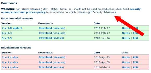
mr.baileysI agree that there should be a visible disclaimer warning users of the implications of running non-stable releases. I'd include at least some basic information on the project page itself (as opposed to just linking to the handbook page). Something like:
Comment #2
gregglesThat looks beautiful to me. I'm not sure we should say "WARNING" quite like that. Especially if a module has only stable releases there's no need to show this text. But even if it has just dev releases the words "WARNING" feel a little over the top.
We also have to be careful here - the goal is to make end users aware of the policies around the software they use. But if we make this too rude then module maintainers may make a 1.0 release right away which we've seen is not a great thing to promote.
Comment #3
avpadernoIt's true that the message should not sound too rude, but the risk maintainers create a 1.0 (or 1.1) release is already present; as any alpha, beta or release candidate versions are not listed in the project page when there is already an official release that is not a alpha, beta or release candidate, a maintainer could create version 1.1 (or 1.2) just to make the more recent version of the module visible in the project page.
IMO, there is nothing rude on the warning message as suggested by mr.baileys; we can remove the at the beginning of the sentence, but the rest of the sentence is perfectly fine for me. Plus, it would avoid maintainers have to explicitly report in all my project pages that alpha, beta or release candidate versions are not suggested for production sites.
Comment #4
dwwFYI: theme_project_release_project_download_table() is your friend. See contributions/modules/project/release/project_release.module. bluebeach is not yet overriding this, so that's all you'd need to do to insert text right there.
In general, I'm in favor of a notice like this, but I'm also keenly aware that the UI/UX for project nodes is a contentious subject. So, we should get some UX review before this is actually implemented and rolled out live.
Comment #5
mgiffordI think it might make sense to place the the text of the notice below the Development Releases heading. It will be accessible if it is in text, but will be better if it is closer to the content that is potentially a concern.
I'd suggest the following additions:
* an ID for <h4 id="development-releases"> so that we can link to that heading.
* provide a link to the notice closer to the link See notice above
Comment #6
mgifford@greggles just brought up RC's in IRC which wouldn't fit into this example. I'd like to see some way of indicating an ID to link to directly:
As well as a link near the download link to point folks to the notice.
A simple text link is probably best. There may be accessibility issues if you wanted to have a dialog window jump up to warn people when they are clicking on the link.
Comment #7
yoroy commentedOf course security is the Most Important Thing In The World etc, but is there a specific real-world reason/trend/issue or a pre-emptive just in case? :)
In the scheme of this page, does it really need its own dedicated new spot or can we add it to one of the existing lists of links?
My idea for the text would focus on stressing the positives instead of warning about the negatives:
"Only issues with stable releases (Y.x-Z.0 or higher) in the [a]supported major version branches get security advisories.[/a]"
Comment #8
gregglesI agree with yoroy's suggestion. It's similarly important to the other items in the resources.
For some insight into why this is a problem - basically nobody knows that this is the policy :( Even within the security team there was confusion. I like the idea of taking a small step here at first and seeing if that helps enough.
Comment #9
dwwIf we want to add this to the resources section, then you'll want drupalorg.module after all:
So, for example, you'll want to add something like:
Comment #10
gregglesAwesome - thanks for the tips, dww.
Anyone else have input on this before we put it live?
Comment #11
gregglesComment #12
avpadernoComment #13
dwwHate to do this, but since some folks completely reorganized the file layout and directory structure of drupalorg just *after* they branched for DRUPAL-6--1, we need completely different patches for D6--1 (production) and HEAD (d.o redesign). :(
The attached is for HEAD. But, to see this live, we need a similar patch against modules/drupalorg/drupalorg.module itself.
I also wouldn't mind a bit more review and agreement on the textual change itself (and do we really want/need to make project nodes a bit more wall-o-text-ish for this)?
Comment #14
gregglesThe reason for the change is in the OP and #8 - it's a policy that amazingly few people know about and yet it could change your decision about whether to download a module or not.
Comment #15
mr.baileysRerolled greggles' patch from #11 against both HEAD and D6--1 and included a comment. I do think that by moving the link to the resources section (basically putting it in the list of RTFM links nobody reads) it's going to be less effective than originally envisioned, but I understand the UI concern of slapping a big warning label near the download table. And putting it in the resource section is a step forward compared to the current situation.
Not sure about the current wording of the link:
This reads to me as "click here to see a list of releases for this project that might get a security advisory", especially given the fact that the other links in this section pertain to an individual project. Could we re-word it a bit so it's clear that it's a general policy? Also, it should probably start with a verb, since the 3 links above it do (Read ..., View ...). Something simple like:
Comment #16
mr.baileysRerolled post-redesign patch.
Comment #17
David_Rothstein commentedFor what it's worth, I thought of this idea independently (without realizing this issue existed) and the text I came up with was this:
I think there's some value in having a direct statement like that, because people need clear guidance when deciding whether or not they should use a module on their site.
However, starting off with a simple link seems like a reasonable first step to try. For the language, I agree a verb is needed. Why not the original text that @greggles proposed, then? "Learn which releases get security advisories". Or maybe, "Learn which releases are supported by the Drupal security team"? ("Security advisories" may not be a familiar term to everyone who views this page.)
Comment #18
dwwI like the direction of "Learn which releases are supported by the Drupal security team" but "supported" can send the wrong message. I bet lots of people will expect that means it's been reviewed and "endorsed" or "approved" by the Security Team. I think we need something like:
- handled
- updated
- overseen
- managed
- cared for
- coordinated
So, perhaps:
"Learn which releases are handled by the Drupal Security Team"
Comment #19
greggles"handle" still feels a bit too active for me.
The big public facing difference is that it gets an SA and our best effort at confidential reporting. Modules without a stable release can still get the "security update" tag which makes update.module notice them and puts them in some rss feeds.
That said, I won't block progress on this for finding the perfect word. Among the alternatives dww proposed and that I can think of "handle" still seems best.
Comment #20
yoroy commentedmonitored by?
Comment #21
gregglesMonitor still feels like an active verb. If you monitor a dam then you are checking on it to make sure it isn't leaking. That's not analogous to the security team's actions.
Handled still feels best to me among these alternatives.
Comment #22
mr.baileys"Covered by ..."?
Comment #23
tvn commentedClosing old issues. Please re-open if needed.
Comment #24
David_Rothstein commentedThis is still extremely relevant.
It has also come up recently in #2453587: [policy, no patch] Changes to the project application review process, where the proposal seems to be to add a more dire warning in the case of a project that does not get security advisories. Though we have to be careful about going too far with that, as discussed in this issue.
Comment #25
David_Rothstein commentedMoving to the correct queue (I think)?
Comment #26
David_Rothstein commentedComment #27
davidhernandezComment #28
gregglesThanks for reopening this!
I like the word coordinated :)
Anyone else have proposals for words/designs that will work?
Comment #29
Bojhan commentedI am not really sure about this at all, what is the goal here? From reading the handbook, I am not even sure what we are supposed to be telling here.
Comment #30
David_Rothstein commentedIn retrospect I still think the original wording or something similar to it is pretty good:
"Learn which releases get security advisories"
Or maybe:
"Learn which releases are covered by the security advisory policy"
Comment #31
yesct commentedComment #32
greggles@Bojahn, the goal is to let people know whether a module is or isn't covered by a security release. The green/yellow/red system gives some broad sense, but leaves a lot of room for misinterpretation (and doesn't actually align accurately to what is covered or not from a security perspective). If you're still unsure of the goals please ping one of the participants in irc? Thanks.
Comment #33
Bojhan commentedThanks for clarifying.
I am not sure about the overall approach, this text can easily be missed as users are essentially extremely task focused - they will try to find the latest download they can click. While I understand that this is the minimal effort to do, it will likely also have a minimal impact on achieving your goals.
To achieve your goal, I suggest we do a small redesign exercise - where we for example; hide this from initial view, place it on a different page, place them further apart. Sadly the module page has received little love in the past few years, I actually have a redesign laying around.
But sadly I don't really have the time to take this further. Is this something the d.o team could pick up?
Comment #34
joshuamiI think we can make the argument for this fitting into the find and select projects initiative, so I'm marking it as such.
Perhaps we should also tackle this issue from the edit release UI as well. (See attached.) It was mentioned above that the security team and maintainers do not know the rules around security review, this would go a long way towards helping maintainers understand when they should actually use modifiers like -alpha, -beta, -rc.
Comment #35
jthorson commentedOoops ... (re)found this after opening #2691081: Add SA Coverage notifications to project pages. Here's a mock we came up with at MidCamp. I would suggest something like this combined with the suggestion to only show 'stable' releases as green in the 'Recommended Releases' section of the download table, with non-stable releases shown in yellow.
Comment #36
jthorson commentedNeeds review for feedback on mockups
Comment #37
yoroy commentedRed is for errors, these are warnings at most, but really just information, no? Keep in mind what kind of message this would send out to people seeing this. Beware of crying wolf too often, we don’t want to train people to just ignore all the red boxes.
It's all very alarming looking and seems to go completely overboard. Maybe go back and limit this to the initial consideration: tell which releases are covered by security advisories and don't yell about the ones that aren’t. (big red boxes == yelling, visually). And two paragraphs of explanations is documentation, not a message :-)
And in contrast to the strong disclaimers for the releases not covered, the "…are considered covered" is a rather weak endorsement for the releases that are.
Why nog put the checkmark directly next to the release itself and add a short explanation + link to the full story below the downloads table. The downloads are already pushed down the page by all the info that comes first, lets not push it further down. We do want people to download modules! :-)
Comment #38
yoroy commentedComment #39
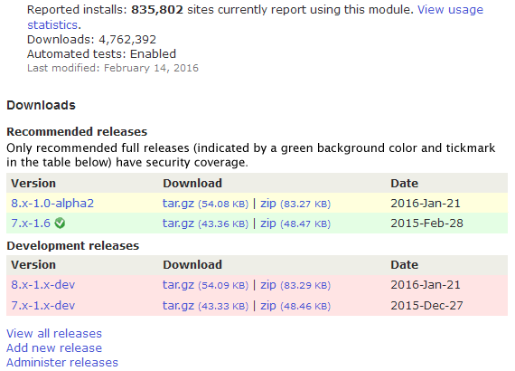
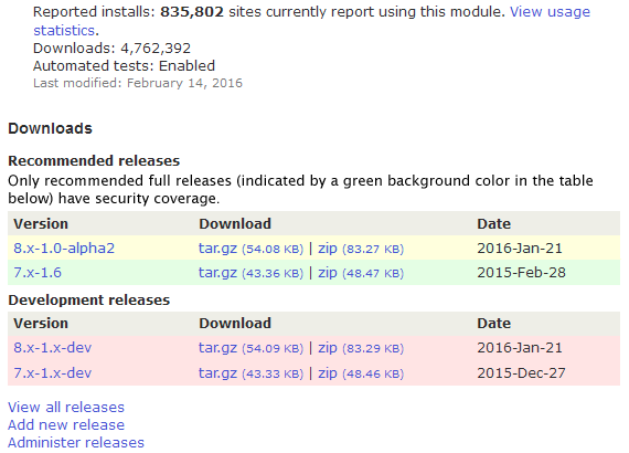
greggles@yoroy I agree with your comment in #37, but the image somehow disappeared. Can you upload again?
Comment #40
yoroy commentedThanks @greggles, done. It's a rough sketch only. We could look into setting a helpful title attribute on the icon and maybe it could link/jump to the explanation below.
Comment #41
gregglesHere's a screenshot with a slight tweak on the idea of Yoroy in #37:
The thumbsup/down is not a final suggestion, just indicative that there would be some kind of an icon that conveys "covered/not". There could be hover text with a quick explanation that "thumbsdown" releases will have security issues reported in the public queue and releases covered by a thumbsup will get to the private queue which means the advisory process and help/support from the security team for the maintainer as they fix the bug.
Comment #42
yoroy commentedComment #43
jthorson commentedThanks for the feedback.
Part of the discussion around the project applications process changes was a desire to ensure that not only was an indicator regarding SA coverage added to project pages, but that it was also made prominent. That said, I agree with the feedback provided ... the mockups I posted did go overboard, but somewhat intentionally; as the main point was to re-jumpstart the discussion. :)
Once I rebuild my drupal.org development environment, I'll look at implementing the toned-down version on an actual d.o dev site.
Comment #44
kattekrab commentedComment #45
fuzzy76 commentedI actually think the table background colors should be re-evaluated while we're at it. People might assume green means "fully supported", but it really isn't as long as it does not have security coverage.
Comment #46
gisleRe #45:
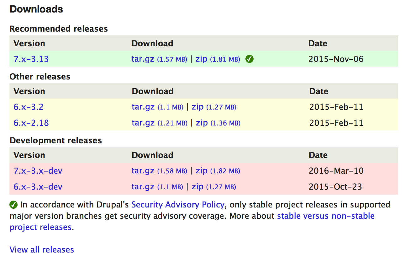
There is a related issue (#2457643: Only allow releases with security coverage to be recommended) about the table background colours. The TWG recently approved a policy that only allowed stable releases (i.e. those with security coverage) to have a green background.
See the related issue for status.
Comment #47
drummAdding yoroy's mockup from #42 to the issue summary.
Comment #48
drummFor implementation, following the pattern of the green checkmark on passing tests should work. See https://www.drupal.org/pift-ci-job/229847, click Show: All
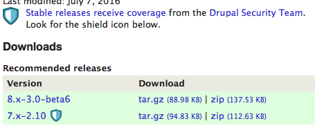
This is a unicode checkmark, ✓, in a span tag for the circle background. That makes it ready for retina screens, and there are no additional images.
We’ll want to be sure this is a bit more accessible, maybe
<a href="#…" title="covered by the Drupal security team">✓</a>will be enough?Comment #49
gisleDo we need the checkmark? To my eyes, the checkmark clutters the display. Its meaning is far from obvious.
It has already been suggested (see #2457643: Only allow releases with security coverage to be recommended) that only releases with security coverage have a green background in the "Recommended" section of the table. Do we need a visual indicator in addition to that?
Please see mockup below for how this would look.
Comment #50
yoroy commentedThanks @drumm, the no-image approach looks good. Maybe add a font-weight: bold for the checkmark. And come up with the 2 or 3 words we can put on its title attribute.
Simpler rules for the use of background colors is very welcome too, mockup by @gisle looks good in that regard.
@gisle only using color is not enough for accessibility reasons, we can’t rely on color alone to communicate information. Of course, no icon will every be completely obvious. That’s why it would link to additional text explaining that it's about "covered by security advisories" and what that means. At the same time a simple checkmark will indicate to many something like: Yep, take this one, it’s the “best” or “recommended” version to use. Once people understand that, the checkmark is enough to help inform people’s decision which version to use.
Comment #51
kattekrab commented@drumm - yes - great! Awesome to be able to re-use something like that.
@gisle - the simple colour background does look good, but have to agree with @yoroy on needing something other than colour here to show the difference for good accessibility practice.
Let's do this!
Thanks all.
Comment #52
kattekrab commentedOh, we still need words for the title tags, right?
or...
Comment #53
gisleOK. I understand the WCAG argument.
But please also use a background color different from green for versions without security coverage.
I teach a class about site building with Drupal, and my observations are that the majority of my students automatically assume that green means "secure". It my be that the checkmark fixes it, but at least in my culture, there is very common to associate the colour green with "safe", "secure", "officially approved" and so on.
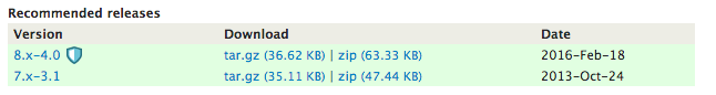
The mock-up in the issue summary uses a green background for the ver. 8.x-1.0-alpha2 - which does not have security coverage.
Comment #54
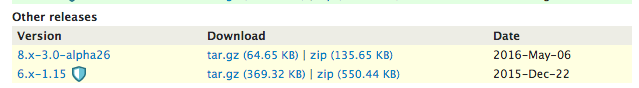
drummI can think of one more design decision - currently the green/yellow coloring goes with the table headers. Releases which are supported, but not recommended, get put under the “Other” heading. See https://www.drupal.org/project/ctools for an example (8.x-3.0-alpha25 is under Other at time of writing). Should we be doing the same here?
I don’t have a personal opinion on this one. The implementation would be a bit different, instead of modifying the View, the key changes could be in the admin releases UI, making a branch without a full release un-recommendable. In the UI, we wouldn't be mixing security-supported and not; the message could go directly next to the table, and wouldn't be necessary to repeat every row. It would remove the option to have maintainer-recommended releases which are not security-supported.
This also can affect
<recommended_major>1</recommended_major>in the update status XML. However, I think the presence of that doesn't make a visible difference in the core update status UI, so it probably doesn't matter too much.Comment #55
gisleIn comment #8 of #2457643: Only allow releases with security coverage to be recommended, jthorson (from the TWG) says that maintainers could have "non-stable" recommended releases (i.e. they should appear in the "recommended" section of the table, but with a yellow background).
His argument is:
I amended the proposal accordingly and this was also the design that finally was approved by the TWG.
(However, I don't care whether you put it under "Recommended" or under "Other", as long as it is not green.)
Mockup in issue changed to reflect the design suggested by jthorson and approved by the TWG.
Comment #56
fuzzy76 commentedAllowing maintainers to recommend releases without security coverage is a terrible idea to begin with IMHO. It sounds like a separate issue for one of the workgroups, but I'm a bit unsure which one.
Comment #57
gislefuzzy76 wrote:
It sound like something the TWG should decide. Quoting from its project page:
Except that the TWG has already made a decisision.
Recapping the history of this related issue #2457643: Only allow releases with security coverage to be recommended:
If you guys want to go another round with the TWG (or whatever working group this belongs under) I am fine with that as well, I just wanted to point out that this has already been before the TWG and a decision has been made.
Comment #58
catchYes that would need a new TWG decision. For example you might have a 1.x branch with a beta, that's never going to get a stable release. Then a newer branch that's also on beta, but is headed towards rc. In that case you want to push people towards the newer branch, even though neither are released yet. Same as if you have a 1.x and 2.x branch, the 1.x branch has a stable release but won't get further development, the 2.x branch has an RC - you want to steer new users towards the RC of the newer branch so they don't need to upgrade later. So security support and recommended branches are really two different things.
Comment #59
jthorson commentedI think that Catch's description in #58 describes our current status quo. A proposed policy that maintainers not be allowed to recommend non-stable releases would have to be put forward as a new TWG issue, though my initial suspicion is that it would not be successful for the reasons identified above.
Comment #60
drummOk, works for me.
This will be altering the
project_release_download_tableView. Drupal.org-specific information about the security process will make its way into the table, which we don’t want in Project module. Rather than keeping track of altering it via hooks, let’s clone the View and manage it in thedrupalorg_projectsFeature.(The
project_downloadsView was made for the /project/drupal page changes at the time of the 8.0.0 release. It may or may not be usable for this issue.)Comment #61
jthorson commentedI originally took a look at simply adding this as a new column/field on the project_release_download_table view (instead of adjusting the existing field); by adding the version-extra field to the view, and then adding a custom display formatter that outputs the checkmark for 'null' and no image for any other value.
This approach ran into a snag, in that adding display of the version-extra field would silently fail via the Views UI.
Drumm ... I wanted to bounce this off you as an alternative solution, as this would make it a Views only change, with no custom code. Thoughts?
Comment #62
drummYes, we should use Views, and export the whole View without custom altering code. (Assuming that’s possible.) We do need to clone
project_release_download_tablesince the View configuration will be Drupal.org-specific.I’m not sure why adding that was failing in Views UI. Investigating that is the next step here.
Comment #63
jthorson commentedThe parameter is already in the view as a sort parameter, it was just adding it as a display field which was failing.
Does Views support a conditional output rewrite, where we can add the checkmark to the Content: Version field, based on whether or not Content: Version-extra has a value? Unless it does, I'm not sure how we implement the mockup in the issue summary without any custom code.
If we can put the checkmark in it's own column, and sort out why adding version:extra as a display field is silently bailing, then we can do this using the 'no results' and 'rewrite output' options, and no custom code should be needed. (Except, perhaps, new code for a display handler associated with that field, which I suspect may be missing in versioncontrol_git.)
Edit: added "version:extra" for clarity
Comment #64
drummYes, and the new field can be grouped into the Version column using the Table format options.
The background will probably need a class for the row, which will need a bit of custom code. Project Issue does this in
project_issue_preprocess_views_view_table().Comment #65
jthorson commentedAh, perfect. That was the missing link for me. :)
Comment #66
jthorson commentedSeeking feedback on the implementation currently live at jthorson-drupal.dev.devdrupal.org.
... Other than the 'no security releases for D6 versions' comments ... realized that, and am working on an alternate approach which would allow us to distinguish between them. :)
Comment #67
yoroy commentedCan't visit project pages, e.g. https://ci-drupal.redesign.devdrupal.org/project/views gives me 403 Forbidden.
Comment #68
greggles@yoroy try this - https://jthorson-drupal.dev.devdrupal.org/project/views I think you were on the wrong subdomain.
Comment #69
jthorson commentedProposed implementation now live on my dev site.
Examples:
Project with D8 release: https://jthorson-drupal.dev.devdrupal.org/project/admin_toolbar
Project with D6/D7 releases (showing D7 covered, but D6 not): https://jthorson-drupal.dev.devdrupal.org/project/views
Project without releases: https://jthorson-drupal.dev.devdrupal.org/project/edit
Seeking reviews ...
Comment #70
drummA few small implementation changes I think would be good:
.security-coverage-checkmarkas the CSS selector instead ofspan.security-coverage-checkmark. Not matching the element name is slightly faster, and makes the CSS a bit easier to work with.https://jthorson-drupal.dev.devdrupal.org/project/title=instead of something like#drupalorg-security-info<div id="drupalorg-security-info"><span class="security-coverage-checkmark">✓</span> Stable releases in supported branches receive <a href="https://www.drupal.org/security-advisory-policy">security advisory coverage</a>. <a href="https://www.drupal.org/node/467020">Read more about stable versus non-stable releases</a></div>(This also removes the
messagesclass, which isn’t well-styled on its own.)Comment #71
jthorson commentedI found that the text felt a bit awkward when sitting alone under the download table ... the border that came with the messages class helped address that. In removing the messages class, are you suggesting removal of the box as well; or keeping the box as is and simply using dedicated styling instead of piggybacking on the existing element styles?
Comment #72
yoroy commentedThank you @greggles, I somehow ended up there while following @jthorson's link.
The current solution, it's still… aesthetically challenged :-)
I assume we really want to avoid loading images here, else we could reuse existing checkmark icons and style the message underneath accordingly:
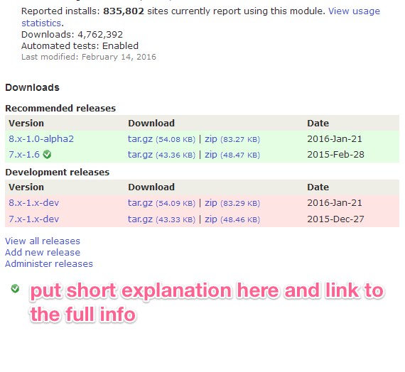
As you can see I moved the checkmark icon next to the download links and tried to make it a bit smaller still:
I think it's fine to just wrap the text beneath in a simple p-tag. I tried to cut some words as well.
Does this still get the point across?
Styling for the icon in that last mockup:
Comment #73
yoroy commentedOr even:
Only stable project releases in supported major version branches get [security advisory coverage]. More about [stable versus non-stable project releases].
Comment #74
gregglesThe text in 73 seems accurate/complete to me and is a nice short length.
I wonder if "green checkmark" will imply more than we want. It seems ok to me to use a new image if someone can think of a different icon that focuses on the point a bit more.
Comment #75
jthorson commentedI agree ... thus the request for feedback. I guess I could have been clearer in that this was a 'proposed implementation approach', not 'proposed implementation'. :) Thanks for the suggested improvements.
Perhaps something like an 'SA' inside a circle, since we're really talking about Security Advisor coverage?
Resized checkmark and updated wording are live on the dev site (but not committed to branches yet). Checkmark is still in the first column, as I didn't immediately see where I could append it to the rewritten extension field (and didn't have time to dig into it today).
Comment #76
drummAnother image would be okay to add if needed. The ✓ is convenient since it is text and resolution-independent already, but of course not useful if it doesn’t communicate well. If we go with an image, we should use an SVG. (Or a PNG sized 2x if it isn't a vector image.)
Comment #77
jthorson commentedSpeaking with drumm and mlhess at NOLA, we decided to try a shield image instead of checkmark icon. The dev site has been updated, but needs someone to build us a shield image ... the current implementation is 12x12px.
Comment #78
yoroy commentedComment #79
yoroy commented#2721227: Design a security shield icon is RTBC
Comment #80
kattekrab commentedIssue summary needs an update to show the shield, in place, etc... as per the now "fixed" #2721227: Design a security shield icon shield issue.
Comment #81
kattekrab commentedComment #82
hestenetHere is the sheild icon from #2721227: Design a security shield icon
And here is one mockup of how it might be used:
Comment #83
hestenetComment #84
hestenetComment #85
yoroy commentedDoes it really have to be that big and put in front of the other information? This way it looks like we're yelling again. We're presenting it as a big selling point here, but security is a hygiene factor, not a selling point.
The design of the icon was optimised for small dimensions, it doesn't really work on that larger scale. Doesn't really help to distort the aspect ratio either.
#72 is a complete proposal, what were the considerations for this different approach?
Comment #86
gisleI still think is counter-intuitive that the the release "8.x-1.0-alpha2" in the latest mockup (#82) is shown with a reassuring green background. If I've understand the arrangement correctly, this is an alpha-release so does not receive security coverage. Still, the green background colour communicates to me that this release is "safe".
Personally, I am just confused by the "badge" pictogram that now has been added to the design. I understand that some sort of pictogram is needed to also conform to WAI-standards, but why not a standard checkmark as shown in #72?
Comment #87
avpadernoI much prefer what shown in #72, even if I would put the checkmark on first row, before the version number. I don't see anything confusing in the row background, as that is used for another meaning. If the green checkmark is going to be used to say which versions get security advisories, the message seems clear, to me: The rows without the green checkmark don't get any security advisory.
Comment #88
catchAgreed with #85. The massive shield looks like the whole project is being promoted as secure, I think just the smaller icon in the release table would be plenty.
Although for me pesonally I'd rather invert this, and have security-supported releases in green, then non-security-supported releases in yellow. We're promising less with the policy change, not more - right now this looks like a much bigger promise.
Comment #89
gislekiamlaluno wrote:
I did actually user test this at one point, asking users (the users were site builders that were familiar with WCMSes in general, but none of them knew about Drupal) to indicate what releases they consider "secure" by presenting them with mockups where there were "checkmarks" on some releases and/or a green background on others. The meaning of the "checkmark" was explained in a text placed below the table, like in #72, and no explanation of the meaning of having a green background. Almost all these users picked the releases with the green background, including one without the checkmark. If there was a checkmark on a yellow backround, it was ignored. I was not surprised, as in my experience, users don't read advisory text - they scan for visual clues.
And while this test was based on the original "checkmark" design, I don't think having a "badge" placed next to the release will change this finding. To me the "badge" just suggests that this particular release has won an award or something.
As for the "another meaning" of the row background hinted by kiamlaluno, I don't think this meaning is documented anywhere near the project page. How many users know the meaning of the green background? And do we really want maintainers to be able to "recommend" a release with no security coverage?
PS: At one point, I actually got the TWG to agree that we only should allow releases with security coverage should have a green background (see this issue: #2457643: Only allow releases with security coverage to be recommended). And then it of course it was closed and forgotten.
But let me humbly suggest that before this is implemented, you at least try some user testing with mockups to determine that the following assumptions underlying this design are true:
And by users, I mean real users trying to discover what Drupal module they should pick - not veterans that has been around Drupal since the previous century and know all the secrets.
Comment #90
avpadernoIt all depends from how the test was done. Did the projects used for the test all have a single stable release?
I find difficult to believe that users could confuse the meaning of a symbol with the background color. If I were shown a table with some of the rows showing an asterisk in the same position, and an explanation of what the asterisk means, I would not get the asterisk is for all the rows with the same background color. That in every site, even in a site I see for the first time.
Comment #91
avpadernoAlso, to be sure every user understands the same thing, symbols should be avoided. This is probably going to be less confusing, if we replace the thumbs-up with yes, and the thumbs-down with nothing.
Comment #92
gisleNo, there was several stable releases to choose from. One of them was "recommended", but had not received security coverage.
This was the mockup used for test:
You're apparently one of the few people that actually read explanations. Most people don't.
Comment #93
avpadernoIf we are going to do something for users who don't read, we are good. I cannot imagine what they understand from a shield, without reading.
:DI just hope they don't play Despicable me - Minions Rush, or the shield will remind them of the game.Actually, it seems I am one of few people who don't confuse a symbol with the background used in a table.
Comment #94
avpadernoThat is probably why the test didn't work. The test should use more than one image, possibly using a table that has a header also for the image, or the word used to mean covered by security advisories.
Comment #95
gisleJust to make my intentions clear.
I am not suggesting replacing the pictogram with the background.
Nor do I suggest that we change the meaning of the green table background to mean something other than "recommended release".
What I suggest is this: Do not permit a maintainer to tag a release as "recommended" as long as that release does not receive security coverage.
The intentions behind this proposal is to create a small dis-incentive for those maintainers that keep their projects in perpetual beta to avoid having them vetted by the security team (e.g. Feeds, Field collection).
Comment #96
avpadernoIMO, it should be the users who understand that if they use versions not covered by security advisories, they do it at their own risk. The problem is when that becomes the normality, and I am not sure it can be done anything about that. I don't think we can push developers to create a new stable release every X months.
My notes are about how to implement the feature, not the motivations.
Comment #97
hestenet@kiamlaluno - That's good feedback - I think a separate column for the symbol is important, and I think you're right about the colors being confusing.
There are some mockups of how this could look on the project page as a whole here: #2035277: Draft text for security advisory coverage messages
Comment #98
mrf commentedre: "The intentions behind this proposal is to create a small dis-incentive for those maintainers that keep their projects in perpetual beta to avoid having them vetted by the security team"
The security team does not do any active vetting of projects. The security team waits for users of the module to report issues. The only difference between a security issue found in a 1.0 module vs a beta and sandbox is whether or not the resolution of that issue will have an accompanying security advisory published on Drupal.org
Maintainers are keeping their projects in perpetual beta to accurately reflect the number of bugs a user might expect using that module. I really don't think SA coverage factors into their decision very often.
If the security team policy I describe above is still is an accurate description of what the security team is doing whatever type of visual language is used here should be subtle enough to reflect the nuance that "someone with a security background didn't necessarily review this code but if they had and found something it would have a public advisory".
Comment #99
drummOn backgrounds: there’s been some at the Drupal Association planning to remove the green/yellow/red backgrounds like https://www.drupal.org/project/drupal. That was snuck in for the D8 launch, I haven't heard much feedback on that specifically, positive or negative. Rushing that to all of contrib wouldn't have been a good idea at all. I'm tempted to say we might want to do that now, but I don't really want another bike shed.
Comment #100
drummCross-posting the implmentation from #2035277: Draft text for security advisory coverage messages
I cleaned up the “Project Information” section a little, removing the odd margin and “Last modified” styling. I could see more icons coming into this section and everything getting a left margin again, but that's another issue.
I think that’s the best place since that area is (mostly) trying to summarize project quality. Especially with that being the one icon, I think it gets enough emphasis.
Comment #103
avpadernoI like #100. I still think it should be clear there is an icon for every row on the releases table, and not an icon for every group (whatever users would think as group).
Comment #104
drummI forgot to mention - I haven’t gotten to the downloads themselves, those are coming up soon.
Comment #106
drummAdding deployment notes draft.
Comment #107
drummI finally got the shields for each release working well.
The final todo is to move the non-full releases to the Other group.
Comment #108
drummMerging in #2457643: Only allow releases with security coverage to be recommended has proven to be more difficult than expected.
The download table is 4 displays of a View. I added the must be full release restriction to the “Recommend releases” display, that went well. To get them added to the “Other releases” table, I added an OR group to the filters. The query is coming out with JOIN condition
taxonomy_term_data_node__field_data_field_release_recommended2.field_release_recommended_value != '1'and WHERE condition
taxonomy_term_data_node__field_data_field_release_recommended2.field_release_recommended_value = '1'… which of course matches nothing. Debugging that is looking like a tour through Views internals or redoing how the View is built in general to avoid this.
In the interest of getting the work done here moving along, I’ll reopen #2457643: Only allow releases with security coverage to be recommended with more details.
Comment #110
drummComment #111
drummThis is on staging now: https://www.staging.devdrupal.org/project/ctools
I plan to deploy about an hour from now.
Comment #112
mrf commentedStage looks good to me.
Comment #113
mrf commentedComment #114
drummThis has been deployed.
Comment #115
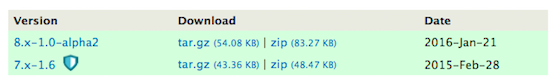
avpadernoIt seems there is something wrong with https://www.drupal.org/project/views_slideshow: Only the 8.x-4.0 version gets the shield, but not so the 7.x-3.1 version. The maintainer marked as recommended both the versions; the only difference I see is that the 8.x-4.x branch is the default one, but that should not make any difference.
Comment #116
avpadernoAlso, it should not appear on Drupal 6 versions, as in https://www.drupal.org/project/ctools. Those surely don't get any coverage from the Drupal Security Team, since Drupal 6 is not supported anymore.
Comment #117
mrf commentedI'm also seeing issues with https://www.drupal.org/project/backup_migrate (7.x-2.8 missing shield) and https://www.drupal.org/project/entityreference (7.x-1.1 missing shield)
Comment #118
drummLooks like those were all created in 2013. I'm guessing those nodes were saved/migrated slightly differently. I'll be able to investigate later tonight or tomorrow AM.
Comment #119
drummThis affects 3,304 releases made before 2014-01-14, and 6 made on 2015-11-12, if those are still the current ones.
They have an empty string in the
field_data_field_release_version_extratable, more recent releases don't have a row in that table. Saving the an affected release node makes it match the newer ones.I’ll delete those rows and clear the appropriate caches.
Comment #120
drummviews_slideshow, backup_migrate, and entityreference are now fixed up.
Comment #121
drummWhat I’d really like to do for D6 projects is remove the ability for them to be in the download table. We did this briefly very soon after the D8 launch, but we heard loudly from maintainers that really wanted to actively support their D6 projects. We should do this, but it either has to be communicated/coordinated well or done so late that no one notices.
That said, #2532062: [policy, no patch] Changes to the security team process / tools to reduce workload from increased project applications will mean projects can opt out of security team coverage, so this can’t be the simple show-if-full-release Views field we have now. I can look into the best way to filter for D6 tomorrow.
Comment #123
drummThe fix is pushed to https://www.staging.devdrupal.org/project/ctools.
Since there’s going to be more of a need to do more logic around what has security coverage or not, the custom Views handler should serve us well. It is a lot more readable than tripling down on Views hacks that would have served us well if coverage remained straightforward. And it avoided the apparent Views UI bugs that have plagued this issue.
Comment #124
drummThis has been deployed.
Comment #125
dgtlmoon commentedSorry to be a huge pain
Alt text is meant to be an alternative information source for those people who have chosen to disable images in their browsers and those user agents that are simply unable to “see” the images.
Image title (and the element name speaks for itself) should provide additional information and follow the rules of a regular title: it should be relevant, short, catchy, and concise (A title “offers advisory information about the element for which it is set.“). In FireFox and Opera it pops up when you hover over an image:
<img src="/sites/all/modules/drupalorg/drupalorg/images/shield-icon.svg" alt="Full release covered by the Drupal Security Team">I really feel you need an ALT and TITLE here, I'm waving my mouse over the icon without any obvious information at hand, yeah it's in the project body, but I feel a TITLE would help also
Comment #126
drummI committed the same text as
altto betitletoo. This is in thedevbranch and will be deployed later this week.The fact that it is a shield doesn't really add useful information if you can't see the symbol, so I think the
alttext is okay. I think screen readers usually don’t readtitleattributes, so the duplication shouldn't be a problem. Please correct me if I'm mistaken.Comment #127
drumm(restoring issue credit, I unchecked the boxes for the commit message)
Comment #128
dgtlmoon commented@drumm so it's not just about screen readers, it's also about us fortunate people with perfect sight who like to mouse over things to find out what they're about, in this case title= would be fantastic and is no way duplicating
Comment #130
drummThe
titleattribute has been deployed.