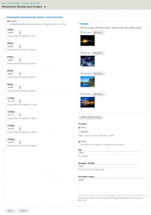
Responsive Background Images is an easy to use, simple helper module for making your background images responsive. It can be used with either static or slideshow background types, and will always fill the full window space with your image(s). The slideshow background effect is automatic with this module if you enable more than one image.
The module achieves this by first recognizing the screensize with which a user is viewing your site, then loading the best file size (image style) for that screen. For example, a 320x480 image will load for iPhone viewers, and a 1600x1200 version for those on a large desktop.
Responsive Background then resizes the image dynamically to match the browser width exactly, maintaining the proportion of the image even if the user resizes the window. If the user were to view your site first on a small screen and then maximize the window, the module will automatically load a new image size so that the background does not become pixelated. If a user were to zoom in or out while viewing your site, the background image will stay the same and not resize with the rest of the page.
This solves theming issues with sites that have standard responsive features, and offers an enhanced user experience for all browser sizes. (description by Jenna Colbaugh)
Features:
 DDEV is the official local development tool of Drupal. And like Drupal, DDEV depends on the support of the open source community.

