
 Support for Drupal 7 is ending on 5 January 2025—it’s time to migrate to Drupal 10! Learn about the many benefits of Drupal 10 and find migration tools in our resource center.
Problem/Motivation
Tables have seen little issues, the only improvement we saw was to remove some of the distracting elements and improving the whitespace.
We developed Proposal: A Style Guide for Seven. This issue aims to introduce the proposed styling for tables to core.
To quote the rationale provided:
To improve the ratio of information to UI chrome, this guide recommends removing zebra striping and using thin rules to separate table rows. A progressive enhancement creates a subtle highlight on the hovered table row, allowing the eye to more easily move horizontally along the row, even when large stretches of whitespace appear between cells contents. (Note that this effect, being an enhancement, has no planned touchscreen equivalent and does not pass WCAG contrast standards.) For similar reasons, this style also removes left and right borders from the table and table cells.
The style used here for the sort-active table header cell is a motif carried through to other elements, such as secondary tabs and pagination. This consistency is both good for usability and for Drupal’s credibility (part of the brand).
Proposed resolution

Remaining tasks
The main work has been completed and has been committed in comment #177. There are some final cleanups to do:
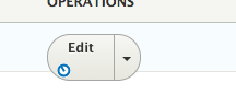
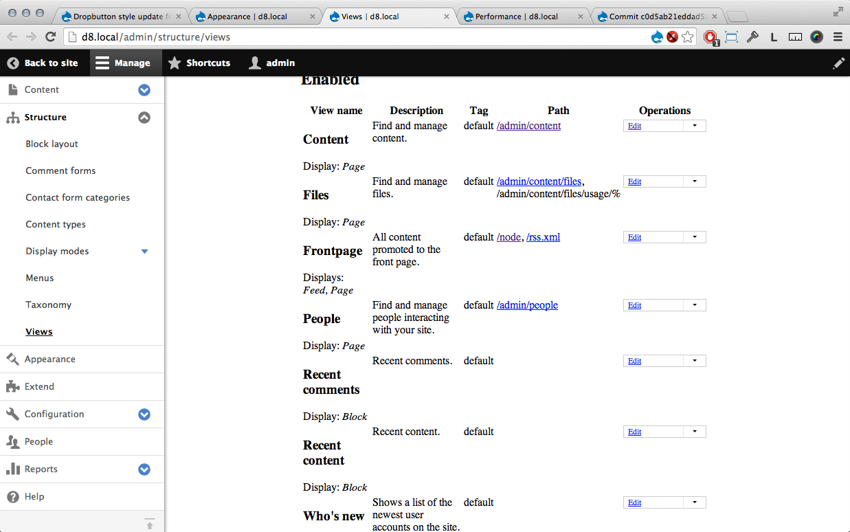
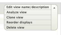
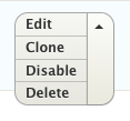
- In the Views UI the buttons appear too large. See screenshot in comment #179.
- AJAX throbbers cause the buttons to inflate like a balloon. See screenshot in comment #183.
User interface changes
The dropbutton style will be changed, no functional differences.
API changes
None
Related Issues
| Comment | File | Size | Author |
|---|---|---|---|
| #204 | shot02.png | 5.04 KB | G-raph |
| #204 | shot01.png | 6.65 KB | G-raph |
| #204 | interdiff.txt | 589 bytes | G-raph |
| #204 | dropbutton_style_update-1989470-204.patch | 840 bytes | G-raph |
| #203 | 1989470-rtl.png | 5.42 KB | pfrenssen |


Comments
Comment #0.0
Bojhan CreditAttribution: Bojhan commentedUpdated issue summary.
Comment #0.1
Bojhan CreditAttribution: Bojhan commentedUpdated issue summary.
Comment #1
Bojhan CreditAttribution: Bojhan commentedThis ought to be extended to the following interactions:
Publish button:
Autocomplete:
Comment #1.0
Bojhan CreditAttribution: Bojhan commentedUpdated issue summary.
Comment #1.1
Bojhan CreditAttribution: Bojhan commentedUpdated issue summary.
Comment #1.2
Bojhan CreditAttribution: Bojhan commenteda
Comment #2
ry5n CreditAttribution: ry5n commentedMaybe this should happen here: http://drupal.org/node/1899236
Comment #3
ry5n CreditAttribution: ry5n commentedAfter much work I’ve completely re-written the JS for this in #1899236: Add new Splitbutton render element to eventually replace Dropbutton. I think it’s now ready to be made into a patch, but I would love some help with JS and PHP.
Comment #3.0
ry5n CreditAttribution: ry5n commentedb
Comment #4
LewisNymanComment #5
LewisNymanI'm concerned about the progress of #1899236: Add new Splitbutton render element to eventually replace Dropbutton and the reliance on some hardcore PHP hacking to get the correct output. It's really important that we get all buttons in core looking consistent.
I think it's better to split to issue into two. Let's implement the updated styling here and come back to deal with the tricky stuff in #1899236: Add new Splitbutton render element to eventually replace Dropbutton.
Here's the latest patch, we'll need to remove the functional changes.
Comment #6
jibranSending for test.
Comment #8
mcjim CreditAttribution: mcjim commentedComment #8.0
mcjim CreditAttribution: mcjim commentedaaaa
Comment #9
Bojhan CreditAttribution: Bojhan commentedI like this strategy, could we get an updated patch?
Comment #10
LewisNymanI decided it was easier to start again, written on top of #1986074: Buttons style update.
Here's a first shot at a CSS only patch. It would be nice to create a primary and small variant, seeing as we can't easily reuse all the button classes in #1986074: Buttons style update.
Comment #10.0
LewisNyman...
Comment #11
idebr CreditAttribution: idebr commentedComment #12
emma.mariaComment #13
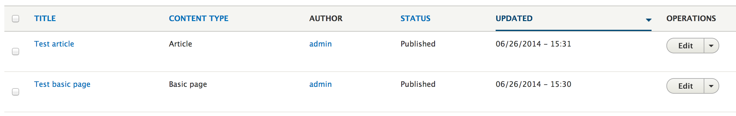
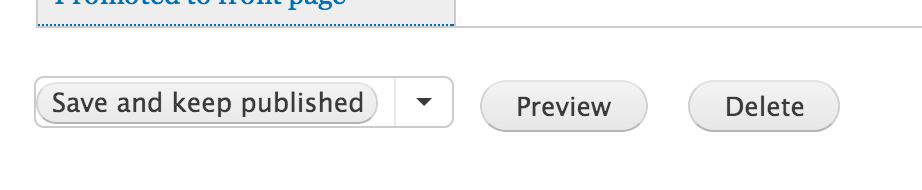
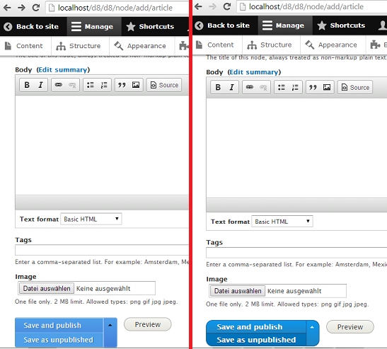
webchickI just committed #1986074: Buttons style update which now makes the node add/edit form look like this:
Because that's rather wonky-looking, and because that's a very frequently-visited page, I'd love this patch to make it in by the next alpha (Dec. 16). Tagging such. Go, emma, go! :)
Comment #14
emma.mariaWorking on this today :)
Comment #15
emma.maria10: dropbutton-style-1989470-10.patch queued for re-testing.
Comment #16
emma.maria10: dropbutton-style-1989470-10.patch queued for re-testing.
Comment #17
emma.maria10: dropbutton-style-1989470-10.patch queued for re-testing.
Comment #19
emma.mariaThis was as far as I could get for now. I focused on the styling for the normal buttons, not the primary ones.
Comment #20
tim.plunkettPatch doesn't apply :(
Also, despite having this radius defined four times (twice for 2 selectors), all dropbuttons are square when I tested it
Comment #21
LewisNymanOk... this was hard work but I think it's almost there. The issue I kept banging my head against only seems to appear on the views listing page and I can't see what is affecting it.
It would be good to get some other eyes on it while I dunk my head in ice cold water.
Comment #23
philipz CreditAttribution: philipz commentedI found some problems in Chrome (Mac) but those look like cross browser issues to me.
First thing is publish button on create node page looking bad.
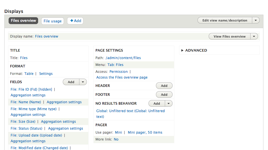
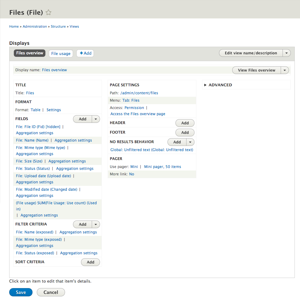
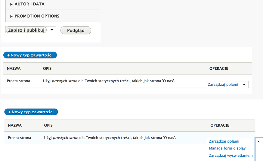
Second problem is dropdown button on Content Types page. First the label of button is cut because the parent table doesn't have enough space for operations column. I'm not sure if this is reported as a bug in separate issue?
Moreover the button is pushed down and after expanding it unfolds to the right not left (I've seen it does unfold to the left correctly on views edit pages). This might also be a separate issue I'm not sure :)
I'll try to figure out what's causing this now.
Comment #24
joelpittet@LewisNyman that double border bit is happening due to position: absolute vs position: static.
No double border with this:
.js .views-edit-view .dropbutton-widget { position: static; }Though changing that won't help because the widget will want to expand the cell's width with position: static; Maybe a suggestion is to use box-shadow to emulate a border outside of the box... or there may be a box-sizing property that could help here too.
@philipz i'm on chrome and ff mac and I don't see that issue in your screenshot, may want to clear caches and the like? The expanding left vs right issue should be fixed with split button but that's a different issue, the positioning of the button affects which way it will expand.
Comment #25
webchickIn addition to those, this is definitely not going to fly (from the node form):
Comment #26
LewisNymanWhen I apply the patch on simplytest.me I see this?
Comment #27
webchickHm. Well that's definitely much nicer than what I see. :D I even tried private browsing. I'll futz with my local and see what's going on. This is Firefox on OSX, fwiw.
Comment #28
philipz CreditAttribution: philipz commentedI was testing and making screenshots from #23 on latest 8.x dev but you were right about cache. I though I cleared it but maybe I did not. Anyway now I confirm I see publish button exactly as #26. Looks great :)
Unfortunately buttons on Content Type page, Languages page or Text formats and editors page all look like below. Does this patch deal with that?
Combined three screenshots:
Comment #29
webchickI can confirm that; even in English, this looks wrong, e.g. on admin/structure/types:
Node form looks good though. :D
Comment #30
webchickAnother screen that be lookin' funky is the configuration synchronization screen:
Comment #31
philipz CreditAttribution: philipz commentedOK I've tested it more and it seems the overflow: hidden on dropdown labels (when folded) is caused by
in
/core/themes/seven/css/components/dropbuttons.cssI don't know if this is really needed somewhere else? I think visible overflow on buttons is bad in any case possible.
Regarding buttons shifted down it is NOT happening on Views admin listing page for example and it is because the
tdhasvertical-align: top. This (almost) fixes the problem for other admin listings like Content Types page. This needs change in/core/themes/seven/style.cssso it might need more testing.Comment #32
philipz CreditAttribution: philipz commentedAfter couple of changes and I've got this looking like this (in attached screenshots).
There's one change in
core/modules/views_ui/css/views_ui.admin.cssto fix a little glitch on view edit page.Comment #33
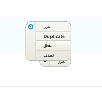
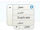
philipz CreditAttribution: philipz commentedPlease ignore this patch #32. Needs more work. Sorry for the noise I will test future patches better :)
Comment #35
philipz CreditAttribution: philipz commentedTested this one on Views list/edit pages, admin list page (Text formats and editors) and node create page. This is based on #21.
Comment #37
emma.maria35: dropbutton-style-1989470-34.patch queued for re-testing.
Comment #39
LewisNymanHey nice work :) This is looking very close. Even the views edit page looks great!
The only thing I could spot is that the primary border is missing from the toggle. I found it was a position static being set in misc/dropbutton.css. This patch overwrites that.
Comment #40
philipz CreditAttribution: philipz commentedThat was not easy to see ;) Now it looks really nice. As always clearing caches and refreshing browser couple of times was necessary.
Comment #42
webchickHm. A fail in ThemeHandlerTest sounds like it could be legit, but let's re-test and find out...
Comment #43
webchick39: dropbutton-style-1989470-38.patch queued for re-testing.
Comment #46
LewisNymanIt seems that there is a test that checks the stylesheets loaded in the Seven info file actually exist.
Comment #47
webchickAwesome, this is soooo close!
Checked node form, manage fields page, views UI, and config page in Firefox, Chrome, and Safari. Looks awesome in all three!
The only thing that seemed odd to me is that on some tables, e.g. the Manage Fields page and the Configuration Synchronization page, have what look like EXCEPTIONALLY LARGE DROPBUTTONS relative to the size of other things, esp. when they have add actions there, like:
But other places these look like I would expect (i.e. relative to their current size), like the Views main listing:
If it's possible to tweak this quickly, I'm happy to RTBC and commit this. If it's possible to do by Monday, it could go into alpha7 and that would be amazing. :D If not, no worries, we can catch it next time...
Also, this is off-topic (I think), but what's the plan for these "kinda sorta not really actually a dropbutton" buttons on the Views UI? They do look exceptionally odd now that the rest of the buttons on this page look so slick.
Is there a reason we don't convert those to standard dropbuttons as well?
Once again, apologies if any visual inconsistencies are down to caching issues. :( Not marking "needs work" for that reason.
Comment #48
philipz CreditAttribution: philipz commentedPlease try this one. It should fix different button size problems.
There's still quite some mix of too many buttons styles in many different files like views_ui styles, buttons styles and dropbuttons styles. I'll dig into that some more next week.
Comment #49
Bojhan CreditAttribution: Bojhan commentedActually I'd like us not to fix the Views UI in this issue, its a very special UI and we should carefully consider changes we make to it. Because it might actually be less effective.
Comment #50
webchickYeah, I'm fine pushing that to a follow-up, I was just making sure it was intended to get looked at at some point.
Comment #51
tim.plunkett@philipz can you please post interdiffs for every patch? Comparing the two side-by-side is difficult for reviews and posting an interdiff is trivial for patch rollers.
Also screenshots help.
Comment #52
klonosComment #53
tim.plunkettThanks klonos!
We spent a long time making sure these buttons looked right the first time, and when used in listings, I think this is a visual regression. The text is not vertically centered like it used to be, and the button just looks too big for the font.

There's a reason Views had a different size: it looks silly to have huge buttons in line with normal sized text.

Also this one is completely different from the rest...

Comment #54
webchickMake sure to "drush cc all" and triple clear caches, or else test on simplytest.me. That's not what the Views UI looks like here, it looks more like the 2nd screenshot of #47. (Of course, it's possible that *I* only double cleared cache on my own local and am in the wrong here! ;))
Comment #55
philipz CreditAttribution: philipz commented@tim.plunkett sorry for not posting interdiff. You definitely need to clear cache as @webchick said.
Comment #56
LewisNymanIf we can I'd like to include changes to Views UI into this issue. It's a lot of work and extra code to make Views UI look as it used to and one of the aims of the style guide is bring more consistency to the whole admin interface. If we can fix all concerns raised by @tim.plunkett and other Views maintainers without actually writing any Views specific CSS that would be great.
If Views requires a smaller text size button the best way would be to create that variant globally the same way we do for regular buttons:
.button--small. Maybe that is better in a follow up because requires changing mark up.Comment #57
webchickYeah, I guess my only feeling is that right now the node form (an extremely user-facing form) looks pretty nasty with only 1/2 of its buttons converted to the new style, and so I'd love to see this in sooner than later. So if we can get Views UI to look passable here, I'd prefer deferring "UBER AWESOME" to a follow-up. But let's see what Tim says.
Testing the latest patch now, stay tuned...
Comment #58
webchickOk this actually looks quite fine to me, but should probably get another review by someone who parses CSS. :)
My concerns about the inconsistent size of dropbuttons are fixed:
And Views UI looks like this which, apart from the top-left pseudo-dropbutton stuff, looks fine to me:
The caveat, of course, is by not fixing the pseudo-dropbuttons here, we are doing to Views UI what we did to the node edit form, which is make it look pretty awful and half-done. However, since Views is a less-frequently-accessed page than the node form (at least by *most* people :D), I'd be ok with this as a stop-gap. But assigning to Tim Plunkett to see what he thinks.
Comment #59
philipz CreditAttribution: philipz commentedThis last attempt is based on #46 again + only one change from #48. Nothing more.
I've removed changes to views admin ui files witch makes buttons on view edit page smaller and nicer again.
Also I'm not sure why but now action buttons on node form have correct font-size without overriding made in #48. Maybe some other patches went in and fixed it? Anyway it's good that this is not needed in this patch anymore.
Here's last patch based on #46 + interdiff and screenshots. Tested this in FF, Crome and Safari. Except smaller buttons on view edit page everything else looks like @webchick's screenshots :)
Comment #60
klonos@philipz: #2157113: The "insert/edit image" BUeditor button still pre-fills the file url as http://drupal.org/files/
Comment #61
tim.plunkettIn HEAD, the dropbutton links are still clearly links, since they have blue text and match the other links.
With this patch they are black text, which is not as accessible.
The zebra striping and borders have been removed, making it harder to see where one clickable area begins and the other ends. The rounded corners are also not correct in the Views UI.

HEAD:
PATCH:
Furthermore, the expanded dropbutton is broken now. I tried this in a fresh install in incognito mode after clearing every cache possible.
In HEAD the buttons do not affect their container when expanding, here they force other columns to resize, as well as the rows to grow to fit. This was done purposefully after extensive accessibility and UX testing, so this is a regression.
HEAD:

PATCH:
The shifting of the columns can't really be shown with an image, but the row shifting can. Both are very disorienting, and we worked hard to prevent that the first time around.
In all honestly, I don't see why the dropbuttons need to change. Only the node form doesn't match other buttons and is used alongside them, but that is one-off code. That code was added much after the dropbutton code, and did not have any actual UI review or review from the VDC team (who moved dropbutton in from CTools).
The dropbuttons used on listing pages like admin/structure/types, or in the Views UI, are fine as is.
I would like to see this issue rescoped to fixing the node/add/% button, and that way avoid need for further UX/a11y testing (the tag I added can be removed if that is agreed upon).
Comment #62
tim.plunkettIn fact, the dropbutton is supposed to just be a variant of #theme => links.
The node form is a complete abuse of dropbuttons, and is the reason it looks so bad.
#1751606: Move published status checkbox next to "Save", under the commit message of "Issue #1751606 follow-up by sun, swentel: Various fixes for content creation page." (not even the actual commit for the issue but a follow-up!) introduced a whole form_pre_render_actions_dropbutton(), in order to trick buttons into looking like dropbuttons.
The buttons in the top right of the Views UI that look off that keep being mentioned but pushed to a follow-up, those are the only other place that dropbuttons are used for non-links, but with a completely different implementation.
So please, leave the dropbutton for actual links alone, and let's undo the damage done with the node/add form, form_pre_render_actions_dropbutton, and non-link dropbuttons.
Comment #63
webchickHm. I'm not sure I totally agree with that. Or at least, when I look up the "drop button" / "split button" pattern on e.g. Google Image search I get pictures like:
http://i.msdn.microsoft.com/dynimg/IC155322.png — Microsoft
http://getbootstrap.com/components/#btn-dropdowns — Twitter Bootstrap
These are very similar to the designs in the Seven Style Guide, and "buttonish", not "linkish." The Seven Style Guide was also developed in concert with the Drupal UX team, so presumably they made it not look like links on purpose?
Or, put another way, is there any other application other than Drupal that styles dropbuttons the way HEAD does?
"Add" etc. in Views as well as "Manage fields" and such initiates an action, so to me buttons are appropriate there.
Comment #64
webchickHowever, the points about not stretching the table row, losing the zebra striping, etc. are all totally valid.
Comment #65
tim.plunkettFrom the original CTools docs:
If that was improperly named, then we inherited the bad naming. But it has always been for a list of links.
Everyone has agreed that the node/add button needs to be fixed. But it is a list of buttons, not a list of links.
Comment #66
philipz CreditAttribution: philipz commentedI agree with @tim.plunkett that we could leave the dropbuttons as they are.
I'll focus on fixing current problems with 'droplinks': labels being cut and links expanding in wrong direction. This is a big thing because it looks bad now. This often is worse in languages other than english where many words are longer. I found issue on that problem that is not moving forward #1890266: dropbutton text fails to retain .dropbutton-widget width.
Comment #67
LewisNymanThe main aim of the style guide is to provide consistency, not just make things look better. When Bojhan or myself have presented the style guide this is the picture we usually show that justifies it.
It doesn't actually matter whether the html tag is a link or a form button, it's how we represent these elements to the user.
The comments raised in #61 are all perfectly valid and actionable but I them frustrating because both Ry5n and myself spent a lot of time implementing the original style guide design for dropbuttons in #1899236: Add new Splitbutton render element to eventually replace Dropbutton which would fixed all these problems but I never received any support or feedback from the VDC team. It's a shame we are in the situation where we have to compromise the design in this issue.
Comment #68
tim.plunkettActually that issue received direct criticism. That counts as feedback too.
Comment #69
LewisNymanI've gone through the regressions raised and had a go at fixing them. Mainly on the views/content type listing pages. There is still a few glitches on the Views edit pages on dropbuttons that are just one button(?) or dropbuttons that have two items in them. I'll try and get to that this even unless you have any spare time @philipz.
Comment #70
philipz CreditAttribution: philipz commentedOK I will look into those glitches later today.
Comment #71
philipz CreditAttribution: philipz commented@LewisNyman I think I fixed issues on Views edit pages you mentioned.
Also I've added right margin to buttons in tables so they fit better in operations column - they didn't it chrome without this margin.
Comment #72
tim.plunkettThe layout shifting and bottom left corner glitch are gone, but the zebra striping/boring is still missing
Comment #73
LewisNymanDo you think the hover effect on the links is enough or should we add the separating lines as well? I'm not fussed either way but if we can solve the problem with less all the better.
Comment #74
philipz CreditAttribution: philipz commentedAre we talking about zebra striping like the one in Views edit page on buttons in three columns?
There it is applied but it's not looking very good. The style guide does not show any example of this striping and the current HEAD dropbuttons do not have any zebra striping too but they do have separating lines.
I would go here with the separating lines only unless this is accessability requirement.
Comment #75
LewisNymanTurns out the zebra striping came from an overly broad selector in the views admin CSS. I've also added the separating borders in this patch so we can make a decision with a full view.
Comment #76
philipz CreditAttribution: philipz commentedI really like how this looks now! Also I didn't find any problems in Firefox, Chrome and Safari.
Comment #77
mgifford75: dropbutton-style-1989470-75.patch queued for re-testing.
Comment #79
dimaro CreditAttribution: dimaro commentedI'll do the re-roll the patch.
Comment #80
dimaro CreditAttribution: dimaro commentedRe-rolled #75
Comment #81
philipz CreditAttribution: philipz commentedLooks good. I tested in FF and Chrome and found one thing only: right border radius on hover.
Comment #82
jlbellidoChanged tags
Comment #83
dimaro CreditAttribution: dimaro commentedI'm working on it
Comment #84
dimaro CreditAttribution: dimaro commentedI have fixed the dropdown's borders issue. Have a look at the following screenshot:

Notice that i have also removed the outline because it was causing extra borders when the dropdown was expanded.
Comment #85
philipz CreditAttribution: philipz commentedTested in FF & Chrome. Everything looks good now.
I'm not setting it as RTBC yet as at least one or two people should look on it :)
Comment #86
tim.plunkettSince we're losing the zebra striping, we need someone to do an a11y review (WCAG AA, specifically), because it's not really obvious which one you're hovering over.
Otherwise, this looks fine.
Comment #87
Bojhan CreditAttribution: Bojhan commentedAren't we using underline to show which one you are hovering over - I thought we were actually improving on WCAG AA here? I seriously doubt our current hover colors on these buttons would validate WCAG AA, the color difference between the two is very small.
Comment #88
mgiffordThe color contrast looks fine, but without a mouse the tab order really makes it look like you can't click on the buttons.
You can, but it's only at the end of the page after everything else.
There is a a slight effect over the Preview button (like there is with the mouse) but no noticeable over the Save and ... button. When you press enter on the down arrow (there is no indication that you are over it, you just have to guess) it works as expected.
The tab order is wrong and there is no way to tell you are focused on the new drop-down.
About text formats & Text format - are actually in the wrong order too, and that should be changed, but it's a much less serious accessibility issue.
It should be Text format -> About text formats -> Save and publish -> down arrow -> Save as unpublished -> Preview -> Create new revision
Comment #89
LewisNymanThanks Mike, how about this?
Comment #90
mgiffordSome of this might be bigger than the Dropbutton style update. However there still is no indication that the down arrow has focus. Also, it's probably better to follow the mouse over design change when that does provide a clear pattern that works well (although not for the arrow).
The use of underline is a good addition, particularly when the drop button is open.
Comment #91
klonosand/or we could have the active link text be bolded while the other option(s) are regular text. That would help a bit more to distinguish the active/current menu. I'm not sure if that might cause a width/size shift though.
Comment #92
philipz CreditAttribution: philipz commentedThis should be fixed now. Also removed
.firstclasses in favor of:first-child.The buttons' text is bold already without hover so first this requires to change buttons to normal weight.
I tested this idea and as you expected the button's width shifts.
Comment #93
philipz CreditAttribution: philipz commentedIs the tab order problem going to block this patch from RTBC?
Comment #94
Bojhan CreditAttribution: Bojhan commented@klonos No bolding, that changes the width. The style guide states underline lets follow that.
@mike could you explain what is part of this patch and what is a separate issue with the tab order on the content creation screen?
Comment #95
mgiffordI think that tab order can be a new issue.
Comment #96
tim.plunkettWhy would we introduce an accessibility regression for the sake of a minor design tweak?
Comment #97
Bojhan CreditAttribution: Bojhan commented@Mike Could you clarify whether Lewis his patch resolves the dropdown focus problem? Otherwise we could try to invert the drop down icon upon hover. It's a little funky, but works and is a noticeable enough change (I don't think we tackle this a11y issue now, do we?)
@tim.plunkett I think we are showing in the style issues, that we are committed to resolving a11y issues. Often resolving existing a11y issues that aren't even in the queue yet. The tabbing issue is an existing problem, and we are not resolving it here because its not within scope and probably requires some more discussion because other pages might also be affected.
Comment #98
Bojhan CreditAttribution: Bojhan commentedI believe this is wrongly assigned atm.
Comment #99
mgiffordI applied @LewisNyman & @philipz's patch at the same time right now. The patch in #89 looks like it has the focus that is required. I've just included some shots of the various states of the button using keyboard focus. Seems like this nails it.
I'd assumed that @philipz was just building on #89 and would also include the same effect on focus. It didn't.
Comment #100
philipz CreditAttribution: philipz commentedI was building on #89 and the changes were very minor. More precisely I added
:focusrules todropbutton-actionanddropbutton-toggleelements which were not present in patch #89.The screenshots you've included look exactly like I've seen after applying patch #92.
I'll check again but are you sure you didn't cross/mix the patches? :)
Comment #101
mgifford@philipz Not sure why they didn't behave the same. Maybe there was a bug when I installed it on SimplyTest.me. I do wish that SimplyTest.me had a summary of what was submitted so that one could more easily double check after the install is up and running. It seems to be bust right now though.
Ultimately, as long as that behavior is there, then it should be fine.
Comment #102
LewisNymanI just confirmed the interdiff.txt in #92 is correct. The patch in #92 should have the improvements from #82.
Comment #103
LewisNyman92: dropbutton-style-1989470-92.patch queued for re-testing.
Comment #104
pakmanlhThe patch in #92 works properly, including the focus behavior.
Comment #105
Wim LeersFound two minor problems.
outline: noneon that element fixes it.Comment #106
LewisNymanI realised half way through this patch why there were no background styles on hover/focus, the shapes of the inner buttons are tricky to manage. Anyway I've been over the dropbuttons on the content creation page, views listing table, and views edit page. and ended up having to rewrite quite a bit of the styling. I also realised that we were missing the active styles! That's the best part!
I realise the CSS for this is seriously WET, this issue was only intended to be a stop gap to get the dropbuttons consistent with the regular buttons before we do a proper clean up of the mark up in #1899236: Add new Splitbutton render element to eventually replace Dropbutton
Comment #107
LewisNymanComment #108
Wim LeersOh noes, sorry about that! :( I can confirm that the problem I described in #106 has been fixed, but I'm afraid this now needs CSS review again.
EEK!
Comment #109
LewisNymanThat was naughty and I am sorry.
Comment #110
rteijeiro CreditAttribution: rteijeiro commentedPatch applies well and seems to be ok (see screenshots).
Just fixed some missing periods and indentation (see interdiff.txt).
Comment #111
LewisNyman110: dropbutton-style-1989470-110.patch queued for re-testing.
Comment #113
LewisNymanReroll. Knocked out by #2194807: Remove obsolete CSS for language admin form
Comment #114
rteijeiro CreditAttribution: rteijeiro commentedOk, now applies and looks perfect! Let commit this asap :)
Comment #115
tim.plunkettUm what?
Do you mean copied from? Also why wouldn't we just use .button in the markup, instead of duplicating the CSS that will absolutely diverge the next time someone messes with the .button style?
This indentation is whack.
I don't see how this is "rare". And again with the copy/paste
Seriously? Why bother using a *cascading* stylesheet if we just copy everything every time?
Comment #116
mgifford@tim.plunkett - I assume you meant to change the status too.
Suggesting changes is good. Thanks for posting your concerns. "Um what?" really isn't all that helpful.
Comment #117
LewisNyman@tim.plunkett Yep, there's a really good reason why we're copying CSS instead of reusing it. We tried fixing all the problems with dropbutton in one with #1899236: Add new Splitbutton render element to eventually replace Dropbutton and that didn't work out very well, it was very difficult to fix every implementation of dropbutton in core. This consistent with the approaches we have taken in other style guide issues.
The markup is already bad, it's easier to work with it here and fix the markup that already exists in a follow up issue. Webchick has highlighted that the inconsistency between buttons is a high priority. We already have #2160481: Componentize the dropbutton CSS as a follow up. I'm happy to make more before this gets committed.
I've changed the indentation for the gradient CSS. Which technique is more readable is debatable. It would be nice if we could give specific guidance in our CSS standards.
Comment #118
tim.plunkettI think the last thing to do here is provide before and after screenshots of the Views UI in Bartik and Stark, since this changes views_ui.admin.css and views_ui.admin.theme.css (which are not Seven specific).
Comment #119
tim.plunkettThe different font sizes were odd before, but now seem even more arbitrary.
This isn't an actionable comment per se, just pointing out that I'm more confused now than I was before :)
Comment #120
LewisNymanAha that's a good point, I went though and removed those redundant/inconsistent font size declarations and everything still looks fine. I also noticed a rounded corner issue that was ccaused by the font size change and a text alignment issue on one views dropbutton that uses input elements.
Here are some before/after screenshots:
Comment #121
tim.plunkettI was looking for screenshots of the Views UI in Bartik and Stark, not just Seven, since you're making changes to a module here.
Comment #122
LewisNymanOk, I added that font size declaration back in, I may of removed it by mistake.
Lots of screenshots!
Are we RTBC worthy? :)
Comment #123
Bès CreditAttribution: Bès commentedSeems ok for me except a little hover on the node creation page. Here is a patch
Before

After

Comment #124
aboros CreditAttribution: aboros commentedThe patch in #123 did not apply. It needed a re-roll, because there was a new css file (dialog.theme.css) added to .info and test code. Here is a re-roll, it applied without errors and dropbuttons look delicious.
Since it's a re-roll, still needs review.
Comment #125
aboros CreditAttribution: aboros commentedAnd here is the patch i forgot to attach to #124.
Comment #126
stefanos.petrakis@gmail.comReviewing in progress...
Comment #127
stefanos.petrakis@gmail.complease delete or add related comment
please delete or add related comment
is this indentation compliant with the coding standards?
is this indentation compliant with the coding standards?
Comment #128
stefanos.petrakis@gmail.comTested the patch, works fine, attached screenshots (*_before_after.png)
Comment #129
stefanos.petrakis@gmail.comAlmost done :-)
Needs minor modifications, related with Coding Standards compliance.
Comment #130
aboros CreditAttribution: aboros commentedI am not sure what you mean by "please delete or add related comment" but i added a @file comment to the beginning of the new css file and removed couple empty lines where they made no sense to me according to this doc: https://drupal.org/node/1887862 Also according to this doc it seems the funky indentations are standard so i kept those.
Comment #131
LewisNymanThanks for the tidy ups. Always good to have more eyes on code. I applied the patch and had a quick double check. Assigning to Tim to make sure his concerns have been address.
Comment #132
tim.plunkettThe font sizes are still affected for non-Seven themes. Clarifying the title (it's already against that component specifically).
You can see that the "View Page" dropbutton is big enough to overflow its container, and that the "Add" dropbuttons are much bigger.

Bartik before:
Bartik after:

One additional thing I noticed:
All of the files in core are "dropbutton", singular. The new file is "dropbuttons", plural.
Comment #133
aboros CreditAttribution: aboros commentedpicking up, doing re-roll plus implementing stuff from #132.
Comment #134
aboros CreditAttribution: aboros commentedImplementing stuff from #132. File name changed to singular, views ui font-size declaration reverted to 11px and overriden in Seven theme dropbutton.css.
Comment #135
tim.plunkettInterdiffs are useful...
The problem wasn't the font-size actually.
Because the selector is changing, this is now overriding the 0.5em defined in dropbutton.theme.css
This needs to come back, the only line-height declaration is now in Seven only, so Bartik inherits a 20px line-height.
Comment #136
aboros CreditAttribution: aboros commentedI was starting to fix things proposed in #135 when i realised that changing the filename from plural to singular (renaming dropbuttons.css to dropbutton.css) broke the whole thing. When using dropbutton.css as file name, the file does not get included into the html output. Dropbuttons at node forms for instance completely lack styling. Maybe i am just unaware of something new coolness in D8, but if i rename the file to something other than dropbutton.css and change seven.info.yml accordingly, suddenly the stylesheet gets in and node save dropbutton looks sexy again.
I am more than happy to work on it but need guidance.
Comment #137
aboros CreditAttribution: aboros commentedThe proposed filename is: dropbutton.component.css
I will rename the file and also fix other concerns from #135. Also will do my best to provide an interdiff this time ;)
Comment #138
aboros CreditAttribution: aboros commentedComment #139
aboros CreditAttribution: aboros commentedFixes concerns from #135 and renames dropbutton.css in seven theme to dropbutton.component.css.
Views UI Stark

Views UI Bartik

Views UI Seven

Setting to needs review.
Comment #140
eigentor CreditAttribution: eigentor commentedI don't know if this inside the scope for this issue, but a smaller version of the Dropbuttons is missing. Inside the Views UI the buttons are too big and cause overlaps:
Apart from that: awesome Work!
Comment #141
aboros CreditAttribution: aboros commentedThank you for reviewing. I think it is totally inside the scope. However, i think it works well for me.

And this is a hacked version where i used the inspector to put more words in that h3 and besides the button overlapping with it (which is normal) it still looks ok to me.

Keeping on needs review.
Comment #142
tim.plunkettWhen did the text get so big again? :(
The longer this drags on, the more I don't understand what we're gaining here.
Comment #143
LewisNymanI think it was just a misunderstanding of the feedback. We have some new contributors so let's try and be patient.
I'll take a look at this.
Comment #144
aboros CreditAttribution: aboros commentedSorry, i was messing around with font size because i had the suggestion in person at #drupaldevdays. I tried now and it looks like removing the font-size from dropbutton.compontent.css and setting it to 11px in views_ui.admin.theme.css is what is needed.
I assign it to me.
Sorry for messing it up.
Comment #145
aboros CreditAttribution: aboros commentedHere we go, font-size removed from seven and set to 11px in views_ui.admin.theme.css

Comment #146
LewisNymanThanks Aboros! I'm stuck for time today.
Comment #147
eigentor CreditAttribution: eigentor commentedI checked 8.x without the patch. The overlap with the header also happens there
So it is not introduced by this patch. Not to hold things up, it should be posted as an issue for Views.
Also the questions if the buttons are too big for the views UI should probably be a followup.
There may be other places in different UIs that need fine-tuning.
Comment #148
LewisNymanSure as long as we aren't breaking anything or making it worse then we can move other problems to another issue.
Comment #149
LewisNyman145: 1989470-dropbutton-style-145.patch queued for re-testing.
Comment #151
aboros CreditAttribution: aboros commentedNeeded a quick reroll. It applies cleanly again.
Comment #152
mgiffordI haven't looked at this for color contrast, but it is quite likely that the new style will completely overwrite #1858206: Dropbutton background with gradient does not meet WCAG AA standard
Should we mark that one as a duplicate and just make sure that this new style has proper contrast?
Comment #153
tim.plunkettThat issue has had a working patch for 10 months...
Comment #154
LewisNyman@mgifford Yes please do :). If this issue gets committed before #1858206: Dropbutton background with gradient does not meet WCAG AA standard then it would be redundant.
Comment #155
mgiffordOk, I closed that one as a duplicate. Makes sense.
The color contrast there is fine (as it's #0074BD on white), but there should be some on focus and hover states for this button. Can we make the box bolder, or a different color, or something on focus? The down arrow box to expand the dropbutton could be quite a lot different.
This is an important. On focus is particularly important for keyboard only users.
The tab order is also wrong. From here admin/structure/views/view/files#main-content
Right now it seems that you can only get to the Add dropdown after going through after all of the other bucket items in the div (views-ui-display-tab-bucket)
Add should be the first item you tab on in the Fields div. The second should be the down arrow. The third should be File: File ID (Fid) [hidden].
Right now keyboard only users are going to assume that it just doesn't work.
Let me know if you need more clarification.
Comment #156
mgiffordComment #157
LewisNyman@mgifford Thanks for looking over this.
Not exactly sure what you mean by the box?
We're trying not to touch the output markup in this patch because it's tricky, so I assume the tabbing order hasn't been introduced here. There are a fair few position absolutes in the views UI that I don't want to refactor here.
Did you also check the primary styling on the node/add page? :-)
Comment #158
mgifford@LewisNyman This is a bigger patch than I probably need, but essentially for the most part focus & hover really should act the same way. There may be places where it is better to make focus more prominent, but it should never be less prominent. In the patch in 151 it was less prominent.
But ya, as it says clearly here http://www.outlinenone.com/
Don't use
outline: 0;oroutline: none;Focus is important - http://24ways.org/2009/dont-lose-your-focus/
This is especially important for the toggle.
I checked and tab order is wrong in Core now, so not related to this patch. Sorry.
Comment #159
Bojhan CreditAttribution: Bojhan commentedI cant evaluate this patch, since it removes most of the earlier introduced styling?
Comment #160
LewisNymanhmm the above patch looks like it includes tabs styling changes? @mgifford do you have an interdiff?
Comment #161
mgiffordSorry, I got carried away with the inconsistencies in hover/focus behavior. Here's a better patch and an interdiff.
Main things, outline is important and shouldn't just be removed unless it is replaced with similar behavior.
In most cases where
hoveris used,focusshould be too. I'll make a new issue about that.Comment #162
mgiffordGo bot. Also, follow-up issue from #158 #2249995: Clean up hover/focus - In Seven
Comment #163
Bojhan CreditAttribution: Bojhan commented@mgifford I think most of these hover issues would be resolved if we actually try to get closer to the design thats in the OP. Take a look at https://groups.drupal.org/node/283223#Split_Buttons_and_Dropbuttons we already resolved most of these a11y issues.
Comment #164
LewisNymanComment #165
mgifford@Bojhan I like the designs in Split Buttons and Dropbuttons on GDO.
There isn't actually a state for focus though listed. Active is and that might be what is meant there, but then there shouldn't be a hand for the pointer.
As long as hover/focus operate the same way, in most cases this will be just fine. Focus just wasn't addressed in these patches or in some other places in Seven.
Comment #166
LewisNyman@mgifford Just checking there's nothing actionable left from your perspective? Are we one good review away from RTBC? :-)
Comment #167
mgifford@LewisNyman Which patch? The one in #151 or #161? I don't think we have something that resembles https://groups.drupal.org/node/283223#Split_Buttons_and_Dropbuttons and even then I'm not entirely sure given the set of images in the example.
Comment #168
LewisNyman@mgifford No, we started trying to implement the original design in #1899236: Add new Splitbutton render element to eventually replace Dropbutton but ran into tons of problems because it required html changes. This issue is a CSS only stop gap to implement part of the design, so the content creation page doesn't look so weird. I'll be on IRC today if you want to chat.
Comment #169
mgiffordIn that case, I think we're "one good review away from RTBC". And I assume we're talking about #151.
I'll try and find you on IRC to see if I can get some clarification about when/where to best do accessibility testing on the end feature.
Comment #170
mgiffordAfter talking to @LewisNyman on IRC we decided to just add in the outline into core/misc/dropbutton/dropbutton.css into the patch in #151. Or about the first 20 lines of:
https://drupal.org/files/issues/interdiff-1989470.txt
This should provide the minimal accessibility required to get this into Core.
The other changes in #161 will go into #2249995: Clean up hover/focus - In Seven.
Comment #171
LewisNymanWe noticed the latest patch didn't include the dropbutton.component.css file for the seven theme. I grabbed it from #161 along with the changes from #170. I removed the background color changes on hover that was in the base system styling because they were causing visual issues and seemed unnecessary. I had a test over the pages with Stark and Bartik as well and the only issues I saw were the new bottom borders introduced by #890362: Links should not be indicated by color only
Comment #172
Manuel Garcia CreditAttribution: Manuel Garcia commentedPatch looks good to me.
I've checked the dropbutton in:
Everything looks nice to me there.
I've also checked on Bartik, nothing is broken by this patch (looks as before).
Comment #173
mgifford@LewisNyman - woops.. Sorry about dropping the file. Glad to see it's now RTBC.
Comment #175
mgifford171: 1989470-dropbutton-style-171.patch queued for re-testing.
Comment #176
tstoecklerBack to RTBC per #172.
Comment #177
Dries CreditAttribution: Dries commentedCommitted to 8.x. Phew! Thanks for all the refining. :)
Comment #178
Gábor HojtsyYay, thanks a lot! Another polished piece we can enjoy!
Comment #179
eigentor CreditAttribution: eigentor commentedSorry to rain on the parade.
But at least as the Views UI is concerned, the Buttons are still too big and overlap the space that they are meant to stay in.
I intalled the latest 8.x from simplytest.me, so I assume this should mirror this patch
So should I post a followup "fine-tune size of dropbuttons?"
I checked core/misc/dropbutton/dropbutton.css, so the version I installed appears to contain the latest patch that was committed.
Comment #180
LewisNymanThanks for catching that. I tried reducing the font size down the 10px, it looks a bit better in my opinion. This doesn't look like a any changes fell out in a later patch, which is a good thing.

Comment #181
Bojhan CreditAttribution: Bojhan commentedComment #182
Bojhan CreditAttribution: Bojhan commentedOk, so we fixed this tiny Views issue. That's oke, I am not sure how we didn't spot it earlier.
Comment #183
tim.plunkettDropbuttons also look awful when AJAX is involved.
The throbber is contained by the button :(
Try enabling or disabling a view. Here is is with both throbber types:
Comment #184
Bojhan CreditAttribution: Bojhan commentedI have no idea, why we would contain it in the button. I thought its normal to just show the throbber in the middle of the screen. Anyways, something we should fix.
Comment #185
LewisNyman@tim.plunkett You're right, we ended up having to set the dropbutton to position absolute to prevent it from shifting the table columns around.
I think we can be fix this in #2207695: Expand the throbber API to include a 'full screen' option, see comment #17:
There is also #1847916: Replace the ajax-progress-throbber div with a class
Comment #186
Gábor HojtsySidenote: do we have issues for resolving this in Bartik? I could not find one. Looks very basic in Bartik now:

(So bad it prompted me to file and resolve #2276387: Translate routes should properly inherit admin path use from edit route quickly, which is a good thing in itself).
Comment #187
emma.mariaFor #186 I have created this issue #2278415: Bartik dropbutton styling looks bad
Comment #188
tim.plunkettApparently this broke Stark as well...
So 2/2 on breaking other themes.
#2282599: Dropdown menus in most of core are broken in Stark
Comment #189
LewisNymanWe didn't break Bartik. That's how it always looked.
Comment #190
ngocketit CreditAttribution: ngocketit commentedThere seems to be a long discussion here but I don't know why the vertical-align of td, th was changed to 'top' instead of 'middle' as it used to be. As a consequence, we now have a bad looking on content listing view where the texts are not vertically centered within the rows.
Comment #191
LewisNyman@ngocketit Shall we open a new issue to investigate? This one is far too long and I think the problem that you reported isn't simple.
Comment #192
ngocketit CreditAttribution: ngocketit commentedI created a new issue here Texts are not vertically aligned in listing views
Comment #193
yuki77 CreditAttribution: yuki77 commentedComment #194
rteijeiro CreditAttribution: rteijeiro commentedComment #195
jwilson3So where are we. Seems like the last issue reported was #183 (ajax throber inside the dropbutton).
Now that #2207695: Expand the throbber API to include a 'full screen' option is in I think we're unblocked to fix that piece.
Comment #196
G-raph CreditAttribution: G-raph commentedCan anybody please tell me what still needs to be done in this ticket (because I can't figure it out anymore :)?
This issue is blocking #2278415: Bartik dropbutton styling looks bad. Thx!
Comment #197
jwilson3@G-raph: I just did, in #195 :)
Also, the bug that turned up in #2278415 needs to be elaborated here, so it can be discussed and addressed.
Comment #198
yuki77 CreditAttribution: yuki77 commentedComment #199
LewisNymanIt looks like the only thing left to do here is review the patch to reduce the Views UI font size in #180
Comment #200
yuki77 CreditAttribution: yuki77 commentedI think there are
1) Fix the styling on ajax loading (e.g. disabling/enabling views) #183
2) Reduce the font size (done in the last patch)
3) Do something about the css on .js .formactions .dropbutton-widget which is overwriting the css in issue 2278415
https://www.drupal.org/node/2278415
https://www.drupal.org/files/issues/2278415-postponed.jpg
Are there more?
Comment #201
G-raph CreditAttribution: G-raph commented1) Fix the styling on ajax loading (e.g. disabling/enabling views) #183=> done in this patch (see screenshots)
2) Reduce the font size (done in the last patch)=> done in previous patch
3) Do something about the css on .js .formactions .dropbutton-widget which is overwriting the css in issue 2278415=> I fixed issue#2278415 without this ticket blocking it. So we don't need to change the css and this is no longer applicable.
Patch in attach. Please review.
Comment #202
pfrenssenUpdated the "remaining tasks" in the summary.
Comment #203
pfrenssenThe change looks good in LTR languages, but support for RTL languages still needs to be added.
Comment #204
G-raph CreditAttribution: G-raph commentedKeep forgetting the RTL :) Fixed it.
New patch in attach.
Comment #205
pfrenssenLooking good! I'm no frontend developer, but the fixes are straightforward enough for me to understand. Tentatively RTBC'ing.
Comment #206
alexpottThis really deserves an new issue - the issue title is "Dropbutton style update for Seven" but we're only touching views files - how come? Also considering drop buttons are general now is this the right place for this?
Comment #207
LewisNymanSounds like a good call, we should let this issue die peacefully now.
New issue: #2346931: Dropbutton AJAX throbber looks awful
Comment #209
Manuel Garcia CreditAttribution: Manuel Garcia as a volunteer commented