

 The 2026 Drupal Business Survey is open. Your response will help shape the future of the Drupal business ecosystem.
Updated as of #249.
Problem/Motivation
Invalid child elements within grouping elements like details and vertical tabs are invisible to the user when the grouping element is closed or not active, respectively.
Note: Due to #182 and #188, this issue should only contain changes to the base system and Claro. The Claro changes will probably transfer to Default Admin with minor modifications.
- Followup for Default Admin: #3604037: [PP-1] Indicate that grouping elements have child element errors for UX and a11y.
- Followup for Olivero: #3605962: [PP-1] Indicate that grouping elements have child element errors for ux and a11y, Olivero.
Steps to reproduce
- In
settings.php, set$settings['extension_discovery_scan_tests'] = TRUE. - Enable the core
form_testmodule. - Set both the default and admin theme to Claro.
- For "standard" details elements:
- Go to
/form_test/details-contains-required-fields. - Click the
Submitbutton. - Close one of the details elements.
- Go to
- For "accordion" style details elements on the node edit form:
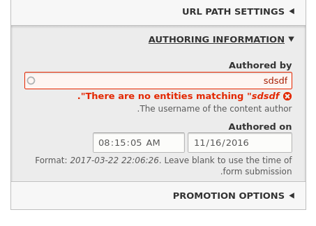
- Enter a value without a beginning slash in the
URL aliasfield. - Click the
Savebutton.
This should cause a validation error: "The alias path has to start with a slash". - Close the
URL aliasdetails element. - Open a details element that does not have an error, such as the
Authoring informationelement.
- Enter a value without a beginning slash in the
- For vertical tabs:
- Widen your viewport to at least 650px.
- Go to
/admin/config/people/accounts. - Within one or more tabs for the
Emailsconfiguration at the bottom of the form, remove the value for the requiredSubjectfield. - Click the
Savebutton. - Click a tab which does not have an error to activate it.
- Click a tab which does have an error to activate it.
For RTL, either:
- manually change the
dirattribute on thehtmltag tortlin the browser inspector / devtools, or - enable the Locale module, add Hebrew as a language, and repeat the above steps on the Hebrew version of the pages.
For testing on themainbranch, translation files for11.4.xversions can be downloaded and then manually imported.
Translations aren't necessary just to see the RTL version of the icon placement.
Proposed resolution
To improve the user experience and accessibility we should indicate when there are errors 'inside' a grouping element.
Option 1
- Following the logic of the early UX review in #24, reuse the red side border width from the page-top error block.
Merge request for option 1: https://git.drupalcode.org/project/drupal/-/merge_requests/16294
Option 2 (REJECTED)
- Details and vertical tabs inactive error state: Let the icon be the non-color visual cue and use a thinner side border (same width as the blue side border for open accordion details and active vertical tabs).
- Vertical tabs active error state: Use a thicker red side border to differentiate from the standard error state.
Both options
- Add the error icon from the page-top error block to grouping elements.
- Position the icon close to the end of the element's visible label.
- Use red text color for the element's visible label.
- Details: Surround the entire details element with a 1px red border.
- Use the input error color for the red border / red text.
- Vertical tabs: Use the input border color for the border of the active tab to so that it's clear when a tab with errors is also active.
- Append visually-hidden " (child error)" to the element's visible label.
- Add the attribute
data-child-error-countto thedetailselement.
Because vertical tabs are progressively-enhanceddetailselements, the attribute will exist on the correspondingdetailselement but not on the vertical tabs menu item (thelielement).
Themes can get the value of the attribute from thedetailselement from within the JavaScript theme function. - For the icon in forced-colors mode, use the
mask-imageproperty andcanvasTextbackground color.
The value of the attribute should be an integer corresponding to the number of invalid children.
Remaining tasks
Adapt previous work to Claro.Create merge request.Usability review.Forced colors mode for icon (#234).Manually test the RTL cases (and add screenshots to the issue summary?).- Code review.
Update change record.
UX & Accessibility Questions
For vertical tabs, is the difference in border width now sufficient?(answered in #238)Any suggestions for making the active error state more apparent (#212, point 3)? Is this problem a blocker?(answered in #238)What are remaining blockers for this to be acceptable in a beta state?(answered in #238)
IIUC, the11.5.0-beta1release date is pretty soon.
Since this is blocking #2915899: [PP-1] Enable the Inline Form Errors module in the Standard profile and recipe and we want to get that into11.5.0, I assume we need to make this beta-ready by the11.5.0beta deadline.
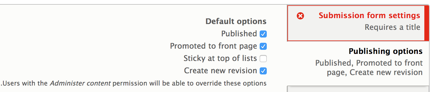
Option 2 screencast
User interface changes
- Visually, the grouping elements will indicate that there are errors inside.
- There will be a visually-hidden "(contains error)" appended to the summary or vertical tabs title for screen reader users.
Screenshots
Full color mode
For comparison, see the previous proposed solution screenshots for Seven.
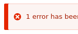
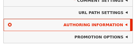
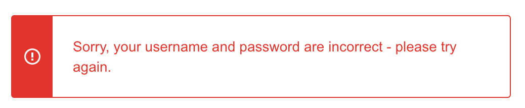
Claro top error block:
This is unchanged. It's only provided here for reference.

LTR (left-to-right)
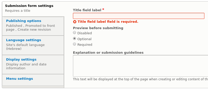
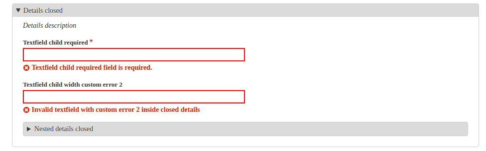
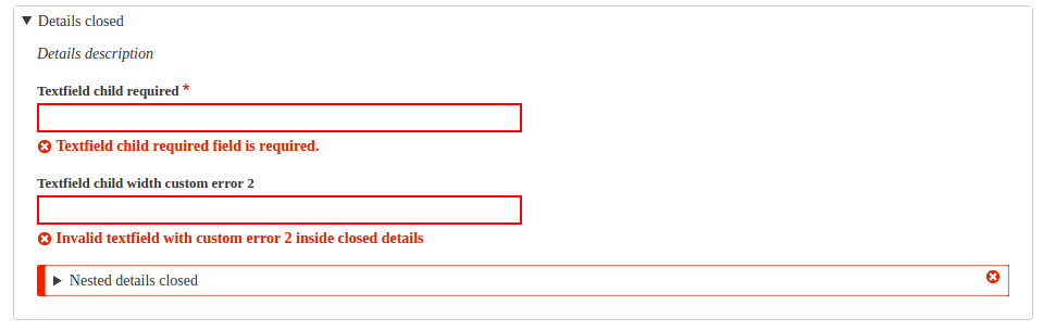
Scenario 1 : Standard details (/form_test/details-contains-required-fields)

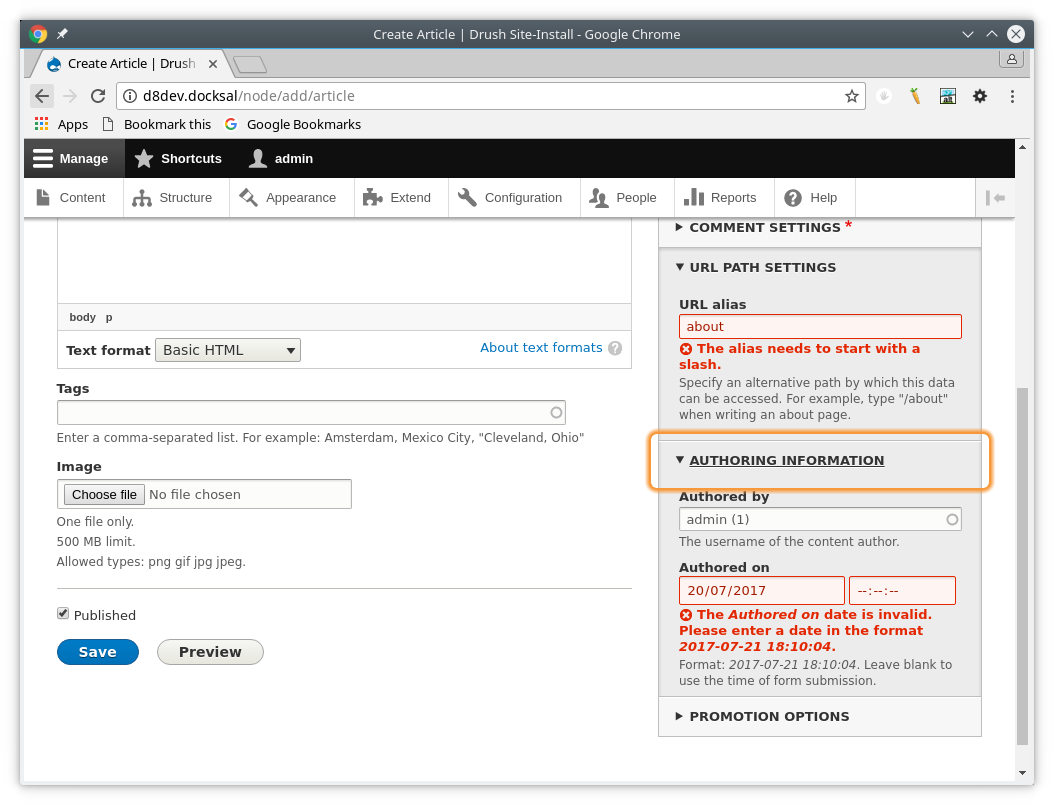
Scenario 2 : Accordion style details (node edit form)

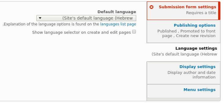
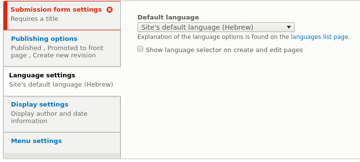
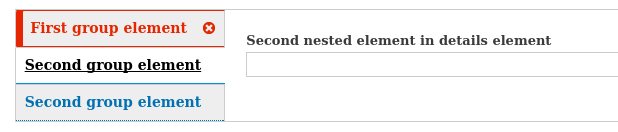
Scenario 3 : Vertical tabs (/admin/config/people/accounts)
Active item contains a child error:

Active item does not contain a child error:

RTL (right-to-left)
Scenario 1 : Standard details (/he/form_test/details-contains-required-fields)
Submit closes a details with errors. Error indicator visible on closed details.

Scenario 2 : Accordion style details (node edit form)
URL alias without leading slash, Save, close "URL alias" details. Error indicator visible, no false positives on sibling details.

Scenario 3 : Vertical tabs (/he/admin/config/people/accounts)
Tested inactive error tab

and active error tab

Forced-colors mode
LTR (left-to-right)
Scenario 1 : Standard details (/form_test/details-contains-required-fields)

Scenario 2 : Accordion style details (node edit form)

Scenario 3 : Vertical tabs (/admin/config/people/accounts)

RTL (right-to-left)
Icon renders correctly on details

and vertical tabs

CSS disabled
Demonstrates the hidden "(child error)" text.
Claro details, LTR, closed:

Introduced terminology
API changes
Data model changes
Release notes snippet
| Comment | File | Size | Author |
|---|---|---|---|
| #245 | Capture d’écran 2026-08-20 à 10.36.21.png | 68.51 KB | gwenweb |
| #245 | Capture d’écran 2026-08-20 à 10.32.17.png | 46.22 KB | gwenweb |
| #245 | Capture d’écran 2026-08-20 à 10.36.03.png | 69.24 KB | gwenweb |
| #245 | Capture d’écran 2026-08-20 à 10.32.12.png | 34.53 KB | gwenweb |
| #245 | Capture d’écran 2026-08-20 à 10.34.35.png | 444.22 KB | gwenweb |
Issue fork drupal-2848507
 Show commands
Start within a Git clone of the project using the version control instructions.
Or, if you do not have SSH keys set up on git.drupalcode.org:
 changes









Comments
Comment #2
dmsmidtWe just talked about this in the UX hangout discussion (http://youtu.be/X2LJEiW2BS0).
At least we can color the borders red and make them a bit thicker.
Since #2754977: Enhance formErrorHandler to include children errors on RenderElements is in we now have enough information on the grouping elements to know if there are errors on child elements.
Comment #3
andrewmacpherson commentedTag clean up: "accessibility" is the preferred one. The "a11y" tag doesn't have many issues so I'm moving them all to "accessibility".
Comment #4
andrewmacpherson commentedFor vertical tabs we could iappend an error indication in the tab summary message.
e.g. if there is one error, say "Error: [field label]", or if there are several errors, something like "Contains multiple errors."
It doesn't help us with the details group though.
Comment #5
dmsmidt@adrewmacpherson, do we really need to add text?
What about adding the IFE error icon before the labels and adding a thick red border?
Comment #6
dmsmidtWorking on the PHP part.
Comment #7
dmsmidtHere is a first stab at things. This will add the 'error' class to tabs with errors.
And the 'error' class plus 'aria-invalid' to details and fieldsets.
Stylers go ahead!
We will need a functional JS test for this.
Comment #8
dmsmidtAlso, added vertical tabs to the module for easy testing:
https://github.com/dmsmidt/errorstyle
Comment #9
dmsmidtComment #11
andrewmacpherson commented@dmsmidt Re: comment #5
Yes, an error icon (with fallback text) will do the job, better than my text suggestion.
I was trying to address "At least we can color the borders red and make them a bit thicker" from comment #2. A thick red border alone would not be sufficient to convey an error because:
:focus, for instance.Including the error icon in vertical tabs addresses these, because it uses shape as well as colour, and is a meaningful indication of "error".
Comment #12
andrewmacpherson commentedReview of the patch in #9:
<details>element nested inside the tab panel (via PHP) and the error class is applied to the vertical tab itself via JS. I changed the names of these classes to confirm it worked.errorclass will not be sufficient on it's own. Presumably the idea is that this class would be used to add an error icon (a red cross, say). If it's just an icon, it will need a text fallback. Ideally this would be an inline image element, but we don't seem to use many of those in core anymore. A CSS background images and/or generated content will not be presented to screen readers, so we should either use an inline image element with analtattribute, or include aspan.visually-hiddenthe vertical tab somehow, such as a translatable string invertical-tabs.js. (I would put it after the tab title, but before any vertical tab summary text. This might mean prepending it to the tab summary string.)aria-invalidto put it on the container element. The WAI-ARIA recs (1.0 or 1.1CR) are a bit vague on this, saying it can be used on "all elements of the base markup". As far as I am aware though, it is only supported when it is applied to a form input element, not a div/details wrapper. In a quick test with Chromevox and the errorstyle module, it was not announced.Comment #13
ttamniwdoog commentedSteps to recreate:
1) In Drupal 8.4, create a new article content type here: /node/add/article
2) Scroll down to the URL Path Settings in the vertical tabs: /node/add/article#edit-path-settings
3) Enter in a node title and then enter in a bogus URL that doesn't start with a forward slash("/") as seen here: https://www.drupal.org/files/issues/00000003.png
4) Click "Save and Publish"
5) After saving the page, you should see an error at the top of the page like: https://www.drupal.org/files/issues/00000004.png
6) Also notice the error seen in the URL Path Settings now. Should look like this: https://www.drupal.org/files/issues/00000006.png
Comment #14
markie commentedAs part of an internal accessibility sprint we determined these next steps:
(Drupal\Core\Render\Element\RenderElement::preRenderGroup).
(/core/misc/vertical-tabs.js (line 68ish)
Comment #15
andrewmacpherson commentedRe: #14 - I think we've covered all of that in the various comments so far.
Do you mean adding a
.errorclass to the details and the summary elements? Surely we can style the summary with a selector likedetails.error summary.aria-invalid=truedoesn't work for anything other than form inputs, so putting it on a<details>is of no benefit.Comment #16
dmsmidtI think it is pretty clear where we stand.
As per #12-2 we now need to "visually" show that there is a child error, some solution are proposed.
@andres (#12-3), I did some research about
aria-invalidbefore I made the patch, but indeed those specs are very vague. I read them as: 'it is ok to add them to elements other than things like , but we may not do anything with it". I'm ok with removing them.Comment #17
damienmckennaHere's what a motley crew at Mediacurrent came up with (cehfisher, DamienMcKenna, dbungard, markie, Michelle, samuel.seide, smurrayatwork, ttamniwdoog, Widescreen_bob). This adds a border to the fieldset ("details" tag) in both expanded and collapsed formats, and then adds the error check mark to the summary text.
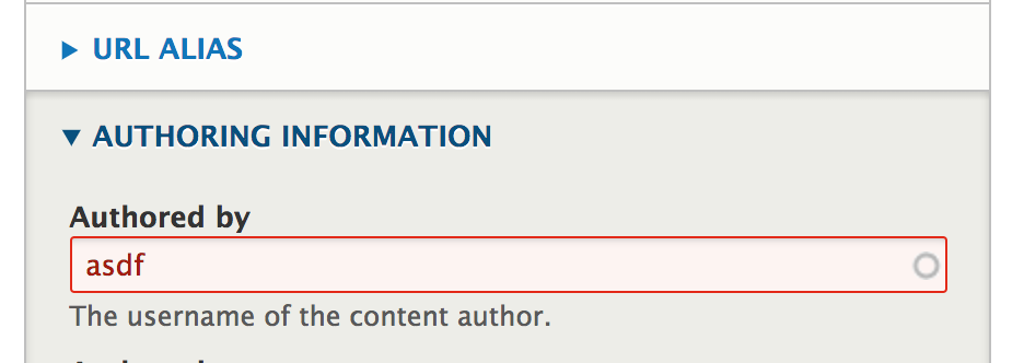
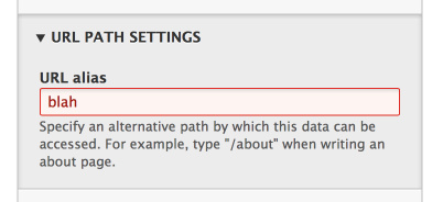
This is what the error message looks like without the changes:
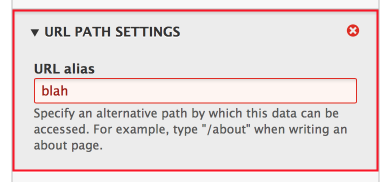
This is what the error message looks like with the changes:
While reviewing this it was noticed that the field with the error class is not AAA compliant (red text with a reddish background color), maybe something to look at later?
Comment #18
dmsmidtFirst actual visual changes, great!
Indeed, the field error styling should have it's own issue.
Could you also provide a screenshot of how this looks on closed details? The most pressing concern is that it is not clear where errors are if a details is closed or a vertical tab not focussed.
How would the proposal translate to vertical tabs, could you guys come up with something similar?
One thing I thought when looking at the icon in the top right: 'this looks like a red close button'. Although it is perfectly aligned, the location may not be the best. Any thought?
Comment #19
damienmckennaThis is what the fieldset looks like when it's collapsed:
Comment #20
damienmckennaWe did not get into vertical tabs in the main content area, we just focused on the sidebar fieldset on node forms.
Comment #21
dmsmidtGreat start. Thanks for the additional screenshot.
In closed form the red icon works better. Maybe we can remove it when the element is open. In combination with IFE the icon would already be present beneath the field.
Maybe a screenshot with IFE enabled and the element open would also help.
One, not belittling ment note: in D8 fieldsets can't be collapsed anymore, they are sort of replaced by details elements. Let's keep the terminology clear to avoid confusion.
Comment #23
dmsmidtComment #24
dmsmidtDesign feedback / idea from the UX meeting of 15 march (see demo at: https://www.youtube.com/watch?v=lWKo_OK6gHg):
"Reuse the error message styling (thick left border)."
"In open state and IFE enabled the element becomes crowded."
Comment #25
yoroy commentedAn incomplete proposal:
- How it could look with the red left border (using the wrong color red here)
- Can we do something with a ::before pseudo CSS class to add actual error wording to the container?
Comment #26
andrewmacpherson commentedRe: #25
The thick red border looks smart! I expect it will work just as well inside a vertical tab header.
Using a thick border alone (comment settings in the screenshot) isn't enough IMO. The fact that it's thicker than the regular border technically means it doesn't rely on colour alone. However the thickness doesn't convey "error" - the red colour provides that. Including the error icon would be better because it's a meaningful symbol.
So far the screenshots have used the special details styling from Seven's node form. We'll need to make it work with Seven's general details style, and Bartik.
No, CSS-generated text presents a few problems:
EDIT: I tried a CSS generated content test case with Chrome 57 + ChromeVox. This combination doesn't read the CSS generated content either.
content:for a few punctuation symbols, not translatable strings. It's possible to use HTML attributes to provide CSS content (e.g.content: attr(data-foo);but I don't see how that's better than just putting it in a HTML element.The patch in #17 adds the error class to vertical tabs via JS. We can provide a translatable string at the same time. For details elements, providing error wording in HTML would be preferable I think.
Comment #27
andrewmacpherson commentedPatch from #17:
The entity-meta sidebar markup comes from Seven. These selectors belong in
core/themes/seven/css/components/entity-meta.css.Comment #28
andrewmacpherson commentedRe: #17
It has a contrast ratio of 7.02:1 which does indeed pass at level-AAA. In any case our target for the core a11y gate is 4.5:1 to meet level-AA.
I just reviewed the information at Specifying colors and contrast for accessibility - it's a bit misleading because it says we need to meet level-AA, but then mentions the enhanced contrast ratios needed for level-AAA. I should update that page to make it clearer which numbers are for level-AA. Although obviously I'd prefer we met AAA, which we do :-)
Comment #29
dmsmidtComment #30
yoroy commentedForgot to say thank you to @andrewmacpherson for explaining why and how. Thank you @andrewmacpherson :)
Comment #31
dmsmidtWorking on this @Seville.
Comment #32
dmsmidtSome after screenshots added to the descriptions according to these changes.
@todo
- Novice: add before screenshots of all after scenarios
- Fix test fail- Provide error wording for a11y
- Tests (check for the error class and error wording)
Comment #34
dmsmidtThis adds some missing CSS and fixes the test failure.
We now cover the addition of the error class for details elements in our tests.
Concerning the tests, we now only need a Functional JS test for the error class on Vertical Tabs.
Comment #35
lauriiiWe should not make any changes to Classy or Stable on this issue because they are frozen. We only want to change them on bug fixes that are non-disruptive and major enough. The first assumption should always be that we cannot change them. However, what we can do is create minimalistic styles for core and a bit nicer styles for Bartik and Seven. Then in Drupal 9 those styles will be available in Stable.
We should use data attribute instead of classes when the selector is used by JavaScript
Comment #36
andrewmacpherson commentedRe: #35 - I think this error class will be relevant without JS. Currently we use a polyfill-type of approach for the details/summary elements, but native support is now in Blink and Firefox. Details/summary groups work in these browsers when JS is disabled - this class is used for styling in the patch, combined with the native HTML5 'open' attribute...
Comment #37
wolffereast commentedAdding related issue
Comment #38
pk188 commentedRe-rolled and fixed #35
Comment #40
andrewmacpherson commentedThis needs a re-roll to account for Drupal core now using ES6 for javascript development. That change record describes the new contributor workflow for ES6 javascript. See the sections on "creating (or reviewing) core patches".
The patch in #38 changes
core/misc/vertical-tabs.js, but the new ES6 filecore/misc/vertical-tabs.es6.jsneeds to be updated too.Comment #41
andrewmacpherson commentedComment #42
andrewmacpherson commentedComment #43
pk188 commentedRe rolled.
Fixed #40.
Comment #44
pk188 commentedComment #46
BarisW commentedI'll work on this patch as part of the Haarlem accessibility sprint.
Comment #47
yoroy commentedJira puts the icon inside the thick left border, maybe we can do same?
Comment #48
BarisW commentedFixed the error introduced in #43. I would suggest adding these changes to classy, I think this is the most minimal version that needs to be added to Classy.
Comment #49
andrewmacpherson commented@yoroy - that Jira style is interesting. If we put the icon inside a thick border for this issue, would we want to change our message boxes to match?
Comment #50
dmsmidt@andrewmacpherson and @yoroy, thanks for the nice styling idea. I think it could be implemented in a new theme. The styling introduced by this patch are in line with current styling patterns of errors and proposed during an UX meeting (see #24). Redesigning (error) messages is out of scope for this issue.
@lauriii these styling addition (no changes) are actually major accessibility bug fixes. And as mentioned in #36 the class is used for styling. Could you reconsider?
Bartik details element styling is off, see:

Before
After

Comment #51
yoroy commentedI was trying to address #26, the part where a thick border only was not considered enough. But the current error icon is already added here as well so that's ok then. Agreed that a new design is out of scope here.
Comment #52
lauriiiCould we add a JS specific indicator for the errors? Also, .error isn't the most self-documenting name for this.
Also according to Classy's BC policy, this change isn't allowed. However, I think if we can make this more specific we could make this change since it wouldn't cause too much of risk anymore and would still be a great improvement.
Could we use the BEM modifier pattern for naming the class for the visual styles?
Changes to Classy aren't technically allowed. We should move these changes to Seven.
If we can come up with a more specific class name, we could probably make the CSS less specific.
Comment #53
dmsmidtComment #54
dmsmidtI addressed all @laurii's concerns in this patch, only styling for Bartik and Seven are changed. I also fixed #50 (Bartik details styling regression).
I'll create a follow up issue to make this even more accessible by announcing the amount of child errors if a closed detail/tab gets focus.
This is however a bit out of scope, but the groundwork is now also present (data-child-errors-count).
Should we mark this Major priority btw? Since it is a blocker for Inline Form Errors and a serious non-contained accessibility bug.
Edit: created follow up and working on a fix #2892443: Announce that grouping elements have child element errors for accessibility.
Comment #56
andrewmacpherson commentedThis needed a re-roll following #2880007: Auto-fix ESLint errors and warnings. There was trouble with some offsets, and the first chunk in vertical-tabs.es6.js already had a trailing comma after the ESLint changes in that issue.
Sorry, no interdiff file. I got errors when trying to make one, relating to the same chunk. I manually compared patches #54 and #56 prior to uploading it here.
Comment #57
andrewmacpherson commentedThe simplest way to announce that grouping elements have child errors in a screen reader, is for the error icon to have alternative text (see comment #11).
However, the icon is a CSS background image, on a pseudo-element, so we can't associate the text-alternative directly with the icon :-(
The workaround for this is to provide the text alternative in a
span.visually-hidden, nested inside the focusable control, so it forms part of the computed accessible name.e.g.
The interesting part is that the icon disappears when the grouping element becomes open. Do we make the text fallback disappear too? I can imagine a confusing scenario like this...
So let's leave the text-alternative in place (visually-hidden) all the time.
I'd rather deal with the text-alternative in this issue, instead of a follow-up. I might take a crack at it tomorrow.
Comment #58
dmsmidtSome valid points by @andrew, so putting this back to needs work.
Comment #59
dmsmidtComment #60
dmsmidtHere is an implementation of what @andrew suggested.
Could you test it?
If it works we should add a functional JS test for the vertical tabs en elaborate on the existing browsertest a bit.
Comment #61
dmsmidtComment #62
dmsmidtWoop, first Functional JS test for a core Render element (hooray for a11y tests) :-).
We now have full test coverage for details and vertical tabs concerning the changes of this issue.
I also did some further cleaned of the patch.
For the JS reviewers, note that we now need to use
html()instead oftext()to support the hidden error indicator span.Comment #64
dmsmidtTest fix.
Comment #65
GrandmaGlassesRopeMan@dmsmidt
Can you upload a test only patch for #64?
Comment #66
dmsmidtSure, here it is.
Also bumping the priority, cause it is a IFE blocker and also without IFE an accessibility problem.
Comment #68
dmsmidtFails as expected.
Comment #69
GrandmaGlassesRopeManThe expected behavior here is that the
htmlcontents is returned instead of a glob of all the text nodes?This isn't critical, but it is something to think about. The way jQuery is storing data attributes is changing in 3.0, http://jquery.com/upgrade-guide/3.0/#breaking-change-data-names-containing-dashes.
Comment #70
dmsmidt@drpal
#69.1: yes it is, see #62, last sentence.
#69.2: alright, I'll keep that in mind. I guess there will be a major cleanup when the time comes for Drupal.
Comment #71
yoroy commentedComment #72
andrewmacpherson commentedManual testing of patch #64. I used the dmsmidt/errorstyle test module, and
node/article/add.I like it very much :-) I'm happy to sign off on this approach for the icon's text alternative.
A couple of points about the message text in
formatPlural():+ '@title <span class="visually-hidden child-error-indicator">(contains an error)</span>',Let's shorten this to "contains error". Most native screen reader announcements are quite terse (in English at least) and little words like "an" sound out of place.
+ '@title <span class="visually-hidden child-error-indicator">(contains @count errors)</span>Mixed feelings about this. When a group is closed the error icon doesn't convey the number of child errors, so we're giving a screen reader user information that we're not providing to sighted users. However when a group is open, it's very easy for a sighted user to see that it "contains 3 errors". Overall, I think we can leave this as it is - it will very likely help a user orient themselves when reviewing vertical tab titles.
Comment #73
andrewmacpherson commentedThis patch addresses #72.1 - a minor string change.
Comment #74
andrewmacpherson commentedAlas, I found a bug.
If the node authoring information has an error, the text alternative says "contains 3 errors". You can experience this by submitting a node with the authoring date component filled in, and the time component left empty. Of course, there is only one error message, and visually only two components are marked as an error (i.e. the date and time parts). So "contains 3 errors" could be confusing for a screen reader user.
I think this is probably an edge case for datatime elements. Since it only affects one element type (and only causes a problem if it is inside a details container) can we treat this as a follow-up issue? Possibly some other compound elements might be affected.
Alternatively, if we change the plural message to "contains several errors", we can mitigate this problem, at least as far as the UI indication goes. (The
data-child-error-count="3"attribute would still be wrong, but a user wouldn't experience this directly.)Comment #75
skaughti have just been locally playing with dmsmidt/errorstyle to add in time to the Datetime field.. and stumbled upon #2875131: Datetime element formats are confusing while trying to find time formatting options.. suffice it to say, the datetime element is confusing, both as a form element (DX) and it's related validation notices (UX)
similarly, the Datelist element suffers from the same oddness when it comes to how which aspects of theses combo fields are in an error'd state.
IMO these are greater issue these two elements themselves, not of this issue 'Indicate that grouping elements in details and vertical tabs... other related issue for these elements and their error notification should be created.
Comment #76
mpdonadio#74, #75, there are one more more interrelated issues regarding that (the format weirdness, the error message(s), no labels when on a non-HTML5 browser, maybe more). Some are listed in datetime.module and some are in forms system. I have a sort-term todo to triage all of these into a mini-plan to improve the overall UX of the datetime / datelist elements, the overall UX of the datetime / daterange / timestamp widgets, and unify the UX (as much as possible) for the datetime / daterange / timestamp widgets.
Comment #77
lauriiiLooks a lot better for me! Thank you for making the changes. There are still a few issues that show up in the csslint output here.
Comment #78
dmsmidtComment #79
dmsmidtConcerning #74, this is due to a different bug. Children errors are not computed correctly, this is not limited to date fields.
Follow-up: #2897601: Incorrect #children_errors count from bubbled errors in compound elements .
Fixed ccslint notices.
Comment #80
andrewmacpherson commentedChatted with @mgifford about #74 in the #accessibility slack channel.
We'd like to go with "contains several errors" to avoid the confusing count in the text alternative.
Maybe when #2897601: Incorrect #children_errors count from bubbled errors in compound elements is done we can re-introduce the numeric count.
EDIT: but since were basing the single/plural phrase on #children_errors, we'd still have the plural when ther is only one compiund element.
So, compromise to get this over the line. Let's just avoid using the plural format, and always say "contains error".
Comment #81
dmsmidtAlright, removed the plural version. This can always be re-added later when the follow up is fixed.
Fingers crossed, I wasn't able to test the rewrite because my system is just doing a dist upgrade.
Testbot will tell..
Comment #82
andrewmacpherson commentedStill working well.
#79 cleaned up 4 instances of the "float can't be used with display: inline-block" coding standards message.
Of the remaining coding standards messages, none of them are being introduced by lines this patch touches:
.vertical-tabs__menu-item.is-selected. I think this is fine/intentional. It's the style of the currently selected vertical tab..vertical-tabs__menu-item a:focusThis is definitely a false positive, vertical tabs does have an alternative visual change.[data-vertical-tabs-panes]. I don't understand this one - we have lots of other[dir="rtl"]attribute selectors which it doesn't complain about.#81 changed the text alternative for the error indicator, to work around the bug I noticed in #74
Comment #83
xjmDoes this issue need a change record for the
child-error-countit's introducing? (Sorry, don't know much about JS.)It has fixes for Bartik and Seven but not Stable/Classy, which aligns with our BC policy.
Comment #84
andrewmacpherson commentedYeah, I guess the new
data-child-error-countattribute counts as small API addition affecting themers? The idea is that custom theme CSS could present a visible numeric badge with the error count, like an iOS app icon does.We already discussed (#72, #74, #80) making use of the error count to convey "contains several errors" in the accessible text-alternative for the details error icon, but held back (in core themes) because of #2897601: Incorrect #children_errors count from bubbled errors in compound elements .
Comment #85
lauriiiAgreed with #83 that we should create a minor change record for the Drupal.theme.verticalTab API addition so developers who use this would be aware of the new key.
Besides that:
This should be camelcase
Could we add the newly added key to the docblock?
Comment #86
andrewmacpherson commenteddoing #85 now
Comment #87
andrewmacpherson commentedNew patch addresses #85, and it gave me a chance to learn the new es6 yarn watch workflow too.
I've updated the keys for
Drupal.verticalTabandDrupal.theme.verticalTabwhich were out of sync. Now they both mention the same 3 settings keys.Comment #89
dmsmidtManual tested, still works. All points in #85 are fixed. Back to RTBC, thanks!
Comment #90
lauriiiI forgot to add the tag on #85
Comment #91
dmsmidtChange record added: https://www.drupal.org/node/2902133.
Comment #92
yoroy commentedJust to confirm that the interaction and visual design are good to go here. There's ways we can make this look nicer, but what this patch does is in line with the currently available visual vocabulary of Seven theme. (See #50)
Comment #93
gambryReally small comment issue fixable on commit:
@param defines a jQuery object but comment suggests a number (and
count($element['#children_errors'])confirms).Comment #94
xjmThanks @gambry. I don't think a discrepancy on the data type of a parameter is something a committer should fix on commit, so setting NW for that. Let's make sure we don't have a wrong assumption in the code about the data type.
This file is also missing its closing newline.Sorry, disregard, that's the auto-generated ES5 file. Still getting used to that.Sorry to bump this back over small things; I know it's been RTBC a long time without further review. (This is also why @gambry was probably reluctant to NW it.) Unfortunately most of the committers are not as fluent in JS and this makes patches with JS get delayed. I just want to let you know I'm definitely aware of how long this patch has been under review and that it's a major UX/a11y bug that affects IFE.
Comment #95
jefuri commented@dmsmidt already gave me a heads up and begged me to finish this issue :P.
But seriously, the data type comments form the review are fixed and rerolled against 8.5.x.
Happy reviewing!
Comment #96
jefuri commentedComment #97
jefuri commentedComment #98
andrewmacpherson commentedThanks for the patch @jefuri.
This is categorized as a major bug, so it's still eligible for 8.4.x. I've re-queued the test against that branch, and will review it when the tests have run.
Comment #99
andrewmacpherson commentedComment #100
andrewmacpherson commentedReview of patch #95:
vertical-tabs.es6.jsandvertical-tabs.es6.jslooks fine. It corrects the last outstanding JS documentation nitpick that @gambry found in #93. (Good, this part is what we needed to be back at RTBC).seven.libraries.ymlfile was re-arranged slightly in #2887860: Allow attributes to be passed to admin blocks (admin_block theme hook). The colors.css line was moved. This should be easy to fix.So what happens next? Do we need to have separate versions of the patch for 8.5.x and 8.4.x?
We should be able to fix this at the DrupalCon Vienna sprints and get it into 8.4.0.
Comment #101
andrewmacpherson commentedThe patch in #95 applies against the 8.5.x branch and is RTBC-worthy IMO.
This patch applies to the 8.4.x branch, please review.
These interdiffs now show basically the same thing, the JS documentation tweak raised by #93.
#87 - #95 (for 8.5.x branch)
#87 - #101 (for 8.4.x branch)
Comment #102
mpdonadioOK, for the sake of sanity, let's name the latest patches like this. Feel free to remove my commit credit as I didn't really do anything; these are just the other patches renamed.
Comment #103
dmsmidtComment #104
dmsmidtBummer, found one nit. Gonna fix it in a bit.
Wrong test description.
Comment #105
dmsmidtAlright, I confirmed that #102 didn't change anything.
Then fixed the patches for both versions (docblock).
Comment #107
BarisW commentedTested again, and it all works great.
Fieldset collapsed
Fieldset expanded
I also tested RTL and that works as expected as well.
Comment #109
andrewmacpherson commented@dmsmidt and I have been discussing and watching this at the DrupalCon Vienna sprints, from the same table. The tests for both branch patches in #105 are green again, we looks like we had some random testbot blips. RTBC!
Comment #110
alexpottI think we might need to wait here so that vertical tab javascript has had time to run. That's why #105 appears to have random errors. I think
\Drupal\FunctionalJavascriptTests\JSWebAssert::waitForElement()might be what we need to use.Comment #111
dmsmidtAlright, added the wait to the test. Better safe than sorry.
Comment #112
lauriiiThanks @alexpott for the guidance on the random errors.
The patch as a whole looks good for me now! The CR looks good as well. Thank you @dmsmidt and everyone else!
Comment #113
xjmAre the screenshots in the summary current? The seven LTR screenshot looks like it's missing the right red border around the tab.
Comment #114
dmsmidt@xjm, good catch. Just checked, and yes they are recent.
Sadly marking this as 'Needs work' again.
Comment #115
xjmThanks @dmsmidt!
Comment #117
andrewmacpherson commentedThe 8.5.x branch doesn't apply cleanly anymore. It's the vertical tabs JS file, I'll update this.
Comment #118
andrewmacpherson commentedIt was #2915784: 1/3 JS codestyle: camelcase that means patch #111 no longer applies. Should be an easy re-roll.
Comment #119
andrewmacpherson commentedHere's the re-roll. I've only updated the 8.5.x patch from #111.
I'll have a look at the individual cases, and check screen shots are up to date. Confirm whether the Seven LTR vertical tabs issue is still a problem.
Comment #120
andrewmacpherson commentedForgot to upload the patch.
Comment #121
andrewmacpherson commentedConfirmed that the LTR vertical tab is still a problem. The right border of the vertical tab does not have a red line.
I noticed that the right vertical tab border DOES become red on hover.
The RTL equivalent looks OK.
Comment #123
andrewmacpherson commentedWorking on a re-roll now. Patch no longer applies due to JS format clean-ups, and #2854624: Details and accordion update based on Seven Style Guide
Comment #124
andrewmacpherson commentedRe-rolled the patch, ran JS prettier.
Going to look into the remaining problem with the LTR vertical tab border from #113.
There's also been some changes committed for the summary/details in Seven, so it's worth another round of manual testing, which could take me a few days.
Comment #126
andrewmacpherson commentedFixes automated test failures: deprecated JavascriptTestBase, and a CSS file declared in Seven's library.
Still to do manual tests.
Comment #128
andrewmacpherson commentedThe last test failure was due to switching to WebDriverTestBase. It turns out that HTML5 client-side validation happens when using chromedriver, preventing the form submitting. Since we're checking that server-side error handling produces the
.child-error-indicatorspan, I added anovalidateattribute to FormTestChildErrorVerticalTabsForm.Comment #129
wim leersThis is the last blocker of #2915899: [PP-1] Enable the Inline Form Errors module in the Standard profile and recipe.
Comment #130
idebr commentedThese changes need XSS protection, since any text used in the title is now interpreted as html.
Preferably the title should stay as text and only the error markup is appended as html, so existing implementations remain unchanged.
Comment #131
dmsmidt@idebr thanks for the review. Although I don't fully agree about the XSS.
The @title is sanitised in
Drupal\Core\Render\Element\Details::preRenderDetails().And we currently allow adding HTML to translations strings in Drupal.
I can't see any other way that user input could lead to the (client-side) execution of code.
Working on the open styling issue.
Comment #132
dmsmidtUpdating images, since there are several styling updates since last patch.
Comment #133
dmsmidtComment #134
dmsmidtFinally found the time and courage to dig into this again.
- Fixed missing vertical tab border red as indicated by @xjm
- Removed usage of
.html()in the JS like suggested in #130 @idebr (with no-js fallback)- Updated CSS to work with all latest changes to the themes
- Improved test to also check if the count of the data attr is correct (fingers crossed)
- Different details error class names for Bartik vs Seven (in line with the rest of the class names)
I could use some cross browser testing help :-)
Comment #136
andrewmacpherson commentedThanks @dmsmidt! I'll try to find time for the cross-browser testing soon.
#131:
But does that also count for the change in vertical-tabs.es6.js - the
.html(settings.title)?#134:
Awesome, that was the only thing xjm blocked it on in #113.
Comment #137
dmsmidtThanks Andrew, testing appreciated ;-)
#131/#136:
Yes, somehow.. Only via translation interface we could get some html in, but we do that all the time with links.
But, I fixed it anyhow, so XSS should be no discussion anymore ;-)
Patch didn't apply because new Stylelint stuff was just committed. So, rerolled and fixed JS/Style linting.
Comment #138
idebr commentedComment #140
andrewmacpherson commentedTagging for the global sprint this weekend. The Leeds (UK) meeting is having an accessibility focus, and the cross-browser testing is a good group activity.
Comment #141
andrewmacpherson commentedWorking on this at the Leeds UK sprint today.
Comment #142
Suesdesign commentedI applied patch 137 and tested the form on Mac OSX 10.14.2 with the Bartik theme and Seven theme with the following browsers:
Chrome 71.0.3578.98, Firefox 64.0.2, Safari 12.0.2 and Opera 58.0.3135.4. The results were correct and found to match the screenshots provided, so I did not provide new screenshots.
Comment #143
andrewmacpherson commentedThanks @Suesdesign, that's covered a lot of manual cross-browser testing.
We're working together at a sprint. Sue has also checked the LTR vs RTL scenarios.
We decided against getting screenshot evidence for every combination of browser and OS, because that would be a LOT. Instead we agreed to only provide screenshots if we found any differences.
Still ongoing:
Comment #144
nigelwhiteTested on Linux 18.04
Comment #145
andrewmacpherson commentedCrediting nigelwhite, part of the same QA effort in Leeds.
Comment #146
andrewmacpherson commentedComment #147
andrewmacpherson commentedI'm doing testing in WIndows 10 today, to include Edge and IE11
Comment #148
nigelwhiteHere's another one on Linux 18.04. Drupal 8.7.0-dev. Patch 137
Comment #149
andrewmacpherson commentedEdge and IE11 have 2 problems affecting the details/summary grouping.
When the details group is closed:
Affects Seven and Bartik, RTL and LTR, whether inline_form_errors is enabled or not. I'll prepare a screenshot when I'm at the right machine.
A few months back there was a fix for a missing discosure triangle icon, which was related to normalize.css - maybe this is related to that too?
Comment #152
katannshaw commentedHello. Is there any update on the status of this issue? I'd love to unblock this issue so that Inline Form Errors module can be enabled by default per [PP-1] Enable the Inline Form Errors module in the Standard install profile.
Comment #153
skaughtA concern is could be that html5 validation is on by default all forms. This actually blocks inline form error notices from running as expected. There is an issue for this. As well as a contrib module to bypass (https://www.drupal.org/project/disable_html5_validation)
Of course, you can simple change the status of the issue to 'needs work' -- we are all allowed to pickup an issue as you wish (:
Comment #155
dmsmidtComment #156
dmsmidtSince this is still a blocker for IFE to be enabled by default (and an a11y issue) I'm picking this up again.
A long time has passed, so the latest patch needed a lot of love (please use a diff viewer for comparing patches, and save me an interdiff ;-)).
I also did a lot of linting / autofixing and improved some logic to be more compatible with different HTML structures per theme.
It fixes the last reported issues (supporting IE11).


See new screenshot:
Bartik converts details to vertical tabs, which do also work.
Since Claro is experimental, I would suggest to support it in a follow up.
@SKAUGHT #153, yes thanks for bringing that to my attention again. However this issue is not blocked by it.
Comment #158
olivier.br commentedpatch at #156 doesn't apply on 9.1.4, here is a reroll.
Comment #159
djsagar commentedReroll patch with interdiff, Patch #157 is custom command failed.
Comment #160
catchComment #161
ankithashettyRerolled patch in #159, thanks!
Comment #163
nikitagupta commentedComment #164
gekkie commentedThis issue bit me today in a drupal8 project... Is this still a viable solution and will this get merged into core?
Comment #166
aleixpatch to be applied on 9.3
Comment #169
benjifisherWe discussed this issue briefly at #3258637: Drupal Usability Meeting 2022-01-21. That issue has a link to a recording of the meeting.
We would like to help this issue move forward. It is not clear what the next steps should be. I see that the most recent patch has a failing test, so I guess that needs to be addressed. This issue also has the tag for manual testing.
Comment #172
yepaReroll the patch on 9.4.x
Comment #173
_utsavsharma commentedComment #174
quietone commentedPatch does not apply.
Comment #175
_utsavsharma commentedFixed CCF for #172.
Comment #176
mgiffordTagging for WCAG SC 3.3.1.
Comment #177
needs-review-queue-bot commentedThe Needs Review Queue Bot tested this issue. It either no longer applies to Drupal core, or fails the Drupal core commit checks. Therefore, this issue status is now "Needs work".
Apart from a re-roll or rebase, this issue may need more work to address feedback in the issue or MR comments. To progress an issue, incorporate this feedback as part of the process of updating the issue. This helps other contributors to know what is outstanding.
Consult the Drupal Contributor Guide to find step-by-step guides for working with issues.
Comment #180
kentr commentedLooking into re-rolling this for
main.Comment #181
kentr commentedI tried to rebase this recently and hit conflicts with Default Admin CSS.
Since Default Admin CSS is still very much in flux, I'm postponing on #3582351: [Meta] Clean up CSS within Admin theme.
Points 4 and 5 in that issue summary might stabilize it enough to allow work on this issue to proceed efficiently:
Comment #182
mherchelThere's going to be a bunch of work in default_admin CSS for a bit.
Lets create a followup issue specific for default_admin, and then make that a requirement of getting it stable. Then we can unblock this :)
Comment #183
mherchelCan't add a comment since it's only a branch now, but don't forget to add the new variable to the twig templates' documentation.
Comment #184
kentr commentedFollowup: #3604037: [PP-1] Indicate that grouping elements have child element errors for UX and a11y
Thanks. Will do.
Comment #185
mherchelI added the issue above as a blocker in
Comment #186
kentr commentedThis is coming along. It looks like a lot of the Claro styles will transfer directly to Default Admin by just changing colors (so, doing Claro is fruitful).
I infer from #24 that the reason for reusing the page-top error block styling was for UX consistency. Based on that assumption, I've been restyling the previous work to match current error block styling with some adjustments for the specific context.
This screenshot is for Claro vertical tabs, with the invalid tab not selected:
Is work on Olivero postponed since it's in the process of being deprecated?
Comment #187
kentr commentedI'm using CSS custom properties, so because of #3599680: Consolidate, merge, and refactor Gin's CSS variable's into Admin theme's original variables. the Claro rules might mostly copy / paste right into Default Admin.
Comment #188
mherchelI would assume so. But feel free to do it. It'll need to get done in contrib if it doesn't get done here.
Comment #189
mherchelI'm not sold on the 🚫 sign. IMO, the 🚫 is for "Don't do this".
A red asterisk would be more for "You're missing something important here".
That being said, reach out the the usability maintainers if you want, and see what they say. That being said I don't think this should hold anything up. We can always change it later.
Comment #190
kentr commented@mherchel:
I hear you. Though, a red asterisk signifies required fields. In my mind, it would be confusing if the same symbol is used for validation errors.
Yeah, let's run it by UX in a bit.
FWIW, here's how I arrived at the icon:
Previously, the design (for the Seven theme) was:
In #24, @dmsmidt said (emphasis mine):
I reasoned that the UX team's intention was to use design elements from the page-top error block for the UX benefit of consistency. The linked video is no longer available, unfortunately. Note that the icon in the designs matches the icon in the image of the page-top error block.
However, the page-top error blocks are totally different now. Both Claro and Default Admin use a version of this "cross out" icon.
The icon in my comment #186 is the same icon that's in Claro's top error block:
I took some liberties with the red color, though.
The red in the top error block is slightly lighter than the red used to mark invalid fields. I used the latter red for the text and border. The difference is small enough that to me the icon appears to be the same red (though it isn't).
Default Admin's top error block:
Comment #191
kentr commented@mherchel:
I rescoped this issue so that it gets done and can be applied to Default Admin more quickly.
Olivero followup: #3605962: [PP-1] Indicate that grouping elements have child element errors for ux and a11y, Olivero.
Comment #192
kentr commentedComment #193
kentr commentedComment #194
kentr commentedComment #195
kentr commented@mherchel,
I may be able to get rid of the template changes by using a theme-agnostic CSS
errorclass like this (which would eventually apply to Default Admin, and probably Olivero):instead of:
Using the
errorclass on thedetailselement is also more consistent with how it's used on thefieldsetof a group of checkboxes / radios.Are you OK with that?
Comment #196
mherchelYeah, if it works do it. Also feel free to use the
:has()selector in this (I feel like that could help).Comment #197
kentr commentedComment #198
kentr commentedComment #199
mgiffordAs discussed in Slack with @quietone
Comment #200
kentr commentedComment #201
kentr commentedComment #202
kentr commentedComment #203
kentr commentedComment #205
kentr commentedI think this is ready for usability / UX review to evaluate the general direction.
The CSS still needs some work. The icon in the details is vertically-centered, whereas in the previous proposed solution it was inline with the first line of the summary element.
This is only because I haven't managed to position it correctly yet.
Comment #206
kentr commentedComment #207
kentr commentedComment #208
kentr commentedComment #209
kentr commentedComment #210
kentr commentedMarking Needs review to put it in the UX group's todo list.
Comment #211
kentr commentedThis was discussed in the UX meeting today.
I'll start working on the changes. I'll let someone from the UX team remove the "Needs usability review" tag.
Related: #2859914: Misleading Icon used on form validation errors
I just discovered that Olivero also uses the cross out icon for form top error blocks:
I believe the UX team will have a recommendation on whether it's better to be consistent with the error icons for the grouping elements and change them later holistically versus using different icons for the grouping elements.
Comment #212
rkollerUsability review
We discussed this issue at #3609715: Drupal Usability Meeting 2026-07-17. The link to the recording: https://www.youtube.com/watch?v=oD9o5dkfjeo. The attendees at the usability meeting were @kentr, @rkoller, @simohell, and @worldlinemine.
Going through the steps to reproduce section within the issue summary we've noticed a few potential problems to denote.
(contains errors)is kept for the expanded AND collapsed state. The removal of the styling for the error state is not "necessarily" an issue for the "standard" details elements scenario nor the accordion style detail elements in the advanced sidebar on node edit form, there the state isn't changed often or at all. But if a vertical tab with child element(s) failing the validation becomes active the styling is changed from the error state to the active state, and if you switch again to another vertical tab the styling of the current vertical tab changes back to the styling for error states. That makes the navigation in between vertical tabs on examples like/admin/config/people/accountsvisually busy and extremely cognitively challenging - people with a small working memory are in trouble here. Strictly speaking there is the need for a design for an active error state, because otherwise you never really know for sure what the actual active vertical tab is./admin/reports/statusis using a different kind of icon for the error state - the iconography should be consistent across the entire admin UI, otherwise it creates ambiguity and increases the cognitive load.The group agreed on suggesting the following points:
(contains errors)available in the aural interface for the expanded and collapsed state of a parent element, the styling for the error state should be kept in the expanded and the collapsed state for sighted users. Strictly speaking there is even the need for an active error state, which is most important and sort of mandatory in the context of vertical tabs - design input is required in this case. Otherwise it would be impossible to determine the active vertical tab in the following example - you would never know which of the six vertical tabs is the active one./admin/reports/status, admin messages, and on for example errors on this issue should be consistent. The easiest fix for the error state, instead of using the prohibition sign is to simply use the "x" icon used on the status reports page for error admin messages and errors on parent elements as well. Our suggestion is not about the visual presentation, the question "should it be just an X" or "should there be a circle around the X", all that should be up to the designers. Our only concern is about providing a consistent clear iconography across all contexts of the admin UI for the error, warning and informational state. A related and already existing issue that was found during the meeting is #2859914: Misleading Icon used on form validation errors.If you want more feedback from the usability team, a good way to reach out is in the #ux channel in Slack.
Comment #213
kentr commented@rkoller, thanks for the excellent summary!
Notes for next UX / Usability review
This is ready UX review again to determine if it's good enough to go as-is or what is the MVP.
There are a few things that are status quo which we may not have the authority to change here without high-level sign-off:
I previously used that icon in the new styling here for consistency within forms. Now there is consistency with the status page but inconsistency within the form.
Also, the problem raised in #2859914: Misleading Icon used on form validation errors is that the "X" icon implies clicking it will make something go away. Maybe we should reevaluate the priority of #2859914: Misleading Icon used on form validation errors to establish a better error icon all around?
Here are new screenshots of the top error block, vertical tabs, "accordion" style details, and "standard" details, respectively.Here's a screenshot of the status quo top error block and new screenshots of vertical tabs, "accordion" style details, and "standard" details, respectively.
Yeah. I need direction regarding the change. Maybe a small half-circle protruding from the border like in the Navigation module active menu items?
Edit: Or both a blue and red left border?
Comment #214
kentr commentedComment #215
kentr commentedI reopened and repurposed #2859914: Misleading Icon used on form validation errors to apply to the prohibition sign.
We'll need to sort it out for #3604037: [PP-1] Indicate that grouping elements have child element errors for UX and a11y because Default Admin uses the prohibition sign even on the status report page:
Comment #216
kentr commentedPossible correction to #213:
The thick red left border might be a little thinner on the vertical tabs. The details elements also have a red border on the container that may be adding to the total width of the thick red left border.
I'll look into it.
Comment #217
kentr commentedI reverted the icons to the prohibition icon based on @rkoller's comment in Slack:
Comment #218
kentr commentedNeeds work, also, per #213, #216, and the fact that Safari puts these icons at the beginning of the vertical tabs title instead of the end.
I'm working on them.
Comment #219
kentr commentedComment #220
kentr commentedReady for another UX review.
Changes since last review
UX & Accessibility Questions
IIUC, the
11.5.0-beta1release date is pretty soon.Since this is blocking #2915899: [PP-1] Enable the Inline Form Errors module in the Standard profile and recipe and we want to get that into
11.5.0, I assume we need to make this beta-ready by the11.5.0beta deadline.New screenshots
Claro vertical tabs, LTR:
Claro details, accordion style, LTR:
Claro details, standard, LTR:
Claro vertical tabs with summary, LTR, open:
Note: It's not possible to see this in the MR.
Comment #221
benjifisherWe discussed this issue at #3611503: Drupal Usability Meeting 2026-07-24. That issue has a link to a recording of the meeting. I am giving issue credit here to the attendees at the usability meeting: benjifisher, kentr, and rkoller.
In Comment #220, I think the first question is more about accessibility than usability.
We can revisit this issue soon, especially if kentr can attend the meeting again.
Comment #222
kentr commentedComment #223
kentr commentedI edited the heading (and the list).
Not sure that I'll be able to attend the next meeting.
Comment #224
kentr commentedComment #225
mherchelThis is looking great. As far as I can tell, this is the last blocker for #2915899: [PP-1] Enable the Inline Form Errors module in the Standard profile and recipe.
I'd also like to say that this is such a major improvement in both UX and accessibility, be wary of trying to make it perfect. We can always defer non-critical issues (e.g. thickness of border).
Thanks for picking up the torch on this one @kentr
Comment #226
kentr commentedThe border thickness was about differentiating the blue & red borders (because color alone isn't sufficient).
I should have copied this from Slack earlier:
Though, it seems that the icon is also a visual cue to differentiate the containers with errors.
And now that I think about it:
If the icon by itself is enough to differentiate error from non-error, then perhaps left border thickness can be repurposed to differentiate active error from inactive error states.
Comment #227
kentr commentedI'm going to put up an MR for another option so that they can be compared:
Option 2
Comment #229
kentr commentedI put up the MR for option 2 and attached a brief video of the different elements in place of screenshots.
Comment #230
kentr commentedI'm hiding Option 2 because IIUC the UX team preferred Option 1, and changing to Needs work in wait of the official UX team summary.
Per the recording of the 2026-08-07 usability meeting, I used a darker gray for the vertical tabs active item border.
The CSS variable used is
--input-border-color, which resolves to#919297/--color-gray-500.Kudos to the meeting participants for tracking down the variable that needed changing!
Screenshot:
Comment #231
kentr commentedFrom the meeting recording, it sounded to me like we're almost there. But I do want to ensure that I didn't miss anything.
Comment #232
benjifisherUsability review
We discussed this issue at #3614155: Drupal Usability Meeting 2026-08-07. That issue has a link to a recording of the meeting. I am giving issue credit here to the attendees at the usability meeting:benjifisher, rkoller, simohell, and the_g_bomb.
We preferred Option 1, but either way, the remaining usability issue is how to indicate the active vertical tab, especially when it does not have focus. The thicker left border is not enough for all users. (Let's not quibble about whether that is an opinion on UX or a11y.)
We agreed that a good solution would be to use a darker shade of gray for the border of the content area and the top and bottom borders of the active vertical tab. Probably the same shade of gray that is used for the border of (unfocused) input elements would work well. When the vertical tab has focus, the focus highlighting should override the top and bottom borders.
We did not agree on whether making that change should be a blocker for this issue. On one hand, we kept Comment #225 in mind. On the other hand, the
mainbranch does not have this problem: since there is no error indication on the vertical tab, there is no conflict with the indication of the active tab, so this problem is a regression from themainbranch.It seems that disagreement is moot: kentr already reviewed the recording of the meeting and, judging by the screenshot in Comment #230, implemented the suggestion.
I hope the improved contrast in the border applies all the time, not just when there are errors. If not, that can be deferred to a follow-up issue; perhaps it can be done as part of #3424484: Improve the color contrast for structural interface components. I am adding that as a related issue.
One other thing we noticed while testing is that the focus indicator on vertical tabs should use a complete border, as it does for input elements, not just the top and bottom borders. We did not check whether there is already an issue for that. We are not suggesting that it be fixed as part of this issue.
If you want more feedback from the usability team, a good way to reach out is in the #ux channel in Slack.
Comment #233
kentr commentedBoth, perhaps?
The improved contrast in the border [color] does apply all the time:
I'm removing Needs accessibility review because members of the accessibility team were present in the UX meetings and I think we've addressed all of the points that were raised.
Yeah, to me that should be a separate issue because it's preexisting [edit: and not related to showing that a grouping element has a child error].
So, I think that we've also addressed the outstanding UX problems [edit: but that's the UX team's call].
When the UX team removes Needs usability review, I believe this will be ready for a more general review (including code).
Comment #234
mherchelWhich MR needs review?
Note that I took a look at the code (didn't test out the functionality yet), and the first thing I noticed in the CSS is that the icons don't adapt to forced-colors.
To make that work, we should be using
mask-imageinstead ofbackground-image, and then setting the background color to red. From there we can add a forced-colors media query that will set the background color tocanvasText, which is a CSS system color that the browser will adapt to whatever color is needed.Comment #236
kentr commentedNeeds work for forced-colors (#234).
I hid the branch for Option 2. There's only one MR now.
Comment #237
kentr commentedI implemented forced-colors for the icons, including using
mask-imagefor the full-color version.Though for the full-color version, I used the same red color as the text & border instead of the color of the icon SVG.
Vertical tabs have other problems in forced-colors, but they are preexisting.
Screenshots:
Vertical tabs:
Accordion style details:
Standard details:
Comment #238
benjifisherWe did not have a quorum for #3615346: Drupal Usability Meeting 2026-08-14, but @rkoller and I tested the current MR for this issue. We agreed that, with the improved indicator for the active vertical tab (screenshot in Comment #230) there are no usability problems blocking this issue. I am removing the tag for a usability review.
Comment #239
kentr commentedComment #240
mgifford@benjifisher I assume from this that we can also remove "Needs manual testing"
What else is outstanding, aside from the final review?
Comment #241
kentr commentedIt should probably have manual testing for the RTL cases (and maybe screenshots).
I think it also needs a change record, based on When a change record is needed or not:
I updated the remaining tasks in the issue summary and will work on the change record.
Comment #242
kentr commentedAh, there's already a draft change record.
Comment #243
kentr commentedI think the CR is good to go.
Comment #244
kentr commentedComment #245
gwenweb commentedTested the RTL cases manually using the Hebrew language (Locale module enabled, URL prefix /he/).
Scenario 1 : Standard details (/he/form_test/details-contains-required-fields)
Submit closes a details with errors. Error indicator visible on closed details.
Scenario 2 : Accordion (node edit)
URL alias without leading slash, Save, close "URL alias" details. Error indicator visible, no false positives on sibling details.
Scenario 3 : Vertical tabs (/he/admin/config/people/accounts)
Tested inactive error tab
and active error tab
Forced-colors mode (emulated via DevTools)
Icon renders correctly on details
and vertical tabs
DOM check
data-child-error-countcorrect on<details>, but not found on<li class="vertical-tabs__menu-item">. Is this intentional?CSS uses logical properties throughout (inset-inline-*, border-inline-*). RTL positioning looks correct.
Comment #246
kentr commentedThanks @gwenweb.
Not sure. Let me see if I broke that, or if it was like that when I picked it up.
Behind the scenes, vertical tabs are progressively-enhanced
detailselements, and the correspondingdetailsdoes have it:The only harm I can see with putting it on the
lielement is more complexity. Themes can also get it in the JavaScript theme function if they need it.Comment #247
kentr commentedComment #248
kentr commentedRE the question about the
data-child-error-countattribute from #245:IMO it was either intentional or it's not a problem currently.
I updated the proposed resolution and am setting back to Needs review to reflect this.
Rationale
core/misc/vertical-tabs.jsfrommainand used that with the rest of this MR in the Stark theme.The result did not include the
data-child-error-countattribute on thelielement.Here's the markup (formatted oddly to make the attributes more readable):
detailselement in the DOM that corresponds to thelielement does have the attribute.detailsnode is also passed to the JavaScript theme function, so it should be easy for themes to get that attribute / value if they need it.Comment #249
kentr commentedI added the screenshots from #245 to the IS and changed the ordering of those that were already there.
Comment #250
kentr commentedAlso AFAIK this doesn't currently need more manual testing. I may be wrong and / or that may change in the future.
Probably the CSS needs to be cleaned up.
I want to get feedback from the people who really know cutting-edge CSS and Drupal's CSS conventions before I spend more time on that, so that I go down the right path.
Comment #251
mherchelI'll put this on my todo.
I'm not terribly worried about 100% perfect CSS, because 1) Claro's about to be removed from core, and 2) Claro's CSS quality is all over the place.
Comment #252
kentr commentedCan this be RTBC based on #238, #245, #248, and #251?
Core committers will look at the code, anyway.
Comment #253
kentr commented