
By hestenet on
As you can see we've put a fresh coat of paint on Drupal.org - but the changes run below the surface. This latest iteration of the front page brings the key concepts of our design system to the forefront: Clean, Modern, Technical.
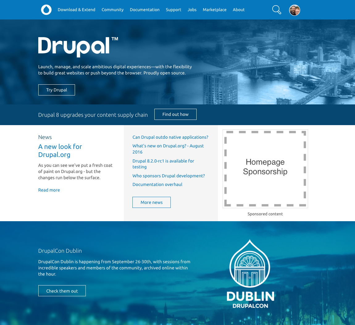
This change also brings new editorial tools for Drupal.org content editors. The new home page provides us more flexibility with content and presentation, and so you'll see more frequent updates, more information about DrupalCon, and more editorial flexibility on the home page than you've seen in the past. These tools are also helping us to build cleaner, modern landing pages - like you've just seen with our Fall Membership Campaign.
We've previewed this work with several key members of the community and the board, and we want to say thank you to everyone who's given us their feedback on this first step for our new home page. We also want to give an extra special thank you to dyannenova for her contributions to this effort.
This is just the beginning - very soon we'll have a new visual look for the case studies that are featured on the home page, and then shortly after that we'll begin promoting solutions to Drupal evaluators in specific industries, like Higher Education, Media & Publishing, and Government.
If Drupal.org is the home of the community, then the front page is our front door. We want to welcome new users and evaluators of Drupal, highlight the project's strengths, and promote news and happenings from throughout the ecosystem.
We hope you like the changes, and we think you'll like the upcoming iterations even more. We'd love to hear your feedback!


Comments
Fantastic
This is much better.
Oh man, I propose to put
Oh man, I propose to put wallpaper pictures from different countries. For example I have a very nice places are in the city, the capital of Ukraine, and I would like them to show the community, as well as see where the others live, and they have interesting things. How do you like this idea?
I think it's a great idea! We
I think it's a great idea! We don't want to change the look and feel too often (it would begin to look inconsistent) but every once in a while we could absolutely do something like this. Great way to represent the global community.
--
Tim L
Drupal Association - CTO
How about changing the city
How about changing the city based on the visitor location ?
To me, the graphic kind of gave a hint that drupal.org HQ is in London
How about an image of
How about an image of whatever city the next DrupalCon is going to be in? At the moment that photo would be Dublin.
============
Drupal Core Maintainer for "Out of the Box" Initiative
Annertech - Web Agency of the Year.
I like this Idea.
I like this Idea.
Excellent way to riff on a great concept
I hope that some of these ideas come into effect. I'd be willing to supply a few images of iconic cityscapes.
Look nice
This new look is looking very nice. Good job here.
The new look is cool :)
The new look is cool :)
Home page looks clean and beautiful
New design looks beautiful and clean. Just one suggestion - can we please move the COMMUNITY activity blocks from bottom to above the fold area of the home page.
day by day UI also getting
day by day UI also getting improved for drupal site. Good job @team
good job but...
...i would add "Download Drupal" button next to "Try Drupal", so we clearly give 2 choices to new users...
Maybe even add 3rd option for someone that would like to quickly jump into some kind of "Demo" without installing anything?
it would be great if we could better explain whats the difference of running Drupal on platform like pantheon and installing on own server. I mean, for totally new and non-technical users, main page should lure them, guide them and then catch and never let loose :)
--
Using Drupal since 2005
My Drupal blog - http://blog.elimu.pl/category/drupal/
My Web Dev Company - https://palikowski.eu
My personal blog - http://palikowski.net/blog
+1...i would add "Download
+1
+1...i would add "Download
+1
I understand that Patheon is a great sponsor of DA fueling financial support, but that does not necessarily means that the Drupal project shall sp*t itself on face and sell its soul. C'mon we're still a FLOSS software which is free to GET / GRAB / DOWNLOAD / HAVE it on your own in any mean of ownership.
2016. I have to remind ourselves about the core values of libre software on Drupal.org.
+1...i would add "Download
+1
We moved Download & Extend to
We moved Download & Extend to be the first item in the top navigation (which of course is visible no matter where you land on Drupal.org, not just the front page) as part of the precursor to this deployment.
However - I can absolutely see what you mean about the visible prominence of the button on the front page. The whole team is at DrupalCon right now, but we'll think about this while we're here and as we come back.
Thanks for the feedback!
--
Tim L
Drupal Association - CTO
Drupal.org is still on Drupal 7?
Looks good, would have been cool if you'd moved to the D8 platform.
It usually move to new
It usually move to new platform when next platform is released. So Drupal.org will be on D8 when D9 will be released.
It was running on D6 till now was moved to D7 recently.
+1 on
+1 on
Looks amazing. Definitely
Looks amazing. Definitely will boost Drupal marketing position forward.
Great job guys!
How was it built?
It would be good to see a blog post or video about how the new home page was built and maybe for a small section on the home page to feature this content.
What base theme was used and why? What was done in Drupal core and what required contrib? etc
I think this would serve a useful purpose for introducing newcomers to site building with Drupal and would also be of interest to the wider community.
---
Paul Driver
www.easable.uk
Ilkley, West Yorkshire, UK
Base theme
https://www.drupal.org/project/bluecheese
https://www.drupal.org/project/drupalorg
I more detailed post might
A more detailed post might not hurt - thanks for the suggestion! Very briefly I would add that we're using Fieldable Panel Panes, with some template styles available as drop down fields on the panes, with the background image, graphics, and CTA button configurable by content editors. (Believe it or not - much of the home page was hard coded for historical/performance reasons in the past). As I've mentioned before we've used the same tools to build out the Fall membership campaign and we'll be building some additional landing pages as well.
--
Tim L
Drupal Association - CTO
+1 on
+1 on
Thank You Everyone! The
Thank You Everyone! The homepage looks way cool.
Great work BUT
that we have the discussion with the missing "Download Drupal" button yet again is disheartening.
Awsome! That's what i can say
Awsome! That's what i can say.
--
Rinto
http://www.writeyourcode.com
Dubai, UAE
Yeah - add "Download Drupal" button.
Yeah - I agree - adding back the "Download Drupal" link next to "Try Drupal" is a good idea.
I also think it's important because it's the number 1 thing that sets open source apart from proprietary and freemium solutions.
Download the code.
Yes, I see it's a top line menu item - but I don't think that's as prominent as the button.
Other than that suggestion - I just have to say this is awesome. Thanks so much to the team. It looks great, and it's going to make the team's ability to change and update stuff so much easier.
Well done, and great timing on the eve of DrupalCon Dublin.
Kudos!
Donna Benjamin - @kattekrab
Drupal Association Board
Download Button
It usually goes like this when a user visits a site especially a new user (novice) he/she will first have a glance of a website and a user first eyes goes on big button instead of top navigation on desktop or tab.
Well, we all know its open source but you a new user sees at "Try Drupal" it will appear as proprietary in most case instead of freely available code for humans. Adding "Download Now" button will be what should home page must focus on for novice or new users.
Note: In mobile or smaller screens there is not open button seen directly as "Download Drupal" any where.
So only this button added to front on every update should be of prime interest of Drupal and its community.
"Old" discussion
https://www.drupal.org/node/2471244
Drupal 7 download button
The Download Drupal 7.x button should appear on the Download & Extend page after the Download Drupal 8.x button. It's not intuitive that you should have to click on the "Drupal's project page" link to find the current Drupal core 7.x download button.
Profile picture link to dashboard
I sure miss the "one click" access to my dashboard. Now we've got to hover over our profile picture, wait for the drop down menu, bring the mouse down and then click to access it (much slower user experience for power users). I think an easy compromise would be to allow clicks on the profile picture to take users directly to their dashboard, and leave the hover/drop-down for other account related links.
Click to open the menu is
Click to open the menu is needed for accessibility, if you are not navigating with a mouse or hand tremor.
You can click “Make this your Homepage” on your dashboard. Then clicking the Drupal wordmark on any page will go straight to your dashboard.
That works
Thanks, that definitely is works.
Holy cow. The bike-shedding
Holy cow. The bike-shedding within these comments is epic. Honestly, we need to keep the cooks out of the kitchen. If everyone gets their say, the site will not become cohesive, and will turn the design into a mess. This looks much better than it did before and I'm happy there will continue to be iterations :)
Professional appearance
This is the most professional looking Drupal.org home page we've seen. Nice work to everyone involved!
Nice!
Great work!
Advanced search
The new look is very neat and professional - well done! However I am really struggling to find the information I need - Drupal,org is a large and complex website. I am having to go back to Google to search, because I get very odd (and not useful) results from the search on the website. For example it would be nice to search on keywords, relevancy, version AND forums for solutions to issues.
For example I entered the following in the search box:
"taxonomy permission unable to add new tag"
Results in order were
On Google, after adding the word Drupal in front, the first three links were from drupal.org.
There are 10 kinds of people in the world, those who understand binary and those who don't!
InterComm South Africa (www.intercomm.co.za)
Tweak the mobile menu?
I really like it overall. My one feedback item would be the mobile menu. The line height on the menu items seems much too high and could be cut in half to fit everything on the screen (well, in portrait anyway).
Also, the hamburger -> close icon positioning and sizing is a bit off; the position of the close icon shifts down and to the left a bit and it somewhat smaller than the hamburger; ideally the target area/position should be identical. A little animation "flourish" goes a long way, too; perhaps a slide down on the menu and animation on the icon?
Overall, a great improvement to a great website!
Feedback
Looks great, very good job!
Wonderful update. Stuff is
Wonderful update. Stuff is in the same place, just the place is better looking :)