Problem/Motivation
During the usability sessions, some participants did not notice the toolbar on mobile, as struggled to get back to their administrative content area.
When the toolbar was originally designed, mobile devices had limited screen sizes and vertical height was a premium, times have changed maaan.
Proposed resolution
Set position fixed on mobile
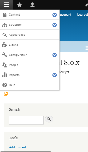
To avoid the mobile toolbar having too many items and crowding the viewport, when at mobile widths, collapse toolbar tabs that don't open trays into a single toolbar tab that can be toggled to hide/show the items.
Remaining tasks
Implement the change
Test
User interface changes
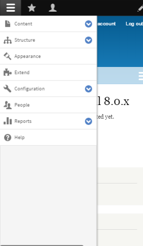
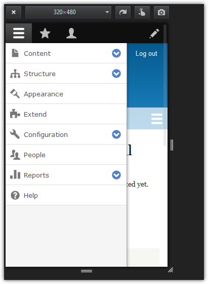
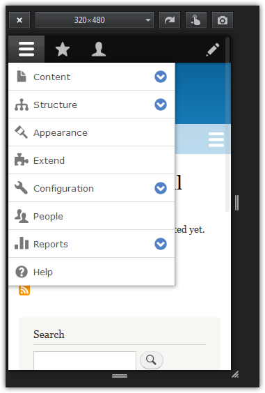
Fixed toolbar on mobile which is always visible to the user.
Toolbar tabs that don't open trays are collapsed on mobile.
API changes
None
Data model changes
None


 Show commands
 changes





Comments
Comment #1
lewisnymanComment #2
merilainen commentedHere is a plain CSS fix for this. Probably the javascript should be updated not to toggle the toolbar-fixed css class, but I'm not familiar enough to change the code and make sure it works with the Barebone library.
Comment #3
lewisnymanComment #4
lewisnymanOk thanks, this change also affects desktop as well as mobile. I'll ping tkoleary and ask if there was a design decision behind not making it fixed position.
In any case, this introduces a few visual oddities on desktop, we can choose to fix them here or we can choose to make this patch mobile only which doesn't seem to introduce the issues.

Comment #5
johnalbinIt was because position fixed didn't work in iOS 7.
http://caniuse.com/#feat=css-fixed
Comment #6
wim leersI think JohnAlbin may be right: I vaguely remember that this was done solely for browser compatibility reasons. It would be good though if Kevin could confirm this.
Comment #7
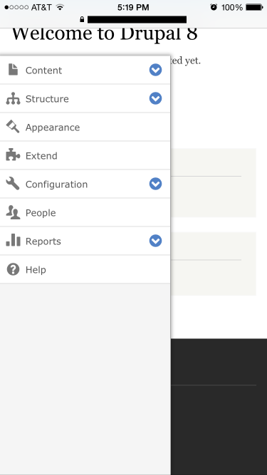
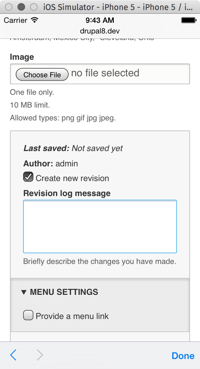
lewisnymanAh right, iOS7 had a show stopping bug which meant that the toolbar always stayed fixed even when you zoom in on text inputs, in many cases covering up the text inputs. This was fixed at some point because on iOS8 the behaviour is that the position: fixed is disabled while an input is in focus. It returns when the focus is moved to a non-input element. Here's a screenshot in iOS8 with the current patch.

I can't seem to recreate the original bug on my iOS7 simulator, it's possible it was fixed in a 7.x point release.
Comment #8
wim leersApplying Drupalisms to iOS :P
Comment #9
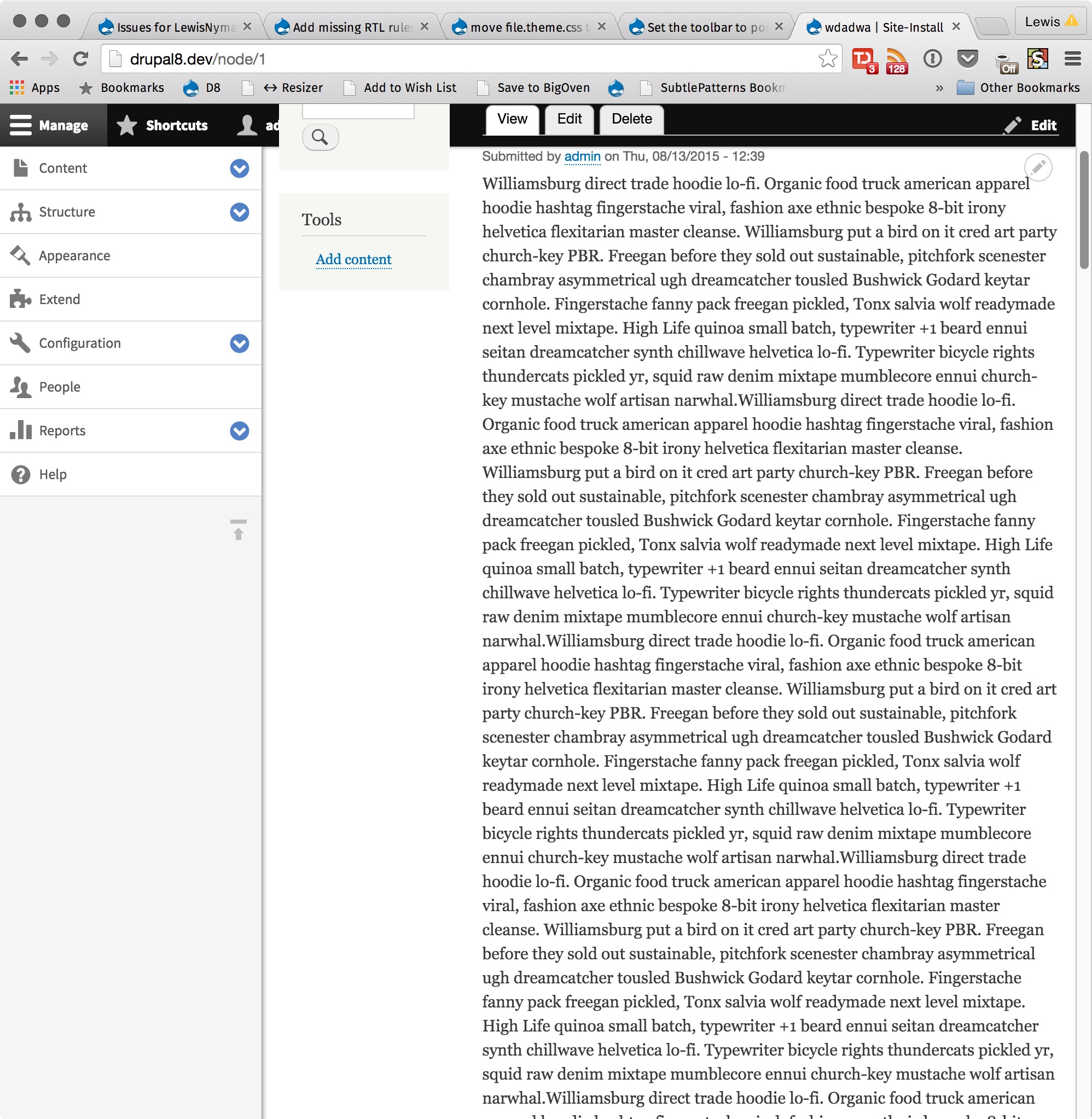
MattA commentedHere's another reason to make it fixed:

Comment #10
dpetruk commentedHi, all!
If we will decide to keep toolbar menu fixed. I suggest this patch.
I've changed style for toolbar and removed unnecessary js code.
Comment #11
dpetruk commentedAlso, about zoom bug.
https://www.drupal.org/files/issues/prevent_auto_zoom_in_mobile-2516918-...
This patch can fix many issues with zoom on mobile. But it might not be so comfortable for people with bad eyesight.
Comment #12
lewisnymanI manually tested this patch and I'm happy with the changes here. We don't have a formally list of mobile devices to test. As this bug was only ever reported for iOS, I feel safe marking this as RTBC without introducing regressions.
Comment #13
wim leersWe should also remove the
isFixedproperty from the model, and thetoolbar-fixedclass from the CSS and JS.Comment #14
grapefruitjuice commentedRemoved "isFixed" from model and also removed "toolbar-fixed" class from the CSS and JS.
Comment #15
wim leersLooks good, but this does mean we need another round of manual testing IMO.
Comment #16
nod_Things related to isViewportOverflowConstrained must go too, that would solve the eslint error too.
And now there is a zindex issue, some header links show up on top of the toolbar (like my account, home, log out).
Comment #17
grapefruitjuice commentedComment #18
grapefruitjuice commentedRemoved things related to isViewportOverflowConstrained, added position: static for #toolbar-administration to prevent zindex issue.
Comment #19
droplet commentedIt's a bit buggy from my last test in #14 when you scroll the mobile down and scroll back to top very fast (like pull to fresh, out of screen size).
the debounce function in Drupal.drupalDisplace caused the wrong calculate. (leaves a big grey gap)
$(window).on('resize.drupalDisplace', debounce(displace, 200));Comment #20
MattA commented@droplet That sounds a lot like the issue I reported in #2551777: Scrolling creates an empty space on mobile browsers a while back. It is actually a separate bug since it happens regardless of the position:fixed property.
Comment #21
ellizard commentedComment #22
lucastockmann commentedI'm going to review this.
Comment #23
meenakshi.r commentedIssue is fixed & tested.
Before applying patch
After applying patch
Comment #24
wim leers#21 lost all JavaScript changes. It was a bad reroll.
Comment #25
grapefruitjuice commentedWhat about patch from #18 ? Wich includes javascript changes and zindex fixes.
Just re-added.
Comment #27
droplet commentedI like some changes in this patch. But I'd say to keep it clean and let it move forward. Dead code / improves can be cleanup in other issues.
Above JS changes are uncertain (from my EXP on #2542050: Toolbar implementation creates super annoying re-rendering.. I can't tell the exact problem now but it's a bit tricky.)
.toolbar-fixed was designed to set Toolbar to be fixed. But now it is not present in mobile. Here's the problem we have to address.
Comment #30
lauriiiI closed #2864051: Admin toolbar disappears when scrolling and #2562251: .toolbar-bar becomes detached from fixed position tray items when scrolling on mobile, leaving gap as a duplicate for this.
Comment #31
tameeshb commentedComment #33
vj commentedApplied #31 patch on 8.4.x. Worked for me. Just need to clear cache after patch
Comment #34
aaronchristian commentedPatch works well for me too. The duplicates @laurii has noted were RTBC and have been closed already.
There are 4 coding standards messages but are unrelated to this patch.
Setting this to RTBC unless anyone else objects.
Comment #35
aaronchristian commentedComment #36
droplet commentedIt has a wired implementation in Toolbar's MQ handler
Comment #42
grathbone commentedRerolled #36 for 8.8.x.
Comment #43
lucastockmann commentedComment #44
jamesashok commentedReferring the above comments and taking pointers from #9, #13 and #16, the following patch makes toolbar fixed across all screen sizes and browsers. Please refer the screenshot attached...
With this patch,
# isFixed and isViewportOverflowConstrained occurrences from JS has been removed.
# Narrow devices will have a fixed top admin toolbar and an overlapping secondary side toolbar.
# Standard devices with side secondary toolbar will push the main content to the right (no overlapping secondary side toolbar), which is the default behaviour as usual (left undisturbed)
# The toolbar-fixed has been permanently added to the toolbar. It is not removed from the code, just in case if it might find some use or other options to compete with in the future.
I have tested across all major browsers and OS simulations and attaching now a couple of screenshots..
Before patch
After patch
Comment #45
avpadernoComment #46
jamesashok commentedComment #47
wim leers#44: very interesting patch, thanks!
It's been too long since I looked at the Toolbar module's code in detail, so I can't sign off on this. My thoughts:
Comment #48
jamesashok commentedDetailed Changes made to the code with the patch #44:-
isFixed&isViewportOverflowConstrainedproperties defined for the toolbar in this modelisFixedvalue and 2) setting the value forisFixedon toolbar model for standard devicesisFixedproperty has been removed from the modelisFixedandisViewportOverflowConstrainedvalue to addtoolbar-fixedclass on body elementisToolbarFixedmethod tosetToolbarFixed)Basically we are removing all occurrences of
isFixedandisViewportOverflowConstrainedas they are used only to decide when to make toolbar fixed.Comment #54
nod_credits from duplicate issue
Comment #63
nod_Adding credit for duplicate issues I just closed.
Comment #64
nod_Comment #65
pankaj.singh commentedComment #66
pankaj.singh commentedTested the patch given in #44 on 8.9.x, the toolbar is fixed on mobile devices while scrolling the page. However, the length of the toolbar touches or going down to the footer of the page.
Also, I tried to apply the same patch on 9.1.x-dev but its getting failed. Please refer to the screenshot attachd for detailed insight
Comment #67
nod_Need reroll for 9.1.x
Comment #68
nod_Adding credit for cat-hearding
Comment #69
nod_reroll
Comment #70
nod_This is an issue.
When on desktop and you force the menu to be vertical, clicking on a menu link closes the tray. Before the tray would stay open on the next page when there is enough width space. We need something like "isFixed", but with a better name.
Comment #71
pankaj.singh commented@nod_ thanks for the patch. Tested and applied the patch given in #70 on 9.1.x-dev. The issue with the toolbar on devices while scrolling the page is fixed and working fine on my end. Please find the screenshots attached.
Also, the similar issue with menu stays open on devices(having limited width space) is already reported in comment #10 on the issue: https://www.drupal.org/project/drupal/issues/3097856
Comment #72
droplet commentedTo change the API doesn't look right.
I believed #36 still works. (That part exists for less hard-coded style (MQ) I bet) (In general case, to toggle a HTML class is the right way)
some codes removing Backbone style. I don't like it but doing that before #3145958: [META] Re-evaluate use of Backbone.js in core doesn't look right also :)
A combine with https://www.drupal.org/project/body_scroll_lock is needed
Comment #73
nod_yeah making #70 started to feel like it was too much. You're right droplet.
#36 had an issue on narrow screens, for this to work need to change what it means to have the .toolbar-fixed class on the body.
Tested in seven, did not test on claro.
Comment #74
andrewmacpherson commentedI'd like to see how this plays with text resizing, especially user-specified text sizes on mobile browsers.
Fixed headers sometimes cause problems when users increase the text size; the header ends up occupying too much of the viewport, leaving less room for the content the user is actually trying to focus on.
Comment #75
priyanka.sahni commentedComment #76
priyanka.sahni commentedVerified and tested by applying the patch #73.It looks good to me.Can be moved to RTBC.
Comment #77
priyanka.sahni commentedComment #78
bnjmnmIt's possible for toolbars to become much larger than what is seen in the earlier screenshots. On a narrower viewport, it's possible for the toolbar to consume a significant amount of the available space on the screen. For toolbars such as mine, I'd only have half the screen for content and wouldn't be able to geet more space by scrolling away.

If this was a brand-new feature, I could see the merits in arguing that this was an acceptable tradeoff for sites that opt to have lengthy toolbars. However, in this case, there may be existing sites with many toolbar items that are accustomed to this behavior. Implementing the solution in its current state could be a regression, and could limit the available non-toolbar space on these sites - potentially preventing them from accessing the page content altogether.
Comment #79
droplet commentedWe should ask: Does the toolbar support unlimited items first?
If NO, then make it fixed. (But, see below)
If YES, then found a solution (, because no matter fixed or not, that's a problem)
In fact, I doubt users can't find the toolbar. I agree a pinned toolbar is provided a quick way to perform actions (eg. FB.com). But without a pinned toolbar is an extremely common pattern around the net, d.org also the same. ( I wouldn't say common is always good. We need to take a balance since we can't pin every actions)
"Failed to find the toolbar" vs "Failed go back to Admin area". To me, this is two different concepts.
Sometimes the UX testing is designed and guides the tester to fail. For example, after creating a new node, you asked "How to go back?". As a long time user, I may fail too. But if you asked "How to edit it?". I will find the edit button. The further problem is "Pinned toolbar" vs "Pinned EDIT"
Another problem, they may found the "Main nav" menu instead.

Comment #80
bnjmnmyes 🤦♂️.
I agree. This is a problem for not just situation such as the one I pointed out in #78 , but has other impacts such as the ones you elaborated on here: #2958478: Toolbar height calculation is faulty in multiple cases.
Since a JavaScript maintainer agrees this is a concern, I'm comfortable switching this to Needs Work. This issue could be rescoped to include figuring out how to deal with excess toolbar items, or a followup issue could be created, and this would be postponed until that was completed.
Comment #81
droplet commentedNeeds to tag the UI team I think (, if there's a UI/UX team for the design)
Comment #82
rkollerAt the moment there are three menu icons available in the toolbar: "menu", "shortcuts" and "profil". In case there are one to x custom helper modules installed like @bnjmnm illustrated in #78 would it be a reasonable step to introduce a fourth icon wrapping and collapsing all registered custom helper modules into for viewports smaller 610px? That way it might be possible to keep the single row toolbar as well as still add the
position:fixedfor viewports smaller 610px.Comment #84
shriaas@rkoller I think that will be a good idea to make the UI clean.
Also in some websites the toolbar is hidden when you scroll down and it appears when you scroll up a little, that can also be implemented for the mobile view and even the desktop too.
Comment #87
vikashsoni commentedApplied patch #73 applied successfully in durpal-9.3.x-dev
and looks good for me
Thanks for the patch
for ref sharing screenshots ....
Comment #88
catchSince several bugs have been marked duplicate of this, I'm going to reclassify as a bug here too.
I've also run into #2516938-44: Set the toolbar to position fixed on mobile several times personally which is definitely a functional bug.
Comment #92
bnjmnmStarted an MR which includes the beginning of a solution for excess toolbar tabs. There are steps to do before it is review ready, but the underlying functionality is now there.
Comment #93
bnjmnmComment #94
bnjmnmComment #95
pradipmodh13 commentedComment #96
raveen_thakur51 commentedApplied patch #73 on Drupal 9 PHP version 8.1. I am attaching my screenshots for reference. Please review & thank you.
Comment #97
pradipmodh13 commented3809.patch has been successfully applied on Drupal 10.1
Now toolbar is fixed and working as expected in mobile.
For ref attached recording.
Comment #98
pradipmodh13 commentedComment #99
bnjmnmThere are already more than enough screenshots and recordings - it's not necessary to provide more such as #96 and #97. These are demonstrating something that has already been demonstrated 7 times prior, so it does not move the issue forward and will not receive contribution credit.
A significant feature was added in #92 reviewing that addition might even warrant screenshots or videos. However but neither of the above have the toolbar configured to include tabs that don't open menu trays, so the end result is just screenshots of the exact same functionality that was screenshotted in #87, #76, #71, #66, #44, #23, #21.
Comment #100
hooroomooTested the toolbar and the excess toolbar items toggle manually with different phone sizes and window sizes and looks good.
Comment #101
avpadernoComment #102
bnjmnmSince there's no explanation of the near instantaneous switch from RTBC to "Needs review" in #101 I'm guessing this was an accidental submit?
Switching the status back to RTBC since #101 appears to be accidental (either accidentally switching status, or accidentally omitting the explanation for the status change)
Comment #103
lauriiiAsked few questions on the MR
Comment #104
smustgrave commentedThis it would help to have before/after screenshots in the issue summary to show what is being fixed.
Comment #106
utkarsh_33 commentedComment #107
smustgrave commentedMoving back for the screenshots
Comment #108
utkarsh_33 commentedAttached the screenshots of how it looks before and after the changes.
Comment #109
bnjmnmComment #110
hooroomooLooks like the styling on the toggle when there are excess items is gone now 😅 Attached video here
Comment #111
raveen_thakur51 commentedComment #113
utkarsh_33 commentedWhen we try to add multiple toolbar items and use the mobile view, ideally the items should collapse and on clicking the ...it should expand but it's not happening here.And even the click on ...just updates the HTML element via ajax but it does not perform any action on click of it.I have attached the screenshot for the problem that i described.
Comment #114
utkarsh_33 commentedComment #115
smustgrave commentedOnly open thread I see
Comment #116
utkarsh_33 commentedComment #117
thomas-kane commentedI reviewed the test in testCollapsibleToolbarItems() and it appears to pass test.
Note: DrupalCon2023, bug smash initiative.
Comment #118
smustgrave commentedTested this manually at DrupalCon and the toolbar does stay fixed.
But adding extra tabs the "..." appears but clicking on it does nothing and when using enough tabs they wrap.
Comment #119
narendrarClicking "..." works for me (enabled Workspaces module, it toggles workspace switcher).
However I found an issue related to z-index when manage icon is clicked.
Comment #120
hooroomooThe toolbar stays fixed and the toggle works and looks as expected. Pushed a small commit that just changes the selector of the toggle in a test. #119 was discussed today with lauriii and bnjmnm and the z-index issue is pre-existing and out of scope of this MR.
Comment #121
lauriiiThere's one kind of a major issue with this which is that when there's horizontal scroll on the page, e.g. when there's a table on the page, the toggle is pushed to the right side of the screen. This makes it very hard to notice the toggle. Ideally we would do #3068696: Tables overflow on mobile first but maybe there's a workaround that we could use here before that?
Comment #122
hooroomooComment #124
hooroomooTested manually and code looks good to me
Comment #125
lauriiiTested the scenario mentioned in #74. There's still a ultra-narrow mode which kicks in when zoomed in. Toolbar is not using rem or em units meaning that overriding body/html font-size won't impact toolbar. Pretty sure we can remove the needs accessibility review tag.
Posted few comments on the MR.
Comment #126
hooroomooComment #127
smustgrave commentedAppears the review was done by lauriii and the feedback was addressed.
Applied the MR myself and didn't notice any regression.
Comment #128
lauriiiLeft couple more comments in the MR.
Comment #129
utkarsh_33 commentedComment #130
utkarsh_33 commentedI again tested the above problem that @laurii mentioned in Umami profile after removing the toolbar items but still i can't reproduce it.I'm attaching the screen recording for reference.
Comment #131
ckrinaFirst, thanks all for working on this! I'd say the idea looked like a quick win before we get the new navigation, but I've tested the latest changes and I'm a bit concerned it's a bit too far to what I'd sign-off to get in.
I'm afraid the place where this is right now will need a substantial amount of hours to design&rethink a few things, develop and review and I wonder if it's really worth the time of core experts here when we're planning on replacing this as soon as we can with the new Toolbar.
Comment #132
herved commentedHello, I stumbled on this for the issue depicted in #108.
We have a sticky header that relies on Drupal displace -
top: var(--drupal-displace-offset-top, 0);- which is not positioned correctly on mobile with the toolbar.Reading #131 is not really reassuring.
Can a compromize be found here maybe?
Comment #134
quietone commentedThe Toolbar Module was approved for removal in #3476882: [Policy] Move Toolbar module to contrib.
This is Postponed. The status is set according to two policies. The Remove a core extension and move it to a contributed project and the Extensions approved for removal policies.
The deprecation work is in #3484850: [meta] Tasks to deprecate Toolbar module and the removal work in #3488828: [meta] Tasks to remove Toolbar module.
Toolbar will be moved to a contributed project before Drupal 12.0.0 is released.
Comment #135
quietone commentedToolbar has moved to contrib