
 Come together with the global Drupal community in Rotterdam, 28 Sept – 1 Oct 2026. Sessions, contribution, connection, and Early Bird savings until 8 June.
Problem/Motivation
Because each time the user clicks on a pane in the right column the pane gets focus, a click to expand a pane gives the Summary element focus and a click to collapse a pane also give the summary element focus. This gives rise to the strange behavior that, given that I have pane "A" and pane "B" open, when I close pane "A" so that I can "focus" my attention on the contents of pane "B", the element that is in focus is pane "A" not pane "B".
Additionally the ability to expand any or all of the panes creates a more visual noise on the page and adds to the "tyranny of small decisions" effect while at the same time possibly forcing scroll when it might not really be necessary.
Last, there is the usability regression where, when all of the panes are collapsed, they do not have the summary of configuration that is so effective in vertical tabs at preventing the user from opening and closing all of the tabs to see what is configured/configurable.
The whole pane, not just the summary, should be in focus

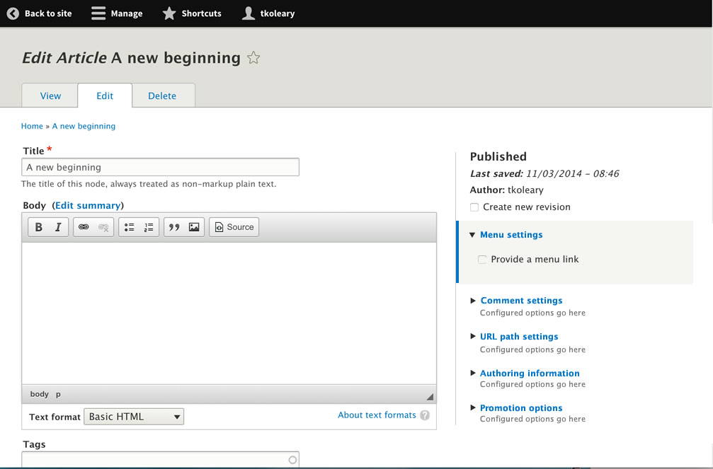
I want to see what's in URL settings by collapsing comment settings

The thing I wanted to hide (URL settings) is what is in focus, not the thing I wanted to show (comment settings).
Even worse, because of the focus effect, my eye is tricked into thinking that the URL alias field is a child of Comment settings!

Proposed resolution
Return to the approach used in vertical tabs where only one pane is visible at a time with summaries of the configured options. Instead of rendering as tabs use accordion effect. Also remove extraneous styling to take away excess visual noise. Last, replace the default focus effect with one that will not seperate the label from the pane.
Collapsed

Expanded
Remaining tasks
- Change behavior back to accordion
- Revert tab styling to match vertical tabs
- Remove outline on focus (browser default)
- Add custom focus effect
- Make expanded background color #F5F5F2
- Remove all borders except border left (#ddd) on the component container
User interface changes
All tasks above are UI changes.
- Add back the summary of configuration as it appears in vertical tabs
- Remove custom styling and sdd back the styling of the tab tiles from vertical tabs
- Add a focus effect to replace the stock browser focus effect so that there is not a separation between the summary and the details elements when in focus
- Simplify the backgrounds so that only an expanded element has one and it matches seven theme
API changes
| Comment | File | Size | Author |
|---|---|---|---|
| #20 | Screen Shot 2014-11-15 at 10.12.16 AM.png | 208.37 KB | tkoleary |
| #17 | Screen Shot 2014-11-14 at 11.38.10 PM.png | 364.36 KB | tkoleary |
| #10 | expanded.jpg | 60.94 KB | tkoleary |
| #10 | collapsed.jpg | 60.49 KB | tkoleary |
| #1 | Screen Shot 2014-11-09 at 2.05.41 PM.png | 72.19 KB | tkoleary |

Comments
Comment #1
tkoleary commentedComment #2
tkoleary commentedComment #3
tkoleary commentedComment #4
tkoleary commentedComment #5
tkoleary commentedComment #6
tkoleary commentedComment #7
tkoleary commentedComment #8
tkoleary commentedComment #9
tkoleary commentedComment #10
tkoleary commentedComment #11
tkoleary commentedComment #12
tkoleary commentedComment #13
Bojhan commentedLets use the right tags, d.o is really bad at this (someday we will sort them by usage).
I am not really sure, were personal dislike and actual issues are. Because we have tested this redesign, and it performed appropriately. The issues you mention did not come up. However I think its important to note, any design comes with its pro's and con's - the reason we chose down this path, is not because we were ignoring those parts - its because we chose to favour other attributes.
You are mixing four things though:
1) Behaviour of opening and, not closing another open tab
2) The information value of vertical tabs
3) An focus issue (mostly there because of a11y, not ux)
4) A visual design change
I am not sure, either are connected. The first three don't require the significant amount of visual change you did. Your reasoning "Also remove extraneous styling to take away excess visual noise" is not enough to all of a sudden completely diverge from the style we set. I am getting slightly annoyed by these issues, we had a very long period for style guide input, we had a very long period of implementing it exactly. We had a polish period to allow for further changes.
We are now very deep in code freeze, near UI freeze - and you want to completely change it. The issues you mention, I have a hard time marking them critical/major that they would allow for this level of disruption. Also as I mentioned earlier, I really hope we can buckle down on the issues that are truly making Drupal hard to use.
I am very saddened that you are disagreeing with so many of our previous decisions :(
Comment #14
yoroy commentedHave to agree with bojhan here. Multiple relatively small observations are conflated into a proposal for a high impact redesign. This level of change at this point in the development cycle is only defensible when there's clear evidence that we have critical usability issues with the current design.
Comment #15
tim.plunkettComment #16
tkoleary commented@bojhan, @yoroy
Well maybe the issue bites of more than it should. I tend to do that :)
I'd be happy to break it up. But the reason that the design includes these things is that they cascade into one another.
In my mind the panes pattern behavior here is a clear UX regression from vertical tabs in 7, however I don't expect everyone to just take my word so I'd be happy to set up a test here for that against a prototype of the new design and live by the results. This can be one issue.
If we do determine it's a regression and move to the proposed interaction then the summaries need to go back in because either you can open multiple tabs or you need to see the configured options as in VT. That can be another issue.
If the summaries go back in then we need to style the summaries. Given that we restyled the summaries already in VT, we have a style for them if they go into the right column (which is the style I matched in the design). This can be another issue.
If the interaction becomes an accordion, then we no longer need three levels of grey to delineate the different states of the panes, and frankly these grays have always been a complete anti-pattern to the rest of the style guide and I don't know how they got in in the first place (The design I proposed does use colors from the style guide, the current implementation does not). If we no longer need three levels then this is an opportunity to simplify the design (never a bad thing) as I have done, while remaining firmly within the confines of the guide (which I think I have also done). I already reached out to Lewis Nyman when I posted this issue for his clarification on whether he thought it did conform to the guide. This can be another issue.
As for the removal of the container borders and background, that is my way of getting around the fact that we are not able (without significant theming pain) to mortise the vertical tabs to the top and right (as they were in the original design if you recall). Therefore a more minimal approach with no borders top right and bottom removes the visual tension created by this strangely "floating" pane which does not align to anything. This, if you like can be another issue, or part of the one above (i'd prefer, as this would make #5).
Last, if we change the interaction pattern to accordion, that still does not remove the part of the focus problem where the focussed element is the *label* not the place where the user intends to "focus" their attention and the focussed element (label) is separated from the pane by the browsers border focus effect. The design deals with this problem again in a way that I think is entirely visually consistent with the guide (happy to defer to Lewis for his opinion on that as well). This also can be another issue, and if so it should encompass field-sets as well which share precisely the same problem.
I do not think these are trivial issues and yes I am aware that there are other pressing needs but after discussion with Tim Plunkett and Alex Pott on this at Bad Camp regarding the implications of extending this pattern across all modals with vertical tabs, they both felt it made sense and that we should do it.
Also, Roy, I sent Bojhan here from the related block modal issue: [#2079037}, which you might want to look at if you haven't seen it. The same design issues there can be divided up in the new proposed issues above if need be.
On the up-side we would not be really re-inventing any wheels here. The colors are not new, we get the accordion from jquery, we have styles for the tabs already and we already have styles we can borrow for the focus effect from messages, the code to parse out the strings for the summaries is in vertical tabs. everything else is just ripping out CSS attributes which gives us less code to maintain.
Comment #17
tkoleary commentedBTW, in support of the idea that most of this is just ripping out attributes, here's what I did entirely in chrome just by ripping those things out with inspector.
I added the top line. Not entirely certain on it but I think it ties the page together better.
Comment #18
lewisnymanI'm happy to revert to accordion style behaviour and to make active states more clear, but we are pulling in too many solutions into one issue. I think the initial designs struggled to 'group' the secondary options in the way the old design did. The most recent design above is better. Give me a little more time and I'll give a more complete suggestion.
If we are redesigning, I would really like to cover the block UI in this as well.
Comment #19
tkoleary commentedI totally agree. All right columns should share common styling and patterns.
Comment #20
tkoleary commented@Lewis-Nyman
Hacked in Chrome inspector along the same lines:
Interesting thing I noticed here is it's better to put the border on the right side of the left column since otherwise it ends at the bottom of the tabs which is weird. Also removed padding right from the search field.
Comment #21
lewisnymanMy higher level opinion: The 'sidebar' for the content creation screen and the block placement screen were designed before the styleguide and they are not inline with the styleguide. They do need design tweaks, I'm not sure if the latest design inline with what I expected, especially when you look at the design for accordions and details: https://groups.drupal.org/node/283223#Details_and_Accordion The latest design here feels more Adminimal than Seven.
I also think these issues would have more success if each design change was split up in separate issues with it's reasoning, which would make it easier to digest and discuss.
Comment #22
lewisnymanI suggest we move the visual redesign discussion to #2375663: Update the design for the right sidebar on content creation page
Comment #27
martijn de witComment #36
nlisgo commentedNo meaningful contributions have been made to this issue for 9 or more years. A related issue has been tagged which was created around the same time as this and has been more active since.
I am closing this as a outdated. Please re-open if you think that that other issue does not cover some scope needed here but then we should perhaps narrow the scope in that event.