
 Come together with the global Drupal community in Rotterdam, 28 Sept – 1 Oct 2026. Sessions, contribution, connection, and Early Bird savings until 8 June.
Problem/Motivation
The current password handling in Drupal is less user friendly. The users are supposed to enter the password twice. We need a password element with the feature to toggle whether to view the typed password, which then allows us to remove the requirement to enter the password twice.
Proposed resolution
We shall deprecate the old password element confirm_password and create a new password element with the ability to toggle to show password text.
Remaining tasks
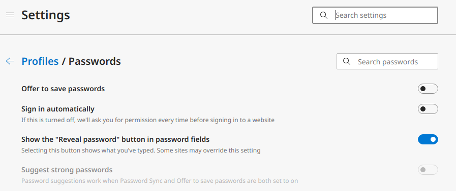
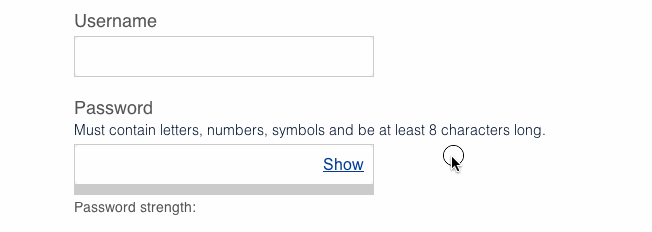
User interface changes
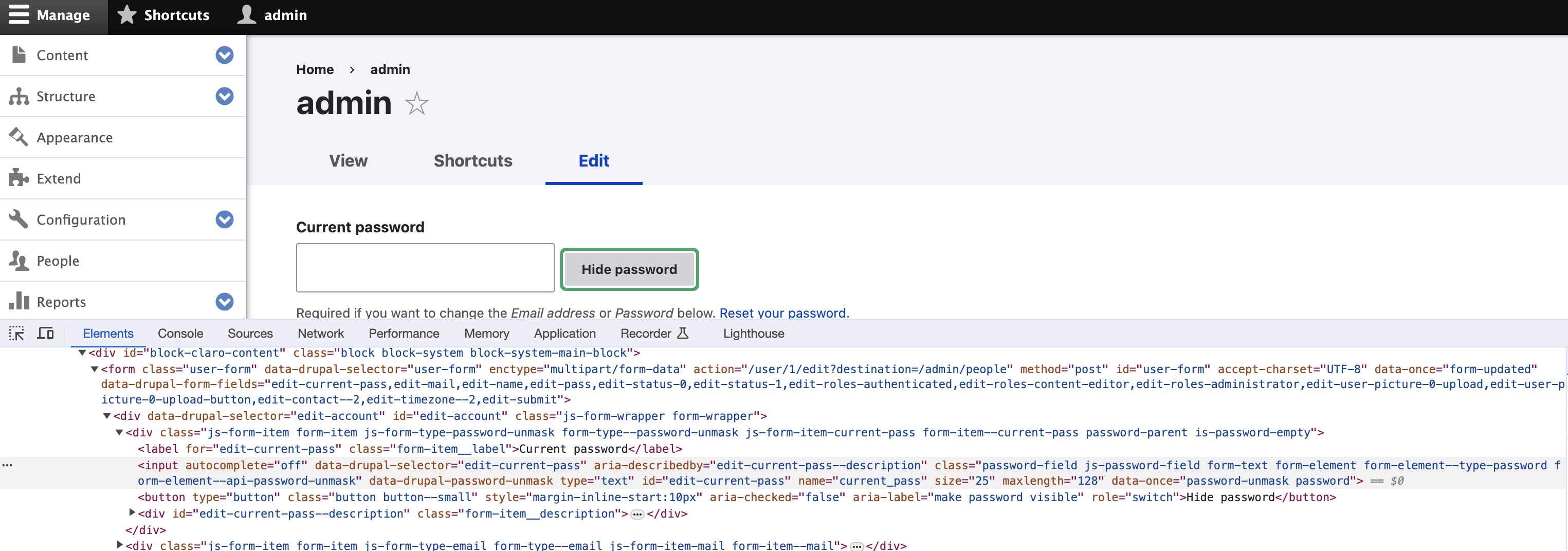
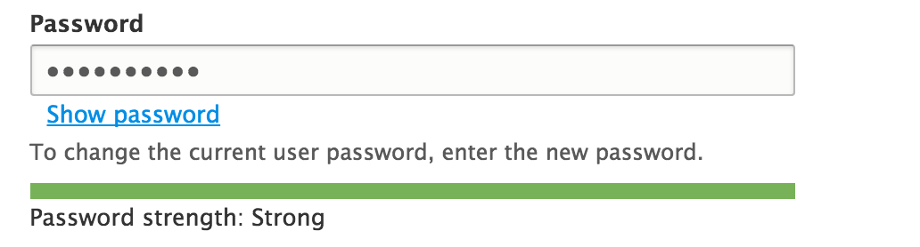
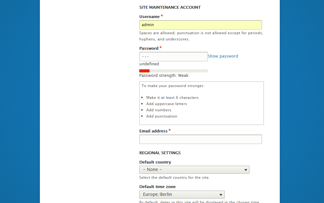
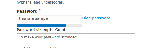
Password field before patch:-

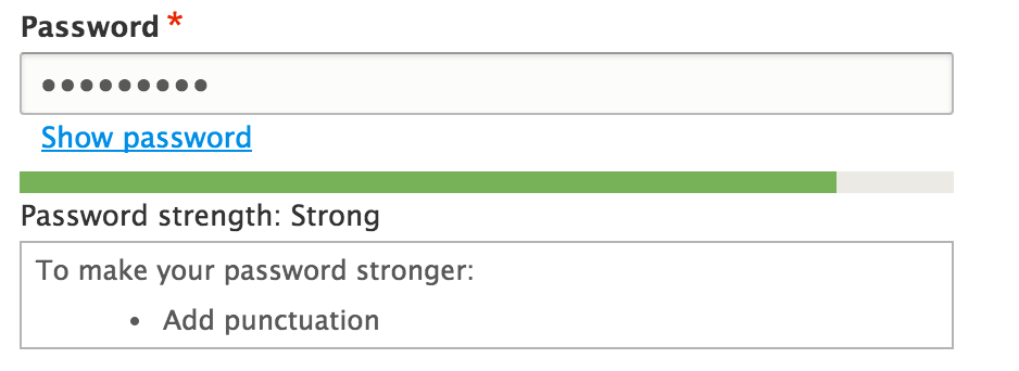
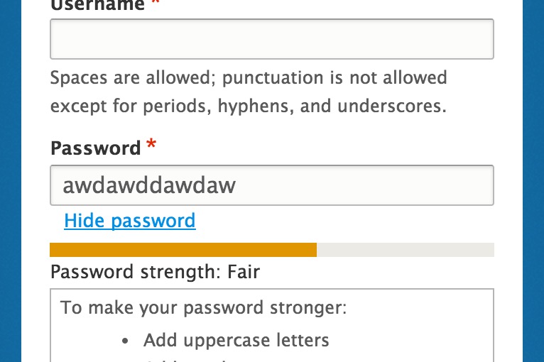
Password field after patch:-

API changes
- Programmatic password submits for user create/update now require one value instead of 'pass1' and 'pass2' depending on config
Sign-offs needed
Please don't commit this without signoff from an accessibility maintainer - @mgifford or @andrewmacpherson
Beta phase evaluation
| Issue category | Feature because usability improvement |
|---|---|
| Issue priority | Not critical because usability improvement |
| Unfrozen changes | Unfrozen because it only changes CSS/markup |
| Prioritized changes | The main goal of this issue is usability |
| Comment | File | Size | Author |
|---|---|---|---|
| #286 | 2293803-nr-bot.txt | 90 bytes | needs-review-queue-bot |
| #277 | login_hover.png | 99.81 KB | omkar.podey |
| #277 | login.png | 112.77 KB | omkar.podey |
| #276 | 2293803-nr-bot.txt | 13.48 KB | needs-review-queue-bot |
| #271 | 2293803-nr-bot.txt | 90 bytes | needs-review-queue-bot |
Issue fork drupal-2293803
 Show commands
Start within a Git clone of the project using the version control instructions.
Or, if you do not have SSH keys set up on git.drupalcode.org:

Comments
Comment #1
lewisnymanComment #2
Bojhan commentedComment #3
Bojhan commentedComment #4
mgiffordIt would be really cool if the Must contain values got crossed out as soon as you filled them in.
That being said, there will be a need to test this if we adopt this new pattern.
I notice in the example that the descriptive text is also above the input form. Would this rely on #314385: Make position of #description configurable via the API?
Comment #5
joachim commentedThere's a contrib module that implements the show/hide password functionality: https://www.drupal.org/project/password_toggle
However, I don't think that removing the confirmation element is a good idea. Showing the password is a great usability improvement, but only if you are somewhere where you're not overlooked! If you're sitting in an office, or in a café, or doing a presentation, then you can't do that, so the confirmation element is necessary as a fallback.
Comment #6
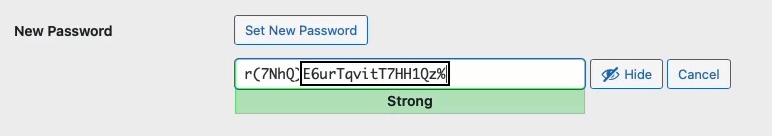
sqndr commentedI have written an implementation for this (see Redesign password strength indicator so it's less fragile). Screenshot is attached (Bartik as admin theme). This 'show/hide' field is currently not inside the input element but outside (as you can see).
I think it's a good idea, especially on mobile. Having to type the same thing twice feels like a bad user experience to me. I've never really liked that. Anyway, even if we don't agree on that; I hope that we can agree that a show/hide field would be a nice improvement?
Comment #7
corbacho commentedI like the idea of the issue.
About #6, I like that implementation is outside of the box, so it doesn't conflict with LastPass, or other chrome extensions that put their stuff inside of password boxes
Also, notice that Internet Explorer 10 and 11, has this functionality already inside the password box:
http://www.askvg.com/how-to-disable-show-password-button-in-windows-8-wi...
Comment #8
sqndr commentedI'll try to post the patch here so we could experiment with this.
Comment #9
sqndr commentedI'll try to get this working again :)
Comment #10
sqndr commentedAs a way to get started, I've included (copy/paste) the behavior from the
password_togglemodule.Works that needs to be done with the javascript:
- Change the checkbox to a text/link (after the input field).
- Remove all the IE overhead that's currently in the behavior.
As soon as that part is working, we can start removing the confirm password field.
Comment #11
Bojhan commentedHah, did you check #2247049: Redesign password strength indicator so it's less fragile
Comment #12
sqndr commented@Bojhan: What do you mean? I was involved in that issue you're mentioning. In comment #36, this issue was created as a follow-up? That's why it's marked as a related issue ;-)
Comment #13
nod_Please don't forget the JavaScript tag when working on JS issues :)
The JS needs work. We use .find explicitly instead of context selector, we only use .on, not the shortcut versions, Ideally we'd detect IE10+ and don't run this if the show password feature exists in the user's browser (hopefully we can detect this without sniffing…).
Basically, we can't just copy/paste the contrib JS here.
Comment #14
lewisnymanThere seems to be very little documentation of this feature compared to the caps lock warning. It looks like we can style it using a pseudo selector so at least we can remove it so we don't have two showing up at the same time?
I'll work on this patch a little today.
Comment #15
sqndr commented@_nod: Would it be okay to add a button and whenever the button is clicked, the password property changes:
type = 'text';. Since we've dropped support for IE8, this could be a short solution? All browsers support changing the input field type, and IE8+ supports this as well.The script would then:
- Check if the browsers already has show/hide password functionality. If not:
- Add a link (or button) after the input field with a text.
- Whenever the link is clicked: change the text (show - hide) / change the type (text - password).
Sorry 'bout the simple copy/paste. ;-)
Comment #16
nod_If changing password input type isn't a problem anymore, that's cool with me. Simpler is better.
As for the detection it's too bad they give only the pseudo-element. I don't have IE around anymore so I can't check it out.
Comment #17
lewisnymanI rewrote the JS, posting it for review before I do any styling/design work.
Comment #18
nod_quick question, do we want that on all password fields? including custom FAPI forms and all?
Comment #19
lewisnymanhmm, the only use cases I can think of for password fields are logging in and setting your password. It feels correct to keep this functionality in the same place as password strength,
Comment #20
Bojhan commentedThe screenshots arn't as subtle as in the OP. I am not sure the current direction makes sense.
Comment #21
sqndr commented@Bojhan: The screenshots with the checkbox were just to demonstrate the way the contrib module handles with this. There's a new patch #19, were a button is added instead of a checkbox. This patch follows the image from the issue summary.
As said in #7, we are placing a button or text outside of the password field, to overcome issues with browsers extensions and IE.
Comment #22
corbacho commentedReviewing the JS from #17, (nice work!) I saw that we could avoid querying the whole document twice (once for :password, another one for data-show-password-trigger)
Other fixes:
* Adding comment
* Adding $context = $(context) as I see is the pattern in other Drupal behaviors in core.
* Not creating the element showPassword unless is needed. (I was thinking to .clone() it if you don't like it inside of the closure)
* Moving the data-state="hidden" as part of the html string
* Name-space for the click event
Questions:
* should we just use parent() instead of .closest('.form-type-password') ? Which one should be more reliable ?
* Should we use an "a" element instead of "button" ?
Demo: http://jsfiddle.net/corbacho/6eQZX/
Sorry, no interdiff because output wasn't any useful.
Comment #23
nod_Since we're talking about replacing the confirm with this button (no empty
<a>) I removed the code related to the confirm functionality so if we're going this way we'll need a change notice.Simplified the code a little. Rely on a data-drupal-revealpass attribute to do it's thing. Works pretty well so far.
We could probably create the button element from the PHP directly (in the form_process_password_confirm function) and add a "for" attribute or something so that we can do event delegation without relying on .parent() or .closest(). Anyway that's what I got so far.
Comment #25
nod_fail fix.
Comment #27
nod_Comment #28
mgiffordThe order of the elements could present accessibility challenges like identified in #1811240: Improve "password matches" and "password strength" accessibility so just addign this as a related issue.
Comment #29
mgiffordFun to run across this pattern here:
https://designpatterns.hackpad.com/Passwords-4dSSBUhCYjj
This is the hackpad for the UK Gov's https://www.gov.uk/service-manual/
Comment #32
mgiffordComment #33
mauzeh commentedPosting a reroll against 64de978a08663904ba8231f20d2f26c8f5a135e8 @ 8.0.x.
Comment #34
nod_There are coding standard issues, Tabs are used in some places, it should be 2 spaces.
Comment #35
mgiffordIt's neat to see this pattern. The input form needs a label. It's fine to have that label be invisible, but screen readers need to have it announced to them what the form is.
That being said, it's better laid out for screen readers, so think it's something that will a big usability & accessibility improvement when we get it in.
Comment #36
lendudeRemoved the coding standard issues.
Moving this forward has a couple of issues, changed the Issue summary to reflect these issue (API changes).
In view of these issues it seems unlikely that this can still be added to D8 and should maybe be moved to contrib.
Marking this as 'needs review' to run the testbot, but this still needs work.
Comment #38
BarisW commentedThis looks sweet!
We could re-use some of the JS/CSS from #1811240: Improve "password matches" and "password strength" accessibility. And add
Drupal.announcetoo.Comment #44
emma.mariaComment #46
lewisnymanSetting to 'needs work' based on the comments in #36. Surprised it passes tests.
Comment #47
sqndr commentedReading #36, I feel like this is to late to add this functionality to Drupal 8. Any other thoughts? Marking as postponed meanwhile.
Comment #48
mgiffordThis needs a reroll again. I would say this would be a pretty damn cool feature to bring into D8, but I have a hard time not seeing it as a feature. In which case we could bump it to 8.1.
Any other thoughts?
Comment #49
lewisnymanSounds like a good call
Comment #50
lewisnymanComment #51
sqndr commentedSmall issue ;) I'll try to look into the rest of the patch again later today.
Comment #52
corbacho commentedLuke has published a new interesting research
Showing Passwords on Log-In Screens http://www.lukew.com/ff/entry.asp?1941
Comment #53
nod_Rerolled #36, 1) and 3) are taken care of, about 2) and drush, they're releasing same time as D8 betas so it shouldn't be a huge issue. NR for testbot.
Comment #55
lendudeRerolled #53 for #2348321: Upgrade to jQuery Once 2.x
Set issue to the right version so patch gets applied to 8.0.x
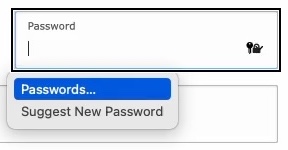
One more thing I'd like to add to my list in #36:
4. Name of the form element should be changed to something else then 'password confirm', because that is no longer what this field does. 'password reveal' or something along those lines? Or should we keep the name for ease of migration....
Let's see if this applies...
Comment #57
lendudeHopefully this fixes most of the fails...
Comment #58
nod_Sweet, good to go for me. Let's hope someone can RTBC this.
Need to ping drush maintainers and check what needs to be done on that end.
Comment #59
lendudeBit of nitpicking...
Docblocks needed to be updated.
Comment #60
mgiffordSome screenshots from the last patch. Would be so nice to have this in D8.
Comment #61
manjit.singhLooking good for me !!!
Some screenshots from #59 patch !!
Also Button link is collapsed with password input field in LTR and RTL, So Adding some margin for link button :)
Comment #63
nod_Patch is missing the revealpass.js file.
Also we can't rely on
password-parentclass to style revealpass because it's a class added by the user module and we don't want to tie this feature to user module. We need some CSS help, don't like using px much for this, ideally we'd add the space inside the CSS with before and content or something. Like we did for admin links (the edit in machine name).We need to add a span around that button to add the space in CSS. Need to have someone tell us which name we should give the class on the span.
Comment #64
manjit.singhAdding revealpass.js in patch.
replaced px with em
@nod_ Would
form-type-password-confirmOrform-item-passwork ? rather thanpassword-parent.Comment #65
manjit.singhforget to attach patch :)
Comment #66
lendudeLets kick the testbot into action....
Comment #69
lendudeUpdated after #2457887: Use Utility\SafeMarkup class instead of Utility\String for placeholder(), checkPlain(),format() functions changed some unrelated things.
Comment #72
nod_Comment #73
lendudeRerolled.
Comment #74
lendudeComment #78
lewisnymanNice work everyone! I think that we are almost there, I noticed that we still have the desktop styling once the show password link wraps so it still looks indented. We need a min-width media query around that styling.
Also this selector is wrong, we should add a new class called .toggle-password.
Comment #79
manjit.singh@lewisnyman Found some issue on installation screen.
These issues are only on installation screen, Please find screenshot.
Comment #80
nod_We missed a place, changed it let's see how it goes.
didn't touch the style.
Comment #81
manjit.singhSeems like issues are still there ? Can you Please check the screenshot and comment posted in #79.
Comment #82
lendude@nod_ you found it first :-) Nice one.
@Manjit.Singh can't reproduce the issues you show in #79 with the patch in #80 in Safari or Chrome, what browser are you using?
Comment #83
manjit.singhFound this issue in chrome while installing new site.
Steps to reproduce.
I have done these steps and facing this issue. Can you please try it at your end. Hopefully you will get same issue.
Comment #84
lendude@Manjit.Singh nope, still just works for me. Can you try patching first and then doing the install from the beginning, that is after all how it will work in the end.
Comment #85
droplet commentedIt will cause Password Manager doesn't work.
Comment #86
aspilicious commentedNeeds a bit of polishing. Can someone please finish this awesome patch? Would make every dev his live less miserable who has to deal with UX designers ;)
I attached some screenshots to show that it sometimes brakes a bit on different screen sizes.
I tried the installer and the user/edit page.
#78 has some starting instructions.
Comment #87
aspilicious commented+ // @todo remove element?And we need to take care of this.
Comment #90
lewisnymanWe should be able to add this behind an experimental module/checkbox in 8.1, it would be great to have this option.
Comment #91
mgiffordComment #92
lauriiiRerolled the latest patch
Comment #94
joelpittetRemoved some more pass1/pass2 references that have snuck in and the Confirm test.
Comment #96
joelpittetNot sure where that extra file came from.
Comment #97
joelpittetSo passes tests:) but the strength indicator seems to be gone at the moment.
Comment #98
joelpittetOh that was easy, hopefully I attached it in the right place
Comment #99
lendudeNice to see this moving again!
We should really rename the element to something like PasswordReveal (and change all references in classes and such from confirm to reveal), the current naming makes little sense except from a BC stand point I feel. But maybe that should be a follow up (cause I realise that would make this a much bigger change)?
Manually tested this in Bartik, Seven, Stark and during install and the reveal works and password strength and hints show up in all.
Comment #100
lauriii#99.3: We could create new class called PasswordReveal and PasswordConfirm would extend that. How ever we cannot change our existing usages to use that new element since we have to maintain BC.
Comment #101
mallezieRemoved the leftover comfirm selector
Added media query for margin
changed selector to new class
removed element in test
Comment #102
lendudethis snuck into the patch
Comment #103
mallezieOops.
Comment #104
mallezieAnd oops again, that last patch is incorrect, hence the 15KB growth.
Comment #105
lauriiiFixed some eslint warnings caused by the new JavaScript.
Comment #106
chuchunaku commentedI applied patch replace_confirm-2293803-105.patch locally on a clean Drupal install and was able to test the hide password / show password functionality without receiving any errors. I tested the patch by running drush uli to generate a link to create a new password. I then entered the new password and clicked the show password / hide password link.
Comment #107
droplet commentedwe should not loop this inside each.
IMO, it should be init from revealClickHandle function and provide a way to override default actions.
Comment #108
nod_The script is pretty simple, I would expect people to override Drupal.behaviors.revealPass if they want override the behavior.
They can still register a delegated event listener is they want to do something on the click.
Comment #109
lauriiiThe #107.1 makes sense but could you please elaborate #107.2 since it's over my head :)
Edit: Cross posted with nod_. Anyway if that is wanted to be done, I need some more help to get it done!
Comment #110
David_Rothstein commentedWhy is this called "PasswordConfirm" if it doesn't involve confirming the password?
And related to that, why is it modifying the existing PHP class + form element rather than creating a new one, called e.g. PasswordReveal?
#99 raised some of the above points as well.
See also #90 - for backwards compatibility shouldn't this be an opt-in feature (not necessarily a new module, but opt-in for existing sites in some way)?
Comment #111
joelpittetThis should be an anonymous function when it was moved in the each() in #105
Comment #112
leslieg commentedAs part of SprintWeekend2016 Chuchunaku and I re-rolled the patch using the comment in #111. Other questions remain in comment #110.
Comment #113
lendudeSo, rewrite per #90, #99 and #110.
Don't replace the current confirm functionality but add a new element and allow sites to opt-in using it on user edit pages.
Since it's an opt-in after install, it won't be used on the install pages (so no breaking of drush).
The new element would still need tests if this is the direction we want to take this.
Did some manual testing and the strength indicator and hints show up and in the right place as far as I could tell.
Comment #115
lendudeThink this should fix most (all?) of the fails.
Comment #116
nod_Few things slipped from the last time I checked. All good on my end now.
Comment #117
swentel commentedLooks very sweet!
I think we'll probably need an update hook in user.install to set the property in user.settings - but not 100% sure though.
(note: if it does, I think an upgrade path test would be very much over the top though)
Comment #118
lendudeThanks for the great JS rewrite @nod_!
Didn't look into #117, but thanks for pointing that out @swentel. I have no idea if this is needed. If somebody knows, let us know!
Added some tests for the new element and for using it in the user edit form. Plus removed some residual confirm references in reveal.
Comment #119
andypostGreat to see that configurable, otoh looking on that from entity api side (see related) that should be configurable with widget.
Also introduction of new setting should have upgrade for existing sites and covered with tests
this needs upgrade path with test
Comment #120
dawehnerNote: you can replace get_class($this) by static::class.
I'm curious, is this something we could do in a template layer or does our JS require those classes?
We need an update hook for that
Isn't type_reveal the default now, so we should also add a test which tests the other case?
Comment #121
chx commentedThanks so much! Looks really great. A few small tidbits.
Now Drupal 8 went with PHP 5.5 so you can just do (check https://3v4l.org/1HEea)
Can we move this up a few lines as it's looking rather odd in the middle of #attributes modifications?
Finally, the issue summary needs an update as the API changes listed say "Programmatic password_confirm submits now require one value instead of 'pass1' and 'pass2'" but it seems this is now config dependent.
Comment #122
lendudeThanks for the great feedback all.
Updated the issue summary per @chx
I'm not to clear on the whole update path (let alone a test for it), so took a stab at it, but you might be referring to something else.
120.2 Yeah the JS uses those classes.
120.4 Currently type_reveal = FALSE as a default, so I don't think we need any tests for that (all user edit tests are run with that setting, so that should be enough right?)
Comment #124
pixelmord commentedAdded relationship to #1259892
Users could not find the Change password fields
Comment #125
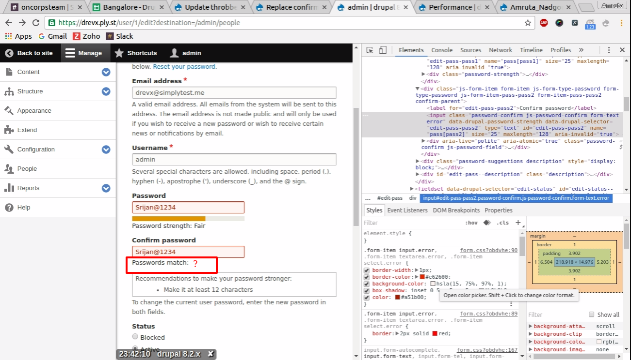
Amruta_Nadgouda commentedBug : If i try to apply a patch then the existing functionality of 'password match' is not working.
Comment #127
prashant.cFixing confirmed password status issue.
Comment #128
prashant.cAdding the correct patch file.
Comment #129
lendude@Prashant.c thanks for looking at this! The patch seems to be missing all the new files from #122
And since we now have javascript testing, this should get some javascript tests. And the update path also still needs a test.
Comment #132
manjit.singh@Prashant.c The only change that i found in the latest patch is in
/core/modules/user/user.jsexcept the missing files.Can you please create a fresh patch with your changes ?
Comment #133
prashant.c@Lendude , @Manjit.Singh
Thanks, made the suggested changes into the new patch file, same needs to be reviewed.
Comment #135
manjit.singhthis seems like not created with current head :( fails to apply.
Also please attach interdiff also in future. It help reviewers.
Comment #136
BarisW commentedHere is a re-roll.
Comment #137
BarisW commentedAnd here is the interdiff
Comment #138
BarisW commentedComment #139
lendude@BarisW thanks for the reroll! Manually tested this again and still works.
Bit of nitpicking:
this needs to go
The copy/paste 'dynamic password validation' comment probably needs a change.
And we still need a Javascript test for this. Setting to needs work mostly for the javascript test.
Comment #140
lendudeLike I said, needs work...
Comment #141
dagmarAdded Js tests and fixed comments from #139.
Comment #143
dagmarThis new patch checks that two reveal_passwords fields can work together.
Comment #144
dagmarThis needs an update on the tests now that #2770921: Feb 21st: Convert chunk of WTB to BTB by just moving classes, changing use statements adding traits was committed.
Comment #145
dagmarHm, after reading #2851541: [policy, no patch] No new WebTestBase tests in Drupal 8 after mass-conversion...
It seems we don't need a modification of the patch. Because the WebTestBase already exists in the user module. Back to NR.
Comment #147
dagmarRerolled after
array > []conversion. As an interesting note, I used the php-short-array-syntax-converter like other devs are doing but for this particular patch, some);need to be converted by hand.Comment #148
jludwig commentedI re-rolled the patch because it wasn't applying cleanly anymore. I also fixed 3 minor coding style issues:
Currently testing the patch and doing some further code review.
Comment #149
jludwig commentedIt works very well. I didn't provide text saying what's going on in the attached PDF, but it basically goes through the whole process: running update.php, configuring it on, testing it out, logging on to make sure it works, then changing it back.
Comment #150
yoroy commentedWhat is the reason to make this an optional setting instead of the new default? I wonder why core itself should provide two different ways of handling this.
Comment #151
andypostMaking such change require strong reasons in issue summary.
There's no agreement on usability reasons, at least they not explained in comments!
new form element introduced, but why it's not integrated to existing?
I pointed #2227381: Apply formatters and widgets to User base fields 'name' and 'email' and I'm sure proper widget is a way to go.
but what about install form and tests that supposes there should be 2 fields (all over contrib).
And it requre product manager review + maybe postpone til 8.5
Comment #152
nod_If I remember right that was the reason why it was not set as default. At least it broke drush, probably other things.
( edit ) also, 3 years ago. time flies.
Comment #153
aspilicious commentedExisting sites that are "themed" could be ugly if we swap the password widget. But we could/should enforce it for new installs and deprecate the old widget.
Comment #154
droplet commentedIt broke the PasswordManager #85.
By the way,
Why the ref articles talk about LOGIN SCREEN, but here used in a Change Password screen. Does it correct?
Comment #156
vprocessor commentedJust reroll of #148 for core version 8.5.x
Comment #157
vprocessor commentedI checked this patch on real projects, patch works good for me
Comment #158
cilefen commentedThank you for rerolling @vprocessor. We need peer review on this and as per #151 it needs work.
Comment #159
cilefen commentedwhoops
Comment #160
Christopher Riley commentedAlthough the patch works within the change password area the functionality that I believe was desired is the ability to do a reveal password on the login page so that the user can see what they are typing in. Lord knows there are enough uneducated users out there that don't remember the caps lock.
My two cents
Comment #162
merauluka commentedI could see the usefulness of allowing people to turn the strength indicator on and off in certain instances. Here's an updated version of #156 but allowing the
data-drupal-password-strengthvalue to be set at the form level and passed on through to JS.Comment #164
andrewmacpherson commentedI think this one should require an accessibility maintainer's sign-off before committing. @mgifford and I are both following this. I like the ideas here though, it would be good to have this.
Is this just about replacing the dual-field widget for creating passwords (profile edit, site installation) or will this be used on the user login form?
Depending how it gets implemented, there are potential security issues that impact visually impaired users. If a screen reader announces it as a password field, users may assume what they type is masked out, and be unaware that it's on screen and readable over their shoulder. And vice versa, it may be visually masked out, and a screen reader announces the keys being pressed.
Comment #165
andrewmacpherson commentedI think patch #162 lost some stuff from #156 that is still needed. It no longer has the JS function revealClickHandle(), for example. I'm attaching an interdiff for someone else to do a re-roll.
Comment #166
andrewmacpherson commentedI went scanning though the patches for important semantics like role or type attributes. I can see the approach of revealClickHandle() in #156 is toggling between
<input type="text">and<input type="password">. That's good to see, and is probably sufficient to answer the security concern I put in #164. I had been worried by some approaches I'd heard about where a text field is laid on top of a password field using CSS. I'll do some manual accessibility testing on this soon hopefully.Comment #167
andypostwhy only on user edit? register/login could use it as well
if they concurrent then you need to use "states" at the settings form
no reason to affect settings with personal data
Comment #168
lauriiiReroll from #156. I also tried to make few of the texts more generic since depending your site setup, they might affect multiple places.
Comment #169
jofitzRemoved "Needs Reroll" tag.
Comment #172
daniel kulbeRerolled against 8.8.x-dev
Comment #174
amateescu commentedThe reroll from #172 didn't include the new added by the previous patches.
Here's another reroll for 8.8.x and some small cleanups.
Comment #176
amateescu commentedFixed the deprecated method call.
Comment #177
bnjmnmThis would be a great addition to core! Here's a review to help move things along:
Even within the core/misc/ directory, there's no consistent naming convention for JS files, but the most common is separating words with dashes. (theres only one other example of all-lowercase combined words: tabbingmanager.js)
To lean in the direction of consistency and make the purpose of the file a bit clearer, something like password-reveal.js or password-unmask.js is preferable.
This label alone is probably not sufficient to those not yet familiar with this new functionality. This could be improved by making the label just "Use password reveal" and adding further information in
#descriptionThis file shouldn't be any different from HEAD -- the newline change causing this can be addressed with a quick
yarn js:buildI see these two instances of creating the
data-drupal-password-strengthattribute and setting it to true, but I don't see anything in the patch or core that puts this attribute to use, and it is always set to true regardless of the value of the corresponding user setting. Comment #162 mentionedThis may not be in scope of the issue either.
(but it is also possible I missed something in the prior 176 comments 🙂
More accurate to say the text is masked, referring to markup as "hidden" tends to mean it is not visible at all.
nit: handle/handler (should be changed in the function name as well)
This and
revealLink()should use ES6 arrow function syntax.This could use an assertion that confirms the password is not visible. This would prove that the form element errs on the side of caution in no-js sessions.
Since this is identical to existing logic in user.module, it may be worth moving this to a trait as problems could emerge if a change is made to one and not the other.
Comment #179
chop commentedAttempt to address issues raised in code review at #177 and re-roll against 8.9.x-dev
Comment #181
bnjmnmThanks for giving this issue some attention @chOP!
The test failure doesn't have anything to do with the patch itself, but a new requirement of FunctionalJavascript tests that wasn't present when the previous patch was added.
Adding this to
PasswordRevealTestshould take care of itI'll keep an eye on the issue and review again once the next patch is in.
Comment #182
chop commentedI will also rename that test class to
PasswordUnmaskTestmatch the renaming elsewhere.Comment #183
tarekdj commentedAttached a patch based on #181 and #182
Comment #184
bnjmnmLooks like a reroll is needed for the patch to apply. It should only require a change to
\Drupal\Core\Render\Element\PasswordConfirm::processPasswordConfirmIt should apply fine f the the
$element['pass2']array looks like this:Comment #185
sokru commentedReroll based on #183, taking into account the comment from #184.
Comment #186
honza pobořil commentedIt an age when most users should use password manager, Oauth or email login should we care more about usability of password field (what will be filled by a p. m.) or about better login options in core?
Comment #188
george.karaivanov commentedUpdate patch #185 to be applied on drupal 8.9.1
Comment #189
hardik_patel_12 commentedLast patch failed to apply , re-rolling for 9.0.x kindly review.
Comment #191
kishor_kolekar commentedplease review patch
Comment #193
mgiffordHere is another article highlighting why this issue matters https://uxmovement.com/forms/why-the-confirm-password-field-must-die/
@bnjmnm thanks for watching this. Were your issues from 2 years ago addressed? @andypost had some comments too and @andrewmacpherson a full 3 years ago.
Is @kishor_kolekar's last patch close?
Comment #194
sokru commentedIf the button element is chosen I think it should have also button class
<button class="button...">. This way it would be look ok on Olivero theme, but weird on focus with Seven theme.Olivero theme with patch #191:

If button class would be applied on Olivero theme:

If button class would be applied on Seven theme:

Comment #195
andrewmacpherson commentedI've already taken a quick read of the latest patch. I'd like to take time to do some testing with assistive technology
Good parts:
<input type="password">and<input type="text">. I think that's a safe method for assistive tech, but we should definitely do some manual AT testing before committing this. This was already the case last time I checked this issue.Needs work:
Question: if the password field is part of an AJAX-enabled form, and it gets re-rendered after an AJAX response, will it appear masked?
The button has a dynamic accessible name (i.e. the button text changes). This isn't very reliable....
It would be safer to employ an ARIA
role=switchpattern (which behaves similar to a checkbox). This way we avoid using a dynamic name, and avoid conflating the purpose with the current state. The idea is that screen readers would say "Show password, switch, not checked", then "Show password, switch, checked". See these fairly recent notes on switch role support.I wonder if "show" is too vague. This is about changing the behaviour of an existing input , but "show" is often used to mean "reveal additional controls". A clearer name would be something like "make password visible", so screen readers would say "make password visible, switch, not checked". Having said that, I've seen the "show password" name in plenty other websites, so it might be a familiar enough name; I still think "visible" would be a stronger term though.
The toggle comes after the text box, which can cause confusion in a couple of ways:
#descriptionis suitable.Leave the "needs accessibility review" tag in place for now. Get accessibility maintainer sign-off before committing.
Comment #196
andrewmacpherson commentedI was looking at Microsoft Edge DEV channel today (version 89, on Linux) and noticed a password setting I hadn't seen before.
Here's a screenshot of the button it produces:
This setting isn't available in the current stable releases of Chrome, Opera, or Brave. I don't know if this is an Edge-only feature, or whether it will be available in other Chromium-based browsers.
We should ensure our show-password button won't interfere with the one provided by the browser. I don't think we have to avoid providing one, or try to detect the browser setting though. We just need to make sure our button doesn't prevent a user operating the browser's built-in version.
Comment #199
rkollerIn the course of research for https://www.drupal.org/project/ideas/issues/3251513 I've discovered this issue here. I wanted to test the current state of the patch. But i was unable to apply the patch neither to 9.1.15 nor to 9.3.x-dev or 9.4.x-dev. In each case it failed to apply. :/
Comment #200
lendudeReroll and trying to clean up some CS issues, don't think I got all of them.....
Comment #201
lendudeLet's see what this does.
Comment #203
kostyashupenkoKicking jquery
Comment #204
rkollerthank you for the rerolls! the last two patches (#201 & 203) apply again on
9.4.x-devwith php8.0.14on ddev (even though #201 has failed tests). but unfortunately while the patches get applied and i see changes listed in the patch files applied to the sites assets - when actually accessinguser/1/editor perform a fresh site install i still see the old enter password/confirm password fields. the new pattern isn't used currently.Comment #205
Christopher Riley commentedLatest patch does not work with 9.4 via composer.
Comment #208
daniel kulbeUpdated patch for 9.5.x
Comment #209
daniel kulbeRe-upload
Comment #210
gauravvvv commentedFixed build errors, Attached interdiff for same. please review
Comment #211
smustgrave commentedSeems patch #210 failed to apply.
This was previously tagged for issue summary update which from what I can tell still needs to happen please.
Thanks.
Comment #213
rkollerDuring yesterdays usability meeting #3383430: Drupal Usability Meeting 2023-09-01 we've discussed #3272325: Password suggestions are hidden from screenreaders and the whole password creation and altering process in the Drupal installer and on the user profile page in general. This issue was touched during the discussion. There was a clear consensus in the group that from a usability standpoint it would be a more than welcome and important issue to fix.
I am adding the
Needs rerolltag as recommended in the meeting by @benjifisher and @lauriii . #201 "might" be a good place to start the reroll @lauriii presumes. All patches after that failed tests as well and as noted in #204 even though the patch in #203 successfully applied none of the actual functionality was available in the interface so maybe that is not a good place to start.And for the record #3383430: Drupal Usability Meeting 2023-09-01 will have a link to the recording of the meeting. The attendees at the meeting were @aaronmchale, @benjifisher, @emma-horrell, @lauriii, @rkoller, and @worldlinemine.
Comment #214
rkollerAnd for reference the following comment might be of use for this issue as well: #3272325-6: Password suggestions are hidden from screenreaders. I've compared the password field behavior there between Drupal, WordPress, Typo3, Joomla!, and CraftCMS including short videos for each of the systems illustrating the usage with MacOS VoiceOver. All of them have a hide and show functionality for the password but with differing behaviors implementation wise. Maybe the videos are of any use for this issue as well.
Comment #215
gauravvvv commentedI have created a patch for 11.x, please review
Comment #216
needs-review-queue-bot commentedThe Needs Review Queue Bot tested this issue. It fails the Drupal core commit checks. Therefore, this issue status is now "Needs work".
This does not mean that the patch needs to be re-rolled or the MR rebased. Read the Issue Summary, the issue tags and the latest discussion here to determine what needs to be done.
Consult the Drupal Contributor Guide to find step-by-step guides for working with issues.
Comment #217
rkollerThanks for working on the reroll @gauravvv
I've successfully applied the patch in #215 to a Drupal 11.x-dev install. The hide and show functionality is working in the latest version of Microsoft Edge on MacOS 12.6.8 while the hide and show icon and functionality is not available for Safari 16.6 and the latest Firefox. I will test it functionally with VoiceOver later today in Edge for now. And a few tests are also failing.
Comment #218
rkollerA few details I've noticed when testing in the latest stable version of Microsoft Edge and VoiceOver on MacOS Monterey (12.6.8):
1. As soon as a field that is showing and unhiding a password looses focus (for example you open devtools, you click outside of the field or window) the password is hidden again. Problem is the hide/show icon completely disappears. You have to clear the password field and start to reenter something that the icon is showing up again.
2. When the password field looses focus there is no announcement in the screenreader that the state of the password changes back to hidden. That way as a screenreader user I would expect that the password is still visible in the state I have set before?
3. Is the "confirm password" field necessary at all with the ability to hide and show the password? That way one is able to check and or copy and paste the visible password? Other CMSes also have dropped the confirm password field with a hide/show password functionality in place - see #3272325-6: Password suggestions are hidden from screenreaders
4. In Edge the Icon is not accessible by the keyboard. After entering a string into the password field and the hide/show icon was showing up I was unable to reach the hide/show icon by keyboard. I've tried to tab (for the "current password" field the "reset your password" link gets into focus for the "password" the "confirm password" gets into focus on tab) and to use VO and arrow keys. In both cases I was unable to reach the hide/show icon.
5. In combination with the announcement text " you are currently on a text field. to enter a text in this field type. this is a secure text field. text typed into this field will not be displayed and will not be spoken by VoiceOver." the option to hide/show passwords is invisible and not directly apparent to the screenreader user (#195 see also https://www.drupal.org/project/drupal/issues/2293803#comment-13968132 ).
6. If I manually click the hide/show icon and set the password to visible that change isn't announced by VoiceOver instead I again get the same announcement like when the password is hidden "you are currently on a text field. to enter a text in this field type. this is a secure text field. text typed into this field will not be displayed and will not be spoken by VoiceOver."
6. Unfortunately the functionality isn't showing up in Safari. But I suspect there might be some overlap and interference between the Safari password widget and the hide/show password icon.
Both inline inside the password field already leads to issues for Typo3
and it might be difficult to accomplish some sort of coexistence and clean layout for both.
one potential idea so solve 4 and avoid in particular 6 might be to add an hide/show button right after the password field with the icon and a label text instead of just the inline icon within the password field. that way things would be more explicit and clear - a pattern wordpress applies:
that might cover also the point brought up in #195 that just
hideandshowas label might be too vague for screenreader users.for sighted users having an icon with a label based on the state (hidden or shown) would make things clear; having just an icon might make some users think about its meaning. and for screenreader users having an a bit more verbose aria label with something like "make password visible" and the switch state would be clearer as well (the exact wording would have to be discussed). and @andremacpherson also suggested to make the user aware if the toggle comes after the text box.
Comment #219
vsujeetkumar commentedFixed the CCF issues, Need to addressed #218, So Keep as in 'Needs work'.
Comment #220
vsujeetkumar commentedFixed the fail test case. Please have a look.
Comment #223
utkarsh_33 commentedNow the show password is properly spaced.Attaching the screenshot.
Comment #224
hooroomooLeft some comments, could you also update the issue summary?
Comment #225
utkarsh_33 commentedComment #226
smustgrave commentedTrying to clean up the tags some. Don't see much use that this ticket was worked on at an event in 2016 :) feel free to add any back.
Hate to do it but was previous tagged for issue summary and don't believe that has happened.
Comment #227
utkarsh_33 commentedThe MR now has the password_type_reveal config set to true for the existing as well as new users so as to keep it consistent. The users can disable it if they want from the account settings.
Comment #228
utkarsh_33 commentedI had a discussion with @lauriii and @tim.plunkett and we decided to deprecate the password_confirm and remove the user configurability of the new password show/hide functionality.
Comment #229
catchDrupal\Core\Installer\Form\SiteConfigureFormalso needs updating to switch to the new element.Comment #230
rkollerSome additional aspects not mentioned yet. I've tested the lasted state of MR4780
I think the width of the password strength indicator should have the same width as the password field like without the patch applied. Because with the patch applied the strength indicator width follows the viewport width instead of the fields's width as shown in #223. For wide screen monitor >30" it becomes an even more visually challenging task to check the actual current strength and then jump back and forth to the password field.
Would it make sense to add the hide and show functionality for the
current passwordfield as well on the user profile page? what applies to thenew passwordfield applies to thecurrent passwordfield as well. If i want to see the entered new password i would also like to be able to see the current password entered.And was it an intentional step to remove the password suggestions box? The box isn't shown anymore after the first character is entered like before.
Comment #231
utkarsh_33 commentedComment #232
rkollerthanks for the changes @utkarsh_33! i've applied the latest changes and i can confirm that the password suggestions (#230.3) are back in and that the show and hide password functionality is also available for the current password (#230.2) now. neat thank you!
1. But by making the password suggestions available again the width of the suggestion box is now the same as the width of the strength indicator. that way that block gets even more visual weight for widescreen displays in particular.


i still vote for the behavior that was in place before the patch, that the width of the strength indicator and the suggestion box is the same as the width of the width of the password field.
2. Another detail i've noticed when testing the functionality on microsoft edge i've noticed that chrome based browsers provide such a functionality out of the box as an inline icon:
would it be possible to hide that icon chrome based browser provide somehow? cuz having two options alongside is sort of redundant and confusing to the users. plus the icon disappears as soon as the field looses focus and isn't reappearing if the field regains focus.
3. one detail that was first raised in #195 is the question how the state of the field (if hidden or shown) is announced to a screenreader user. i've added a jump mark to the link to leonie watsons talk on youtube: https://youtu.be/OUDV1gqs9GA?t=3219 . there she illustrates well the problem if the
aria-pressedattribute is used in combination with having a button label for the different states. in the current state of the patch the announcement for the toggle button in voiceover in safari is:show password, toggle button
hide password, selected, toggle button
for hide password it would make me at least think. if the dynamic button labels should be kept the suggestion in #195 was to use the
role="switch"attribute instead of thearia-pressedattribute.the other option might be to keep the
aria-pressedattribute but use a consistent label of eithershow password,reveal password, orView password. View password might tackle the worries @andrewmacpherson in #195 raised in regards of the clarity of the button label as well. for screenreader users that would be the clearest approach imho.for sighted users instead is having the same button label for both stats not that clear. two suggestions in that regard. in general would it make sense to move from a plain text link styling to a button styling? Then one option might be to have the label
View passwordand whenaria-pressedis set totruehave a pressed button styling that signifies the function is active. the downside i am not sure if a styling for a pressed toggle button already exists in the drupal design system?the other option might be to make the button label visually hidden and add an icon for the visible state (an eye icon for example) and an icon for hidden state (a striked through eye icon) and dont announce those icons by the screenreader?
4. another point mentioned in #195 about "The toggle comes after the text box, which can cause confusion in a couple of way" would still need an agreement on a solution. the suggested approach there is to go with an accessible description mentioning the nearby switch.
Comment #233
mgiffordI definitely prefer the show/hide feature to be outside the input field. That example with the Light/Dark mode that you pointed to in the Youtube video would work well. Would allow us to have the button as a button too. Probably we'd want to swap the text or image to let folks know that their password is now visible (or invisible).
Comment #234
narendrarWhen tested manually, found some issues. Please see attached screenshot:
Comment #235
narendrarComment #236
utkarsh_33 commentedI have assigned the show password button and Aria role=switch as mentioned in #195 along with the updated message requested.
Comment #237
utkarsh_33 commentedI have added the ability to add the strength bar optionally as you can see the screenshots addressing Comment#234.2.
Comment #238
utkarsh_33 commentedComment #239
smustgrave commentedSeems to have a test failure
Also could someone familiar with the issue take a look at the issue summary. Was tagged a long time ago but scanning the page don't know if it was updated.
Comment #240
bnjmnm<button>tag, as it should. However, it is styled like a link - there should be a means of visually distinguishing the button (which triggers functionality) from a link (which takes the user to a new destination). This should be happening regardless, but it's particularly a concern here since the looks-like-a-link toggle is quite close to an actually-a-link element that is styled the samedifferent take from the more-thorough #195, I'd prefer this information to be visually hidden as the hide/show state should already be reasonably apparent to sighted users via the buttons, and the password fields are already a bit visually noisy as-is. The
#descriptionapproach might but would need to preserve any existing description. Another possibility is using aria-description and appending any text from the description element.Comment #241
utkarsh_33 commentedI have addressed the feedbacks in #240 related to link should look like a button and also included the show/hide functionality in the login form.
 .
.
Attaching the screenshots to get feedbacks if any from design perspective for the latest change
Also regarding the comment related to #195 related to (The toggle comes after the text box...) i think I'm not a 100% sure about this change.So maybe some further help is required on that point.
Comment #242
simohell commentedRegarding #240 there is widespread patterns of having the "show password" styled as a link. For instance USWDS
https://designsystem.digital.gov/templates/authentication-pages/sign-in - that should be accessible.
But I do see the problem with having an actual link close by...
Comment #243
bnjmnmIf a user navigates to the password field via a screenreader, and that password field is currently set to
type="text", thus making the password field visible. They are not aware of this fact until after they've entered a password and navigated forward to the hide/show button. Ideally, when the password is fully visible, an AT user should be aware of this as soon as they land on the password field.Comment #244
utkarsh_33 commentedAFAIK If the user navigates to the password field via a screenreader the password field is set to type="password" by default unless you toggle it's type to text after pressing the show password button.

Attaching the screenshots for respective states.
Initial state:
State after clicking the show password button:

Comment #245
ckrinaI totally understand the different points made for this element to look more like a button, and different from a link. But on a design perspective using a regular button is not good enough: apart from it being an unusual pattern, it takes too much visual attention to it and the expectations from users after clicking a button might not be what we expect.
All the accessibility feedback needs to be addressed but we can't penalize sighted users this way. Luckily, this discussion has already happened with other UI elements and we reached an agreement for an element: the Action link, used in the "Show/hide row weights".
So my recommendation here would be using the component Action link, on its small variation. It would look like this:
(Obviously the icon would switch with the text too as it's already happening with the "Show/hide row weights".)
Comment #246
utkarsh_33 commentedThanks for the clarity @ckrina. I have updated the element as requested.Attaching the Screenshots for both the states.

Show password state:
Hide password:

Comment #247
utkarsh_33 commentedComment #248
utkarsh_33 commentedI have also updated the CR.
Comment #249
omkar.podey commentedNice work, Updated CR, most changes are related to tests which seem reasonable, just some nits with JS parts. Also needs an issue summary update since it is no longer an option to switch between the two.
Comment #250
utkarsh_33 commentedComment #251
smustgrave commentedWith all this feedback still believe issue summary should be updated to latest. Or least documented why it's no longer needed
Comment #252
utkarsh_33 commentedComment #253
omkar.podey commentedTried to test with the MacOs Voice over functionality but it doesn't announce the
aria-descriptioncould be related to https://developer.mozilla.org/en-US/docs/Web/Accessibility/ARIA/Annotati....It might work with other screen readers do you know of any ?
Comment #254
utkarsh_33 commentedComment #255
tim.plunkettComment #256
rainbreaw commentedThe following are comments based on the a11y maintainers' discussion during the office hours today (and not a recommendation for moving this forward -- we are putting them here for reference). A maintainer will follow up with an actual recommendation shortly.
--------------
When providing a toggle switch, it is useful to focus the label on the function which is changing rather than changing the whole text. We aware that needs of screen reader users may be at odds with the needs of people with cognitive disabilities.
In order to prevent confusion for both an individual using a screen reader (changing the label of a toggle element), and an individual with a cognitive disability that can make it difficult to generalize concepts and need things to be direct and explicit.
In this case, a label of "password visibility" would focus on the function of the toggle instead of the state, which can avoid this conflicting confusion.
A screen reader user will also have an affordance through the screen reader indicating the current state, so the same would need to be present for a sighted user. Example: an icon that changes its qualities to convey the current state to the user. It should not be assumed that the actually presence of a visible password is sufficient to convey the current state to a sighted user.
Comment #257
prashant.cComment #258
bnjmnmCurrently, visibility can only be toggled by pointer device, so it is not possible to test screenreader/AT implementation.
I left feedback in the MR regarding how to address this, and once that is completed I can potentially provide accessibility signoff.
Comment #260
brooke_heaton commentedHey folks, been around for a while and trying to follow the transition from patches to MRs but as I'm on Drupal 10.2 I have absolutely no idea which patch or MR I should be using for this. Can anyone advise?
Comment #261
kunal.sachdev commented@brooke_heaton, you can use this https://git.drupalcode.org/project/drupal/-/merge_requests/4780 MR.
Comment #263
kunal.sachdev commentedAddressed all the feedback. Also there is an unrelated CSpell failure in MR
fatal: bad object c574a6e4f0867d27a49a244ee9648d7adfaf9f9b.Comment #265
kunal.sachdev commentedGoing to work on resolving the test failures.
Comment #266
kunal.sachdev commentedThe performance test is failing because this is introducing an additional cache query in
core/modules/user/user.module::user_form_process_password_unmask(). I think we can increase the query counts by one to resolve the test failure.Comment #267
kunal.sachdev commentedComment #268
mgiffordI took a look with this issue with VoiceOver, and with keyboard-only reviews. This looks good. Like the new pattern with the show/hide text.
Comment #269
rkollerI've noticed one detail when I tried to log into the site with the latest changes from this MR applied. The login screen is also showing me the password strength indicator as soon as i start to enter a password there.
plus the
Show passwordwould probably need some styling.Comment #270
mgiffordThere's been some discussion in Slack to move the password strength indicator before the input form so that a user is told how they should comply before fill in the form. I thought that the password strength indicator was semantically linked to the password field by aria-describedby but can't seem to find that now.
I suspect with these changes we should put on "Needs Accessibility Review" and "Needs Usability Review" but I wonder if we can't commit this and create two smaller follow-up issues.
This one is already approaching its 10th anniversary.
Comment #271
needs-review-queue-bot commentedThe Needs Review Queue Bot tested this issue. It no longer applies to Drupal core. Therefore, this issue status is now "Needs work".
This does not mean that the patch necessarily needs to be re-rolled or the MR rebased. Read the Issue Summary, the issue tags and the latest discussion here to determine what needs to be done.
Consult the Drupal Contributor Guide to find step-by-step guides for working with issues.
Comment #273
sakthi_dev commentedRebased with latest changes by resolving conflicts.
Comment #274
rkollerThere is one detail to note about the micro copy used for the aria-label that is based on the suggestion made in #195) . When tested in VoiceOver you get the following announcements:
make password visible, on switchmake password visible, off, switchThe problem is the following, the cognitive load is rather high for figuring out what the actual current state is and what the future state will be when clicking the button.
make password visible, on switchdescribes an action to take, to make the password visible, with the switch set toon- but the state the password field is in is hidden. While withmake password visible, off switchthe password is actually shown. Based on thearia-labelI would expect that state of the password field the exact opposite way around than it actually is.I've discussed the topic with @mgifford in this thread on Slack as well as @Emma Horrell today. There was a consensus in both discussions that the current label is hard to comprehend in context, even though the reasoning behind was valid in the first place.
In both discussions we've tried to ideate and come up with alternatives. Instead of using a task like "make ..." use a term that describes the state or function of the button was the goal. Something like
Password camouflagewould describe things well but it is a way too abstract term. Other ideas werePassword cloak(the term cloak is usually used in a slight different context not to hide but to encrypt),Password mask(the term mask is probably too ambiguous, unclear and context sensitive), andPassword hidden. In the end we tried to simply invert the termvisibleand remove the verbmakewhich brought us to:Password invisible, on, switch=> password hiddenPassword invisible, off, switch=> password shownStill not perfect but it would be at least more clear. We also tried to explore what other sites and CMSes use, but most or better all of them in case they have the hide and show functionality use the same switching labels sighted users see (checked a few: WordPress, Joomla, GitHub, GitLab, Twitch, Amazon, the MoJ Design System from gov.uk). Further options could be to do some wordsmithing for the aria-label at the next usability meeting and/or to run a one-two punch content test with users.
Comment #275
omkar.podey commentedI guess the show password isn't that important on the login page so just removed it with the strength indicator.
Comment #276
needs-review-queue-bot commentedThe Needs Review Queue Bot tested this issue. It fails the Drupal core commit checks. Therefore, this issue status is now "Needs work".
This does not mean that the patch necessarily needs to be re-rolled or the MR rebased. Read the Issue Summary, the issue tags and the latest discussion here to determine what needs to be done.
Consult the Drupal Contributor Guide to find step-by-step guides for working with issues.
Comment #277
omkar.podey commentedUpdated for login show password.
On hover

Comment #278
omkar.podey commentedComment #279
kunal.sachdev commentedThe changes looks good.
Comment #280
longwaveAdded some questions to the MR.
Comment #281
longwaveAlso this feels like a fairly late and possibly disruptive change, should we consider keeping the old element around until Drupal 12 as per #3410492: Defer disruptive 10.3 deprecations for removal until 12.0? There seems no harm in doing so.
Comment #282
rkollersorry for the late reply @omkra.podey but i had to wait before i got word from the others who ideated on the aria-label suggestions with me. i've now manually tested the patch again another time:
It is a good choice that you've readded the hide and show password button in #277. It is definitely useful for the login page in the front end. the only nitpick i've noticed in claro there is the eye icon, that icon is missing in olivero in the front end. but this minor styling issue might moved to a followup issue?
in regards of the aria-label
Password invisibleit is definitely an improvement overmake password visiblemaking the label more clear. I still had some doubt after actually testing it with voiceover becausePassword invisiblefrom a grammatical perspective sounded slightly off and something likePassword invisibility, onwould feel more grammatically correct as @Emma Horrell put it. But the terminvisibilityhas the downside that it is too complex andinvisibleconveys the meaning adequately. So the arial-label seems good to go. And there is always the option to simply change the string of the aria-label at a later point based on user feedback and running some user test like for example a one two punch user test. But that could be done in a follow up issue if necessary and shouldn't hold back this issue.this MR looks good overall
Comment #283
omkar.podey commentedComment #284
kunal.sachdev commentedThere is one remaining unanswered thread in the MR https://git.drupalcode.org/project/drupal/-/merge_requests/4780#note_280791.
Comment #285
omkar.podey commentedComment #286
needs-review-queue-bot commentedThe Needs Review Queue Bot tested this issue. It no longer applies to Drupal core. Therefore, this issue status is now "Needs work".
This does not mean that the patch necessarily needs to be re-rolled or the MR rebased. Read the Issue Summary, the issue tags and the latest discussion here to determine what needs to be done.
Consult the Drupal Contributor Guide to find step-by-step guides for working with issues.
Comment #287
omkar.podey commentedComment #288
smustgrave commentedI believe all threads have been answered, though can't close any. But MR needs manual rebase
Comment #290
mithun sPushed a rebase from the 11.x branch. Please review
Comment #291
smustgrave commentedSeems rebased added some failures.
Comment #295
pooja_sharma commentedAfter rebased MR, fixed test failures of pipeline(II stage)
However, there are still some test failures of pipeline(III stage) that's needs to be addressed.
Comment #296
pameeela commentedComment #299
andypostnot clear what's left here