
 Come together with the global Drupal community in Rotterdam, 28 Sept – 1 Oct 2026. Sessions, contribution, connection, and Early Bird savings until 8 June.
More Seven Theme issues: #1986434: New visual style for Seven
Problem/Motivation
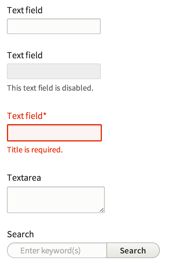
A big part of this style guide is to find a consistent styling for our most basic elements. To do this we wish to change the text input slightly, mostly introducing a border radius and slightly changed background color. In Seven's initial design the hard corners where throughout core, however for the updated style we changed this to achieve a more softer look.
Right now its not clear to the amount of items we can stretch this but ideally this is something we can apply to all form elements unless specified differently.
We developed Proposal: A Style Guide for Seven. This issue aims to introduce the proposed styling for text input in core
To quote the rationale provided:
Text inputs are styled to be recognizable but not garish, with a subtle background tint (#f0f0f0). A slight softening of text inputs is achieved with a 2px border-radius; this is a subtle refinement that we use throughout form elements to subtly soften otherwise harsh corners. For consistency, we propose changing the D7 “throbber” to a “spinner” styled similarly to the progress bar component (see below) for consistency. To reduce UI clutter, the spinner would appear only while awaiting a response from the server.
Note that the required field marker is no longer red, both to reduce UI clutter (without removing information) and to allow red to be reserved exclusively for error states and danger actions.
Proposed resolution

We propose to add a border radius of 2px, change the background color to #f0f0f0 , and remove the red required indicator.
Remaining tasks
- Update patch styling to include time inputs
- Produce and patch and an interdiff
User interface changes
All input form element styles will be changed, no functional differences.
Test Pages
- /core/install.php
- /node/add/article
- /admin/structure/views/view/content - Try changing a few settings
- /admin/structure/views/add
- /admin/structure/block - Try adding a block
- /admin/structure/types/manage/article/fields/node.article.body
Related Issues
| Comment | File | Size | Author |
|---|---|---|---|
| #223 | Screen Shot 2014-07-23 at 9.32.23 AM.png | 40.21 KB | mgifford |
| #222 | form-items-label-styling-1986418-222.patch | 359 bytes | lewisnyman |
| #217 | Screen Shot 2014-07-21 at 11.25.38 AM.png | 13.84 KB | webchick |
| #217 | Screen Shot 2014-07-21 at 11.24.10 AM.png | 16.14 KB | webchick |
| #217 | Screen Shot 2014-07-21 at 11.22.35 AM.png | 12.46 KB | webchick |

Comments
Comment #0.0
Bojhan commentedUpdated issue summary.
Comment #1
oresh commentedStyles taken from ry5n's sandbox + some additional styles as said above:
- red * changed to grey and made bolder
- search input has a little bit different style. Buttons are covered in another issue, so i didn't touch this.
- Auto submit search input has border radius on all sides
Additional:
In the way it's done right now - .error class is added only on the input and not form-item, making it impossible to style label and description. Though .form-disabled class is handled
Other fields:
We still need styling for items like file upload or image fields (as in style guide) - we haven't done them yet in sandbox. They are also not covered by this issue (as seen by screenshot).
Comment #1.0
oresh commentedUpdated issue summary.
Comment #2
Bojhan commentedNot sure if its related to this patch, but I get an error on install with this
Comment #3
swentel commentedRedundant space
Same here
Same here
Same here
@Bojhan don't think this patch can cause installation errors, as it's only css.
Comment #4
aspilicious commentedSimplytest.me fails on this... o_O
Comment #5
aspilicious commentedComment #6
swentel commentedWorks perfectly fine on local install, it's CSS people ...
Comment #7
scronide commentedRemoved the trailing spaces, split the ".form-text, .form-textarea" selectors across separate lines and indented their properties. I also made similar changes outside of the scope of the original patch for consistency's sake.
Comment #8
scronide commentedComment #9
aspilicious commented@swentel Yeah but it's strange simplytest.me crashed only on this one O_o. I know it couldn't be caused by the patch. :)
Comment #10
lewisnymanThe styling and the CSS looks fine for me. We can add the additional error styling in a follow up patch.
Comment #11
Bojhan commentedPlease add designers in the credit for this patch.
Comment #12
ry5n commentedSince these all appear as text inputs, we should use a class to assign the appearance, rather than targeting individual elements:
.textinput {---
Selectors like the above are not cool: descendent selector for no obvious reason, overqualified selector for 'label.option'. This selector would be much better as a stand-alone class. That said, cleaning up the css architecture in Seven is going to require a coordinated effort with HTML cleanup in core. If maintainers feel that that should be follow-up, that would be OK.
Likewise, we should at least try to use the new standards for states, i.e. 'is-disabled'. State classes are the one place we should see double-qualified selectors: .something.is-disabled. Analogous to .something:disabled. Speaking of which, if the item supports the ':disabled' pseudo-class (form elements), that should be present in the css too. So this is also not up to standard:
Assuming
1. our previous '.textinput' class,
2. '.field' is the new name for a component consisting of an input with label, description, etc.
3. form elements get the 'disabled' attribute when disabled,
The above should be refactored to something like this:
---
The standard rounded corners in the style guide, including for text fields, is 2px, not 3px. Also, per coding standards each of those selectors should be on its own line.
I’d keep the focus transition.
Comment #13
Bojhan commentedComment #14
danmuzyka commentedAssigning to myself...
Comment #15
danmuzyka commentedNot sure about refactoring the markup so that we can use different selectors, such as
.textinput; I'll defer to others on that change.Attaching updated patch that changes the border radius to 2 pixels, and adds vendor prefixes for border-radius. Also adding interdiff.
Comment #16
echoz commentedIt seems like we no longer need prefixes for border-radius.
http://caniuse.com/border-radius
http://css-tricks.com/do-we-need-box-shadow-prefixes/
Comment #17
aspilicious commentedYeah remove the prefixes
Comment #17.0
aspilicious commentedmeta issue added
Comment #18
aspilicious commentedThese changes are unrelated and incorrect. In core we always use 6 digeits for colors and 0.x when working with decimal numbers
Comment #19
echoz commented@18, the Format section of the CSS formatting guidelines states "When hex values are used for colors, use lowercase and, if possible, the shorthand syntax..."
Comment #20
aspilicious commentedoh ok :s
Comment #21
lewisnymanComment #22
lewisnymanI think it's a good idea to deal with the property standardisation in another patch. It makes this patch very hard to apply, it keeps getting out of sync with core.
Comment #23
lewisnymanRe-roll.
Comment #25
frankbaele commentedcleaned up the patch to only contain the relevant css and no refactoring css and also updated it to the current head
Comment #26
rteijeiro commentedPatch applies well and seems to work well.
Comment #27
lewisnymanNice work guys, just a few improvements.
I think ems would be more appropriate
We no longer need prefixes on border-radius
Are we keeping the transition? It would be nice
Comment #28
emma.mariaComment #29
emma.mariaI have add the improvements.
Comment #31
emma.mariaHere's a patch that should hopefully pass this time.
Comment #32
rteijeiro commentedComment #33
emma.mariaComment #35
lewisnyman#31: form-items-styling-1986418-30.patch queued for re-testing.
Comment #37
rteijeiro commented#31: form-items-styling-1986418-30.patch queued for re-testing.
Comment #38
rteijeiro commentedI have found some vendor prefixes and I am not sure if we should remove them. Pasted some examples. What do you think?
Comment #39
lewisnymanIf in doubt go to http://caniuse.com with our supported browsers in mind. It would be nice to find a way to achieve this consistently across core. Maybe it should be a separate page of our CSS standards?
Comment #41
rteijeiro commented#31: form-items-styling-1986418-30.patch queued for re-testing.
Comment #42
jjmonterey commentedI couldn't find an example of a disabled text field in d8 Core as displayed in the png above(Screen Shot 2013-05-03 at 10.29.50 PM.png).
My screenshots of current text fields were taken from the site-wide contact form: /contact
Comment #43
jjmonterey commentedScreenshot of text box and text area not required from an article with restricted text:

Comment #44
lewisnymanThe latest patch includes button styling files, they are never loaded though. Should be easy to remove.
Comment #45
mgiffordI haven't tried the latest patch, but from scanning through it and looking at the screenshots in #42, I think the biggest accessibility problem is conveying too much via color. I like the addition of the red outline for disabled text fields, but wonder how a color blind person would be able to determine the meaning?
Think this will be a good addition to Core.
Comment #46
scronide commentedI believe #42 and #43 show the current state of Seven, not the effects of the patch.
That said, for either: the majority of people with colour blindness will still perceive a red hue. Folk with complete red-blindness will still recognise bolder outlines. The most important aspect of the colour choices is that normal fields, error-state fields and focused fields appear distinct.
Comment #47
lewisnyman#31: form-items-styling-1986418-30.patch queued for re-testing.
Comment #48
lewisnymanThe previous patch included the buttons styling somehow. Let's get some up to date screenshots.
Comment #49
eigentor commentedRe-uploading with another filename the image to make it visible in the issue summary.
Comment #49.0
eigentor commentedupdated related issues
Comment #49.1
eigentor commentedTried to make image visible.
Comment #49.2
eigentor commentedOnce more the image. New source: https://...
Comment #50
rteijeiro commentedPatch applies well and styling seems ok. (See screenshots)
Is it a RTBC?
Comment #51
_12345678912345678 commented#48: form-items-styling-1986418-48.patch queued for re-testing.
Comment #53
_12345678912345678 commentedI did the auto re-test and the patch failed. I will get on GIT and manually test it as well.
Comment #54
Bojhan commentedJust wondering, angie was reviewing this - is there some kind of padding on the title field because its off, by some - in regards to the body.
Comment #55
lewisnymanRe-roll! I haven't looked into the title styling yet. Go testbot!
Comment #56
bitingduke commentedLast patch applies well to me.
I've tested in Google Chrome, Mozilla Firefox and Safari. The styling seems work on test pages.
Comment #57
josephrossetto commentedTesting /admin/config/system/site-information, and "error" class is not injected in the label for text input field.
Comment #58
aschiwi commentedSo "needs work", right?
Comment #59
josephrossetto commentedYes.
Comment #60
lewisnymanI'll add this.
Comment #61
lewisnymanOk, I've implemented two theme functions to add error classes to the label and description.
Comment #62
lewisnymanComment #63
bsnodgrass commented#61: form-items-styling-1986418-60.patch queued for re-testing.
Comment #65
lewisnymanRe-roll.
Comment #66
lewisnyman#65: form-items-styling-1986418-65.patch queued for re-testing.
Comment #67
tkoleary commented@LewisNyman
Looks awesome. The only thing I noticed is that when overlay is uninstalled the focus effect appears to shift right a few pixels.
Comment #68
Bojhan commentedHaving used this, I am still not 100% sure - it looks rather inconsistent in combination with the other form elements.
Comment #69
lewisnyman@Bojhan, which form elements? We have designs for other form elements such as the select inputs. Do we need more designs to achieve consistency? I don't think we have it now.
Comment #69.0
lewisnymanAdded test pages
Comment #70
idebr commentedThe focus shadow is hidden on the left because of overflow: hidden on .layout-node-form (see visual illustration in attachment). This cannot be unseen :(
This breaks the autocomplete throbber. It is now completely missing from autocomplete fields such as entity reference, which used to be the only visual cue the field was more than a plain textfield
Indenting error in closing tag :P
Comment #71
idebr commentedComment #72
lewisnymanThanks for the review. I don't know why node-layout-form had overflow hidden on it. I've fixed that along with the other bugs.
Comment #73
parthipanramesh commentedWorks.
EDIT: Sorry I did somthing wrong. Doesn't apply..
Comment #74
webchickSorry, no longer applies.
Comment #75
idebr commentedThis breaks the node layout form for secondary input as it applies the 'Position Is Everything technique for equal-height columns: http://www.positioniseverything.net/articles/onetruelayout/equalheight
Comment #76
philipz commentedThis is re-rolled patch #71. I've removed the
seven.themechanges in it so this is pure css patch.I'm not sure what was the code in
seven.themefor but all it seemed it did was breaking required labels of form elements to something like this: "Title!required".Comment #77
idebr commentedComment in #75 still needs work
Comment #78
philipz commentedYes, but I'm wondering if this could be fixed from the other end.
I'm not sure if there's an issue about 'Position Is Everything technique' and why this was chosen?
This looks like an old hack. Maybe it could be changed to
display: tablein a follow up issue.Comment #79
lewisnyman@philipz It would be good to add the theme functions back in. The theme functions in core must have changed and knocked it off a bit. I think we only added a few additional lines to add error classes on to the description and label.
I think the simplest way to solve the content creation screen problem in this issue is to add
padding-left: 4px;to.layout-region-node-main.Comment #80
philipz commentedOK I'll update and include the theme functions and the padding-left fix today.
@LewisNyman what do you think about changing the equal heights columns approach to media query + display: table? Is this something I could try and open issue on or is this topic closed and it's not going to change?
Comment #81
philipz commentedTheme functions re-added. The "Title!required" problem is gone and this must have been caching issue on my side.
Overflow fixed and workaround padding added.
Comment #83
philipz commentedThe old theme function in this patch was using now deprecated
form_get_errorwhich now takes$form_statearray as second parameter and it is not available in the theme function (or at least is not to my knowledge).I'm not sure this can be done like it was before.
Comment #84
lewisnymanLooks like you can check if the '#errors' attribute is empty? Works for me. Looks like we're almost there.
Comment #85
philipz commentedYes, it is very close now :) I don't have much time right now but the only minor problem is
Comment #86
lewisnymanYep nice catch
Comment #87
philipz commentedIt looks like this might be RTBC :) One thing I found but not sure if this is related issue is the required marker printed as "Array" on a field I added.
This is not happening for Title field. I cleared caches of course.
Comment #88
lewisnymanNo this happens without the patch. Good find though. Is there an issue for this already?
Comment #89
philipz commentedEdit: it seems that date field had theme_ functions converted to Twig in #1963476: datetime.module - Convert theme_ functions to Twig which might be the reason for this to happen.
I'm not sure if this really needs fixing or rather it's just waiting for some other patch to make it work like it should.
Comment #90
philipz commentedCreated issue for this #2160365: Date field required marker rendered as "Array".
Anyway the form styling patch should be ready to be commited but I guess someone else should look on it right?
Comment #91
lewisnyman86: form-items-styling-1986418-86.patch queued for re-testing.
Comment #92
mgiffordI didn't see any accessibility problems with this patch. Looks good too.
Comment #93
adnanc commentedLooks good!
Comment #94
alexpottWe are replacing calls to theme with calls to drupal_render() - see #2006152: [meta] Don't call theme() directly anywhere outside drupal_render()
Could be replaced with Xss::filter()
Comment #95
idflood commentedUpdated the patch in #86 to fix problems described in #94.
For the renderable array I took the patch in #2177653: Replace theme() with drupal_render() in form.inc as a reference. I also used the Xss::filterAdmin instead of Xss::filter since it was previously a filter_xss_admin.
Comment #97
idflood commented95: form-items-styling-1986418-95.patch queued for re-testing.
Comment #98
idflood commentedComment #99
alexpottthis would be simpler if done like this.
$form_element_label = $variables + array('#theme' => 'form_element_label');Comment #100
alexpottComment #101
idflood commentedThanks for the review @alexpott. I tried your suggestion but it triggered many warning on the create article page:
But I looked again at #1986418: Update textfield & textarea style and the patch was updated with a cleaner version.
Comment #103
idflood commented101: form-items-styling-1986418-101.patch queued for re-testing.
Comment #104
idflood commentedComment #105
idflood commentedPatch wasn't applying anymore so here is a reroll.
There are two things I didn't reapply since the elements were not anymore in the css:
I was not able to find which issue/commit removed these style but without that the autocomplete still looks good. Here is how it looks after applying the patch:

edit: didn't mean to "delete" all these files, I don't know what happened.
Comment #106
idflood commentedComment #107
lewisnyman105: form-items-styling-1986418-105.patch queued for re-testing.
Comment #109
lewisnymanComment #110
idflood commentedReroll of #105, it had a conflict with 'use Drupal...' added to seven.theme.
Comment #111
idflood commentedComment #112
lewisnymanOnly one space before comments.
I don't know why but it looks like the label theming changes is no longer adding the error class?
Comment #113
idflood commentedHere is a new patch which should fix the problems described in #112.
Comment #115
idflood commented113: form-items-styling-1986418-113.patch queued for re-testing.
Comment #117
mgifford@idflood The install fails on SimplyTest.me as well.
Comment #118
idflood commentedMy bad, the error was caused by #2173655: Refactor theme() to _theme(); make it a private API to discourage module developers from circumventing the renderable build system.
Comment #119
lewisnyman118: form-items-styling-1986418-118.patch queued for re-testing.
Comment #121
lewisnymanReroll. This is looking RTBC worthy to me. Any objections?
Comment #122
lewisnymanComment #123
lewisnymanWhoops answered my own question. Found this overqualified selector
Comment #124
rteijeiro commentedWorking...
Comment #125
rteijeiro commentedWhat about this one?
Comment #126
rteijeiro commentedAdded #123, #125 and some other fixes (just see interdiff.txt)
Comment #127
philipz commented126: form-items-styling-1986418-126.patch queued for re-testing.
Comment #129
philipz commentedRe-roll with one simple change.
Those selectors:
seemed too specific so I changed them to:
Comment #130
lewisnyman129: form-items-styling-1986418-129.patch queued for re-testing.
Comment #131
Coornail commentedHey
Tested the last patch:
Comment #132
tompagabor commentedComment #133
thamasTesting the patch in #131.
Notice: in the description the input background is defined as #fafafa but in the code it is actually #fcfcfa. I think it is OK, but wanted to mention it.
/core/install.php
Generally OK, but box-shadow cant be seen on the password fields. I think fixing that could be a separate issue.
/node/add/article
Looks good. ("Athored on" field checked too.)
Notice: CKEditor appereance should follow these other input elements. Should be a separate issue.
/admin/structure/views/view/content - Try changing a few settings
Looks good.
/admin/structure/views/add
Input fields are OK.
Fieldsets need work but that will be a separate issue.
/admin/structure/block - Try adding a block
Looks good.
/admin/structure/types/manage/article/fields/node.article.body
Looks good.
Comment #134
tompagabor commentedI tested all the url-s.

One more differencies:
The field with error not exactly the same, what is proposed, but maybe good enough to commit.
Screenshot:( edited 3 screenshot on one image)
Comment #135
tompagabor commentedfixing core/install.php box shadow. It is, because using overflow: hidden;
Comment #136
Bojhan commentedAh, interesting catch.
The background should indeed, have a small red hue.
Comment #137
Bojhan commentedAlmooooost there! :)
Comment #138
tompagabor commentedHere is the patch i missed to upload to #135.
Comment #139
lewisnymanI recommend we add 4px of left padding to the install form like we did for the content creation page, I assume we are using overflow hidden for a reason there?
Comment #140
philipz commented@Lewis: What element overflow are you talking about?
Comment #141
tompagabor commentedHere is the patch for background-color problem on form-error, and the deleted box-shadow patch.
Comment #142
tompagabor commentedComment #143
philipz commentedI'm not sure but it is possible that this is no longer needed:
because of #2195675: Breadcrumbs push the sidebar down on node edit pages where
.layout-node-formand itsoverflow: hiddenwas removed.I will double check that.
The overflow was for the faux column of the node meta data in the right column.
Comment #144
lewisnyman@philipz Yeah worth double checking.
Looking good! I did find one error introduced on the install form.
Before:
After:
Ignore the fact that everything is outside of the box because that's being fixed in #2193271: Remove default #size attribute from core
Comment #145
tompagabor commentedfixed the small ( < 1010px ) screens layout.
also removed the lines from the #143 comment, without errors.
Comment #146
tompagabor commentedComment #147
philipz commentedThis patch got suddenly huge ;)
Comment #148
philipz commentedI've checked that the
left-paddingof.layout-region-node-maincan be removed.Comment #149
tompagabor commentedAdded back the left-padding of .layout-region-node-main.
Comment #151
philipz commentedSorry if I wasn't clear enough. The padding CAN be removed. I set it to Needs work because patch #145 was over 90 kb and clearly mixed with some other patch applied.
Comment #152
tompagabor commentedOK, some code changes on the http://git.drupal.org/project/drupal.git repo, and i made create diff from there.
Now i create a fresh clone, and make a new patch.
Comment #154
lewisnymanI've clicked through all the problem pages and everything looks great!
Comment #155
lewisnyman152: form-items-styling-1986418-152.patch queued for re-testing.
Comment #156
rteijeiro commentedSo RTBC then?
Comment #158
tompagabor commentedneeds some reroll, becaouse there is no more theme_form_element_label, or theme_form_element
Comment #159
tompagabor commentedIs it good, to add the error class to the wrapper div?
Is there always a wrapper class on the seven theme?
The patch is doing this.
Comment #160
tompagabor commentedComment #161
lewisnymanLooks like we just need a preprocess function to add a class to the label on error. If you look in the patch in #152 you can see we were overriding a theme function to add a class there but I bet we could do it in a preprocess.
Comment #162
tompagabor commentedI need to upgrade the core/includes/form.inc -> theme_form_element_label, because it can't handle additional classes. No we can add classes through $variables.
Comment #164
tompagabor commentedupdate theme_form_element_label function documentaiton.
Comment #166
tompagabor commentedOK, i rerolled it again :)
Comment #167
corbacho commentedThumbs up!. It looks soo good!

Tested in Mac (FF, Chrome, Safari) and IE 11,10,9
Screenshot attached.
Chrome/Safari in Mac doesn't apply padding on "select" elements. Firefox Mac and IE9-IE11 yes. So they have more consistent look in the latter case.
But this is something we can't control easily, unless we set a 'height' value to the select element. Maybe in a follow-up issue if people agree that is worth it.
For me it's RTBC
Comment #168
sunThis feature addition needs to go into a separate issue:
#1244338: Add generic #class property for form elements
Was this tested in other themes than Seven?
Can we remove this additional/duplicate blank line?
Isn't this what #1493324: Inline form errors for accessibility and UX tries to resolve, beyond Seven theme?
minor
Comment #169
webchickNot quite sure what this change does, and the two CSS-inclined people at the sprint were unsure as well.
Since this is changing something outside of /core/themes/seven, let's get some before/after screenshots in both Stark and Bartik, ok?
Comment #170
echoz commentedThat overflow: hidden; (in 2 places, one for narrow viewport) was added in #2100509: Password strength indicator for site maintenance account is aligned incorrectly on the installation screen so that might help to not miss testing those screens.
Comment #171
tompagabor commentedI need some clarification.
First:
I delete "overflow :hidden", because in the SEVEN styleguide, the input text has a box-shadow, and the "overflow: hidden" cut this shadow. First, try to use 4px padding, but this padding also break the layout. Then i create another CSS for clearing floats.
I think we can move this CSS modification to the SEVEN stylesheet.
Second:
This issue is about the textfield & textarea style, only in the seven theme.
We don't need to modify the whole CSS, and the labels, and descriptions.
Third:
Can we make another issue for the styling the error field labels and descriptions? If we can, than we can commit this issue in a short way..
Comment #172
lewisnymanAgreed, let's change the patch so we're only modifying Seven CSS and .theme files.
If you think we are close to achieving it the error label and description styling here then we can expand the title of the issue. If you think it's too much trouble and is better off split into a separate issue (it looks like it is) then let's do that.
Comment #173
tompagabor commentedMoved user.module.css modifications to seven/style.css.
Remove the preprocess function from seven.theme, because to add an error class to the form label and description is a more complex problem. Now just format the inputs and textfields.
This issue: #1244338: Add generic #class property for form elements is about to add #class to the form label.
This issue: #1493324: Inline form errors for accessibility and UX is about,to add inline form errors. My idea is, after this was coomited, then apply the styleguide for the errors.
Comment #175
tompagabor commentedi forgot remove the .htaccess mods. It's for my local development enviroment.
Comment #176
lewisnymanNice work reducing the patch down to just CSS. I noticed some weirdness in the installer which must be related to the CSS changes we made:
Comment #177
lewisnymanComment #178
sqndr commentedIt must have something to do with all the floats that come in. When I add a
clear:both;to thedetailselement, the layout seems fixed. See here: http://cl.ly/image/0c1Z1H0D1E0v. Another thing to do could be to float thedetailselement as well?Comment #179
lewisnymanSounds like we're floating too many things... but is that the problem introduced in this patch? I'm not sure.
Comment #180
lewisnymanI also just noticed that the form-required markup has changed which mens we need to change the CSS here:
Comment #181
sqndr commentedWithout the patch, the installation layout seems to be looking fine. It does seem like the patch is breaking the layout.
Before the patch:
http://cl.ly/image/3T320C150a2S
After the patch:
http://cl.ly/image/3T1I2M1f3e2v
Comment #182
sqndr commentedWe need to tag a more specific class than
.form-type-password, because this is used in more than one place during the installation process.Comment #183
lauriiiComment #184
lauriiiAdded more specific selector for
.form-type-password.@tompagabor: did you have a specific for this
Comment #185
Bojhan commentedIt looks like textarea's with a WYSIWYG aren't affected. We should also fix the fact that this is using the old astrix semantics, which is causing all of the required field labels to be red.
Comment #186
lewisnymanComment #187
ekl1773The install screen displays fine for me- all lined up. Required field labels on install page are currently red, but on the contact form it's just the red asterisk. Looks like .form-required isn't loading here. Looking at "create basic page" we're back to red label again- the class loads.
Comment #188
ekl1773Here's an updated patch to solve the above issue. As @LewisNyman suggested, I added an :after to .form-required to fix the label coloring.
Comment #189
Bojhan commentedThis seems to work pretty well.
Comment #190
lewisnymanLet's get this done in Austin.
Comment #191
lewisnymanComment #192
ravenite@gmail.com commented.form-required:after does in fact fix the coloring, but is not displaying the asterisk in Windows/Chrome but displays fine in Windows/Firefox
therefore, this needs more work.
Comment #193
lewisnymanHey, you know what? This isn't a problem introduced in this issue. This was introduced in #2152217: Remove theme_form_required_marker() from the theme system - use CSS instead
Comment #194
biigniick commentedthe add view page view settings section crowds as smaller resolutions. it happens with and without the patch.
all these pages look good
/core/install.php
/node/add/article
/admin/structure/views/view/content
/admin/structure/block
/admin/structure/types/manage/article/fields/node.article.body
Comment #195
biigniick commentedthe crowded section is here
and here
Comment #196
biigniick commentedmore screenshots
Comment #197
ekl1773@BiigNiick: Thank you for all the screenshots. It looks like you've probably got some "%20"s in your URLs for the embedded screenshots there. If you go back in and switch those out for spaces (often easiest if you copy the file name from your system and paste it in after drupal.org/files/issues/[filename]) they'll display. Something about the upload changing the file name isn't working right at the moment.
Comment #198
lewisnyman@BigNiick: Thanks for all the screenshots. Setting this to needs work and referencing these images:
I expect that views is setting some widths somewhere that are not wrapped in media queries.
Comment #199
jamesquinton commentedComment #200
jamesquinton commentedRe-rolled patch.
Regarding the crowded form elements, this should be fixed by https://drupal.org/node/2226317 (Divs in the container-inline wrapper should be inline-block instead of inline).
Comment #201
lewisnymanRight that's true. Here's a screenshot with this patch applied and the div in container-inline set to inline-block.
Seems like RTBC then?
Comment #202
mgiffordI'm pretty sure the Authored on time is missing the styling. It has focus but no styling in this image:
What about checkboxes & radios? The image upload button seems to sorta work, but less so with the keyboard. Not sure why.
Seems fine though for accessibility. Just some missing consistency.
Comment #203
lewisnyman@mgifford Thanks for catching the time input, I'll update the issue summary. An interdiff would be ideal here, this should be a one line addition.
We have designs for checkboxes and radios but it made sense to separate them because checkboxes and radios are trickier from an accessibility perspective.
Comment #204
jamesquinton commentedOK cool!
Patch and interdiff for fixing #202.
Comment #205
sqndr commentedThe Authored on fields look good now. Screenshots added as well.
Marking this as RTBC.
Comment #207
lauriiiRerolled patch #204
Comment #208
lauriiiI don't think this is a novice issue anymore.
Comment #209
mgiffordLooks good.
Comment #210
alexpottWhat about rtl testing?
Comment #211
lewisnymanThanks Alex.
I went over the patch looking for ltr styles. I could only find one. The float left in the install-page.css password confirm styling does not affect rtl because it's combined with width 100%.
I've removed the form-search styling because that's being handled in a separate issue.
Comment #212
sqndr commentedLooks good to me!
Comment #213
alexpottComment #214
lewisnymanThis should apply again as #2033211: Move Seven CSS files into css directory was reverted
Comment #216
dries commentedLooks good. Committed to 8.x.
Comment #217
webchickWe seem to have lost the boldness on field titles with this patch. Was that intentional? I find we lose a lot of scannability without it. For example:
Both the title and description have the same visual weight, so my eye is inclined to read through both of them, even though one is clearly more important than the other. And when the field is filled in, it once again has the same font weight, so on Edit I'm inclined to read all three:
It's especially odd when coupled with this on the same form:
Because fields over there are bolded. Hm.
It might be this is just a matter of sitting with it for awhile, but figured I'd raise it to see if this is in fact what was intended.
Comment #218
sqndr commentedLooking at the patch, I assume these lines need a revert in order to get the boldness back:
Comment #219
sqndr commentedLooking at the screenshots in the issue summary and at the seven style guide #283223: URL's without the word "node", I suppose this change was intentional. It's now implemented as designed.
Comment #220
lewisnymanThe style guide is supposed to evolve after implementation, I wouldn't be against changing it back. Maybe we could try deemphasising the description text a little more or playing with the spacing to improve scanability. That feels more inline with the style guide
Comment #221
Bojhan commentedYhea, lets bring it back. I think the style guide relied heavily on the font, which we didn't introduce to provide the emphasis and hierachy.
Comment #222
lewisnymanOk, let's switch it back
Comment #223
mgiffordLooks good to me.

Comment #224
alexpottCommitted d7f03d3 and pushed to 8.x. Thanks!