Last Updated
#71
Problem/Motivation
System messages appear just like comments which can make looking for them difficult when scanning the page quickly. There is also other initiatives in the works that would introduce user pictures on comments and also add another type of "system message" for git commit messages (see related issues). g.d.o also has a "unique" style that is different from the rest of the site(s).
By consolidating vertical space, we might be able to increase the number of comments per page. (which would be a separate issue)
Proposed resolution
Consolidate and standardize how we display comments through-out *.d.o.
Itemized style changes
(These could have their own sub issues eventually, especially controversial ones.)
- permalinks take up less vertical space
- still in header
- moved to right to be still easy to scan for (so dont get mixed up with user picture)
- take up less vertical space
- comment links (delete, edit, report spam) de-emphasized
- show when hovering anywhere on the comment (used to be shown all the time).
Motivation: eliminates the noise of always seeing the links, when they are only needed to take action on a particular comment.
- are next to the (newly located) comment number (used to be bottom right of the entire comment)
Motivation:
- taking up less vertical space since not on it's own line (used to be it's own line)
Motivation: reduces the length of the entire issue page.
- are all caps (used to be all lowercase)
Motivation: (all caps are the cool thing now)
- grey (used to be blue)
Motivation: de-emphesize, they are rarely used.
- when hovered on, are blue and underlined (used to be no color change since were blue already, also no change since used to be underlined on hover)
Motivation: link color is blue, so makes sense to change to that color when about to be clicked on
- Date
on hover changes to time "ago"
- meta data fields distinguished from the comment body
- beige background color
- labels right aligned and bold
Motivation: right aligned to not steal focus from the actual comment
- old values grey'd
Motivation: de-emphesizes the old value (older is more faded)
- old values left aligned next to the labels
Motivation: always in the same horizontal location from comment to comment
- new values dark text color
Motivation: we care more about what the new values are
- new values aligned with each other
Motivation: new values always in the same horizontal location from comment to comment to make them easier to scan
- header information (time, comment number permalink)
is grey
Motivation: to contrast with the comment body and draw the eye (toward the comment body)
- user picture is top left
Motivation: to be first thing we see to visually identify "who" make the comment
- system messages are condensed and more scannable
- node changes are not aligned
- retain their comment number permalink
Motivation: so they can still be referenced
- have the time shown on hover to reduce visual noise, and inline with the permalink to not take up vertical space
- are color coded

These type of messages usually correspond to the "colored" states in issue listing tables. It's a natural progression of quickly identifying automated messages in issues and should be themed differently from user provided content. Classes will need to be added to the .comment div to allow theming of different types:
- General
.comment.system-message - This is a general style for system messages that do not have any particular correlation. Coloring matches the files fieldset background/buttons on issue edit.
- Testing Failed
.comment.system-message.testing-failed - This matches the "Needs work" status in the issue listing tables.
- Testing Queued
.comment.system-message.testing-queued - This matches the "Needs review" status in the issue listing tables.
- Committed
.comment.system-message.committed - This matches the "Fixed" status in the issue listing tables. Generally speaking, there is usually only one commit per issue, so an issue is usually marked "Fixed" once a commit is made.
- Closed
.comment.system-message.closed - This matches the "Closed (fixed)" status in the issue listing tables.
- "new" comment indicator still easy to scan for
#960292: Bring more visual weight to new comment indicator to improve scanability
- moved next to the permalink (between the comment links and the comment number)
Motivation: to be still scannable
- grey color (used to be yellow/green)
Motivation: the new position makes the coloring unnecessary
- all things (header, meta data, comment)
have horizontal alignment (to the each other and the user picture)
Motivation: harmony in margins
Con: we lose more horizontal space. Can be offset by a separate issue to take over the margins of the issue page.
Itemized changes (not style-wise)
Screenshot proposal as of #93:
Pros:
- Distinction between information - The proposed design allows for a clearer distinction between user (picture, name/time) information and comment meta information (reply, report, edit, new, permalink). This meta information isn't "non-important" but simply just secondary to "Who posted this comment and what do they have to say".
- Coloring - It's clear where the comment begins and ends. By making the header gray (aside from the username link in blue), we have a much stronger contrast of where the content of the body begins since it's black. Not everyone will agree with this mainly because "color" is so subjective to what one deems "important". The d.o style guide was used for all the elements except for certain gray text to give contrast (as the ones in the style guide were too light or dark).
- Structural alignment - Everything is in it's place. The top and bottom edges of a user's picture line up with a single line of text or single nodechange. There is harmony in margins and line height. This also helps with determining where a comment begins and ends.
Cons:
- Permalink, comment links (reply, edit, report) are on the top right. People have established workflow which may be disrupted at first. Will they be able to adapt? Worth the risk?
- More?? Please fill them in here if you think of any.
Live Preview
This is a gist that I've been using to automatically alter the DOM and inject the styling (this can be used on issue's node):
https://gist.github.com/markcarver/8950708
Remaining tasks
See related issues (not really blockers, just need to happen at the same time).
User interface changes
See image above.
Original report by @Alex UA
The issue queue seems completely unreadable after the redesign, as each comment just blends in with the next one. ATM, trying to read the queue hurts my eyes, and there are very few visual queues to let me know where one ends and the next one begins.
Commit history
#7
I put the user name in the title, adjusted whitespace, made comment links smaller, and darkened the separator line.
#32
Applies same to forum posts.


Comments
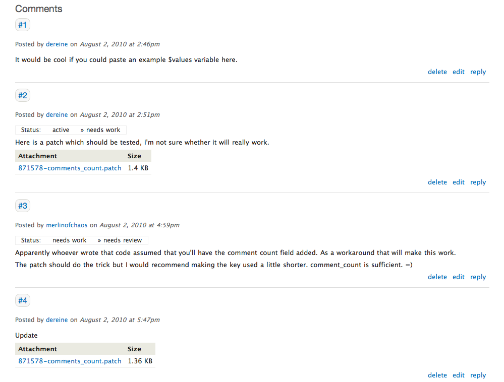
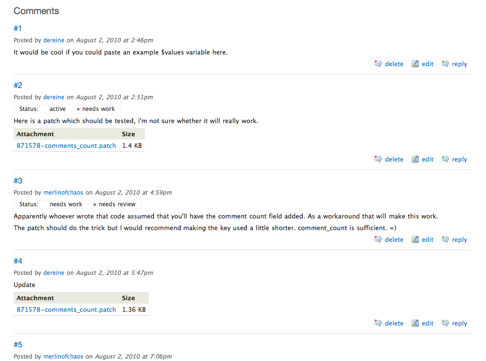
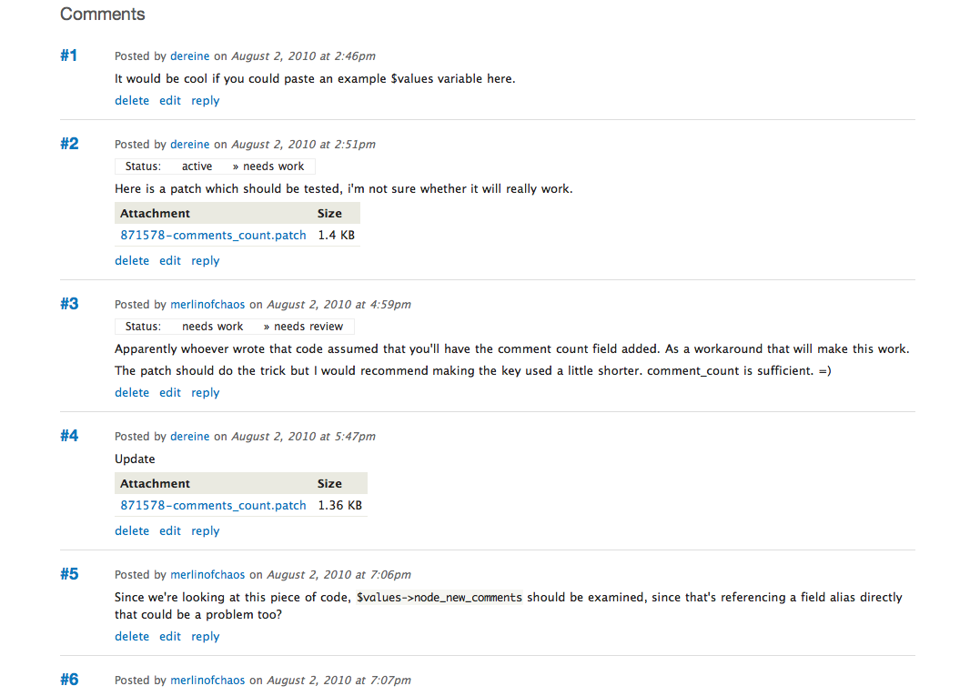
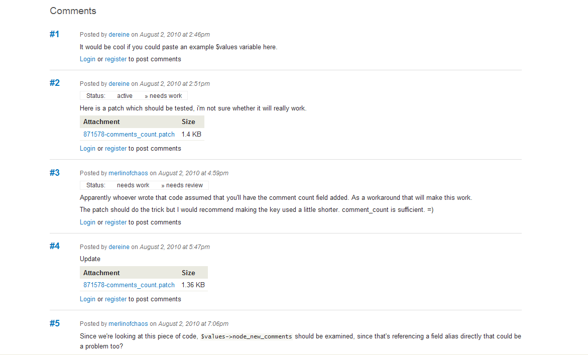
Comment #1
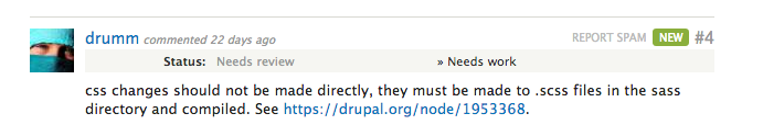
drummLet's look at 2-6 for now. We don't have boxes anywhere else in the theme, but the separator line could get more whitespace and be a darker grey/warm grey.
Comment #2
webchickWithout seeing this issue, my first gut reaction when Neil asked me about the new issues was:
"my first immediate gut reaction is that it's a little tougher now to see where comment A ends and comment B begins" and "Status changes could probably stand to be a little *more* loud. They're important."
which seems to be Alex's argument as well.
I like the zebra striping on the component list at the top of the issue, as well as the "new" status indicators. Slick. I also appreciate that the font size in code samples has been fixed, since it was pretty small before.
In terms of fixing, I think full borders around the comments like we have now would totally ruin the design. However, I wonder if that horizontal rule could be just a touch thicker or a touch darker (or both).
Suggestions 2-6 sound fine, as long as they mesh well with comments in forums and other places.
Comment #3
webchickActually, when I analyze my own behaviour on the current Drupal.org, what I look for for comment separation isn't the prominent border around the comments, it's the "#5" or whatever. It's big, and bold, and a different colour (black) from its surrounding elements (blue + grey). So maybe just restoring that colouring/styling would be enough?
Comment #4
kjay commentedIf we are targeting only the comments on issues then we could do something like the attached screenshots?
Floated numeric title and left margin for comment content to clearly mark each new comment row.
I've provided screenshots for Safari and IE8
Comment #5
webchickOh, damn! That looks nice!!
I love it because it keeps the comment styling consistent with the rest of the site, but also makes it very easy to tell where one comment stops and the other begins.
Comment #6
dwwOn the surface, comment #4 looks quite nice. However, my concern is wasting the horizontal space, especially on longer comments. For example:
http://beta.drupal.org/node/927792#comment-3515044
From the OP:
- I agree we don't want boxes per 1.
- We already have 5 (light grey for posted/date).
- I'd definitely like to see 3 (float the comment links right).
- I'm less convinced about 2 and 6 (shading on the status and attachments), but it depends on how we do it -- could help, could be distracting and wasted pixels.
- We're not really bolding usernames anywhere else in the design, so 5 seems out of place. (Well, except http://redesign.drupal.org/cvs care of #936692: CVS listings totally unstyled). I also don't really see how that helps solve this particular problem of seeing where 1 comment ends and the next begins. So, I'd like to see how this looks before I agree to it. ;)
p.s. This is why I always use letters to enumerate a set of proposals in an issue, so you can refer to comment by number and topic by letter... ;)
Comment #7
drummI put the user name in the title, adjusted whitespace, made comment links smaller, and darkened the separator line.
Comment #8
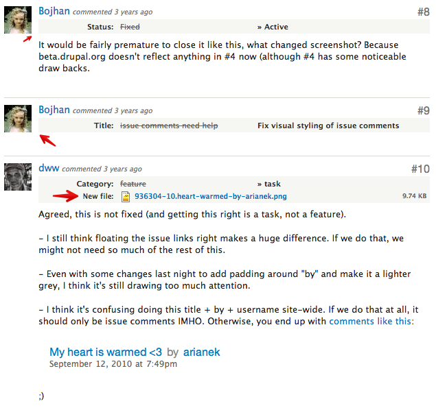
Bojhan commentedIt would be fairly premature to close it like this, what changed screenshot? Because beta.drupal.org doesn't reflect anything in #4 now (although #4 has some noticeable draw backs.
Comment #9
Bojhan commentedComment #10
dwwAgreed, this is not fixed (and getting this right is a task, not a feature).
- I still think floating the issue links right makes a huge difference. If we do that, we might not need so much of the rest of this.
- Even with some changes last night to add padding around "by" and make it a lighter grey, I think it's still drawing too much attention.
- I think it's confusing doing this title + by + username site-wide. If we do that at all, it should only be issue comments IMHO. Otherwise, you end up with comments like this:
;)
Comment #11
kjay commentedI still feel a good part of this issue is down to getting the spacing right plus a few other features perhaps.
Unfortunately I've had a tricky week with work and not been able to get onto this but I'm rushing some screenshots on here that are a snap of where I left off earlier this week around about the time #6 was posted.
#6 talks about the floated right links and I've stepped a little extra by adding the icons that were already in bluecheese folder from a long time ago. I personally don't like these icons as much as simpler ones but they are good start to see what could work perhaps.
First screen shot shows the right links being added only.
Second screen shot shows the same again but with extra white space margins for separation.
Third screen shot borrows from the styling of numbers on http://redesign.drupal.org/start.
Mix and match ?
I will be able to pick up on comments hopefully late today / tomorrow. Sorry for the very rushed post.
Comment #12
dwwTo my eyes, "blue-title" is visually overwhelming, and all you see are the comment numbers, not the comments themselves. Ultimately, it's the comments that are the content on the page people want to see.
I'm not a huge fan of the icons. I think they draw too much attention to something utterly secondary to the issue comments and rarely used.
I'm also concerned about adding too much vertical padding/margin, with an eye towards #939124: Too much scrolling on issue page - less navigation, or more compact navigation
So, of the three, I think just "right-links-icons" looks best, but probably without the icons. ;)
Thanks for continuing to help with this!
Comment #13
kjay commentedYes, I agree that the effect was turned up to 11 and probably not quite right! I've rolled this back out to another three screenshots just to help us compare.
I've toned the effect on the title right back (title-submitted.png) and in the second screenshot (title-submitted-float.png) I've experimented with 'borrowing' from Drumm's idea of floating the submitted info to the right of the title. The difference being that the effect of the title styling creates separation between the two. The third screenshot (links-only.png) rolls us right back I believe to the idea being discussed in #6.
Whether 'links-only.png' provides enough of a visual marker for the start of each new comment I'm not sure but I do agree that it ties in most tightly with the the subtle style of the theme. It is a shame that comment width is an issue because #4 was very much in keeping as well as achieving clear separation of comments.
Comment #14
Bojhan commentedI think it would be wise to ask mark boulton on this one, whatever we can do is so limited - it will still severely impact the readability of these comments. For the importance they have in both the forums, issue queue and all other communication - they need to be revised.
Comment #15
dwwtitle-submitted-float.png looks fine to me for issue comments. I'd love to commit that to bluebeach if you could post a patch for it, at least as a big step forward from what we have now.
title-submitted.png might be better for forum comments that have real titles, not sure... I'd have to see both of them on forum comments.
I don't think it's a problem to have slightly different styles for issue vs. forum comments. Issue comments are a special case in many ways, and we should visually optimize them for the issue queues, even if we need something a bit different in the forum comments.
It'd be nice to hear from Mark/Leisa -- not sure how available they are these days.
Comment #16
kjay commentedI'll roll a patch today. This will need a fair bit of cross-browser checks because it's rounded corners but as you rightly say, the importance of these means we must get this right.
Comment #17
Bojhan commentedWe can have different styling, but to me its silly to do something as fundamental as this in a heartbeat. I think anything along the lines of indenting, to create visually clearer "blocks" of comments - will be a possibility. I have asked lisarex to get in contact with mark, since we can very easily stray away from fundamental design approaches here - it would be better to solve the overall issue.
Comment #18
lisarex commentedNot sure that issues queues were part of the scope set by the DA for Mark and Leisa to focus on. Both drumm and jredding have been in touch w/ Mark recently re: redesign....
We def want to ensure the comments are scannable and easy for folks to read ... will come back to this after homepage issues are ironed out :)
Comment #19
Bevan commentedI submitted some more suggestions & ideas at #939692: Issue threads are hard to scan.
Comment #20
heather commentedI was going to add this to another issue before discovering it was a duplicate. FWIW:
1) Use the same submitted treatment in the original post as in the comments. (Though I see kjay has changed this from the current 2 lines to a one line)
2) Move "information" and "action" items to the right, and move up. Divide area with 60%/20%/20% Title, submission info/Issue details/Jump links
3) I've always found this "reply" action madly confusing. Is it just me? You click on it, and it goes to a new page. With the one comment on the top, then the form... then *the entire thread*. I don't get it. I just use the form at the bottom. I have never seen this behavior of a reply action on a flat list... or even a threaded one anywhere else.
Because comments are not threaded we don't need this "reply" any longer. Also, the comment form is included on the page. Presumably, this is a hangover from ye olde threaded comments.
Comment #21
moshe weitzman commentedWould be great if folks here could also give some suggestions/opinions at #939124: Too much scrolling on issue page - less navigation, or more compact navigation. That issue focuses on conservation of vertical space above the issue content.
Comment #22
kjay commentedThis is the patch promised in #16, providing the styling as per title-submitted-float.png in #13 and applies only to the project issues, leaving forum comments currently back to 'default' prior to drumm's changes in #7. In other words, forum would need more work if this style is the direction we are after. I had always imagined these changes applying only to the project issue comments.
Since drumm's changes in #7 change how comment titles are output, this patch needs to undo his work to match the screenshots.
If this direction is desired then we can look at working on IE8 to add some kind of rounded corner background.
I've also added a screenshot to confirm the changes this patch makes.
Comment #23
drummFor rounded corners, I'm already using (-*)-border-radius on the home page map bubbles and haven't heard any complaints. For anything new, we should use that unless we have a good reason not to.
Otherwise, looks good. But I don't think a thick border is needed. The other place we have something like this is categories on pages like http://beta.drupal.org/news, which has no border.
Comment #24
alex ua commentedI've also opened up another issue that I think would help the issue queue readability greatly: #919640: Darker font color -- and justification for gray
One of the reasons it's so much harder to view the text at the moment is we've (oddly) changed from using plain black text on white background, substituting black (#000000) for a dark grey (#222222).
Comment #25
merlinofchaos commentedGoing through what's here, I really loved the effect in #4; using the indentation really offsets one issue from another without having to read a single thing, and I think that's valuable.
Maybe the amount of indentation should be small; perhaps the body of the comment could be indented just .1 or .2em or some such so that the comment numbers hang to the left a bit?
Comment #26
kjay commentedComing back on #23. Drumm, I tried (locally) removing the border on the numeric title but you loose the impact without making the grey background tint darker, something we want to avoid. I think that the single pixel border is more subtle than making a heaver background tint on the title.
So, attached is a patch that does roll the tint of the 1 pixel border around the title back a fraction, without loosing it!
This patch has been tested in IE8 where it provides a nice square bordered version! We certainly can improve on this if the need is there in the future for IE8 users.
The outstanding issue with going with this approach is whether we are happy with the resulting styling of the Forum comments? To my eye they look readable and clear but will no doubt benefit from more focused later work.
In response to #25 and the option for revisiting the approach of #4, I believe I'm not wrong in saying that the only reason presented so far for not going with column styling is the loss of horizontal space for comment content, which on some posts may cause issues. There could be some merit in trying a quick new patch where the issue number is reduced in size and tighten things up a little. I'll give it a go...
Comment #27
kjay commentedHere is the patch that revisits the approach of #4. I've reduced the font size for the title, maintained the bold and I've reduced the column width of 60 pixels down to 40 pixels. This is probably as far as we can go since a narrower column looses the impact. I've added a screenshot.
Comment #28
alex ua commented+1 to #27- IMO it looks much better.
Comment #29
Bojhan commentedIt is indeed the best choice, a few things we should still experiment with :
1) The bolding of the issue number draws a lot of attention.
2) The name of the comment doesn't stand out, as it previously did, perhaps match font size that of issue number?
3) Because of the smaller font size, it visually looks as if issue commenter and number don't align.
4) Little space between comment name and comment body?
Comment #30
kjay commentedThanks Bojhan. Further screenshot and patch attached.
1) Removed bolding of comment number
2) Sized comment author to same font size as the comment number
3) It is aligned to the baseline
4) margin is as per the the sizing elsewhere I think. The bottom margin on submitted by for the main issue description is the same.
Comment #31
kjay commentedThe previous patch makes no styling additions for forum comments but does roll back template.php meaning drumm's changes in #7 are lost. Attached screenshots demonstrate state of forum based on this patch.
Comment #32
dwwCommitted to bluecheese's bzr branch. Should be live along with the redesign in an hour or so. ;) I think further tweaks should happen in new issues (although they can certainly reference this one).
Thanks everyone!
-Derek
Comment #33
dwwAfter using this for a few hours now, I think we should reopen this.
A) I agree with heather in #20.1 about the same submitted by/posted by for the original post and the comments. At the very least, the original post should include the exact time, not just the day. But, if the comment author is going to get a font-size bump to be more prominent, I think the author of the original post should get the same treatment.
re: #20.2: I don't think that's going to work, especially not once you have a few issue tags, e.g. at http://drupal.org/node/945626 or something.
re: #20.3, see #185855: Remove reply links in comments on issues
B) It's weird that the file attachment table is styled differently in the original post than comments. In the original post, there's a darker-grey border between the header and the body rows. On the attachment table on comments, there's no border, just the slightly different background of the header row.
C) I'm finding it a bit jarring that the original post is all the way to the left, while the comments are indented now. Maybe I just have to get used to it, but the ability to scan vertically has been disrupted a bit.
D) We probably should just kill the "Description" header -- it doesn't add anything. That should probably just be a patch against project_issue -- the fact it's useless is independent of the theme you're using. ;)
Comment #34
Bojhan commentedA) Agreed.
B) Agreed, the whole zebra striping also doesn't work untill we change the zebra stripe to be lighter than the top bar.
C) I think thats oke, you could even concider it better as its clear where the post starts now.
D) Yes :)
Comment #35
greg.harveyThe main thing I'd like to see is this (from Alex's original post):
2- shading around the "status" messages
I find it generally not too bad, but the status messages don't leap out at me, and they're really important information. It's usually the first thing I want to check and I just can't see it easily at the moment.
My two pence.
Comment #36
hongpong commentedSubscribing - can anyone consider changing the font for the short strings of issue-related displays? If you pick a font with 10-15% tighter kerning then all the small elements would probably fit better and would set off better from the comment block. Why not just use Helvetica for fields with < 60 chars? Also would apply to the issue queues more so than the issue comments threads, but yeah...
Comment #37
joachim commentedSubscribing.
I find the status changes hard to read too.
Also -- I filed this elsewhere last week -- I find the difference in visual style between the original issue node and the comments is strange. It's not meant to look like 'original post + comments', it should look like one long sequence of comments. The first one is not special.
Comment #38
mgiffordCan we close this issue or are there items here that we should summarize and bring forward to the new D7 theme?
Comment #39
markhalliwellNo, we shouldn't close it. I actually just posted this mockup in the related issue:
edit: removed image embed so people don't get confused.
Comment #40
joachim commentedThis issue is now so old that I don't remember what the original problem was.
Does anyone have screenshots of the pre-2010 redesign issue comments?
Comment #41
drummUser pictures are coming in a few weeks, #957320: Enable the support for user profile pictures. (We want them to sync to all sub-sites, and pre-fill with pictures from groups.drupal.org.) We should plan for them existing for some users in the future.
I agree with LewisNyman at #493074: Back-link to the commit as a comment on the related issue.:
We don't use rounded corner boxes around content elsewhere on Drupal.org. We keep text content on white or light grey backgrounds.
Maybe the header and changes could get some attention? In particular, the grey box around issue changes, and #40 right up against the grey line, is fair game for cleanup.
Comment #42
drummComment #43
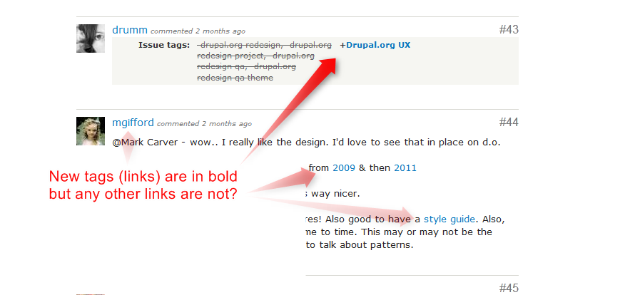
mgifford@Mark Carver - wow.. I really like the design. I'd love to see that in place on d.o.
@joachim Here's a view from Archive.org from 2009 & then 2011
I'd forgotten the outline. Mark's sketch is way nicer.
@drumm - great to hear about the pictures! Also good to have a style guide. Also, guides are meant to be up-dated from time to time. This may or may not be the time, but good to bring in some UX folks to talk about patterns.
Comment #44
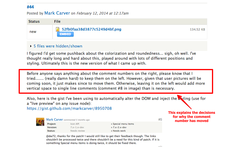
markhalliwellI figured I'd get some pushback about the colorization and roundedness... sigh, oh well. I've thought really long and hard about this, played around with lots of different positions and styling. Ultimately this is the new version of what I came up with.
Before anyone says anything about the comment numbers on the right, please know that I tried....... (really damn hard) to keep them on the left. However, given that user pictures will be coming soon, it just makes since to move them. Otherwise, leaving it on the left would add more vertical space to single line comments (comment #8 in image) than is necessary.
Also, here is the gist I've been using to automatically alter the DOM and inject the styling (use for a "live preview" on any issue node):
https://gist.github.com/markcarver/8950708
edit: removing outdated screenshot
Comment #45
markhalliwellUploaded wrong image, the commit and system message should span all the way across.
Comment #46
drummI like it.
Red doesn't seem like the right color for system messages, except for tests failed. (System messages don't have a class based on what they are, but we could add one.)
Are the grey separators still needed when we have pictures to help with scanning?
Comment #47
markhalliwellI totally agree about the red coloring for normal system messages, they should be yellow like the NR background/border. I had originally colored it for a "patch failed" message, but went over to that particular issue because the commit message made sense there. We will definitely need to add classes for targeting specific system messages.
I think the top border on individual comments are still necessary, yes. Otherwise it tends to just look like a wall of text. I would strongly recommend copying the JS script in my gist so you all can play around with yourselves to get a good "feel" for it.
Comment #48
joelpittetThis is quite the improvement on what is there already and doesn't take a whole lot of re-working of the current structure as pointed out with the gist! Awesome work:)
I just pointed out the visual line on the right becomes the text with the subtle background colors so maybe best to keep them aligned. Also would be nice to give less space to the report spam/edit buttons, but on the other hand a bit of whitespace isn't bad:)
Comment #49
markhalliwellI've updated the gist per joel's feedback. The comment links (report spam and edit) are now next to the comment number and only show up when you hover over the comment:
edit: removing outdated screenshot
Comment #50
joachim commentedCan we keep the comment numbers on the left please, where they are easier to notice and reach?
Comment #51
markhalliwelledit: removing screenshot
Here is also some IRC chat about why:
Comment #52
markhalliwellThis comment's div is currently 114px high on d.o. The new style is only 55px high.
Comment #53
joachim commentedOops. Sorry for not properly reading everything!
Though if you look at my unfortunate single-line comment #50, it has enough vertical space to fit a picture in below the comment number, unless we're making pictures huge.
It's probably not a big deal. It's just that linking to comments is quite important (on IRC, in other issues, for documenting use of patches in site builds), so they're more than just a stray piece of meta information.
Comment #54
markhalliwellWhich is exactly why it is still visible and farther away from the visually heavier user picture. When you're scanning the page, it is much easier to look on the right side of the page for the number (which is basically by itself), than trying to pick it out next to a picture. The only thing that has changed is it's position and color, neither of which are really that crucial to finding it as long as it's consistently in the same position.
Believe me, in the beginning I wasn't too sure about it either. After spending several hours creating this and going back and forth with feedback, it grew on me (in just a few short hours). People are just used to the numbers being on the left... that's all. Habits can be changed and this one really isn't that hard.
More reasoning (for those whom want it or need an itemized list):
I know there is more reasoning that I'm just not recalling from earlier. I'm rather tired, so I think I'll head to bed and amend my list tomorrow.
*Food for thought: We can always implement it. If enough people complain, it'll get reverted... just like our nodechanges on issue views (ahem, *cough*). Just sayin, doesn't hurt to try it.
Comment #55
mgiffordOk, so what is the next step? Who else needs to approve this? Who is going to mark up the theme/css?
This is a great vision.
Comment #56
markhalliwellComment #57
markhalliwellComment #58
markhalliwellComment #59
markhalliwell@mgifford, I've updated the issue summary and left tells for @tvn and @webchick. Hopefully we can get more direction on this soon.
Comment #60
markhalliwellComment #61
Bojhan commentedLet me first say, that I really like that you are exploring to redesign the issue comments. I myself use a style to make them span the whole width, and a few more tweaks.
First look at this, I am a bit confused about the goals. The problem doesn't outline why we need to add significantly more styling, are users experiencing issues? Are there opportunities for improving the user experience and what underlaying goals of users does it support?
I'm frankly a little shocked when I see #39. I think the best way to approach is to first correctly identify the issues, and then to step towards brainstorming different designs. For example do we need more contrast? What are the most important elements, and what is less important?
I'd like to allow for more brainstorming before we rush into implementing this, lets keep in mind that "just making it" and "restoring it whenever" is not an acceptable strategy when it affects the effectiveness of tens of thousands of people. We can actually A/B test this too if needed.
Comment #62
markhalliwell#39 isn't the proposal. Please see #44 and #49.
Is there an issue now, no... But when we add user pictures it will be. Also we're introducing a new system message for git messages....
Quite frankly, I'm unsure how not taking the opportunity to style to differentiate system messages from user comments isn't clear. I updated the issue summary accordingly, was there more information I was supposed to put in?
edit: #39 was just a proposal based on GH type of styling kinda discussed in the git commit back link issue.
Comment #63
markhalliwell@Bojhan, I've updated the issue summary to better reflect why there "is/will be" an issue.
Comment #64
markhalliwellComment #65
markhalliwellAdded styling and handling of "new" spans to gist:
edit: removing outdated screenshot
Comment #66
jibranAre we handling comments threading in styling? We can also accommodate parent comment id.
Comment #67
drummWe should apply the styles that we can to all comments, including forums. I don't think forums will want to add comment numbers (actually, those are permalinks), but the rest should remain consistent.
The new "new" indicator looks too close to our button style.
For implementation, we should split this up a bit. Maybe one pass for general comment styling, then a second pass for issue-specific styling.
Comment #68
markhalliwellCool, good point! I think I pulled that color from the issue that duplicated this. I've altered it to use the dark gray color instead and removed the border-radius. This should help eliminate any correlation.
I definitely agree that we should definitely split this out into separate tasks. I hadn't thought about g.d.o, I'll have to take that into consideration next round. I'm just trying to gather requirements and create a "working model" for people to use and try it out. I suppose this should become the meta overview and we can create sub-tasks once we're all in agreement of how we want to move forward.
I've also updated the issue summary to include a new overall screenshot and the different status messages.
Comment #69
markhalliwellCreated this issue so we can make system message type #3 (re-queueing) a reality.
Comment #70
yesct commentedI tried out several aspects of this and markcarver iterated on the gist while we conversed. (for example: the date actually showing the date, but having a way to have user preferance for "ago" format [note to see the date format change, hover a long enough time to trigger the tooltip], remembered with local storage. and keeping the comment numbers (but smaller) on the system messages...)
I like the new location of the issue number, and moving the new indicator and the comment links to that location.
Usually hiding the comment links is *nice*. I dont need to see them on every comment all the time.
Maybe the links in the "old" column for the meta data should (stay being) blue all the time. (right now, with the gist, they are grey and only indicator they are links is on hover when they get an underline).
Maybe the "Issue summary: view changes" should be styled a bit differently than the other meta data change stuffs. It might be enough to have the view changes link always blue.
Note the gist is updated.
The file table in comments is not moved over to the right (yet?) So it reduces the distinction (that moving the meta data labels gave) from of the comment body.
I could not find a issue to have the comment take the whole width.
Where is that issue?
Comment #71
yesct commentedupdated issue summary to note what comment number the screenshot was for, and format the detailed changes
Comment #72
yesct commentedadded commit history to the issue summary.
Comment #73
Bojhan commentedThanks for updating the summary. This is a lot more clearer now, I think we are looking to resolve the following problems:
New UX challenges:
Existing UX problems:
I like the idea of uplifting the system message from normal comments and using white space to allow for the avatar to be used as landmark. I am a little worried about the visual effects used in the previous proposal (looking at the issue summary and #68). I think its easy for this to turn into a rainbow of colors, Dreditor already kind of does this - and I'd like to keep this to a minimum.
I totally agree with the status changes, this looks really good and much more scannable. Keep in mind that the design has to validate WCAG 2.0, so the gray on gray that you designed won't work, I am also not sure if we can make the link color different as that would introduce a inconsistency. I like the idea of having the new indicator next to the permalink. I am not too sure about having the links appear on hover. Its not very discoverable you need to hover a permalink to get them, they are not connected concepts.
Below is another idea, making the "system change" less intrusive but still very noticeable:
Comment #74
markhalliwellI am really at a loss as to understanding why coloring the entire system message to match states in the following screenshot is considered "bad". I am also confused as to why polishing d.o is generally frowned upon. I get that we have to cater to many, but there are much more good looking sites out there that cater to even more. Further more, this has nothing to do with Dreditor. It's visually identifying system messages in a quick scan.

@YesCT and I were discussing this too. It makes sense for those of that can see it. The only other alternative would be to leave it black and instead add
text-decoration: line-through;on it. I personally do not think it's that light at all and denotes that it's not really that important.They show on hovering the entire comment, not just the permalink. Please use the gist to manually review this. I don't think you're getting the full effect from the screenshots. @YesCT also didn't get it, but after saw it on her browser in a real issue with lots of comments, it makes a lot more sense. It also reduces valuable vertical real-estate when it's not used on every single comment.
This is actually almost identical to the problem I am trying to solve. This is what I call the "labeling syndrome": a general container of information that looks very similar to the content surrounding it, but adds a "label" to denote that it is somehow different. It is also a little redundant to say "commit" as the label when it says who committed the code right after it.
The real goal here is to display that "this is an automated system message, not a user comment". The entire container should be styled and should really match the states that we have already assigned on d.o.
Comment #75
markhalliwellComment #76
markhalliwellComment #77
drummFor implementation, it would be good, but not required, to revert some or all of our comment.tpl.php customizations back to core's comment.tpl.php:
Comment #78
klonosA nice way to communicate system messages (commit log fragments for example) vs. user comments is to use some sort of console font for system. It looks like the comment comes from Skynet :P
...just a thought.
Comment #79
drummI think a key difference in #73 vs. the current issue summary is the visual weight given to system messages. We definitely want system messages to be distinguishable from messages from people. But, the current mockup in the summary gives them much more emphasis than comments from people.
As this moves to implementation, it should be split into at least 2 issues.
Comment #80
markhalliwellThat is semi-true and kind of the entire point. They are smaller than comments so easily recognizable as "system messages" to be be viewed or ignored as one scans the page. Having solid blocks of color isn't a bad thing. Especially when an issue would typically have only a few at most. There a few core issues that would probably have more because of test failures, but that is also important to convey.
I'm also pretty sure this would help eliminate a lot of issues getting re-opened (contrib wise) if a person were to see a green then red box towards the end saying that it's been fixed and then automatically closed... instead of commenting on a closed issue that it hasn't been "fixed" because they overlooked the comments.
Also, the coloring simply matches what we already use on d.o (the corresponding status of the issue). I see this being extremely valuable information we should convey.
Comment #81
mgiffordDo we want to give it till the end of the week for people to give feedback on this issue?
After that it would be good if we could look at setting up the patch to make it happen.
I really like the changes that Mark's recommended.
Also, looking at the Mozilla Support Forums and think there are some great examples there that we could use for inspiration. Just as a random example: https://support.mozilla.org/en-US/questions/935397
Comment #82
markhalliwellRe: #73
I've been giving some thought as to how we can implement WCAG standards, without sacrificing the aesthetic appeal for those of us who don't need or want them.
We can do something very similar to #2163197: Allow fieldsets to be persistent and save focus when AJAXing and utilize localStorage to save the state of a "user's preference". Here is what I'm proposing:
<body>on page load dynamically via JS.localStoragevalue isn't set or explicitlytrue- enable, we add the class.non-wcaglocalStoragevalue is explicitlyfalse- disable, we don't add any classesselectorsstyles. It isn't until.non-wcagis present that we would apply more of these stylistic changes.Comment #83
drumm@mgifford - Please do not impose arbitrary deadlines on issues.
I think adding a field to the user entity and storing the data would be preferred. I'd prefer to use regular Drupal fields and storage, rather than (potentially) custom JS. Adding the body class would be one line of custom code.
But, stepping back, I have some concerns about "switching" accessibility on/off:
Comment #84
markhalliwellCool, that works :) I was just trying to think of saving unnecessary DB calls since it's would be a per user preference. Not really my area of expertise, so I have no basis for debate here.
It isn't really "different versions". Is more like "watered down styles". The markup wouldn't change, just some visual components that would make it easier for people to view (if they have issues viewing artistic design). Also because this would be cascaded styling, it would be in the same area of the scss stylesheet and wouldn't be overlooked:
Correct. There's many things that need to be taken into account for WCAG. My point is that this is really a personal matter. We cannot, nor should we, enforce one or the other. While the more minimalistic approach works for some, it doesn't for others (mainly myself who just see globs of text bunched together and has a hard time separating components visually).
This is why it should be a toggable feature. I'm not claiming to know every aspect of what should be "WCAG" compliant (also not really my area of expertise). However, I do think that we should at least create the groundwork for detect if the user would like more WCAG compliant styles.
I'm really not suggesting we deviate too much, but there are certain components that would probably benefit from the differences. I've found that when it comes to styling high profiles sites, accessibility seriously puts a damper on creativity.
Also, I would like to point out that there are still certain elements on d.o that aren't currently WCAG compliant:

By laying this groundwork, we could start targeting things specially for 1) design/aesthetics or 2) wcag compliant/minimalistic
Comment #85
mgifford@drumm - I asked a question, partly to see what if anything needed to be discussed. I think it's fair after a week of inactivity for anyone to ask such a question. I'm not suggesting that when there is agreement on the design that the markup suddenly becomes the priority of the DA to implement.
@Mark Carver - As Neil said, it's definitely not a best practice to have to switch on/off accessibility. We should be able to identify & work through the problems to see that we are able to meet the color contrast requirements. We may encounter other elements of WCAG 2.0 but think we can work those through too as we have with D8.
Light grey text #BFBFBF on a white background is hard to read, particularly when it small. Bringing it up to #727272 makes it easier for everyone to read.
Likewise #9D9D93 is hard to read on white but #707065 meets WCAG 2.0 AA.
With the comment system - #9d9d94 on #f6f6f2 doesn't work, but how about if we make it #6f6f66? Light grey on #9999A0 pink is bad but maybe #696971 will be sufficient. Blue #1479BD on Green #D5FFD8 fails, but if you make the background #f6fff7 it is fine.
I could go through other elements. Ultimately though they are a shade lighter or darker in most instances and I don't think it will disrupt the overall effect. I wasn't looking at color contrast when looking at these designs.
The light grey on lighter grey is going to be hard for anyone to read. But we can work with what you've provided to help minimize the importance of the text as you did by making it harder to see.
I'm running them through:
http://webaim.org/resources/contrastchecker/
It's also worth noting that the WCAG Contrast Checker has a bunch of problems with the existing page too.
There are modules like https://drupal.org/project/pagestyle that provide high contrast modes pretty easily, but they shouldn't be needed for most users. Some of the greys would just be hard on the eyes for anyone spending time in the issue queues.
I think we can work through the color issues to make this an improvement over what is presently in use in the issue queues.
Comment #86
markhalliwellIt's not hard to read... for me. I need higher hexed grays. Anything around #777 and below tends to all just look the same to me.
We all see things differently, that is my point.
Having lighter grays allows my eyes/brain's focus not be stolen by usually irrelevant information. I do not need to know the time for every comment. Just who posted it and what they had to say. I understand this isn't WCAG compliant. But does every bit of text on a site have to follow this? Why devalue the importance of displaying meta information in lighter colors just because of WCAG standards?
I'm not saying that WCAG standards aren't important; quite the opposite. I proposed giving users the ability to have a personal choice in the matter. I think this is more preferable than arguing over semantics. Or we can go with my original suggestion in #74 and simply leave it as black text with a line-through style on it.
Comment #87
joelpittetFun site! http://leaverou.github.io/contrast-ratio/#%239D9D93-on-white
Comment #88
webchickThis isn't my call, it's Bojhan's, per the Drupal.org Developer Tools Leadership Team announcement, but regarding recent comments I would say that we should always aim for WCAG compliance in any and all styling changes on d.o. We already do so everywhere in Drupal core, and it's one of the amazing things that sets our CMS apart from others. Drupal.org being WCAG compliant is just as important as Drupal.org not looking like complete ass on mobile. I would love us to somehow accomplish both things by the time Drupal 8 ships.
The arguments not to conform to WCAG so seem based solely around nothing more concrete than an unquantifiable personal preference, and that doesn't wash with making sure that all users of Drupal can use Drupal.org successfully. Personal preferences == what user styles are for, IMO.
And a "make this accessible" toggle doesn't work, neither on Drupal.org nor in core, because then someone who already can't use the site needs to figure out how to find their way to such a toggle, and in the vast majority of cases they won't have a user session to link that toggle setting to in the first place. There's also the additional ongoing cost of maintenance for all future styling changes to ensure they look good in both versions, as drumm mentions.
This issue seems to be eating a lot of time from a lot of very busy people. It'd be good to get back to the actual problems we're trying to solve here, since I think there is general agreement on those, and work our way up from there. My 2 cents.
Comment #89
markhalliwellThe following instance has been created: https://style-drupal.redesign.devdrupal.org
I must apologize. I really wasn't trying to turn this into such a debate. I was just trying to offer solutions to an issue that was raised. It turns out I'm just wrong here, ok.
FWIW, I've already planned on working over the weekend to start implementing what I have so far (and so people can view). I'll also adjust all the colors (pertaining to this issue, not the entire d.o theme lol) to be WCAG compliant. Hopefully I'll be able to salvage some of this artistic design here. I'll update the issue summary accordingly and separate things out into the tasks at hand.
I agree we're all very busy, let's get to work :-p
edit: I know it's ultimately @Bojhan's decision. I'm not trying to push my way forward here by starting dev work this weekend, just trying to help out where I can so we can get things moving along :) We can tweak and adjust according to his purview on this matter.
Comment #90
mgiffordWe shouldn't be afraid of debates in this community. You've offered some great ideas. It's alright to challenge assumptions, even around things like accessibility, usability or performance. We can go into why WCAG 2.0 standards are a best practice and discuss that, but this has been done pretty extensively in Drupal 7 & 8.
Great to hear about the new instance to focus on this. I'm excited to see what the HTML looks like. I might have some time over the weekend to put into looking at the accessibility stuff too. Feel free to reach out when you have something you're ready for someone to look at.
I started fiddling with what you've started here http://jsfiddle.net/mgifford/Br8FZ/ but I'm really not a design guy. Accessibility mind you, I know quite well.
Great to see this moving along and thanks for your efforts!
Comment #91
Bojhan commentedIt's been quite a busy week, so it took me some time to review this
@mgifford I think we need to more carefully document the guidelines around a11y and d.o, although its clear what Drupal Core has to adhere to there are no such guidelines for d.o. I fully understand Mark his confusion around this especially considering parts of d.o are not meeting the WCAG 2.0 guidelines. I think its clear now that it is a guideline we follow. Could you help out documenting this?
Mark Carver was able take an hour out of his day to discuss this with me, and we went over many of the proposed changes. Mark showed a number of different ideas, and I think we reached consensus on a direction that will work quite well. Mark will work on these ideas over the weekend and post them here. I will provide additional feedback and rationale where needed to get this rolling.
Comment #92
mgifford@Bojhan - It's totally a big issue. I really hadn't gotten to even looking at color contrast with Bluecheese until yesterday #2207271: Color Contrast Issues with Current Issue Queues
I can totally try to help with the documentations. Would you like something here https://drupal.org/style-guide
What type of issues need clarification?
Comment #93
markhalliwellI didn't have time to actually work on actually code inside the server instance this weekend (family issues/poor planning). I did go ahead and update the gist though per @Bojhan and I's conversation. I've also adjusted the text colors to be WCAG compliant. The system message border colors are identical to the status colors for issue tables, except for the commit message. It was way too light and not even noticeable so I've just used the same green as the update issue button at the top right. We might need to make the other borders darker as well.
Comment #94
markhalliwellForgot to update the summary.
Comment #95
mgiffordThanks for putting this up Mark. I haven't looked at the new gist yet, but it seems to be coming along nicely from the screenshots.
I stumbled across this post recently from back in 2011:
http://www.disambiguity.com/prairie-initiative-kickoff/
Leisa, Jeff Burnz, yoroy, Bojhan and others looked into this and had some really good ideas about the the issue queue.
"The name of the issue becomes collaborative, getting it right is important."
Some of the ideas from her notes have been captured, others still outstanding.
Comment #96
markhalliwellYes, I've seen that before. It does however fall outside the scope of this issue and more inline with architectural changes of the issue queue (some of which have indeed been implemented).
Comment #97
mgiffordAgreed that there's been progress since 2012.
EDIT: I just also stumbled across https://drupal.org/node/1080550
Comment #98
Bojhan commentedSmall review, this looks like its shaping up though. We should get some extra eyes on it, so we can proceed with the implementation.
Comment #99
Bojhan commentedComment #100
markhalliwell1) Permalink same size as... what exactly?
2) Spacing between author and meta table; I could add some spacing, but a little hesitant to do so. It's was actually designed this way so that it aligns with the picture (for one liners, including one line status changes @see #53). This just looks ugly because the file tables aren't styles like the meta information. If they were, the light gray box would continue and they wouldn't stand out so much.
Comment #101
markhalliwellHere's an example of what I was thinking about doing for the file's table. I literally threw this together in 15 mins and don't plan on implementing this at this exact time, but if we need to just so it doesn't look so off, then we might want to discuss it further.
Comment #102
markhalliwellComment #103
drummThis looks like great collaboration & progress! I got a start filing child issues for implementation.
Comment #104
tvn commentedLooks good overall. Thanks Mark and Bojhan! A few comments:
Also it might be a good idea for metadata table to look different from the system messages.
Comment #105
markhalliwellComment #106
drummDo we always want time ago? Once it gets to years, some more granularity would be nice. That would make it possible to spot clusters of comments or remember that a comment happened during a DrupalCon or camp. The format switch to the calendar date at a certain point.
Comment #107
joachim commentedTime ago is useful on a list of issues. When it comes to looking at the actual comments, the actual time should be visible.
Comment #108
jthorson commentedAs a minor augmentation, we should look at somehow adding the 'last tested' time to testing results, which will provide value once automatic retesting of RTBC issues is in place.
Comment #109
drummComment #110
yesct commentedRe #108
I would *love* a last testing date. But maybe that should be left out for now. Not sure that would be easy to put in here right now. I guess we could mock it up, as most of these changes will be separate issues anyway.
Comment #111
markhalliwellThis is a persistent and toggable (double-click) feature. If you need to do that kind of "search", just toggle it...
I strongly disagree. Its far more useful to know when a conversation is taking place (without having to look at a clock). I've already outlined these in the child implementation issue (where this conversation should take place).
I had talked with Jeremey in IRC a few days ago (forgetting to post our conversation here). IIRC, I believe we both agreed that the "last tested date" would reside up at the top with the summary file table (not in comments) and thus falls out of scope of this issue entirely. However, this does bring up that PIFT results for patch files in comments will definitely need to be styled. This should be a separate child issue as it encompasses more than just the default file styles (that aren't patches with testing results). There is a lot of information to present to the user that could be handle in a variety of ways and getting these right will take time.
Comment #112
sunI applied the most recent revision of the user JS/CSS + visually reviewed this issue. See attached annotated screenshots.
Notes:
Lastly: No strong feelings on anything on this, just some (hopefully sane) improvement suggestions — in the hope that this change will make most of my "drupal.org unleashed" user style obsolete... ;-)
In words:
<code>blocks have an additional border, which appears unnecessary, and their background looks a bit dark.Comment #113
Bojhan commented@sun Could you add your comments in writing, or some other way of referencing them? I'd like to respond, but its hard to follow if I comment per screenshot file name.
Comment #114
Bojhan commentedThank you for your thorough review, I looked at all your points. I think the biggest takeaway is that we should take another look at the metadata part, as that has some confusing elements to it.
1. Agreed, there is no reason to add that. We don't use conversational tone like that anyway.
2. I would advise to increase spacing because adding | might be unnecessary then and having a | is quite uncommon on d.o. We should indeed have additional spacing between the id's and links.
3. I am not sure about this one, because I think the 80% case will be that we have only 1-3 tags that are added. Breaking lines might help but will also make it it vertically a lot higher. Lets try and see how it works.
4. From my pov, is the file table quite screwed up. I'd like us to fix it, but earlier on we decided that it might be best to leave it out of scope. Thats also why you don't see a whole lot of tweaks to it.
5. I think we are trying to achieve the same goal here. The issue comment should stand out, but by giving no visual separation between the metadata changes and issue comment you are creating confusion what part of the comment is metadata and what part is the comment, trow in the fact that we have system messages and its visually hard to follow. Thats the reason why we added the background, to make the separation more distinct allowing for easier scanning and getting to the comment of the human more easily. I think we can tweak the spacing a little, it is indeed very pushed together, we should have a minimum specified in a style guide.
6. a) Can't we just call it Summary? b) we should only have strikethroughs on the left side, never on the right. c) The view changes should be on the right.
7. Should not be bold. We can change if if we change the style guide, but I agree we shouldn't do it adhoc.
8. The background could be lighter though I would like to keep it encapsulated. The reason we do this is primary because its often quite a "busy" block. Meaning that its visually quite heavy because of all the indentation, tags etc. Because it is so heavy we use extra visual queues to encapsulate it so you are better able to recognize it as a "separate" block from all of the other comments and skip over it when needed or stay focused on it when needed. There is a wealth of visual design theory behind this core principle, but I hope my explanation above sheds light on why we would do this.
9. Not sure what you mean here?
10. Yeeees! I did already agree to this in #2128907: Remove fileicons from file upload views and really hoping someone can pick it up.
Comment #115
joachim commentedI agree with a lot of the points about the diff table in #112, but I think quite a few of them may be out of scope here:
- those concerning the placement of items in the L/R columns may well be to do with how the issue diff field stores data.
- those concerning strikethrough may be to do with how that field themes its data
Comment #116
markhalliwellUn-assigning myself (don't have time this week or next). Should be back on track to help with whatever might be left at DC Austin.
Comment #117
drumm#2095969: Accessibility problem with headings in issue queue has the permalink, like "#116", changes. That issue is a D7 accessibility regression which needs CSS changes, so we should go ahead and jump to the new style.
Comment #118
drummI filed a couple more sub-issues, I think rounding out the work to do here: #2272951: Style comment links and #2272953: Style node changes in issue comments
I've been working on the top of the comments in #2211731: Change comment "submitted" text, #2211741: Update comment new and permalink styling, and #2095969: Accessibility problem with headings in issue queue. Implementing user pictures, #957320: Enable the support for user profile pictures, is something I'd like to do well; and the header changes made sense to group together. Since this is a highly visible change, I'll be writing a post for https://association.drupal.org/blog before deployment.
Comment #119
Bojhan commentedCould you let me know when you have something to review? I had this style installed the past few weeks, and I have a few comments after using it for a while.
Comment #120
drummThe first round of changes is now on staging sites, like https://staging.devdrupal.org/node/2224917, for testing.
Comment #121
geerlingguy commentedGlancing through some issues on the staging site, it looks great, but the only problem is that there's no spacing/default/placeholder image for users with no profile picture, so the left edge of issues is ragged, resulting in me having to do extra work when sifting through comments; some comment texts are left a full 40 pixels, while the ones with user pictures are justified starting after the picture.
With that fixed, it would be perfect, as far as I'm concerned!
Comment #122
Bojhan commentedWe should also lose the font-size here, its way to prominent - given its importance it should be much smaller. Lets remove the font-size statement in:
Comment #123
markhalliwellCreated patch for #2211779: Implement jQuery timeago plugin/module for relative comment dates which can be tested at https://drumm-drupal.redesign.devdrupal.org/node/2224917
Comment #125
drumm#121 & #122 are taken care of and deployed to Drupal.org.
Comment #126
markhalliwellTalked with @webchick and @Mixologic in IRC about the recent deployment of #2211779: Implement jQuery timeago plugin/module for relative comment dates.
It isn't very clear to people that you must "double click" to toggle it (as semi-expected).
The best solution we have come up with is to add a dotted line underneath the timestamp:
We should also #2275375: Instantly show tooltips for clickable comment time? instead of waiting for the OS alt title to pop-up. This should alleviate close to 99% of people's "pain" with this enhancement.
Comment #127
markhalliwellWhoops, forgot the screenshot:

Comment #128
MixologicJust to add the actual requirement here, right now, the only way to deterministically find out when a submitted patch last applied to core is to do the following:
Where May 27, 2014 at 10:54pm is the datetimestamp of the comment when the patch was posted.
There is some docs that need updating now, specifically this: https://drupal.org/patch/reroll (step 4.), but potentially others to let people know about this change.
Comment #129
chx commentedI love #127: it makes it visible that something is actionable about the timestamp (and dislike ... ago in an issue comment for reasons in #128)
Comment #130
Bojhan commented@markcarver I would honestly, only do it on hover of the comment then. Because its way to invasive to add everywhere, to fix a frankly "small" problem.
Comment #131
joachim commented> do it on hover of the comment then
What if you want to copy the posted date to reference it in another comment?
Comment #132
steven jones commentedJust wanted to say thank you very much for all the effort that has gone into this so far.
I much prefer the 'ago' date format, makes it much easier to scan back through the history of an issue and work out when things were happening etc.
Comment #133
mgiffordIt's important to add highlights consistently to links for both hover and focus. I've never seen the double click functionality for links like that. It isn't a pattern I'd think of trying. Anyways, there's also the issue of the issue number. Right now it's like:
.comment .permalink-wrapper .permalink:hoverWhich doesn't support keyboard only users all that well. This simple change would address that:
.comment .permalink-wrapper .permalink:hover, .comment .permalink-wrapper .permalink:focusComment #134
markhalliwellPer https://drupal.org/node/957320#comment-8822881:
Comment #135
yesct commentedSince this is a meta, we need child issues to handle each piece, or change proposed.
I opened
#2276821: Make it more obvious how to toggle between time ago and date for comments on issues
let's move the discussion of the time ago toggle to there.
and
ug. I made a separate issue for comment #133 before I realized it is related to #2272951: Style comment links and should be done there.
Comment #136
alan d. commentedA cursor change would really help any clickable action:
Or if Tipsy is used, maybe this to show that there is more than just the title attribute (disclaimer - I personally dislike instant tool tips):
Comment #138
drummI deployed the recent commits, covering the recent comments here, notably #126/136 and #133.
The comment time ago has quite a bit of discussion at:
#2275375: Instantly show tooltips for clickable comment time?
#2280497: Comments no longer show the date they were posted
#2277665: "On" is missing in the old version of the comment submitted line