
By Dries on
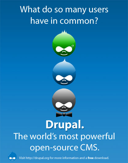
As reported last week, we have been offered one full-page ad in the Free Software Magazine. We asked the Drupal community to design ads from which we would select one for publication. The feedback we got was amazing, resulting in a dozen ads being proposed and discussed. Unfortunately, we can only select one ad for publication and the May 30th deadline is approaching rapidely. Based on the feedback, I selected one of the beautiful and clever ads designed by Josh Stevens. Josh's winning ad is shown on the right; you can click the thumbnail to see the full-version. Unfortunately, we aren't quite there yet. Hence, the goal of this thread is to finalize the ad; that is, to get the message and the brand right. In other words, it is time for the final polish so please share your thoughts or improvements in the comments ... and hopefully, with the help of the various Drupal designers (and Josh in particular), we can craft the final version of what will be the very first Drupal ad.
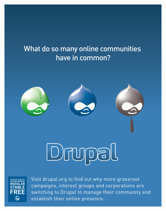
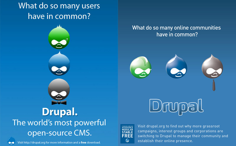
Update #1: Chris Messina submitted an interesting variant on Josh's version. See this composite image for ease of comparison. What do you think? More variants with incremental improvements are welcome but most of all, we are looking for concrete suggestions as how to improve the text at the bottom of the ad.
Update #2: just got mail from the Malaysian Open Source Software Magazine: they offered to publish our ad in their magazine as well. Thanks!
| Attachment | Size |
|---|---|
| drupal-ad-chris.jpg | 97.24 KB |
| drupal-comparison.jpg | 104.37 KB |
| drupal-ad-josh.jpg | 35.35 KB |


Comments
Tracking
Someone previously commented to create a url such as drupal.org/common (?) or something unique, so there may be tracking of viewers of the ad (those who visit drupal.org/[something unique].
Good idea
If Drupal is going to be doing more advertising similar to this in the future, I would strongly support using drupal.org/incommon or something to track results. If not, then it's not really that important to track the ad (it might be interesting however!).
Best,
Matthew
My suggestions
My suggestions:
Also note that the final ad should be 9.25 in x 11.75 in (2775 x 3525 pixels) and in PDF format. 0.375in on each side will be trimmed. Last but not least, the images should be at least 300 dpi. Details at http://freesoftwaremagazine.com/advertise/.
I wonder if Josh could release a larger version of the ad, or even the Photoshop (?) files. It allows all of us to experiment with it, to maintain the ad, and to reuse parts of it for the leaflet (which we still have to design). Ideally, the files would be released under terms of the GPL so they can be maintained in Drupal's contributions repository.
PDF?
I'm not quite sure where you seen "PDF" too, the fact is:
"The images must be 300dpi JPG images with MAXIMUM 10% quality loss."
This size is correct however.
Robin
I ♥ Bugz
Blog - Twitter
Some changes
Here is a version with changes based on your suggestions (dropped the ".", changed to 'free software', added 'community plumbing', etc:
http://www.nautilus7.com/drupal_ads/drupal_adf1.jpg
-----------------
Josh Stevens
Nautilus7 Design | www.nautilus7.com
Comments
I already said most of these in the last thread, but I guess it got lost in the noise:
- We have a standard font for Drupal (FF Max). There is an SVG with the word Drupal in the contrib repository (the font is not free though). I think it has more character than the one you use now (though it makes an excellent font for the other text in regular).
- The Druplicon at the bottom is the old one, and its color doesn't really match the surroundings. The lack of a border further drowns it in the background. Perhaps the 3D one would look better (also in contrib), it has a border.
- The bow-tie and the word Drupal seem off-center.
- At the bottom, you say "© Drupal". But really, there is no official or legal entity behind Drupal. We should probably remove it (is it common to copyright ads anyway?). Or we can change it to your name (or Dries').
Quick hackjob: http://www.acko.net/dumpx/drupal-ad.jpg
By the way, perhaps including some of the power words from the leaflet is not a bad idea for the bottom: Standards-Compliant, Accessible, Modular, Stable, Free.
I like the ad overall, but what bugs me is that it really positions Drupal as a corporate/business CMS. Is this a good idea for an ad in a Free Software magazine? We have lots of open-source-related sites (kerneltrap, gnome footnodes, kde developers, ...). Let's use that.
--
If you have a problem, please search before posting a question.
Changes
The bow-tie/"Drupal" are already dead-centered.
-Changed the druplicon at the bottom to the glossy 3D ones I made for the middle.
-Technically, it is copyrighted by myself (images/art are automatically copyrighted by their creators the second the are created). But since the ad is being given to Drupal, they then own the copyright. Copyrighting is free, and takes no paper work - it's just an 'existence of ownership.'
-The ad is supposed to be in .jpg format, which is why I used photoshop over illustrator, and photoshop (7.0 anyway) does not open SVG files. Is there another version of the word 'Drupal' in FFMax?
Also included some of the power words as well.
Let me know about further changes! :-)
http://www.nautilus7.com/drupal_ads/drupal_adf2.jpg
-----------------
Josh Stevens
Nautilus7 Design | www.nautilus7.com
Placement of power words
I don't like the way you added the power words. Their placement makes the ad (i) unbalanced and (ii) busy.
Comments
Re: bow-tie center... draw a rectangle around the bow tie circle.. extend it up and notice how it is not straight under the Druplicon mouth/nose/eyes. One of them is not centered like the other and IMO it is noticable.
Re: 3D druplicon, I was referring to the cell-shaded 3D one that is used on this site too. It seems to be displacing the other one as the "official" Drupal logo in usage outside of Drupal.org as well, so why not use that?
Re: SVG, really it is the most standard form of vector graphics around in my experience. If not for this, it makes sense to able to read it as a graphics artist in general. Still, I've put a transparent .png up here: http://www.acko.net/dumpx/drupal.typography.png
--
If you have a problem, please search before posting a question.
I dunno ?
All the druplicons are exact duplicate layers of the same one, and all + the bow tie are centered using photoshop's 'align to horizontal center' tool - and I drew retangles, and they still look centered to me ???
Thianks for the text! Lot of good ideas going on in this thread :-)
I'll be back in a couple days (memorial day holiday) with a revision.
-----------------
Josh Stevens
Nautilus7 Design | www.nautilus7.com
Suggestions: text at the bottom
At the bottom of the ad, it reads:
IMO that sentence begs to be extended with a "to"-part. It allows us to explain what Drupal is about, which I think is very important. Maybe something like:
Next, I would rework the target groups in that sentence: (i) 'corporations' and 'small businesses' are somewhat duplicate terms, and (ii) the listed groups don't match with the Druplicons. Maybe replace 'small businesses' with 'grassroot campaigns' (green Druplicon) and replace 'schools' with something generic (blue Druplicon). I would also list these groups in the same order as the Druplicons. If we do that, we get:
Still with me? As a last step we could give the reader a hint or two as to why these people are using Drupal. This lets us add some power words under the sentence itself. If we do that we can remove the slogan (eg. "The content management system for everybody.") that sits right under 'Drupal' and just above this sentence. We get something like this:
Thoughts? The wording and the power words might need some more work, but I'd like to believe that the approach/structure helps to get the message out.
Anyone who wants to rewrite that sentence some more? A mockup maybe?
my two cents
"Visit drupal.org/about to find out why many individuals, discussion communities, grassroot campaigns, and corporations are choosing Drupal for collaboration and content management."
Then try the power words spaced somewhat, centered, across the very bottom. Perhaps separated by a · .
I am late, but not too late?
I like the ad, but it absolutely fails to cmmunicate what it is about. *i* know what drupal is, but this ad is for ppl who do not.
- Users of what?
- Powerfull in what?
- Users use it for what?
Please introduce at least the word "website".
---
[Bèr Kessels | Drupal services www.webschuur.com]
I'm a fan of action verbs...
I'm a fan of action verbs... our latest CivicSpace 1-pager, for example, uses "communicate | collaborate | organize | syndicate" in the footer
So, what DO you do with Drupal? You don't "CMS". Let's see if we can come up with something more active...
If we wanted to try something like the XXXX | XXXX | XXXX | XXXX model, perhaps it would be something like:
create | organize | publish | spread
Drupal is not selling a CMS!
The best ads communicate a vision of the future not a statement of the present. The bar is high and it was set by Apple's "1984" --yes, even for print ads.
So the question to answer in order to have a powerful ad is :
If I use Drupal, how will my project, my organization, my life is going to be better?
My life is not better because I use a powerful CMS! My life is better because I can easily and effectively build communities online that bring pepople together offline.
This is not a tagline, but I'd start from here for an ad.
Stress Drupal's Modules
I think that one of the best things about Drupal is it's modular base, allowing me to truly customize it for my own site's specific needs. Maybe we should add something about this, instead of "community plumbing" ("what the hell does that mean" people will think).
Perhaps "Drupal's solid core and flexible modular system are why it's been chosen by more corporations, schools, and small businesses". I don't have a good way to fit this into the add though, so you might just want to ignore me. I just thought that we should mention how easy it is to extend Drupal.
Best,
Matthew
"So many users"??
The tagline reeks of Babelfish translation, and the idea itself seems pretty weak. Do we REALLY want to use the generic "user diversity" idea? That's for, like, Microsoft ads.
Go for "Free Software," go for "highly flexible," go for something that actually SAYS SOMETHING ABOUT DRUPAL. About how it's unique, about how you'll be better off with Drupal, about how Drupal will be better off with you. But don't do this cookie-cutter crap, please.
explained version?
While I find the ad very nice (just peek at my homepage and you'll know why -- I found the Corporate Druplicon extremely cute), there was an explained version of it, http://www.nautilus7.com/drupal_ads/drupal_ad4.jpg which I found better.
We have two columns. What about a list on the left of the fields where Drupal is used and action verbs on the right?
--
Read my developer blog on Drupal4hu.
--
Drupal development: making the world better, one patch at a time. | A bedroom without a teddy is like a face without a smile.
i think this "explained"
i think this "explained" version makes more use of the webspace in a good way, but looks a but unbalanced somehow... i think the amount of text on one side versus the other.
What do so many users have in common?
Users? Users of what?
Drupal? well DUH druapl users would have Drupal in common.
Heroin? I don't think so.
the Internet? They are more likely to have IE, Safari, or Firefox in common.
I get the idea of where this is going and I think its a good pitch... lots of different people use Drupal. It makes people want to aspire to be like other cool geeks.... but it needs to be a bit more specific.
How about we name drop? Can you think of 3 names of high profile free software advocates that use drupal to power their sites? One grassroots organizer, a CEO, a high traffic site admin that free software users would know?
Then the ad would read something like - What do Steve Jobs, Richard Branson, George Lucas have in common? Drupal. (Replace those three names with some real names).
OR use the brands Yahoo, Firefox and Our Media in place of the person names.
Then the message is right - what do these cool high profile people/organizations have in common? If you want to be like them consider Drupal.
---
On another note:
The use of the quote from spread firefox is also very powerful. A testimonial from a real person and a real project that the target audience of this magazine can relate to is a good hook. If people respect the person saying the quote - they are more likely to believe the overall message.
If you want to use what the cool people/sites are using - use Drupal.
--
If we just want to be silly - "5 out of 6 web geeks agree - Drupal kicks ass" - then include the testimonial from spreadfirefox (or similar).
Just some thoughts. But the first one is SERIOUS. "What do so many users have in common" just won't cut it. It doesn't mean or say anything.
andre
p.s. Josh has done an amazing job coming up with a lot of great visuals - hats off to you Josh. The image is right - lets make the message more powerful.
What about communities?
Hi there!
I agree with andremolnar.
What if it was like 'What do so many *communities* have in common?' and then you guys listed some big communities which have Drupal in common? Maybe something like 'Find out why Spread Firefox, Yahoo, etc... chose Drupal as their CMS, etc.'
:-)
Cheers,
Emiliano.
As per my mailing list response.
I don't necessarily think the term 'users' would be out of context for
an ad in Free Software Magazine. I would be willing to bet that the
readership of this fine publication would probably understand.
---
Code0range: Drink Your Juice
my two cents..
Hi Dries,
I like the following tweak of what you've got..posted by someone else on here, not me.
And to echo Emiliano My two cents is to focus on community plumbing rather than CMS.
i.e. the core strengths of drupal (in my opinion) is its community management capabilities.
So perhaps the lead tagline should read "what do so many online communities have in common?"
And the bottom tagline change from "content management" to "community management"
http://www.nautilus7.com/drupal_ads/drupal_ad4.jpg
Dub
DUBLIN DRUPALLER
___________________________________________________
A drupal user by chance and a dubliner by sheer luck.
Using Drupal to help build Artist & Band web communities.
Currently in Switzerland working as an Application Developer with UBS Investment Bank...using Drupal 7 and lots of swiss chocolate
Yep, agreed
Dublin Drupaller,
I really liked the adjustments! I vote for 'online communities' and 'community management'!
:-)
See you,
Emiliano.
I didn't do the..
no worries..but just to be pedantic...it was nautilus who did that graphic..not me..I was just chipping in on the focus of the advert..away from "CMS manament" to "community management"
Dub
DUBLIN DRUPALLER
___________________________________________________
A drupal user by chance and a dubliner by sheer luck.
Using Drupal to help build Artist & Band web communities.
Currently in Switzerland working as an Application Developer with UBS Investment Bank...using Drupal 7 and lots of swiss chocolate
A quibble
You don't "manage" communities -- you connect with communities. It's the connecting that is the revolutionary concept in business, especially, these days, and making dynamic sites like Drupal so much more powerful and useful than the old brochureware sites that still dominate the web. Perhaps that's a buzz word to include in the copy block....?
.:| Laura • pingV |:.
_____ ____ ___ __ _ _
Laura Scott :: design » blog » tweet
+1 / -1
I like "What do so many online communities have in common?", but I don't think we should change "Content management system".
In fact, with the altered question, the phrase "for everyone" gets a subtle new meaning that already hints at communities.
--
If you have a problem, please search before posting a question.
Possible additions/changes for your consideration
1) A small break-out box with a pithy, glowing quote. No longer than 8-10 words, and attribution.
2) In "ghosted" blue-on-blue text in the blue fields, add some of the various applications of Drupal -- blogs, political campaigns, small businesses, online stores, education, activism, galleries, intranet, etc. etc.
3) Free is a good word. :) I'm in agreement there.
4) Keep the URL in boldface, and keep the http: out of it.
5) Add a '*' to CMS, with a footer for people who might be confused. I can't think of another term that describes what Drupal is to replace CMS.
Anyway, those were some initial thoughts for possible changes. Overall I love it!
.:| Laura • pingV |:.
_____ ____ ___ __ _ _
Laura Scott :: design » blog » tweet
If I may make some comments...
I'm quite new to Drupal (at least new to using it), but I've got a couple of suggestions.
Just my two cents.
-- gz
Another take...
I posted a very quick revision of Josh's nice work, incorporating some of the suggestions I noticed here. Feedback welcome -- I'll try and make changes as fast as possible, given the deadline. Note that I haven't added the druplicon decorations like piercing, bow tie, etc.
Full size: http://photos12.flickr.com/16136351_3512047392_o.jpg
Druplicons
I like it but you should use the 'special' Druplicons IMO. Can you try one with Josh's Druplicons?
What if we use the firefox newspaper ad?
What if we get a list of REAL names of members of drupal.org, and put those in the background, blue on blue, instead of the pure blue gradient? That would show that lots of people use Drupal..... and we could all see our names in print =]
Or even, username - their website (if any) - username - website - username - website
Best,
Matthew
Have a great day™
regarding the green Druplicon...
I think maybe the eyebrow ring should be removed.
combined with the mohawk, the image brings to mind "punk" rather than "grassroots".
Put your money where your mouth is!
Is that a bad thing?
I don't think so. Drupal (and/or CivicSpace) may have a large base of 'grassroots political' sites...however, shouldn't counter culture / alternative lifestyle users be represented as well.
---
Code0range: Drink Your Juice
it's not necessarily a bad thing...
I think a rainbow Druplicon would be a better representation of the counter-culture/alternative lifestyle user base, though I understand the desire to limit the number of Druplicons to 3.
I was just thinking that a punkish grassroots Druplicon might seem too "liberal" from a "conservative" perspective. And, to my mind, the eyebrow ring doesn't really make it any more grassrootish than it'd be without it.
Put your money where your mouth is!
Rainbows make me smile.
That is a cool idea. I think the "punk" guy is balanced out by the "bow-tie" guy though...The only person I know fiendish enough to pull off that gimmick is Tucker **cough**asshole**cough** Carlson. But I think it would be oversimplifying the matter for me to associate bow-ties with conservatives. My best friend is a conservative and he is tattooed and pierced in many strange places.
---
Code0range: Drink Your Juice
I believe...
that if the green were changed to a rainbow, and everything else (mohawk, eyebrow ring) stayed the same, the resulting druplicon would be the polar opposite of the black bowtied druplicon (which, BTW, reminds me of Tucker too).
I think this would be a better illustration of the wide spectrum of users and uses that Drupal can, and does, serve.
Put your money where your mouth is!
FWIW
If there is any American audience at all for this magazine, they will read this as a gay political statement, not an expression of diversity. (I.e., Drupal is a gay product.) Such is the state of politics here. I'm not saying associating with gay rights is a negative, but something of which to be aware ... relevant perhaps only if there is a significant USA readership, or if this ad gets repurposed for an American pub.
.:| Laura • pingV |:.
_____ ____ ___ __ _ _
Laura Scott :: design » blog » tweet
I understand that...
that's why I originally suggested the rainbow for an alternative lifestyle druplicon.
perhaps a tie-dyed druplicon would be better. ;)
Put your money where your mouth is!
Targeting the audience
I agree with Steven, words like: Standards-Compliant, Accessible, Modular, Stable, and Free are not going to overload the brains of people reading Free Software Magazine. I think we need to remember who we are trying to connect to in this particular instance.
---
Code0range: Drink Your Juice
+1/-2
+1 Communities is an improvement over 'user's
-1 but it still begs the questions "what kind of communities"... yes yes... on-line communities but what kind of on-line communities.
political action communities,
corporate intranet communites,
free software distribution communities etc.
-2 The CMS for everyone
Nothing is for everyone. Drupal is no exception.
Would you recomend Drupal to a 65 year old first time blogger?
There is a rule in marketing - don't try to be everything to everyone... because you simply can't be everything to everyone.
Pick your core targets and tailor your message to them... in this case Free Software Advocates.
"The community management system for (and by) Free Software revolutionaries"
(Or something like that)
andre
How about this one?
I like http://www.flickr.com/photos/factoryjoe/16136351/ better (except for the Druplicons). It says 'communities' and has no 'for everyone'-slogan. It does have a longer explanation of Drupal, and includes some power words. Read this comment before you compare both. It is not perfect yet, but I think we should try to build on this version to refine the wording.
My version
Here is a version of this ad w/ the orginal 3 druplicons.
http://www.nautilus7.com/drupal_ads/drupal_adf3.jpg
-----------------
Josh Stevens
Nautilus7 Design | www.nautilus7.com
I really liked the
I really liked the explanations of the second version. Perhaps placing them horizontally instead of vertically to balance better?
I ♥ Bugz
Blog - Twitter
+2 / -0.05
I think this is the best of the latest revisions for the message and clarity.
+1 for online communities
+1 for explaining what kinds
-0.05 (and this is just a nit pick on the wording at the bottom):
"Visit drupal.org to find out why more grassroot campaigns, more user groups, and more corporations are choosing Drupal to manage their community and establish their online presence"
Can we find think of a better word than "establish". (Grow? Build?) Or replace "establish their online presence" with something with more "oomph."
Still... a great improvement.
***
I also tend to agree with Gunnar Langemark's comment regarding name dropping... thank you Gunnar for actually getting some names and examples.
What would everyone think of some footnotes:
"Visit drupal.org to find out why more grassroot campaigns*, more user groups**, and more corporations*** are choosing Drupal to manage their community and..."
* Deanspace (for example) ** Our Media *** Yahoo
The last line could be along the bottom in smaller type face - and the *'s could be replaced with prettier cues to look to the bottom of the page.
I think we are getting there.
andre
p.s. question regarding word-mark
Just a question about the official branding:
Of these two - which is the "official" drupal word-mark?
http://www.nautilus7.com/drupal_ads/drupal_adf3.jpg
http://drupal.org/files/drupal-ad-chris.jpg
I assume its the second one. If so - Josh can you make sure that is the word-mark that is used in the ad.
andre
message is clear here
The message is the clearest in these two. You tell the reader what it is abuot, rather then hoping to expect to have them know what drupal, a CMS and a community is.
---
[Bèr Kessels | Drupal services www.webschuur.com]
Agreed
Yes, I was just asking about the word-mark / logo.
Steven's latest iteration of this (i assume) uses the correct logo.
andre
I like factoryjoe's
I like factoryjoe's druplicons better, at least as far as lighting is concerned. The others seem to have a two-part head, light-wise.
I like the composition
But my going with just colored Druplicons, we lose the diversity message that was clear from the punk and the banker.
Right now it looks kind of like 3 kids -- 3 skatepunks, perhaps -- and I feel does not invite consideration by more business-oriented CIO/IT types.
.:| Laura • pingV |:.
_____ ____ ___ __ _ _
Laura Scott :: design » blog » tweet
I liked Chris Messina's version
Hi!
I liked Chris Messina's version!
Don't you guys consider citing company names?
Emiliano.
Too anonymous!
I think it is good to see such good suggestions.
But it would be even better I think - if there were some recognizable NAMES here.
I believe that adding the likes of Kerneltrap, Linux Journal, Our Media (Marc Canter), ecademy (Julian Bond) and CivicSpace/DeanSpace - but also Bryght (Roland Tanglao) and indeed Yahoo! - would get the attention of a lot of the people in the intended target audience.
"What do so many communities have in common?" is a question begging the counter question: "Could You please mention just three...?"
Best
Gunnar Langemark
http://www.langemark.com
Comments on chris' version
I prefer Chris' version... the composition is overall better: there are three layers to the ad, stacked on top of eachother, + the footer. The vertical arrangement of Josh' version feels squeezed together too much.
Some comments on that:
- IMO everything except the footer needs to be nudged just a tiny bit upwards.
- I don't like the outlined "Drupal" though. It draws too much attention to the shape and not the word. I preferred Josh's simple "white with blue drop shadow".
- I think the tie needs some more shading and a more pronounced angular tie shape. Now it reminds me more of a dangling salami.
- The background is less saturated than Josh' version. Especially the top looks a bit gloomy. Might look better on paper.
- The URL is not emphasised at all. There's room for making it bold and it would be a good move IMO.
--
If you have a problem, please search before posting a question.
URLs in the background
I suggested this in the previous thread, but Dries said he wanted a mockup to get a better idea:
http://acko.net/dumpx/ad.png
I.e. putting the names of popular Drupal sites (preferably geeky ones) as a long list in the background. Obviously the real version should not repeat itself every two lines ;).
The idea is that we name the "online communities" in the Big Question in a subtle and non-intrusive way.
--
If you have a problem, please search before posting a question.
I really like this
I'd been thinking about this, too. What if the sites were different sizes, appearing more like how the tags page looks on technorati?
On the other hand, content of sites has been a controversy here before -- do "we" really want Drupal to be judged by the content of sites that use it? This is more of a devil's advocate question.
.:| Laura • pingV |:.
_____ ____ ___ __ _ _
Laura Scott :: design » blog » tweet
Great!
I love the idea of the site names in the background:
A quick calculation shows 6 sites per line and about 33 lines or 204 site names.
I don't know if we can come up with that many "excellent" sites to show... but if we can come up with a 1/3rd or 1/4 the repetition wouldn't be immediately obvious.
Could somebody mock this up with the lines larger at the top getting progressively smaller towards the bottom - the larger names at the top could be of some of the more high-profile sites... this could also cut down on our required name count...
Awesome idea Steven.
andre
p.s. I agree that for this ad the geekier the sites the better... but any really good drupal sites will do.
The clock is ticking
We don't have much time until the deadline... I suggest we try to collect as many good Drupal sites, preferably community sites. I love the idea of decreasing the font size as we go down, but we can't do it too much or we'll have to start repeating (or find an unrealistic amount of sites).
Should we avoid political sites? Though our readers may not agree with them, there's nothing more sobering than seeing your opponents set up a great community site. I think it'll have a "We need it too" effect.
Also, should we restrict ourselves to english sites? I think near the bottom of the list we can include some non-english ones perhaps. www.linmagazine.co.il for example looks pretty cool, is popular and geeky, but it's in Hebrew.
Finally, I was thinking about whether to show site names, site addresses or both. For most sites, the domain name is the site name, so I'd prefer to list the address as it allows people to visit them.
I've started a list on http://www.acko.net/ad-sites . Please reply with any site you think should be added. I based myself on the Drupal sites list.
We might need some filler sites for the bottom though. I also didn't include any personal sites cos there are too many of them. Still, perhaps we could feature some of the really nice ones, like urlgreyhot.com. Also, personal sites that take advantage of some of Drupal's niftier features.
--
If you have a problem, please search before posting a question.
Terminus 1525
Terminus 1525 is my favorite Drupal site...
I don't think the Drupal site list works very well. I've never been able to get any of my sites in there.
Best,
Matthew
Have a great day™
Works fine for a thousand others ;)
Things to check:
- Enable drupal.module
- Go to drupal.module's settings, make sure the option for publishing to drupal.ori is on and there are no errors.
If that all checks out, your host might not allow external contacting of sites, or you may not have set up cron.php correctly.
Revamping the sites list /display/ on this site is on my to-do list though.
--
If you have a problem, please search before posting a question.
A good list
I took a look at the list - and it looks good.
http://www.principlesproject.org/ - political site - has had some media attention in the washington post at one point.
http://canteatit.net - non geeky non political community site - but i have a personal bias - i was involved in helping create that one ;-)
At any rate: by my count there are 19 high profile sites - which should take up about 1/4 of the page...
23 other non-geeky + 10 more + 15 non english = 48
I think if we can find a dozen more it would be safe to start repeating.
BUT - if we do include political sites - then I'm sure some CS people could hit us with at least 25 good examples.
andre
novayork.com
Hi!
If you need one more non-english site, maybe you can list novayork.com (http://www.novayork.com). It's a new york centric website with some hundreds pictures and some videos, book listings, blogs, etc. Proudly powered by Drupal! :-)
It's brazilian and written in Portuguese.
some suggestions
First, some more educational sites that would be good to include:
Weblogs@UPEI
WoobleLab
Also, I would still suggest including some more individual weblogs. I think that there is an incorrect assumption here in not including more of them that weblogs are not about community. Drupal does facilitate a weblogs participation in the blogosphere. Here are a few examples of some personal sites,
CultureCat.net
RichardCobbett.co.uk
EricScouten.com/
Richard Cobbett...
... seems to use WordPress?
--
If you have a problem, please search before posting a question.
doah!
Well, that theme used to be on a Drupal site. Glad you noticed.
Afraid so ;-) Drupal proved
Afraid so ;-) Drupal proved too heavy for my needs on that page, with WordPress' Pages and a couple of hand-based hacks offering most of the core functionality I was using. I'm currently building a different Drupal based site for another purpose - so please, no throwing rotten fruit ;-)
I have a website. It's very blue indeed.
SpreadFirefox (...)
SpreadFirefox (...)
Robin
I ♥ Bugz
Blog - Twitter
CivicSpace Sites to add
www.BlogSheroes.com
www.BrownBloggers.com
www.DailyGotham.com
List of sites and sites
Many (me included) would be excited about having their Drupal sites listed in an ad, and I'm not comfortable praising my own work or listing it in this thread related to ad improvements. Though it's proposed to list the sites in the ad, it could get extensive - sites are listed here (showcase), here (case studies), and here (sites that use). It is nice and admirable to see Steven filtering the sites into a list, that's not an easy task.
Business sites?
It's quite an impressive list when you look at all of them together.
Would we want to include business/corporate sites?
.:| Laura • pingV |:.
_____ ____ ___ __ _ _
Laura Scott :: design » blog » tweet
A must-include, if you ask me
http://www.mediaactioncenter.org/
.:| Laura • pingV |:.
_____ ____ ___ __ _ _
Laura Scott :: design » blog » tweet
Would permission be needed?
Name-dropping is an excellent idea, especially big names like 'Yahoo!', but I am almost certain you'd need permission from Yahoo! before including their name/identity in an ad.
I'm not 100% sure, but might be something to consider.
-----------------
Josh Stevens
Nautilus7 Design | www.nautilus7.com
A quick chat on drupal-docs
Looks like we would need permission - but for the future it would be nice if we could find some legal advice...
http://docs.yahoo.com/info/copyright/guidelines.html
Doesn't look like enough time to get permission for this ad...
As for all others.... well, its a tough call.
On this topic though:
I think it might be a good idea to add a section to the terms of use of Drupal.org... something that says... if you would like to have your site listed on Drupal.org you agree that Drupal may use your company name in all marketing materials etc.. blah blah blah legal mumbo jumbo...
andre
you can use my site (linked in sig)
it's one of the ecommerce example sites, and it's had some press coverage (including CNN Headline News & MSNBC.com)
Put your money where your mouth is!
CivicSpace sites to consider
Understand this may be too late for this ad (just back online after 3 days offline in the mountains), but here's a list of 236 CivicSpace sites to consider for inclusion in Drupal ads at: http://civicspacelabs.org/home/sites
We cull the list periodically to remove inactive sites, so these are all active.
If there is still a chance to include any in this ad, I'd suggest picking some of the best political sites, since that is an area of specialty for CivicSpace... Good sites to consider:
http://www.starbucksunion.org
http://www.democrats.com
http://www.devalpatrick.com
http://www.purpleocean.org
http://www.norman2005.com/
I'd also suggest including sites that deal with media and arts-- another very popular category and one that people considering CivicSpace are often most impressed by. Sites to consider include:
http://www.musicforamerica.org
http://www.flexyourrights.org
http://www.antisnottv.net/
http://www.prwatch.org
http://www.poetryspace.org
http://www.theregular.org
And finally as a general comment for the entire list for the ad, I'd suggest focusing on sites that don't look at all like a "typical" Drupal site so that people understand that with enough work, your Drupal site can look as good as any on the Web.
Andrew
Another CivicSpace one
http://DemSpeak.com
.:| Laura • pingV |:.
_____ ____ ___ __ _ _
Laura Scott :: design » blog » tweet
Latest Revision
Here is an updated version of mine, with the official Drupal type.
http://www.nautilus7.com/drupal_ads/drupal_adf4.jpg
(would love to have a list of site's to put in the background!)
ps: does anyone know which version we are going with - mine or Chris' - would help to know so a single verison can be continued and refined, rather than 2/
-----------------
Josh Stevens
Nautilus7 Design | www.nautilus7.com
Finalized
I'm afraid the ad has been finalized half an hour ago. I talked this over with Dries earlier today and we decided to go with Chris' version. The angled Druplicons have friendlier proportions (many people have commented in the past that the frontal one looks especially evil). Given that the deadline is any time now and we needed it finished fast, we decided to get the job done with the feedback we had.
Many people liked the idea of the URLs on the background, so I collected those. Chris added them, the final result looks like this:
http://flickr.com/photo_zoom.gne?id=16547534&size=o
I did a print test and it looks smashing on paper. I'll post an announcement in a bit.
You have my congratulations and thanks for coming up with such a simple but effective concept for the ad ;). I'm sure we'll get the attention of many readers.
--
If you have a problem, please search before posting a question.
Great News - It Looks Fantastic
Hats off to everyone that contributed to this.
andre
final polish
is a "final polish" name of the newspaper?
- Pop Up Blocker. -