
 Support for Drupal 7 is ending on 5 January 2025—it’s time to migrate to Drupal 10! Learn about the many benefits of Drupal 10 and find migration tools in our resource center.
Problem/Motivation
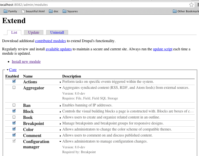
There has been a long intense discussion in D8UX: Redesign Modules Page following the research we did to find a solution. We have done a lot of usability tests on this page, to uncover three major problems:
- The module page is overwhelming, thereby failing to inform users about Drupal’s extensibility.
- It is hard to find a module after you uploaded/downloaded it.
- Additional information such as dependencies and links draw too much attention.
We followed a process of trying to get to a resolution but failed to come to a consensus, in this new issue I wish to put out the proposal from the UX-Team. We feel its best to move forward with solving part of this problem, than trying to come to the perfect solution for everything.
Proposed resolution
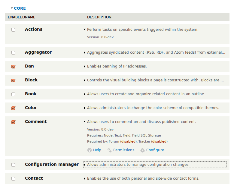
The solution we propose follows the trend in the discussion to think about hiding some of the more complex information from initial view. We designed it in such a way that you can now quickly scan down the list of modules, there is no visual nesting and all dependency information is removed from initial view.
The rationale behind all of this is that the page feels very overwhelming while people deeply care about this additional information they foremost care about finding the module they are looking for, that is the primary use case the new UI is designed for.
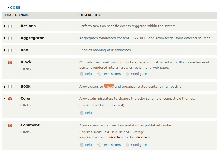
- Keep all module information by default to just one row, thus improving the scanability as there is not an immense amount of vertical row differences.
- The dependency information and operations are all hidden from initial view, because they add a lot of visual clutter - they are now just one click away.
- The module description is now forced to just one line, when it goes beyond the module description is truncated. This allows us to scale to mobile, and also motivates module owners to brief.
We also made a large number of visual tweaks, moving away from the zebra striping and putting more emphasis on the module name than other information in the table. These details are not yet set in stone, but we do wish to move forward with the overall interaction pattern proposed.
This design is the result of a few very long discussion and various iterations within the UX-team, we are sorry for taking this long to push forward on this. With the help of jenlampton, nod_, aspcilious we were able to move this to an actual patch.
Remaining tasks
Overall the code still needs review,
- Accessibility review, does it work on screenreaders and keyboard only interactions?
- Mobile review, although we did keep mobile in mind we need to ensure that it works fine on smaller screens.
We would be happy to discuss visual details in subsequent patches, and even within the team we are still debating some of the visual details. For now, however, let's focus this issue to getting the basic interaction model in core.
User interface changes

API changes
No API changes.
* Search is not in this issue/patch, because we want to keep this issue focused.
We look forward to more code reviews and discussion!
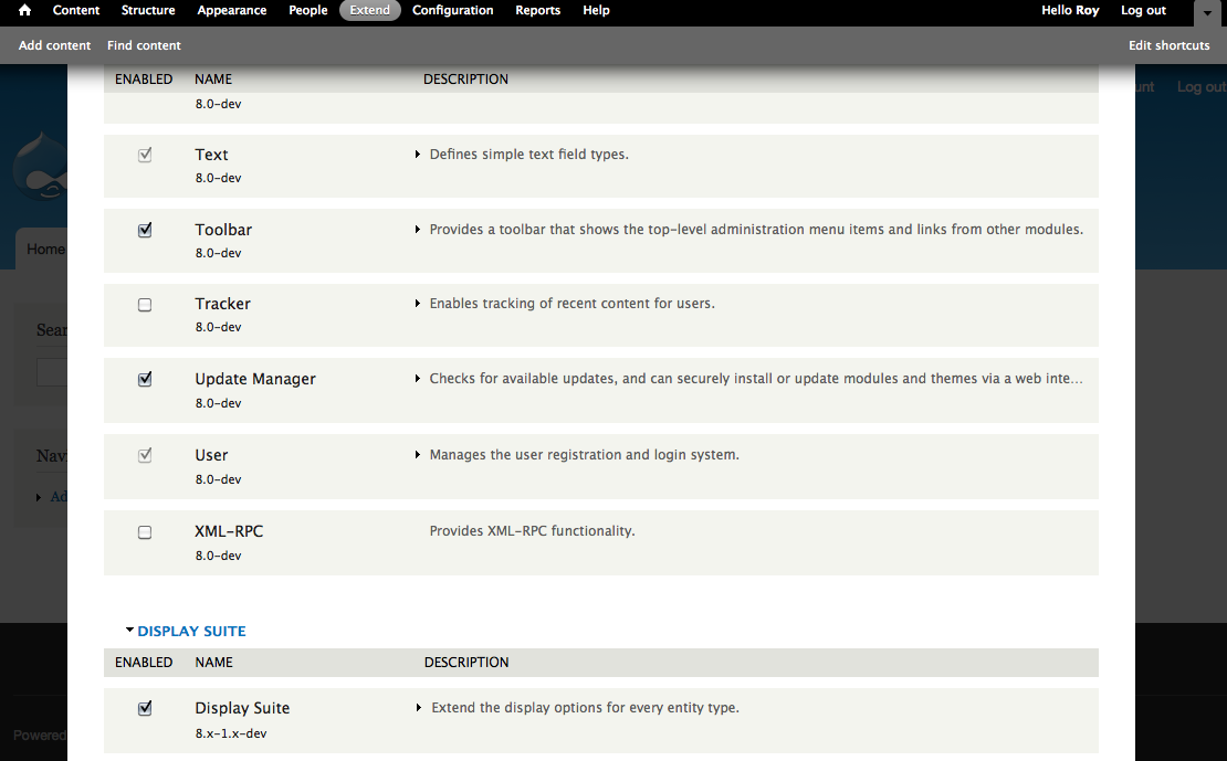
| Comment | File | Size | Author |
|---|---|---|---|
| #207 | i1790280-1.png | 8.95 KB | attiks |
| #207 | i1790280-2.png | 15.3 KB | attiks |
| #207 | i1790280-3.png | 21 KB | attiks |
| #204 | Extend | 8.x 2012-11-18 14-17-24.jpg | 110.31 KB | deviantintegral |
| #203 | core-module_page-1790280-203.patch | 12.41 KB | deviantintegral |


Comments
Comment #1
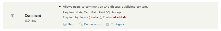
Bojhan CreditAttribution: Bojhan commentedComment #2
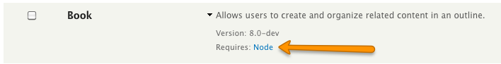
ro-no-lo CreditAttribution: ro-no-lo commentedA few suggestions you might want consider (only based on the screenshot here):
* Have open Fieldsets for everything else except CORE and CORE - Additional. (I barely change something there after the initial setup)
* Merge your efforts with module_filter thus you can filter for a specific modulenamepart
* Add a couple of links who "open all fieldsets" "close all fieldsets" (aka packages) "open all descriptions" "close all descriptions" (from opend fieldsets. This is important to search via Strg+F.
optional:
* use colorcoded rows or border-left / border-right (3px) if a module has a not matched dependency. Because you hide now all dependencies by default you'll have a hard time to *see* and *find* what is needed
Comment #3
nod_The JS part of this code is good for me (I wrote most of it…). I very much welcome the new module page overlord.
The "open all fieldsets"/"open all description" idea is pretty interesting and I agree would be a good thing to have.
Comment #3.0
nod_Updated issue summary.
Comment #4
swentel CreditAttribution: swentel commentedLooks overall good to me. How does the javascript behave when there are say, 100 modules on the page ?
One small nitpick on the code maybe.
the '<a href="#"'> looks a bit weird to me to use this. This will also trigger a hash in the url no ?
Comment #5
ro-no-lo CreditAttribution: ro-no-lo commentedAs a *manual* test, please download the first 40 projects from http://drupal.org/project/usage or at least 40 projects which are available for Drupal 8 at the moment and try the new module page.
* try to find something quickly
* try to disable something which has dependencies somewhere
* try to uninstall something
* try to NOT scroll more than 3 seconds
* try to find unsupported modules (PHP Version, Drupal version, what every ...)
* try to find unmatched requirements
* try to check which version of a module you have (Not Drupal version)
Comment #6
ro-no-lo CreditAttribution: ro-no-lo commentedSorry, not intended Status Change.
Comment #7
cosmicdreams CreditAttribution: cosmicdreams commentedI didn't see anything really off. I'll see if I can manually test this patch tonight.
Comment #8
Kiphaas7 CreditAttribution: Kiphaas7 commentedYay! Also, having a single semi-fixed row height can be a tremendous help for implementing an advanced, performant search filter.
Yay!
Yay! But I don't see any ellipsis in the screenshot indicating more content? For the Block module row, for example.
In response to #4 (JavaScript performance with 100 rows): not an issue, at this moment. The only JavaScript added consists of 2 event handlers, which are both delegated.
Personally, I would love to kill off fieldsets and group rows in a single table instead - again, this would make a global search (not just within a single module group) much, much easier. That would require fixing #31535: Allow table row groups in table.html.twig and template_preprocess_table() first though.
Comment #9
klonosI like what I see this far when it comes to cleaning up things! It's definitely much better than what we have now in D7 (though for some things perhaps too much cleaning up was done).
I'd like to see these implemented too (in order of importance):
1. Filter-searching a-la Module filter (very important!). Having this alone would (mostly) stop me from nagging about anything else. Since we're all for mobile and all, I'd like to point that there's no ctrl+f in mobile AFAIK.
2. Either provide a expand/collapse all feature and have it remember last used state or have modules with unmet dependencies be expanded by default.
3. I download a module after visiting the respective project page and going through it. Some of the modules I've been using for years too, so I pretty much know what they are about by reading their name. What I mean is that I honestly don't care for the description and I'd prefer to have the operation links (help/permissions/configure) exposed and available to me without extra clicks.
Thanx beforehand for considering these.
Comment #10
klonos...or at least make sure that these features are easy to be implemented by contrib. @Kiphaas7: ???
Comment #11
Kiphaas7 CreditAttribution: Kiphaas7 commented@Klonos: Quoted from the start post. Let's not scope creep this issue as well by trying to add search - yes it would be another awesome addition, but it would just grind this issue to death. This patch is, in my mind, an incredible step forwards and a real improvement already. Having said that, 3 small issues with the code:
text-overflow: ellipsis;to#system-modules .description .inner {} :)Comment #12
eigentor CreditAttribution: eigentor commented+1 for implementhing this and building upon it. It solves the most urgent problems of the module page:
What has to be tested is if people actually click on the module name or the small arrow so they ever find the advanced information like configure and permission links.
But this could also be well a follow-up.
Because if they do not click, the optics could be improved to make it more click-inviting.
But maybe they do click - and all is fine.
Comment #13
ro-no-lo CreditAttribution: ro-no-lo commented(based on the screenshot): The "Comment" field is expanded. I sense that you can not easily open and close these informations without moving the mouse. Is that so? If so I would recommand to have vertical-align: top. So that the Module name stays were it is. So open and close is very fast.
Comment #14
bleen CreditAttribution: bleen commentedThis was the one thing that I think we had near 100% consensus on here #538904: D8UX: Redesign Modules Page
Nearly all the other discussion was what to do about keeping/killing-with-fire the categories, what info should be displayed in each table row and what should be hidden or removed, general UX disagreements, etc... but the one thing that seemed universally liked was the filter.
Based on that I would agree that it should be included.
Comment #15
Kiphaas7 CreditAttribution: Kiphaas7 commentedSo a couple of thoughts while playing with the patch:
I tried getting text-overflow: ellipsis to work, but failed to do it elegantly; I could only come up with the following nasty workaround; it kinda works but it kinda ruins the auto-spacing of table columns (as in, it makes absolutely sure the description column get's the maximum amount of space)
the containing
thcolumn needs to be set towidth: 100%,span.versionneeds to be removed (or wrapped insidespan.text) and the following css is required:Comment #16
klonosYeah, basically what @bleen18 said in #14, but furthermore I'd like to say that #9 wasn't a list of *all* the things I'd like to see implemented sometime somehow, it's simply a list of things I personally consider a bug with the current design (with the exception of adding a filter which is a feature request obviously) because features that were there before and helped me do things fast are now gone. If you don't agree with the term "bug" being used in this case, then they are definitely regressions. Most of these changes were made for the sake of "going mobile" (which I agree 100% for the front-end and all pages targeted for site authors, but not for site admin pages - let's simply not go there because that would be really OT).
My point 3. in #9 was a bit "selfish" shall I say, so do let me rephrase that in order to be fair and considerate to drupal newcomers (that might be unfamiliar with most modules and actually need the description). We need to find some "golden rule" or at least a middle ground here so that we can both benefit from the new design in D8. I agree with hiding all the overwhelming info from the modules page, but who's to say what is overwhelming to whom? So, please do not forget us long-time drupal users while going about doing that. Allow us to be able to at the very least do things as fast and easy as we used to do if not make it better (i.e. by adding a page filter) - but please do not worsen it.
To that end, if action links are hidden away in the new D8 modules page and thus are not available to us on page load, then at least provide a way to expand all collapsed fieldsets and have this setting be remembered on next page visits. Going one step further you can make this a smart(er) behavior. The end goal after all is not to see *everything* but to be able to easily scan the page in one go so one can spot missing dependencies. Why not do that for us and have only fieldsets of such modules be expanded by default? Hence, my point 2. in #9. Doing things this way, we will retain the non-intimidating look of the page for newcomers in accordance to what we aim for while at the same time making sure we improve things for long-timers by automating some of their tasks.
While I'm at it, let me suggest this crazy thing: why not completely hide the description? Please don't rush to shoot me dead before reading on! ...Doing that will make it easier for mobile. No? Having it shown by default we presume that *everyone* visiting this page needs this information available on page load which is plain wrong. So, I propose to have the actions links be displayed instead (they will almost always take the same hspace + there'd be no need to truncate anything). The "help" action link would expand the fieldset to show the description. A "more help" link (actual link text TBD) right after the description would be there to do the actual job of liking to the module help (lead to a d.o documentation page, a page showing the README.txt file included in that model or whatever). In other words, this link would behave the same way a "read more" link does.
Honestly, my intention is not to side-track this issue (or any issue for that matter). I fully understand the time we've all spent debating in the previous issue and also the fact that there's only a few weeks left before we go feature freeze. But that also means that there's the risk that certain features I'd like to see in D8 won't get implemented if I don't persist. So to my defense... for implementing some kind of filter in the modules page we already have separate issues but I personally don't see any movement in any of them:
#396478: Searchable modules page
#1475204: [META] Provide a generic search/filter UI interface pattern for listing pages
#1757618: Add Instant filter functionality in D8 core.
Hopefully now you understand why I am (perhaps - I honestly don't feel that way) hijacking this issue. Anyways, do you still feel strong about these being matters to be addressed in separate (perhaps follow-ups of this one here) issue(s) and that they have absolutely no reason being discussed and addressed in this issue?
Comment #16.0
klonosey
Comment #17
Bojhan CreditAttribution: Bojhan commentedThanks all for chiming in, I would like to address a few of the suggestions - but also wish to note that we should really try bringing this to a concencus, if you all feel that in general this direction is good. We should push it further and address critical issues, but leave nice-to-have features to followups. @klonos, Kiphaas7 it would be very helpful you could hop onto IRC some time and just chat about this.
We totally want a search filter on this page. But as mentioned in the issue summary, to keep this issue focused we decided its better split of than to try and do a quite technically challenging thing next to an already invasive change. Feel free to decide what the issue is we continue this in, but please sit down with someone like nod on IRC to hash out the best strategy for that.
@Kiphaas7 We do want to expand all the text, that is indeed a bug. That active is also toggled on the checkbox when clicking the name is indeed a bug. The fact that we now don't allow enabling by clicking on the label, is indeed a disadvantage of this solution, I am not sure if its necessary a big one - because generally the expectation pattern is that you click on the checkbox to select something.
@ronan.orb For search, see my comment above. We can't close Core by default, because that would mean that by default people can't see any modules untill you collapse - that is not a core experience we want to pursue. I am contemplating the open all/close all option but I am a little worried its more an advanced use that common use and it might make for a very messy interaction (seeing dozens, of fieldsets open at once) - I wouldn't mind understanding the reason behind this more other than a cool feature for a couple usecases is this a 80% thing?
Looking forward to some more code reviews.
Comment #18
Wim LeersLooks like a solid improvement! :)
Yes, we want more, but I think everybody will agree this is a great step in the right direction. Let's get this incremental improvement in ASAP and address more aspects in follow-up issues.
s/#666666/#666/
LTR?
Should be defined as a library? Don't we want *all* JS to be in a library?
s/accessing/access/
s/on modules page/on the modules page/
Comment #19
XanoHow is a margin-top LTR/RTL-relevant?
Might it be a good idea to keep the Configure/Permission/Help links visible at all times in their own column? I have no empirical data to support this, but it might improve users' initial impression of using a new module, because it can get them started instantly. The downside is less space for the description.
Comment #20
Kiphaas7 CreditAttribution: Kiphaas7 commentedBojhan: when you and the team did the redesign, were the following issues kept in mind? As in, how do you see them work best with the current proposal?
#1608878: Add CTools dropbutton to core
#1276908: Administrative tables are too wide for smaller screens
Because I see some overlap in functionality (hiding of content based on width, moving of the operations links, only conditionally showing operations links)
Comment #21
Wim Leers#19: Darn, I selected the wrong line. It was the next one, the
float:left.Comment #22
Bojhan CreditAttribution: Bojhan commentedThanks for the code review, I hope someone can adress these.
@Kiphaas7 At the time of our design the dropbutton, did not yet exist/move. We did take into consideration contextual links, but as far as I figured if we have on disclosure mechanism for the dependancy information its a little silly to have another one for actions. The thing I dislike about adding dropbuttons is that it creates a "rainbow" effect where sometime we do have a link and other times we don't (which is not the case in 90% of the places we would apply dropbuttons) - I actually really dislike that about the current module page too.
FYI, I can't adres the code issues - I would love if other people can help out on that.
Comment #23
nod_reroll.
Fix from #18
Added the whole row as a target to expand
remove empty link and added a keyboard event listener to expand with keyboard
Remove useless "-" in modules that don't have versions
Comment #25
nod_forgot a file during the fight :p
Comment #27
Wim LeersThanks for the reroll, @nod_! You fixed the nitpicks (nice), but more crucially, you converted it to use a library instead of a straight JS file. Great!
I'm pretty sure I've figured out the silly reason for the test failure:
This block is causing testbot's red flag.
AFAICT: This change block should be removed. The line
$row[] = array('class' => array('description'), 'data' => $col3);should be moved into the same location it was in in the initial patch.I think all that is needed now is one more reroll that incorporates the feedback from #15, and then this should be ready to go. I spent my night working on this while I *should* have been preparing a presentation.
So, besides fixing the bug that @nod_ introduced, I did:
AFAICT it's now "feature complete", for the limited scope that we have defined. AFAICT it works well. Let's try to just fix bugs and get this in ASAP — only 66 days until feature freeze!
Comment #28
Kiphaas7 CreditAttribution: Kiphaas7 commentedI will try to test run the patch as soon as possible, but if you actually did implement the css I mentioned in #15, did you also get that without the absolute positioning the label column expands to show names on a single line, while with absolute positioning it forces most modulenames on multilines because the width is decreased to just fit the column header title?
(this is because the css is basically a convoluted way of setting table-layout to fixed, see table-layout at w3schools, which might be an easier/more robust way of getting this in. Though the issue of column headers dictating the width of columns is something we need to agree on, see the earlier mentioned problem of module names)
That was one of the reasons why I'd call the css I mentioned in #15 wonky at best; unless you made some changes to improve that..?
Yes, this patch is important, but also I think coding ellipsis in this patch is important - particularly because it *might* require changes to the html structure. And because it is a clear indicator of more text being there.
Comment #29
Wim Leers@Kiphaas7: I incorporated most of your CSS as-is. I'll ping @jessebeach to ask her to weigh in. From what I can tell, the CSS works flawlessly; we can still perfect it later, but you're absolutely right that it should get reviews from a CSS expert before going in.
I was so focused on getting the other aspects working correctly, that I actually didn't notice that problem. Excellent point! I've addressed that problem in this patch by playing a little bit with the widths for the "name" and "description" columns. On mobile devices, I've swapped the ratio, because there we hide the module description anyway.
The ellipses are indeed important. But that's working now. I'm curious what you'll say in your review!
Comment #30
Kiphaas7 CreditAttribution: Kiphaas7 commentedSo a couple of changes...
Did not touch the rest.
Comment #31
Wim LeersI think the z-index on the sticky tableheader should be there anyway, for protective measures. Setting each column's width specifically is fine I think.
I kept the overly specific CSS selectors for clarity (they already were overly specific).
I'll try to do a proper review later unless somebody (hopefully!) beats me to it.
Comment #32
Kiphaas7 CreditAttribution: Kiphaas7 commentedz-index are a bad idea in general in drupal, because there are too many elements trying to control the vertical stack. Better to avoid them and let the browser try to figure out the flow.
Comment #33
yktdan CreditAttribution: yktdan commentedI would like the module page and the Available updates page integrated. The differences between them are annoying. So how about another link called update along with the permissions and configure actions.
Comment #34
Wim Leers#32: It is out of scope, so that's fine. Let's not discuss that here.
#33: That's another feature. See the above comments. Let's focus on a narrow feature set, and get that right, and *then* move on to more features.
Comment #35
Kiphaas7 CreditAttribution: Kiphaas7 commented#34: You're absolutely right.
Ontopic again, my patch definitely needs a thorough review: I kinda rushed it, so I might have missed something.
Comment #36
attiks CreditAttribution: attiks commentedMy 2c:
Comment #37
Kiphaas7 CreditAttribution: Kiphaas7 commented#36
Comment #38
attiks CreditAttribution: attiks commented#37
Comment #39
Kiphaas7 CreditAttribution: Kiphaas7 commentedWell, comments about the design (version string, showing installed dependencies or commenting on that) I'll gladly defer to the UX team.
About the arrow being shown even if the description fits one line: there is no easy way to fix that. It should be a css solution only: might be able to do something like this (second example):
http://www.cssplay.co.uk/menu/text-overflow.html
The link above requires an extra element, but maybe it's also possible with content using :before or :after. Or something like that.
Comment #40
Wim LeersGood feedback, thanks @attiks! However, it is indeed all UI/UX feedback, so it's up to @Bojhan and others to comment on that :)
Comment #41
Bojhan CreditAttribution: Bojhan commented@attiks Let me try and address your concerns;
1. We can move the icon elsewhere, if we chose to make the title clickable. I am still on the fence about this one. Because moving it to the far right, basically moves it out of your immediate focus in this table. But could be the way to go, I'd like to hear some other voices on this.
2. The version is indeed not in its own column, which does make the description a little harder to scan. However I feel by giving its own column, we make it harder to scan - because instead of fixed widths you now have another version column with very varying width.
3. What do you mean by indication of version?
4. You are correct, this was a decision made in the other thread. Basically we don't think its an 80% usecase that you need to know, that things are good. You really just want to know whats missing and needs to be enabled/installed. I am sure there are some usecases to know this, we just thought it wasn't important enough for the core usecase this can be easily done in contrib exstentions.
Comment #42
dcmistry CreditAttribution: dcmistry commentedThis is a great thread! Thank you to everyone who is involved.
Regarding the click/hot area to activate the module:
In my opinion, I do not think that the clicking on the module name should activate the checkbox. The checkbox is for that. I am confident that people understand the checkbox behavior. I understand that it would increase the hot area but it is not the pattern we should encourage. Also, the drop down icon works well in this case - it provides the visual cue to every user (new, existing, and advanced) that more information is underneath.
Comment #43
attiks CreditAttribution: attiks commented#41
#42 A checkbox on it's own, is pretty meaningless, the html used for the module name is
<label for="edit-modules-core-ban-enable" class="module-name" tabindex="0">Ban</label>which implies it is tied to the checkbox. I assume screenreaders use the label to find meaningful information about the checkbox. It is a pattern used by all form api checkboxes and radio buttons.I've been running the patch the whole day, and I find myself clicking on the module name all the time.
Comment #44
nod_Made a few changes,
I'm happy to reroll with changes, let me know. Attached a screenshot too.
The checkbox thing is tricky, As we saw on the issue, developers like to click the name to check the checkbox (me included). And Bojhan has always seen people click the checkbox, not the label. Since this page is more likely to "technical" people than others, I'd say we should stick with the label checking. Since the description makes it obvious there can be more to toggle I don't feel it's necessary to keep the module name as the toggle for description.
Feel free to disagree and I'll be rerolling. Don't want to bikeshed to death here. I'm provinding a patch for people to try out, not necessarly as the way to go.
Comment #45
Bojhan CreditAttribution: Bojhan commentedI have asked other UX'rs to chime in, I don't think this is bikeshedding this is good discussion on the details. I feel like we are really close already.
I am not really fond of making version its own column, as described in #41 the reason I put it in the same column as the description is because it creates a lot of clutter due to its extremely varying width. On the actual dropdown, I don't really like when its somewhere mid-column, the most common place for the dropdown is at the beginning or end of object. If we were to move it, I'd move it to the far right. But lets get some more feedback on this.
Comment #46
Everett Zufelt CreditAttribution: Everett Zufelt commentedWhat mechanism is available for a screen-reader / keyboard only user to expand these rows?
Comment #47
ro-no-lo CreditAttribution: ro-no-lo commentedI added a few screenshots of the current state. Looks great so far.
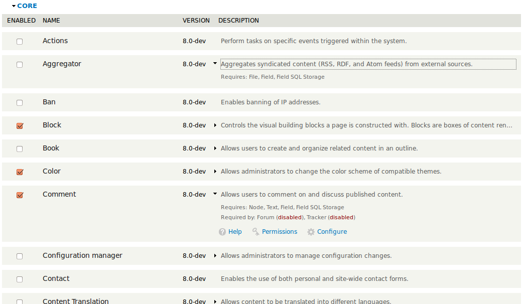
I downloaded like 24 D8 extensions to check a bit the page.
modules_001.png: The version column could use a little space at the right side, so the arrow will not merge with the text. Personally I find "ENABLED" for the checkbox column to wide. Imagein a language where "Enabled" gets translated to a word with like 15 characters. This would take up so much space. For something everybody figure out in seconds. (I used google translate to find a word. In Dutch "ENABLED" is translated to "INGESCHAKELD", spanish: "HABILITADA".
modules_002.png: All fieldsets closed. Imho a closed fieldset could use a nice visual as well. A plain bar with the legend text inside. Just the legend texts floating around looks strange (just think there are no messages and errors)
modules_003.png: who finds the error in that image?
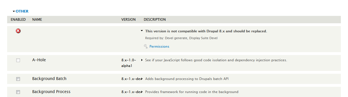
modules_004.png: I renamed devel.info to devel.info_ to simulate a removed module which other modules depended on. There is no visual warning that a enabled (!) module has a dependecy which is no longer matching. Which is an important information. Oddly the devel module is mentioned then in the OTHER section without any name. Also the "devel generate" shows an error message, which is correct but refers to an empty name. Which has no useful iniformation. :-/
modules_005.png: (see 004)
modules_006.png: IE9
As much as the clean look might look nice, I feel interactivly disabled to figure out just by scrolling which modules are providing interactions - The links. In Drupal 7 I *learned* that the modules page is the page which I have to visit to easily get the settings pages of modules. I'm a visiual person and it was simple to scroll and see where "settings" are possible.
This is completly gone by now. I have to open every module by hand. My simulation has only 23 modules. My normal drupal 7 build have like 30 to 50. That does not feel right.
// ...
I'm sorry, when my topic is not entirly based on the CSS / JS rewrite on the modules page. I tested the page also in IE9, which I noticed there is that the IE is nice the to "VERSON" column and adds many soft breaks to give the description column more space. looks odd.
Comment #48
Bojhan CreditAttribution: Bojhan commented@Everett Should be pretty much the same as a fieldset collapsing. I was able to operate it with a keyboard just fine, we'd have to know though whether the semantic order/clues are accessible.
Comment #49
Kiphaas7 CreditAttribution: Kiphaas7 commented#48: Intuitively, haven't tested, I would say no: all the indicators are handled via CSS (background image arrow, ellipsis). Even though it is keyboard accessible, there is no indication sans CSS that there is more.
However, do we really want this to also affect screen readers? We could try to come with a solution that hides the text only on screen, not from screen readers.
Comment #50
sunBy moving the version string into the name/label column, you will resolve the visual flow, clutter, and readability issue.
Move the version below the module name. Only make it appear when the row is expanded.
Make sure to use a lighter font size + weight than the module name, and that its spacing aligns with the spacing of the expanded description.
Comment #51
eigentor CreditAttribution: eigentor commented-1 for giving the version its own column. The version was findable and readable just fine in the original version http://drupal.org/files/module-page-redesign-proposal.png
It makes the arrow for opening the fieldset harder to find, in the current version it clashes with it some times like here http://drupal.org/files/modules_003.png. So in the end the column would have to be quite wide or it might expand the rows into two rows like in http://drupal.org/files/modules_006.png. Apart from that it adds visual clutter.
A whole lot of trouble for this information.The question has to be asked for whom the version is important. People who care about the version of the module will probably be more experienced Drupal users. And those won't have a problem finding it inside the description column.
Comment #52
yktdan CreditAttribution: yktdan commentedA raw version number without any additional information is pretty useless to all but an expert. For someone who understands enough to know about modules and be looking at this page at all, probably the most interesting thing is whether they are running the current version or if they are backlevel and should investigate further. So a link to the Drupal project page is important. There they will find the details of what is current and the issues list which is perhaps why they were looking at the module list page at all. One of the common problems is guessing the project name given the "common name", who would guess that Organic Groups was /project/og.
Comment #53
eigentor CreditAttribution: eigentor commentedIf it shall be in another place, Suns Idea is probably the best solution:
Alternatively it could have its own row in the description column, which does not look as good, though.
But if it is to be seen all the time the original Layout is the best solution IMHO.
Comment #54
yoroy CreditAttribution: yoroy commentedFirst off, huge props to bojhan and team to even get this much-debated page into a state where we have a working patch and can discuss design details. Great job all.
My thoughts on the patch in #44:
1. Version column messes up when version string exceeds a certain character length.
2. If I remember correctly, one of the results from the interviews was that version number is quite important to a pretty large group. I'd be happy to tuck it away in the manner sun suggests though. I like that suggestion.
3. In the collapsed state, I miss an indication that a module *has any settings (operation links) at all*.
4. Version string is more prominent than description. I don't think the design needs to put more hierarchy to them besides the order of mentioning, the difference in color seems unnecessary.
5. The collapse/expand triangle icon between version number and description implies that there's a relation between the two. There isn't.
Overall it seems http://drupal.org/files/module-page-redesign-proposal.png is the better direction to pursue.
The missing indicator for there being config/perms/help links at all in the collapsed state seems like a serious issue to me. I imagine if we have #1355526: Add a way to determine the date a module was added so the modules page can use it for sort we could use that to show newly found modules as expanded first. But even that feels like only fixing part of the problem.
Comment #55
nod_I'm for the version number underneath the module name. It feels like a good place to have this information.
For the links, how about using the soon-to-be-committed dropbutton thing?
Comment #56
Everett Zufelt CreditAttribution: Everett Zufelt commented#49 Thanks for the feedback
- This will need to have a logical flow and appropriate semantics to pass the accessibility gate
- unless there is a strong rationale the experience for a screen-reader user should closely match that of any other user. I don't want to have to read through any of that crap we are hiding 90% of the time either.
Comment #57
Kiphaas7 CreditAttribution: Kiphaas7 commentedEverett, could you try out the following link? It's a very simple test case which uses the same technique as the patch to hide excess description text.
http://jsfiddle.net/SZr8t/1/embedded/result/
Comment #58
Everett Zufelt CreditAttribution: Everett Zufelt commentedKiphaas7
"Text that has been hidden by means of overflow hidden."
Is what I read with JAWS 13 + FF 15.
Comment #59
Kiphaas7 CreditAttribution: Kiphaas7 commentedRight, so that means all the patches at this point, accessibility wise, only hide operation links and requirements.
I think this might be the right trade-off to make, and thus a good thing. I mean, description text is cut short to improve the visual scannability (is that a word?) of the modules list by enforcing a constant row height. Which does not make much sense to do in a screen reader. Hiding operation links and requirements obviously is still a good idea for screen readers.
So basically what we need from a accessibility point of view, would be a cell containing the following:
I think the button needs to be after the description for semantic reasons. However, this would impose some serious issues for moving it to the left as we do now. So I'd propose to move it to the far right with CSS which is easier (because the description cell is already on the far right). This would also be in compliance with usability, if I understood Bojhan in #45 correctly.
(obviously the button would be styled to look like the dropdown arrow, it's just there for semantic/accessibility purposes)
Comment #60
Kiphaas7 CreditAttribution: Kiphaas7 commentedAlso, +1 to the first image of #53. Small version number underneath the module name sounds like a solid compromise.
#54: the toggle arrow can be indicative of more descriptive text AND/OR operations links + requirements. Especially the first (more descriptive text depends on the width of the cell and the amount of text. Which would mean adding JS which would have to check on page load + _every_ resize if there is text to be hidden. That might not be performant.
Interesting link for a very simple case:
http://www.cssplay.co.uk/menu/text-overflow.html
But that one isn't very accessible because the image indicating extra text is not hidden, it's just pushed in the hidden overflow region (which would make it unconditionally visible for screenreaders).
Basically, if you want to conditionally show the arrow, there are the following cases to take care of with JS on each resize (which will result in looping over each row, which might be costly if there are many rows):
Comment #61
Everett Zufelt CreditAttribution: Everett Zufelt commented@Kiphaas7
To be clear, the only thing hidden in this approach is the extra description length? As long as a screen-reader user doesn't come across a "more >" style action that does nothing then this seems reasonable. Having the requirements hidden from screen-readers is key, as it makes a browser "find" on the page far more efficient.
Comment #62
Kiphaas7 CreditAttribution: Kiphaas7 commentedyes, in this approach the description is truncated for "regular" browsers, but not for screen readers (overflow: hidden). Requirements and operations links are hidden from both screen readers and regular browsers (display: none).
A useless "more" style action is at this point also a problem for non-screen readers. So JS seems to be the only option, both for checking the display of the "more" link and creating it.
However, the JS loop required can be significantly shortened by outputting an extra class on those rows that have no links and requirements (should be done serverside). Those would be the only rows that need checking for a "useless" more link, because it is dependent on if the description text gets truncated or not. But since this is not affecting screen readers (they get the whole description all the time), the "more" style action (only for these rows!) should have
aria-hidden="true"to hide it from screen readers.http://www.456bereastreet.com/archive/201205/hiding_visible_content_from...
Granted, support is not great for this property, but something is better than nothing? :)
Comment #63
Everett Zufelt CreditAttribution: Everett Zufelt commentedWhat is the cost of using JS to hide the descriptions? I'd rather us not use poorly supported properties. Remember, assistive technology can be expensive, and isn't updated as quickly as we as developers might like.
Comment #64
attiks CreditAttribution: attiks commentedRandom thought: The admin/config page uses a 'hide description' at the top of the page, why don't we use something similar?
Comment #65
Everett Zufelt CreditAttribution: Everett Zufelt commentedhttp://www.w3.org/TR/wai-aria/states_and_properties#aria-hidden
Would seem to me like we would be using the wrong semantic, and with poor implementation support. My reading is that aria-hidden is to be used when an element is "not visible or perceivable to any user ". Even if this approach might help some users, I think that Core should demonstrate best practices for accessibility.
Comment #66
Kiphaas7 CreditAttribution: Kiphaas7 commentedhttp://www.456bereastreet.com/archive/201205/hiding_visible_content_from...
That's why I listed the berettastreet.com link. It is in the spec.
Comment #67
Everett Zufelt CreditAttribution: Everett Zufelt commentedI still don't think that a solution that only works for some users is acceptable. If the goal is to simplify the UI, then a link that does nothing isn't simple, it is confusing. Nevertheless, let's make sure that the portion of the spec you quoted is referenced in the code where aria-hidden may end up being renderd, so that we can reinforce the best practice.
Comment #68
Kiphaas7 CreditAttribution: Kiphaas7 commented#67, true but as a reminder, that will only happen if there are no operation links/requirements to start with AND
aria-hiddenis _not_ supported.We could increase the support range by adding
role="presentation"to it, if I read the following article correctly (particularly test 9 and 10):http://john.foliot.ca/aria-hidden/
Comment #69
Everett Zufelt CreditAttribution: Everett Zufelt commentedrole=presentation will remove the native semantics, but the text will remain.
Comment #70
Bojhan CreditAttribution: Bojhan commentedWe discussed this with the UX-team at UX hour today, you should all have been there :) We spend about 40 minutes going over the changes, we discussed the concerns regarding version placement, dropdown placement, operations discoverability and general direction.
1) We would like to move the version numbering out of the description, into either its own column to the right or below the module name as shown in option 1 in comment #53. If anyone can please show a screenshot of both, so we can evaluate the best option (especially considering lengthy version labels).
2) We will leave the operations as is, although a dropbutton would be a possibility. The biggest issue for these operations is in the install workflow, and although we now hide them. The better fix would be to provide possible workflow/message when enabling them to signal configuration/permissions. So this is postponed on a new issue, that targets workflow of new modules.
3) Collapsing - we are all a little on the fence with this one. By moving the version to the right, the issue described by yoroy is removed. But in general we felt the pattern described in this thread, of clicking the label to toggle the checkbox is very uncommon and not a good argument to change this.
That's all!
Comment #71
Everett Zufelt CreditAttribution: Everett Zufelt commented"we felt the pattern described in this thread, of clicking the label to toggle the checkbox is very uncommon and not a good argument to change this. "
Isn't any checkbox label a target for triggering the click if it is associated with the checkbox using the label's @for attribute?
Comment #72
yoroy CreditAttribution: yoroy commentedAppend version number to the module name label
The label would become ‘Display Suite 8.x–1.x-dev’ instead of ‘Display Suite’
This looks sort-of allright to me but will result in funny text-wrapping of the version number on certain smaller screen widths. Not sure if using a nowrap tag is evil.
Keep version as a column, but show as the last one
This keeps everything for a single row on one line, so that’s relatively compact in that sense, but it also looks quite disconnected, so far away from the module name. Looks clean but I don’t like it, literally looks like an afterthought.
Show the version on its own line under the module name
In my firebug prototype this was simply done as
This design doubles the initial height of each row in this long list. It does show the version close to the module name without funny wrapping issues. But for just the version info this doubling of the height for each row seems a bit much.
But expanding on this, it does create room for showing operation links:
Show version below label, show operations by default, too
So you’d get in the first td ‘ModuleName + version’ and in the second cell ‘First line of description + any operation links’.
A triangle for expanding would then expose the rest of the description + dependency information.
Comment #73
attiks CreditAttribution: attiks commentedI think the last screenshot from #72 is a nice compromise, it gives you access to all information and actions.
Comment #74
yoroy CreditAttribution: yoroy commentedAnd lets not forget the initial design, included once more for comparison:
Comment #75
Wim Leers#72: in your last screenshot, is it really intended to *always* show the version number, hence more or less doubling the height of each row? I'd consider that a serious regression in comparison to the other mock-ups/prototypes/patches, because the information density gets reduced by half.
Comment #76
yoroy CreditAttribution: yoroy commentedWim: correct & agreed. The only justification would be that it would create room to also always show operation links as well. I'm not convinced any of these options are better than the initial design.
Comment #77
Bojhan CreditAttribution: Bojhan commented@yoroy Thanks for showing these options. We had a discussion on IRC, and its true that the best alternative would be the last in comment #72 - as version number has a connected place and the operation links are always showing. But we also found that the 95% usecase is simply finding that module name, anything else should defer to that usecase. And having two lines then seems somewhat cluttered.
It seems though that we might have just cycled around to the original design. Because then its close to the module name, not disconnected and keeps it to one row. The change being, we put the collapse icon in front of version + description. Instead of module name.
Comment #78
yoroy CreditAttribution: yoroy commentedAgreed. I think we should proceed with the original design, only changing the position of the expand/collapse icon as you say.
Comment #79
tstoecklerIf we keep the collapse in front of the module name, we could keep the one line height by default and then show the version below the module name only when expanded.
I'll try to cook-up a screenshot of that.
Comment #80
tstoecklerSorry, x-post. Did not mean to change status.
Comment #81
Wim Leers#79: that's what I believe is best as well. I think the only people opposed to this would be developers. I know that I wouldn't mind, and in fact @sun also would not mind, because this is precisely what he proposed in #50!
Comment #82
Kiphaas7 CreditAttribution: Kiphaas7 commentedSo just to be clear, we are putting the collapse/show toggle in front of the description, and not at the far right side of the description? Either way is fine by me, just wanted to know if there is any consensus on that.
That leaves the discussion if the label should trigger a collapse or not. Once again reading between the lines it seems that the label is now back to toggling the checkbox?
From a semantic point of view, it should toggle the checkbox. But granted, it's not a widely known feature probably. Again, either way is fine by me, just want to clear things up.
(as a compromise for mobile we could make the entire cell of the checkbox clickable for the checkbox)
Comment #83
sunI do not see why anyone would need the version number of a module at first sight. In terms of priority, that's clearly secondary information. First, navigate and locate. Second, inform and operate.
The last shot of #72 would be an alternative, but it occupies too much screen estate. It also hinders scanability/findability by cluttering the screen with irrelevant information.
I'd therefore recommend to go with #50/#53, showing the version only in the expanded state, below the module name:
Automatically makes this screen more compatible with mobile, which is an extra plus.
(Btw, the checkbox and label column should be vertically aligned to the top. Otherwise, the contained interface elements will "jump" in a ugly way when expanding/collapsing, moving the interface elements unexpectedly to a different position.)
Different topic:
In all screenshots so far, I wasn't really happy with the expansion/drawer yet.
I agree with @Everett that the module name should be the label for the checkbox; i.e., clicking the label should toggle the checkbox. That's just a regular checkbox interface and what I'd expect as a web user on any site and page.
The expansion/drawer/toggle icon looks a bit misplaced. Neither before the module label (#0), nor before the description column (#53/#72) looks like the right place. Also, I almost guess it's very hard to locate and hit its focus area, partially caused by its size. The size and discoverability also makes me wonder whether new users are going to be aware of it.
I wonder whether the toggle shouldn't
1) be located far to the right where such expansion toggles are usually located (end of the row)
2) have a larger icon
3) be mainly for visual purposes only; a click anywhere on the description would actually unfold the row.
Comment #84
Wim LeersOkay, so consensus is clear: #50/#53 it is :)
I would say that the placement of the expansion icon for the drawer is a minor issue that can be addressed in a follow-up.
AFAICT the remaining todos are:
1. reroll based on #50/#53
2. perform an accessibility review
3. rerolls until we meet accessibility requirements
4. profit?
Am I missing something?
Comment #85
Bojhan CreditAttribution: Bojhan commentedThanks sun, for chiming in. It's clear we are close but not there yet. Although yoroy agreed on the original design, I feel its valuable to at the very least try out the alternative that we have now defined. We can always decide it doesn't work.
@Kiphaas7, WimLeers, nod_ Could you try making a patch, that does the following:
1) Moves the dropdown icon to the far right.
2) Moves the version information in the name column, only to be shown on collapsing (and vertical align-top).
As far as I know, the whole row (beside label) is already clickable to toggle open and close.
Comment #86
cafuego CreditAttribution: cafuego commentedI've had a little go, but I don't know how to make the version expand as well when the dropdown button is clicked.
If the dropdown icon moves to the right, I suspect it might need to be rotated 180° so it points left, because as per attached screenshots it looks ... odd :-)
Comment #87
paddy_deburca CreditAttribution: paddy_deburca commentedI too think that it is odd having the icon point right - especially when the text to the left is expanded, the most important text being expanded is the Description - not the version number - I think that the icon should be to the left of Description.
Paddy.
Comment #88
nod_Updated

Comment #89
cafuego CreditAttribution: cafuego commentedHmm... I think it still looks odd. What if the expand control was all the way to the left of the checkbox and pointing back to the right? (sorry ;-)
Comment #90
nikkubhai CreditAttribution: nikkubhai commentedI saw this issue for the first time. So, I think I can give an unbiased reaction to the latest submitted design.
1. Sorry, but I am really unhappy with the arrows on the right. My 1st reaction to it was : What the heck? Why should take my mouse from left corner of the screen to the entire right corner ? Just to save small vertical space ?
2. Also, the biggest problem with modules page is once we have many modules, the page becomes extremely long. I still don't see that problem has been solved properly with the latest design.
3. Maybe I am unhappy because I have used the module : http://drupal.org/project/module_filter which redesigns the module page in a much better manner.
Anyways, I have little knowledge. Please ignore if the points didn't make sense to the issue.
Comment #91
nod_Have you tried the patch and not only looked at it?
Comment #92
yktdan CreditAttribution: yktdan commentedAgree long mouse moves are bad design
module_filter is a big win. You are wasting time designing something missing those features as it will be ported and used in preference.
Comment #93
Bojhan CreditAttribution: Bojhan commented@yktdan Saying we are wasting time is very inconsiderate.
We are aware that module_filter is great at solving the height problem, however we have spend over 300# comments in the previous issue to reach to this. We are really close, we cannot greatly change scope anymore, I'm sorry. I guess module filter in D8, will simply have more beautiful rows :)
Feel free to reroll it with the > next to description. I think that worked. From UX its RTBC then, I'd say.
Comment #94
nikkubhai CreditAttribution: nikkubhai commented@nod_ : Oops. sorry, I tried the patch now. I was totally wrong about my point one. Still, I could not understand what does that arrow do? There was no change after clicking on it. except a border around description.
Comment #95
nod_clear your caches (the drupal cache) :)
Comment #96
nikkubhai CreditAttribution: nikkubhai commented@nod_ : Have cleared them 3 or 4 times. The page looks the same as shown in screenshot. I am using Chrome Version 24. on linux.
This is the patch information if it may help. :
Hunk #1 succeeded at 831 (offset -22 lines).
Hunk #2 succeeded at 878 (offset -22 lines).
Hunk #3 FAILED at 920.
Hunk #4 succeeded at 911 (offset -22 lines).
Hunk #5 succeeded at 2599 (offset 100 lines).
1 out of 5 hunks FAILED -- saving rejects to file core/modules/system/system.admin.inc.rej
patching file core/modules/system/system.module
Hunk #1 succeeded at 1687 with fuzz 1 (offset -248 lines).
patching file core/modules/system/system.modules.js
patching file core/themes/seven/style.css
Hunk #1 succeeded at 1010 with fuzz 1 (offset -7 lines).
I will download latest d8 version and try again.
Comment #97
cafuego CreditAttribution: cafuego commentedI meant the ">" to the left of the checkbox or (at a pinch) to the left of the module name. I think the latter makes a bit more sense, as the module name actually expands with the version number.
I am less worried about moving the mouse (that's what it's for, people ;-) and more about this page being a mix of RTL and LTR functionality with the expander "<" sitting on the right. I think it would be the only page on a Drupal site that breaks the otherwise consistent use of ">" on the left and that's a UX problem in itself.
I appreciate I suggested them to be moved to the right to begin with, but after actually using them that way it just doesn't seem right - sorry @nod_.
Very quick mockups:
On seeing that, my preference is for the second version, with the expander between the checkbox and the module name.
Comment #98
Bojhan CreditAttribution: Bojhan commented@cafuego Sadly, we can't do that. Because check box and collapse are so closely aligned, its hit target will require to much precision - while placing it near description makes it clear that's where you go to collapse it and we have the whole description row as clickable area (without the dropdown indicator, people will not click there). Since this page is at large a one-off, I do not necessarily see users actually struggling with this - yes, it breaks a pattern but that does not necessarily mean our users will struggle with this.
Comment #99
bleen CreditAttribution: bleen commentedWhy are we married to the "arrow" in this case? As was mentioned in #98, this is a one-off-ish page why not go for something a bit different to help with the UX? This is just a thought (would certainly be easier to use on mobile):

Design of icons can probably use some massaging, but the concept is evident. Use a different (but still easily easily recognized) convention since the arrow is giving us heartburn...
Comment #100
PanchoAgree that arrows on the right are both unintuitive and cumbersome.
The last few mockups are not better with the arrow being so close to other hit targets.
And I really don't understand what should be better with plus/minus-buttons which are less intuitive plus highly irritating: does [+] mean "enable" and [–] "disable"?
I'd say we should really stick with the variant #50/#53, maybe with some minor adjustments.
Such as the last one in #83: "a click anywhere on the description would actually unfold the row." Yes it should.
Otherwise the arrows make a lot of sense left of the description, which is where the expansion takes place.
Patch and updated screenshots following.
Comment #101
cafuego CreditAttribution: cafuego commentedNow that you mention it, I usually click on the thing the ">" sits next to, not on the actual ">" itself. So, as per below...
Yes, same with the module name.
But then, if the ">" is just an indicator that there is something that can be expanded, why worry about it being next to the checkbox?
Comment #102
dodorama CreditAttribution: dodorama commentedI have three proposals:
1. The first is to get rid of the arrow, altogether. I was using google reader while reading this and in the article list there's nothing. You just click on the row. Since this is already possible in the patch why we don't just do that? The cursor that becomes a pointer and eventually highlighting the whole row will be a hint that you can actually perform an action. And the row is easier to click than an arrow in a mobile scenario.
2. Save space using lines rather than the white spacing to separate rows. Again borrowed from Google Reader.
3. Hide the table header. It should definitely be there for screen readers by I don't think we really need to explain that the title is a title, the description is a description, etc.
And I apologize if I was reading about Wordpress ... And using the Latin translation of Drupal ...
Comment #103
dodorama CreditAttribution: dodorama commentedAn interesting finding on arrows discoverability from usability testing on the new toolbar might support my proposal.
http://drupal.org/node/1137920#comment-6574554
Comment #104
cosmicdreams CreditAttribution: cosmicdreams commentedRight we're basically talking about an accordion. Why not let color declare the toggle state and dispense with the arrows.
Comment #105
cafuego CreditAttribution: cafuego commentedConsistency and accessibility, says the colour blind person ;-)
Comment #106
danillonunes CreditAttribution: danillonunes commentedI made some changes from patch #88 fixing some problems I found:
- Move the arrows back to front of the description. Explained by #93.
- Remove the white space between the rows. Explained by #102.
- Move the tabindex to the parent element. You can see that the outline when you expand a module now covers the entire description col. See attached screenshot 2.
- Move the version number to description col. Some modules doesn't have anything that can be expanded but the version, so when you click to expand the description there's a tiny wtf moment when you don't see anything expanded below the description. See the "Actions" module on the first attached screenshot - its a discarded work in progress where I was trying to get rid of the arrows to modules that doesn't needs then. Unfortunately, due to the version being hidden by default, every module needs to be expandable.
The patch result can be seen on the second attached screenshot.
Comment #107
danillonunes CreditAttribution: danillonunes commentedAlso, I'm not pretty sure if is necessary to break table consistency here. This patch takes modules table back to the standard colours and borders. Feel free to ignore it if there's some good reason for that (I didn't read the entire issue).
Comment #108
danillonunes CreditAttribution: danillonunes commentedSo, yeah, sometimes I like to remove random tags from d.org issues just to freak people out. That's my thing.
Comment #109
Bojhan CreditAttribution: Bojhan commentedI am not convinced we need all of these changes. We really just need the arrow next to the description, as I tried to explain several times (nod_ patch was a good base, we just need to move the dropdown). The consensus was there, I don't think its productive to discuss fundamental design features again - they are outlined in the summary and in the previous discussion.
I'm sorry for being so strict, but we are really close I'd be sad if we start all the discussion over again - it's really hard to get this in. And I prefer to get the design elements in that we have large consensus, and tweak further once it in instead of discussing endlessly around this really small detail.
Comment #110
danillonunes CreditAttribution: danillonunes commented@Bojhan, I'm sorry, I'll try to separate bug fixes from new suggestions for sanity's sake, but I'm pretty sure that nod_'s patch from #88 + just move the arrows still is not ready to be commited.
Comment #111
Bojhan CreditAttribution: Bojhan commented@danillonunes It probally needs review too, yhea. No problem its great to have suggestions, but I am just trying to make sure we are steering towards getting this in before feature freeze.
Let me clarify, all we need right now is the dropdown arrow to move it from the right (as in nod_ his patch) - to next to the description. That's all.
Comment #112
cosmicdreams CreditAttribution: cosmicdreams commentedRight, let's get this in and then iterate. progress++
Comment #113
danillonunes CreditAttribution: danillonunes commentedAbout the patch from #88.
There's a binary change in menu-collapsed.png. The image is mirrored. This breaks the Navigation menu.
Cursor pointer here is inconsistent with the real behavior. The clickable area (which expands/collapses the description), as defined by system.modules.js, is the td.description. So there's a place inside the td and outside the .inner which triggers the change but isn't styled with the pointer cursor.
There's no need to LTR comment since both the sides are equal.
The div should not be closed here...
But here.
Links is outside the div with the tabindex. I don't know if this is proposital (maybe a tab-navigated element inside another can confuse some browsers or screen readers?), but if is not, this made browsers shows a outline on the tabindexed element, which looks a bit wrong in this case. See the screenshots 1 and 2 for how this looks in Chrome and Firefox. Also, see the comments for cursor pointer.
Chrome
Firefox
Comment #114
yoroy CreditAttribution: yoroy commentedThank you for reviewing. Looks like it needs work :)
Comment #115
danillonunes CreditAttribution: danillonunes commentedThis patch moves the arrows to left and fix the issues I commented in #113.
Preview in Chrome
Comment #116
yoroy CreditAttribution: yoroy commentedGreat! And now it needs review to trigger the testbot ;-)
Comment #117
nod_oh dude that's awesome, thanks so much for posting a patch. Reviewed the code and I'm happy with it :)
If I was totally comfortable with CSS I'd RTBC this right away :)
Comment #118
RobLoachShould avoid use of directly using #id tags in CSS. It's better to target any parent classes available.
Not sure about setting the color. If you switch themes, the colors could conflict.
Removing color here too would be a good idea. Then you won't get conflicts between themes.
Rather not define hyphens. Do we really need it?
I like this :-) .
Comment #119
Everett Zufelt CreditAttribution: Everett Zufelt commentedCan someone give me a demo URL to review the accessibility of the proposed patch? No time to setup for every issue trying to get in for feature freeze :)
Comment #120
Kiphaas7 CreditAttribution: Kiphaas7 commentedRob Loach: for the hyphens, see http://drupal.org/node/1790280#comment-6527134
Comment #121
eigentor CreditAttribution: eigentor commented@Rob Loach well both these colors are grey. I guess that should be rather theme-agnostic.
But if this kind if stuff generally gets defined in Seven or other admin themes you might be right.
/me wishes for SASS in base themes with predefined color variables... /wish.
Comment #122
danillonunes CreditAttribution: danillonunes commented@Everett Zufelt
http://demo.do1790280.danillonunes.net
username: plsdont
password: hackmysite
Comment #123
aspilicious CreditAttribution: aspilicious commentedNeeds a bit more theming, see my screenshot.
http://www.diigo.com/item/image/1fbht/iu36
When you make the screen smaller the headers overlap and the toggle should dissapear when the descriptions dissapears.
Comment #124
mgiffordTook a quick review for #a11y, but not with a screen reader. Seems to work fine without a mouse & WAVE liked it. That's a pretty simple review though.
Would be great to get feedback from @Everett or @falcon03
Comment #125
Everett Zufelt CreditAttribution: Everett Zufelt commentedReviewed demo with JAWS 13 and FF 15
1. No action available on rows to expand. *
2. I could guess and tab to the description
3. pressing enter on the description took focus to top of DOM *
4. When returning to the row of the table nothing has changed *
Items w/ * are blockers.
Comment #126
Bojhan CreditAttribution: Bojhan commentedThanks for all the reviews :) Yup, this needs work again - luckily no UX work anymore, only css and a11y bugs.
I suggest we take a good look at fieldsets which we did make accessible, how to solve 1 - as that seems easy to solve.
Comment #127
nod_Reroll with a11y improvments. I added an
element-hiddenspan at the start of the description reading "Show description" or "Hide description" depending. Clicking on things shouldn't take the user to the top of the DOM anymore and will change the label of this new element.@Rob I tried to put the colors in the system.theme.css but that's a lot of CSS to add for only one page. I'll leave it to a CSS person to move that around if needed :p
Comment #128
Everett Zufelt CreditAttribution: Everett Zufelt commentedAre there hidden elements exposed in columns prior to description? If so, the call to action needs to be further left.
Comment #129
nod_Yes there is the version under the module name that shows up when toggling the description.
I'd rather move the module version, it's easier and will be less confusing on the code-side of things.
Comment #130
nod_Reroll with version in the description cell.
If we move the toggling element earlier in the row, we're stuck with the problem outlined in #43 that we make the label a toggle for the row instead of a toggle for the checkbox. I've had a chat with Bojhan and he agreed to move the version for accessibility reasons.
I changed the priority of the description column for the responsive toggle to fix both issues of #123 (actually I didn't really change it, the column is currently a low priority one in D8).
Comment #131
nod_obligatory screenshots:
Regular screen

Narrow screen

Comment #132
Bojhan CreditAttribution: Bojhan commentedAwesome, I'd like to put this RTBC. If there are any critical concerns, please let me know.
We should have resolved all issues, sadly we can't go ahead with the earlier agreed upon design as it creates accessibility issues. I'm fine with moving ahead with this, although I am aware there are a few other issues I'd suggest we followup on them instead of trying to get to something perfect.
Comment #133
danillonunes CreditAttribution: danillonunes commentedI updated http://demo.do1790280.danillonunes.net with patch from #130
Comment #134
aspilicious CreditAttribution: aspilicious commentedStill styling issues, please resize your screen when testing. I propose to set a fixed width on the enabled row to prevend it being to small (and giving layout issues because of that).
And on chrome I get a weird line when I expand an item. Probably caused by the a11y improvements.
http://www.diigo.com/item/image/1fbht/oruq
Comment #135
nod_Can't really set it fixed, what about the translation? might be longer in another language. Same issue with the current % though.
The weird line is an know issue on chrome, it's indeed because of the a11y improvement, there is an issue somewhere in the queue to fix it.
Little help for the CSS?
Comment #136
Everett Zufelt CreditAttribution: Everett Zufelt commented"Show appearance" needs a button role. Clicking takes me to Appearance page. I only get 3 columns and no chance to show more, is this accurate?
Comment #137
danillonunes CreditAttribution: danillonunes commentedFixed #134 first issue. What I actually do is:
Description col is fixed at 70%
Enable and Name cols are handled by browser, this means that
Enable col take the width of "Enable" text
Name col takes the rest
--
Edited: Also updated http://demo.do1790280.danillonunes.net with this patch.
username: plsdont
password: hackmysite
Comment #138
danillonunes CreditAttribution: danillonunes commented@Everett Zufelt
Are you talking about the Appearance link at the top bar menu?
This is not covered by this issue. I just kept it visible so we can change the admin theme and test the modules page with other themes.
Comment #139
yoroy CreditAttribution: yoroy commentedI've got to say, this is looking really good. It really does make the page less overwhelming. Here's a after/before screenshot:
Almost there!
Comment #140
danillonunes CreditAttribution: danillonunes commentedThis "fixes" the weird Chrome line. Actually the line is still there, it's just positioned together with the description line.
Comment #141
sunThe recent screenshots are looking great. I did not look at the code yet.
There's only one thing that bugs me from a visual/layout perspective for now: Can we reduce the gap between the table rows?
That horizontal row spacing looks really too large, and I can only guess it will be very disturbing in the long run; especially when you have hundreds of modules/rows on this page, those gaps alone will account for a considerable amount of vertical screen estate. That also applies to mobile.
I'd recommend to reduce it to 2-1 pixels.
Comment #142
Everett Zufelt CreditAttribution: Everett Zufelt commentedTried demo again.
FF 15 + JAWS 13
1. Show description still needs a semantic role, likely button.
2. pressing enter on show description does nothing
Safari + VoiceOver on Lion
1. Nothing read in name column
2. Activating Show description link does nothing
All of the above are blockers.
Comment #143
tstoecklerHere is the patch with the border-width 5px (which adds up to a 10px gap between rows if I'm not mistaken).
I agree it looks better.
Comment #144
yoroy CreditAttribution: yoroy commentedNah, lets not do that. Did you try and see? It reduces the table to one massive block, the overall look becomes dense again and it's harder to scan individual rows.
Comment #145
yoroy CreditAttribution: yoroy commentedOh, mine was in reply to #141. I don't think it looks better. Can we quibble about these things in follow-ups please and move forward with fixing actual remaining issues instead?
Comment #146
yoroy CreditAttribution: yoroy commentedNeeds work per #142
Comment #147
danillonunes CreditAttribution: danillonunes commentedThis is caused due to lack of the role button?
Also, is there any problem if we inject this button with JavaScript? If there's no JS, it really does nothing, so it should not be there.
Another thing, what is the description you get before click on the show description button?
For example, this is the Block description in a 1024x768 screen: "Controls the visual building blocks a page is constructed with. Blocks are boxes of content rendered into an..."
And this is the complete Block description: "Controls the visual building blocks a page is constructed with. Blocks are boxes of content rendered into an area, or region, of a web page."
I have a clue that the screen readers already reads the complete description before you click in the show description button, because it's not really hidden, it's just visually clipped to fit in the screen size. Maybe the "Show description" button should be renamed to something like "Show details"?
Comment #148
Bojhan CreditAttribution: Bojhan commented@danillonunes It seems there was a regression in #140, which seem to disabled some of the tabbing (e.g. you cant tab to the module name anymore, and upon tabbing description NVDA doen't actually recount the description). I am trying to pin point what it was though. Feel free to just download NVDA and try for yourself.
I think nod_ can chime in on how to the button role thing, its what we use elsewhere to get collapsing happening too.
Comment #149
Everett Zufelt CreditAttribution: Everett Zufelt commentedNot sure why, not caused because of a lack of the role.
it
Agreed.
"Controls the visual building blocks a page is constructed with. Blocks are boxes of content rendered into an area, or region, of a web page.". But, the version does not appear.
Comment #150
Kiphaas7 CreditAttribution: Kiphaas7 commentedRegarding the button: I already tried to (partly) figure this out (in words at least) around comment #57.
Comment #151
danillonunes CreditAttribution: danillonunes commentedHm, I don't know, #140 and #137 has only CSS changes...
I tested with the patches since #88 and no one actually re-read the description when it expands. I don't think there's a regression.
Also, I could navigate through modules names (actually, their checkboxes, but the screen readers reads their labels) with the latest #140 patch. I tested with Chrome + NVDA and Safari + VoiceOver.
Now I tested it, and here is what I got, after adding the role attribute: When the "expand" button is clicked, the description is expanded, but the expanded text is not read automatically, you need to navigate to it again to read the complete thing. Now I'm not entire familiar with screen reader navigation, but I think this is not the expected behaviour, right? I expect to hear the expanded content right when I click the "expand" button.
I tried to do a jQuery focus on the expanded content after the click, but it doesn't behave as expected. I found this Stack Overflow question, but the answers seems a bit controversial. I will test some suggestions from there later.
The name isn't, but the checkbox is read with the module name. Isn't this enough? (Actually, the checkbox is in the first "Enable" column, and the name is in the second "Name" column - when you focus the checkbox, it reads something like "Module name - uncheck checkbox").
Great! So we can assume screen readers will always read the entire description line and it's not a problem. Still needs to fix the problem with the other details (version, dependencies, etc).
Comment #152
danillonunes CreditAttribution: danillonunes commentedAlso, I found one small visual bug where the pointer cursor is presented at the description thead.
Comment #153
Everett Zufelt CreditAttribution: Everett Zufelt commented"Now I tested it, and here is what I got, after adding the role attribute: When the "expand" button is clicked, the description is expanded, but the expanded
text is not read automatically, you need to navigate to it again to read the complete thing."
That's alright, place for me to test?
"The name isn't, but the checkbox is read with the module name. Isn't this enough? (Actually, the checkbox is in the first "Enable" column, and the name
is in the second "Name" column - when you focus the checkbox, it reads something like "Module name - uncheck checkbox").
"
No, whatever bug causes VO not to read content in the Name column needs resolution. Most (vast majority) of screen-reader users do not tab through a page.
Comment #154
danillonunes CreditAttribution: danillonunes commentedI didn't update because I don't think it's good enough, but I'm doing now if you want to test.
http://demo.do1790280.danillonunes.net
username: plsdont
password: hackmysite
--
Also fixed the issue from #152.
Comment #155
cosmicdreams CreditAttribution: cosmicdreams commentedSo........ I'm not blind or deaf, but I love playing with accessibility tools. Using ChromeVox I'm able to get an auditory tour of the modules page. Then I close my eyes and try to navigate around the page.
Here's some findings:
Hope that helps.
Comment #156
Everett Zufelt CreditAttribution: Everett Zufelt commentedSadly I have no time to test until post Nov 4. I will note that screen-reader users do not tab through a page, but use other navigational functions (read by line, read by paragraph, jump to heading, etc.). I cannot give guidance on using chromevox.
Comment #157
eigentor CreditAttribution: eigentor commented@danillonunes thx for the Demo page! This makes it much easier to follow progress. Though the homefront now mainly fights the accessibility wars, less to see for me. But needless to say I am deeply in love with the new clean and scannable look just like yoroy.
Comment #158
danillonunes CreditAttribution: danillonunes commentedOk, I do some tests using VoiceOver/Safari without tab key and then I understand the problem. Our code looks like this:
The content of the second column is not read because it's already read at the first column - it's a label for the checkbox of the first col. This seems to be a "feature" of VoiceOver to read related labels for a given field, while avoiding reading content twice.
I don't know the best approach to solve this.
- If we remove the "for" of the label, it works, but I don't know what is the consequences of this. The obvious are: we can't click the label to check the checkbox - this can be fixed with JS - and screen readers users doesn't know what the checkbox is for until they navigate to the label. But maybe I'm missing something else.
- We can also duplicate the module name in the second column, copying it in a span out of the label and hiding it with element-invisible. But this duplicated markup is just... ugly (also I think if there's some screen reader that actually reads the labels, it'll be read twice with this solution).
I also do some research to find if there's any attribute that can override the screen reader behaviour of no read the label a second time, but I couldn't found any.
I don't go further on complex solutions like merge the second with the first column. But I can work on that if we can't find any good solution.
Comment #159
Everett Zufelt CreditAttribution: Everett Zufelt commented@danillonunes
Thanks for researching this. I consider this a defect in VO, and since the user has the information they need then I wouldn't consider this point to be one that we need to resolve.
Comment #160
nod_@Everett I'm getting frustrated by a11y issues, I don't know how to test them and me knowing would make a lot of things easier. What is the best place to setup a testing environment? is JAWS + FF / IE on windows enough? what else should I be testing on? I've checked the various doc pages but couldn't find a "a11y testing for dummies in 5 minutes" page. I'd just like the minimum setup to test the recurrent a11y issues found in core. If you have docs about how blind users are using the reader day to day that could help, if it's easy enough to get started and get the hang of it you can ignore that :p
Sorry for the not-directly-related comment on an already overloaded issue but that's the only way we'll get somewhere since people don't seem up for patching.
Comment #161
sunI've the impression that @nod_'s #160 was meant in a very constructive way, asking for how accessibility can be tested better by everyone, so ultimately having very positive intentions. Just trying hard to prevent havoc. :)
Aside from that, was #158 the only remaining, possible problem with this patch?
I'll try to do an in-depth review as soon as possible, but in case this is considered RTBC, please don't wait for me.
Comment #162
nod_Yes, the wording could lead to confusion, sun is spot on. I come in peace :)
The blockers that needs to be resolved are at #142. The HTML and JS reactions need some work to make it screen-reader friendly.
Comment #163
nod_umm, tags please.
Comment #164
sunI was curious and asked myself why we didn't face this situation before.
Apparently, 'tableselect' (the Form API #type + JS library that injects checkboxes for table rows and enables the select-all behavior; e.g., on the admin/content/node overview page) is even worse than what is being proposed here — the server-side processing injects checkbox columns with 'invisible' labels (which apparently means a LABEL element with .element-invisible class), but the actual label in e.g. the node title column is left untouched, not even the client-side JS touches it; i.e., it is not even a LABEL. Two conclusions:
1) All of the existing tableselects throughout core actually contain a link to the entity (e.g., node) in the subsequent column that is the label here. Therefore, the accessibility aspects of the checkbox in the column before were probably never really analyzed.
2) Given the findings here, it sounds like screen-readers are reading out the checkbox label in the first column AND the link with the entity title in the second column on tableselect/admin-overview forms in HEAD already?
3) A lil' bit stupid, but it would actually solve a long-standing feature request in one shot: If these issues exist with tableselect in HEAD already, why don't we use tableselect on the modules page, too? That would inherently allow you to "enable/disable all modules in this package group." — This is the third of two conclusions, so please take this with a salt of humor. Should be a separate follow-up issue and not block or derail this issue. Adding this won't help with the accessibility issues and won't help us to resolve this issue faster.
Comment #165
sunJesus.
Comment #166
Everett Zufelt CreditAttribution: Everett Zufelt commented@nod_
a11y is much like ux, there are a lot of subtleties. Some basics.
keyboard
- focus must be visible
- focus must move in logical order through page
- all actions must work from keyboard alone
screen-reader
interactive elements must have meaningful role
- dynamically generated messages must be annouced in live region (WAI-ARIA live region)
- content must be in meaningful sequence
- interactive elements must work using screen reader
There is a lot more to cover, but this is a good start.
Comment #167
Shyamala CreditAttribution: Shyamala commentedUsed test site at: #122
Tested on Chrome and Firefox on Windows - works amazingly well. 2 issues recorded:
1) Small horizontal scroll is introduced when resizing browser below 600px -> refer image:horizontal-scroll-below-600px.JPG
2) Page title for Uninstall says HOME instead of EXTEND -> refer image:Title-ofuninstall-says-HOME-should-be-EXTEND.JPG = Not sure if this should be a new issue or this will be fixed in this issue queue.
Works well in IE8. Media queries are not supported, but the UI wraps wonderfully!
Will have it tested on ipad and Sony ericsson and post results soon.
Comment #168
Shyamala CreditAttribution: Shyamala commentedIn both Ipad and Sony Ericsson Android phone, I get a message Unsupported Media Type and the site http://demo.do1790280.danillonunes.net is not accessible.
I am able to access the demo site for Bartik theme at : http://mjq977.dev4.webenabled.net/ works perfectly. I think the module demo site is a more current version of Drupal8.
Comment #169
webchickShyamala: Yeah, known bug. :( #1716790: iOS 4 and Android 2.3 and below (webkit based browsers) return "Unsupported Media Type" on XML in stock 8.x.
Comment #170
Shyamala CreditAttribution: Shyamala commentedok, will wait for it to be resolved for testing on those devices.
Comment #171
danillonunes CreditAttribution: danillonunes commentedOn style.css from Seven theme there's a line:
and...
So the width became 100% + 15px, which generates the scroll bar. This was done at issue #1751150: Improve usability of forms on touch screen and small screen devices and I think it should be fixed there (or in a followup from there), since it affects legends at the whole site.
This is funny. It happens with the limited user I created for the demo site, but not for the admin user. I fix it giving this user the "Use the administration pages and help". I think this needs to be discussed further in a new issue.
Comment #172
danillonunes CreditAttribution: danillonunes commentedI give some love to the (hidden) expand/collapse button.
Now its been generated by js and its a proper button (following the #1719640: Use 'button' element instead of empty links).
It also holds the tabindex that before was on description div, this get rid of that blue outline.
Also I give it a nice style for keyboard navigation, it's still hidden and just appears when you focus it with your keyboard, like the "Skip to main content" link.
Here is an exemple of keyboard navigate to the Block row.
Comment #173
Everett Zufelt CreditAttribution: Everett Zufelt commented@danillonunes thanks for working on this.
I'm concerned if we are using tabindex. Is there a reason it is necessary, rather than using a natively focusable element.
Comment #174
benjifisherI like what I see, and I have a tiny little suggestion to add. I have also been thinking about how hard it is to find a module on this page--I suggested an entirely different solution here: http://drupal.org/node/1407412#drush.
My thought for this issue is to add an id to each module's row, and make each module that is listed as "required" a link to that anchor. So I am looking at the entry for the Book module (as in the screen shot) and see that it requires the Node module. With one click, I am looking at the entry for the Node module.
The attached patch is a little rough. With the slightest encouragement, I will produce a better one.
One problem I do not know how to solve is that the page loads a little too far down, so "Node" is partially obscured by the table header. :-(
Comment #175
benjifisherSorry, I seem to have hit "Save" twice.
I like what I see, and I have a tiny little suggestion to add. I have also been thinking about how hard it is to find a module on this page--I suggested an entirely different solution here: http://drupal.org/node/1407412#drush.My thought for this issue is to add an id to each module's row, and make each module that is listed as "required" a link to that anchor. So I am looking at the entry for the Book module (as in the screen shot) and see that it requires the Node module. With one click, I am looking at the entry for the Node module.The attached patch is a little rough. With the slightest encouragement, I will produce a better one.One problem I do not know how to solve is that the page loads a little too far down, so "Node" is partially obscured by the table header. :-(
Comment #177
tstoeckler@benjifisher: To me (as a usability noob) that sounds like a great improvement. Can you please open a new issue for that, though? Thanks. Baby steps. :-)
Comment #178
sunFYI: The default styles for tables have been simplified and de-uglified in #1813792: Remove ugly default CSS styles for table. Technically, that should allow the new styles being worked on here to be simplified as well.
btw, I didn't see a screenshot of Stark in here yet. Since we are changing default markup and system.admin.css, validating Stark is a required step/gate.
Comment #179
danillonunes CreditAttribution: danillonunes commentedThis is a problem that bother me for decades, and for Drupal it happens with table fixed headers, with admin bars that stayed on top, and with basically any theme that defined a fixed top bar (like Twitter Bootstrap), so I think it can be fixed globally. I have a idea in my mind of how to fix this with a tiny js and I will try post it in another issue later.
Yeah, I think there's a lot of CSS that can be moved from system.admin.css to (system.admin.theme.css|core/themes/seven/styles.css), but I'm not sure exactly what.
Comment #180
Kiphaas7 CreditAttribution: Kiphaas7 commented#174 (and following comments): please, create a new issue for this. It might indeed be a very good addition, but it isn't part of of this issue. And it's not a safe tiny change, because it is related to this (monster of an) issue: #1440628: [Meta] javascript toolbar/tableheader with url fragment mess.
EDIT: Motivation for my comment is to keep this issue focused and manageable, because we already had 1 or 2 issues for the modules page were the number of proposed changes spiraled out of control to a point where nobody was able to drive a patch home.
Comment #181
yoroy CreditAttribution: yoroy commentedAgreed with Kiphaas7. We love new ideas, just not here, not now :-)
Check #172 and #173 for why and where this needs work.
Comment #182
danillonunes CreditAttribution: danillonunes commentedIf you're talking about the button, yes, it's using tabindex. I don't know what's the reason, although... :P
--
Also, I'm aware that #172 introduced a bug in IE8. I'll try take a look at it tonight.
Comment #183
Everett Zufelt CreditAttribution: Everett Zufelt commentedI'd really like us to remove tabindex and just use a logical DOM order. tabindex can introduce many accessibility problems, actually more than it solves usually.
Comment #184
benjifisherI have followed the recommendation to open a new issue for the suggestion I made in #174: #1828464: Add same-page links to the Module page. I certainly do not want to be responsible for holding up this issue. As I promised, my new patch is cleaner than the one in #174. For example, it uses
drupal_clean_css_identifier()instead ofstr_replace(), and it has better separation between theme- and form-building functions.Comment #185
benjifisherHere is a screen shot using the patch from #172 and the Stark theme.
Comment #186
nod_Ok, refocusing a bit. patch in #130 was almost there. The issue left was the role thing. Then it got way off track.
I'm not ignoring all the follow up patches but that's what they should be, follow-ups. This issue is has been active way to long.
can we please get it to the finish line and open followups for the rainbow-unicorns?
Comment #188
nod_Unrelated failure.
Comment #189
benjifisherI am a newcomer to this issue, but FWIW I agree with #186. Some version of this patch should be committed soon, and then we can have follow-up issues. The patches I have looked at make a BIG improvement to the modules page.
Looking at the details of the test failure and applying the patch locally, I agree that the test bot is wrong on this one.
Now the question is, which patch to work with. @nod_, can you say what the differences are between the various candidates? It looks as though #186 is almost a re-roll of #130. (Diffing the diff's, I see a
role="button"in #186 andif (e.keyCode && (e.keyCode !== 13 && e.keyCode !== 32))instead ofif (e.keyCode && e.keyCode !== 13).)I notice one glitch in the table headers in #186 that is not there in #172:
So what is the argument in favor of #186 plus follow-up issues instead of #172 and follow-ups? The only objection I see to #172 is whether to use tabindex (#173). FWIW, I have already opened another issue to deal with my suggestion in #174.
Note: there are screenshots for #172 in #172 itself (Bartik) and in #185 (Stark).
Comment #190
eigentor CreditAttribution: eigentor commentedAs the accessibility issues appear the only thing holding this up I wonder if they can be addressed in follow-ups?
Comment #191
Kiphaas7 CreditAttribution: Kiphaas7 commentedI don't think so: isn't this a regression, because there were no accessibility issues before on the modules page?
Comment #192
xjm@Kiphaas7 is correct; accessibility is a core gate.
Comment #193
Everett Zufelt CreditAttribution: Everett Zufelt commentedAt this point I'm not exactly sure what the outstanding a11y issues are. I am hoping that this can be reviewed at the Nov 18 a11ySprint in Toronto. A most recent demo page would be great for those at the sprint.
Comment #194
webchickBoth Jesse and I will be in attendance at the a11y sprint and that's definitely the plan. :)
Comment #195
dagmarI tested this patch. In chromium the first two columns are overlapped as #189 illustrates. This doesn't occur in Firefox.
I think the problem is this:
Please consider in some languages the word 'Enabled' may be longer than in English.
Therefore I think we should either use a bigger value or just avoid use size for the 'Enabled' and 'Name' columns.
Comment #196
ro-no-lo CreditAttribution: ro-no-lo commentedAs you can see in #47 there are languages with longer names for "enabled".
Comment #197
Everett Zufelt CreditAttribution: Everett Zufelt commentedTagging for Toronto a11ySprint
Comment #198
benjifisherForgive me for repeating myself. As I said in #189, the patch in #186 is almost a re-roll of #130. I am not sure what the significant differences are between #172 and #186, but one obvious difference is that #172 does not have the overlapping problem mentioned in #189, #195, #196.
Comment #199
Berdir"System cron" looks wrong here?
Comment #200
deviantintegral CreditAttribution: deviantintegral commentedWe've done an initial review of #186 from the DCTO a11y sprint and it's passed an initial test, for both keyboard access and colour contrast.
One issue that was brought up was that the UX doesn't make it clear that an enabled module that can't be disabled is actually enabled. Especially for keyboard access, you have to infer that the module is enabled from the "required by" fields in the description, that are hidden by default. It's not really a regression against the current modules page, so from my perspective it's probably best addressed in a followup issue.
Comment #201
deviantintegral CreditAttribution: deviantintegral commentedActually - I was pointed to the ARIA disabled role, which we can apply to disabled checkboxes. Here's a patch with just that change - the overlap issues still need to be addressed.
Comment #203
deviantintegral CreditAttribution: deviantintegral commentedThere's another issue with this. When you show all of the columns in the smallest breakpoint, the description text doesn't show and you end up with the strangely empty column. Also, webchick suggested that we could totally hide the "Enabled" label and leave it as element invisible for screen readers, just as we don't have explicit labels for the content listings. The attached:
Comment #204
deviantintegral CreditAttribution: deviantintegral commentedForgot to upload a screencap of the issue.
Comment #205
Bojhan CreditAttribution: Bojhan commentedSo is it correct there are no a11y issues open, and the only issue is the description?
Comment #206
Bojhan CreditAttribution: Bojhan commentedAnyone can fix the small description issue, after that its RTBC!
Comment #207
attiks CreditAttribution: attiks commentedI don't have this (#204) problem, but I noticed something else, I get an outline around the description, and around an empty element.
Edit: Tested in Chromium
Comment #208
nod_The weird border is .element-hidden, was happening on vertical tabs also. I have a patch but haven't tested all the implications. I'd rather make a new issue, it's ugly but not broken.
Couldn't reproduce #204 neither could dagmar1 on IRC. RTBC.
If back to NR/RW please give browser/version so we can reproduce.
Comment #209
dagmar+1 RTBC I tested this in Firefox, Chrome, Opera and works excellent.
Comment #210
nod_I tested in IE9/8 as well
Comment #211
webchickCommitted and pushed to 8.x! YEAH!!!!! GREAT work on this folks!!
Comment #212
bleen CreditAttribution: bleen commentedIs there already a fillip for getting module filter-esq functionality in?
Comment #213
webchickYep, that's at #396478: Searchable modules page. Not sure the current status, but it'd be great to see someone work on that!!
Comment #214
bleen CreditAttribution: bleen commentedsee #1848064: Allow to filter modules by arbitrary search strings on the Modules page for followup
Comment #215
xmacinfoPlease add in back the version numbers for each module at the first level. Or, at the minimum, provide a way to expand all the collapsible quickly. There are ways to do this that are friendly to all type of users and all type of devices.
Furthermore, with this implementation, we cannot print this page to have a site overview. I cannot ask someone to click on each single collapsible to print the page.
Comment #216
sun@xmacinfo:
Both of your points seem to be based on the same use-case: "printing a site overview." — Personally, I do not think that the Modules page is an appropriate tool for achieving that.
Very long ago, I once tried hard to make #99529: Add text file export of status report happen for Drupal core, more or less exactly to resolve that use-case. We might want to revisit that.
(That said, the actual use-case is much more larger, since this information is commonly needed for all bug reports as well.)
Comment #217
webchickWe have a bit of a usability regression with the module links. Filed #1851128: Leave the details of just-enabled modules expanded in modules UI.
Comment #218
xmacinfo@sun: That’s an oversimplification saying use case is printing only! We can do screenshots, even select a region screenshot, or even looking over a coworker shoulder to look at the list.
How about looking for dev version of modules? With the new page, you need to click on every modules to check for something that was easy.
Now working quickly with module page is a thing of the past.
Folks using Drush won’t mind the new page. But it’s not part of core.
Comment #219
greenSkin CreditAttribution: greenSkin commentedThrow in a toggle link for expanding/collapsing everything.
Comment #220
yoroy CreditAttribution: yoroy commentedNew features go into new issues. Follow up all you like but lets leave this issue alone, we've had enough 300+ comment discussions for just this topic alone. Thanks!
Comment #221.0
(not verified) CreditAttribution: commentedquoting problem fix to the first link