
 Come together with the global Drupal community in Rotterdam, 28 Sept – 1 Oct 2026. Sessions, contribution, connection, and Early Bird savings until 8 June.
Problem/Motivation
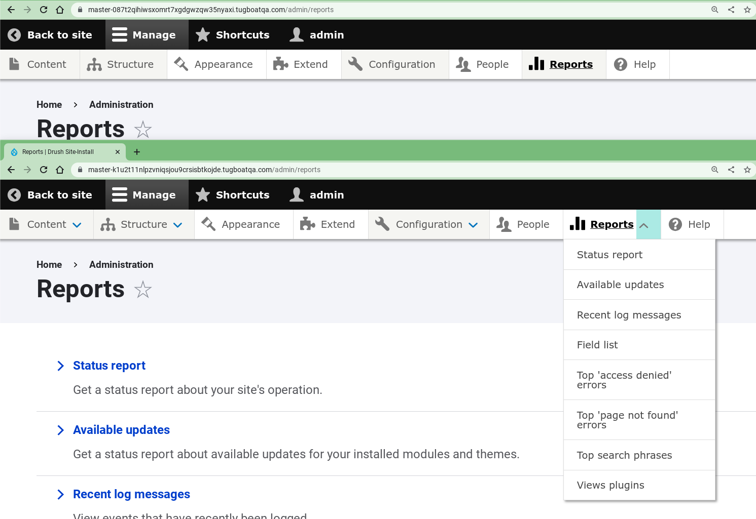
The tabbing order of the toolbar while docked horizontally causes the user to tab through all submenu items before reaching the next top-level navigation item. Hover-intent expands the submenu without user input. This presents visually impaired users with notable difficulty when using the navigation.
Steps to reproduce
Dock the toolbar in horizontal mode and tab through.
Proposed resolution
The preferred tabbing order with expanding navigation is to move from one item to another within the same level of navigation and expand an item by pressing enter (example of preferred behavior). The U.S. Web Design System uses accordions with specialized Javascript and Aria attributes to enable this behavior.
UPDATE October 2025: Using the Accessible Menu library (Github) proposed in #3526087: Use the Accessible Menu library to manage the menu structure might be a more future proof method, completely outsourcing the Accessible Dropdown Menu features to this very interesting library.
Fully accessibility compliant, properly maintained and specialized for these specific components... We could potentially move all Accessible Dropdown menu features to an external library specialized for that, and not reinvent the wheel. A ton of code would be moved out of the Admin Toolbar module as well.
User interface changes
Allows user to expand/collapse navigation items with keyboard.
Testing
Keyboard and Screen Reader
- Verify that the parent links on each level of the admin toolbar have an "Expand" button next to them. For top level parent links, this should be a down-pointing blue chevron. For lower levels, it should be a right-pointing blue chevron.
- Verify that on each level, simply focusing on a parent link or its "Expand" button doesn't automatically open its menu.
- Verify that on each level, you can toggle menus open and closed by hitting "Enter" or "Space" while focused on their toggle button.
- Verify that visible child links are able to receive focus, and hidden child links cannot receive focus.
- Using a screen reader or Dev Tools, verify that that when menus are closed, their toggle buttons have screen reader accessible text that reads "Extend" followed by the name of the parent link. Verify that when they are open, the accessible text reads "Collapse" followed by the name of the parent link.
- Verify that you can dismiss any open menus by pressing "Esc".
- Make the screen width smaller so the tray becomes vertical, and repeat steps 1-5.
Cursor
In horizontal/desktop view:
- Open a menu and submenu by hovering over their respective parent links. Verify that hovering out of the submenu onto the parent menu closes just the submenu.
- Open a menu and submenu by hovering over their respective parent links. Verify that hovering out of the admin toolbar causes all open menus to close. Verify that you can also dismiss all open menus by pressing "Esc", even if the cursor remains within the menu.
- On each level of the toolbar, open a menu by hovering over its parent link, and verify that its toggle button doesn't change. Then, click the toggle button and verify that the button rotates 180 degrees and turns gray. Verify that this change is accompanied by the menu remaining open even when hovering out of the menu.
Option to remove accessibility feature
Go to https://drupal.ddev.site/admin/config/user-interface/admin-toolbar
Check "Remove keyboard accessibility on desktop" and save.
Verify that the "Expand" buttons are gone from the menu.
Using the keyboard, verify that you can tab to any child link by tabbing through all the preceding links until you reach the child link.
Cross Compatibility
Test with Gin, Adminimal...
| Comment | File | Size | Author |
|---|---|---|---|
| #20 | admin_toolbar_regression--20230503.png | 9.08 KB | bdanin |
| #25 | tab_order_chevrons-3286466-24.patch | 11.58 KB | kasey_mk |
| #26 | newstyle-configurable-3286466-26.patch | 24.46 KB | sakthi_dev |
| #27 | arrows-from-core.png | 21.49 KB | camilledavis |
| #27 | arrows-from-gin-high.png | 21.49 KB | camilledavis |
Issue fork admin_toolbar-3286466
 Show commands
Start within a Git clone of the project using the version control instructions.
Or, if you do not have SSH keys set up on git.drupalcode.org:

Comments
Comment #4
camilledavis commentedThe usual behavior for keyboard users (pressing Enter on the parent link to open and close submenus) doesn't work here since the parent link also links to a separate page.
However I noticed in the mobile view, parent links have an Extend/Collapse button next to them which makes the toolbar a lot more usable.
In this merge request I've added those buttons to the desktop view, so it should behave in the following ways:
For cursor users:
For keyboard users:
It was also hard to see the keyboard focus state in the mobile view, so I added the blue-green focus background already found in the desktop view to the mobile view.
Some questions:
EDIT: Ignore the first 2 MRs which I closed, the correct MR is #46 and it's for 3.x
Comment #9
mgiffordThanks so much for the walkthrough @camilledavis this looks great. Seems like it provides a lot of extended functionality for keyboard only users.
Comment #10
camilledavis commentedComment #11
maggiewachs commentedThis patch makes a much needed correction to the admin toolbar's accessible behavior. Currently, keyboard users can access each menu and option, but have to do so consecutively through every menu and option. The correction allows keyboard users to move among top-level menu options and then select which sub-menu to open.
Comment #13
adriancidThanks
Comment #14
saschaeggiThis is a great change in terms of accessibility and I really like to see it, however it would have been nice to coordinate such a change a bit better. As this feels like a major change to how the module works it feels a bit weird to include this in a patch release instead of a minor release.
I've added some of the issues it has caused.
Comment #15
kvantstudio commentedYou've messed up the module on many devices! Accessibility mode should be enabled if someone needs it and in no other way. Bring it back!
Comment #17
camilledavis commented@kvantstudio Strongly disagree that there should be an extra step to enable accessibility features. Accessibility should be the default. Disabling the feature is what should require an extra step (and even then I'd be careful about disabling it for all users).
Agree with @rkoller in https://www.drupal.org/project/admin_toolbar/issues/3357166 and @itmaybejj in this thread https://drupal.slack.com/archives/C2ANFUGGG/p1680208825935249 that the arrow buttons could be made less visually intrusive.
One way could be to make the arrows not be in a circle (the way the arrows on the sub-menus are), and/or make them smaller (but keep enough padding for an adequate touch target.) Would be good to have more input from designers
Comment #18
adriancid@kvantstudio I think you need to moderate the way you're talking here.
I reverted this feature and create a new release, and reopened the issue to continue working on it.
Comment #19
saschaeggi@camilledavis we have changed the appearance of the chevron to be smaller, less visually intrusive in Gin, see #3357237: [admin_toolbar] 3.3.1 compatibility issues
cc @adriancid
Comment #20
bdanin commentedThis adds a bunch of extra icons that overlap each other, unexpectedly. I've attached a screenshot. This is a fairly disruptive change. I will lock my admin_toolbar to
3.3.0until this can be readily resolved. Otherwise, I have to add custom CSS to undo whatever change this is. Ultimately the same issue as How to remove newly added blue arrows at top level of menu, and reported a few times in the issue queue of this project.Comment #21
kasey_mk commentedI and my users really liked the change adding the chevrons and improving the menu's accessibility, and I'm disappointed to see them gone in 3.4.
They did add a lot of real estate for us admin users with lots of menu items, so I did add some style overrides to get rid of the cutesy icons which didn't add much in terms of usability.
Thanks for working on this. I look forward to their reintroduction!
Comment #22
adriancid@Kasey_MK I don't know if you followed the issue queue in the last few days with many users reporting problems with the feature, this is why I reverted all the code and invited all the users to come here to try to improve the feature, we can't have something on this module widely used that impact the sites. We can continue working here until this feature will be ready to be added again to the module.
Comment #23
bdanin commented@adriancid thank you so much for reverting this until further testing can ensure existing installs don't break the UI of active sites. I always support the addition of improved accessibility, so thanks for the continued effort.
At this point I can install the latest stable release without issue on my site :)
Comment #24
emerham commented@bdanin, it looks like you also are using the adminimal admin toolbar module? Seeing how Adminimal Admin tool bar is a Skin on-top of Admin toolbar it would be up to them to adjust their styling once Admin Toolbar has decided the best layout for their icons.
Comment #25
kasey_mk commentedI really appreciate all the work going on here, and look forward to seeing where this lands after taking people's feedback into consideration.
In the meantime, we made a patch for ourselves so our users can keep the accessibility improvement they were so excited about last week, and I'm sharing it here in case others feel similarly.
I left out the z-index update which did break things for us as well as for others (we had just overridden that in our CSS with a value of 9990). We didn't encounter any other issues that we couldn't also resolve with some CSS overrides.
The following CSS overrides in our themes make the toolbar a little less huge overall. We decided to set the visual-only icons to width:0 in order to make room for what we perceive as a vastly improved UI. We left the chevrons the size they are, recognizing the value of them being finger-sized, but tightened up some of the padding around the words, trusting that the words themselves are big enough to target.
Thanks again for continuing to work on this!
Comment #26
sakthi_dev commentedAs the new design breaks styles with other modules/themes made it configurable. Please review Continue from https://www.drupal.org/project/admin_toolbar/issues/3357738.
Comment #27
camilledavis commentedHere are a few options to make the arrows less visually intrusive, any thoughts?
Using the chevron from core level-2 dropdowns:

Using the chevron from Gin - vertical placement could vary too:

Comment #29
camilledavis commentedNew MR looks like this:
Works with Claro and Olivero 9 and 10 - any suggestions for other themes/modules to test against?
Also tested with Gin which will need to be updated
Adminimal would also need a small update (layout is fine but icons get replaced with the ones intended for mobile)
Fixed issue with css too generic (mentioned here: https://www.drupal.org/project/admin_toolbar/issues/3357166#comment-1503...)
Comment #30
saschaeggi@camilledavis can you share a screenshot how it would look like in Gin?
Also can we make sure that once this is RTBC that we have time to update Gin to support this (maybe we can remove the hotfix for the previously commited change as well again) so we can avoid breaking sites?
That would be lovely, cheers! :)
Comment #31
camilledavis commented@saschaeggi Here's how it would impact Gin:
Additional issues:
I'm also wrapping up a commit that would allow the keyboard navigation arrows to be disabled. They'd be enabled by default, but users could disable them temporarily (I hope!) while the dependent theme/modules are updated.
Comment #32
camilledavis commentedAdded a config option to remove keyboard accessibility, if this option is checked the toolbar will fall back on the previous behavior (force keyboard users to tab through all child elements.)
I've re-included this previous keyboard navigation code in lines 103-118 of admin_toolbar.js but one thing I find annoying is that it gets run 5 times (every time drupal.behaviors is triggered)
In the rest of the code I've prevented things from running multiple times by putting it in a once() function. However the previous keyboard navigation code passes a 'context' variable to jQuery, which the once() function would break. I can't figure out what this 'context' variable is for. Usually it's for running jQuery on updated DOM but I don't know of any module/theme that adds toolbar items dynamically. If such a module/theme is in use, the code I've added may not work - to fix it I'd have to take it out of the once() and pass the 'context' variable as well. I'm reluctant to do this though unless someone can point me to an actually theme/module that would cause this issue
Comment #33
rkollerthanks for all your work on this issue @camilledavis! i finally found some time to manually test the patch and was also finally able to successfully apply MR58. by accident i've tried to apply MR46, the closed MR from the same line which is empty, the days before. :/ i've applied MR58 to admin_toolbar 3.x-dev on drupal 10.1.0-beta1. the config option mentioned in #32 is in place. but the problem is somehow the arrows for the top level menu items aren't displayed and available in the horizontal toolbar no matter if the checkbox
Remove keyboard accessibility on desktopis checked or not. i've tried in claro as well as the latest gin dev version.Comment #34
rkollerOk i've figured out why the changes from the patch haven't been shown. A restart of the project in my local environment (DDEV) has fixed the problem (realized when the arrows were showing up after i spun up my computer again today - several
drush crhaven't done the trick yesterday night). A few observations:In general:
Remove keyboard accessibility on desktopcheckbox is functioning correctly. When checked the arrows are hidden and the regular sequential tabbing is back, unchecked the new behavior is available.Claro:
Gin
Comment #35
camilledavis commented@rkoller Thanks for testing this!
For Claro I agree that a focus outline would be better, Claro has a white-in-green outline on most stuff and I created a patch to add this to the toolbar here: https://www.drupal.org/project/drupal/issues/3270230
Comment #36
rkoller@camilledavis ahhh excellent. thank you! and i've quickly tested the patch in microsoft edge's high contrast mode. i completely forgot about that on my initial run through. i've attached a small video. looks like the arrow in focus visually disappears.
Comment #37
camilledavis commentedWeird, looks like it treats the text differently from the icons. Think the easy fix here would be to not have the arrows turn black on focus
Comment #38
rkolleryes i agree. i've quickly tested your change and that way the arrow in focus stays visible in expanded (dark grey) as well as collapsed state (blue). i think it is the correct behavior anyway not to change the component's color on focus. not aware of any case in core aside the toolbar. elements in focus get an outline which is handled in the linked issue of yours (#3270230: Toolbar focus styles are not sufficiently obvious to know where your focus is). but the color itself remains the same in focus while on hover you usually have the change of color to create some sort of affordance (that is a detail that is missing here but i would consider that out of the scope of this issue?).
Comment #39
mgiffordTagging for https://www.w3.org/WAI/WCAG21/Understanding/keyboard
Comment #40
mgiffordThis works way better for tablet users too.
Here's a screenshot without interaction. Makes it easy to see the impact before/after (after patch is at the bottom of the window).

Here's a screenshot with the down arrow being pressed, also set up to show before/after (after patch is at the bottom of the window).

If you click on the text, it works the same as without the patch. If you click on the down arrow, it becomes sticky. It is arguable that the button should have a 44x44 target size, but the text right next to it provides affordances to the same content. We may have to review this in the future, but I think it is an improvement in the behavior now for both keyboard only users and mobile/tablet users.
I like this patch.
Comment #41
mherchelI was asked to leave a review in #accessibility Drupal Slack channel. The first thing I'd like to say is wow, this is a huge improvement, and much needed!
Note that in this review, I haven't extensively looked through the code, and have done some cursory testing. The issues within the functionality I've found should be straightforward to resolve, and if not should be relegated to followup issues and should not be blockers.
aria-expandedto indicate their state to screen readers. Ideally this would be handled in core's toolbar.menu.js, but there's already a mutation observer set up, so this should be super straightforward to add.On a side note, it might be useful to add some comprehensive testing steps to the issue summary (including testing Gin, etc).
Comment #42
camilledavis commentedComment #43
camilledavis commentedComment #44
camilledavis commentedComment #45
camilledavis commentedComment #46
camilledavis commented@mherchel thanks for your feedback!
Re: the following -
If I add aria-expanded attributes I also have to add aria-controls attributes to the buttons and a unique id for all the submenus which feels messy to do here since I am just pulling keyboard functionality from Core's mobile/vertical toolbar mode, I'd rather address the core issue
(Accessibility of Main toolbar items)Edit: Use ARIA disclosure pattern for submenu buttons in vertical toolbar orientationThe "opened on hover" and "opened by clicking" states are slightly different though - if a dropdown is opened on hover, it'll close on focusout, but if it's opened by clicking it will stay open until clicked again. So the chevron rotating could indicate that the menu will now stay open until clicked closed.
If we want it consistent though I think it would make more sense to flip the chevron on hover as well.
Comment #47
dmundra@camilledavis testing your changes on a Mac using Chrome and VoiceOver the changes work as described in the testing steps.
I also add the related issue that was mentioned in comment #35 and #38.
Comment #48
camilledavis commentedComment #49
adriancidIt would be great if somebody with knowledge about accessibility can review this issue.
Comment #50
rkollerI've got reminded to this issue by the notifications and finally found time to revisit and test again. A few minor details I've noticed:
aria-expandedis the right choice for a toggle button. I always have problem as a sighted user understanding the current state for toggle buttons that change their label inbetween states. A point that Leonie Watson also illustrated in their talk for smashing magazine: https://youtu.be/OUDV1gqs9GA?t=3222 . She advocated to usearia-pressedinstead. That way the button state is either pressed/selected or not and the button label remains the same between states. That way things are completely clear and unambiguous for screen reader users?expandinstead ofextend?extend, me as a none native speaker associate with to "add" something, and i've also searched and the more commonly used combination of labels for such toggles is expand/collapse compared to extend/collapse?/node/add/articlethen if you reach in the admin menu the corresponding menu item, that menu item only gets underlined but gets no blueish background. the underline i hardly notice and the blueish background was a welcome addition but for the menu item for the page the user is currently on it feels like it is missing that focus because the blueish background is missing.structureexpanded. now you go to the top level menu itemshortcutsand expand that. thestructuresubmenu collapses. now you go to themanagetop level menu item and expand that, now the expandedstructuresubmenu is expanded again automatically? is that an intended behavior? at least for me it was unexpected. cuz if you havestructureexpanded and now expandappearanceinstead,structurecollapsesexcept probably the first point mentioned about the regression all other points are definitely no blockers for this issue. and yep as mentioned before this patch would be a huge improvement for the admin_toolbar. thanks again to @camilledavis for all the work on this issue!
Comment #51
charles belovI would be concerned about a setting which disables keyboard accessibitily for all users. I would expect disabling keyboard accessibility to be a user setting, not a sitewide setting.
Comment #52
camilledavis commented@Charles Belov I agree with you, but based on the previous discussion such a compromise may be necessary to get the feature merged...
Comment #53
benjifisherIf I read this issue correctly, there are 4 related merge requests:
The open MR applies to version 3.4.2, but there are conflicts with 3.5.0 or the 3.x branch.
It is also confusing that the feature branch for MR 58 is named 3.x.
I am setting the issue status to NW: MR 58 needs to be updated, with the merge conflicts resolved.
Comment #54
chri5tia commentedRerolling for 3.5
Comment #55
jday commentedTested #54 and it works with Claro on a 10.3 install.
Comment #59
dydave commentedWew! Thanks a lot everyone for the great work on this issue! 🥳
It is a big ticket, with quite a lot of exchanges and code changes involved, so I've been trying to get a better understanding of what could be expected in this issue 😅
Thanks Benji (@benjifisher) for summing up the current status at #53:
I rebased the previous merge request (MR !58) locally, fixed all the conflicts, cloned the branch and pushed to a new feature branch, with a "standard" name.
I then added a quick commit to fix CSpell, PHPCS and StyleLint validation errors, mostly with the
--fixflag for automated fixes.I created the new merge request MR! 138 above at #57 based on the work from the previous one, which would seem to pass all validation jobs and tests 🟢
While I was running build pipelines for the MR, I had a bit of time to test it locally and I personally really love it! 😍
Great job Camille (@camilledavis)! It looks great! 🤩
Thanks a lot! 🙏
I like very much the way the chevrons display for the top level menu items, the way they toggle when navigating with the keyboard.
I tested navigating with the keyboard "Tab" key, through the top level links, then hit the "Space" key on the chevrons to get the sub-menu expanded... this is great!!
Currently you have to go through each menu item of a sub-menu before being able to go to the next top level one... 😅
Keyboard navigation and UI are greatly improved by this merge request! 👍
See below a few screenshots of the major changes introduced in this merge request:
Navigation with mouse over, with keyboard accessibility enabled:
Focus/keyboard navigation with "Tab" and "Space" keys:
Disabled keyboard accessibility: Module's current behavior:
How do we move this feature forward?
From a coding perspective, this seems like a major refactoring and rewrite of the module's CSS and JS files:
css/admin.toolbar.cssjs/admin_toolbar.jsThis is where most of the impact of these changes would be focused and unfortunately, front-end development is not my strongest suit 😅
I have no clue how to tell whether all these changes would be "legit", respect any kind of standards, best practices, etc....
Could it be better to avoid modifying the existing CSS and JS files and create a new library with the necessary changes in new CSS and JS files?
It looks like these files have completely changed and I'm not sure how I could review or validate them...
I'm not sure exactly how we could proceed with this major change, in the sense: how could we ensure we would not be breaking some of module's current front-end features?!
Otherwise, from a personal testing experience: it felt great 👍 and everything seemed to work very well.
I have not tested responsive support, mobile support, rtl support, different browsers, etc...
I have only done very limited front end testing.
I will have to spend much more time reviewing and testing the JS file along with the CSS.
IF we were to decide to move forward with these changes and this major refactoring, we would still have the following tasks:
admin_toolbar.jsto full Vanilla JS, without JQuery.admin_toolbar.js.enable_keyboard_accessibility: true.Since all the jobs and tests are still passing 🟢, moving issue back to Needs review as an attempt to collect more reviews, testing and feedback.
Feel free to let us know if you have any questions on this comment, this issue or the project in general, we would surely be glad to help.
Thanks in advance! 🙂
Comment #60
dydave commentedComment #61
charles belovAfter attempting on simplytest.me to apply patch https://git.drupalcode.org/project/admin_toolbar/-/merge_requests/138.patch to admin_toolbar 3.x-dev version and Drupal 11.2, I'm getting an error during the build:
I don't get the error with admin_toolbar 3.x-dev version and Drupal 11.2 alone.
Comment #62
dydave commentedThanks a lot Charles (@charles belov) for taking the time to look at this issue, it's greatly appreciated! 🙏
Indeed: the patch in the MR was outdated and had conflicts with the latest DEV changes.
I have just rebased the merge request and it should apply fine now to the 3.x version of the module.
Could you please try testing the patch again?
I've just given it another round of tests and it really looks great 👍
Please, let us know if you encounter more issues trying to test the patch or with the module in general, we would surely be glad to help.
Thanks in advance for your feedback!
Comment #63
charles belovPlease note my comment on Focus indication clashes with active tab indication. There is code in patch 138 which conflicts with the patch 149 for that issue.
Comment #64
dydave commentedThanks so much Charles (@charles belov) for the feedback once again!
Yes indeed: these are different issues currently under development, so they are very likely to have conflicts and there is not much we could do to fix that.
Ideally, we would like to consider these issues separately, or potentially group one in the other...
But you shouldn't be applying both patches at the same time to test both issues, there are great chances it won't work.
If we take out the problem with the styles of the focus:
What would be your general feedback on this patch: In particular, all the work that was put into changing the tabbed navigation and the display, etc... ?
There are a lot of things that could be tested in this issue, putting aside any other known issues that could be addressed separately.
Could we perhaps try focusing on what we already have in this patch?
I personally think it is a great improvement:
I would personally say the module is much better with this patch than without.
Please let us know if you encounter more issues while testing or if you would have any questions or concerns on any aspects of this issue, we would surely be glad to help!
Thanks in advance! 🙂
Comment #65
charles belovI think the tabbing is greatly improved and works predictably. I do notice one issue:
If I am on /admin/structure and I tab to Structure, not the caret to the right of Structure, the focus indication disappears and I'm left to wonder where the focus is.
I notice Structure is a link on /admin/structure, so technically it needs to be capable of being tabbed to. I'm not a fan of pages linking to themselves, but I'm guessing that is outside the scope of the current issue.
But if it's a link, and can be tabbed to, it needs to show the focus.
Similarly, if I am on /admin/structure/display-modes/form and tab to Structure, Display Modes or Form Modes, the focus appears to disappear.
Actually, as it turns out, the underline toggles on focus/loss of focus if a menu item is in the active path. This is inconsistent with how focus is indicated in the rest of the Admin Toolbar and it took me several tries to notice that. It isn't user-friendly, at least to this user, and adds to cognitive load, taking my focus away from my task.
Please do not over-engineer focus indication.
Comment #69
benjifisherI updated MR !138. Anyone applying a patch to 3.6.2 based on the previous version of the MR would have trouble because of conflicts from #3532249: Uncaught TypeError: toolbarElement.querySelector(...) is null.
Comment #70
aaronbaumanSetting to "needs work" per pervious comment.
Comment #71
aaronbaumanI did my best to reroll the changes, but the CSS diff is basically unreadable.
It's a very brittle changeset that's going to break again if there are more upstream changes to CSS.
Comment #72
dydave commentedThanks everyone!
I thought I had mentioned this somewhere here, but it doesn't seem to be the case....
There is a related issue with a different approach #3526087: Use the Accessible Menu library to manage the menu structure completely outsourcing the Accessible Dropdown Menu features to the very interesting library:
https://accessible-menu.dev/
https://github.com/NickDJM/accessible-menu
Fully accessibility compliant, properly maintained and specialized for these specific components...
See some code examples and demos on the Github page... it really looks like what we're trying to do here 👍
Ideally, it would be great if we could potentially move all Accessible Dropdown menu features to an external library specialized for that.... Trying not to reinvent the wheel 😅
See my comments in the corresponding ticket.
I really haven't had any time to work on this.. but I would personally recommend putting our time and efforts on this issue rather than keeping on working on our own custom solution in the module...
This would also prevent having any sort of conflicts with any changes in the upstream (re #71).... since a ton of code would be moved out of the module...
Feedback, comments and opinions are more than welcome!
Thanks again! 🙂
Comment #73
ressaThanks @dydave for the suggestion, which sounds really interesting!
I have updated the Issue Summary, to alert future new arrivals to this issue for the alternative solution in #3526087: Use the Accessible Menu library to manage the menu structure.
Comment #74
dydave commentedThanks you very much @ressa! 🙏
Hope this could help getting some traction 🤞
From my perspective: The amount of work and time required to integrate the JS library and rework the styles should be lower than the one required for these changes to land and stay maintained overtime, with an immediate return in the short to mid term.
Once I'm done with the refactoring of module's Automated Tests and the clean-up of
admin_toolbar_search, I'll most likely start looking into this 🤓It looks very interesting and I'd like to get more familiar with the Accessibility standards implemented as well.
I'm not an expert at all myself ... I'm sure I've got lots to learn and plenty to catch up 😅
It's good to know though you can rely on developers who actually specialize on these kinds of standards and mostly, keep up and follow the new ones... Pretty much what we do with Drupal Core change records for example 😅
It's really intense to keep up with all the new features, evolutions, API changes, modules, developers trends, etc...
Would be happy to hear some opinions and feedback.
Cheers!
Comment #75
charles belovRegarding:
Having the chevron direction vary by level presents a cognitive challenge for me. It would be better if the chevron direction were consistent across levels, as well as consistent with the operating system behavior. In the Mac Finder, the chevron points right on unexpanded items and down on expanded items. Windows Explorer does not present a chevron.
Sorry about overlooking this before.
Comment #76
mile23Looking at the MR, it seems like the 3.x branch of the issue fork needs an update.
Comment #77
aaronbaumanSorry, i can't reroll this.
I don't understand why the delta in this MR is so huge, nor why the entire admin_toolbar.js file has been rewritten since this MR was opened.
Would be great if someone who does can circle back here.