
 Come together with the global Drupal community in Rotterdam, 28 Sept – 1 Oct 2026. Sessions, contribution, connection, and Early Bird savings until 8 June.
| Comment | File | Size | Author |
|---|---|---|---|
| #38 | 3357210 with webform module working fine enable arrow.png | 146.77 KB | Harish1688 |
| #36 | 3357210 with webform module working fine .png | 181.09 KB | Harish1688 |
| #32 | 3357210-32.patch | 4.32 KB | aziza_a |
| #26 | after_apply_patch.png | 62.36 KB | raveen_thakur51 |
| #26 | before_apply_patch.png | 60.93 KB | raveen_thakur51 |
Issue fork admin_toolbar-3357210
 Show commands
Start within a Git clone of the project using the version control instructions.
Or, if you do not have SSH keys set up on git.drupalcode.org:

Comments
Comment #3
kvantstudio commentedWho thought of making these markers? It is necessary to delete them!
Comment #4
troesler commentedPlease can you add a checkbox in the config interface to disable this feature ?
Thanks !
Comment #5
redseujactroesler wrote in #4:
I do agree. I do not like those "blue arrows" either. There should be a way to hide them.
Comment #6
rkollerI've initially commented on #3357166: Upset theme since update to 3.3.1 since i thought that issue would be about the blue buttons in general but turns out it was about gin in particular and this issue was recommended for Claro.
In general I strongly disagree about hiding or removing those buttons. From a functional perspective the changes introduced in #3286466: Tabbing order does not satisfy 508 accessibility requirements are important ensuring that the 508 accessibility requirements are satisfied. The problem is more about the styling of the buttons than the inherent functionality they provide. And you also have to note that this styling isn't something new, on the vertical toolbar, even if admin_toolbar is not installed, those blue buttons are already in use for quite a while.
But on a cognitive level those blue buttons pose a more serious problem in the context of the horizontal toolbar compared to the vertical toolbar. personally my focus it completely drawn to the blue buttons and if my eyes scan the horizontal toolbar i have a hard time distinguishing the different buttons because the attention is completely drawn away from the visual cues the icon the menu item labels provide - they become sort of subsidiary close to invisible. on the vertical toolbar the effect isn't that drastic but the blue buttons were one of the reasons i haven't used the vertical toolbar and stuck to the horizontal so far.
but i wonder would it make sense instead of removing or hiding the blue button "just" update it's styling and lower its affordance like it was done for the gin toolbar? #3020422: Toolbar style update would basically already solve that problem since it changes the styling of those buttons. The only problem that this issue isn't close of being fixed.
Comment #7
redseujacI think the user shoud be able to decide about the visibility of those buttons. In the toolbar settings there should be a possibility to disable them. That's not that difficult?
Edit:
OK. I have read the comment https://www.drupal.org/project/admin_toolbar/issues/3286466#comment-1494... and I understand the intention of the blue arrows. I understand there may be reasons to keep them, but still I'd wish that the user could disable the arrows, especially because they are causing problems on small monitors (splitting the toolbar in 2 rows!).
Comment #8
ichthus commentedI use two small monitors 1280x1024.
These down arrows occupy so much width that they make the admin toolbar wrap so it occupies two rows and obscures the top of the page.
I had to add this to my theme to restore things:
.toolbar-tray-horizontal .level-1 > .toolbar-box .toolbar-handle { width: 2.2em; }Not happy.
Comment #9
dan_metille commentedYes, accessibility is a very important priority and I fully support it. But come on, it is counter productive if it penalize the visual comfort of most users. UI/UX is an holistic science and art which should not only blindly follow rules in detriment of the ease of use. On 1440px screen, the horizontal toolbar is now split on two rows! This is not a good way to make people receptive to accessibility improvement.
Comment #10
acbramley commentedIt seems like this feature was added without an issue or notification in release notes? Unless I'm missing where it came from, the commit is not associated with any issue https://git.drupalcode.org/project/admin_toolbar/-/commit/ed4b6816274525...
Comment #11
mably commentedThis breaking update should have been include in a medium or major version release at minimum, not a minor version one.
Lots of us have been forced to roll back to 3.3.0 version, crossing fingers about the database update...
Comment #12
aastrong commentedI also saw this issue with 3.3.1 and 3.3.2
Reverted to 3.3.0 and working fine.
Comment #13
wweibel commentedUpdated Gin to 3.0.0-rc3 and toolbar 3.3.2 and the ugly arrows is resolved.
Comment #14
carsonwHere's a patch that uses the same methdodology Bootstrap does for screen readers to hide the arrows on Level 1 and restore the right padding of the top level links.
Comment #15
carsonwAccidental duplicate comment. Ignore this.
Comment #16
redseujacI applied the patch #14 and it's working properly. Those blue arrows are gone from the admin toolbar.
Comment #17
_kom__ commentedI've got the same bug on 1680 px width screen (two rows splitting of toolbar with overlapping page header).
Comment #18
loze commented+1 for #14 or making it a config option
Comment #19
mistergroove commented+1 for making it a config option. Installed the patch. Anyone else have double arrows showing on submenus too?
Comment #20
Harish1688 commentedHi carsonw,
After trying out the patch mentioned in comment #14, I found that it successfully hides the arrows. However, it has a downside in that it affects the accessibility of the dropdown, as it cannot be accessed through the tab key.
Comment #21
dtfabio commentedHi mistergroove, I can confirm that I also get the same blue arrows when switching from v 3.3.1 to v 3.3.2 of the module.
Comment #22
eduardo morales albertiComment #23
redseujacmistergroove wrote in #19:
No, I do not have double arrows on submenus.
I'm using Olivero theme and Claro admin theme and I edited the file manually not with Composer.
Edit:
I removed the patch and patched the file again with Composer. Working fine: no double arrows showing on submenus.
Comment #24
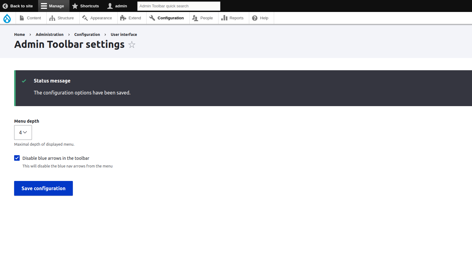
aziza_a commentedAdded config option to enable and disable blue icons as per user preference.
How to use:
1) Go to /admin/config/user-interface/admin-toolbar
2) Click on Disable blue arrows in the toolbar checkbox to disable the icons and it will hide the icons
Comment #25
aziza_a commentedDemo image files
Comment #26
raveen_thakur51 commentedHey folks! I have applied Patch #24. My Drupal version is 9.5.9, PHP version - is 8.1. I have applied the patch using Composer (2.6). and it worked perfectly fine for me. As you can see my attached images(before_apply_patch & after_apply_patch.png) for reference. Please & Thank You.
Comment #27
kevinfunk@aziza_a, thank you for your patch! It works great with Drupal 10.0.9.
Comment #28
redseujacHmm! after applying the patch on admin toolbar 3.3.2 drupal 10.0.9, my admin toolbar with the blue arrows is splitted on 2 lines. The "Help" is on the second line. So there is something wrong with some patch settings for me.
When I click the checkbox for disabling the blue arrows, it works as expected.
When I uncheck the box to return to the toolbar with blue arrows, the toolbar is splitted again on 2 rows.
So, I went back to the original admin toolbar 3.3.2
Comment #29
Harish1688 commentedHi @aziza,
After trying out the patch mentioned in comment #24.
1. patch '3357210-24.patch', working fine to hide the arrows.
2. After applying the patch it has a downside in that it affects the accessibility of the dropdown, as it cannot be accessed through the tab key.
3. Also tried with version 10.0.9, as per comment #28, but not facing any issue with after apply the patch with enable mode.
Comment #30
aziza_a commentedHave tried to fix this issue
Comment #31
redseujacHarish1688 commented in #29
I tested in version 3.3.2 of admin toolbar and not in 3.x-dev. Maybe that's the reason why I have the issue.
Any others tested the patch sub version 3.3.2 ?
Comment #32
aziza_a commentedPlease ignore #30 wrong patch added
Hi @redseujac,
Checked on 3.3.2 not able not replicate it.
PS - don't know if the solution is proper for tabbing issue - but can't think of any thing else to fix it :)
Comment #33
redseujacaziza_a commented in #32:
OK. I will try again with the patch #32.
If I remember correctly, there is a database update needed after the patch? Could you confirm this please?
Comment #34
redseujacMaybe I could have found the cause of my problem.
I have an additional toolbar item in my menu: 'Webforms'.
Indeed 'Webforms' can be displayed as a main toolbar item (with a dedicated icon), instead of being displayed under 'Structure'.
(https://www.drupal.org/node/3168118#:~:text=To%20move%20the%20Webforms%2....)
So, with that extra menu item, my admin toolbar became longer, all the more because I'm using the Dutch language and the text of the menu items are also a bit longer in Dutch.
However, when I'm using the original admin toolbar with the blue arrows, in spite of the extra menu item, the toolbar is displayed on just one row, while after applying the patch the toolbar with the blue arrows is displayed on 2 rows.
Could you try to replicate with 'Webforms' displayed as a main toolbar item?
Comment #35
gurbakshish commentedI checked the #32 patch and it works well.
Comment #36
Harish1688 commentedHi @aziza, @redseujac,
Verified the patch "3357210-32.patch" mentioned in comment #32, with core version 9.5 and 10.0.9.
Based on comment #34, I have tested the webform module by setting it as a top-level item in the toolbar. I did not encounter any issues during testing. The functionality is working perfectly fine.
After applying the patch has successfully resolved the accessibility issue with the dropdown, mentioned in comment #29.
Looks fine for me.
Comment #37
redseujacHarish1688 commented in #36
I see on your screenshot that the blue arrows are NOT enabled at the admin toolbar.
My problem with the splitting of the toolbar occurs when the blue arrows are enabled.
Comment #38
Harish1688 commentedHi @redseujac,
If we enable the blue arrows, the appearance of the menu will be altered. Enabling the blue arrows will cause additional space to be occupied, resulting in longer menu items. As a consequence, the menu items may span across two lines. However, in this specific ticket, the decision was made to remove the arrow to prevent the occurrence of extra spaces and design within the toolbar.
Comment #39
adriancidI'm closing this as a duplicate of #3286466: Tabbing order does not satisfy 508 accessibility requirements I think we should discuss and try to fix the issue there. New release coming in the next minutes reverting all the code, I missed some commits on the last revert.