
 Come together with the global Drupal community in Rotterdam, 28 Sept – 1 Oct 2026. Sessions, contribution, connection, and Early Bird savings until 8 June.
The attached patch adds tiny links (actually 'v' characters that imitate down arrows) to the log messages list. You need to have some error rows to see any difference.
I find this an enormous help in working with long tests.
| Comment | File | Size | Author |
|---|---|---|---|
| #22 | error-list.png | 40.21 KB | dawehner |
| #22 | drupal-912460-22.patch | 5.69 KB | dawehner |
| #22 | interdiff.txt | 3.3 KB | dawehner |
| #19 | simpletest_error_navigation-912460-19.patch | 5.75 KB | chi |
| #19 | test-result-demo.zip | 141.3 KB | chi |

Comments
Comment #1
bleen commentedNot sure if this is better than a "v" character, but have you considered
↓(↓) instead?Overall .. this is a nice improvement for simpletest
Comment #2
salvisThank you for your feedback, bleen18!
With default styling the ↓ is very thin. Is there a bolder down arrow hiding somewhere in the Unicode
plainsplanes?Also, I have no experience of how well these special characters are supported.
Comment #3
bleen commentedHmm... what about this:
▼(▼) I suppose I'm just looking for something more semantically correctComment #4
salvisYes, the ▼ looks pretty nice.
Here's a new patch (this is the only change).
Comment #5
salvisThis still applies to HEAD.
@bleen18: Care to RTBC this with the change that you requested?
Comment #6
bleen commentedI think this needs at one other look before it can be marked RTBC ... Everything looks good to me but I'm not familiar enough with the ins and outs of the simpletest module to know if there are any weird ramifications of this. I doubt it, but...
Comment #7
salvis#4: simpletest.link_to_next_error.912460.4.patch queued for re-testing.
Comment #8
salvisNice, it still applies.
I have seven tests that give me the following result:
#1: 3759 passes, 52 fails, and 0 exceptions
#2: 3495 passes, 39 fails, and 0 exceptions
#3: 3330 passes, 45 fails, and 8 exceptions
#4: 3052 passes, 29 fails, and 12 exceptions
#5: 3281 passes, 47 fails, and 8 exceptions
#6: 3024 passes, 25 fails, and 8 exceptions
#7: 949 passes, 36 fails, and 22 exceptions
The patch here adds anchors and links to the huge report so that I can easily jump from one fail/exception to the next. I find this pretty much indispensable...
The patch still applies to 8.x, too.
Comment #9
salvis#4: simpletest.link_to_next_error.912460.4.patch queued for re-testing.
Comment #10
danillonunes commentedWhat about a title attribute or something like that explaining where the link goes to?
Comment #11
salvisIt's an arrow pointing downwards. If you have lots of fails/exceptions, you'd have thousands of title attributes that serve just about no purpose. This is intentionally lean.
There's no harm if someone doesn't find it. Besides, SimpleTest is only used by developers (and possibly site admins) — it does not need to cater to the dumbest possible user.
Comment #12
sunIt would be much more cleaner if the jump ID incrementing logic would be part of the theme function, instead of the helper function.
Furthermore, I don't think we want jump IDs and links for every single failing assertion in a row that merely point to the next line. That's too much clutter. Instead, we need some more intelligent logic that jumps to the next block of failed assertions. Possibly output that link for the last failed assertion of the last block of failed assertions.
The change to reverse the #collapsed logic is not required for this patch.
Obviously, inline styles are discouraged. That's what CSS classes are for.
13 days to next Drupal core point release.
Comment #13
salvisThank you for your review!
Which theme function? Do you mean simpletest_result_form() rather than simpletest_tag()?
I'm not sure. Encapsulating this in simpletest_tag() is pretty clean IMHO, compared to handling it outside of the function.
Let's discuss this. I like having the 'next' links in the top left corner of the browser window. This lets me click through every fail without ever having to move the mouse. Granted, I click more often, but you are still free to scroll and click only on the last link in a group if that's what you prefer.
The links are as unobtrusive as possible. Removing them diminishes the UX and removes a mode of operation for no good reason.
Comment #14
chx commentedI like this patch too but I have my doubts over inline styles and even the inline HTML. Can you or someone else reroll using
l()and a CSS file please? I do not think we need to move the counter -- having the counter in simpletest_tag() is better in the rare case you have several simpletest results on one screen. And, I do not think it's such a clutter either.So I think this classifies as novice material now -- just convert the link to a proper Drupal link + CSS please. Thanks!
Comment #15
salvisOk, rerolled according to #14.
Comment #16
chx commentedI like this. I will let the maintainers decide whether they like it too.
Comment #17
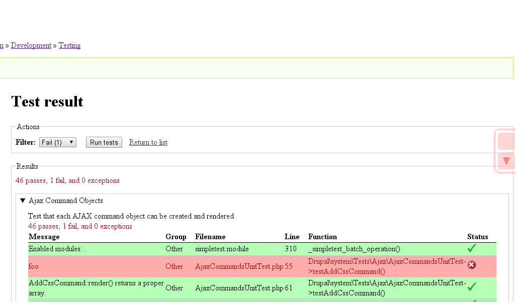
sunHrm. The first attached screenshot shows what I see with this patch applied.
The resulting UI of this is not really great. The arrows/jump-links appear in very unusual positions - partially clashing with the UI patterns of existing page elements.
I spent quite some time thinking about this, since I investigated similar ideas for potential inclusion in http://drupal.org/project/admin_ux
Meanwhile, I think an actual improvement would be to have a "sticky test results navigator."
We not only want to navigate in test results. The next best most cumbersome UI operation is to run the failing tests again, or alternatively, get back to the test overview/list page. In both cases, that usually involves quite some page scrolling, too - which is the reason for why I see these issues to be closely related, or actually, to be the same UI/UX problem space.
Thus, I strongly believe we should implement this navigator instead. It behaves pretty much like the sticky table headers, but appears above them. The previous/next links are purely JS-driven and do not require any server-side changes at all.
Here is a quickly mocked screenshot for that:
Comment #18
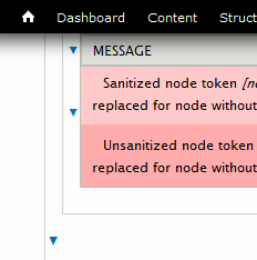
salvis@sun: For some reason the CSS does not seem to work for you. Maybe you need to clear your cache? Here's what #15 looks like for me:
The anchors need to be moved upwards to ensure that the message and the arrow is not obscured by the table header or a toolbar/admin_menu.
My idea is to make this as light and unobtrusive as possible. If you want to implement a navigator at some unknown time in the future, that's fine with me, but I need it now (actually two years ago and ever since) and it works just fine.
Comment #19
chi commentedLet's try to fix the issue with js scrolling navigation.
Comment #20
Bojhan commentedI don't get why there insn't also just a toggle, to only see the fails.
Comment #21
chi commentedIt isn't convenient for me. When error occurred I would like to know what happened before the fail. So I need to see green messages as well as verbose messages in close vicinity to the fail message.
Comment #22
dawehnerThis is really really nice! Posting a screenshot to show.
This is just a cleanup of some pieces, though it feels that sun's idea seems to be the best in terms of experience and simplicity.
Comment #33
quietone commentedTriaging issues in simpletest.module to determine if they should be in the Simpletest Project or core.
This looks like it a simpletest module issue, changing the project.