
 Support for Drupal 7 is ending on 5 January 2025—it’s time to migrate to Drupal 10! Learn about the many benefits of Drupal 10 and find migration tools in our resource center.
Hello.
Let's say I have two images - one horizontal (height < width) and one vertical (height > width). And that's how they look in gallery formatter:
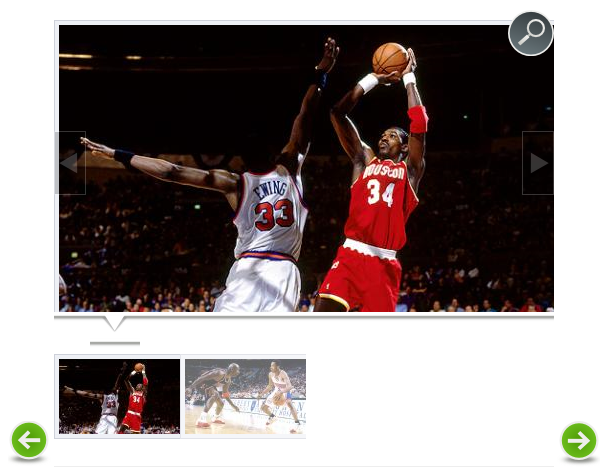
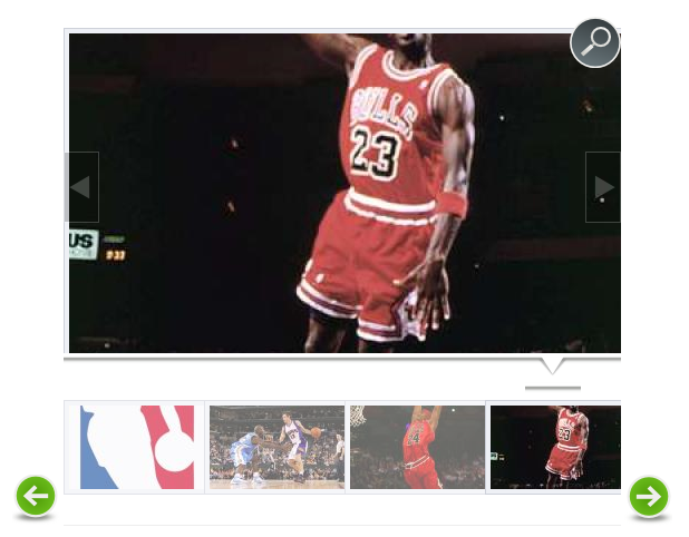
horizontal - http://drupal.org/files/horizontal.PNG which looks great.
vertical - http://drupal.org/files/vertical.PNG which looks horrible because of a bad cut when making thumbnails
Is it possible to do that the vertical image would be cropped from the top not from the middle when making thumbnails?
| Comment | File | Size | Author |
|---|---|---|---|
| #18 | gf_vertical_01.jpg | 71.68 KB | GN |
| #11 | galleryformatter_center_image_in_slide.patch | 2.73 KB | mukesh.agarwal17 |
| #5 | settings.png | 171.65 KB | Greg Adams |
| #5 | top-align.png | 254.57 KB | Greg Adams |
| #5 | middle-align.png | 426.73 KB | Greg Adams |


Comments
Comment #1
Sameo CreditAttribution: Sameo commentedComment #1.0
Sameo CreditAttribution: Sameo commentedAdded screenshots.
Comment #1.1
Sameo CreditAttribution: Sameo commentedSome more explanation.
Comment #2
Greg Adams CreditAttribution: Greg Adams commentedThis used to work with the imagecache module and an addon that worked similar to Photoshop's Canvas-Size.
I am having the same problem and am trying to fix this issue.
I've tried around a little without any success. It seems this module is not made for different orientations of pictures which is pretty sad.
I guess this needs a patch to handle both portrait and landscape pictures.. but then again.. patches are ugly.. especially when a new version is released.
Comment #3
Sameo CreditAttribution: Sameo commentedI'm almost here - http://drupal.org/files/a4fs8d4fs4d4.PNG
Unfortunately, I have no idea how to put the slide image into a center and remove that white space between thumbnails. I tried it via .css files and even module file (galleryformatter.module) without success. I guess it somehow related to .js files.
Comment #4
Greg Adams CreditAttribution: Greg Adams commentedI figured out a pretty simple way to do this... (See picture)
set the image style to SCALE: width 470px height: leave empty (standard is scale and crop)
you can change 470 to whatever size you like.
Then force the dimension of the slides box and it's children with CSS !important
I might be forgetting something.. well I Installed the dev version but I guess this works for the normal release too. Still fiddeling around though.
Tell me if this helps you at all.
EDIT: Of course you can do the same for the thumbnails below. It might be a little different if you are using the standard greenarrow theme.
Comment #5
Greg Adams CreditAttribution: Greg Adams commentedOK.. so here's how I am handling this..
VERY light on script. (I'm only adding the class "top, middle, bottom" to the wrapping container. Then I can change the layout via CSS. no unneded script.
the MIDDLE option uses a script to get the absolute height of the image and then centers it but TOP and BOTTOM are pure CSS
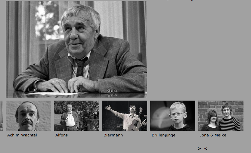
look at the pictures...
I also changed the width to 550px and the container to 470px so I can move the image around. Once set up it's fully dynamic.
BTW: the big image is supposed to be as wide as 3 thumbnails. this is a layout my client chose but it can be changed to have the full width or whatever.
Here's my CSS code
...and my script for the middle option
Comment #6
Sameo CreditAttribution: Sameo commentedWow, sounds like a good plan, but where I should put a javascript? Into a theme's .js file? (doesn't change anything)
I just installed a dev version as well.
Comment #7
Greg Adams CreditAttribution: Greg Adams commentedfor testing I just put the script in a block with PHP filter. This script can be included via the blocksystem, on the page it's needed (this way you could add small snippets for certain pages.
Then when I am done with developing I tend to load the script via the theme.. meaning I need to change all the "jQuery" back to "$".
but sometimes I just leave the script in the block because of the websites workflow.
So yes I would add it in the info file of your theme as a custom script if it makes sense.
just create a folder "js" Path: YOUR_THEME/js/yourscript.js
in the info file insert it as js/yourscript.js
this should work if your code is clean.
I modified my script a little more.. but for the one posted before I will at least correct it a little (validation stuff)
somehow I cannot get the height of the thumbs it always outputs as "0" and the same happens for the first slide element . So I just respect it and make sure the first image in the album has a specific dimension. The thumbs part is handled a little differently. My client wants a certain workflow, so I actually have to extend the behavior. I am trying not to touch the module's script at all because I'm not a big fan of patching (I only do it if it really makes sense)
Comment #8
Sameo CreditAttribution: Sameo commentedOh well, I gave up on that because it just doesn't work to me.
Anyway, thanks.
Comment #9
kiwimind CreditAttribution: kiwimind commentedThe way I got round this was to just amend the scale and crop so that images that needed cropping were cropped from the top.
Granted it doesn't work in all cases, but it works for most of mine.
Let me know if you want me to detail what I've done further.
shonk
Comment #10
dialn CreditAttribution: dialn commentedlo tengo
firts settings/ styles image
edit gallery formatter slide
eraser all efect
add new scale height:312
add new cut width:500 height:312
Listo..
Comment #11
mukesh.agarwal17 CreditAttribution: mukesh.agarwal17 commentedI had the same problem - both horizontal and vertical images and the cropping not helping me. I have written a small patch which allows the image to be in the center of the slide (in case you are not using any image style in slide style or using a different image style other than scale and crop). The patch scales well with the default implementation as well.
Next step is to provide option for alignment of the image in the slide: center, left top, left center, left bottom, right top, right center, right bottom, top left, top center, top right, bottom left, bottom center, bottom right.
Comment #12
mukesh.agarwal17 CreditAttribution: mukesh.agarwal17 commentedBtw, the above patch needs to be reviewed the moderators.
Comment #13
halloffame CreditAttribution: halloffame commentedAnything for 6.x-1.0-rc4? Tried applying the patch at #11 but it says 'patch has been partially applied' and as expected slide images does not display properly...
Comment #14
chertzogI had a problem with the patch in #11, it wasnt getting the dimensions correctly. I only needed to have the images centered horizontally, because i was scaling them to the height of the overall gallery. In the code below, I commented out the lines for centering vertically.
The offending lines were:
and they needed changed to:
As well as wrapping the entire function in:
This is because the webkit loads css and javascript at the same time, which means that when the function is executed, the images have not yet been loaded. So we put off running the function until the page loads.
There may be a better way of doing this, but this works for me.
So for anyone that needs this, apply the patch in #11 for the lines in the module file, and use the above code in the theme/galleryformatter.js file.
Comment #15
hgneng CreditAttribution: hgneng commented#11 works for me.
To center the images, I use following style:
Comment #16
milos.vucijak CreditAttribution: milos.vucijak commented#11 works great on Mozilla, and i had to patch module manually. Now i have problem on Chrome, JS cant take img weight and height, so it tako 0 as value and then position pictures in wrong place... Any suggestions?
Comment #17
jsimonis CreditAttribution: jsimonis commentedChecking in to see if there has been any progress in making this part of the module? I have a site where we need vertical images - they're posters for a play - and right now it's sizing them up to meet the width, which is making them cut off at the top and bottom.
Comment #18
GN CreditAttribution: GN commentedFor me, the most simple and robust quick-n-dirty solution seems to be not cropping vertical images at all, just framing it from both sides.

It can be achieved by using "Scale" and "Crop" effects separately instead of "Scale and Crop".
This is what we get by using
Scale 500x375, Crop 500x375 for slides
Scale 121x91, Crop 121x91 for thumbnails.
Of course, you may not like the black frame - but it makes sure that nobody's head (or hand, or leg) is ever cropped off, whatever the aspect ratio of a specific image, whether it's horizontal, vertical, or square.
Comment #19
jsimonis CreditAttribution: jsimonis commentedI ended up using a lot of the solutions above, but I had to play with the css a little more to ensure that the sliders at the bottom were as wide as the maximum space for the slider area. It worked great and the client loved it.
Comment #20
bhny CreditAttribution: bhny commentedI had no luck with the patches
#18 is so simple and works great. thanks!
Administration » Configuration » Media » Image styles
galleryformatter_slide Overridden
Scale 500x312 (upscaling allowed)
Crop 500x312
galleryformatter_thumb Overridden
Scale 121x75 (upscaling allowed)
Crop 121x75
Comment #20.0
bhny CreditAttribution: bhny commentedFixed text.