
Problem/Motivation
Use this issue to track Claro's conformance with WCAG colour contrast success criteria:
- Success Criterion 1.4.3: Contrast (Minimum) (Level AA)
- Success Criterion 1.4.11: Non-text Contrast (Level AA)
Proposed resolution
Identify contrast problems occurring in completed parts of Claro (not yet complete parts such as toolbar do not need addressing). Create child issues to address these and document them here.
Remaining tasks
Find problems, make issues, document them here adding them in the following list:
Must haves:
None added yet
Should haves:
- #3123811: Grey text in Claro theme failed accessibility
- #3266216: The section-titles in the preview section on views edit pages have a too low contrast
- #3266299: Claro: Form labels that are disabled have too low color contrast
- #3020418: Update Placeholder styles so that contrast ratio passes guidelines
- #3271652: The styling for optgroup labels in the time zone select list on the regional settings page isn't applied in all browsers
- #3272266: Grey button's background color has a too low contrast ratio against page background
- #3273056: Active and hover state of skip to main content has a too low color contrast
Could haves:
None added yet
| Comment | File | Size | Author |
|---|---|---|---|
| #22 | claro-config-contrast-issue.png | 127.44 KB | katannshaw |
| #20 | 3088562_18-20.txt | 955 bytes | boulaffasae |
| #20 | 3088562-20.patch | 1.83 KB | boulaffasae |
| #18 | before-patch.png | 284.63 KB | komalk |
| #18 | after-patch.png | 297.1 KB | komalk |


Comments
Comment #2
Thirugnana Sambandam CreditAttribution: Thirugnana Sambandam commentedAttached the file link below for reference
https://docs.google.com/spreadsheets/d/1QfbnyYpms-bw7lSPehwGG9XMu4Rpnrse...
Comment #3
saschaeggiThanks for reporting. I had a look into it and to me it looks like these issues are related to the toolbar. As we currently still use the 'old' toolbar from seven these issues are related to that. So it depends on #3070493: Introduce a mechanism to provide an alternate Claro design for the toolbar in the future, #3020422: Toolbar style update and #2539992: Move theme toolbar CSS to the Seven theme
Comment #4
saschaeggiComment #5
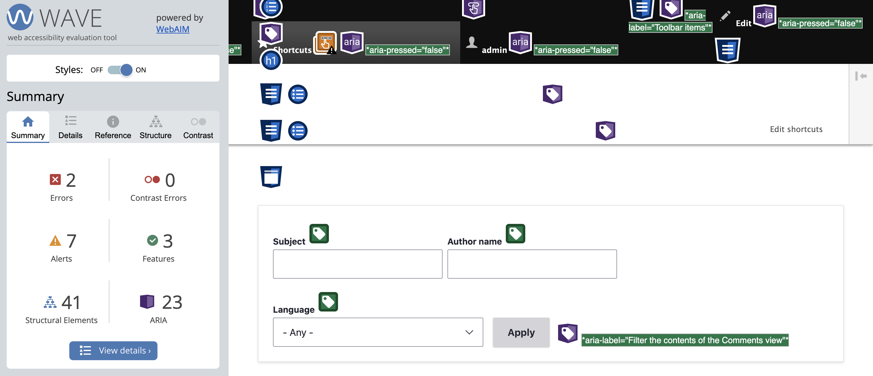
Tarun Lewis CreditAttribution: Tarun Lewis at UniMity Solutions Pvt Limited commentedI looked into this as well. Looks to me like the issues are not strictly in the toolbar. I have attached a couple of screenshots for admin/structure/block to illustrate this, through the use of Wave Accessibility Tool. Could you please confirm this?
Comment #6
andy-blumConfirming #5 that there's an issue with the .region-message class in the block layout page falling short. The '--color-oldsilver' color on a #fff background results in 3.8:1, short of WCAG AA's 4.6:1 threshold.
Adjusting this to the next darkest gray bumps the contrast to 7.38:1. Patch attached.
Comment #7
Tarun Lewis CreditAttribution: Tarun Lewis at UniMity Solutions Pvt Limited commentedThank you for confirming Ablum. I will install the patch and re-test. In the mean time, I can also confirm that there is a broken ARIA error that does not have any association with the toolbar. I have attached a screenshot of the same. This is reference to #15 admin/config/people/accounts
Comment #8
Tarun Lewis CreditAttribution: Tarun Lewis at UniMity Solutions Pvt Limited commentedHello ablum,
I had applied the patch, and I can confirm that the issue has been resolved for admin/structure/types (#5). Similar errors have been encountered in other pages. Recommend this patch be applied there as well.
Comment #9
andrewmacpherson CreditAttribution: andrewmacpherson as a volunteer commentedThe issue summary (and most comments so far) just address colour contrast. I'm changing the issue title to make that the scope. We'll triage accessibility issues on #3066007: Roadmap to stabilize Claro.
Re. #7:
@Tarun Lewis, can you open a separate issue for the broken ARIA references? These may not turn out to be the fault of the Claro theme, so it will be better to have them in a separate issue from Claro's colours.
The WAVE screenshot in #7 reports 12 broken ARIA references, but only 3 of them are highlighted in the viewport. I think we may already have an open issue for broken
aria-describedbyreferences on radio buttons.Comment #10
andrewmacpherson CreditAttribution: andrewmacpherson as a volunteer commentedComment #11
andrewmacpherson CreditAttribution: andrewmacpherson as a volunteer commentedComment #12
andrewmacpherson CreditAttribution: andrewmacpherson as a volunteer commentedComment #13
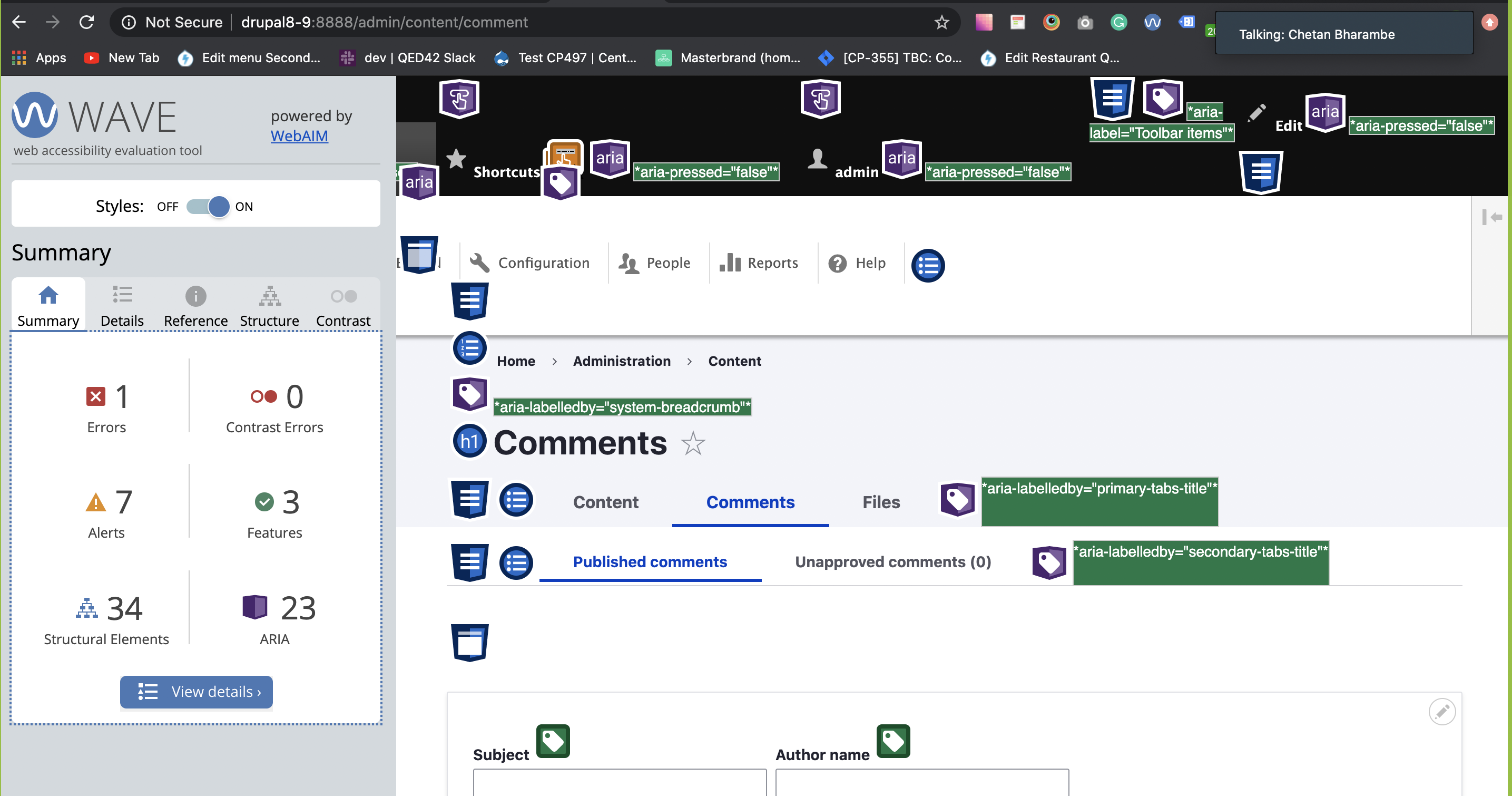
komalk CreditAttribution: komalk at Material for Drupal India Association commentedReview the patch.
The errors have been encountered in other pages regarding the contrast has been solve for me attached a screenshot for admin/content/comment for reference.
Comment #15
chetanbharambe CreditAttribution: chetanbharambe commentedComment #16
chetanbharambe CreditAttribution: chetanbharambe for Drupal India Association commentedApplied #13 successfully
Issue still exist in 9.1.x
Please see attached screenshots for both 8.9.x and 9.1.x
Comment #17
chetanbharambe CreditAttribution: chetanbharambe for Drupal India Association commentedComment #18
komalk CreditAttribution: komalk at Material for Drupal India Association commentedReview the patch attached screenshot for the reference.
Comment #19
bnjmnm@saschaeggi is correct in #3 Every contrast issue reportedin the spreadsheet from #2 is due to Toolbar styling. Claro styles have not yet been applied to the toolbar - this is happening in #3020422: Toolbar style update. There's little reason to alter CSS that will be fully replaced in that issue.
It looks like contrast issues othher toolbar may have been identified. Those should receive their own issue, and this can be a meta issue to track all of them.
I also noticed all of the patches are making direct changes to the .css files. The changes should be made to Claro's .pcss.css files, then complied to CSS. For more info: https://www.drupal.org/node/3084859
Comment #20
boulaffasae CreditAttribution: boulaffasae as a volunteer and at Fullwave commentedUpdate:
- Made changes to Claro's .pcss.css files
Comment #22
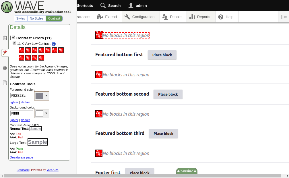
katannshaw CreditAttribution: katannshaw at Lullabot commentedI'm researching adding Claro to a D8 site for a client and I've noticed this issue at /admin/config as seen in the attached screenshot. Is there a status update on the adoption of patch #20 to fix this issue?
Comment #23
bnjmnm@katannshaw re #22, I recommend filing a new issue for what you've identified. It does look important and worth addressing, but this issue is supposed to be a meta that keeps track of all contrast related issues, not a place for patches. If it the patch in #20 addresses the issue, it could be uploaded to that new issue, with at least these two changes
.admin-item__descriptionis being changed to an arbitrary new color. It needs to match the Claro designs, and if the designs aren't accessible then the designers need to revisit and decide on an accessible color.Feel free to find me on Drupal Slack if you need any clarification on the above. I'm not sure if it's 100% coherent to someone who hasn't spent hundreds of hours in the Claro issue queue 🙂, but I'd like to help ensure it gets the attention it deserves. (and it won't get that attention in this issue).
Comment #24
volkswagenchickAdding
NorthAmerica2021andEasy Out of the Boxtags for visibility.DrupalCon NA is April 12-16 with a focus on EOOTB on Wednesday, April 14.
Thanks
Comment #25
mgiffordTagging for WCAG SC.
Comment #28
rkollerI've added one new small issue as a child issue. But I would have one further question in regards of non-text contrast. Some of the field set outlines as well as some border-bottoms in tables have a too low color contrast. Should those also meet the requirement of a 3:1 ratio and be documented? I would say yes but wanted to ask in here first before i start to collect those occasions.
Comment #29
ckrinaThanks @rkoller! Just adding the issue to the summary, I don't have the answer to you question though. Also, as an answer to #22, it's been fixed and committed in #3123811: Grey text in Claro theme failed accessibility.
Comment #30
ckrinaAdding more issues to the summary.
Comment #31
rkollerNoticed that the placeholder text has a too low color contrast as well and also found an already existing issue (#3020418 - https://www.drupal.org/project/drupal/issues/3020418). Added it as a child issue.
@ckrina and i've updated the IS. you have added the issue number of the meta issue in #30 but i suppose you've intended to add #3266299 instead? I've also added the newly added child issue to the IS.
Comment #32
rkollerComment #33
rkollerAdded another issue as a child and updated the list in the IS.
Comment #34
ckrina@todo task: sort child issues as Must haves/Should haves/Could haves so this we can prioritized.
Comment #35
rkollerFound a problem with select lists and the not applied styling in a few browsers leading up to a color contrast issue. added the issue as child as well as to the IS
Comment #36
rkollerComment #37
rkollerAdded a new issue about grey buttons as child as well as to the IS.
Comment #38
rkollerAdded another button related issue for Views where buttons turn into ghost buttons on focus.
Comment #39
rkollerComment #40
mherchelI don't think #3272614: Use the Action link button style for Views setting modal buttons should be in this list. Even though the focus state of the buttons doesn't match designs, it still meets contrast criteria.
Comment #41
ckrinaRemoving #3266760: Greyed out authenticated user role in user profile has a too low color contrast since it's a duplicated of #3266299: Claro: Form labels that are disabled have too low color contrast. Also ordering the tickets in prevision of marking a few of them as stable blockers. Let's discuss this at today's Claro meeting.
Comment #42
ckrinaComment #43
rkollerWe have discussed https://www.drupal.org/project/drupal/issues/3272614 in yesterdays weekly Claro meeting on Slack https://drupal.slack.com/archives/C7AB68LJV/p1649860250066069 . Since the initial issue is somehow fixed when retested we agreed to remove it as child from this meta issue while rescoping the issue and apply changes @ckrina suggested to bring in there instead. I remove the issue from the IS and update the issue afterwards.
Comment #44
lauriiiDid assessment on this with @ckrina. Didn't find any new color contrast issues: https://docs.google.com/spreadsheets/d/18ZHFW8bMgV3YYBSiFn8IpLxlS66uj8At.... We went through the color contrasts using WAVE, and manually through different states of elements (hover, focus, ajax triggered elements).
Comment #45
bnjmnmThere are comments that successfully document what has been reviewed, and several issues have been filed that demonstrate the reviews surfaced issues worth addressing. I believe it successfully completes the work required to confirm Claro's has good baseline AA color contrast support. It's certainly possible that edge cases still exist, but those can be filed as individual issues, as would be the case with any bug. We've found the things a basic review would surface.
This meta has done its job of being home to a broad evaluation of color contrast AA conformance in Claro, and can be closed. That broad evaluation is complete. The number of discovered issues is more than low enough for to be reasonable to use the issue queue and Claro's stable roadmap to keep track of them. This meta has done its job of providing a place for those general reviews, but keeping it open beyond that makes this issue a home to existential dread more than one where accessibility improvements happen.