
 Support for Drupal 7 is ending on 5 January 2025—it’s time to migrate to Drupal 10! Learn about the many benefits of Drupal 10 and find migration tools in our resource center.
Problem/Motivation
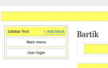
During the 2015 usability study, users struggled to understand block regions. None of them used the "demonstrate block regions" link found at the top of the Block layout screen. The assumption here is that this demo would have helped them.
Not just for noobies
Using the block region demonstration is a handy tool for anyone trying out a new theme, novice and experienced alike. It's important for this to be highly visible on the block layout page.
Proposed resolution
[still being worked out in comments below]
- Safe and easy route: Reduce and clarify help text. Change the link text to be more descriptive. Perhaps add an icon next to it.
- Radical route: Enhance the "Demonstrate block regions" feature to include block placement functionality. Make this the default UI for block placement and ordering.
API changes
None.
Data model changes
None.
| Comment | File | Size | Author |
|---|---|---|---|
| #47 | 2514150-47.patch | 5.82 KB | MattA |


Comments
Comment #1
lunk rat CreditAttribution: lunk rat commentedComment #2
lunk rat CreditAttribution: lunk rat commentedComment #3
willzyx CreditAttribution: willzyx commentedNote: currently the block region demonstration link is displayed only if help module is enabled. see #2513580: [Regression] Demonstrate block regions link in Block layout should be visible even if help module is not enabled
Comment #4
Bojhan CreditAttribution: Bojhan commentedThanks for sharing this, the obvious solutions to these are clear - but I am afraid we might lose some of the usability of this page if we start adding links all over the place.
In this case, I think we also want to explore the following directions:
- Placing it more prominently in the text (e.g. by placing it in between two paragraphs)
- Placing it just above the table, or with the first region header (avoiding duplication, but still showing it)
I think we want to avoid abusing the action pattern. The idea of the action pattern that it links you to creating things, in this case it doesn't - which will break people's mental model about action buttons. We also generally avoid having two primary action buttons next to each other, we've learned from previous tests that having two action buttons at the top creates a high cognitive burden to find out which one is the prominent one for adding things (and which one is the 99% adding usecase).
I hope we can explore this a little more.
Comment #5
lunk rat CreditAttribution: lunk rat commentedHah @Bojhan I was having those same reservations as I was making this mockup (that it was abusive to the action buttons, and that the demo links would clutter things). But I proposed it anyway to get ideas going ...
What about having the demo as a tab? I guess then you'd need to inject the other tabs above the demo or it really wouldn't be a tab.
Comment #6
Bojhan CreditAttribution: Bojhan commentedWhat about removing half of the help text there, so that its one line ending with demo? Most of the text there is really unneeded.
Comment #7
giorgio79 CreditAttribution: giorgio79 commentedWhy separate the demo from the block list? Replace the block listing with the demo, to get closer to the D8 layout initiative :)
The demo preview is much more intuitive than the boring block list.
Comment #8
webchickYep, that is definitely something I would love to see us to explore in 8.1.x+. When we're 25 issues away from RC though, we need something a bit more "quick and dirty" for 8.0.0.
Comment #9
lunk rat CreditAttribution: lunk rat commentedComment #10
lunk rat CreditAttribution: lunk rat commentedHere's a mockup to try Bojhan's idea from #6:
With this I'm trying to:
New help text:
New link text:
My reasoning is that adding the keywords "See" and "layout" will better indicate what the link does. Thoughts?
Also, I thought maybe placing an icon left of the link might help, but not sure what the patterns are for icons in the admin theme.
Comment #11
webchickThis is by no means scientific, but I had to scan around that screenshot for a good 10+ seconds before I saw the link. :\ It's very difficult to find it with the BIG ASS BUTTON being so prominent.
Comment #12
webchickOf course, the *real* way to solve this is to make the block demonstrations page the block placement UI. Stick add buttons in the regions everywhere, show a labeled box for each block. Drag and drop. Done. However, that's obviously a bit more radical proposal. ;)
Comment #13
MattA CreditAttribution: MattA commentedYou know... I should probably just go ahead and link this here too:
@webchick Fortune favors the bold. :D
Comment #14
lunk rat CreditAttribution: lunk rat commented@webchick: I am with you on #12 ... remember this was my first suggestion in the sheet during our debriefing and analysis (my suggestions got deleted when we restored the Google sheet ... sniffle). I was holding off on this so as not to offend anyone with a radical proposal ... but if this is "the *real* way to solve" it then we should change the issue title and description to reflect that mission ... be radical!
@MattA your mockup is ace, I think we should shoot for something like this! And as you said, another benefit about the region demo is that it also provides a theme demo, so #2513556: Add a link to the Block Layout page on the Appearance page could benefit from this change.
This would also solve #2513528: Add a link to add a block in empty regions on the Block layout page. and of course it also came up in #2512456: Implement the new block layout design to emphasize the primary interaction of placing a block
Comment #15
lunk rat CreditAttribution: lunk rat commentedComment #16
lunk rat CreditAttribution: lunk rat commentedUpdated issue summary proposed resolution to reflect proposals in comments.
Comment #17
Bojhan CreditAttribution: Bojhan commentedLet me work on the text here a little bit
Comment #18
MattA CreditAttribution: MattA commentedAs per part 2 of the solution in #2512456-210, here is a basic patch with the demonstration link as the action button.
I'm posting it in this issue instead of #2513580: [Regression] Demonstrate block regions link in Block layout should be visible even if help module is not enabled because it's more inline with this one, and I doubt the "radical solution" here would even go into 8.0.x anyways.
Comment #20
willzyx CreditAttribution: willzyx commentedso should we mark as duplicate and close #2513580: [Regression] Demonstrate block regions link in Block layout should be visible even if help module is not enabled?
attached patch should fix the fail.
Comment #21
MattA CreditAttribution: MattA commented@willzyx Dunno. I suppose, if people really want to take the other route, then we can update the IS and move the patch over to the other one?
I'm really curious about this failing test though. I mean the text was already being sanitized wasn't it? Maybe it's the assertion that needs to change instead? Although, if that were true, how does the text in the tab link test pass? So confused...
Comment #22
webchickIncreasing this one to major, since #2513580: [Regression] Demonstrate block regions link in Block layout should be visible even if help module is not enabled (which will get fixed as a result of this one) is major.
Also looks like we have tests now.
Comment #23
MattA CreditAttribution: MattA commentedHmm, since the other issue was a regression, we may want to change testBlockDemoUiPage() to make sure that the link is still there without the help module/block being available.
Comment #24
MattA CreditAttribution: MattA commentedAdded test for the regression.
Comment #25
legolasboI'm not a fan of using a local action for this button. These buttons are used to add new things to the system, which is not the behaviour this new button triggers. This button also draws the user's attention away from the primary action of the page (placing blocks).
In my opinion we should use a regular button as shown below.

Only these lines have to be removed, the other changes are out of scope. (even though i agree the overall readability of the method is improved)
Comment #26
tim.plunkettI disagree, also local actions provide this extremely useful mechanism, otherwise we'd be back to putting moduleExists checks directly into block code, or hook_form_alter-ing.
Changing the if to a case is a noob out-of-scope change, but whatever.
Comment #27
LewisNymanThis is a styling problem, not a conceptual problem with action links. Follow up created: #2537840: Make the '+' icon for action buttons optional
Comment #28
LewisNymanDouble comment
Comment #29
tim.plunkettJust like the double comment above, there were two issues opened. #2537840: Make the '+' icon for action buttons optional is the real one.
Comment #30
Bojhan CreditAttribution: Bojhan commented@lewisnyman This is slightly abusing the pattern. Because its not about "adding" here, its purpose is actually quite unique and not found elsewhere in core.
I wonder if removing the + is really the solution here, don't we want a different "prominent" pattern that doesn't contain the idea of adding.
Comment #31
LewisNyman@Bojhan These components are called "action links" not "adding links" though. I think in contrib these are used for many other things in different contexts. My understanding is "an important action within the current page context".
Comment #32
legolasboBojhan +1,
Even if we remove the + people will still expect actions that add things there, since that's what they are taught trough out core.
Comment #33
MattA CreditAttribution: MattA commentedLewisNyman +1,
I too have always thought of them as general actions. To me, the '+' is just a huge, incorrect assumption made by the theme, and as such #2537840: Make the '+' icon for action buttons optional seems reasonable.
Even if we went with a different prominent pattern, wouldn't it make sense to keep the action link, and just make the theme function it uses override-able?
Comment #35
MattA CreditAttribution: MattA commentedFix for changes made in #2338081: Local Tasks, Actions, and Contextual links mark strings from derivatives (or alter hooks) as safe and translated.
Comment #36
alexpottAssigning to @webchick since she's already commented on the issue and was as the usability testing.
Comment #38
borisson_Was failing on MigrateBlockedIPsTest, setting back to rtbc per #26
Comment #40
webchickSo I was the one who originally asked for this, so conceptually have no problems committing. :)
But it's interesting, because over at #507488: Convert page elements (local tasks, actions) into blocks I was asked to do research to determine what to call that blue button on the top of the page. In researching that, I looked up the User interface standard for that pattern, which is at https://www.drupal.org/node/1089894. (Action links)
That page states (emphasis mine):
If you click around core's UI, this is indeed how the pattern is used consistently atm. (I know contrib does some different things; for example @Berdir showed me a screenshot of SimpleNews that would probably make @Bojhan cry. :D)
So this would clearly be deviating from the existing UI pattern, and doing so in an extremely prominent place. (This is brought up by @Bojhan in #4 and @legolasbo in #25.) Based on the current usage of action links, #2537840: Make the '+' icon for action buttons optional would basically be won't-fix, since the plus sign is intended to cause awkward discomfort if this pattern is mis-used for other things.
I agree the long-term solution for this is either #2537840: Make the '+' icon for action buttons optional (meaning discuss expanding the existing pattern to apply to actions other than create), or another pattern in Seven for a prominent action (suggested by @Bojhan in #30).
In the short-term though, and given this is a patch that would have major impact on the usability of this form (in addition to fixing a bug with the dependency on Help module), I wonder if we can do what @legolasbo suggested in #25 and just do a normal button for now:
It initially looks like "ACK! WEIRD!" but in some ways, that's good. This is a weird interaction, and it's what people are desperately searching for when they get to this page, so we should call attention to it.
Thoughts?
Comment #41
webchickComment #42
legolasboSince we're talking about a one-off solution which looks:
Why don't we position the block demonstration in the table header? We've already added buttons to the table itself, also adding the demonstration button to the header feels more logical to me than just a random button. This way it is incorporated in the actual form widget it is supposed to clarify and more in line with the direction we've taken so far.
Comment #43
webchickHm. My initial reaction is "Um, ick! :D" but let's see what others think.
It's a fair point that it is contextually related to the stuff the table is doing. The thing is though, the other buttons in table headers ("Place block") are a "do things right here" type of button. This is a "do a completely different thing, for the whole page" so it makes sense IMO for it to be visually separated. Additionally it is a primary action of this page to preview what the regions are going to look like (at least for newbies / experienced people new to a particular theme), so putting it in the same place as other primary action buttons (aka the screenshots in #25/#40) I think is preferable.
Comment #44
legolasboThat was also my initial reaction when creating the mockup ;) Let's discuss which is feels 'better', "Um, ick!" or "ACK! WEIRD!".
I think you are right about this.
So far none of the options feels like a great solution for the problem. Perhaps @Bojhan could share his two cents? He's usually full of good ideas :)
Comment #45
Bojhan CreditAttribution: Bojhan commentedThanks for picking this up, it is indeed unfavorable to abuse the pattern like this. We really want to establish the idea that "blue on top" is adding to "the list below".
I think webchick proposal here should suffice, I do not want us to do more unconventional things like adding it to a table header. While ideally we have a good pattern for these type of demo links, we do not yet. And inventing one in this issue, might be a bit much. Lets try to bootstrap this and go with Angie's proposal.
Comment #46
webchickYay, thanks! (To be clear, that was @legolasbo's proposal, I just +1ed it. :))
Comment #47
MattA CreditAttribution: MattA commentedAll right I'll play ball. Here's a fresh patch, so no interdiff. I even removed that "noob out-of-scope change".
I was able to replace ThemeManager with ThemeHandler though, we'll see if the testbot agrees...
Comment #48
MattA CreditAttribution: MattA commented@todo Needing to change the status to "Needs review" after uploading a patch is a usability problem...
Comment #49
MattA CreditAttribution: MattA commentedJust to play devil's advocate for a bit though, the UI standards page that @webchick linked also clearly states the original problem as: "User wants easy access to an action related to the data or content of the page." This means that the solution mentioned there only applies to a subset of the issue. It may not be ideal to use our original solution, but it is worth considering how likely contrib is going to use action links for other purposes and whether it is worth the effort to solve the '+' issue. I personally find it highly unlikely that this problem will not come up again in core or contrib. There are already several people in this issue alone that think local actions should apply to the entire problem space.
Comment #50
webchickYes, I agree we need a follow-up issue to explore adding styling for a "prominent action that is not 'add'" to Seven and/or do #2537840: Make the '+' icon for action buttons optional. But I'd rather not hold this issue up on it, since it's a legit bug fix and a really bad UX problem.
Comment #51
MattA CreditAttribution: MattA commentedWell looks like the new patch is green, so as soon as someone reviews it, you'll get to have your pick. :)
Comment #52
tim.plunkettThis comment no longer reflects reality. Also we use this method in a couple places, is this change really desired in all cases?
Comment #53
MattA CreditAttribution: MattA commentedHuh? When the route doesn't contain the theme, the render method sets the theme to NULL, so unless I'm missing something else the comment seems fine.
Additionally, since setting the theme only has to be done for the default route, there is only one possible value which it should be. The question is if
ThemeHandler::getDefault()returns that value. However, if you look atThemeLocalTask::getDerivativeDefinitions()the system default theme is specifically set as the default task, which means that it is the only one that should be used. The theme handler returns that value, and the implementation of a current active theme and/or negotiation in aThemeManagerends up being irrelevant in this case.Comment #54
ifrikComment #57
tkoleary CreditAttribution: tkoleary at Acquia commentedBlock place module solves this problem.