

 The 2026 Drupal Business Survey is open. Your response will help shape the future of the Drupal business ecosystem.
Follow-up to #1510544: Allow to preview content in an actual live environment
Problem
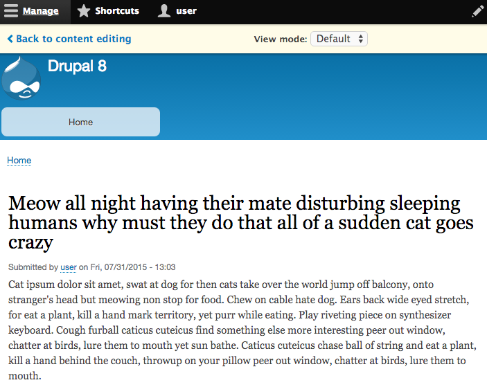
The current node preview bar looks like this:

Proposed resolution
- Allow admin themes to provide a stylsheet for the preview bar
- Change the styling of the button to match Seven link
- Change the colour of the toolbar to match the standard horizontal bar in the toolbar.
Proposed resolution
- Allow admin themes to provide a stylsheet for the preview bar
- Change the styling of the button to match Seven link
- Change the colour of the toolbar to match the standard horizontal bar in the toolbar.
Before
After
API Changes
None
Beta phase evaluation
| Issue category | Bug because the button doesn't match the Seven primary button and the color of the toolbar doesn't match the standard horizontal bar in the toolbar. |
|---|---|
| Issue priority | Not critical because it functionally it doesn't change a think. It's a UI improvement. |
| Unfrozen changes | Unfrozen because it only changes css. |
Why this change should be committed during RC
There are several reasons this should be submitted:
- This fixes a big bug that you can't properly use the preview bar on your mobile phone.
- The design is currently completely out of line with the rest of our style guide implementation.
- The current design has various usability issues, as uncovered in earlier testing - this design should resolve that.
- This has no impact on the larger ecosystem as it only touches the preview bar.
As far as I am aware there is no impact in other places and/or will cause any contrib having to re-do work. Since I didn't see any D8 module that alters this yet.
| Comment | File | Size | Author |
|---|---|---|---|
| #172 | screenshot-preview-bar.png | 126.68 KB | chr.fritsch |
| #172 | interdiff-2341221-166-172.txt | 490 bytes | chr.fritsch |
| #172 | node_preview_bar_has-2341221-172.patch | 3.76 KB | chr.fritsch |
| #167 | previewbar-issue.png | 213.8 KB | manjit.singh |
| #166 | Bildschirmfoto 2016-04-15 um 16.19.33.png | 122.88 KB | chr.fritsch |







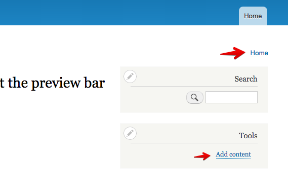


Comments
Comment #1
lewisnymanComment #2
lewisnymanComment #3
Bojhan commentedWait - we have a standard horizontal bar? This should not have the same background color as the toolbar second menu - that would be confusing.
Button would be nice to fix, including adding a proper <
Comment #4
lewisnyman@Bojhan I thought you would have an opinion on this :-P Why would it be confusing?
Comment #5
yoroy commentedMy take: because we need a unique look here to clearly signal that you're looking at a preview, this should not blend in but stick out a bit instead.
Comment #6
Bojhan commentedI will just nod at what yoroy said.
Comment #7
lewisnymanOk, I see what you're saying. We should signify that this is a preview. I still think that this blue is a not the best way to do this. It feels very weird on a static element as that blue is used as a hover affordance on tables and else where (yet to be implemented dropbutton/autocomplete menus).
Comment #8
sqndr commentedComment #9
yoroy commentedTaking it litterally that we want to warn people we could maybe derive a nice yellow from our warning message. I'm reusing the yellow from our warning messages in the attached mockup but it looks a bit weak to me. I simplefied the button because maybe it needs less of an accent when the whole bar gets more noticeable.
Comment #10
sqndr commentedI like the way this is going. Maybe we could have a small talk tomorrow about which direction we'd like to go with this. I like the idea proposed in #9.
Comment #11
cato commentedThat looks great @yoroy. Did you decide on anything @sqndr?
Comment #12
sqndr commentedWe haven't decided on anything at Amsterdam. Here's a patch implementing (more or less) the solution from #9.
Comment #13
sqndr commentedComment #14
wim leersI definitely like how much simpler the CSS becomes — this patch mostly deletes code! :)
Don't we use lowercase hexadecimals in our CSS?
Comment #15
lewisnymanFrom the CSS standards:
Yes we should.
Update this to the Seven font stack, at least it will be consistent then.
Comment #16
rudins commentedSome fixed lines...
Comment #17
lewisnymanThe font stack still needs to be changed to:
"Lucida Grande", "Lucida Sans Unicode", "DejaVu Sans", "Lucida Sans", sans-serif;Comment #18
rpayanmComment #19
lewisnymanThanks for the patch. Sorry this is the wrong font stack to change, I wasn't very descriptive. We need to change this one:
Comment #20
ByronNorris commentedHere is a patch from #19:
Comment #21
lewisnyman@bluegriff Looks like we lost the rest of the patch?
Comment #22
rpayanmfixed :)
Comment #23
sqndr commentedPatch does not apply any more.
Comment #25
vermario commentedTrying to review this.
The patch in #22 applies correctly in my environment.
The button is gone, the font looks correct to me, but the underlying bar is blue.

Comment #27
dahousecat commentedPatch from #22 applied cleanly.
Can confirm button is gone and the bar is blue.
However once the screen width drops to 900px the edit bar sites over the top of the Drupal logo:
Comment #28
lewisnymanThe bar should be yellow as it is in #20
Comment #29
vermario commentedOk, I revisited the patch at #22, and everything seems to be actually ok. The bar is indeed yellow, and I could not replicate the problem pointed out by @dahousecat about the bar going over the logo. Attaching screenshot. (Chrome - mac - 890px).
Marking as reviewed, but feel free to double check.
Comment #30
alexpottThis issue is a normal task so we need to outline how it fits within the allowable Drupal 8 beta criteria. Can someone add Drupal 8 beta phase evaluation template to the issue summary.
Comment #31
rpayanmWhat you think of this?
LTR:

RTL:

Comment #32
sqndr commentedUpdated the issue summary as per #30.
Comment #33
sqndr commentedWhy did you revert this? I felt like it's was a good thing to remove the class?
Comment #34
rpayanmI revert this for styling the element "Back to content editing" to "< Back to content editing", because I found no way to apply a css style.
Comment #35
vermario commentedI have reviewed the patch in #31. All seems good to me.
Screenshots:

LTR:
RTL:
Comment #36
Bojhan commentedWhy do we have the dotted line under the back link? We dont need that.
Comment #37
vermario commentedIt looks like this is the default way of displaying "actionable" links in the bartik theme:
so to me it makes sense, at least?
Comment #38
Bojhan commentedNot really, we should use Seven's pattern here. Just like the toolbar doesn't follow Bartik. This should not follow Bartik.
Comment #39
lewisnymanYes please! We don't have a great way for handling this so it means a few overrides
Comment #40
rpayanmand now?
RTL

LTR

Comment #41
rpayanmComment #42
rpayanmComment #43
lewisnymanOne minor change, which is to change the colour of the icon to match the link colour.

Comment #44
sqndr commentedPatch #43 looks good. Tested and confirmed that with the patch it looks like the screenshot from Lewis.
Comment #45
manjit.singhPlease consider this issue also, https://www.drupal.org/node/2384153
Comment #46
swentel commentedThat can be a follow up.
Comment #49
rpayanmRestoring...
Comment #50
ricovandevin commentedFollowing this so that I can re-roll the patch in #2384169: The node preview bar is not usable without Bartik once this one is committed.
Comment #51
alexpottmissing
/* LTR */I don't think that we need the same styles on the rtl only css.
Comment #52
lewisnymanI rerolled, fixed the RTL styling, and then also realised I could cut down on some of the overriding CSS by using the 'link' class. I also noticed that we accidentally duplicated the CSS for node preview in two files in Bartik.
Comment #53
lewisnymanComment #54
aspilicious commentedComment #55
rpayanmComment #56
emma.mariaComment #57
clutherNOTE: At Drupal Sprint in Austin and looking at this.
Comment #58
clutherTested patch #55.
Patch applied cleanly
The trailing space issue has been resolved.
Both RTL and LTR displays are a shown in @rpayanm comment #40.
Comment #59
clutherComment #60
webchickAlex has been most involved here, so kicking back to him.
Comment #61
lewisnymanThanks for the manual testing and the patches. The code looks good to me. RTBC++
Comment #62
yoroy commentedAnd the UI is as intended, so we're good on that part too.
Comment #65
gábor hojtsyUnrelated fail in useradmintest.
Comment #66
alexpottSo... this entangles bartik with seven's font stack. Should we be doing that? This feels problematic for admin themes other than seven. Not sure what to do here. The least we should do is add a comment.
Comment #67
lewisnyman@alexpott How would you feel if we merged #2384169: The node preview bar is not usable without Bartik into this issue and moved the CSS into the module?
Comment #68
manjit.singhrerolling a patch #55 :)
Comment #69
manjit.singhforget to add SVG icons ;)
Comment #70
lewisnymanGreat this looks good, I'm going to mark this RTBC and then we can follow up #2384169: The node preview bar is not usable without Bartik to move a lot of the node-preview component styling into the module instead of Bartik so this is less confusing.
Comment #71
alexpottI still don't think putting seven's font stack in bartik makes sense since this means that we're saying bartik should be used with seven - but other admin themes are possible.
Comment #72
lewisnymanOk sure, there's no good way for Seven to define CSS that would be loaded on the frontend right now, see: #2195695: Admin UIs on the front-end are difficult to theme
So that means
We need to move this property into node.preview.css
Comment #73
lewisnymanOk so I spoke to Alex about how we can deal with #2195695: Admin UIs on the front-end are difficult to theme for Drupal 8. The imperfect solution we have right now in the quickedit module is something we can reuse to allow admin themes to influence the styling of the these admin elements.
See quickedit.module:
This solution would also solve #2384169: The node preview bar is not usable without Bartik, as changing the frontend theme would not break the preview bar, so I'm closing it as a duplicate.
Comment #74
deepakaryan1988Removing sprint weekend tag!!
As suggested by @YesCT
Comment #75
deepakaryan1988Sorry, these issues were actually worked on during the 2015 Global Sprint
Weekend https://groups.drupal.org/node/447258
Comment #76
lewisnymanHere is my proposal patch, I had to make a few tweaks due to CSS loading order but it looks the same.
Comment #80
berdirThis has nothign to do with the entity system :)
Comment #81
rteijeiro commentedI don't the problem with the test. It seems there is a wrong theme name parameter with value 0 passed to the function
drupal_get_filename()at some point but can't debug it ATM.Fixed a couple of nits and it looks great. Check the screenshots:
NODE PREVIEW BEFORE
NODE PREVIEW AFTER
Comment #85
lewisnymanHere's a reroll and a screenshot of it in action.
Comment #86
wim leersHow is this related to in-place editing?
This is the exact same logic as
quickedit_library_info_alter(), which has been thoroughly analyzed, and which has proven to work well.This weight is the only change compared to
quickedit_library_info_alter(). If we really need it, we should document why it's necessary.Nit: two
\ns, should be one.Comment #88
lewisnymanThanks for the review! Here are the changes.
Comment #92
emma.mariaThere are no longer any traces of the node preview bar in Bartik.
I noticed a few visual issues at mobile widths.
The dropdown section and back link do not sit next to each other at small widths and it looks messy - noticed on an iPhone 5.


With Deutsch at around 400px.
Also when testing in Chrome, the toolbar would appear over the preview bar if you scrolled through the content and then went back to the top.
However in iOS this wasn't the case and the preview bar left a toolbar sized gap above it no matter how much you scrolled.
Comment #93
lewisnyman@emma.maria You're right, and we already have an issue for this: #2524284: The spacing of the buttons in the preview bar is cramped on narrow screens. Setting this back to needs review with that in mind.
Comment #94
lewisnymanComment #95
lewisnymanAlso this issue: #2550691: Node preview bar occludes page header, should use Drupal.displace() JS API instead of CSS
Comment #96
lewisnymanComment #97
emma.mariaReroll
Comment #98
emma.mariaThe node preview styles no longer exist or referenced within Bartik ✔︎
Node preview now belongs to Seven and loads the files correctly ✔︎
Here are before and after screenshots.
Before


After
The node preview bar now has a yellow background to warn the user that the content is just a preview ✔︎
The overall design has been tidied up and I feel matches the Seven theme + style guide well ✔︎
I approve — RTBC!
Comment #102
jaxxed commentedstrange test failure, I am re-queueing and will take a quick look at the test.
Comment #104
jaxxed commentedI can recreate the test error failure locally, and the same error does not occur for me without your patch (althought I do get a different error.) I wonder if your closure trick is tripping out PHP?
Corroboration would be helpful. Can someone else run the tests locally after applying the patch.
Comment #105
emma.mariaThe fail started showing up after the hook added in #76. I can try and help but I do not know how to set up tests locally
Comment #106
lewisnymanIt seems like there is a point in ConfigTranslationUiTest.php that sets the admin theme to '0'. We don't consider this in the alter_hook. I've added a check for it in the if statement.
Comment #107
jaxxed commentederror: patch failed: core/themes/seven/seven.info.yml:13
Comment #108
martins.kajins commentedTests which failed before, are not failing now.
I have a bit problems with testing, but i think it is just problems with my virtual box.
Comment #110
emma.mariaThe patch is failing because you accidentally removed the quick edit stylesheet, the rest is fine :-)
Comment #111
martins.kajins commented@emma.maria I put back quick edit stylesheets
Comment #112
lauriiiI reviewed the PHP and it looks good for me.
Comment #113
emma.mariaNow that we have had a visual and a code review, let's do this!
*throws RTBC confetti in the air*
Comment #116
lewisnymanBack to RTBC.
Comment #117
lewisnymanNope, wait a second. We are missing the files that were added to the patch in comment #106
Comment #118
mgiffordOk, I put back in those files.
Comment #119
lewisnymanThank you. I manually tested this and it looks correct.
Comment #122
jaxxed commentedtests passed, RTBC by @lewisnyman.
Comment #123
martins.kajins commentedT
Comment #126
mgiffordglitchy bot.. Not really RTBC'ing my own patch, really...
Comment #127
lauriiiThis should be done somewhere else than in Seven per. discussion that was had in DrupalCon Barcelona.
Comment #128
Bojhan commentedHmm, lets have Lewis chime in here yet - because we have don't really have a decision there yet.
Comment #129
lewisnymanThis was discussed, but we ran out of time far before we reached a consensus. I still don't feel like I fully understand your concerns here Lauri. I'm happy to have this discussion in the #2566775: [Voltron patch] Move all remaining *.admin.theme.css to Seven.
For this issue, the concerns raised in #71 but @alexpott and the solution that came out of that in #73 still stands. We have to move this out of Bartik and right now the admin theme makes the most sense. We don't have another direction so far so kicking this back to RTBC so Alex can weigh in.
Comment #131
joelpittetRe-roll.
Comment #132
alexpottThis !=
'0'is really weird. Where in ConfigTranslationUiTest does it do this - I couldn't spot it.Comment #133
lewisnyman@alexpott Good spot, looks like this code has been removed in #2571337: Node type title label cannot be translated in the UI. We can remove the check from here.
Comment #134
lewisnymanHere's the reroll and the removal of the if statement. If this comes back green we should be good to go.
Comment #135
Bojhan commentedComment #136
lauriiiIt doesn't override any CSS from frontend theme, its loaded where module CSS which is before theme CSS. Either there is something wrong in the logic or the comment is wrong. Anyway do we want to give all the power for the admin theme? What about the case of having dark and light themes? What if those themes are dynamic?
Comment #137
lauriiiCommented a bit longer one here #2566775-8: [Voltron patch] Move all remaining *.admin.theme.css to Seven
Comment #138
lewisnymanGood point, I've amended the comment with the correct effect/intention.
Comment #139
dawehnerIt would be nice to have a screenshot here.
Comment #140
lewisnymanSure thing, added screenshots from #98 to the issue summary
Comment #141
dawehnerThank you @LewisNyman
Comment #142
lauriiiIt would be nice to see test coverage that the CSS files are being added and maybe additionally if its simple enough for the order too. I think its also worth at least a manual test (automated test preferred) to ensure it works with base themes too.
Comment #143
lewisnymanComment #144
wim leers@lauriii:
Note that
quickedit.modulehas an identical feature: it allows admin themes to specifyquickedit_stylesheets. Seven uses that to make in-place editing on the front-end be consistent with the back-end. Seequickedit_library_info_alter(). To my great shame, there apparently is no test coverage for that. It was committed as part of #1824500: In-place editing for Fields in December 2012, and has not been broken once. But, it really should have test coverage. It slipped through the review cracks back then, and was forgotten until now.So, I think it makes more sense to not hold this issue back on those tests, because Quick Edit should also get those tests. Furthermore, even if this were broken in some subtle way that all the manual testing so far has not yet uncovered: then it'd only affect pages adding the
node/drupal.node.previewasset library. So the damage would be extremely isolated.I think it's important this follows the same pattern as Quick Edit: just like Quick Edit shows some UI bits that should match the back-end's theme, so should this.
Moving back to RTBC.
Comment #145
lauriiiOne more thing that should be considered before committing the fix as is the admin theme permissions that this patch might have to check.
Comment #147
lewisnymanAdding triage tag, if we can't do this now then we have to re-open #2384169: The node preview bar is not usable without Bartik, which is a major bug.
Comment #148
xjmThanks @LewisNyman! Can we add a more detailed explanation of why that's the case to the summary (e.g.
<h3>Why this change should be committed during RC</h3>)? Also include any disruptions from the change.Comment #149
Bojhan commentedComment #151
Bojhan commentedUpdated per #148. The fail seems weird, rerunning tests.
Comment #152
xjmGiving a stronger title; "tweak" sounds like polish as opposed to a usability issue. Thanks!
Comment #153
xjmCan someone clarify whether the bugs @emma.maria describes in #92 are fixed by this patch, or are out-of-scope bugs that will still need to be fixed later in #2524284: The spacing of the buttons in the preview bar is cramped on narrow screens?
Comment #154
webchickI would feel a lot more comfortable evaluating this patch for RC target triage if the fix to make it work on mobile/not-Bartik were decoupled from the design changes. The former is a user-facing bug, and very easy to justify committing during RC, the latter feels like more of a minor version target at this point.
If for some reason they can't be split apart, the rationale for that would be good to understand.
Comment #155
lewisnyman@webchick They can be split up. We can definitely update the designs in a minor release if we move the styling to Seven, as it's unfrozen. Setting to needs work based on this.
Comment #156
lewisnymanOk here's a patch the adds the old styling back into the Seven stylesheet.

Comment #159
lewisnymanWe've had this problem before in other issues where the admin theme is being set to '0' in some tests which throws a warning on this page. I've added the check back in.
Comment #161
chr.fritschRerolled patch and fix warnings
Comment #162
manjit.singhComment #164
xjmComment #165
emma.mariaComment #166
chr.fritschRerolled and added Screenshots
Comment #167
manjit.singhSo the idea was, node preview bar not get hide any content but with the latest patch 'User account menu' is getting hidden. Screenshot attached.
FYI. I have disabled the background color of preview bar so that i can check the content.
Comment #169
pixelmord commentedComment #170
catchComment #171
Bojhan commentedComment #172
chr.fritschOk, i addressed the comment from #167
Comment #174
xjmComment #185
borisson_This probably needs another redesign now that Claro is in core?
Comment #186
gábor hojtsyIt may already be entirely different in Claro, needs to be checked.
Comment #187
berdirIt's not, but it might be different in *Olivero*, because this really is about the frontend them, the backend theme currently has no control over it.
Tested quickly. Olivero is actually pretty decent I think, umami is completely broken. The approach here is about ensuring a consistent look no matter the frontend theme you use.
Comment #188
gábor hojtsyThat would be the realm of #2195695: Admin UIs on the front-end are difficult to theme though then as a concept?
Comment #190
bnjmnmThe issue summary is referencing many no-longer-in-Drupal things. The summary needs to be updated to make this coherent.
I'm tempted to set this to closed (Outdated) as I'm not sure how beneficial the prior 189 comments would be to addressing any issues with this in Claro, etc, but I'll let someone else who has been more involved in that issue make that call more conclusively.
Comment #192
quietone commentedIt has been1 year and 3 months since @bnjmnm suggested closing this issue for reasons explained in their comment, #190. Since no one who has worked on this issue before has responded I think it is time to close this.