
Problem/Motivation
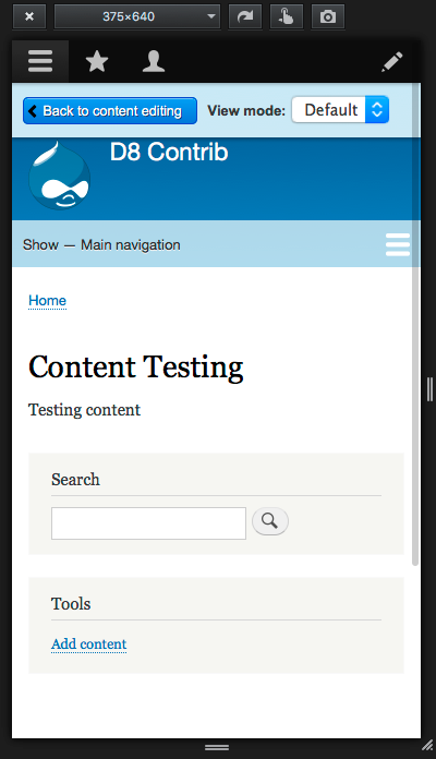
The node preview bar looks bad on narrow screens

Proposed resolution
Add a media query so the horizontal styling doesn't apply on small screens
Remaining tasks
None.
User interface changes
A better node preview bar on mobile.
preview_bar_button_and_view_mode_spacing-2524284-65
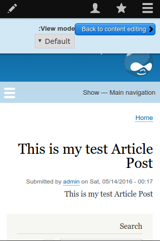
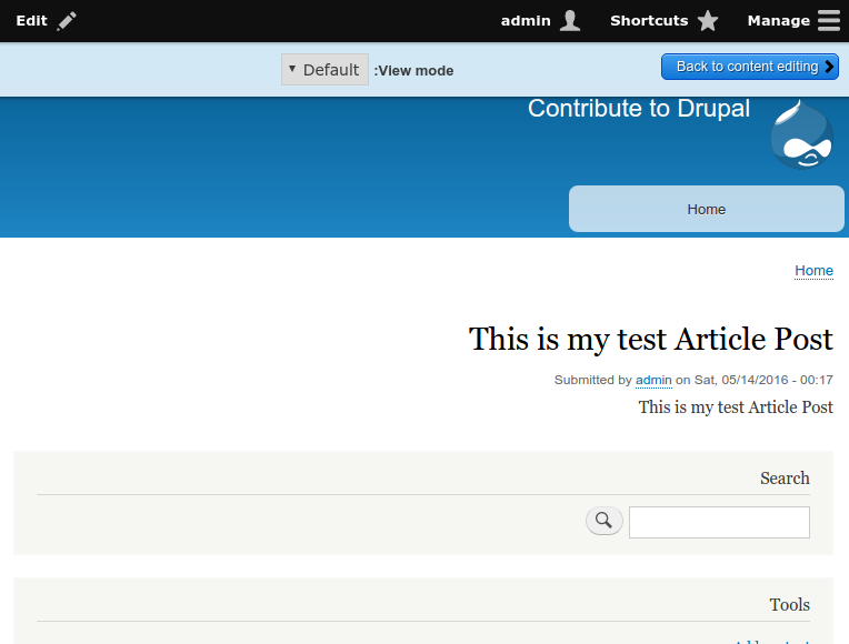
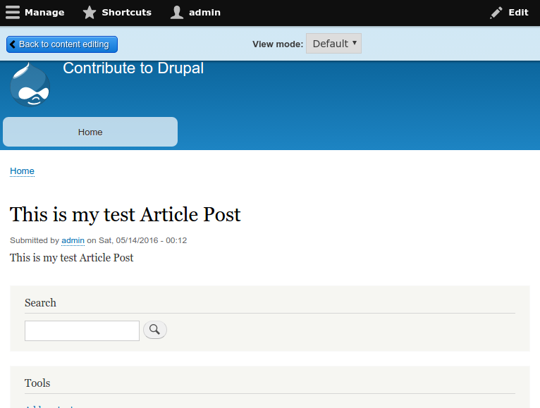
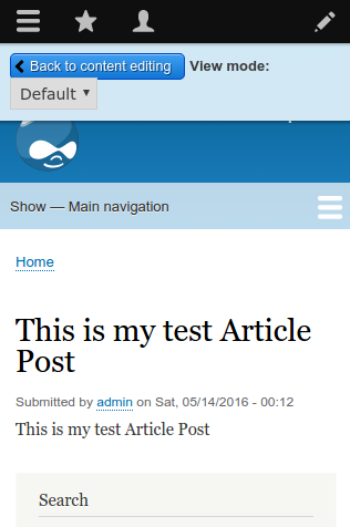
See comment #72.
API changes
None.
Data model changes
None.
| Comment | File | Size | Author |
|---|---|---|---|
| #89 | preview_bar_button_and_view_mode_spacing-2524284-65.patch.txt | 1.37 KB | leanderl |
| #86 | after-patch-code-change(1).png | 49.6 KB | bandanasharma |
| #86 | after-patch-code-changes.png | 26.18 KB | bandanasharma |
| #86 | before-patch-code (2).png | 32.74 KB | bandanasharma |
| #86 | before-patch-code(1).png | 47.61 KB | bandanasharma |


Comments
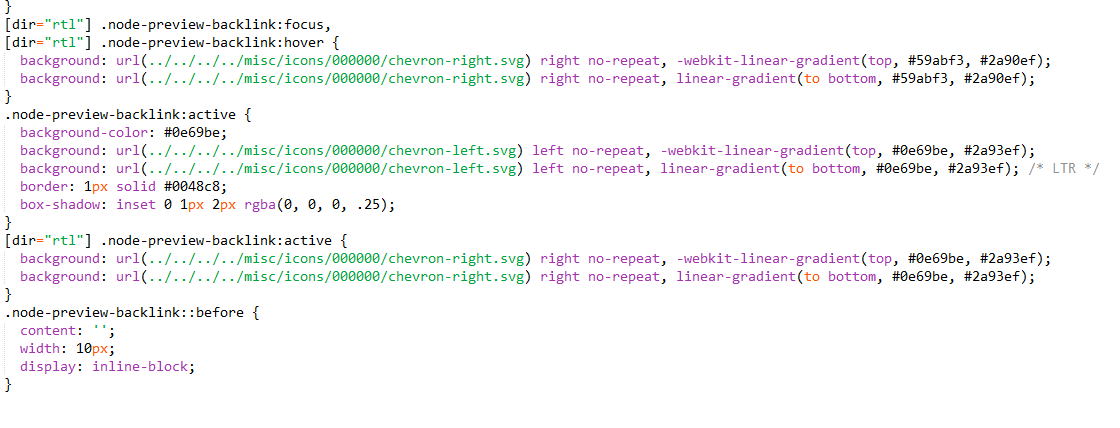
Comment #1
AlviMurtaza CreditAttribution: AlviMurtaza at Axelerant commentedAdded spacing to prevent overlapping of select box in preview bar for ltr and rtl
Comment #2
AlviMurtaza CreditAttribution: AlviMurtaza at Axelerant commentedComment #3
LewisNymanThanks for the patch. The CSS you added in node.preview.css is actually overriding CSS that is in Bartik's node-preview.css. Instead of overridding it, can we just put that CSS in a min-width media query? Thanks.
Comment #4
LewisNymanThanks for the patch. The CSS you added in node.preview.css is actually overriding CSS that is in Bartik's node-preview.css. Instead of overridding it, can we just put that CSS in a min-width media query? Thanks.
Comment #5
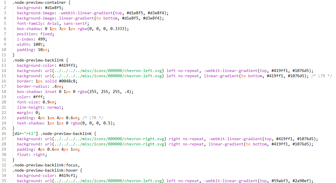
Aleksandar_P CreditAttribution: Aleksandar_P at Develomon for FFW commentedComment #6
Aleksandar_P CreditAttribution: Aleksandar_P at Develomon for FFW commentedI have rewritten the node-previrew.css using existing min-width media query.
Comment #7
Aleksandar_P CreditAttribution: Aleksandar_P at Develomon for FFW commentedComment #8
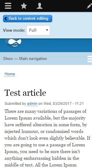
Sabreena CreditAttribution: Sabreena at Axelerant commentedPatch looks good to me. Attaching a Shot.
Comment #9
Wim LeersThe screenshots in #1 made me realize something, having recently debugged the Toolbar code.
The real problem here is that the preview bar simply sits on top of the page. It instead should be pushing the rest of the page down, just like the Toolbar does. Attached is a screenshot that clearly illustrates it.
I know that none of this uses any JS (this is generated by
\Drupal\node\Form\NodePreviewForm::buildForm()). If this were not using CSS, but instead used theDrupal.displace()API, this problem would not exist.Comment #10
LewisNyman@Wim I'm all for improving this UI component. I was thinking that maybe this could be in the toolbar module so other modules could reuse it? This feels like a separate issue to the one reported here though, so my instinct is to split them. What do you think?
Comment #11
Wim LeersDrupal.displace()was created as part of the Toolbar work, but it's already a generic component that anything that wants to basically "change the viewport" — which this preview bar is one example of, the Toolbar is another — can and should use. Seedrupal.displaceincore.libraries.yml. Sorry for not making that more clear!So, given that, AFAICT this really is exactly the issue reported here? If the preview bar started to use
Drupal.displace(), all of the changes here would basically be reverted AFAICT. If I'm right about that, then it feels like we should just apply the proper solution right away here. But, if you feel it's better to get this in as an interim step, that's fine by me too. As long as you're aware that this is not a real solution.Comment #12
LewisNymanThe problem here is in the screenshot in the issue summary, the buttons in the preview bar sit too close to each other and are hard to tap on mobile.
Comment #13
Wim LeersOh! I'm very sorry. I read "cramped on narrow screen" and saw the screenshot in #8. I totally missed the screenshot in the IS.
Apologies!
Filed #2550691: Node preview bar occludes page header, should use Drupal.displace() JS API instead of CSS for what I thought we were discussing.
Comment #14
alexpottWhy are these changes necessary?
There is unneeded spaces on the last line here. And the float should have
/* LTR */after it.Comment #15
Tony-Mac CreditAttribution: Tony-Mac commentedI am working on this at the dug-BE code sprint in Ghent.
Comment #16
StryKaizerTag fix
Comment #17
Tony-Mac CreditAttribution: Tony-Mac commentedReferring to comment 14
1. Float none and display block were not needed. Please see attached screenshots for before and after changes. The code was deleted.
2. I removed the two superfluous spaces and added the LTR comment.
Please review.
Comment #18
pjbaertThis doesn't really look OK. See screenshot.
I do believe we need this part. (I added the CSS back to in Chrome to check this. See attachment 2)
Comment #19
pjbaertComment #20
snehi CreditAttribution: snehi as a volunteer and at Publicis Sapient for Publicis Sapient commentedAccording to @pjbaert
Attached patch.
Comment #21
snehi CreditAttribution: snehi as a volunteer and at Publicis Sapient for Publicis Sapient commentedComment #22
meenakshi.r CreditAttribution: meenakshi.r as a volunteer and at Srijan | A Material+ Company commentedI tested the issue.
Issue is still reproducible with the patch.
before patch
after patch

Comment #23
snehi CreditAttribution: snehi as a volunteer and at Publicis Sapient for Publicis Sapient commentedMeanwhile unassigned issue i am not a UI expert.
Comment #24
vulcanr CreditAttribution: vulcanr as a volunteer commentedFixed this issue. Added display block for that select div. Related to the node-preview-class.
Comment #25
Bojhan CreditAttribution: Bojhan as a volunteer commentedWith #2341221: Node preview bar has usability issues, is difficult to use on mobile, not usable without Bartik, and does not align with the Seven style guide and current toolbar designs I am unable to replicate this? Or is this specific to one platform?
Comment #26
vulcanr CreditAttribution: vulcanr as a volunteer commentedThis is specific to bartik
Comment #27
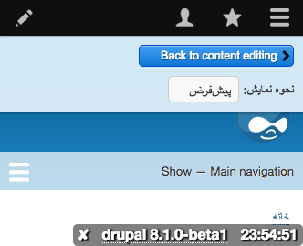
NikitaJain CreditAttribution: NikitaJain commentedTested the_spacing_of_the-2524284-24.patch on Firefox & chrome browser for Ubuntu 14.0.4.
Spacing added to prevent overlapping of select box in preview bar.
Patch looks good for ltr. But for rtl the issue is not resolved after applying the patch.
Screenshots attached.
Comment #28
herom CreditAttribution: herom as a volunteer commentedThe latest patch contains unrelated changes in
sites/default/directory.Comment #29
rashid_786 CreditAttribution: rashid_786 at SDG Corporation commentedComment #30
snehi CreditAttribution: snehi as a volunteer and at Publicis Sapient for Publicis Sapient commented@rashid can we please have interdiff please
Comment #31
Hubbs CreditAttribution: Hubbs commented#29 patched fixed the issue, but created a new issue for wide screens. At this point I didn't continue to check RTL. Screenshots below.
Comment #32
Hubbs CreditAttribution: Hubbs commentedComment #33
Hubbs CreditAttribution: Hubbs commentedEDIT - New post to follow. I missed some RTL stuff with the 'back to content editing button'
Comment #34
Hubbs CreditAttribution: Hubbs commentedCreated a new patch to fix this issue. All changes made to core/themes/bartik/css/components/node-preview.css
Modifications include:
.node-preview-containerpadding: 10px;changed topadding: 5px 10px;.node-preview-backlinkmargin: 0;changed tomargin: 5px 10px 5px 0; /* LTR */Added
display: inline-block;[dir="rtl"] .node-preview-backlinkAdded
margin: 5px 0 5px 10px;Added
------------------------
Before and Afters
Right to Left

NOTE: I couldn't figure out how to simulate this in my browsers. This is just showing the RTL code applied manually simulating the best I could.
Comment #35
emma.mariaComment #36
webbykat CreditAttribution: webbykat as a volunteer commentedPatch worked nicely for me. I also tried it out RTL and it appears appropriate- slightly different from the simulated version above because of where the field label and colon appears, but the styling itself is right. Steps for anyone else to confirm there as well:
Comment #37
dorficus CreditAttribution: dorficus as a volunteer commentedAlso manually testing
Comment #38
dorficus CreditAttribution: dorficus as a volunteer commentedAlso tested and can confirm using same steps as @webbykat outlined.
Comment #39
dorficus CreditAttribution: dorficus as a volunteer commentedComment #40
karolus CreditAttribution: karolus as a volunteer commentedAlso tested and confirmed as Webbykat had outlined in #36.
Did see another styling issue, though--the dropdown select reverts to defaults in Firefox. This is shown in the screen grab:

This is specific to Firefox, as shown on the same screen in Chrome:

Comment #41
dorficus CreditAttribution: dorficus as a volunteer commentedI believe that the FF has a different CSS selector for that select element. I'll look into it and see what I can find.
Comment #42
dorficus CreditAttribution: dorficus as a volunteer commentedSo, the default styling for the dropdown/select is created by the user agent stylesheet. Do we need the Firefox select to look the same as the Chrome, and if so, should we be checking on other browsers to try and match the styles?
Comment #43
catchMoving to Bartik.
Comment #44
emma.mariaKnocking this down to Needs Review as there are some concerns in the last few comments.
Comment #45
yoroy CreditAttribution: yoroy as a volunteer commentedThere's a better looking select list in Firefox when using Drupal 8.0 so looks like we lost some styling indeed.
The same select already looks worse (default) when using Firefox and Drupal 8.1.x *without this patch*, so this little visual regression is probably not caused by this patch.
Comment #46
ironkiat CreditAttribution: ironkiat at Pixel Onion Pte Ltd commented@yoroy, I just dig into the commits, it seems like the nice select styles for Firefox appears in Seven theme only, not ported into Bartik yet.
Commit 9e6dd21
core/themes/seven/css/style.css
Comment #47
emma.mariaI am going to jump in here and say that the "look and feel" styling of the components themselves within the preview bar is out of scope for this issue.
As long as the horizontal layout of the components is no longer broken this issue is complete and we can most definitely raise a follow up for the select element styling in Bartik.
Comment #48
emma.mariaComment #49
yoroy CreditAttribution: yoroy as a volunteer commentedAgreed that whatever needs to be done to improve the look of the select list is not in scope of this issue.
Comment #50
yoroy CreditAttribution: yoroy as a volunteer commentedThanks for digging that up @ironkiat. Could you create a seperate issue for that in the Bartik queue?
Patch in #24 still worked just fine on simplytest and Drupal 8.1, so probably rtbc
Comment #51
ironkiat CreditAttribution: ironkiat at Pixel Onion Pte Ltd commentedThanks @yoroy, created issue: https://www.drupal.org/node/2674292
Comment #52
star-szr#24 would need work (it incorrectly changes files outside of the scope of this issue). #34 seems more promising overall. Although it's more complex it seems like it had a lot more testing than #24.
Putting to needs review so we can decide which fix we want to go with and give the relevant patch another round of manual testing and screenshots please :)
Comment #53
ironkiat CreditAttribution: ironkiat at Pixel Onion Pte Ltd commentedTested and reviewed patch 34, seems to work pretty well on both desktop and mobile sizes.
Desktop:

Mobile:
On Firefox, after applying the patch in here: https://www.drupal.org/node/2674292 - the select element looks as per the screenshot above.
A possible further fine tuning may be to float the entire "View mode" to the right and when screen sizes gets really small (below 320px) then we remove the float.
Comment #54
Saphyel CreditAttribution: Saphyel as a volunteer commentedI'm going to do the changes that #53 said.
Comment #55
Saphyel CreditAttribution: Saphyel as a volunteer commentedReady to review!
Comment #56
aliyakhan CreditAttribution: aliyakhan as a volunteer and commentedLooks good
Comment #57
Wim Leers#55: Could you provide an interdiff? https://www.drupal.org/documentation/git/interdiff
Comment #58
yoroy CreditAttribution: yoroy at Roy Scholten commentedThere's a problem with the view mode select list becoming invisible with the toolbar in vertical mode. See attached screencast
@ironkiat Why do you think it is an improvement to float the view mode select list to the right? For left-to-right languages this drastically reduces the discoverability which I'm not sure we want to do.
Speaking of left-to-right, maybe this needs to be checked with a right-to-left language as well.
Comment #59
Saphyel CreditAttribution: Saphyel as a volunteer commentedInterdiff
Comment #60
ironkiat CreditAttribution: ironkiat at Pixel Onion Pte Ltd commented@yoroy, totally agree, yeah I'm not too familiar how it should be when it's for right-to-left language...does the Back to Content Editing appear on the right instead?
I suggested the view mode select list to be on the right because I felt it should be separated from the "back button". Giving it some visual separation will possibly help to not let users feel they belong to the same group / action, which they shouldn't be. Both are very different actions we all know that.
Comment #61
prateekS CreditAttribution: prateekS as a volunteer and at Srijan | A Material+ Company commentedComment #62
prateekS CreditAttribution: prateekS as a volunteer and at Srijan | A Material+ Company commentedComment #63
Sabreena CreditAttribution: Sabreena at Axelerant commentedTested the latest patch #55 for both LTR and RTL directions and I agree with @yoroy. By floating the view mode select list to the right in LTR, or to the left in RTL pushes the view mode out and it becomes invisible (when the toolbar is in vertical mode). Attaching SS.
As per my views, we should keep the select list aligned with the "back to content editing" button for desktop, and for mobile layout select list will appear just below the button as done in patch #34.
Comment #64
Sabreena CreditAttribution: Sabreena at Axelerant commentedApplied patch #34 - https://www.drupal.org/files/issues/preview_bar_button_spacing-252484-34..., LTR looks good.
However, for RTL there is no change. And for screen resolution 768px view mode select list is cropped.
Adding the Screenshots for RTL.
Comment #65
Sabreena CreditAttribution: Sabreena at Axelerant commentedAdded a patch to fix issue for RTL.
Comment #66
vijay.mayilsamy CreditAttribution: vijay.mayilsamy commentedi'm working on this
Comment #67
vijay.mayilsamy CreditAttribution: vijay.mayilsamy commentedI had applied the patch and tested it locally. It looks fine to me
Comment #68
vijay.mayilsamy CreditAttribution: vijay.mayilsamy commentedHere are the screenshots of the page before applying the patch
Comment #69
vijay.mayilsamy CreditAttribution: vijay.mayilsamy commentedHere are the screenshots of page before the fix
Comment #70
vijay.mayilsamy CreditAttribution: vijay.mayilsamy as a volunteer and commentedComment #71
vijay.mayilsamy CreditAttribution: vijay.mayilsamy as a volunteer and commentedI have tested it manually and looks fine to me. Here are the screenshots of before and after the patch updates:
AFTER
https://www.drupal.org/files/issues/after-patch-mobile-RTL.png
https://www.drupal.org/files/issues/after-patch-tab-RTL.png
https://www.drupal.org/files/issues/after-patch-desktop-RTL.png
https://www.drupal.org/files/issues/after-mobile.png
https://www.drupal.org/files/issues/after-tab.png
https://www.drupal.org/files/issues/after-desktop.png
BEFORE
https://www.drupal.org/files/issues/before-patch-mobile-RTL.png
https://www.drupal.org/files/issues/before-patch-tab-RTL.png
https://www.drupal.org/files/issues/before-patch-desktop-RTL.png
https://www.drupal.org/files/issues/before-patch-mobile.png
https://www.drupal.org/files/issues/before-patch-tab.png
https://www.drupal.org/files/issues/before-patch-desktop.png
Comment #72
vijay.mayilsamy CreditAttribution: vijay.mayilsamy commentedI have tested it manually and looks fine to me. Here are the screenshots of before and after the patch updates:
AFTER
RTL - Mobile:
LTR - Mobile:
RTL - Tab:
LTR - Tab:
RTL - Desktop:
LTR - Desktop:
BEFORE
RTL - Mobile:
LTR - Mobile :
RTL - Tab:
LTR - Tab:
RTL - Desktop:
LTR - Desktop:
Comment #73
vijay.mayilsamy CreditAttribution: vijay.mayilsamy commentedComment #74
nikunjkotechaComment #75
kapil17 CreditAttribution: kapil17 commentedi have further validated this issue at drupal camp delhi 2016 . please refer attached screenshot.
RTL BEFORE

RTL AFTER

LTR AFTER

LTR BEFORE

Comment #76
kapil17 CreditAttribution: kapil17 at Srijan | A Material+ Company commentedComment #77
xjmComment #78
Bojhan CreditAttribution: Bojhan as a volunteer commentedThanks for all the work, excited to see this go in!
Comment #79
xjmUpdating the summary to link the manual testing in #72 rather than every screenhsot, because every time I look at this issue, I am completely overwhelmed and can't figure out what I am looking at.
Comment #80
xjmComment #81
xjmCouple things I noticed:
Isn't the second hunk here overriding the first? Let's remove the first one? Edit: Ah, I see, the second is only for the media query version. Still, the first hunk looks incorrect and/or unnecessary, since we never specify this for LTR.
There is trailing whitespace at the end of this hunk. We should reroll to fix that, at least.
Thanks everyone!
Comment #82
xjmShould these be combined into a single entry for clarity?
Comment #84
aj2r CreditAttribution: aj2r at La Drupalera by Emergya commentedComment #85
aj2r CreditAttribution: aj2r at La Drupalera by Emergya commentedHi,
the code does not match with the code at #81 and #82, and patches updated, in branch 8.4.x.
I've just removed the space in line 23 of node.preview.css at core/modules/node/css.
Comment #86
bandanasharma CreditAttribution: bandanasharma as a volunteer and at gai Technologies Pvt Ltd for gai Technologies Pvt Ltd commented#85 patch apply cleanly. Not seen any visualize ui impact before and after apply patch. Observe some code level changes happen in the core/modules/node/css/node.preview.css and core/themes/bartik/css/components/node-preview.css
In the node/css/node.preview.css file just remove new line space and in bartik/css/components/node-preview.css file apply some css changes or patch add these new css:
Attached the some before and after screenshot.
Comment #88
leanderl CreditAttribution: leanderl commentedWe (leanderl, sannastrand, marikaj) are reviewing this on DrupalCon Vienna...
Comment #89
leanderl CreditAttribution: leanderl commentedApplied and tested patch in #65. It works very well for LTR and RTL.
The discussion in #81 and #82 seems to be about some patch differerent than #65. For that reason we have rerolled, tested and reuploaded the patch in #65.
Set to RTBC like it was in #74 and further confirmed in #75.
Worked on this on Vienna 2017 Code sprint with
marikaj, sannastrand
got mentorship from jcventura
Comment #94
lauriiiI removed changes made to the core CSS files since they were unrelated for the actual bug fix. Other than that the changes look good visually and code wise.
Committed 4a1d43f and pushed to 8.5.x. Thanks!
I haven't cherry-picked this to 8.4.x as I will still check with the other maintainers if that's fine.
Comment #95
lauriiiDiscussed this issue with @xjm and we decided not to backport this to 8.4.x. 8.4.0 was released, so we think that is better to leave this just for the next minor release. It takes a lot of energy to make assumptions of how disruptive some CSS changes are, so I don't think it is worth taking a risk on this issue. As mention earlier, this has been already committed to 8.5.x, and will be released on 8.5.0. Thanks everyone for your contributions!
Comment #97
LewisNyman