
Let's remove some noise and make Drupal easier to digest and user. In Views, I introduced drop buttons because 80% of the time, users are adding fields. 20% of the time, they're sorting, deleting, etc. This pattern applies to all of Drupal.
- /content: 80% task is to edit, so push delete into the dropbutton
- /blocks: 80% task is to configure, so push delete into the dropbutton
- /structure/types: 80% task is to manage fields, so push edit, delete, manage display into the dropbutton. If we must, keep manage display as it's own button
- /taxonomy:80% task is to list terms (add could be too, but you can add under list), so push edit vocabulary, add terms into the dropbutton
- /menu: 80% tasks is to list links (add could be too, but you can add under list), so push edit menu and add link into the drop button
- /modules: might be the exception as permissions and configure are on the same playing field. If we had to decide, configure is probably more used than permissions.
| Comment | File | Size | Author |
|---|---|---|---|
| #98 | 1480854-operator-groups.png | 1.77 KB | Alan D. |
| #98 | 1480854-operator-groups-2.png | 1.63 KB | Alan D. |
| #86 | dropbutton-1480854-86.patch | 64.51 KB | tim.plunkett |
| #84 | dropbutton-1480854-84.patch | 55.58 KB | tim.plunkett |
| #82 | dropbutton-1480854-80.patch | 55.58 KB | tim.plunkett |


Comments
Comment #1
kika CreditAttribution: kika commentedI support this change. Jeff, any visuals?
Comment #2
droplet CreditAttribution: droplet commentedany research ?
From my own experiences and feedback from new learner. new Views UI is worse than before. and more times they asked me ""how to sort the fields".
Hidden OP button is a bad idea if there has *enough* space and only 2 or 3 buttons.
I've seems same kind of discussion when new Windows 8 explorer and Gmail UI come out. Both have supporters.
#0 show the good side, I try to think the bad side:
EDIT | DEL
80% of time on edit and 20% of time on DEL
EDIT | dropdown
80% of time on edit and 25%+ of time on DEL. more click, misclick, selection, thinking of where's my DEL button..etc
the worst case is:
Click EDIT link and use DEL button on edit page. (or mis-clicked, click go back to page and then dropdown..etc .)
Comment #3
kika CreditAttribution: kika commentedLet's separate the problem and the proposed solution.
The problem is the information overload and lack of visual hierarchy -- cluttering UI with actions what are rarely needed and obscuring primary actions. This is especially important in mobile context where screen estate is very valuable and everything bit less than very important needs to be tucked away. This clearly needs solution.
There are different UI patterns to approach this problem, Jeff's buttons are one of them. Also, those Views3-type buttons can be further finetuned and / or combined with other patterns (http://twitter.github.com/bootstrap/components.html#buttonDropdowns) Do they work? I have no data, this needs user testing. But the direction is right.
Comment #4
yoroy CreditAttribution: yoroy commentedWhat kika says. We'll want to test this to be sure but the direction is good.
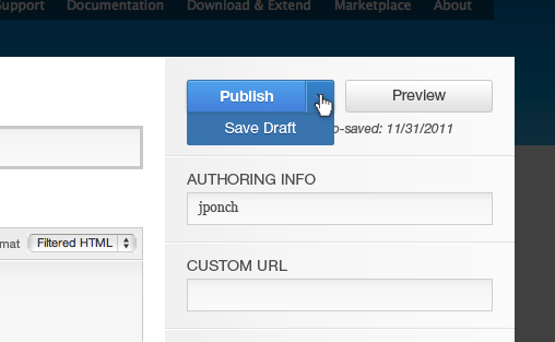
We're thinking about using this pattern for the Save/publish button on node forms as well:
Comment #5
Noyz CreditAttribution: Noyz commentedKika, well said. A couple of usage points of data:
1. Drop buttons are WIDELY used. They can be found in Gmail, facebook, Wordpress, etc. They're also used in frameworks like Bootstrap which are powering many sites. I'm less sure of the user testing Wordpress does, but Google and Facebook do a lot of user testing. Clearly drop buttons are working. Additionally, they are becoming a known pattern.
2. 'New Views UI is worse than before" is an opinion. Fact says opposite. We ran a comparitive study against old and new, and this is what we found: https://skitch.com/jeff.noyes/8cy3f/comparative-views-usability-study-an...
Outside of these two points. If someone would code this up, I would gladly run the change through my usability department to put data on the solution.
Comment #6
droplet CreditAttribution: droplet commentedMore research:
#1. Above pattern is a "Split button dropdowns". Left side is an action link. Right side is a dropdown menu. That's different to most sites.
I'm surprised there is "no split button dropdowns" on those sites:
** just do a quick research on above site, maybe overlooked the UI patterns **
All these different to Views / #4 patterns. Most of them hide same set of buttons:
Views:
discuss:
http://bit.ly/4ZMYAy
http://bit.ly/wOyh78
example usage:
http://bit.ly/GEFAE5
http://bit.ly/bbeqPM
#2.(offtopic question) Great. Any more details about the study ? New Views has a lot of changes. Not just the Split dropdown.
Comment #7
Bojhan CreditAttribution: Bojhan commentedI would support this change, especially for crowded operation tables this would be a huge gain.
Not really sure other than consistency what we would gain on operation tables where there are only 2 (and perhaps 3) options?
Would love if we can design a pattern for this, e.g. what is the 80% use case in most operation tables is it configure/edit? Do we propose a certain order? How do we handle cases where its more 60/40 or 50/50 like on the modules page?
Comment #8
Jose Reyero CreditAttribution: Jose Reyero commentedI think adding this as an UI pattern is a good idea though always making all links into a drop down is a bad one. It doesn't make sense for 2, 3 buttons, it doesn't make sense to push it on every site builder either....
Actually what we can see on other well thought of systems (gmail) is that they display several most frequently used operations, they hide the rest with a drop down. (Please don't mention Facebook as any example we should follow...)
So, what we are needing here is some 'operations' element so it can be themed differently deppending on things like the device you are using (mobile, etc). And maybe adding 'weights' to different links so we can make smart run time decissions about which and how many links to display.
If we move all operation links to some 'operations' element that just renders all links for now (so no actual UI change yet), then all it will take to implement any of your favourite patterns is a theme function.
Comment #9
Noyz CreditAttribution: Noyz commented"Would love if we can design a pattern for this"
The drop button is the design pattern. Where action links exist, use drop buttons and lead with the primary task. Even when there are only 2 or 3, they are still actions where one item is used more than others. E.g. it's much more likely to edit content than it is to delete it.
Comment #10
Noyz CreditAttribution: Noyz commentedI *think* disagree with you on the following premises, but perhaps you and I are thinking of the same examples where this rule possibly falls down. Despite, allow me to post my thoughts on your feedback...
There are only two instances that I can think of where we might want to break this rule. And we're potentially not breaking the rule because the actions are equal;
Comment #11
Bojhan CreditAttribution: Bojhan commented@Noyz When you say "you" who are you referring to? Can I deduct from your rationale that the primary reason to apply this for two option operations, is because of consistency - users only learning and encountering one pattern across Drupal? I think that is fine, but good to reach consensus on.
With "Would love if we design a pattern for this" I mean the exact rules around how to use this in edge cases. For example, its not clear how we handle the 50/50 usecase, do we just choose one?
I have tagged this with needs accessibility review (who can probably just test the Views UI), I expect no problems - but just making sure, because our contextual links weren't nice to use from an accessible standpoint.
Comment #12
Bojhan CreditAttribution: Bojhan commented@yoroy What do you think?
Comment #13
Noyz CreditAttribution: Noyz commentedSorry, 'you' = Jose Reyero
Agree, 50/50 needs detailing. A couple thoughts...
1. I think Manage Display could actually be a sub option under the primary action of "manage fields" So:
- Manage Fields
- Manage Display
- Edit Basics
- Delete
2. Modules is potentially being redesigned, so it might be a non issue.
Comment #14
Everett Zufelt CreditAttribution: Everett Zufelt commentedI've never found these UI components on Views or Panels/ Page Manager particularly easy to groc as a screen-reader user. Perhaps because the text on the expansion link (not a button) is "
So we're going to need to do a good job at making sure these are understandable and functional for keyboard only and screen-reader users, including label and positioning relative to the rest of the content.
Comment #15
Noyz CreditAttribution: Noyz commentedEverett, have you tried examples of drop buttons that do a good job? Maybe the developers could learn a thing or two from some solid examples of accessible drop buttons.
Comment #16
yoroy CreditAttribution: yoroy commentedJust saw this is assigned to me, I'll have a look later today
Comment #17
yoroy CreditAttribution: yoroy commentedRight. I think we should move forward and do this. The two clear 50/50 cases for Modules and Manage/Display fields I think can be designed around. I like the suggestion Jeff makes in #13 to make Manage Display a sub of Manage fields. Doesn't remove the issue that with 2 equally important options this pattern is not ideal but I think that is a decent trade-off compared to the noise-reduction we'll achieve for all other cases.
Would love to see a patch for this.
Comment #18
Bojhan CreditAttribution: Bojhan commentedTime for a patch it is.
Comment #19
Everett Zufelt CreditAttribution: Everett Zufelt commentedCan someone please test and let me know if the drop buttons currently in use, say in Views, are accessible to keyboard only users?
What is the visual effect when tabbing to it, what happens when enter is pressed, how are options navigated to / visually indicated / activated?
Comment #20
LewisNymanAnd for touch screen users. Maybe a select list is the right html element here?
Comment #21
joachim CreditAttribution: joachim commentedI for one really dislike the drop buttons in Views and Services (which AFAIK uses the CTools UI).
It slows things down and means I can't see things at a glance. In the case of Services, there are two or three operations that are frequently performed, and having to access the dropdown really slows everything down -- particularly when you're not sure which one it is you want.
Comment #22
Noyz CreditAttribution: Noyz commentedJoachim, you're correct. Drop buttons CAN slow things down. It's two clicks instead of 1. However, the problem is that when all links are exposed, Drupal appears hard, complex, and that's not slowing people down, it's stopping them! To mitigate, we need an in-between, and the in-between is to focus on the 80% action - which by-in-large is easy to do. The majority of the time, you're editing content, not deleting. The majority of the time, you're editing a view, not deleting, cloning or exporting. Etc. Etc.
Accessibility. Drop buttons are used by Google, Microsoft, Wordpress, etc. There are ways to make them accessible by keyboard.
Touch screens... It's hover that's a concern on touch screens. Drop buttons still require a click, so it's the same pattern.
Comment #23
Bojhan CreditAttribution: Bojhan commentedI agree, with Noyz here - however if we want to move this forward we should really get a patch going. Anyone up for the challenge?
It's currently not really accessible, controlling it by keyboard is not possible as far as I could see. However we can make this accessible, similar to contextual links optimization (which still isn't fully in core).
Comment #24
Everett Zufelt CreditAttribution: Everett Zufelt commented@Noyz
"Accessibility. Drop buttons are used by Google, Microsoft, Wordpress, etc. There are ways to make them accessible by keyboard."
Can you provide examples of accessible implementations?
Comment #25
Noyz CreditAttribution: Noyz commented@Everett, can you use Google docs? If so, the button they use to instantiate a doc albeit a doc, spreadsheet or presentation is a drop button.
Comment #26
Everett Zufelt CreditAttribution: Everett Zufelt commented@Noyz
Google docs isn't a good example of accessibility. I never use docs, but whether I can use it or not isn't the question. The question is if the widget used allows the UI to conform with WCAG 2.0.
Comment #27
gmclelland CreditAttribution: gmclelland commented@Everett Zufelt - what about http://jamielottering.github.com/DropKick/ for accessible dropdown selects
Comment #28
Everett Zufelt CreditAttribution: Everett Zufelt commented@gmclelland
Is there a demo? Note if the page you provided has a demo on it then it is not currently accessible.
Comment #29
gmclelland CreditAttribution: gmclelland commentedYes the page(http://jamielottering.github.com/DropKick/) features demos of the dropdowns. The dropdowns are keyboard accessible, I'm not sure about screen reader accessible?
Comment #30
Bojhan CreditAttribution: Bojhan commentedI say lets get a patch going, there seem to be multiple solutions that are keyboard accessible (Twitters library) - but need more thorough testing. A patch is a good way to move this forward.
Comment #31
webchickWell, no, a better approach is to evaluate the accessibility of the approaches first, and then make a patch. Else we risk re-writing this at least twice.
Comment #32
mgiffordI posted an issue to their issue queue as there are missing labels from the form. It could be that this was just an oversight, but it's hard to evaluate from the demo how accessible the code really is:
https://github.com/JamieLottering/DropKick/issues/64
Comment #33
nod_If there a patch on the way, let's not forget a relevant tag.
Comment #34
webchickRelated (and possibly postponed on?) #1608878: Add CTools dropbutton to core
Comment #35
xjmTagging.
Comment #36
catchSorry but this is a made up statistic unless serious documentation is produced to suggest otherwise.
My 99.9% use case for /content is to delete spam, on at least 2-3 different sites, and yes those sites have mollom enabled.
Comment #37
gmclelland CreditAttribution: gmclelland commentedhttp://gregfranko.com/jQuery.selectBoxIt.js/ - Here is another one I came across
Here are some highlights:
Comment #38
Everett Zufelt CreditAttribution: Everett Zufelt commented@gmclelland
Do you know if anyone has evaluated that widget to ensure it is accessible? Would be greate if it is, and degrades gracefully for those using older assistive technology, but how still have JS enabled.
Comment #39
LewisNymanI think drop down buttons definitely have a use is situations where there is one major action followed by a few minor ones.
I'm not sold on the idea that every page in Drupal is that situation. I think we should be careful here.
Comment #40
gmclelland CreditAttribution: gmclelland commented@Everett Zufelt - no I don't know anyone who has tested this. I'm just going by what their website said. It's just something I came across that I thought might help.
Comment #41
droplet CreditAttribution: droplet commentedI think this issue talking about "Split button dropdowns" (ctools-like widgets), not a simple dropdown list ?
http://twitter.github.com/bootstrap/components.html#buttonDropdowns
no needs to do accessible evaluation on these two.
Comment #42
joachim CreditAttribution: joachim commentedhttp://gregfranko.com/jQuery.selectBoxIt.js/ has an ugly 1 pixel jog of the items as you pass your mouse down the dropdown.
Comment #43
damiankloip CreditAttribution: damiankloip commentedas webchick mentioned, this would be a good follow up to #1608878: Add CTools dropbutton to core
Comment #44
Sylvain Lecoy CreditAttribution: Sylvain Lecoy commentedI am really not in favor of that usability regression, more information here:
http://drupal.org/node/1608878#comment-6467134 and http://drupal.org/node/1608878#comment-6467312.
Comment #45
tim.plunkettEach case should be considered individually, some make perfect sense as dropbuttons, others should be separate.
See #1608878-49: Add CTools dropbutton to core
Comment #46
Sylvain Lecoy CreditAttribution: Sylvain Lecoy commentedThen retitling.
Also please do not confound the dropdown menu of facebook, gmail and so on with ctool dropbutton, which is neither a standard, neither commonly used in the industry. They are different as when you click on the former, it does not trigger an action, while when you click on the later, it trigger the default action and contribute to add complexity and are oftentimes dysfunctional.
From a design standpoint however, this is an excellent feature because it help clean up a busy layout. The Publish > Save draft, Preview as shown in #4 is an excellent use case.
Comment #47
joachim CreditAttribution: joachim commentedJust noting in passing that http://gregfranko.com/jQuery.selectBoxIt.js/ has vanished.
Comment #48
webchickLet's not make judgment assumptions on where this pattern should apply. This should be left up to UX people. Updating title accordingly.
I'm also postponing this since we can't use any dropbuttons anywhere until/unless #1608878: Add CTools dropbutton to core is committed.
Comment #49
sunUgh. I wasn't aware that there is an entire separate/duplicate discussion on the dropbuttons here. :(
I reviewed the patch/proposal and outlined a couple of issues/problems with them over in:
#1608878-47: Add CTools dropbutton to core
No idea how to proceed and whether to copy the comments from over there to here or continue over there or whatever... :-/ In any case, I think this proposal needs more evaluation and discussion.
Comment #50
Sylvain Lecoy CreditAttribution: Sylvain Lecoy commented@sun: (off-topic) how do you make that issue link directly to a comment?
Comment #51
klonos@Sylvain Lecoy: [#issuenumber-commentnumber] ;)
Comment #52
xjmActive now that dropbutton is in, and re-scoping as a meta.
Comment #53
Bojhan CreditAttribution: Bojhan commentedTo quote myself from the other thread;
Comment #54
webchickApplying them everywhere consistently would certainly make committing patches easier, as well as remove user confusion when they navigate to admin/foo and see drop-buttons but don't on admin/bar.
#1802834: Use #type => operations for EntityListController::buildOperations() is a nice one-liner patch that would provide this consistency to every entity listing page in core. I think that patch makes a lot of sense, since "edit" is clearly the 80% use case over "delete."
Comment #55
Sylvain Lecoy CreditAttribution: Sylvain Lecoy commentedI am maybe not a common user, but my 80% use case is "delete" for deleting spams.. And I use anti-spam (Mollom).
We don't have any statistics to say that "edit" is clearly the 80% use case, how can we say that ?
Comment #56
Bojhan CreditAttribution: Bojhan commented@Sylvain For the comment moderation queue, I imagine delete is the 80%. We don't have any statistics on this, neither will it be possible to produce though - as it would require an extensive study on a large number of screens (we sadly don't have the resources for that). So there will be cases, where something else than edit is the 80% case - and we have to decide case by case what we do then.
Comment #57
tim.plunkettThe beauty of this is how easy it is to
since there is a 'weight' key.
Comment #58
Sylvain Lecoy CreditAttribution: Sylvain Lecoy commentedI can see how beautiful it can be, but we are not doing art here, cleaning a busy layout is definitely nice, but usability is another story. We should keep in mind that convention is always preferable over configuration and it may introduce inconsistencies in the interface if you configure your comment moderation queue to display 'delete' first versus displaying 'edit' first in the content list.
What I eventually want to bring in, is that maybe the operation list cure is not a dropdown button. I am afraid of seeing a list of button, which overlap each others when expanding one, and seems non-functionnal because of that. I agree that operation list is not great, but I firmly believe that replacing them with dropbutton will not be better.
Conceptually there is something wrong with that, but I cannot explain what, I do believe that it will add a UI freeze before the page will be usable, due to the JS rendering methods (-processed). I do believe that it will be a mobile killer from a usability and resource consuming standpoint. For me, replacing operations links to drop buttons would be a NO GO.
I would be however in favor of completely removing the operation links: cleaning up the busy layout, and find another way of managing content. In gmail there is no button aside your email to manage them, if you want to delete one, you drag it in the trash - or enter the email and click delete. If you want to delete multiple ones, you select all the messages and select delete from the dropdown menu. I agree there is something wrong with operations, but I disagree that dropbuttons would fix it.
Do you have GMail for android ? I think they are doing it right.
Comment #59
Bojhan CreditAttribution: Bojhan commented@Sylvain It is already in core, and its intend was to use it all over the place. So I don't think there is much point in discussing whether or not to use it at all, we already decided we are going to use it in #1608878: Add CTools dropbutton to core. I see no reason, why we went through 185 comments, only to use it in views and the publish drop down.
I know that is not a satisfying answer, but you give little to no reasoning other than saying it will be a mobile killer, usability and resource consuming - those are just container words, not actually reasons. Although the interactions at Gmail are undoubtedly cool, they are far beyond what this issue is about - which is defining the boundaries where to use it and how.
I do not agree that having "delete" on the comment listing, and "edit" on the content listing will be confusing. People will quickly realize the most important action is always on top if we do it all over core. If you fundamentally disagree with using this in tables, than I don't know what to do.
Comment #60
webchickIt is actually a good point that on screens such as admin/content/comment we might want to make "delete" the primary action there. On screens like admin/structure/types, "edit" makes the most sense, and "delete" is a 1% case.
But none of that is a reason not to introduce this pattern everywhere for consistency. We just need to evaluate the "primary" action carefully in each instance and make sure it continues to make sense.
Comment #61
catchThe Entity listing stuff, despite being possibly to use for all kinds of entities, is really intended for ConfigEntity objects (I'd rather see VBO for content entity admin, or at least add multiple select to that controller for them, since usually I want to delete a f-tonne of spam if I ever go to those screens not just one at a time). Cetainly we want to treat those differently in terms of particular aspects of administration, so it makes sense to take care applying the pattern - but I don't see a reason not to use it for config stuff where edit is definitely the common case.
Comment #62
Sylvain Lecoy CreditAttribution: Sylvain Lecoy commentedI would love to totally get rid of operations links, and of course not replacing them by dropbuttons.
If you want to edit first, you will probably open the content to actually see what you want to edit. When you want to delete something, you select it then you delete. So conceptually you do not have to get a list of operations doing the same actions for different contents.
Gmail listing is for me a good direction, we should stop having repeating patterns for every entities. If there is 20 nodes, there is 20 edit buttons, 20 delete buttons, or 20 dropbuttons. I think this is really inelegant, and we should definitely stop this.
I am confused in my writing just waking up sorry but do you get the idea? Do you see what I mean? Does it makes sense?
Comment #63
tstoecklerThe difference that there is no "edit" concept in a Gmail listing. If there were only the Delete action, I could see the argument for dropping the repeated links and solving this with a tableselect (which is already possible, btw.). But I disagree that we should drop the edit links so people need to go the node view page and then click edit. I think that's unnecessary overhead. In the majority of cases you will know what you want to edit from the node title.
Comment #64
tim.plunkett#62 describes VBO. Please, help work toward that being added to core, but that is unrelated to this issue.
Comment #65
Sylvain Lecoy CreditAttribution: Sylvain Lecoy commentedHere is some screenshots of the Joomla CMS for admin management. I suggest you to directly go straight to User/Content and Media management: http://www.joomla.fr/screenshots.
They dropped the "Actions" pattern like wordpress or our current drupal operations tab, and I think it's removing some noise and make Drupal easier to digest and use.
Replacing with dropbutton is moving the problem to another place, its like a quickfix, we should reconsidering the problem from the fundamentals. If VBO is doing it, then we have a proof of concept !
Comment #66
tim.plunkett@Sylvain Lecoy, we have just finished adding dropbuttons to core to become the new UI pattern for operations links. This issue is about deciding which operations should come first in the dropbutton. Please take your new ideas for replacing dropbuttons to another issue. Thank you.
Comment #67
webchickOr, better yet, start porting http://drupal.org/project/views_bulk_operations to 8.x so we can try and get it into core after Views lands. That's the only way we're ever going to get a UI like you describe.
Comment #68
Sylvain Lecoy CreditAttribution: Sylvain Lecoy commentedWell to that nicely "go away with your ideas" I could just answer: In a chronically leaking boat, energy devoted to changing vessels is more productive than energy devoted to patching leaks..
#1608878: Add CTools dropbutton to core was about to add CTools dropbutton to core because it was a hard dependency of Views. Quality review was by-passed because of the top priority, several follows-up has opened since:
People (including me) expressed their thoughts about a possible usability regression, since I am aware that when things are not going in the good direction, I should propose a patch and work but it is considering I am totally devoted to Drupal and/or I am paid to propose implementations. Given that, time is a luxury that I don't have, so I can't do as much as work as you do, but in a community, all ideas should be taken in account.
In this issue particulary, the author expressed his wanting to have a CTools dropbutton instead of the operations links. Since a possible end for this issue is Closed (Won't fix) I think your asking of creating another issue is completely off-topic and not fair with me.
EDIT: #4 is just a great use case.
EDIT: Entities listing is not. Just looked at the change notice and noticed that in the screenshot, only two actions are sufficient to demo the overlaping of dropbutton. How can we accept this ??!! Seems broken beyond repair...
Sylvain
Comment #69
tim.plunkettRetitling. Let's try to get this issue back on track.
Comment #70
tim.plunkettThis converts comments, menu links, content types, terms, vocabularies, users, and roles. Nodes were already converted.
Comment #72
tim.plunkettFixed a typo in taxonomy.
Despite all of the discussion about comment moderation (#56, #60), delete isn't currently an operation at all. Of course we could add that, but in D7 and current D8, 'edit' is the only operation.
Comment #73
Bojhan CreditAttribution: Bojhan commented@tim Well that is stupid :D. We should add that in. Not sure if that needs to be done here though
Comment #74
sunMissing dropbutton:
- admin/structure/block
- admin/structure/menu/manage/management
- admin/config/content/formats
- admin/config/regional/date-time
- admin/config/user-interface/shortcut
+ likely more... probably best to grep for "Operations" to find all.
Follow-ups for missing operations:
- admin/content/comment
- admin/people
Comment #75
sunI seriously did not touch the issue tags at all and also did not reload this page/form. No idea how that happened.
Comment #76
Bojhan CreditAttribution: Bojhan commented@sun Does this mean you agree with the proposed pattern?
Comment #77
sun@Bojhan: My confidence is around ~60%. I'd therefore recommend to add and do this quickly + early, so we have sufficient time until release for a full scale evaluation of the consequences. That way, there's time to rethink and revert, if necessary, but more importantly, enough time to see and experience it in action.
Comment #78
tim.plunkettWorking on this.
Comment #79
tim.plunkettOkay, this converts a lot more stuff.
Everything that has two or more operations should be handled.
There may be some remaining single operations that should be converted, but I should have gotten most of them.
Comment #82
tim.plunkettMissed a semicolon. This is no longer a meta.
Comment #84
tim.plunkettI just reupped the same patch. Doh.
Comment #86
tim.plunkettFixed the error, and this converts every operation except two:
I'm done with this. If this passes, it should be RTBC.
Comment #87
sunThis looks great to me.
Comment #88
Bojhan CreditAttribution: Bojhan commentedKeep in mind, that this needs to be documented before its (fixed). In http://drupal.org/node/1144006
Comment #89
webchickOk, this seems to have buy-in from all of the UX folks, so committed and pushed to 8.x.
Escalating to a critical task for updating the UX standards. This will need a page similar to http://drupal.org/node/1146122 that talks about when and how to use this pattern. http://quince.infragistics.com/Patterns/Drop%20Down%20Button.aspx, referenced at #1608878-58: Add CTools dropbutton to core, seems like it would provide a good starting point.
Comment #90
yched CreditAttribution: yched commentedI'm not in front of the original code, but this looks like we've lost something ?
Comment #91
tim.plunkettIt was something from CCK that was never documented or supported by Field API. I went through git blame, it was in the original patch, never got doc'd and wasn't used in contrib.
Comment #92
yched CreditAttribution: yched commented@tim: Alright, thanks :-) - was wondering if this was maybe used by field_groups or DS.
Comment #93
Bojhan CreditAttribution: Bojhan commentedCreated the pattern at http://drupal.org/node/1808594, could someone add a picture?
Comment #94
tim.plunkettI added one.
Comment #95
Bojhan CreditAttribution: Bojhan commentedI'd consider this fixed. We could surely tweak the docs more, but its there and has the most important stuff in
Comment #96
tim.plunkettFor posterity's sake.
Comment #98
Alan D. CreditAttribution: Alan D. commentedThe task usage changes between developers, administrators and content authors. No one choice is ever going to keep everyone happy. For me:
Delete is more common usage for me. I use this page is used freq. so double clicking is going to be a pain, and was the first admin task I tried and gave an overall negative feel.
Rarely used, overly cluttered, so no issues
Over 90% task would be to manage the display settings
....
This appears to be overkill in many admin pages to use a design pattern on a simple operations link listing that was designed to fit in 500+ options into a single page (aka the Views UI).
I think that people have misinterpreted the UI patterns in GMail, et al. They list all common operations with drop-downs for either related lesser used operations or lists of misc. rarely used operations.
In Gmail, each message has seven task buttons at the top of a read message, with three being drop-downs; although the most common button, reply is pushed to the aside. Many applications like MS Office et al takes this one step further giving tabs, these contain multiple common operations as buttons and drop-downs of related actions for any given button if applicable.
I think that the point I'm trying to stress is that drop downs are almost always limited to operation that are related.
So would it be better to have a way of grouping options, and potentially a non-linked trigger for Misc type menus?
User listing:
Edit, #group => edit
Display
Contrib hits this page, adds the additional delete with options:
Delete, #group => delete
Disable account, keep content, #group => delete
Disable account, unpublish content, #group => delete
.....
So the resulting listing page becomes:
I think that the big clunky button-like select styling would need to be dropped if displaying more than one operation or have little button like arrays like GMail. Maybe something like:
And for listing pages, a cleaner UI