


The Solo theme and Paragraphs Bundles module for Drupal
Some of the Paragraphs Bundles modules are now available as Views styles.The Vanilla Views suite F.L.A.S.H.C.R.P.T.B FlashCrptb is a collection of ten powerful Drupal modules designed to enhance the visual and interactive experience of Drupal Views using pure, lightweight Vanilla JavaScript, these modules Accordion, Basic Carousel, 3D Carousel, 3D FlipBox, Hero, Lightbox, Parallax, Reveal, Slideshow, and Tabs.
Comprehensive Landing Page Examples Showcasing All Paragraph Bundles
Blue Skyline - Bright Den - Calm Corner - Color Whirl - Dawn View - Dream Road - Dusk Deck - Earth Base - Green Park - Jewel Place - Ocean Field - Peace Beach - Red Hill - Ring Retreat - Secret Garden - Shadow Line - Shine Land - Sky Pattern - Space Art - Star Circle - Star Gate - Star Home - Summit Point - Sun Plains
The theme includes 50 professional predefined color schemes that can be installed with a single click.
Berry Blue Dreams - Blueberry Skies Quartet - Blushing Magnolia - Celestial Blue Depths - Charcoal Gray - Classic Ivory Lace - Cotton Candy Whispers - Crimson Denim Night - Deep Ocean Shadows - Deep Sea Echo - Denim Twilight - Dusk Shadow Fusion - Eclipse Noir - Enchanted Forest Zest - Ethereal White Harmony - Flaming Sapphire - Galactic Stone Hues - Gentle Ivory Breeze - Gunmetal Echo - Indigo Pulse - Ivory Whisper - Jungle Denim Fusion - Lemon Lime Forest - Luminous Alabaster - Magnolia Afternoon - Metallic Nebula - Midnight Denim Swirl - Midnight Garden Trio - Midnight Navy Duo - Midnight Whispers - Monochrome Splash - Mystic Ash Twilight - Nightfall in Paris - Nocturnal Velvet - Obsidian Cascade - Ocean Depths Mystery - Parisian Skyline - Porcelain Brilliance - Porpoise Dream - Pristine Porcelain Glow - Raspberry Nightfall - Razzle Onyx Elegance - Royal Azure Flame - Rustic Redwood Charm - Salmon Denim Fade - Silken Shadow Whisper - Smokey Quartz Symphony - Soft Silk Elegance - Twilight Ash Mystique - Urban Stone Shadows
Paragraphs Bundles Live Examples
- Paragraph Bundle 3D Carousel Example
- Paragraph Bundle Carousel Example
- Paragraph Bundle 3D Flip Box Example
- Paragraph Bundle Accordion Example
- Paragraph Bundle Alert Example
- Paragraph Bundle Block Content Example
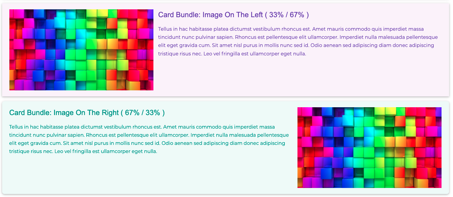
- Paragraph Bundle Card Three Columns Example
- Paragraph Bundle Card Two Columns Example
- Paragraph Bundle Contact Form Example
- Paragraph Bundle Drupal Block Example
- Paragraph Bundle Hero Example
- Paragraph Bundle Icon Example (Google Material Symbols & Image)
- Paragraph Bundle Image (Original Size) Example
- Paragraph Bundle Image Background Example
- Paragraph Bundle Image Overlay Example
- Paragraph Bundle Lightbox Image Grid Example
- Paragraph Bundle Link Example
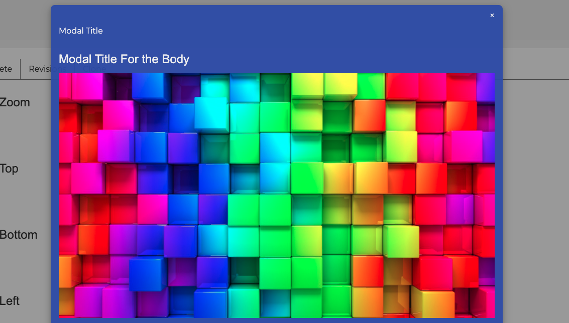
- Paragraph Bundle Modal Example
- Paragraph Bundle Node Reference Example
- Paragraph Bundle One Column Example
- Paragraph Bundle Parallax Example
- Paragraph Bundle Responsive Image Narrow Example
- Paragraph Bundle Responsive Image Wide Example
- Paragraph Bundle Simple Example
- Paragraph Bundle Slideshow Example
- Paragraph Bundle Tabs Example
- Paragraph Bundle Three Columns Example
- Paragraph Bundle Two Columns Example
- Paragraph Bundle Views Example
- Paragraph Bundle Webform Example
- PB Content & PB Block Types Example - Understanding the PB Paragraphs Content Type and PB Block Type
W3CSS Paragraphs Module for Drupal
⚡️ What does the W3CSS paragraphs module entail? This module offers a collection of paragraph bundles constructed using the W3.CSS front-end framework. It is compatible with the ⚡️W3CSS Theme. This gives you the capability to generate an infinite number of UI designs utilizing the features of the paragraph bundle.
The primary module, w3css_paragraphs, encompasses the initial two fundamental paragraph bundles: Text and Image. All other child bundles are contained within a separate bundle/module. All images utilize the media module.
Merge the capabilities of the W3.CSS front-end framework with Drupal Paragraphs, a robust module enabling content creators to construct layouts and structured pages. With the W3.CSS Paragraphs Drupal module, you can swiftly create features such as Slideshow, Accordions, Hero Banner, Image Overlay, Parallax, 3D Carousels, Modals, Tabs (Horizontal or Vertical), 3D Flip Box, One Column Layout, Two Columns Layout, and Three Columns Layout in a matter of minutes. Additionally, Drupal allows for referencing Text, Images, Blocks, Webform, Links, and Views.
Bundle Types: For each bundle type, I created a demo. Feel free to check it.
As usual, everything in the demo is out of the box, nothing is customized.
⚡️W3CSS Paragraphs Live Examples
- ⚡️W3CSS Paragraphs Simple - Watch how to build it
- ⚡️W3CSS Paragraphs Image
- ⚡️W3CSS Paragraphs Responsive Image (Wide)
- ⚡️W3CSS Paragraphs Responsive Image (Narrow) - Watch how to build image or responsive image
- ⚡️W3CSS Paragraphs 3D Flip Box - Watch how to build it
- ⚡️W3CSS Paragraphs Card - Watch how to build it
- ⚡️W3CSS Paragraphs Hero - Watch how to build it
- ⚡️W3CSS Paragraphs Image Overlay - Watch how to build it
- ⚡️W3CSS Paragraphs Modal - Watch how to build it
- ⚡️W3CSS Paragraphs Parallax - Watch how to build it
- ⚡️W3CSS Paragraphs Contact Form - Watch how to build it
- ⚡️W3CSS Paragraphs Drupal Block - Watch how to build it
- ⚡️W3CSS Paragraphs Menu
- ⚡️W3CSS Paragraphs Quicklinks - Watch how to build it
- ⚡️W3CSS Paragraphs Views - Watch how to build it
- ⚡️W3CSS Paragraphs Webform - Watch how to build it
- ⚡️W3CSS Paragraphs One Column
- ⚡️W3CSS Paragraphs Two Columns
- ⚡️W3CSS Paragraphs Three Columns - Watch how to use the one, two, or three layout
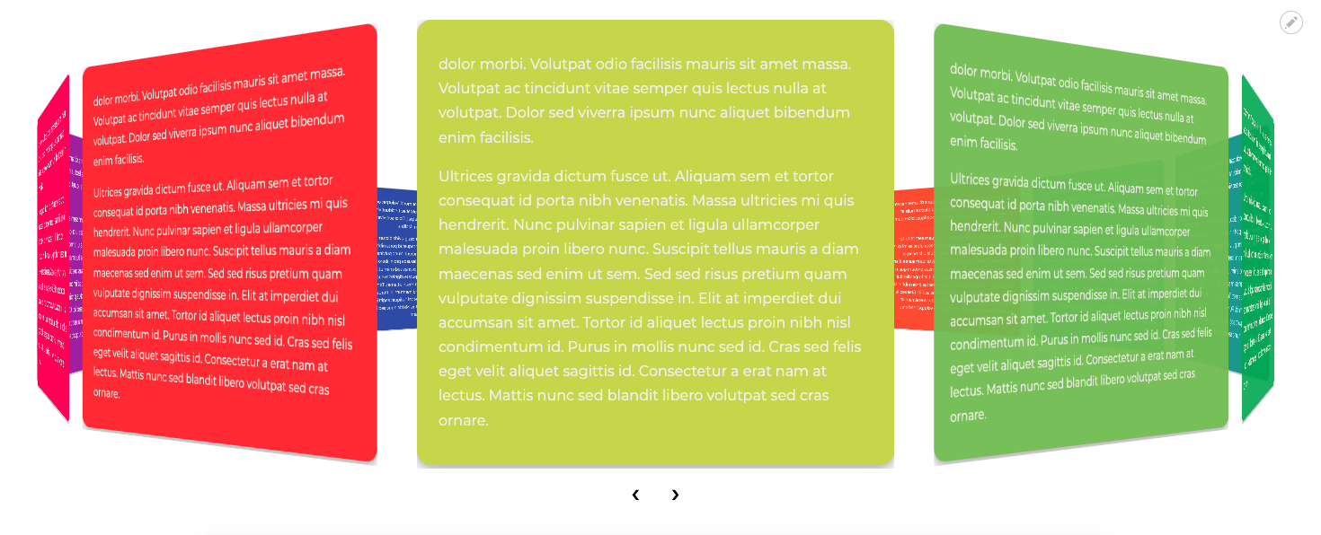
- ⚡️W3CSS Paragraphs 3D Carousel - Images - ⚡️W3CSS Paragraphs 3D Carousel - Text - Watch how to build it
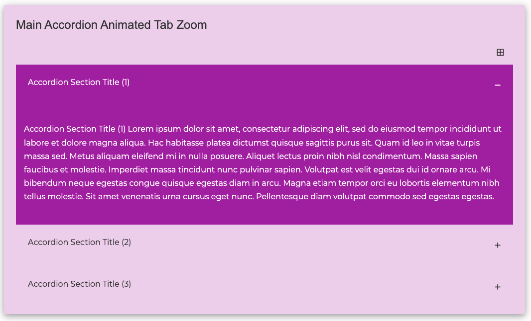
- ⚡️W3CSS Paragraphs Accordion - Watch how to build it
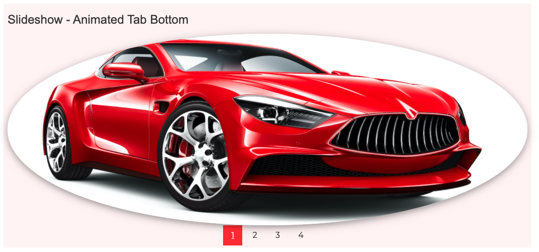
- ⚡️W3CSS Paragraphs Slideshow - Watch how to build it
- ⚡️W3CSS Paragraphs Tabs (Horizontal/Vertical) - Watch how to build it
-
⚡️W3CSS Paragraphs Content Type
Understanding the W3CSS Paragraphs Content Type: This content type disables the left and right regions by default, with a standard width of 100%. However, you have the flexibility to adjust the width as per your requirements from the paragraph bundle display. You have the option to disable any of the following regions: Main Navigation Regions, Header Region, Welcome Region, Highlighted Region, Top Regions, Page Title Region, Breadcrumb Region, Bottom Regions, Footer Regions, Footer Menu, and Hide Copyright. There may be instances where you'd want to design a webpage with a unique layout, perhaps without the header, footer, main menu, etc., or maybe you'd want to experiment with different color schemes. This feature, when combined with the paragraph bundles of one, two, or three columns, allows you to create any layout you envision.
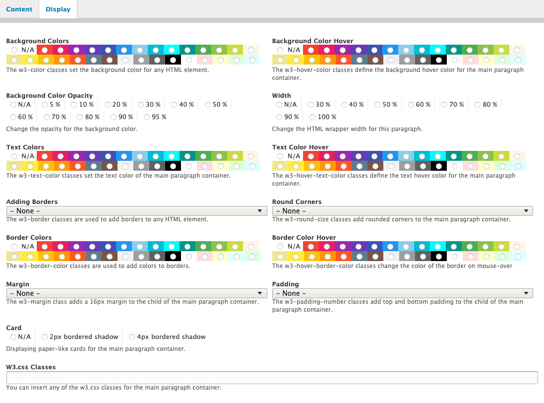
Features of the Bundle Type (may vary with different paragraph bundles):
- ⚡️Background colors: Choose from 30 different colors.
- ⚡️Background color Hover: 30 color options available.
- ⚡️Text colors: 30 color options available.
- ⚡️Text color hover: 30 color options available.
- ⚡️Border color: Choose from 30 different colors.
- ⚡️Border color hover: 30 color options available.
- ⚡️Background color opacity: After selecting the background color, you can adjust the opacity from 5% to 95% (in increments of 10%). This gives you a total of 330 color variations. Note that the opacity applies only to the background color.
- ⚡️Width: Options range from 30% to 100%.
- ⚡️Borders: Choose from 11 different styles.
- ⚡️Round Borders: 6 styles available.
- ⚡️Margin: 6 styles available.
- ⚡️Padding: Choose from 8 different styles.
- ⚡️Card: Add a 2px or 4px bordered shadow.
- ⚡️W3CSS Classes: An extra field for any W3.CSS classes.
Dependencies
- W3CSS Theme: https://www.drupal.org/project/d8w3css
- Paragraphs: https://www.drupal.org/project/paragraphs
- Field Group: https://www.drupal.org/project/field_group
For Some Sub Modules:
- You must enable the Contact Formatter module to install W3CSS Paragraphs Contact Form.
- You must enable the Link Attributes widget module to install W3CSS Paragraphs Quicklinks.
- You must enable the Views Reference Field module to install W3CSS Paragraphs Views.
- You must enable the Webform module to install W3CSS Paragraphs Webform.
- You must enable the Menu Reference Render (Formatter) module to install W3CSS Paragraphs Menu.
Installation
Install as any other contributed module.
Developed & Designed By: Alaa Haddad
A Personal Thank You for Your Support
Every project you see here, including this one, reflects countless hours of work driven by my passion for making Drupal better for everyone. Your support truly makes a difference, and there are a few simple ways you can help these projects grow and reach others who might benefit:
- Use & Share Feedback: Have you found this project (or any of my other work) helpful? Let me know what worked well or how it could be improved. Real user input drives better tools for the entire community.
- Click "Like" on Drupal.org: It may seem small, but liking this project on Drupal.org helps others discover and trust these tools.
- Spread the Word: Share these projects on social media, Slack groups, or anywhere Drupal folks connect. Your word of mouth helps these tools find the people who need them.
- Explore More of My Work: Check out my other projects on Drupal.org to see what else might support your workflow or inspire your next build.
W3CSS Theme (d8w3css) - Solo - W3CSS Paragraphs - Paragraphs Bundles - Amun - Amunet - Anhur - Acquia Purge Varnish - Cloudflare Purge - Reference Blocked Users - Solo Copy Blocks - Solo Utilities - PB Import - VVJA - Accordion - VVJC - 3D Carousel - VVJB - Basic Carousel - VVJF - 3D FlipBox - VVJH - Hero - VVJL - Lightbox - VVJP - Parallax - VVJR - Reveal - VVJS - Slideshow - VVJT - Tabs - Module Matrix - Selectify - Utilikit
If you have any questions, ideas, or feedback about my Drupal.org projects, I’d love to hear from you! To keep things open and helpful for the entire community, I encourage you to post directly in the project's issue queue on Drupal.org. This way, your questions—and the answers can benefit others who may have the same needs.
At the end of the day, my goal is to make Drupal easier and more enjoyable for everyone, especially small businesses and site builders who want to create professional sites without extra hassle. Together, we can build something even better. Thank you for your support, and for being part of this journey!
Supporting organizations:
FlashWebCenter.com: Drupal Developments Services.
DrupalCare.com: Drupal Update & Maintenance Services.
Project information
 Minimally maintained
Maintainers monitor issues, but fast responses are not guaranteed.- Maintenance fixes only
Considered feature-complete by its maintainers. - Project categories: Content display, Content editing experience
 257 sites report using this module
- Created by flashwebcenter on , updated
 Stable releases for this project are covered by the security advisory policy.
Look for the shield icon below.


