
 Come together with the global Drupal community in Rotterdam, 28 Sept – 1 Oct 2026. Sessions, contribution, connection, and Early Bird savings until 8 June.
Problem/Motivation
#3096078: Display core compatibility ranges for available module updates was committed before a usability review.
It adds a lot of (mostly duplicate) text to the available updates report:

We should try to improve the UX of this info because it's:
a) Important.
b) Likely to grow larger and more complex over time.
Proposed resolution
- Have the available updates report determine if a release is compatible with your currently installed version of core or not.
- Make "not compatible" an open details that replaces download link.
- Add a closed details under download link for compatible releases.
- Shorten the text from "This module is compatible with Drupal core:" to "Requires Drupal core:".
Manual Testing: How to
- Start with a clean 8.9.x clone
- Apply latest patch.
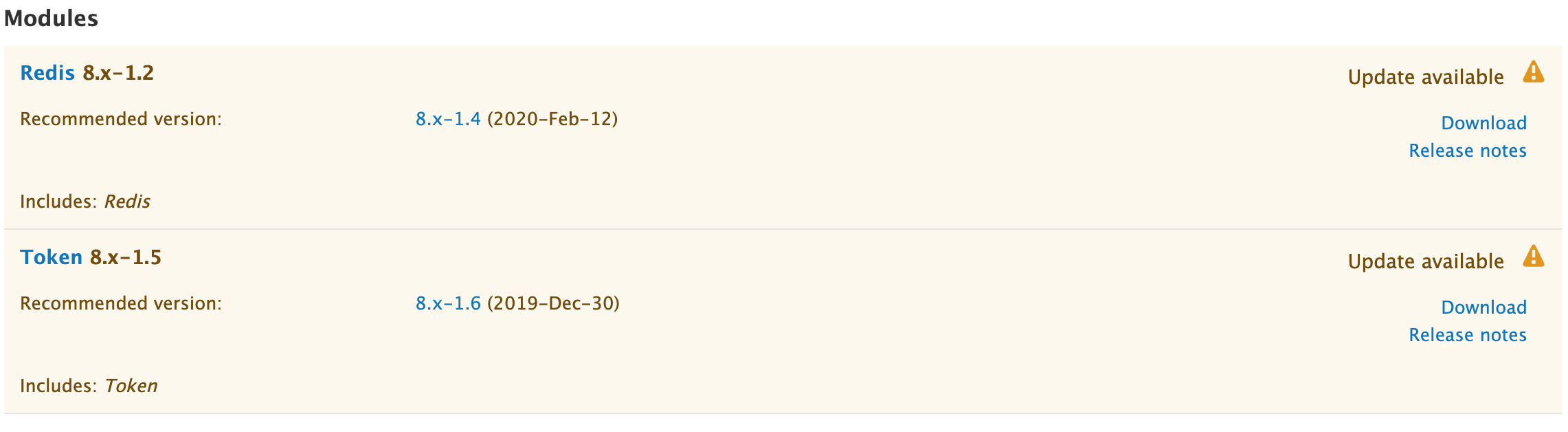
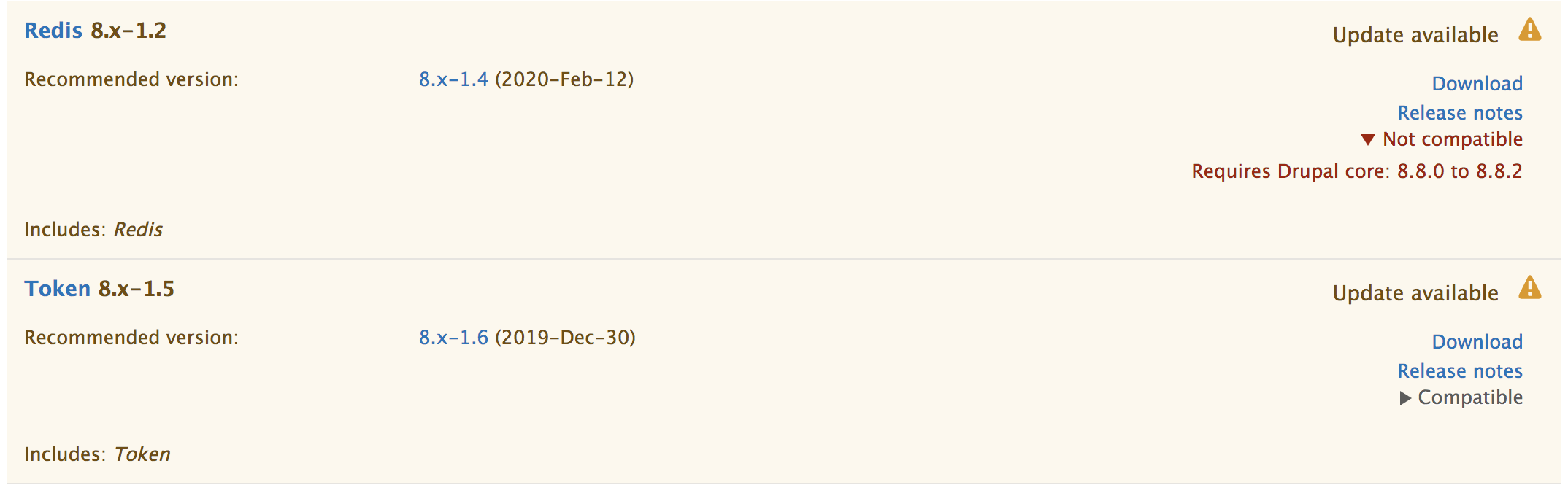
- Download token 8.x-1.5 (since 8.x-1.6 is out, and that defines the core compatibility in the new format that triggers all this).
- Download redis 8.x-1.2 (since 8.x-1.4 is out, and that defines
core_version_requirement: ^8.8 || ^9). - Modify
core/lib/Drupal.phpand setconst VERSION = '8.7.10';(see manual-testing patch in #86). - Install Drupal and enable Redis and Token
- Visit /admin/reports/updates and check for updates, click around, enjoy.
- Visit /admin/reports/updates/update and see that #3113992: The 'Update' page has no idea that some updates are incompatible is a separate bug.
Remaining tasks
Initial UX review.Brainstorm solutions.Implement them.Initial prototype in #26Decide if the compatibility details area should go above (#26) or below the "Release notes" link. See #31 for more.Decided: Below. Patch in #44.Decide the correct text to use for the details titles:- "Not compatible"
#28: "This update has compatibility issues"#32: "This update is not compatible with your version of Drupal"#48: "Not compatible..." (with ellipsis)
Decided (#60): "Not compatible" (no ellipsis).
Decide if we should also inform site admins about compatibility with recommended/available core update versions.See #2. Decided: not in this issue (#58). Follow up: #3114149: Update report should show whether suggested project versions are compatible with recommended core versionDecide if we should show compatibility info at all if the update is compatible with your current version of core(see #43, #46, #47, etc). Decided: yes (#58)Decide if we want icons next to 'Not compatible' and perhaps download link or not(#6, #16, #48, #49, ...). Decided: not in this issue. We may do it in a follow-up issue. (#58)Decide if the not-compatible message should say the currently installed core version, and if so, above or below the ranges of compatible core releases. See #46.4, #48, #55 Decided: NO #88.Decide if the release notes should go above the download link in the compatible case(#56) Decided: Keep the current order (#58)Decide what the hover / focus styles for these<details>(especially<summary>) elements should look like:SevenUnderline. See #2980304: Seven theme's details/summary focus style is broken/missing in some browsers. or patch #96.Claro: See #100.
Improve implementation:remove @todo'sFix compatibility message to not hard-code 'module' into the text (either use 'release' or be aware of project type)(#54)Expand details by default for "Not compatible" modules#65Change details payload in both cases to start with a full sentence that explains what "Compatible" or "Not compatible" means.#65Change the text inside the details to: "Requires Drupal core: 8.8.1 to 8.9.2"#66Remove the colors on the details headings for accessibility and UX concerns#67 Restored red for Not compatible (patch #94, based on #91 and #93)Removed color to be decided in follow up #3114707: Add color to summary element to improve UX of core compatibility info on available updates report see @xjm Release manager decision in #109.Restore the Download link in the "Not compatible" case.#68Overruled, re-removed in #104.Decide if we should add a twig template for the compatibility details or let it all be hard-coded markup.The details render array is now created intemplate_preprocess_update_version()so it can be altered by themes overriding this preprocess hook if needed. (#137).Decide if we should pass core_compatible to the update-version.twig.html templates or not. #68We need to do that since we're conditionally hiding the download link after all (#101)
Fix styling (target: aim for #36, implementation: custom CSS in update/css/update.admin.theme.css for<details>/<summary>):Seven:Fix focus styles (need to decide #96 vs.Defer to #2980304: Seven theme's details/summary focus style is broken/missing in some browsers. - #159)Fix hover styles: Moved to #3116331: details/summary doesn't have a hover styleRestore grey for compatibility details after #110?Nah, let's do all the color in #3114707: Add color to summary element to improve UX of core compatibility info on available updates reportChange how the CSS is working to only touch Seven and leave the module + stable CSS alone.#141
Claro: Entirely todoMoved to #3114910: Improve Claro styles for core compatibility details on available updates report
Update / fix failing tests.Done: patch #81Add new tests:Make sure details are closed vs. open vs. by default for compatible vs. not compatible releasesAssert the intro text is how we expect it to be for compatible vs. not compatibleIrrelevant after #88.Make sure download link is gone for not compatible releases
Reviews:AccessibilityPassed: #91UXLots...Markup and CSSDone: #160, #161, #164, #166Code / implementation
Add screenshots for themes they have not updated their templatesRemove the changes to drupalci.yml so the full test suite runsManual testing. See above for instructions.RTBC.- Commit.
- Follow up for the 9.0 Usability review of the major version update
- Follow up to do a UX review of the update status report once other semver work is implemented in core and on Drupal.org as a part of #3110198: [META] Beta targets following Drupal 9.0.0-beta1 and 8.9.0-beta1
- Follow up: #3114707: Add color to summary element to improve UX of core compatibility info on available updates report
- Follow up: #3114910: Improve Claro styles for core compatibility details on available updates report
- Follow up: #3116331: details/summary doesn't have a hover style
User interface changes
Screenshots From Seven (patch #141):
Initial state

Toggled both details

Claro

Seven with no template changes
With stable template from before #3096078: Display core compatibility ranges for available module updates since this was not committed to 8.8.x
Not sure how reliable this search is, but it only shows 11 themes overriding this template:
http://grep.xnddx.ru/search?text=version&filename=update-version.html.twig
This includes the contrib versions of Claro and Stable
API changes
None
Data model changes
None.
Release notes snippet
TBD. Probably not needed since this is just cleaning up another feature that hasn't yet been released.
| Comment | File | Size | Author |
|---|---|---|---|
| #189 | 3102724-189-8.8.x.patch | 28.19 KB | tedbow |
| #182 | 3102724.175_182.interdiff.txt | 648 bytes | dww |
| #182 | 3102724-182.8_9_x.patch | 28.12 KB | dww |
| #182 | 3102724-182.9_0_x.patch | 28.14 KB | dww |
| #86 | 3102724-86-manual-testing.do-not-test.patch | 375 bytes | dww |

Comments
Comment #2
dwwOne extremely important thing this UI should make more clear is if a given release is compatible with the version of core you're currently running. That's definitely not obvious when skimming the output. Especially if your version of core is inside one of the printed ranges, it's going to take quite a bit of mental energy to parse the range and figure out if the given update would work on your site. We could compute that automatically and tell you by some more obvious mechanisms (icon with hidden text, explicit text, both, etc).
The other extremely useful bit of info that's currently rather buried is if the given release would be compatible with a recommended core update. This is a bit harder to quantify, since there might be multiple core updates recommended. E.g. if you're on 8.7.9 right now, update.module will tell you to update to 8.7.11 and mention that 8.8.1 also exists. But it'd be really slick if an available update for one of your contribs could say (approximately):
(more or less).
Comment #3
webchickThis page has probably never had a usability eye on it, so it's a little difficult to parse out exactly what to be focusing on. And I'm assuming we want something simple, rather than a full-scale redesign?
Because in terms of other apps' update pages, none of them that I have readily available go to nearly this level of detail, esp. on the top level. They just simply would just not show you things that do not work for your version, and any more detailed version information would be hidden behind a "Details" / "More" link; the interface itself simply showing you lists of things to update and a button to update all of them.
Examples:


So to avoid a wholescale redesign, one idea could be doing this a bit like the modules page, where the pertinent info is available at hand (name of module, whether it's a security release or not), and you expand a details element to get at the rest of the info, which we could format however (e.g. in a table, if that's an easier way of parsing this info).
(I'm sure this is missing some nuance, but to get the brainstorming kicked off...)
Basically: make it very easy for people to make the best choice, and bury the other choices, as well as other details not directly related to solving the problem at hand.
Comment #4
dwwThanks, @webchick!
Re:
Big ole' can-o-worms. :/ See #3076183: [Meta] Determine how available updates for modules should be handled if they are not compatible with the current version of Drupal core -- oh yeah, you commented there, too. ;)
I like the ideas of collapsing most of the details on this report. That sounds like a really good move, but seems a bit out of scope. I agree this report hasn't had much UX review in years (although it's not fair to say "never" we did try in the earlier days, including a fair bit of effort from bojan and yoroy). I was trying to be more specific with this issue and the details around the core compatibility ranges, not a full-scale "redesign the available updates report" issue.
That said, if we go this route to address the duplicate / verbose info that was just added, we'd still end up burying the important info about core compatibility. Or, we'd have to put this info "above the fold", and then we're not really any better off.
Or, we'd have to summarize the key compatibility stuff I mentioned in #2, put *that* above the fold, and put all the detailed version range stuff in the hidden details.
Or something. ;)
Comment #5
webchickOh, right, I knew this problem space sounded overly familiar. :D And fair point this has received some UX love, just not in a very long while, and so other pages such as the Status Report page or https://www.drupal.org/project/upgrade_status have had much more recent UX love would be good places to look for patterns in general.
So for the purposes of this issue, you want us to explicitly focus on this text that was added?
Can you elaborate on why exactly you think this info is so critical and should be raised in visual importance? To me, the critical thing to answer is "Does this work with my version of core or not?" and IMO you could handle that in simpler, graphical terms (e.g. green checkmark next to active download link / red X next to disabled download link). The "what other versions is this compatible with?" seems like interesting info, but not relevant to the task at hand, so could be buried wherever... or am I missing some crucial nuance here?
Comment #6
webchickIf we did something like that... (yellow box intended to be a tooltip over the "X"; checkbox would read the opposite.)
Once again, just throwing out ideas for brainstorming; not suggesting this as a way forward.
Comment #7
xjmThis issue is at least major, because it will need to block backporting #3096078: Display core compatibility ranges for available module updates and #3074993: Use "current" in update URLs instead of CORE_COMPATIBILITY to retrieve all future updates to 8.8.
Comment #8
xjmTooltips are really hard to get right from a usability and accessibility perspective. My guess as not-a-user-experience-expert is that it'd be better for it to use a "Details" pattern if needed.
I think you need to know what version of Drupal you need to install in order to also install the needed security update. "Not compatible with your version of Drupal." does not give you that information.
Comment #9
xjmSorry, my remark about "Details" is ambiguous in light of #3 which I had not read. I mean like:
"Not compatible with your version of Drupal. Details ▸"
"Not compatible with your version of Drupal. Details ▾
Requires numbers numbers numbers.
"
What's also not clear to me is whether the message is shown if it is compatible with your version of Drupal. IMO it shouldn't be.
Comment #10
xjmComment #11
xjmComment #12
xjmThere are designs on #2990476: If the site is on an insecure version of an old minor and there is a secure version of that old minor available, the update status report should link that release for fixing the update status report WRT security releases, so we should also go with something minimal here that just undoes the regression of adding confusing words and numbers, and continue to work on this page after. I do like Angie's idea of not having a download link if it's not compatible with your version of Drupal. I might go a step further and just display no download link at all, since the word download as not-a-link also seems like a UX issue.
Comment #13
gábor hojtsyI think the current UI elements being discussed have a goal of indicating if you can update to them or not, while still being compatible with your current Drupal core. This is like Google Play Store's incompatibility marker (which is shown before app downloads and for some reason green):
I also agree with @xjm that if there is a security update of a contrib and you cannot update to it because it is not compatible with your core, then you need to figure out which core you need first, which is where this message is (also) useful.
Another thing that may happen is that you are to update core (eg. for a security release) and then some extensions may not be compatible with it anymore, but that is not indicated on this screen, so the individual extensions do not display whether the current versions you have are compatible with which core and therefore you cannot tell what your boundaries are of updating your core. (Even though that is also information Drupal itself has but does not expose here).
All of this is of course heavily going into the realms of "just do this with composer" and "we are reimplementing composer data here for human brain processing". And yes, that is what we are doing because we want to keep supporting tarballs I guess.
Comment #14
xjmWe have to support tarballs until we don't. As of a year ago, 50% of sites still used tarballs. Removing the update status report or making it purely informational is out of scope for this issue. :P All we need to do here is clean up the message.
After sleeping on this, I'm promoting this to critical, because we really need this and the issue it's blocking in 8.8 and that's blocked right now.
Comment #15
gábor hojtsyOk, but what do we want it to make users able to do? We can clean it up once we know that. Eg. it sounds like we don't care about whether a project supports an older version of core, so we could filter those out in the first place. In the screenshot core is 8.8.1 while the message explains the extension was also compatible with 8.8.0, which does not matter anymore here. That is one cleanup. What else to display depends on further refining the use case though.
IMHO talking about what to do with it is premature without defining first what the use cases it supports should be.
Comment #16
xjmSo what about something like replacing the download link with:
Which expands to
(We'd
format_plural()"versions". I mean not obviously the deprecated function but you know what I mean.)Comment #17
xjmWe could potentially add some logic to only provide info on versions of core higher than yours unless it's only compatible with lower versions.
And as I said, the message should not display anything if the version is compatible.
Comment #18
webchickRe: #15, I also struggle with "what are the specific problems we're trying to solve here?" as leaping ahead into design-land without that seems premature.
As best I can tell it's something like:
"As a site builder, I want the update status report to inform me of updates to my site, particularly security issues."
"As a site builder, if a particular update is not compatible with my version of Drupal, I expect to be informed of what steps I need to take to get into compliance."
Are there more? Are we also intending to solve like:
"As a site builder, I want to be informed through the update UI of all possible Drupal versions that I could use a particular update with."
^ Because that doesn't sound like an actual use case. ;) That sounds like something I'd go to Drupal.org project pages to find out, personally... On this page, I expect to get relevant information for this site.
What are the other user stories we're hoping to achieve through this information?
Comment #19
dwwWow, flurry of activity. Yay. ;)
@webchick re: #5:
Exactly. That's what I'm trying to say in #2. I think the thing that was added in #3096078 as if it was important and useful info at the same visual importance as a bunch of other stuff is mostly completely irrelevant to site builders, and what they actually need to know are the 2 points I wrote:
...
To that end, @xjm's #16 (or something like it) is way better than what I put at the end of #2.
+1 to the top-2 user stories in #18. Those seem like the right things for this report to help site builders understand. The last non-case of "show me all possible core updates that a given release is compatible with" (what was actually added) seems mostly irrelevant and confusing. That's why I tried to stop #3096078 from being committed in the first place, and was in favor of reverting it, but I was both too late and not convincing enough. ;) Happy to see this now considered a critical follow-up to actually fix it.
Thanks,
-Derek
Comment #20
dwwp.s. I understand this issue is now blocking a backport to 8.8.x, but there is no such info in the available updates report in 8.8.x at this time, any patches for this will have to target 8.9.x, be "tested" against 8.9.x, etc. Seems like 8.9.x is the more appropriate version for this issue, but ultimately I defer to @xjm on that.
Comment #21
dwwp.p.s. The other unspoken elephant in this room is that even if a given contrib release says its compatible with a given version of core, that's but one piece of the whole dependency tree. E.g. maybe you're still on PHP 7.1 and a new contrib release now requires 7.3. Or perhaps the latest release of a contrib you have now adds a new dependency on some other contrib you don't have. Nothing on this report knows about any of that or can tell you about either of those (or other) cases.
So while we can make approximate recommendations, we can't guarantee that what we're recommending you do will actually work. I'm not really sure what to do about that. Writing all the text in a conditional style in that implies "we think this will work, but you'll have to try it and see" would be crappy. Yet, we can't actually state with certainty that the releases we recommend you upgrade to will all work, either individually, or collectively. Hence, why-are-we-trying-to-re-implement-composer-in-update.module? ;) But yeah, I understand we don't yet require everyone to use composer, so we have to have something to help site builders get by without it.
Even with composer in the mix, it's nice to have something tell you automatically that you're missing updates, which composer on its own does not do.
Comment #24
xjmHere are the notes from the UX meeting earlier this week where we discussed the problem we're trying to solve (sorry, forgot to post them amid other activity:
For this issue, we want to mitigate the UX regression from #3096078: Display core compatibility ranges for available module updates so that the update status report helps users understand which releases are available and whether a given release is compatible. We want to go with the minimal change so that D9 is in a shipable state and so the change is backportable to 8.8.x.
I'm adding issue credit for those who helped participate in the UX discussion.
Anyone up to implement a prototype of the above proposal from the meeting discussion?
Comment #25
dwwI'm in the middle of a very initial quick hack prototype of this. Stay tuned...
Comment #26
dwwSuper ugly. Totally un-styled. Probably not The Right Way(tm) to deal with the template changes (although I don't believe any of this has actually been released yet, so we should still be free to make such changes without BC worries). Probably not the right markup we want to end up with. Left some @todo for possible API changes to ProjectCoreCompatibility we might want to make.
That said, basically working prototype. ;)
NW for all sorts of things, including:
(added all those to the summary's remaining tasks list).
Sort of a PITA to actually test this. Ended up installing token 8.x-1.5 from tarball, hacked my local copy of
core/lib/Drupal.phpto claim I'm on 8.8.0, then manually forced a FALSE return fromProjectCoreCompatibility::isCoreCompatible()to see the incompatible cases happen.Screenshots from Seven:
Compatible
Initial
Open
Incompatible
Initial
Open
Comment #27
dwwPutting screenshots from #26 into summary, other updates / cleanups.
Comment #28
aaronmchaleThe like the approach by @dww in #26. If I remember correctly I think we agreed to not hold this issue up too much on specific wording and look at it in a follow-up, but my initial thoughts are that to avoid any confusion we should be a little more explicitly, for example instead of simply saying "Not compatible" we could say "This update has compatibility issues", that would just make sure there's no confusion about what "Not compatible" relates to. But again if we felt it's better to do that in a follow-up, happy to wait until then ;)
Great work everyone!
Edit: maybe it was #2991207 that we agreed to do text changes in a follow-up, these are both quite similar so maybe @xjm can clarify which one it was we agreed not to let text changes hold up.
Comment #29
dwwHere's what I meant with the @todo in the patch. Technically, this isn't "in scope", but it seems like a useful API cleanup given the in-scope changes we do need to make to this class to make this all work.
I didn't touch the tests, so this would still fail. No reason to have the bot churn on it until we get closer to what we want and fix the tests to match.
Also, I know we want this to backport into 8.8.x, but meanwhile, all the patches and testing are going to have to target 8.9.x, so I'm moving the version accordingly. See #20.
Finally, hiding all the screenshots from the file table. They're all linked or embedded in the comments, so we don't need them in the file table in the summary.
Thanks,
-Derek
Comment #30
tedbowI actually think this is inscope to change in this issue we now need this on class level we should be able remove it here.
Spelling should be
core_compatibleI didn't know why this was stored in the
$releasearray but I see we use in the twig template to not output the download link.I guess we can't just
unset($release['download_link'])here because of BC concerns if some overrode the template?
Comment #31
dww@tedbow re: #30:
1. Great, glad you agree. Already fixed in #29.
2. Whoops! ;)
compatibility^H^H^Heis to blame. ;) Fixed.Yeah, I guess. :/ I've been deeply involved in a bunch of issues that try to touch core twig templates and I still don't really understand what we're allowed to change, when, and why. :( So I simply hacked this together, without caring too much about The Right Way(tm) to solve everything. I still consider this a prototype, and I'd rather focus on how we actually want this to look and behave first, then sort out how to implement it such that it can be committed.
For a UX review, I wonder if the details should go above (#26) or below the "Release notes" link. Even if we style this better, it still seems a bit jarring to have things in this order:
Maybe this is better:
And in the not compatible case:
Added making a decision about this to remaining tasks.
Also re-ordered the remaining tasks a bit.
Comment #32
dww@AaronMcHale re: #28 -- sorry I missed this earlier...
I think this is that follow-up. ;) Since this is (part of) what's blocking a bunch of update.module patches from being backported into 8.8.x, it seems we need to get this correct, here and now. We can't keep punting the wording to the future, or we'll never be able to actually commit anything to 8.8.x. I believe the idea is "let's not completely redesign the entire available updates report UI" here. That much is true. ;) That needs to happen separately. But anything related to this compatibility range stuff should be fixed as part of this issue.
Specifically re: "This update has compatibility issues" -- I think that's still too vague. If we want to be more explicit, we should say something like "This update is not compatible with your version of Drupal" or something. It's not just "compatibility issues". It's fully incompatible. ;)
Added making a decision on these details titles to the remaining tasks...
Thanks!
-Derek
Comment #33
dwwComment #34
dwwAlso added this to remaining tasks:
Comment #35
webchickOof, reviewing the screenshots in #26, that DETAILS element REALLY QUITE YELLY and as a result, it completely visually overshadows the "Download" link, which is the actual thing you want to do here in the 90% case...
Hm.
Comment #36
webchickCan we somehow re-use the more subtle details styling from the modules page? This is meant to be supplementary info, not "OMG, CLICK ME NOW, PLZ!!!!!"
Comment #37
webchickAs far as the outstanding questions in "remaining tasks," my 2 cents:
Comment #38
dww@webchick: Thanks for the replies!
Re: #35: Yeah, absolutely. I kept trying to make it clear this is totally un-styled. The screenshots in #26 in no way represent what I (or anyone else) wants this to actually look like. ;) It's just proof-of-concept, fleshing out the required API changes to make it work, etc.
Re: #36: Good question. Thanks for the pointer to an existing pattern in core to try to re-use. All those styles live directly in core/modules/system/css/system.admin.css:
So, either we get to:
A) Duplicate those styles into core/modules/update/css/update.admin.theme.css in such a way they'll take precedent over the default details styles in Seven and Claro.
B) Add specific styles to Seven + Claro for this.
C) Do some hacky crap to add
system-modulesclass and a<td>around the available updates report so those styles kick in (ugh).I vote A, I guess, but the folks who really know about The Right Way(tm) to deal with markup/CSS changes in core should state their preference.
Re: #37:
- Position (4 - hope we don't renumber those): Great. I think the bottom of the pile is better, too.
- Title "Not compatible" (5) - Right, less is more. :) Note: there's no data about "existing wording" because this feature has never been released. ;)
- Compatibility with recommended updates (comment #2, currently 6 in remaining tasks): I was imagining that would be buried inside the message inside the details. So I'm less concerned about adding more text there, since someone already clicked on the "tell me more..." link. But sure, I guess we could punt that to yet another follow-up. I'm just already concerned we have a huge list of issues and patches that are interdependent that we're trying to resolve and backport all the way to 8.8.x, and every new "let's do that in a follow-up" adds to that complication.
Thanks again!
-Derek
Comment #39
webchickCool re: styling still being @todo. :) I did see that in the "remaining tasks" but wanted to be sure to emphasize the point so it was not lost. :P We also don't have to use the module page styling, it just is already there. Whatever works best.
Sorry, yes, I know this hasn't been released yet, but that also means no end user has been confused about the shorter text yet, so... ;)
Yeah, fair point about issue spaghetti. I guess if we're going to point those things out, I would recommend we do them in one place, like either at the top of the page, or in the "Drupal core"'s row. Otherwise you're going to repeat yourself over and over and over again on each "expando-thingy" on what the various current/recommended/latest versions are (these will not change row-to-row), which adds a lot of extra noise each time and makes the "meat" of the message harder to parse.
And if we're going to put it once, up there, then it doesn't seem like it has anything to do with this issue, which is about the compatible/not compatible messaging per row. Hence, the recommendation for a follow-up, since it sounds like it'd be a nice improvement regardless of what happens here.
Once again, just my 2 cents, tho.
Comment #40
dwwRe: #39 Righto. ;)
We can't put compatibility with the latest recommended core release up only once, since in general, each project on this page could specify different
core_version_requirementconstraints, and therefore, not all of them will be compatible with any given core release (either currently installed or recommended). That's why this stuff is already duplicated for each row. In practice, a huge number of your projects will all have the same compatibility, so all these messages are going to be duplicate, which is why we want to hide them in a collapsed<details>in the first place.My point from comment #2 was that if we're going to say this over and over:
This module is compatible with Drupal core: 8.8.0 to 8.8.2as that list grows, and potentially includes multiple ranges of compatibility, and it gets harder and harder to parse the list and figure out WTF, it'd be nice if it simplified things for you to tell you "is compatible with what you're currently running" (yay, we're already doing that with the title of the details link) and "would be compatible with the version of core we're recommending you upgrade to". But yes, this last part is complicated to get right (since there might be multiple versions of core being recommended in the core section) and adds clutter to an already cluttered list of stuff for mere mortals to read through and parse. So probably won't fix or punt to Yet Another Followup(tm) and not let it hold up this critical issue.
But, I'll leave that open for more feedback before officially crossing it off the remaining tasks as a final decision. I am not a UI expert. ;)
Thanks,
-Derek
Comment #41
aaronmchaleRe #32
Yeah that makes sense.
Re #36
Oh I like that idea :) The module page example does look cleaner.
Re #37
Very valid point, fewer words can be more effective, but you also need a happy medium where you need just enough words to effectively convey what the important part, without loosing the important part on a quest to use the fewest possible words.
Does "Not compatible" do that, well technically yes, but it does still have an ambiguity about it, the user might ask "Not compatible with what...", of course they can just expand the detail element to find out, but is it obvious enough that by expanding the detail element that's what they will find out?
Re #38
Personally I'd go with that one, I know there's the whole debate and discussions going on about how to deal with CSS changes.
Comment #42
dww@AaronMcHale re: #41: Thanks, all great feedback.
As @webchick pointed out in #39, this is all just speculation at this point, since none of this has been released, we're not a few years into releases that are making these compatibility ranges/lists more verbose/complex, etc. We just have to make our best guesses, ship it, and see what happens. ;) Until we have any real evidence that "Not compatible" is actually confusing, Occam's razor says we should keep short.
Another reason to keep the details title at just "Not compatible" is that we might want to expand this stuff someday as part of #3076183: [Meta] Determine how available updates for modules should be handled if they are not compatible with the current version of Drupal core. The modules page already does a bunch of checks for if you can enable a given module or not, including core compatibility, missing dependencies, PHP version, and more. Perhaps we'll actually have a list of compatibility problems for you under "Not compatible", and it'd be a string break and UI change for site admins if these titles change later for that.
- - -
From the summary, is it safe yet to actually make these decisions:
4. Decide if the compatibility details area should go above or below: Below
5. Decide the correct text to use for the details titles: "Not compatible" and "Compatible releases"
6. Decide if we should also inform site admins about compatibility with recommended/available core update versions: Punt-to-followup for (non-critical, maybe not even backportable) discussion.
?
and for implementation details:
#38.A: Duplicate/custom
<details>styles in update.admin.theme.css so the DETAILS AREN'T SHOUTING? ;)Thanks,
-Derek
Comment #43
dwwUgh, hate to ask, but Occam's razor has me thinking... if the update is compatible with your current version of core, does any site builder actually care to see the list of all possible compatible versions? I'd be shocked and amazed if anyone is going to see the Available update report, remember their recommended core release, go through 1-by-1 to click "Compatible releases" for every project, and parse the list of version #s in each one to see if they're ready to upgrade to a later core or not, etc. If we intend to give site builders the info they need to make good decisions about what version of core to upgrade to and when, I think we need to do what I propose in #2. Otherwise, I suspect we're fooling ourselves that anyone is actually going to read all this and process it themselves.
So... maybe we only add the details to a project for the "Not compatible" case, and avoid cluttering things at all in the compatible case?
Comment #44
dwwTo move this along a bit, let's decide we're putting the release notes above the compatibility details in all cases.
p.s. I also noticed a bug in core/themes/claro/templates/admin/update-version.html.twig where I left a duplicate download link in place.
p.p.s. @tedbow, re: #30.2: "we can't just
unset($release['download_link'])here..." because none of the core templates are written such that they check if download_link has a value or not. They all assume there's a value. And yeah, changing all that is more BC-breaking than the changes in this patch. *shrug*Comment #45
dwwOkay, here's a stab at styling. Currently only dealing with Seven. Claro is still @todo. But this is getting closer (I hope)...
Compatible
Initial
Open
Not compatible
Initial
Open
Comment #46
dwwNotes on #45:
1. I don't love that it says "Compatible releases" for the compatible case. Maybe just "Compatibility" is better? "Releases" seems a bit weird here.
2. Still wonder if "Compatible releases" should just completely go away (see #43).
3. Maybe "Not compatible" needs to be red with an error icon or something?
4. Inside the message for "Not compatible", I wonder if the text should say more (I know, bad idea). But either add the word "only" or perhaps even add another sentence: "Your currently installed version ($version) is not supported." or something...
Comment #47
webchickYeah, all the app store examples in #3/#13 just focus on a simple "yes/no" binary of whether a release is compatible with the version you're running now. That version is already prominently at the top of the page. I don't think we need to repeat it over and over.
And #17 seems to agree with you to not show anything if it's already compatible. I think there was one comment (maybe by @tedbow?) that an argument for showing it in both cases is:
- I have core version 8.7.2.
- Module Y has an update, compatible with 8.7.0-8.7.9. It is a yellow row.
- Module Z has a security update, only compatible with 8.8.0+. It has a red row, and a "not compatible".
You are of course going to focus on the security problem first and foremost, and update your version of core to get it. But now module Y doesn't work anymore.
That said, I highly doubt you're gonna be astute enough to find that out ahead of time, because you'd need to clicking on every. single. row. to expand its details and hold it in your head. So +1 I think to dropping it entirely for compatible, and only showing details for "Not compatible," unless anyone else has counter-arguments. In the OS/App store examples, this is the same flow you'd get anyway. ("Oops, your app is now no longer compatible with Catalina, go bug the developer for an update.")
Comment #48
aaronmchaleRe #42
Ah that's quite a good point, ok sure, I'm fine with just sticking with "Not compatible". Though, I wonder if it would make sense to add an ellipsis at the end, so "Not compatible...", just as a further indication that if they expand the detail element they'll get more information (this proposal is based on the assumption that we are going with the styled detail element shown in #36).
Re #42 and #44
Agreed.
Re #43
That sounds sensible, I think knowing that a module is compatible is enough, going on to explaining what versions it compatible with doesn't seem to be very useful information. As in, module X is compatible, great I'll install it, I'm not really interested in the compatibility range other than the fact it is compatible with my current setup.
Re #45
Nice :)
One thing I'd like to note though: I liked that in #6 there was a clear visual indicator to go along with if the module was compatible or not (the green tick or red cross), I think that's really helpful for if you're scanning the page. I have a visual impairment, so if I were l looking at a long list of updates, and having to go down the list looking at each update one by one to see if the text said compatible or not, I would find that a little tedious; But that clear visual indicator is really helpful.
Re #46
[1] Yeah maybe just text saying "Compatible" (with a green checkmark or something similar, see above).
[2] I think keeping the word "Compatible" is still useful to have.
[3] Making the "Not compatible" text red with a visual indicator sounds like a good idea.
[4] I like "Your currently installed version ($version) is not supported." (maybe "compatible" instead of "supported" to be consistent), but then on a new line the existing text "The module is compatible with...". That we we're stating the current situation, then explaining the reson.
Comment #49
dww- Adds colors
- Changes summary text to just "Compatible" for the default case.
Slightly confused by @AaronMcHale in #48:
#46 (me), #47 (webchick) and #17 (xjm) all seem to be leaning towards removing all the compatibility details entirely for a compatible release. No new words / clutter. Just the same old download link. But in #48 you're saying to remove the details but leave the word "Compatible"? That seems a bit odd. I'd say we should either leave "Compatible" as a working details that shows the details, or remove it entirely. But adding a word (that's going to repeat a lot on this report) that seems fairly unnecessary, seems like a not-so-great-UI change...
Re: visual scanning -- Isn't scanning for "Download" (blue) vs. "Not compatible" (red) going to be sufficient? Do we really want/need to add green check boxes to the Download links?
I tried for a bit to get the error X icon on the summary, but I apparently don't have enough CSS-fu to make that work. ;) Any help on that welcome. If, indeed, we want an X icon next to "Not compatible" at all. I'm also worried a bit about icon overload, since we already have icons on each row about "up to date" (green check) vs. "update available" (yellow warning) vs. "security update missing" (red error).
Compatible
Initial
Open
Not compatible
Initial
Open
Comment #50
dwwwhoops, uploaded 1 wrong file... here it is.
Comment #51
dwwMinor CSS cleanup, fixes (e.g. to make it work right when you expand the details so nothing crashes into anything else) and syncing the CSS between core/modules/update/css and core/themes/stable/css. End result looks the same for the purpose of the screenshots, so not uploading anything new for those.
I started looking at Claro, but it's very opinionated about
<details>styles, so it's going to be more work to override all that and get it looking similarly there. @todo. ;)Comment #52
dwwAdded these to remaining tasks:
Comment #53
dwwRe: Fix compatibility message to be aware of project type (not hard-code 'module' into the text)
-- or maybe better yet, just say "This release is compatible ..." instead of 'module' or 'theme'.
Comment #54
dwwYeah, "release" is more accurate, anyway. Way simpler fix / smaller interdiff.
Comment #55
dwwp.s.: Again, to get these screenshots, I have to hack a FALSE return for isCoreCompatible() given the current state of releases. So ignore that it thinks 8.8.0 is incompatible with this stated range...
Comment #56
aaronmchaleRe #49
That's a fair point, the word "Compatibility" would be repeated a lot, and actually if we only showed "Not compatible" and showed nothing when there are no compatibility issues that might make it easier to spot those rare cases where there is a compatibility issue while scrolling through a potentially long list. I'm happy to go with the majority here then :)
Yeah after looking at your screenshots of the different colours, and I think if we're now only showing "Not compatible" (and it's red), I think it would be pretty obvious when scanning down the list.
Looking at the screenshots in #49, something just jumped out at me (and this is assuming we don't show "Compatible", as per above). If a release is compatible we show a download like above the release notes link, if the release is not compatible instead we show the not compatible detail below the release notes. To me that seems a little inconsistent, since now we're not showing "Compatible" if the release is compatible, essentially we're showing either a download like or a compatibility detail. I agree that the compatibility detail should be below the release notes link, but I wonder if the download link should also be moved below the release notes link. The might also be good because visually it might encourage people to click the release notes link before clicking the download link.
Re #53
+1 I think release works well well.
Comment #57
dww@AaronMcHale re: #56 thanks! Adding this to the remaining tasks:
Personally, I'd vote no. In practice, in the compatible case, "everyone" just wants to download and "no one" reads release notes. Swapping this order seems to put the less likely task first (even if we wish it was more likely). Also seems like scope creep (although I admit it's hard to tell what's in and out of scope in this issue).
If anything, to address the inconsistency, I'd reconsider the decision to move compatibility below release notes. If we remove "Compatible" entirely, and only show the details for "Not compatible", I think it'd be fine to have:
[> Not compatible]
Release notes
Cuz in that case, if it's not compatible with core, that's even more important for you to know than whatever the release notes say (which may or may not even tell you about the core compatibility, even though that could be happening automatically on d.o release nodes -- #NeedsFollowup?)
Comment #58
benjifisherWe (@dww, @AaronMcHale, @Gábor Hojtsy, and I) discussed this issue on the #ux channel in Drupal Slack. I am not sure we reached consensus, but I believe we agree enough. If we can accept "good enough", then I think we can move forward with this issue and the chain of issues it is blocking.
I am making the following decisions. The numbers refer to the list in the issue summary.
Personally, I largely agree with the points made in #42. I will not repeat those reasons here. I will add a few of my own:
Consider the case of the developer who tries to update a local copy of the site, runs into trouble, and then wants to discuss the situation with the rest of the team and/or client. Let's not remove the compatibility information just because the current release is compatible with the currently installed version of core.
Let's not remove the Download link, since the developer/site admin may want to update core and a contrib project at the same time. (Worst of all, because of UX and a11y, is to have a disabled link.)
Consistency is good for UX, so let's have the same 3 elements (Download link, Release notes link, and compatibility details) in both cases.
Comment #60
tedbowHad another UX meeting on this today. With @xjm, @webchick, @benjifisher, me, and @ckrina
Here the consensus we came to:
Some ideas to start the follow up, change to table and make each module much simpler to option expand to see more info
Comment #63
tedbowcreding 2 more from the UX meeting
Comment #64
dwwThanks for the meetings, decisions and updates!
Harvesting all the action items from #58 and #60 into remaining tasks.
I'll take a stab at this now, stay tuned...
Comment #65
dwwComment #66
dww- Fix text for compatibility range message.
(whoops, reversed which interdiff I attached to which comment... sorry about that).
Comment #67
dww- Remove red vs. green colors, always use grey.
Comment #68
dww- Restore download link for incompatible case.
@todo: Maybe we don't need to pass the $release['core_compatible'] bool to the update-version.twig.html anymore? Maybe people want to be able to tweak this?
Comment #69
dwwFound some more CSS woes with Seven styles where the hover and focus for the details were causing it to remain blue. Trying to keep it grey, but use a bottom border (since text-decoration doesn't seem to work) for focus and hover...
Not sure I love this, but I'm trying to be consistent with the other Seven focus styles. /shrug
Release notes with focus
Compatibility details with focus
(Also fixing screenshot embeds in the summary from #68)
Main TODO remaining from the summary:
Gotta stop for tonight. If anyone else wants to pick this up and run, feel free. ;)
Thanks!
-Derek
Comment #70
dwwAdding this to the remaining tasks:
Other minor updates to remaining if anyone else wants to work on anything.
Comment #71
aaronmchaleRe #67
Personally I feel like it would be better if the "Not compatible" detail label (not the contents) was red, because then when you're scanning down the list it's easier to spot the extensions which aren't compatible. If they are all grey that makes it harder to quickly find extensions which will need your attention.
Thanks for all the work on this
Comment #72
webchickRather than red, it's expanded by default, which will help to draw extra attention to it.
Comment #73
xjmWe should set the issue NR when a new patch is posted so that tests are run; otherwise, tests get run on every patch all at once when it does get set to NR, causing a potential testbot backlog (which is about to happen now). The alternative is to add the
-do-not-testsuffix to patches which are incomplete prototypes or etc.Comment #74
aaronmchaleSorry just now catching up on this weeks UX meeting (which unfortunately I wasn't able to be at due to busy work).
I like the idea of expanding the "not compatible" detail element by default, as it draws your attention, agree that if we do that then there's no need for the ellipsis ("not compatible...").
Regarding colour, my thinking has always been to provide a visual indicator, but if the detail element is expanded then that's probably enough of a visual indicator on its own. With that in mind, and as people in the call mentioned, if we don't introduce the red colour then we don't need an accessibility review, and so can move this along quicker. Finally if (as proposed) a larger redesign of this page is done in the future, we'll have more opportunities to look at how we properly convey information. So with all that in mind, I'm ok with just leave "not compatible" in the default grey colour.
I like the idea of changing the core compatibility sentence to use wording like: Requires blah blah blah.
Comment #75
xjm...Or CI has changed and it randomly picks the wrong patch to test.
In either case, please set the issue to NR when a new patch is submitted and set it to NW after, or manually queue a test for the patch, unless it's a prototype with a
-do-not-testsuffix. Thanks!Comment #77
dww@AaronMcHale re: #71: I agree that red for the not compatible summary would be better. However, for scanning, not compatible details are now open by default (#60.3 decision, #65.2 patch), which should help a lot. Also, neither of us were on the call where the decision to drop the colors was decided. Alas. ;) Not sure if it’s worth trying to keep redesigning this or just get something done enough to commit.
@webchick: re: #72 👍
@xjm re: #73 + #76:
I've been trying to save bot cycles and churn when we know the tests still fail.
I've been uploading (nearly) everything with the "Do not test" option selected. Apparently I missed on 1 or two. ;)
I can start adding do-not-test suffix to be extra clear (and to prevent accidents while uploading).
I don't want to fix the tests until we converge on what the actual output will be.
@AaronMcHale re: #74 👍
@testbot re: #76: Coding standards fixes -- well at least that much is useful feedback. 😜
@all: We're back up to 3 "Decide" tasks:
<details>elements should look like:Thanks everyone,
-Derek
Comment #78
dwwSome other (hopefully) quick questions:
A) Can y'all confirm this is what you want the text of the compatibility details to look like? The meeting summary from @tedbow in #60 says that the compatibility range itself is supposed to say:
Earlier, in #58 @benjifisher said:
But I'm not sure on the exact wording y'all wanted for that. Here's what's in the latest patch/screenshots:
Compatible
Not compatible
Is that cool?
B) Do we want not compatible stronger:
?
C) Should it say "... with this release" per #53 and later? I originally put "with this update" in the 1st sentence to not repeat ourselves with "This release is compatible ..." in the 2nd. But now the 2nd has been simplified to just "Requires Drupal Core: [ranges]".
Thoughts?
Thanks!
-Derek
p.s. This patch just fixes the CS bug mentioned in #76.
p.p.s. Edited example text in here to make sense. The screenshots are a hack where I force incompatible for a compatible release, since I don't know of any modules that have releases in the wild yet that would trigger the incompatible cases...
Comment #79
dwwThis "fixes" the unit tests. Sort of. ;) We don't completely assert everything about the new
<details>, so at least the unit tests do not cover::createCoreCompatibilityDetails(). Doing a directassertSame()on an expected array vs. a computed render array is not going to be fun, unless we love having expected code like this in our unit tests:However, a)
::createCoreCompatibilityDetails()might go away in favor of a twig template and b) I'm assuming we'll test that in the functional tests, once we get those working.Anyway, patch includes a hacked drupalci.yml to only run Update module tests so we can start to see how this behaves...
Comment #81
dwwThis patch fixes the assertions in the existing functional tests to work with the new layout/markup. So, all existing tests are now passing. Crossing that off remaining tasks.
Also fixed the CS bug I introduced in #79. ;)
Fleshed out the point on adding new tests:
Do we need any/all of that?
Thanks,
-Derek
Comment #82
xjmComment #83
xjmUntagging for usability review since we did that already.
The points in #81 should have test coverage IMO.
Since this is CSS-a-licious, we also need a code review from a frontend maintainer. Tagging for frontend framework manager review for now, although there are others who can provide a similar review.
And, of course, this is the kind of patch that should have thorough manual testing.
Thanks for all your work on this!
Comment #84
dwwRe: #83: Thanks for the feedback, and you're welcome. :)
I'd still love UX review / feedback on #78, but I guess I can keep pinging the #ux channel in Slack until that's decided.
Removing the ?s from the new tests point in remaining tasks, since that's now a definite TODO. I don't think there's anything for "Any other new behavior in here we need test coverage for?" -- it's either already in the (now updated) existing test coverage, or covered by the other two points in #81. So I deleted that one.
I was imagining "needs frontend framework manager review" should wait until we're done hacking Claro's styles, too. That's what "Markup and CSS" review point was a placeholder for. I thought it was premature to try to get @lauriii to spend any cycles on this just yet. But if they have time to look now, they could hopefully help answer some of the pending "Decide" tasks, and provide feedback on the approach for Seven styles (which would probably inform / improve how we go about trying to get Claro's styles working, too).
Re: manual testing, it's kind of a mess to see this work locally on a real site. :( So I added all this to remaining tasks:
core_version_requirement. E.g. token 8.x-1.5 (since 8.x-1.6 is out, and that defines the core compatibility in the new format that triggers all this).core/lib/Drupal.phpand setconst VERSION = '8.8.0';8.0.0(see patch in #85).core/modules/update/src/ProjectCoreCompatibility.phpso thatisCoreCompatible()always returnsFALSE(see patch in #85). Ignore the fact that the message will say something like "Your version of Drupal (8.8.0) is not compatible. Requires Drupal core: 8.8.0 to 8.8.2" (or whatever).Thanks,
-Derek
Comment #85
dwwSorry, typo in the support patch and instructions. Fixing.
Comment #86
dwwWoot! I asked in Slack if anyone had an official release of a contrib module that already requires 8.8.0. @berdir linked me to redis which is exactly what we need. This definitely simplifies manual testing! Updating the testing steps in the summary accordingly. Also update the screenshots, since now the "Not compatible" case makes sense.
Comment #87
dwwComment #88
webchickWhat we talked about on the UX call was just "Requires Drupal core: X to Y" and that's it. I don't personally see the need for the extra sentence there:
Removing words / eliminating repetition makes the key information that changes each row (is it compatible? which versions are compatible?) more scannable. If we find in the field that people are confused about what "not compatible" means, we could always revisit this, but IMO we should start with short and sweet.
Comment #89
dwwRe: #88 -- that all makes sense and is fine with me. Would definitely simplify the code, and remove one of the items that #NeedsTests. ;) I've just been struggling to keep track of who's deciding what, and didn't want to completely ignore @benjifisher's input on this point. Can we consider that a final decision and proceed to rip it back out?
Thanks,
-Derek
Comment #91
andrewmacpherson commentedRegarding the fuss about using red...
The relevant WCAG success criterion is 1.4.1 "Use of Color". To assess it, answer the following:
In this case, I think technique G14 has been carried out: Ensuring that information conveyed by color differences is also available in text.
Re. #74: the default open/closed state of the details group can't be relied upon as the non-colour signifier for purposes of SC 1.4.1 Use of color. That's because the open/closed state is temporary, and users can be expected to toggle it while exploring the page. However the text of the summary element itself is sufficient here ("not compatible" vs "compatible".
Earlier versions of the text looked confusing to me. In the screenshots of #54, you have "Not compatible" followed soon by "is compatible" and I think those messages could be mixed up. Like, you have to parse out that it's not compatible with this core version, but is compatible with a different core version. If you're not reading carefully that might get mixed up. The messages as of #86 have removed this confusion.
P.S. remember to use the accessibility issue tags :-)
Crediting @rainbreaw, who also responded to @dww in Slack
Comment #92
dwwThanks @andrewmacpherson and @rainbreaw for the info! Very helpful.
I do think red would improve the UX here, and would not be an accessibility problem. We already have a very dark red (#a51b00) that we're using on this page for high contrast with the light red (#fcf4f2 - 7.02:1) or light yellow (#fdf8ed - 7.19:1) backgrounds where these
<details>might appear. I'd like to restore red for the "Not compatible" summary / details, assuming there are no objections.But first, here's a patch and screenshots for #88.
Comment #93
dwwp.s. With permission, pasting @rainbreaw's Slack comments for posterity / education:
dww: I understand it's an accessibility problem to rely on color to convey any information. However, it seems like it shouldn't be a problem to use color as a supplemental way to express something, right? I'm working on https://www.drupal.org/project/drupal/issues/3102724 and earlier iterations of the patch used red for the
<details>summary text that says "Not compatible". Later reviews have requested we remove the color for fear of introducing an accessibility problem. I don't care that strongly, and am happy to go along with it, but it seems like a bit of superstition / misplaced worry. Can anyone confirm / deny my hunch on this?rain: I didn’t read through the issue in order to get the context of concern about using color as a supplemental indicator, but you are correct. Color may be used as an indicator as long as 1) it’s not the only way to get the information that the color conveys, 2) it has sufficient contrast (4.5:1 under most conditions for level AA, 7:1 under most conditions for level AAA), and 3) it’s meaning and legibility has been carefully evaluated so that you are confident it is clear. For some, red can be a problematic color when used for text on screens because it may take more for them to focus.
rain: When done well, using color as another source of meaning can be a huge positive, as some users may have difficulty understanding the meaning of the text, and others may not be sure of the meaning of icons. (edited)
rain: Keep in mind that color has different meaning to different people as well
... Then @andrewmacpherson chimed in, but they already posted above, so I won't re-paste the Slack thread that continued.
Thanks,
-Derek
Comment #94
dwwRestoring the dark red for "Not compatible". Leaving the screenshots of all grey from #92 in the summary for comparison.
Comment #95
dwwMinor summary cleanups, and officially crediting @andrewmacpherson, too.
Comment #96
dwwAdding #2980304: Seven theme's details/summary focus style is broken/missing in some browsers. as related. In general, Seven's focus styles for
<details>are inconsistent and broken on many browsers. :( Including on the admin/modules page that's the inspiration for these styles -- there's no visible focus indication *at all* on Chrome or Safari.I hacked on this for a while, and discovered that although some docs suggest it works, using
text-decorationon the<summary>is very poorly supported by most browsers. In my testing, only works on Firefox, but not Safari nor Chrome. I don't have access to other browsers to play with. Ugh.So I tried using a bottom-border on hover. That mostly works, but doesn't look very nice. That's basically the screenshot from patch #69.
Then I tried making the summary
display: inline-blockso that the border is only as wide as the text. That looks way better on Safari and Chrome. But that ends up completely removing the show/hide triangle icon on Firefox. 🤦♂️So then I read more crap online about hiding the default triangle and defining your own, I found #2405059: Update Drupal's default menu icons to use SVG and harvested some triangle SVG icons and CSS hackery, twiddled with it some more, and came up with this. Ouch. But it's working "well", and looking basically right on FF, Chrome and Safari:
(These screenshots are all from Chrome, but they look nearly identical in Safari and FF):
Initial state
Focus: Release notes
Focus: 'Not compatible' details summary
(Hit tab once after above screenshot):

Focus: 'Not compatible' details summary, collapsed
(Hit space once after above screenshot):

🎉🤦♂️🤞
I'm really not sure I'm the right person to try to get this working in Claro. If anyone else wants to run with that, please do! 🙏
Thanks,
-Derek
Comment #97
dwwNow that I actually read all of #2980304: Seven theme's details/summary focus style is broken/missing in some browsers. and saw the solution in there, that's *WAY* better than #96. So much simpler. Tested #94 in here in combo with the latest patch over there and got this working with way less treachery and weirdness. Bumped that to RTBC. If we can land that one ASAP (a major bug in its own right), that'll simplify life in here considerably.
Thanks!
-Derek
Comment #98
dwwWhile clicking around on my local test site for this issue, I noticed:
#3113992: The 'Update' page has no idea that some updates are incompatible
:( That's *definitely* out of scope for this issue, but it's at least major, perhaps another critical blocker...
Sorry,
-Derek
Comment #99
dwwComment #100
ckrinaHere's the definition of


detailsin Claro: https://www.figma.com/file/OqWgzAluHtsOd5uwm1lubFeH/Drupal-Design-system..., and here an screenshot of the defined styles including hover.Anyway, I'm afraid adding a box inside a box here might me too much visual noise, so I'd try to implement the details without the wrapper. Which is actually following the styles for
action-linkcomponent (https://www.figma.com/file/OqWgzAluHtsOd5uwm1lubFeH/Drupal-Design-system...). Specifically, I'd use the Action link component on its small size (not sure if it's been implemented yet). You can see here all the defined states:Comment #101
benjifisherI added #3114149: Update report should show whether suggested project versions are compatible with recommended core version in response to one of the to-do items mentioned in the list of Remaining tasks.
#60 and others referred to last week's usability meeting. Here is a link to the recording: Drupal Usability Meeting - 2020-02-13.
Re #89:
Thanks for the consideration, @dww, but you can take the results of the meeting to be definitive. I did say in #58 that I was aiming for "good enough". I cleaned up the corresponding item in the "Remaining tasks" list.
Another point where the consensus went against me: as I recall, we agreed to remove the Download link in the Incompatible case. I am setting the status to NW for that.
Comment #102
dww@benjifisher: Thanks for opening that follow-up, and for the updates.
Re:
Ugh. :/ A) that "decision" wasn't indicated at all in #60 or later. We've gone back and forth on this a few times already. I really don't want to change it again. If we have to, okay, but I'd really rather not.
Thanks,
-Derek
Comment #103
tedbow#102
Sorry I didn't know that was new decision that was made on the call I remember discussing but in #60 I was trying only mention things that had not already been agreed to
In the screenshots in the comments #26, #45, #54, and #55 the "Download" had already been removed from incompatible versions.
from the comments from @andrewmacpherson #91 and @rainbreaw(copied from slack) #93 it seems there is a lot to consider to when getting the use of color correct.
Since this issue is already 103 comments long, it is critical, and it is very hard to follow with the 2 UX meetings and discussions on slack, could add the color in follow up. I don't think @andrewmacpherson or @rainbreaw have indicated that it is accessibility issue if we don't use color.
Comment #104
dwwRe: #101 / #103.1: Okay, re-removed. New screenshots for the summary.
I'm interdiffing vs. #94 since I'm backing out the hacks in #96 for now in the hopes that we solve that via #2980304: Seven theme's details/summary focus style is broken/missing in some browsers. instead.
Re: #103.2: I've tried extremely hard to keep the summary of this monster issue up to date. I don't know what more I can do to make it easier to follow. Multiple folks in earlier iterations agreed that color would be nice. The UX team meeting had a superstitious fear of using color by not understanding the accessibility implications and dreading possible delay for an actual review. I spent the effort to research it myself, then ask the experts, then report the findings here. I also verified that the color (which we're already using on this page) has >7:1 contrast with both possible backgrounds. There's a lot to consider, but we've considered it, and it's already implemented and screenshot'ed for everyone to compare and confirm it's easier to scan than the all-grey alternative.
This is already a follow-up to a critical issue that was (IMHO) rushed in prematurely. I don't want to add yet-more-follow-ups for things that are already done, researched, and working. Let's get this as good as we can (short of a complete redesign of the report) and then we can be done, instead of making the issue spaghetti even more complex.
Finally, no one is saying it's an "accessibility issue if we don't use color", that's a totally unfair red herring of an argument. We're saying that using color to supplement the meaning of "Not compatible" helps the UI, and perhaps helps some users understand something's not right with a given update if they don't fully parse and digest all the text. Please don't put words in my mouth.
Thanks,
-Derek
Comment #106
dwwWhee, fun! ;) Now 4 tests are failing because they can't find their download link. :/ Can we reconsider this decision and just go back to #94? Or do we really want to sprinkle checks and knowledge about core compatibility and download links throughout all of our tests?
Comment #107
xjm@dww, yes, I think it is totally appropriate for tests to provide test coverage asserting that there is no download link for an incompatible release. So we should flip the failing assertions or move them to a separate case, and explain why in the test.
Having the above failures is a good thing -- it means our tests are working as expected and now we don't have to do as much work to provide additional coverage.
Comment #108
tedbowre #104
The reason I mentioned that is because if making the other changes in this issue with the details element and the message did cause an accessibility issue without the added color then we would have to do them at the same time. We could not add the color in a follow up.
If making the other changes in this issue with the details element and the message did not cause an accessibility issue without the added color then we would not have to do them at the same time. We could add the color in a follow up.
I do agree that adding the color will add value. I just it thought might be easier to do it in a follow-up. But I don't want to hold up this issue arguing to split this out to follow-up if others think we don't need to.
That wasn't my intention. sorry.
Comment #109
xjmAn additional aspect WRT the color that we discussed in the UX meeting is that it has additional design implications in each core theme if we use a new color for it. There are already lots of pinks, reds, yellows, greens, gold, blues, etc. on the page. The screenshots are missing the other colored warnings that might appear. If we let the element inherit normal font color from the parent, we don't need to worry as much about the design implications in all four themes.
It's about scope management. A followup for the color is completely acceptable since the critical part of the issue is to remove the cognitive burden of repetitive text on the page. Design and accessibility improvements with color can be done in any minor release. On the other hand, this particular issue is a requirement for backporting a critical in the next patch release of 8.8, which we hope to create as soon as packaging is fixed, possibly within the next week.
Comment #110
bnjmnmBased on the clarification in #108 and #109, it does seem like the color changes could potentially delay the completion of the critical parts of this critical issue. There's clearly no accessibility concerns with this approach, but I've seen many large rabbit holes appear as due to color changes. Since these are changes that don't absolutely need to be done in the scope of this issue, I created a followup to make those changes after this issue lands #3114707: Add color to summary element to improve UX of core compatibility info on available updates report.
I should also mention that I want to see these color changes implemented. Once this issue lands I'll make sure to be involved in the followup either as patcher or reviewer. It's a good idea with good rationale, and makes everything easier to ingest. It shouldn't be a neglected followup.
I still get tripped up on what exact changes can be done in which themes, but I assume since a release manager has stated that it's OK to make these changes in a separate issue then we can do it (please chime in if there's anything that would prevent the color changes from being applied to Stable or other core themes).
Comment #111
dwwRe: #108-#110:
Okay, I'm clearly out numbered. ;) Following the follow-up-follow-up. Still a bit sad the color improvements aren't going to make it into the same releases as the other UI fixes here. I thought the scope here was "Improve usability of core compatibility ranges on available updates report", which thoughtful use of color aids.
Meanwhile, we need new screenshots. Based on prior experience, I suspect #110 didn't solve the color problem and necessarily get us ready to commit, but instead re-introduced the weirdness where the summary is blue in some cases and grey in others, like it was in #92:
https://www.drupal.org/files/issues/2020-02-15/3102724-92.seven-initial-...
I'm clearly getting burned out trying to land this issue, so I'll probably step back and let y'all run with it for a while.
Thanks/sorry,
-Derek
Comment #112
tedbowThe contrib releases now need to have
<core_compatibility>^8</core_compatibility>and the test needs to set a version of Drupal core to be installed.That way the updates will be marked as compatible with the currently installed version of core
UpdateCoreTestfails I think the problem with isThis won't work for core updates. This will never be set.. So the links aren't showing up.
So we should either just unset the download link. That might be a BC concern.
Or we should just set a flag like
version.show_download_linkbased on if it is core orversion.core_compatibleis not empty.Comment #114
tedbowthis should fix #112.2
Comment #116
tedbowDrupal\Tests\update\Functional\UpdateContribTest::testSecurityUpdateAvailability()uses with<core_compatibility>^8</core_compatibility>Comment #117
dwwInstead of #114, this is both way simpler and the tests now mostly pass. Interdiffs relative to both #112 and #114.
However, I still get 1 fail for this:
Unfortunately, aaa_update_test.sec.8.x-1.2_8.x-2.2.xml is a tangled web of
<core_compatibility>definitions, and given the lack of comments on the fixtures, I'm not sure that changing them is okay without breaking something else. I'll leave this one for @tedbow to sort out. But in short:<core_compatibility>^8.1.1</core_compatibility>.Something's gotta give. ;)
Comment #118
dwwSorry, I missed #116 (x-post)
Re: #116.2: See remaining tasks for the point on "Add new tests". ;) We need more than "a test that link doesn't show up for incompatible releases"...
Generally, keeping such TODO items in the summary is way easier to track than having them sprinkled throughout all the comments. To that end, updated the Seven styles TODO items again after #110.
Thanks,
-Derek
Comment #120
dwwOh right, core/modules/update/tests/src/Unit/ProjectCoreCompatibilityTest.php
I still don't love how that test works, trying to do assertSame() as it does on entire arrays. But instead of adding the new flag to each expected case, we can just ignore this flag, too (since we'll have real tests for the presence/absence of the download links elsewhere).
Comment #122
dwwComment #123
dwwBased on UX meeting today, we agreed to move getting Claro styles perfect to a follow-up: #3114910: Improve Claro styles for core compatibility details on available updates report
Screenshots in #122 are Good Enough(tm) to ship this one.
Removing more things from remaining tasks. :) Yay!
Cheers,
-Derek
Comment #124
dwwRe: CSS styles and how they work...
#3113992-10: The 'Update' page has no idea that some updates are incompatible shows we're going to want to re-use these custom
<details>styles on the /admin/reports/updates/update form, too.We should probably refactor the CSS and inject a special class directly into the details element so they can apply in both cases. Or something. ;) Awaiting feedback from @lauriii and/or others who are more how-core-handles-markup savvy than I am.
Thanks,
-Derek
Comment #125
lauriiiSince this is optional array item, it seems fine to remove it. However, should we still add this back in Stable so that themes that haven't updated
update-version.html.twigtemplate would remain intact? We should also add screenshots how this page would look like in themes that haven't updated the template.Could we rename this "compatibility_details"? The current key is describing how this is rendered, not what is being rendered. How this is being rendered should be allowed to change but what is being rendered should remain the same.
Edit: Maybe this is referring to details about compatibility and I was making premature assumptions about the relation to HTML details element which is used for rendering this. If that is the case, it seems fine to use the name as it is.
I'm wondering if we want to be this opinionated about which element this is rendered with? It seems like it would make sense to have a template for this which would render details element from a title, message and whether the release is compatible or not.
The CSS additions seem quite opinionated and should probably be in a theme instead. However, it seems like this is already the case with this file. It seems pragmatic to just add these new rules to this file.
Nit 🔬👁: we don't usually document types like this in templates because there's no actual guarantees that the types would actually be these. For booleans, we usually say something along the lines of "A flag indicating whether the release is compatible with the installer core or not.". For render arrays, we usually just say something along the lines of "The core compatibility details".
Comment #126
tedbowAssigning to myself to work on some of #125
Comment #127
tedbowThis addresses #125. I am leaving this assigned to myself as I am working on the test failure in #120
This allows not setting the details element in the class and for themes to choose a different html element if they want.
It allows removing the
hide_download_linkflag.So now that class is less tied directly to the report output and can also get back to 100% unit test coverage.
Comment #129
tedbowThis doesn't work for setting it to open.
Fixed this and added test coverage.
Also it no longer has the "Compatible"/"Incompatible" title.
Added that back and added test coverage for:
re the problem @dww mention in #117 regarding test failures in
\Drupal\Tests\update\Functional\UpdateContribTest::testSecurityUpdateAvailability()I think a good way to solve this is not to reuse the fixture for that test in
\Drupal\Tests\update\Functional\UpdateContribTest::testCoreCompatibilityMessage().I made of copy of
core/modules/update/tests/modules/update_test/aaa_update_test.sec.8.x-2.2_1.x_secure.xmlwhich we reused for this new test and createdcore/modules/update/tests/modules/update_test/aaa_update_test.core_compatibility.8.x-1.2_8.x-2.2.xmlfor this newtestCoreCompatibilityMessage()then I removed the changes we made to
aaa_update_test.sec.8.x-2.2_1.x_secure.xmlin #3074993: Use "current" in update URLs instead of CORE_COMPATIBILITY to retrieve all future updates which just to addcore_compatibilityvalues which weren't used intestSecurityUpdateAvailability()Comment #130
tedbowShould be "currently installed" no dash. Also don't need "on this site"
left out "compatible" here
Fixed comment wrapping
Comment #131
tedbowComment #132
tedbowAdded a note to the summary that very few themes are overridden this template.
See http://grep.xnddx.ru/search?text=version&filename=update-version.html.twig
Comment #133
tedbowUnassigning myself. Think this is ready for reviews.
I will keep an eye on this to address reviews but also feel free to ping me in slack
Comment #134
tedbowMoved and simplified manual testing instructions to new heading
"Manual Testing: How to"
Comment #135
dww@tedbow: Thanks for moving this forward, adding tests, etc.
My concerns with the new approaches:
#type => 'details'render element does more than spit out<details><summary>. Apparently IE11 doesn't support<details>properly (https://www.caniuse.com/#feat=details), so there's a JS polyfill that gets injected. Also some aria-related stuff. So doing this directly in the template means we lose all this goodness, and either none of this will work and be accessible on some browsers, or we have to duplicate all the stuff the render element does for us. I'm strongly in favor of going back to letting the render element do its thing and not having to worry about any of that here.Also, fixed a critical typo in one of the summary updates: s/The details is not in the/The details is now in the/ ;)
Comment #136
tedbow@dww thanks for the feedback
Assigning back to myself to address 1 and 2. You maybe right about 3 also.
Comment #137
dww@tedbow: Thanks for working on this. While you're re-rolling, please restore "Not compatible" as the title for the details in that case, instead of "Incompatible". "Not compatible" is what the #ux team agreed to, and I don't want to silently change it out from under them...
Thanks again!
-Derek
Comment #138
tedbowaddressing #135
template_preprocess_update_version. Personally like this better because it keeps theProjectCoreCompatibility100% tested and separate from the report logic and keeps all the output related to the report inupdate.report.incAlso it avoids putting the html details element in the
$project_dataarray so that non-core callers of won't this and possibly use it. So less place to worry about BC.template_preprocess_update_versionremoves the logic from the twig fileI figure replacing @dww's whack css(I haven't confirmed it's whackness) with my whack CSS won't help. 😜
re #137
Comment #139
tedbowComment #140
dwwRe: #137: Fantastic! That all looks much better. 100% agree with doing the details render array in
template_preprocess_update_version().Assigning to myself to take a stab at non-whack CSS. ;)
Also updated remaining tasks and fixed some formatting bugs in the summary.
Thanks,
-Derek
Comment #141
dwwThis seems a lot cleaner and better. Now the "opinionated" CSS lives in Seven, and the Update module and stable can be "agnostic". ;)
Makes it less delightful for Claro initially, but that's for #3114910: Improve Claro styles for core compatibility details on available updates report to sort out (and arguably, it'll be easier to do properly there without anything in Updates's CSS to get in the way):
Also attaching a screenshot of Stark (not that it really matters).
interdiff continues to be confused about all the changes to the test fixtures. :( So I'm also attaching the commit I made locally vs #138 (which is a more accurate diff between the two patches).
Nearly there! ;)
We now have all the tests we need, so removing that tag.
Summary of actually remaining tasks:
A) Fix focus styles (need to decide #96 vs. #2980304: Seven theme's details/summary focus style is broken/missing in some browsers.)
B) Fix hover styles (awaiting outcome of focus style implementation) -- maybe it doesn't matter for now?
C) Markup and CSS re-review (we've changed a lot of that since the initial review). Re-tagging for front end framework maintainer.
D) Code / implementation review (not sure who's going to do this, but it probably shouldn't be @tedbow or myself).
E) Manual testing
F) RTBC
Thanks,
-Derek
Comment #142
dwwFixing screenshot embed in the summary, other minor tweaks.
Comment #143
dwwSo as not to leave Claro in a yucky state for too long, here's an initial set of styles to basically restore what we had as of #122. Still not a complete solution, leaving that for #3114910: Improve Claro styles for core compatibility details on available updates report, but at least if that gets delayed/forgotten, things aren't too bad in the meanwhile.
Claro initial
Claro toggle both
Comment #144
benjifisherThe patch in #143 still contains the hacks to
drupalci.yml.Comment #145
benjifisherCan you save me the trouble of reading through the comments and say again why we have things like
and
Comment #146
dww@benjifisher: Thanks for reviewing!
Re: #144: That's intentional. Until at least A-D from #141 are done, running the full test suite on every new patch in here just wastes time and DA $ for useless bot cycles. Added an explicit remaining step about it so we remove that in the right order.
Re: #145: The key comments to read for this would be #117 and #129.2. In short:
<core_compatibility>in the release history XML to trigger any of this.Cheers,
-Derek
Comment #147
tedbowok x-posting again with @dww. Saw his comment after I wrote most of . don't agree with anything he said but have a couple changes I think we should make.
we can add it back if this patch needs a bunch more changes.
aaa_update_test.sec.8.x-1.2_8.x-2.2.xmlIn #3096078: Display core compatibility ranges for available module updates we added
<core_compatibility>^8.1.1</core_compatibility>to this fixture so we could reuse this fixture for the new test we were adding,\Drupal\Tests\update\Functional\UpdateContribTest::testCoreCompatibilityMessage().This was fine when
core_compatibilitywasn't having the side effect of hiding or showing the download link based on the current installed(mocked). But now with this issue hiding/showing the link, it breaks\Drupal\Tests\update\Functional\UpdateContribTest::testSecurityUpdateAvailability()which was the original test that used this fixture because it always checks for the download link.So instead of making
testSecurityUpdateAvailability()more complicated to take this into account I just duplicated this fixture into aaa_update_test.core_compatibility.8.x-1.2_8.x-2.2.xml which keepscore_compatibility.The
testSecurityUpdateAvailability()test doesn't actually needcore_compatibilityto be set because if it is not the compatibility message logic won't run and the download links will just show. This is already true for all the other fixtures thattestSecurityUpdateAvailability()uses so I don't think it is issue remove it from 1 of it's fixture.Looking at the new fixture
aaa_update_test.core_compatibility.8.x-1.2_8.x-2.2.xmlthere are releases in there it does not need. Removing those.aaa_update_test.2_0.xmland otheraaa_update_*.xmlwith additions ifcore_compatibilityto the XML.I think actually we don't need these changes. We may have needed this to be set in earlier versions of this patch but now it works without these changes. Just none of the new logic will run if it is not set. I think this is fine because
\Drupal\Tests\update\Functional\UpdateContribTest::testCoreCompatibilityMessage()tests this fully.I added a note to #3110917: [meta] Fix update XML fixtures bad data to decide if we need this for all contrib xml fixtures.
Comment #148
dwwEverything under both "Improve implementation" and "Add new tests" is now done, so crossing both of those off from remaining tasks...
Re: #147: Ooof. ;) Well, we won't know if the test changes you wrote are working for another hour or so. Therefore, I think reverting the change to drupalci.yml was premature. :P
But yes, hopefully the fixture dance is an improvement. I again wish we had legit comments for each fixture so it's easier for *anyone* other than you to actually make sense of the update tests right now. ;) Where's that follow-up? Is that supposed to be in #3110917: [meta] Fix update XML fixtures bad data or is there (going to be?) another one dedicated to the comments?
Thanks,
-Derek
Comment #149
dww@tedbow posted #3115435: Make clear why each XML update.module fixture is created the way it is -- thanks! This no longer needs a follow-up.
Glad to see the tests are still passing in #147!
Given that we've started documenting fixtures for #3113292: Update module has no tests for changes to status of the installed release (revoked, etc), I think we could already add comments to fixtures/tests in here, and not wait for #3115435. At least for the new fixtures added here. But that's a stretch goal, and we could commit this basically as-is.
Comment #150
benjifisherRe: #146
@dww, you are very generous. That was more like a pre-review. I just skimmed the patch to get an idea of the scope.
Re: #147
I will start the real review now. I might not finish until tomorrow AM.
Comment #151
benjifisherI tested the patch manually, with the Seven theme. It works as expected, matching the screenshots. I crossed this off in the list of Remaining tasks, along with the item for removing the changes to
drupalci.yml.I have not yet looked at the changes to the tests. I will try to get to that tomorrow.
I did not look too closely at the new CSS rules.
The code looks pretty solid. I just have a couple of comments and a few suggestions for improving the readability.
Is this in scope? I will not complain if this change stays in.
At first, it seems we are adding the property, setting it in the constructor, and then using it in only two functions. The point is that
setReleaseMessage()is a public function called from outside this class, and it needs some way to access this value when it calls the new functionisCoreCompatible().Do we have any standards for the order of functions in a class? Maybe not. Since
isCoreCompatible()is used beforecreateMessageFromCoreCompatibility(), I would defineisCoreCompatible()first. It seems a little odd to put it betweencreateMessageFromCoreCompatibility()and its helper functiongetCompatibilityRanges().Thank you for not using the pattern
$var = (some condition) ? TRUE : FALSE! (Can I call that an anti-pattern?) Can we remove=== TRUE? Even better, your use of the null coalescing operator two lines down suggests an alternative:$variables['show_download_link'] = $version['core_compatible'] ?? TRUE;.Ideally, the details element would expand into the empty space in the row below it when opened, but that seems really hard to do in a reliable way.
I suggest removing the variable
$core_compatibility_messageand exiting early, unless you anticipate that this function will be expanded. That is,I notice that this patch removes the lines
from the three Twig templates, so it no longer matters that the property
core_compatibility_messagewas never documented in the comments at the top of these templates.Comment #152
dwwThanks for the real review, this time. ;)
Won't re-roll until you finish, but a few quick replies to #151:
1. I think it's in scope, b/c part of the scope of this is what you just added to the summary:
* Shorten the text from "This module is compatible with Drupal core:" to "Requires Drupal core:"
The code used to be (wrongly) written as if this stuff only applies to modules. It works for themes, too. So I wanted to fix the code comments to match the reality as we first changed that message to "This release requires Drupal core..." and then eventually "Requires ...". I'm honestly afraid everything's not going to get backported correctly already, and if we spin off follow-up-follow-up-follow-ups for little crap like this, I think we'll all lose our stuff. ;)
2. Yup. Is there a concern here, or you're just documenting your findings?
3. No such standard that I know of. But sure, re-ordering it seems fine to me.
4. Oooh, I like
$variables['show_download_link'] = $version['core_compatible'] ?? TRUE;for this -- nice one!5. Yeah, I ran into CSS hell at various screen sizes without all this:
Stuff was crashing into things in yucky ways, so I figured it was safer to let the open details push everything else out of the way.
6. I'm sort of indifferent. I like early return to avoid indenting, but I like not assuming this is the only thing this function will ever do. I suppose we can add the indenting later if we decide to remove the early return. So sure, seems like a win.
7. Again, you're just documenting findings, right? I'm a big fan of accurate docs on twig templates, something we're not super consistent about in Drupal, so I tend to try to document everything I touch as I'm making changes. /shrug
So 3, 4 and 6 are the only action items, right?
Thanks,
-Derek
Comment #153
tedbow@benjifisher thanks point this out in #147
I meant to say "don't DISagree with anything he said" (he being @dww in #146
Comment #154
tedbowAssigning to address #151 @benjifisher thanks for the review.
Comment #155
tedbowIt is not likely it will be set and be empty but if is(an alter?) we should not show the details either.
re @dww in #152
Sorry I didn't see this until I had made the patch. I looked through your comments and I think we are in agreement.
Anyways I think @benjifisher has preference for smaller interdiffs so here is the patch.
Comment #156
tedbowComment #157
benjifisher@dww, @tedbow:
Thanks for the feedback and changes in #152-#155.
From #152:
Right. Do you want me to be more explicit about action items vs. comments/documentation and suggestions vs. "required" changes? I have already written the points below, and they are not any more explicit than my review in #151.
Just two things on the changes between the two most recent patches:
core/drupalci.yml. I will update that item in the IS.$core_compatibility_message, which is now unused.Now for some comments on the tests.
I am not sure what the effect of this change is. I tried removing these lines and running the test: no failures. Is this another change that was needed in earlier versions of the patch?
There are a few things I do not like about this function. I think the most significant is
$update_info_element = $link->getParent()and that every reference to this variable includes another->getParent(). Let’s get rid of both of these variables and just declare the one we actually want, currently$link->getParent()->getParent().Closely related,
->getParent()->getParent()is pretty fragile. I checked locally with the Stark theme, and I think we end up selecting<div class="clearfix">inside<div class="project-update__version--recommended project-update__version">. I do not see any other methods onBehat\Mink\Element\NodeElementfor going upwards in the DOM, so maybe it is not worth fixing unless we can come up with something simpler than this:and then use
$update_infoeverywhere we previously had$update_info_element->getParent(). You can choose a different name for the variable if you do not like$update_info.Still on the same function, some of the lines are very long. There are some exceptions, but we do have a coding standard to keep most lines of code to 80 characters or less. Please do something about this, at least for the longest lines. You can put function arguments on separate lines, as I did for
array_filter()in the snippet above, and you can break a line before->for a method call. Shortening variable will help a little: consider changing$update_compatibility_details_elementand$expected_compatibility_rangeto something like$compatibility_detailsand$expected_range, for example.Still in the same function:
and
There should be a comma after the "If" clause (i.e., after "version of Drupal core"). I am not sure about "not be open": my first thought is to replace it with "be closed", but maybe that would be harder for non English speakers.
Thanks for the explanations in #146 and #147. I see that this hunk is reverting changes to this fixture added in #3096078: Display core compatibility ranges for available module updates.
My only suggestion here is that we add a comment to
testSetProjectCoreCompatibilityRanges()thatsetReleaseMessage()adds these two keys to the$project_dataarray.Comment #158
tedbow@benjifisher thanks for the review
Now if core compatiblity can't be determined, in this case because Drupal core updates can't determined because the installed release is not set, the new logic is skipped.
\Drupal\Tests\update\Functional\UpdateTestBase::assertVersionUpdateLinksin that case we found it by label, like "recommend update", and then check for the link within it.I refactored that out to
\Drupal\Tests\update\Functional\UpdateTestBase::findUpdateElementByLabel()so we can use it here. So once we have the update element with "Recommended" we make sure we have the link to the version, the details and the download link if we should.->getParent(). That fixed most of the long lines. I manually fixed another.I don't think we should change lines like
$compatibility_details = $update_element->find('css', '.project-update__compatibility-details details');because that is pretty standard and readable
core_compatibility_messagewas already in this array and set bysetReleaseMessage()without a comment. Also since we are testing a class with only 1 public method I don't think it is needed.Comment #159
xjmI keep forgetting to mention here that #2980304: Seven theme's details/summary focus style is broken/missing in some browsers. is a major bug, but an existing one. Since this issue does not significantly expand where the bug is exposed nor expose it on any content author path, I don't think it should be blocked on the focus fix. (That said, if we do get it resolved, that would be really good.)
Comment #160
lauriiiWhy not attach this in the template with
{{ attach_library() }}?Any thoughts on not shipping this CSS in Claro? We could let the details element render with the default styles. We could add better styles in #3114910: Improve Claro styles for core compatibility details on available updates report or #3072770: Available updates page.
If we decide to use this we should use PostCSS because this is in Claro. We should also override the hover effect. Also the focus effect could be improved. We should also test this in high contrast browsers.
We should mention the new
core_compatibleitem here.Comment #161
tedbow@lauriii thanks for the review!
update-version.html.twigfile should we make the template just to attach the library?UPDATE: chatted with @lauriii about this he agreed we can leave this since there is no template.
core_compatibility_messageitemComment #162
benjifisherThanks for the updates, @tedbow! This patch addresses all the points I made in #157, except for #157.7, which you consider out of scope (#158.6).
I am setting the status to NW for the points below and for #160. Can we remove the "needs frontend framework manager review" tag now that we have that comment?
Arguably, this is out of scope, but I think it makes sense to use the new helper function. I vote for keeping this change.
There is a lot to say about this function, but let’s start with an easy comment: the second line of the doc block is missing a
*(comment leader).It is a little inconsistent to have
->getPage()on its own line but not->getSession(). I will not insist, but I would prefer$this->getSession()->getPage()or (for consistency) each method call on a separate line.Using
:containsin the CSS selector is much simpler than my original suggestion. :+1:Why return
NULL? If we remove those three lines (theifblock) then, when there are no results, the test will stop on theassertCount()(unless I am confused about how assertions work). As is, the calling function is responsible for checking withassertNotEmpty(), which I consider a drawback. It does mean that the calling function can give a more informative error message, but I do not think that outweighs the additional burden.If you agree with the previous point, then make sure to remove the
assertNotEmpty()lines from both uses offindUpdateElementByLabel(): earlier in this file and inUpdateContribTest.php. And remember to update the@returncomment.Comment #163
benjifisherOops. NW
Comment #164
lauriiiI think we can remove the needs FEFM review tag. ✌️
Comment #165
tedbowre #162
Such as
$this->assertEmpty($this->findUpdateElementByLabel('Recommended update:'));and to keep it more like
\Behat\Mink\Element\Element::find()But maybe I was overthinking it. We already are using:
$assert_session->elementTextNotContains('css', $this->updateTableLocator, 'Recommended version:');in multiple places which works fine.
fixing
Comment #166
benjifisher@tebow, thanks for addressing the points in #162. I am satisfied there.
Sorry for not noticing this earlier, but
@filecomments to 80 characters in all three Twig templates (Update module, Stable, Claro).@see template_preprocess_update_version()comments to those templates.Maybe also add a new screenshot for Claro to help with the final review.
Maybe it is time to remove the changes to
drupalci.ymlagain. I will follow up this comment with some updates to the "Remaining tasks".I am not sure what the policy is for templates in the Stable theme. I notice that the
@filecomments have minor differences: "Theme override" instead of "Default theme implementation" and no "@ingroup themeable". I checked a few other templates, and that seems to be the standard.I did not notice #161 when I was writing the review in #162. For the record, the decision implemented there (in response to #160) was
Comment #167
benjifisherI am updating the "Remaining tasks" in the issue summary. I am not sure about
Comment #168
benjifisherThe testbot found a whitespace error that I missed:
There is an extra space after the
=.Comment #169
tedbow@benjifisher thanks for the review
Comment #170
tedbowreverting drupalci.yml changes
Comment #171
benjifisherThe text wrapping looks right, and I compared the three versions of the template file. I notice that the patches in #169 and #170 remove a line from the two templates in the theme directory:
and
Other than that, LGTM.
Comment #172
tedbowfixing #171
Comment #173
benjifisherThanks for the many iterations, @tedbow! The latest patch has my stamp of approval!
Comment #174
lauriiiWhile it seems unlikely that anyone would be extending this class, should we still be careful and avoid making changes to this function declaration?
Why are we assigning this to a separate variable rather than directly using
version.core_compatiblein the template?Comment #175
tedbow@lauriii thanks for the review
I would in favor of making this class final like we did for ProjectSecurityData, ProjectSecurityRequirement, and ModuleVersion.
If we can do this in this issue great otherwise I will make a follow up.
$version['core_compatible'].We should show the link
if (!isset($version['core_compatible']) || $version['core_compatible'] === TRUE)I wasn't sure how you do
isset()in twig.{% if version.core_compatible %}
won't work because this is not set for the Drupal core project but we should still show the link.
I just looked at it and this actually works
{% if version.core_compatible is not defined or version.core_compatible %}I will change it but if that is too complicated for the twig file I can change it back
I also notice this
This variable is not longer being used. I should have removed it in #155. Fixed
Comment #176
tedbowre #174.2
Not to derail this issue I made #3116198: Make ProjectCoreCompatibility class final and internal
I think as long as we do it before this class gets backported to 8.8.x I think we are ok.
Comment #177
benjifisherThe changes to the Twig templates and the preprocess function look good (and consistent). I also checked that the preprocess function in Seven does not need to be changed and that
show_download_linkdoes not appear anywhere in the patch in #175.I mentioned the left-over variable
$core_compatibility_messagein #157, but it was not in a numbered point, so I forgot to check it in my review #162. Thanks for removing it.I do not have an opinion on declaring the class
final, but I agree that we do not yet have to worry about BC since it has not yet been included in a release.+1 for removing the "needs manual testing" tag. I have been testing manually, and I just tested again with both Stark and Seven.
Back to RTBC.
Comment #178
benjifisherI got distracted by the cross-post and forgot to update the status.
Comment #179
tedbowHere is a 9.0.x version
Comment #180
dww@tedbow Re: #153: Thanks for clarifying. ;)
@xjm re: #159: Makes sense. I didn't think this issue should be blocked on that, simply that we needed a decision on if/how we were going to fix the focus styles and if we needed the hacky crap I did in #96 or not. I'm glad the decision was we can leave it broken here and fix it more generally in #2980304: Seven theme's details/summary focus style is broken/missing in some browsers.. Thanks!
@lauriii Re: #160.2: Sure, we can leave out the initial Claro CSS. I thought something not-perfect was better than nothing at all. Silly me! ;) I don't see anyone jumping in to help with getting #3114910: Improve Claro styles for core compatibility details on available updates report ready, so it seems very likely we're going to ship a version of this with no styles at all for Claro. Not my preference, but not my call.
@benjifisher Re: #167: I don't really know what to say. #2980304: Seven theme's details/summary focus style is broken/missing in some browsers. doesn't address hover styles, only focus. I don't think fixing hover styles is considered a major accessibility bug. I don't think we can reliably get the hover styles working properly without the extra
<span>that #2980304 adds. I definitely don't want to block/delay this any further. Maybe we should punt this to a (follow-up)^3 to circle back and get the CSS right in Seven after both this and #2980304 land? Not my call. :defer-to-xjm: ;)Re: #175
Super minor nit: We don't need
$core_compatibleif we're going to return early. That should come after theif.Otherwise, everything looks great in here. Thanks @tedbow for taking this to the finish line, and @benjifisher and @lauriii for all the reviews!
Too bad we need separate patches for 8.9.x and 9.0.x now. :( If we're adding new patches for my micronit, it wouldn't hurt to re-upload patches so the 9.x patch is first (and only queued for testing on something that will work) and then the 8.9.x patch is on another comment so the RTBC re-testing stuff sees it as the last patch in the issue. Or change the version of this issue to 9.0.x-dev and upload 8.9.x first, then 9.0.x.
Thanks everyone!
-Derek
Comment #181
dwwAt risk of x-posting w/ tedbow (whom Slack says is idle / snoozing), I'm going to re-roll to clean-up #180. Stay tuned.
Comment #182
dwwSuch a micro change, leaving at RTBC. If someone else wants to +1 it, cool.
Thanks!
-Derek
Comment #183
benjifisherI applied the patch from #182, did a quick manual test, and looked at the result in situ. +1 for RTBC.
Comment #184
tedbow#182 looks good. I confirmed it only had the micro nit of moving the var mentioned in #180. that is indeed better. Thanks @dww
Comment #185
dwwOpened the follow-up for Seven hover styles: #3116331: details/summary doesn't have a hover style
Updating summary remaining tasks.
Also added a CR for this, since I think we need one to inform themers about the template / CSS changes, especially since we're modifying Stable:
https://www.drupal.org/node/3116334
Reviews/edits on that welcome.
I left the "introduced in version" field blank, since I'm not sure what that's actually going to be (hopefully 8.8.3, but TBD).
Almost there! :)
Yay,
-Derek
Comment #188
gábor hojtsyYay, thanks all. Committed the respective patches to 9.0.x and 8.9.x. The 8.9.x patch did not merge into 8.8.x
Comment #189
tedbowrerolll
Comment #190
dwwConfirmed that #189 applies cleanly to current 8.8.x branch of core.
Confirmed that the only differences between #189 and #182 are patch context lines.
RTBC.
Thanks!
-Derek
Comment #192
gábor hojtsySuperb, thanks!
Comment #193
gábor hojtsyPublished the change record too :) https://www.drupal.org/node/3116334
Comment #194
dwwYAY!!! :) 😁 🎉
I edited the CR to say this was introduced in 8.8.3 (hope that's accurate).
Not sure what to do about 8.9.x and 9.0.x branches. Is there going to be a 9.0.0-alpha2? Should we ignore 8.9.x?
Thanks,
-Derek
Comment #195
gábor hojtsyCurrently there is a Drupal 9 alpha2 planned for next week yes. For 8.9.x it will go into 8.9.0.
Comment #199
hestenetSmall request - could we update the IS or perhaps the Change Record with a screencap of what the final product looks like?
This might also be helpful for us on the d.o side in: #3054376: [META] Changes/additions on drupal.org preparing for Drupal 9's release (and specifically this comment)
Comment #201
dww@hestenet re: #199: See the User interface changes section of the summary. Those screenshots are accurate. Seven is as shown. Claro is also as shown, awaiting improvement at #3114910: Improve Claro styles for core compatibility details on available updates report.
Cheers,
-Derek
Comment #202
dwwRe: #200 WTF? I didn't touch issue credits at all. Weird. :/
Comment #203
hestenetThanks @dww - when these issues get so long it's hard to be sure what the latest is.