
Closed (fixed)
Project:
Drupal core
Version:
11.3.x-dev
Component:
field_ui.module
Priority:
Normal
Category:
Feature request
Assigned:
Unassigned
Issue tags:
Reporter:
Created:
18 Jan 2015 at 09:23 UTC
Updated:
10 Jan 2026 at 18:03 UTC
Jump to comment: Most recent, Most recent file


 Show commands
 changes

Comments
Comment #1
arpitr commentedComment #2
arpitr commentedComment #3
ashutosh1629 commentedComment #17
smustgrave commentedWith the latest updates to fields to display entity reference types, target bundles, think this could be a good feature.
Comment #18
lauriiiComment #19
benjifisherI generally prefer to put admin paths in
<code>tags. In this case, it is especially helpful since the unknown (and unclosed)<content_type>tag was being stripped.Comment #20
benjifisherI do not see anything in the screenshots (the original nor the updated one) to indicate which fields are required. Am I missing something?
Comment #23
pameeela commentedComment #24
pameeela commentedTested manually in Claro and Gin and looks good. Added a screenshot of Gin to the IS. I did make a small tweak to the greys used to ensure they meet WCAG AA colour contrast requirements.
Comment #25
lauriiiFYI, I worked on this with @ckrina on Slack: https://drupal.slack.com/archives/C1AFW2ZPD/p1760259963507569
Comment #26
catchOne question on the MR about the plural text.
Also a general question - wouldn't this also be useful information on the manage form display page? e.g. it would make it easier to group required fields together. Doesn't need to block but could maybe be decided here and then a follow-up to implement.
Comment #27
lauriiiI think it's a great idea to expand similar functionality to the manage form display page. I think we can work on it separately from this.
I agree that unlimited value / single value would be more self documenting. I went with 'single to make scanning for those easier. I tested adding 'value' to the end but it makes the whole UI really wordy because these pills get repeated multiple time on the page.
Comment #28
tim.plunkettReviewing.
Comment #29
dead_armRecommending that we include each type of a field's meta information as a specific column in the Manage Field table. This recommendation follows the existing pattern we use in admin table columns.
The table header label should match what the field label is in the field setting configuration.
Whether a field is required:
Cardinality
Comment #30
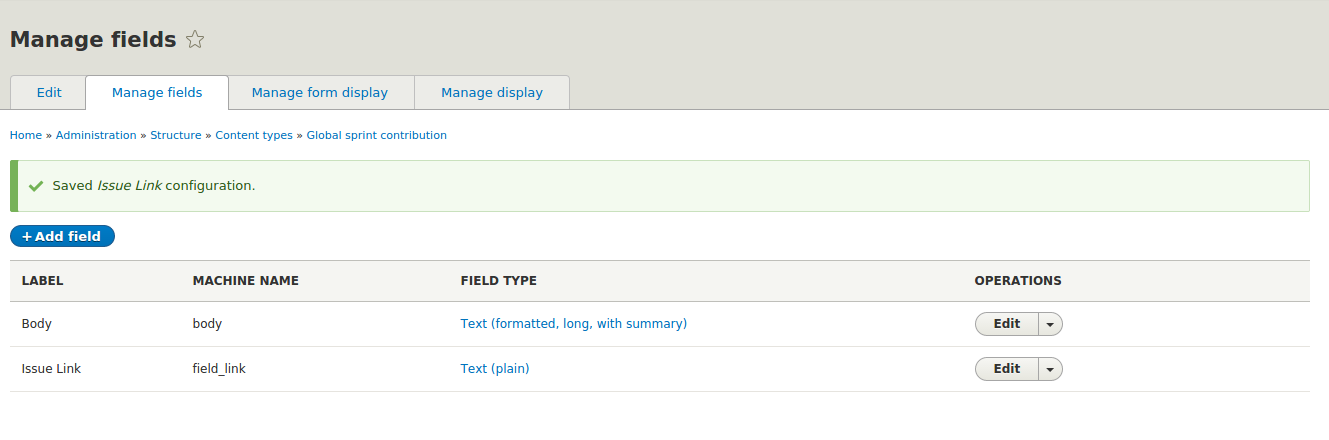
lauriiiThank you for the feedback @dead_arm! 🙏 I've incorporated your feedback regarding the clarification on the field cardinality being a limit for the number of values. I've also worked with @ckrina to remove the "Details" column and move it to the first column which is now named as "Field", since it contains field label, machine name, as well as some of the details. I've added a screenshot to the issue summary.
Comment #31
ckrinaHuge +1 to this change because it increases readability and scannability by organizing strategic information on the left, while keeping extra valuable information to understand each field on the second column. Having that info close to the field name helps read and understand the data thanks to visual clues like the monospace font and smaller size&color intensity for the machine name, or the labels to extra properties like number of values or if the field is required.
It could be argued that as a result of these changes each column ends up too separated from each other, with the resulting action column/button too far on the left. But that's a layout problem because the table shouldn't be full width: the same as you don't have the text on a blog post going from left to right of the viewport, we shouldn't have tables taking the whole width if it isn't needed. But that's a general admin interface problem to solve, way beyond the scope of this issue. So a perfect task for a follow-up.
Comment #35
catchAlready reviewed this one back in #26, a few changes since but everything looks good. This will need a follow-up for Gin/admin theme in core to adopt the styling, not sure how that's being managed so tagging for follow-up. Opened #3558734: Add required/cardinality information to manage form display in field UI for the manage form display page as mentioned earlier.
Committed/pushed to 11.x and cherry-picked to 11.3.x, thanks!
Comment #37
alexpottThis introduced a random fail due to changing how field labels are handled for html security. From escaping to XSS admin filtering. I'm pretty sure that this change was unintentional. Let's fix this in #3559326: Random fail in ConfigTranslationCacheTest since labels changed from escaped to XSS filtered text
Comment #38
mgiffordWas there any accessibility testing done on this?
Comment #40
rkollerI've saw that this issue got posted a few weeks ago on the #ux channel, but until December I haven't had any capacity for taking a look at anything outside the weekly ux meetings on Friday. In December, pulling the latest version of 11.x, I've noticed that this issue already went in. Due to the problems I have with my eyes and how my brain processes information I now have a real hard time to scan and process the information on the field list page - my brain simply refuses to even skim the field list due to the visual load. To me the changes represent a significant regression in regard to readability and scannability. So I raised the issue for discussion at last week's usability meeting.
(Note: I've pressed sent too fast and forgot to upload the videos linked in this comment. They can be found in #41)
Usability review
We discussed this issue at #3560473: Drupal Usability Meeting 2025-12-05. The recording of the meeting can be found at https://youtu.be/RpXB-oQZzVs. For the record, the attendees at the usability meeting were @benjifisher, @rkoller, and @the_g_bomb
We had the clear consensus that surfacing the attributes for "Cardinality" and "Required Y/N" that are already on the details page also on the list view is a good thing. But there a few problems:
--color-gray-600-#828388) used on the machine name and secondary text against the white background (#ffffff) results in a color contrast of3.8:1. To comply with WCAG2.2 SC1.4.3 a color contrast of at least4.5:1is required. The exact same case for the light and dark mode in Gin, only the dark mode uses a different background color (#2a2a2d) against the same color for text (--color-gray-600-#828388).--color-gray-700-#75767b) against the white pill background (#fff) has a contrast of4.5:1in Claro and the Gin light mode which is in line with WCAG2.2. While the border color for the pill (--color-gray-300-#c1c2c7) against the white background (#fff) has a color contrast of only1.8:1. It is not a focusable interface component a user is directly interacting with, it only has an informational purpose, but the pill styling is there for a reason, to distinguish it from the machine name - so it is considered a meaningful graphic (*at a later date I've discussed the matter with @katannshaw). In consequence, to make sure that those pill components are recognizable, the contrast would have to be at least3:1. In the dark mode in Gin there is one additional problem, the visual weight of those solid white pills is drawing the entire attention away from the rest of the information.Field label,Machine name,Cardinality, andRequired Y/N. You already have the very same problem for a few field types in the field type column. ForReferenceandMediafields three attributes are shown:Field type label,Reference type, andContent type/Media type. At the moment we have very wide cards disguised as object rows/table rows, and each card has blobs of information with huge gaps in between. That leads into a few problems:Field labeland theMachine nameare two different attributes, but it is not necessarily apparent directly what kind of attribute that second attribute actually is. While the two pills are an example for masked attributes, that means two different attributes that look exactly the same. There is no visual cue to differentiate in between the two, the user has to read and process the pill labels, which increases the cognitive load. Masking should be avoided at any cost.Fieldcolumn you have only two outputs in Safari (see safari.mp4): for examplemedi field_mediandsingle required. So the users conclusion might be: "I have two attributes on this field". While in Edge (see edge.mp4), you have three voiceover cursor steps instead:medi field_medi,single, andrequired. It is not necessarily clear at all what the different attributes are just based on the announced output. And in case a user is using different browsers things might become even more challenging and confusing, having two announcements for a field cell in one browser and three announcements in the other.Field typecolumn has a similar problem for theReferenceandMediafield. Each wraps three attributes, theMediafield type containsField type label,Reference type, andMedia type, while theReferencefield type containsField type label,Reference type, andContent type. The order and arrangement of attributes in theField typecells is less demanding cuz the three attributes are stacked onto each other (eyes scan only in one direction along the y-axis - one dimensional), while the order and arrangement of attributes inFieldcells is way more demanding because the attributes are stacked in pairs (eyes have to scan in two directions along the x and y axis - two dimensional). In consequence it makes skimming through the table comparing rows across a column hard and a cognitive demanding task.Field typecolumn there is another preexisting problem which is also out of the scope of this issue. If a screenreader user shift tabs from theEditbutton back into aField typecell you are getting a rather confusing announcement; you get the title of the column header combined with the label of the third attribute, resulting in for exampleField type media type: image(see back.mp4). Without the visual context it raises the question is this cell now a field type or a media type?Link edit list additional actions button(see redundant_button_labels.mp4)We had a clear consensus about the following recommendations:
4.5:1in Claro and Gin. The first shade of grey that would meet that requirement would be--color-gray-700with#75767b.3:1in Claro and Gin. The first shade of grey that would meet that requirement would be--color-gray-500with#919297.Probably the best would be to create a followup issue for point 1 & 2 in the queue for Claro and another followup in the Gin queue. In the context of point 3 there is the question how to handle the
reference type,content type, andmedia typeattributes, since they are only available onReferenceandMediafields. That way it would be a problem to add dedicated columns for those attributes as well, since they don't apply for every field type. :/Comment #41
rkollerI've pressed sent too fast and forgot to add the referenced videos
Comment #42
pameeela commented@rkoller thank you for the detailed review. Could I suggest creating follow up issues for the actionable items? This is a lot of information to parse and this is a closed issue, so it won't be actioned here. Since you have posted the full summary here, there is no need to repeat the background in the new issues, you can just link back to your comment for those who want more information. The less info to parse, the more likely it is to get picked up, I think!
Comment #43
mxh commentedGiven the substantial negative impact on accessibility, wouldn't it be appropriate to revert this UI change? I really appreciate all the effort that went into improving the UI, but the impact on accessibility is quite concerning. It might be best to roll it back while we find a more inclusive solution.
Comment #44
rkoller@pameeela missed your comment earlier, apologies. I've created separate issues now. But I've chopped up the review and moved the relevant parts to the followup issues. I always prefer to provide the information necessary in context:
For the Claro issues: #3566280: Color contrast issues on the field listings page
For the Gin issues: #3566817: Color contrast issues on the field listings page
For the table semantics: #3566810: Move the additional attributes in the field column on the field listings page to dedicate columns