Problem/Motivation
Two or three weeks ago I've done an impromptu user test, asking attendees of the Drupal Dojo Austin about their first impression about certain parts of Project Browsers browser page. For the reference, that nights attendees were @rocketeerbkw and @cutehair. When looking at admin/modules/browse their first overall impression was, that there is way too much white space on the browse page. On a 16" screen only the first half of the first row of module cards is above the fold:

But also on a larger screen you only get 1,5 rows of cards above the fold. I've placed the screen next to the plugin browser screen in wordpress. there you get three full rows of modules in contrast:
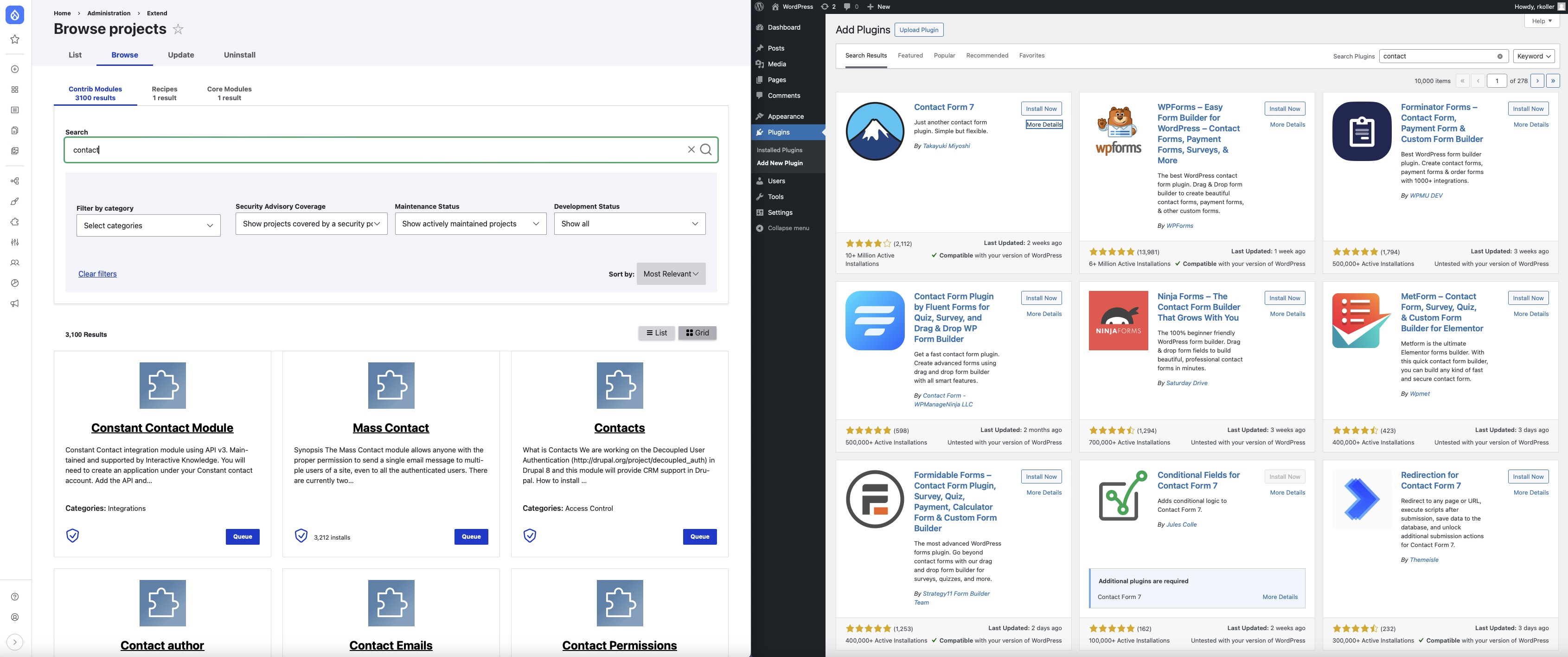
attendees considered the wordpress one more compact and better in comparison. the cognitive load on the wordpress plugin browser is lower.
Steps to reproduce
Proposed resolution
- Reduce min-width of list items in .pb-projects-list and .pb-projects-grid from 400px to 350px
- Shorten, center and increase font sizing of the project descriptions
- Increase font sizing of project title, make the link colour black
- Center the Install button and Installed checkmark


Comments
Comment #2
chrisfromredfinHa! Leslie has been screaming about this for a while, too! And we didn't have an issue for it. Curious if a lot of this space is coming from us or is default from Claro. I'm hoping it's us so we can change it rather than UNsetting Claro.
Comment #3
rkolleri am adding this issue as related since it is also about makeing the information more compact and condensed. this issue here is about the card view the linked issue about the list view of the browse page.
Comment #4
lostcarpark commentedDefinitely agree that the search options currently take far too much space.
Comment #5
chrisckJust started a DrupalCMS trial on launch day and came looking for this exact issue. IMO there is way too much empty space in both the grid view and list view. If we are keeping the center alignment design, then here is a good implementation for center alignment tile design: https://docs.helpscout.com/
Suggestions
.pb-projects-listand.pb-projects-gridfrom 400px to 350pxAnd just throwing this out there, what if we had projects select from an icon set rather than create their own logo? It would make it visually cohesive and save project maintainers from having to create a logo graphic.
Comment #6
chrisfromredfinLet's see what it looks like with ChrisCK's suggestions implemented! (updated issue summary with proposed fixes)
Comment #7
lostcarpark commentedI've scribbled some ideas on the current layout...
Here are my thoughts...
Comment #8
leslieg commentedMy thoughts on this - from a site builder perspective only:
- Agree that the filter criteria should all have the grey background so folks understand that all the filters work together. Shortening the Search text box and combining the text "Search" with the text box on one line and placing that line within the grey area would make things more compact.
- There are several places where there is a large vertical gap that could be reduced, both within the grey filter area and in the results area (above the number of results)
- A lot of work went into placement and functionality of the other filters (categories, security coverage, ...) so I would not move or change them
- the # of results and List/Grid buttons should remain in the results area, not in the grey filter area.
Comment #9
lostcarpark commentedI've made a first stab at tightening up spacing. The changes I've made are all through CSS, so none of the tests should be affected.
Here's a preview of the current changes:
From Leslie's comment above, moving the search into the grey area would make sense. This would slightly change the hierarchy of the form, so some tests would probably need some rework.
From Chris and rkoller's comments on Slack, we want to avoid changing the order of controls for now.
Currently the "Sort by" label is above the drop-down, which makes the line containing it excessively tall. I wonder would it make sense to move the label to the left of the drop-down, where there's plenty of space (as an aside, the Sort by label has a colon, which none of the other labels do)?
Comment #11
lostcarpark commentedI thought this would need a Svelte code change, but when I pushed that change it caused a test to fail. Looking at the fail, I needed to move a container class back, which was when I realised the Svelte change wasn't needed and it could all be done with CSS.
I've moved the Search box inside the grey filter area. I think this connects them better visually, and allows the spacing to be tightened up:
I also checked it doesn't break in mobile view:
I think there would be scope for a more radical change, but after discussing in Slack, there wasn't an appetite for that, so I've kept it to simple tightening of the spacing.
Comment #13
chrisfromredfinI figured out that the searchString is gone now in favor of $filters.search so I updated that and it worked. But then I figured it needed a test, and i couldn't make the test work (which is weird it really should...)
So, I'm moving the behavior change to a follow-up and merging with just the CSS fixes that are definitely more in-scope. The follow-up should fix it and have a test.
Comment #15
chrisfromredfinThis will get people to their projects faster!
Comment #17
lostcarpark commentedWell, doh! Didn't notice this has been merged and tried to add test.
Will add in follow-on issue.