
 Come together with the global Drupal community in Rotterdam, 28 Sept – 1 Oct 2026. Sessions, contribution, connection, and Early Bird savings until 8 June.
I have a rudimentry claro subtheme. This has been created with the sole purpose of avoiding some of the additional gumph that claro seems to add see https://www.drupal.org/project/drupal/issues/3332943
Anyway, recently after updating to 10.1.2, I have noticed another issue with the flex box layout when editing the node. Namely the flex grid seems to stretch beyond the size of the screen (safari os x). This results in making edit dialog boxes very difficult to work with etc.
I can override this by resetting the flexbox in my claro subtheme.
Please see attached screenshots
User interface changes
Screenshots are from 1000px, 1900px and 2500px widths, bigger page versions are scaled down in the picture.
Dev 11.x narrow viewport form is with Firefox to show clipping of sidebar, others Chrome.
Current layout (dev 11.x)


Option 1: Expand columns to fill viewport width (patch in comment #23)


Option 2: center both columns (merge request)


| Comment | File | Size | Author |
|---|---|---|---|
| #55 | Screenshot 2023-11-16 at 12.26.55.png | 492.52 KB | 2dareis2do |
| #55 | Screenshot 2023-11-16 at 12.27.24.png | 484.77 KB | 2dareis2do |
| #50 | P23-w2500.png | 450.4 KB | simohell |
| #50 | P23-w1900.png | 514.16 KB | simohell |
| #50 | P23-w1000.png | 444.43 KB | simohell |
Issue fork drupal-3381219
 Show commands
Start within a Git clone of the project using the version control instructions.
Or, if you do not have SSH keys set up on git.drupalcode.org:
 changes
Comments
Comment #2
2dareis2do commentedComment #3
2dareis2do commentedComment #4
2dareis2do commentedok looking at this in a little more detail I can see in :
in https://git.drupalcode.org/project/drupal/-/blame/7ec47764af5a21f45f0a60...
you have
I can fix like so
Notice the change to grid-template-columns from
3fr minmax(22.5rem, 1fr);to66% minmax(22.5rem, 1fr);I need to read up on flexbox again as I am a little unfamiliar with this syntax, but it looks to me as if this has been implemented fairly recently in claro https://git.drupalcode.org/project/drupal/-/commit/a832e39b2b3b19fbff3ff...
Comment #5
2dareis2do commentedComment #6
2dareis2do commentedOk this is the change I have made in my claro sub-theme:
screenshot attached
Comment #7
lauriiiThanks for the bug report @2dareis2do! We do not officially support sub-theming Claro but the bug you are facing related to node edit page layout on Safari seems like a valid one. Maybe we should repurpose this issue for fixing that? You can find steps for creating a MR in https://www.drupal.org/community/contributor-guide/task/create-a-merge-r.... Let me know if you need any help with that 😊
Comment #8
Harish1688 commentedHi 2dareis2do,
As pr comment #7, I was trying to resolve the issue (
flex grid seems to stretch beyond the size of the screen (safari os x)) showing in image (Screenshot 2023-08-15 at 16.34.35.png), but it's not reproduce on safari (Version 16.5.2). and not found same on other browser's. attached screen for reference.can you give more details about the issue .
Testing steps:
1. Set up the Drupal (10.1.x-dev) and moved to safari browser.
2. Moved to node and tried to found the issue.
Comment #9
2dareis2do commentedThanks for looking into this.
I cannot see the attached screenshot?
I have recently been playing around with bootstrap_barrio and noticed in the scss complier gulp uses a postcss-pxtorem plugin. I am wondering if something similar is used with claro?
Happy to provide a patch for this but not even sure if anyone else here has experienced similar issues?
Comment #10
Harish1688 commentedHi,
As per comment #9, Updated the image in comment #8.
Comment #11
2dareis2do commentedOk lets see if anyone else has this issue before fixing it.
Fix above works for me already.
Comment #13
gfbarbosa commentedsame issue here after core update (9.4 > 10.1) .. I'm not using a subthem.
#4 works for me (
grid-template-columns:66% minmax(22.5rem, 1fr);)Comment #15
gfbarbosa commentedComment #16
2dareis2do commentedThanks for confirming @gfbarbosa. Glad the fix works for you.
I have started to work with css grid layouts now i am working with bootstrap 5.3, so probably need to read up on why this is happening. Glad the fix is working you, but atm, I am not confident that this is the best approach.
Also looking at claro I have just seen this https://www.drupal.org/node/3084859. So looks like I also need to read up on postcss.
Ok so in web/core/package.json it looks like we are also using
"postcss-pxtorem": "^6.0.0",. Also in web/core/scripts/css/compile.js we have:That can have some adverse affects.
Anyway, I would be happy to provide a commit a change for this once I have a chance to read up a little more on fr units and css grid.
Comment #17
2dareis2do commentedComment #18
gfbarbosa commentedI believe the same occours here: updated Claro theme renders badly for some content type edit forms
Comment #19
2dareis2do commentedOk I have come up with a solution that works for me. It looks to me as if the intention was to actually create a 75% - 25% ratio between the columns but also allow the right hand side to not be less than 22.5rem for smaller viewports, and to resize the left column accordingly.
The existing css seems to have a couple of issues. Namely:
margin-inline: auto;added to bothgapproperty to the grid, the grid width is stretched to be wider than 100% (not sure why this happens as I have seen demos of css grid where column the gutter or gap is subtracted from the columns, but this does not appear to be the case here).With this is mind I have re-worked the css slighlly and hopefully this should fix these issues.
Please see attached patch.
Comment #20
2dareis2do commentedUpdated patch with relative paths to theme from web/core
Comment #21
2dareis2do commentedComment #22
2dareis2do commentedOk I have tried uploading a patch and applying to 10.1.x but the tests are failing for some reason.
Works for me locally when applying patches as follows:
Comment #23
2dareis2do commentedComment #24
viren18febs commentedComment #25
smustgrave commentedPer #7 this issue could be repurposed to fix a safari bug, but that will mean a title and issue summary update.
Before/after screenshots should be added to the issue summary as well.
Comment #26
smustgrave commentedComment #27
2dareis2do commentedafter screenshot attached
#4 has before https://www.drupal.org/files/issues/2023-08-15/Screenshot%202023-08-15%2...
#smustgrave, is this safari only issue?
Comment #28
2dareis2do commentedComment #29
2dareis2do commentedComment #30
smustgrave commentedWill also probably need sub maintainer sign off
Comment #31
jkdaza commentedI have experienced the same issue on a couple of sites after upgrading from 9.5.x to 10.1.x.
I can replicate the issue on Chrome and Firefox, using both Mac OS and Windows.
The patch in #23 fixes the layout issue.
Comment #32
rovoClaro content editing layout is still broken in 10.1.5.
Confirming patch in #23 fixed the layout issue.
Fixed

Comment #33
shweta__sharma commentedUpdated before/after screenshot in issue summary. Also, I confirmed that this issue is not a browser-specific issue I can find this on Chrome too.
Comment #34
shweta__sharma commentedComment #35
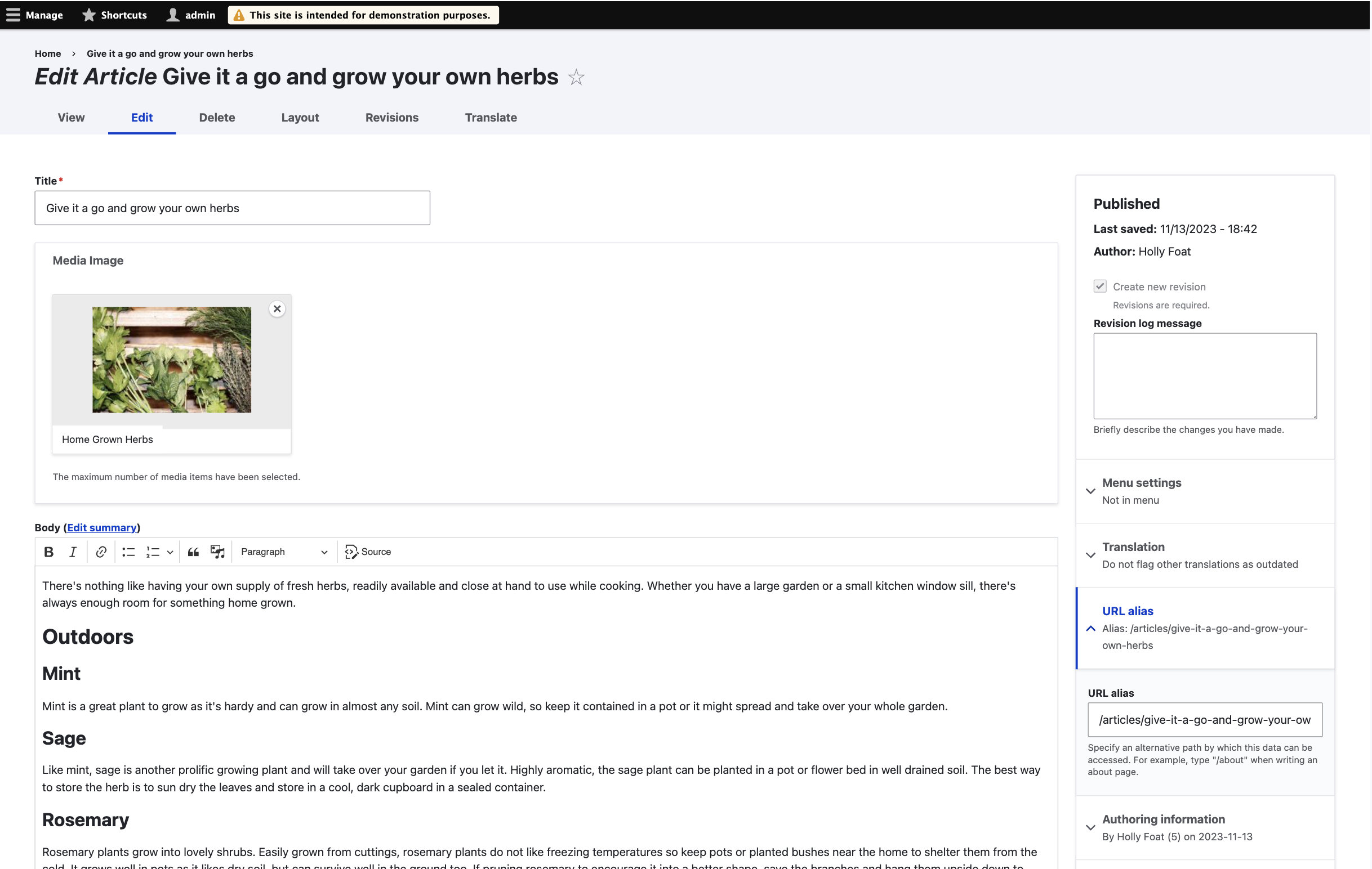
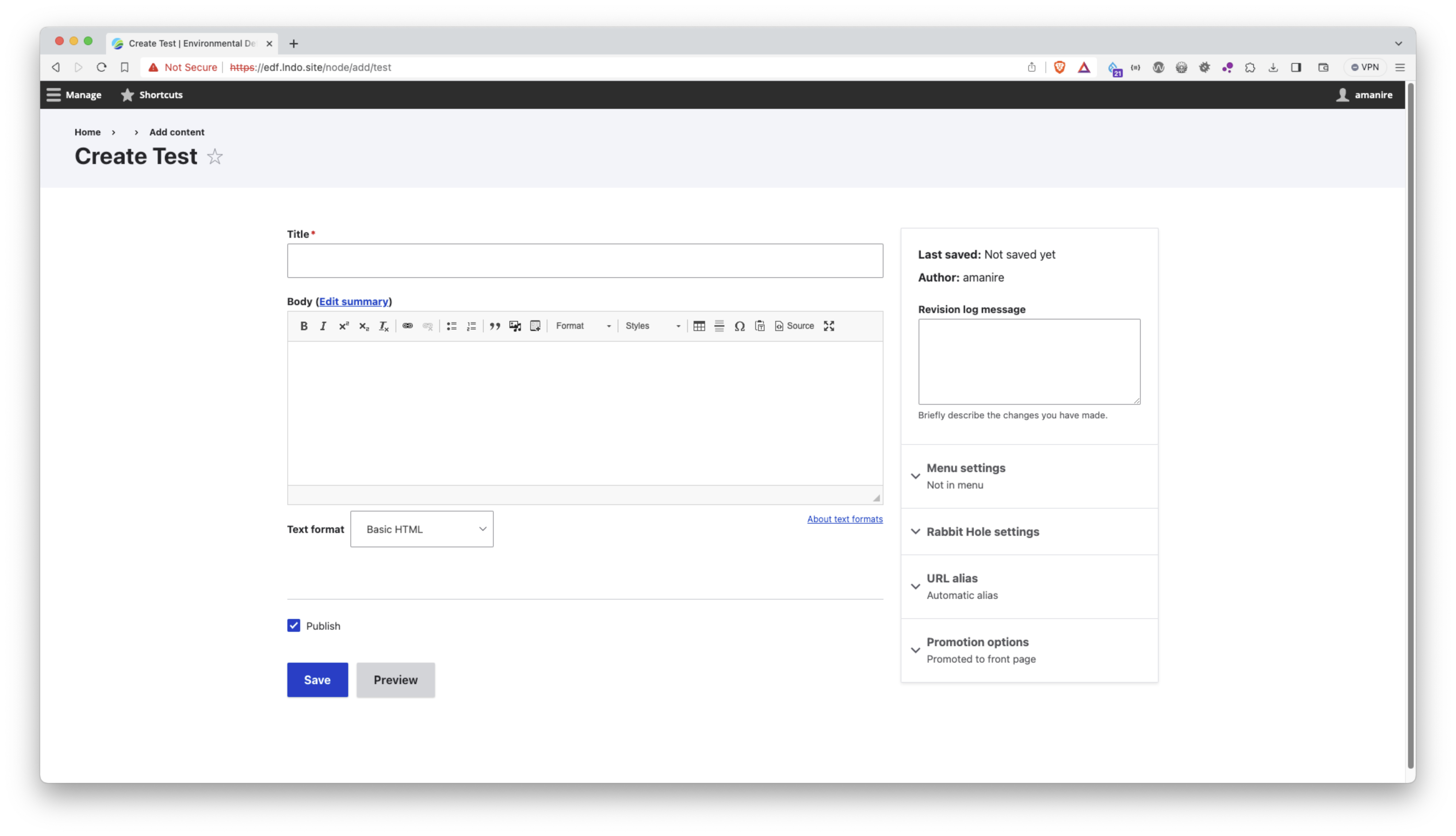
amanire commentedI was referred to this issue by way of https://www.drupal.org/project/drupal/issues/3372054#comment-15312495. I can also confirm that the patch in #23 resolved the layout issues I described in that issue with text fields of size > 100. Looks like we need a MR for the patch. I can do that momentarily.
We should probably clarify in the issue description that this is relevant on any node add/edit form with a text field that overflows the width in Claro and not specific to sub-theming.
In addition to Chromium and Firefox, I can confirm that the patch resolved it in MacOS Safari.
Comment #36
amanire commentedUpdating the issue tag. The issue is with CSS grid, not flexbox.
And updating the title to clarify that this is specific to the node form layout.
Comment #37
klidifia commentedI think the issue here is not confined to a browser and is in essence this:
If the width of the Claro theme is extended via some method there are undesirable results.
An easy way to test this is to input a long string into the new CKEditor5 interface, e.g.
AAAAAAAAAAAAAAAAAAAAAAAAAAAAAAAAAAAAAAAAAAAAAAAAAAAAAAAAAAAAAAAAAAAAAAAAAAAAAAAAAAAAAAAAAAAAAAAAAAAAAAAAAAAAAAAAAAAAAAAAAAAAAAAAAAAAiioooooooooooAAAAAAAAAAAAAAAAAAAAAAAAAAAAAAAAAAAAAAAAAAAAAAAAAAAAAAAAAAAAAAAAAAAAAAAAAAAAAAAAAAAAAAAAAAAAAAAAAAAAAAAAAAAAAAAAAAAAAAAAAAAAAAAAAAAAAiioooooooooooA- Observe the undesirable effects.I think this patch resolves the issue experienced here, and is likely solving various disparate issues e.g. 3372054
Please could someone else test/verify.
Comment #38
needs-review-queue-bot commentedThe Needs Review Queue Bot tested this issue.
While you are making the above changes, we recommend that you convert this patch to a merge request. Merge requests are preferred over patches. Be sure to hide the old patch files as well. (Converting an issue to a merge request without other contributions to the issue will not receive credit.)
Comment #39
simohell commentedThe bug mentioned in comment #37 will be fixed in #3400762: Long string breaks the layout of Claro with a minimal CSS change.
The patch here deals with the piece of CSS, so it would make sense to recheck this issue against that code.
Comment #40
amanire commentedThank you for referencing that issue @simohell. I tested the work there locally and found that it did address the layout issue but introduced a regression in the responsive layout at viewport widths between 976 and 1278px. I posted screenshots in a comment there showing the difference.
Comment #42
amanire commentedComment #43
simohell commentedTesting this MR I see that the main column expands without limit.
Expanding a text area without a limit harm usability on large screens.
Studies show that optimal width is around 45-75 characters/line.
The solution in #3400762 was chosen as the only change it was supposed to make was fixing the bug, but unfortunately it was not tested on all browsers and some browsers render it in a way that was not intended.
I think we need to find the CSS to keep the form in a usable width while making the form keep from breaking up.
I'll try to tag @ckrina in Slack on this to check if there how much space there is to iterate on the layout or just to fix the actual bugs.
Comment #44
simohell commentedComment #45
amanire commented@simohell yes, I agree about limiting the character width on larger screens. That is also consistent with prior float-based layout so I would personally consider removing it a regression. I think this MR needs to be cleaned up a little, but I just set
max-width: 76remonnode-form-layout, which results in the same main column max width as it was previously (52 rem) and restored themargin-inline: autoto center it. This eliminates that regression on larger screens.The Title text field is set to a size of 200 in these screenshots. I'm seeing the same results in MacOS Brave (Chromium), Firefox and Safari.
Display on 1920px wide screen
Display at 977px wide viewport
Comment #46
simohell commented@amanire This latest version seem to work and also fixes #3400762: Long string breaks the layout of Claro
It might be a bit better to double the gap and allow side bar to grow a bit more in a larger screen, but that needs maybe a bit more eyes to decide. This fixes the bugs is good enough I think for now. I like having the sidebar stay in the middle but that is a bit bigger change to the current version so I hope to hear what @ckrina thinks.
I tagged this for usability review and hope to have this in the meeting next Friday.
I also added your screenshots and a new one with some clipping taking place.
Maybe also update the text description?
Comment #47
amanire commentedI'm having second thoughts about setting a max-width on the node form. One thing I noticed is that other admin forms do not have a max-width set for wider screens (for example,
/block/addor/admin/structure/types/add). I agree with the typographic principle of keeping line length < ~75 characters but it also seems maybe that it’s inconsistent with the general approach of the Claro theme to expand to the available space. Also, I expect that the lack of a max-width would be preferred on larger screens for more complex UI elements like vertical tabs.Comment #48
2dareis2do commentedInteresting about long text strings. Testing my patch with long string and this seems to work fine.
My personal preference would be maximise the available screen available rather than constraining it.
See https://www.drupal.org/project/drupal/issues/3381219#comment-15302379 vs After (in 1290px)
Comment #49
simohell commentedI think we have currently 3 options:
- fill the vieport width with form
- set maximum width and center form
- set maximum width and center main columns, fix side column to side of the window
(additional note: how does this work with RTL-languages?)
I will update screenshots with Umami demo-content in a while to give better comparison of actual use case.
Comment #50
simohell commentedAdding screenshots from different versions in different sizes.
One is narrow, second is about FullHD, third is about full 27" 1440p monitor.
Comment #51
2dareis2do commentedThanks for showing the differences.
I can see the difference between option 1 and 2. Not sure about 3?
Good idea to look at rtl languages as well.
As this is a bug fix, why is this targeting 11.x and not 10.x ?
Comment #52
simohell commentedIf the issue exists all the way to the latest dev we fix it there and then apply it to the other versions as well.
The 3rd option is how they layout currently works, except for the actual bug.
Comment #53
2dareis2do commentedok thanks.
From what I can tell small viewports look very similar.
Looking at medium viewports, difference is more noticeable.
For larger viewports, the above is also true i.e. less scrolling up or down, but also any copy is more difficult to read if too wide.
All options would probably be an improvement but good you have a choice. In some themes it is also possible to make the layout configurable.
It would also be interesting to see the original design for this if it exists.
If you can fix the issue and keep the original intent, that would probably be the best option. What is the fix for that?
Comment #54
simohell commentedIt looks like the fix for current core layout was simpler than I thought.
I managed to test this right, all that was needed was setting a minimun value for main column:
not
grid-template-columns: 3fr minmax(22.5rem, 1fr);but instead
grid-template-columns: minmax(0, 3fr) minmax(22.5rem, 1fr);I have implemented that fix as a merge request in the other related issue #3400762: Long string breaks the layout of Claro.
Comment #55
2dareis2do commentedNice and simple. I like it.
Thats works for me.
Fluid (wide) vs max-width container (constrained) images attached.
I also like the way you can use mixmax of grid layouts as a ternary.
Comment #56
ckrinaRemoving the max-width on the node edit form would be reverting a decision we consciously took a while back in #3158854: Node form: address chasm between main form and meta. Several related issues have been opened over time like #3096358: Claro layout on really wide screens/viewports causes uncomfortable text line length trying to make changes to this. But we have several conflicting problems, with some of them being:
So we need to address this in a more holistic way. Doing this big layout change in this issue in one of the most important pages in Drupal without a whole design process that takes into account the whole UI is a bit too much, sorry! This whole redesign is happening in #3076820: [META] Layout redesign.
So if I understood this correctly, I'm closing this one in favor of #3400762: Long string breaks the layout of Claro because that one is not introducing big design changes but solves the main issue I understand this was initially opened for.
Let's follow the conversation there :)
Comment #57
2dareis2do commented@ckrina
If i understand this correctly, there is no design change here. @simohell's solution fixes the issue without making any changes.