
Problem/Motivation
During the usability sessions, some participants struggled with fill out the menu link add page. It has an overwhelming number of options, some are really important, some aren't important or commonly used.

Proposed resolution
We can reuse some of the design conventions introduced in #1510532: [META] Implement the new create content page design. Placing the important fields in the main column and the less important fields in the secondary column.
The form should be organised to have data in the main part and metadata on the sidebar. The most important or frequently edited stuff should go at the top in each section.
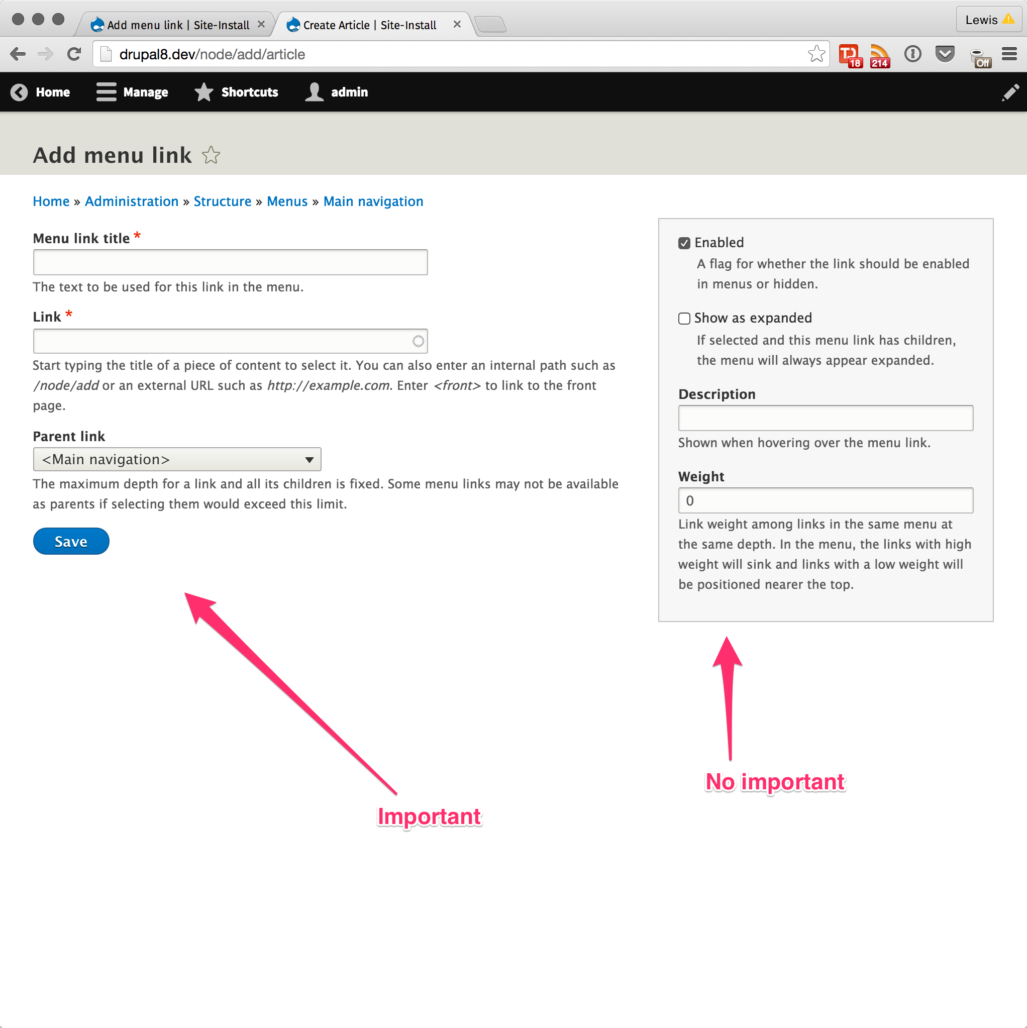
Metadata elements include Parent link, 'enabled' and 'show as expanded' checkboxes, description and weight.
Except for the "Parent link," all the sidebar elements should be tucked away in collapsed sections by default. This makes the form look neater and less cluttered.
Suggested grouping and order:
1. Parent link (no details element)
2. Checkboxes ("Enabled" and "Show as expanded"). To be decided: the label for this details element.
3. Description
4. Weight
Remaining tasks
- Implement the suggestions
- Design review
- Test
- If #1428520: Improve menu parent link selection is fixed before this issue, then make sure the two work well together. See Comment #46.
User interface changes
Before
Adding a menu link (menu_link_content_menu_link_content_form):

Editing a link provided by a module (menu_link_edit):

After
Adding a menu link (menu_link_content_menu_link_content_form):

The same form with the <details> elements expanded:

Editing a link provided by a module (menu_link_edit):

API changes
None
Data model changes
None
| Comment | File | Size | Author |
|---|---|---|---|
| #93 | menu-link-edit-form-after.png | 72.89 KB | benjifisher |
| #93 | add-menu-link-expanded.png | 123.31 KB | benjifisher |
| #93 | add-menu-link-after.png | 95.46 KB | benjifisher |
| #89 | add menu link expanded.png | 389.74 KB | Utkarsh_33 |
| #86 | menu-link-edit-form-after.png | 92.95 KB | benjifisher |
Issue fork drupal-2519362
 Show commands
Start within a Git clone of the project using the version control instructions.
Or, if you do not have SSH keys set up on git.drupalcode.org:
- 2519362-redesign-the-menu
 changes, plain diff MR !4796
1 hidden branch


Comments
Comment #1
dawehnerWell, compared to before this is already much better! +1 for ordering the fields that it actually makes sense.
In case we have that extra setting on the right side (not sure whether its needed) I think giving it some title seems to be helpful.
Maybe "additional settings" or something like that?
Additional question, should the title of the page describe to which menu we add a link to?
Comment #2
dawehnerwrong issue ...
Comment #3
ChandeepKhosa CreditAttribution: ChandeepKhosa at 2Toucans commented..
Comment #4
ChandeepKhosa CreditAttribution: ChandeepKhosa at 2Toucans commentedI investigated one of the files and ran a search for "The text to be used for this link in the menu." resulting in the following :
MenuLinkContent.php, which is stored in core/modules/menu_link_content/src/Entity/
As this is not a straightforward template file needing a HTML & CSS change, I am unfortunately unable to help further with this issue unless assisted where I can find other relevant files that need to be edited.
Comment #5
Frando CreditAttribution: Frando as a volunteer commentedHere's a patch that implements a two-column style for the menu link edit form. The theme hook is defined in system module, as it's used by core (MenuLinkDefaultForm), menu_ui and and menu_link_content module.
To reuse the node form two-column style, I generalized these css rules to make them usable in all forms, not only with node module. I also moved them to classy - they are already applied via classes that are only set in classy, not in node module, so they belong there anyway I think.
Screenshots:

Menu link content entity:
Default menu link:

Comment #7
Frando CreditAttribution: Frando as a volunteer commentedThis should be green.
Comment #8
LewisNyman@Frando Do you think there is a way to merge some of the work in with #2335523: Replace content creation page layout CSS with reusable layout classes so we don't have to copy and paste the same CSS?
Comment #9
mansspams CreditAttribution: mansspams at Wunder commentedComment #10
yoroy CreditAttribution: yoroy as a volunteer commentedInteresting approach to use this pattern here, I like it.
Initial thoughts:
- Not sure about the 'Advanced' label, the initial issue discerns between important and not important, 'advanced' is not a good synonym for 'not important'
- Don't think it has to be a collapsible fieldset (looks like it from the screenshot)
- Do we even need to show weight here anymore? You can reorder by drag and drop on the menu link listing (or use the weights here). Even if you know what this does you can only make half-educated guesses or be very blunt and put in + or - 10000000 to make it the very last or first item.
Comment #11
yoroy CreditAttribution: yoroy as a volunteer commentedLooking at the screenshots in #5 a bit more. Why is the setting for weight in the right column in the first screenshot for a new link, and in the left column when editing an existing item?
Also, I like the implicit suggestion made in #1:
(yes! :-)
Comment #13
Gábor HojtsyChanges like this are clearly possible in Drupal 8.2. Any takers?
Comment #15
ChandeepKhosa CreditAttribution: ChandeepKhosa at 2Toucans commentedI think it would be useful if someone could summarise the additional work that needs to be undertaken to resolve this issue, as I'm finding it a little difficult to figure that out. Thanks!
Comment #16
Gábor Hojtsy@ChandeepKhosa I think functionally #10 and #11 explain suggested changes. In terms of the patch itself, it would be nice to discuss with the frontend folks what kind of file changes are allowed in classy, etc. Looking at how the CSS is moved around, it needs to be made sure existing themes are at least somewhat compatible.
Comment #32
srishtiiee CreditAttribution: srishtiiee at Acquia commentedWhile the 'weight' element is grouped as a secondary item, it unexpectedly appears in the primary section of the menu link edit form, rather than being grouped with the other secondary elements in the column. I'm unsure about the reason behind this behavior and would appreciate some insights.
Comment #33
srishtiiee CreditAttribution: srishtiiee at Acquia commentedThe weight element in the menu link edit form needed to be wrapped in a container to be grouped along with the other secondary elements.

Comment #34
smustgrave CreditAttribution: smustgrave at Mobomo commentedComment #35
smustgrave CreditAttribution: smustgrave at Mobomo commentedStill needs usability sign off I believe.
But testing MR 4792 and the form does update correctly, matching screenshot in #33.
The space between the center column and right is awkward but realize that's just a claro feature, but wanted to mention.
Think this is a nice little improvement for creating menu links.
Comment #36
benjifisherUsability review
We discussed this issue at #3390521: Drupal Usability Meeting 2023-10-06. That issue will have a link to a recording of the meeting.
For the record, the attendees at today's usability meeting were @AaronMcHale, @Emma Horrell, @benjifisher, @rkoller, @simohell, and @worldlinemine.
@srishtiiee, thanks for working on this issue. It has been idle for too long. We like the general idea a lot, but would like to see several changes:
I have added the issue tag for follow-ups because of the last two points. I also added the tag for an issue summary update: I would like more detail (something like my list in (2)) in the "Proposed resolution" section and "before" and "after" screenshots in the "User interface changes" section.
If you want more feedback from the usability team, a good way to reach out is in the #ux channel in Slack.
Comment #37
srishtiiee CreditAttribution: srishtiiee at Acquia commentedAddressed feedback and updated the issue summary.
Comment #38
smustgrave CreditAttribution: smustgrave at Mobomo commentedTest failure may be related to issue. And can the follow up be opened too. Leaving in review though and will look more tomorrow
Comment #39
srishtiiee CreditAttribution: srishtiiee at Acquia commentedBack to NW for the test failure.
Comment #40
smustgrave CreditAttribution: smustgrave at Mobomo commentedWith regards to #5 follow up going to have and dig through some tickets but there may be one already for that.
Comment #41
srishtiiee CreditAttribution: srishtiiee at Acquia commentedComment #42
benjifisherI think the suggestions from the usability review have been implemented. Thanks!
We did not recommend a label for the details element containing the "Enabled" and "Show as expanded" checkboxes. But I think that "Configuration" is too generic.
I am setting the status to NW for a better label and for the comments I made on the MR.
Comment #43
Utkarsh_33 CreditAttribution: Utkarsh_33 as a volunteer and at Acquia commentedComment #45
kostyashupenkoOk so next step is to rework menu-link-form render to match as much as possible node-edit-form render.
Also some feedbacks are not resolved (they are related to hooks)
Here are the screens after my last changes:
There is an issue with bold border between first an second section, which isn't a case for node-edit form.
Comment #46
rkollerWhile testing #1428520: Improve menu parent link selection i still had the changes for this issue applied by accident. Turns out both issues are intertwined:
Quickly chatted with @benjifisher in the #accessibility channel where he posted the other issue and we were in agreement that the menu select field should be moved over to the sidebar right above the parent link select field. He recommended to post this comment on both issues and whichever issue is fixed second should adapt for the other.
Comment #47
benjifisherComment #48
benjifisher@kostyashupenko:
Thanks for the updates. You resolved many of the comments I made yesterday. I do not have the GitLab permission to mark threads as resolved, but I gave a :+1: reaction (thumb up) for the ones that are complete.
There are a few points from that review that should still be fixed, and I added a few new ones.
If you make further updates, please comment here and change the status to NR to make sure that I see when the MR is ready for re-review.
Comment #49
srishtiiee CreditAttribution: srishtiiee at Acquia commentedAddressed the feedback.

Also fixed the border to match node edit form.
Comment #50
smustgrave CreditAttribution: smustgrave at Mobomo commented- #3395365: Review menu form description texts
- #3381219: Node form layout issues with Claro theme
Attached the follow ups requested in #36
Comment #51
benjifisherThere are still a few (3?) points on the MR that need to be addressed.
Comment #52
benjifisherWe still have to decide on a label for the fieldset containing he "Enabled" and "Show as expanded" checkboxes. I think "Configuration" is too generic.
Comment #53
benjifisherI discussed the label on Slack with @rkoller and @smustgrave. We agreed that "Display settings" is clearer than "Options". If you think of something even clearer, use that.
Comment #54
srishtiiee CreditAttribution: srishtiiee at Acquia commented@benjifisher thanks for pointing out that the css file (
node.module.css) is never used, created a follow-up to remove all references to it #3396523: node.module.css is obsolete and can be removed. I removed thetemplate_preprocess_hookfrom this MR. Also, the label for the details element containing the checkboxes is changed to "Display settings" as per the suggestion.Comment #55
smustgrave CreditAttribution: smustgrave at Mobomo commentedBelieve this is good to go!
Comment #56
lauriiiThe MR is starting to look pretty good. I was testing this with bunch of contributed modules to make sure that this is at least somewhat compatible with them, and didn't find anything concerning.
However, I do have one concern regarding the current grouping, specifically regarding the enabled checkbox. Content editors for smaller sites (sites without strict editorial workflows) use this sometimes to create disabled menu links for the link to be enabled later. For this reason, this has different priority compared to the other field currently in the advanced section, especially on the form to create new menu links.
Comment #57
benjifisher@lauriii:
If I remember correctly, we discussed the Enabled checkbox at #3390521: Drupal Usability Meeting 2023-10-06 (see Comment #36 on this issue). There are reasons to show it in the main area or in the sidebar ("advanced") area, and we did not object to either decision.
In addition to the reason you gave in #56, some other advantages to keeping this checkbox in the main area are
We did not consider the option of having the Enabled checkbox in one place on the add form and a different place on the edit form. Personally, I think we should make the two forms consistent.
Comment #58
benjifisherOops, I did not mean to change the status.
Comment #59
srishtiiee CreditAttribution: srishtiiee at Acquia commentedMoved the 'enabled' checkbox to main area, changed label for the details element that only has the 'expanded' checkbox now and added support for 'description' in edit form along with the add form.

Comment #60
rkollerAll the latest changes look great! the only minor nitpick i would have might be the label for the description field and field set. the field is basically providing the string that is used for the title attribute while descriptions are usually used in the admin ui as a description and explanation about a certain component - directly visible (in list views or on pages adding an entity) but not available on hover in a tooltip. that difference is outlined well if you compare the use of description here with #3365222: Make Description Field Labels Consistent. strictly speaking the use of description makes this issue part of the discussion in #3365222: Make Description Field Labels Consistent as well imho. I think it might be a good thing to discuss #3365222: Make Description Field Labels Consistent including the use of description in this issue in the usability meeting next friday. but from my point of view that shouldn't hold back the issue here, potential naming changes could be covered in the already open followup issue #3395365: Review menu form description texts imho?
Comment #61
benjifisher@rkoller: It seems to me that changing the label is out of scope for this issue. We could discuss it on #3365222 or #3395365.
I think the next step here is code review for the recent changes.
Comment #62
smustgrave CreditAttribution: smustgrave at Mobomo commentedApplying the MR I can confirm I'm seeing the same as the screenshots in #59
Comment #63
ckrinaI see in this comment that specifically asks for adding the line because the node edit form has it.
The function of the line on the node form was to visually help identify the end of complex forms (assumed for content). This small form doesn’t need a visual clue that identifies the end, and on the other side it adds visual noise. So moving this back to needs work to remove the bottom line.
On a side note, I'd love to clarify that this solution should be considered an exception and not a pattern. The reason is that in the new designs that are coming (because of the layout changes and the visual design updates it will force) the visual relation between the main left form and the existing sidebar will be smaller and it will make it complicated to perceive them as part of the same form if it's small. The current purpose of the sidebar is to contain "settings", not content as a "description" as is happening here. I 100% agree with the need to simplify the form and prioritize elements in forms, though. This is something we need to fix with new design patterns instead of limiting ourselves to the ones existing today. So for now I think this is a visual improvement, but let's try to solve it holistically before replicating this pattern elsewhere. And if anybody want to help with the design work please reach out or join the #admin-ui channel. :)
Comment #64
Utkarsh_33 CreditAttribution: Utkarsh_33 as a volunteer and at Acquia commentedAddressed the feedback in #63. Marking it NR again.
Comment #65
smustgrave CreditAttribution: smustgrave at Mobomo commentedBelieve #63 has been addressed.
Comment #66
benjifisher@srishtiiee and @Utkarsh_33: Thanks for addressing the feedback on this issue.
@ckrina: Thanks for the design guidance and the reference to #3076820: [META] Layout redesign. I notice links on that issue to #3158854: Node form: address chasm between main form and meta and #3184667: Node form layout looks awkward on wide screens since #3158854, so I guess #36.5 is a long-standing problem and a difficult design problem.
I did not do any testing, since that was done in #60, #62, and #65. I did review the code changes. +1 for RTBC.
Comment #67
lauriiiPosted some feedback on the MR
Comment #68
Utkarsh_33 CreditAttribution: Utkarsh_33 as a volunteer and at Acquia commentedComment #69
smustgrave CreditAttribution: smustgrave at Mobomo commentedThis one turned more complicated then I thought. But appears all feedback has been addressed again.
Comment #70
xjmGreat work on this! What a great improvement.
Additional feedback on the MR from @lauriii needs to be addressed.
Additionally, I'm not sure that "Expanded" is a good label for the metadata accordion. It's confusing out of context. I see that "Expanded" replaced "Configuration" from before.
After manually testing this, I'm also not sure having one element per collapsed accordion element is the best UX. Then the user has to click to expand each element to see what it contains and modify it if desired.
Compare with the node form accordion:

Each accordion element's label is a noun ("settings", "information", "options" etc. being modified by what kind of setting it is). Some of the elements are grouped logically (like the promotion options) while others are standalone.
I think the menu link accordion should be as follows:
At a minimum, I think labeling each accordion element with a noun is required.
Let's try implementing that and then re-offer it for usability review. Let's also include a screenshot of the elements being both collapsed and expanded for easier review.
Thanks!
Comment #71
Utkarsh_33 CreditAttribution: Utkarsh_33 as a volunteer and at Acquia commentedI have regrouped the form elements as per the comment in #70. Also attaching the screenshots for the same .
.
Comment #72
Utkarsh_33 CreditAttribution: Utkarsh_33 as a volunteer and at Acquia commentedComment #73
xjmThanks @Utkarsh_33. Let's see what the usability team thinks of that change.
Comment #74
needs-review-queue-bot CreditAttribution: needs-review-queue-bot as a volunteer commentedThe Needs Review Queue Bot tested this issue. It no longer applies to Drupal core. Therefore, this issue status is now "Needs work".
This does not mean that the patch needs to be re-rolled or the MR rebased. Read the Issue Summary, the issue tags and the latest discussion here to determine what needs to be done.
Consult the Drupal Contributor Guide to find step-by-step guides for working with issues.
Comment #75
kostyashupenkoRebased
Comment #76
Nitin shrivastava CreditAttribution: Nitin shrivastava at OpenSense Labs commented@kostyashupenko, I checked with the MR #75 mentioned earlier, but it didn't apply successfully. There were errors in four files:
core/themes/claro/css/layout/form-two-columns.css
core/themes/claro/css/layout/form-two-columns.pcss.css
core/themes/claro/css/layout/menu-link-edit.css
core/themes/claro/css/layout/menu-link-edit.pcss.css.
Comment #77
benjifisher@Nitin shrivastava:
I do not see any problem with MR 4796. If you still see something wrong, please give more details so that someone else can reproduce the problem.
Usability review
Thanks to @Utkarsh_33 and others for continuing to work on this issue.
We discussed this issue at #3402418: Drupal Usability Meeting 2023-11-24. That issue has a link to a recording of the meeting.
For the record, the attendees at the usability meeting were @AaronMcHale, @anushrikumari, @benjifisher, @ckrina, @NikMis, @rkoller, and @simohell.
We agree that the changes suggested in #70 make a further improvement. But we think it will be a little better if we rearrange things a bit.
It makes sense to hide the weight in a collapsed details element, since most people will use the overview page (like
/admin/structure/menu/manage/admin) to rearrange menu items, not this form. On the other hand, the weight is logically connected to the parent link. Together, the parent link and the weight determine where the link will appear. (Alphabetical order also matters.) We think the best compromise between these two points is to rearrange the items in the "Advanced" section. Specifically,That way, when Display settings is expanded, Weight will be as close as possible to Parent link.
Keep the details elements collapsed by default, as they are now.
If you want more feedback from the usability team, a good way to reach out is in the #ux channel in Slack.
Comment #78
Utkarsh_33 CreditAttribution: Utkarsh_33 as a volunteer and at Acquia commentedI have addressed the changes requested in #77. Attaching the screenshots for the same:
Comment #79
Utkarsh_33 CreditAttribution: Utkarsh_33 as a volunteer and at Acquia commentedComment #80
smustgrave CreditAttribution: smustgrave at Mobomo commentedWoo fingers crossed this lands. UX feedback appears to have been addressed.
Comment #81
benjifisherMy mistake: in #77, I wrote, "... Parent link, Description, Display settings." I meant to say "... Parent link, Display settings, Description." Again, the goal is to have Weight next to Parent link, when the details element is open.
I also wrote, "Keep the details elements collapsed by default, as they are now." In the screenshot, and in my test with the current MR, the "Display settings" details element is open by default.
From the MR:
Yes, this is a problem. Instead of
'#group' => 'menu_link_weight',, try something like this in the helper function:It will take a little work to get it to work with both forms.
Comment #82
Utkarsh_33 CreditAttribution: Utkarsh_33 as a volunteer and at Acquia commentedThe solution provided in #81 works.Thanks @benjifisher. I have addressed all the feedbacks on this.

Default state:-
On expanding the detail elements:-

Comment #83
Utkarsh_33 CreditAttribution: Utkarsh_33 as a volunteer and at Acquia commentedComment #84
benjifisherThe screenshots look good. It will be a couple of days before I have time to look at the latest code changes.
In the mean time, see if you can simplify the code. I have a feeling that we can get rid of some of the weights, and I think there is one weight of 99 that could probably be a 10. If the two form-alter functions are similar enough, maybe one of them can call the other instead of having them both call a helper function.
Can you update the issue summary with the latest screenshots?
Comment #85
Utkarsh_33 CreditAttribution: Utkarsh_33 as a volunteer and at Acquia commentedComment #86
benjifisherI did some more testing. Remember, there are two forms here: one for
menu_link_contentand one for the Core form. Just to be sure, I added this line to the helper function for debugging:After installing Drupal with the Standard profile,
/admin/structure/menu/manage/main/addusesmenu_link_content_menu_link_content_formand/admin/structure/menu/link/system.admin/editusesmenu_link_edit.This is what the second form looks like with the current MR:
Unless I am forgetting something, we want to move the weight into "Display settings" for both forms. I already added some comments on the MR for how to do that.
Thanks for updating the screenshots in the issue summary. I am adding the "expanded" screenshot from Comment #82 as well. I think the "before" screenshots show the two different forms. We should do the same with the "after" screenshots. Currently, they both show
menu_link_content_menu_link_content_form.Comment #87
Utkarsh_33 CreditAttribution: Utkarsh_33 as a volunteer and at Acquia commentedComment #88
benjifisherThanks for the updates. I asked for a little mode code clean-up on the MR.
We still have to update the third "after" screenshot in the issue description.
Comment #89
Utkarsh_33 CreditAttribution: Utkarsh_33 as a volunteer and at Acquia commentedComment #90
Utkarsh_33 CreditAttribution: Utkarsh_33 as a volunteer and at Acquia commentedComment #91
benjifisherI am sorry I did not check this before, but the doc block for
claro_form_menu_link_edit_alter()is not accurate. The form ID (not base form ID) is defined inMenuLinkEditForm::getFormId().The other doc block is accurate. It took me a while to figure it out:
MenuLinkContentFormextendsContentEntityForm, which extendsContentForm, and that is wheregetBaseFormId()is defined.How did you get the screenshot in #89, with the "Enabled" checkbox in between "Link" and "Menu link title"? That is not what we want, and it is not what I see when I test the MR.
Comment #92
lauriiiApplied the suggestions in the MR. The changes suggested looked good.
Comment #93
benjifisherI realized that we have been assuming the
menu_link_editform is usingMenuLinkDefaultForm, but we cannot rely on that. I suggested a safeguard on the MR.I am updating the issue description. I still do not know why some of the screenshots I am removing show the "Expanded" checkbox between "Link" and "Menu link title".
Comment #94
Utkarsh_33 CreditAttribution: Utkarsh_33 as a volunteer and at Acquia commentedComment #95
benjifisherThanks for the updates. I think this issue is ready for another look from a core committer.
Comment #102
xjmOne small issue with the current version (might just have been a typo?). Other than that, I think this is much better so far. Thanks everyone!
Adding missing credits for the Usability Meeting participants.
Comment #103
xjmlol wrong status because @lauriii is fast!!
Comment #104
lauriiiDoing a self-RTBC here since the proposal was done by @xjm and I just clicked a button. 😇 This was also proposed by @benjifisher in #53.
Comment #105
tim.plunkett+1 for fixing the "Displays Settings" typo. The new layout is great!
Comment #106
xjmSaving remaining credits.
Comment #107
xjmManually tested one last time myself to make sure everything's hunky-dory.
I should also note that @lauriii's reviews are a factor in my comfort committing this WRT the CSS for the new sidebar. ;)
I found a couple small grammar things in the code comments but they're trivial enough to fix at RTBC, so doing that now.
Comment #109
xjmCommitted to 11.x. Thanks! I did not backport it to 10.2.x since it is a UI change.
Tagging for the 10.3.0 release highlights.
Thanks everyone for all your work on this!