
 Come together with the global Drupal community in Rotterdam, 28 Sept – 1 Oct 2026. Sessions, contribution, connection, and Early Bird savings until 8 June.
Problem/Motivation
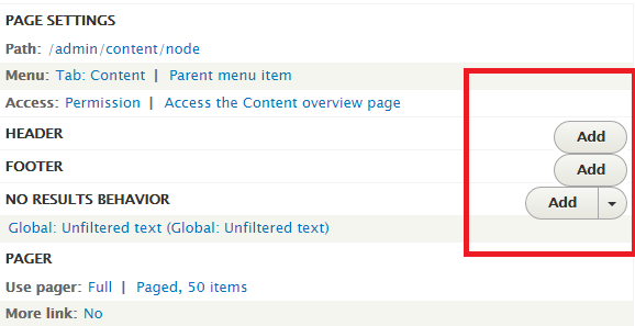
Some of the smallest font sizes in the views UI admin theme are too small for people with impaired vision to read (12px or less).
This is an accessibility issue and we should be aiming to keep font sizes at 1em or larger.
In addition, when text sizes get bigger in views admin, the drop buttons will get bigger aswell. The buttons are positioned fixed en therefore hide the title text on smaller screen sizes, this will get worse when button size increases.
Proposed resolution
Similar to how Seven's font sizes were improved in #2045473: Improve visibility of Seven's smallest font elements, I propose we remove any styles reducing font sizes below 1em, whether this involves flattening the font size hierarchy remains unsure.
Position drop buttons differently within view settings form, using inline-block and float left. Make sure that the styling also works on smaller screens.
Remaining tasks
Identify font sizes smaller than 1em.
Create a patch.
Screenshots.
fix positioning of drop button on views admin screen.
User interface changes
API changes


| Comment | File | Size | Author |
|---|---|---|---|
| #97 | Screenshot 2023-05-18 at 9.51.32 AM.png | 254.26 KB | gauravvvv |
| #97 | Screenshot 2023-05-18 at 9.13.53 AM.png | 505.22 KB | gauravvvv |
| #97 | 2469591-97.patch | 1.01 KB | gauravvvv |
| #89 | beforePatch-86.png | 44.89 KB | asha nair |
| #89 | Afterpatch-86.png | 26.14 KB | asha nair |
Issue fork drupal-2469591
 Show commands
Start within a Git clone of the project using the version control instructions.
Or, if you do not have SSH keys set up on git.drupalcode.org:

Comments
Comment #1
njbarrett commentedComment #2
pefferen commentedThe text sizes smaller than 1em(13px) are:
see attached screenshots
Comment #3
pefferen commentedcreated patch
Comment #4
pefferen commentedComment #5
njbarrett commentedThanks for the patch @pefferen
I think its better if we attach before & after screenshots to show the change of each component.
And we will need to figure out a way to screenshot the change to the progress indicator as well.
Comment #6
pefferen commentedgood point @njbarrett
Steps to test text size views progress indicator(see also attached screenshots):
Comment #7
njbarrett commented@pefferren Thank you, we will also need the before screenshots for the views overview screen dropdown button, and the views ui settings.
If you could screenshot the button with the the dropdown open as well (and do one for after the patch) that would be perfect.
Comment #8
pefferen commentedComment #9
soulsesa commentedthe dropbutton font size is wrong: i'm going to fix it
Comment #10
zakxxi commentedComment #11
pefferen commented@soulsesa is patch #3 not working for you?
Comment #12
njbarrett commentedI tested the patch and am also seeing what zakxxi is seeing - the views list looks great but on the views settings the drop button is overflowing the container.
Perhaps we can reduce the padding on this button, so that it is more inline with the style guide https://groups.drupal.org/node/283223#Split_Buttons_and_Dropbuttons
There is also a font-size: 12px on the dropbutton-wrapper at the top of the views page, the selector appears to be
.views-ui-display-tab-actions .dropbutton-wrapper li aand on.views-ui-display-tab-bucket .views-display-settingwhich I would like to see removedComment #13
zakxxi commented@njbarrett OK, i'm on it.
Comment #14
zakxxi commentedThis is an updated patch.
Changing .views-ui-display-tab-bucket .views-display-setting and .views-ui-display-tab-actions .dropbutton-wrapper li a,
.views-ui-display-tab-actions .dropbutton-wrapper input font-size from 12px to 1em.
@njbarrett I don't see why we need to change padding on the button, I think the style is already inline with guideline wich you send…
Comment #15
njbarrett commented@zakxxi Thanks for the new patch. The reason is because with the larger font size the button is overflowing the table row.
Comment #16
pefferen commented@njbarrett you are right, the buttons break out, that is probably why the font was set in such a small size in the first place. When looking at other places in core where these buttons are used, you see much more white space around the button. The views admin screen is very dens with settings and buttons, as it is. I enhanced the row height of the settings row and enhanced the padding of the button.
The buttons seem very big now, this might be another issue, since the size of the button now meets the default button size.
Comment #17
dimaro commentedChange status to Needs review to run testbot.
Comment #18
njbarrett commented@pefferen thanks, that is looking better. Yes the buttons do look big, which is why I wanted to see them with less padding in the views UI. As the padding is relative to the font size and we have increased it, we can reduce the padding. The font size is the issue here, which we have corrected so we need to try to keep everything else as it was where possible.
You may not need to specify font size: 1em; anywhere here, as it is basically saying keep the font the same size. The only place you might need it is when you are overriding another selector.
Comment #19
MathieuSpil commentedThis needs to be postponed after #2408525: Rewrite Views UI CSS inline with our CSS standards - Part 1 and this will need to be crosslinked with one of its follow-up issues. (Otherwise this will mean a big manual re-refactoring of views-ui)
Leaving on Needs Review for now, so this can be finetuned.
Comment #20
MathieuSpil commentedAfter some discussion, we decided that we would love to use the default-buttons and remove the CSS from inside the views_ui module so the default classes won't get overridden. We should also make sure that the larger buttons get a tiny bit more spacing.
This is following the logic, a module shouldn't re-define the styles for buttons. As a analogy: /admin/config/media/image-styles/manage/large is using the same buttons (with no extra styling I think)
Comment #21
pefferen commentedOk so now I removed the font-size: 1em entries from all the views_ui styling. Nothing changes as expected, see attached screenshot.
Comment #22
pefferen commentedComment #23
njbarrett commented@MathieuSpil that sounds fair, so are we still postponing this until after #2408525: Rewrite Views UI CSS inline with our CSS standards - Part 1 ?
@pefferen Thanks for the new patch, it looks good.
Comment #24
MathieuSpil commentedYes, it should still be postponed after that ticket, because there is a huge refactoring going on there. Re-implementing this ticket instead of that ticket is way more logical.
Open TODO's for this ticket are now: (After a long discussion with a entire frontend-sprintroom)
Make sure Views doesn't have smaller buttons than all the other modules. and style them in a way don't overlap on any titles.
Comment #25
njbarrett commentedSetting status to postponed.
Comment #26
mgiffordOk, that's in now, so let's get on with fixing this.
Comment #29
mgiffordOk, here's a re-roll.
Comment #30
mgiffordWorth noting that I nixed
-.js .views-edit-view .dropbutton-wrapper .dropbutton .dropbutton-action > * {but but the patch in #21 didn't have .views-edit-view and was just:
-.js .dropbutton-wrapper .dropbutton .dropbutton-action > * {I also assumed that
.view-preview-form .arguments-preview {was a rehashed version of this fragment from #21:
#views-ui-preview-form .arguments-preview {Comment #31
markconroy commentedThis looks good to me, font size is now 13px on views dropdowns and labels, etc.
Marking RTBC.
I notice that the description on the preview pane is 09.em, but I'll open a new ticket for that.
edit - that other issue is fixed here: https://www.drupal.org/files/issues/improve_visibility_of-2045473-104.patch
Comment #32
Bojhan commentedCan we get a few proper before/after screenshots to review?
Comment #33
markconroy commentedHere's a before and after set of screenshots of a section of the views page.
Comment #34
mgiffordOk, so we should be good to go back to RTBC now since we have the screenshots.
Comment #35
yoroy commentedThis is looking good!
Comment #36
Bojhan commentedI think this should be small dropbuttons? Instead of the big ones - it kind of screws up the alignment. See https://groups.drupal.org/node/283223#Small_Controls
Comment #37
pefferen commentedAs far as I know these smaller buttons are not yet implemented in Drupal, We tried to use them for this issue back. Creating the smaller drop down button seems to me like a separate (new) issue.
Comment #38
Bojhan commentedNope, than we need to implement that first. We should not degrade the UI this late in the game.
Comment #39
emma.maria@Bojhan: Does an issue exist for the smaller buttons? Should we create a seperate issue and postpone this one?
Comment #40
karolus commentedAlso seeing another issue at some screen widths (see image). This appears to be due to the button/dropdown being positioned absolutely, and subsequently text flowing underneath it. I did some styling tests locally, but, of course, there are edge cases where this can break.
Comment #45
adrianavaz commentedComment #46
adrianavaz commentedHi,
I'm on DrupalCon Vienna and working on this.
This patch is extending the #29 patch. We had to also apply the same changes to stable in order to work.
Comment #47
adrianavaz commentedComment #48
adrianavaz commentedSorry, on #47 we switched the interdiff with the patch. Please consider these files instead.
Comment #50
jenlamptonI'm not sure this is helpful, but we ran into the same problem with the Views UI in Backdrop CMS. We have two possible fixes in mind:
1) We thought to change the Views UI to a two column layout instead of keeping it at 3 columns on smaller screen sizes
2) we thought we could change the positioning of drop-buttons in the Views UI to float right instead of using
position: absolute, though that will require some reworking of the markup to get the buttons in the right place on the page.Current work on this issue is going on here
Comment #57
komalk commentedPatch #48 failed to apply on 9.2.x.
Re-rolled the patch.
Comment #58
komalk commentedAttached screenshot for reference.
Review the patch.
Comment #59
abhijith s commentedApplied patch #58.The patch is working fine for desktop.But it is showing some issues in mobile.Adding screenshots after applying this patch.
Desktop:

Mobile:

Comment #60
abhijith s commentedComment #61
Pooja Ganjage commentedUpdated patch.
Comment #62
Pooja Ganjage commentedComment #63
hinal05 commented#61 patch applied. The patch is working fine for mobile please refer the screenshot.
Comment #65
adityasingh commentedTest case are green. Moving to Need review.
Comment #66
ilgnerfagundes commentedWhen I was patch # 61, I saw that when the view name is big, it is over the action button on the mobile. And the display name is also not being displayed.
Shouldn't this be corrected?
Comment #67
ilgnerfagundes commentedI couldn't insert the image in the text, I'm sending it now
Comment #68
kuldeep_mehra27 commentedoverlapping of view name have fixed
Comment #69
ravi.shankar commentedFixed custom command issue of patch #68.
Comment #70
sakthivel m commentedBefore Patch

After Patch

#70 Created patch Please verify it
Comment #71
kapilv commentedComment #72
kapilv commentedComment #73
ranjith_kumar_k_u commentedFixed custom command fail
Comment #74
kapilv commentedComment #75
sakthivel m commented#73 patch applied. The patch is working fine
Comment #77
chetanbharambe commentedVerified and tested patch #74.
Patch applied successfully and it's working perfectly on iPad only.
UI is breaking on Mobile devices.
Testing Steps:
# Goto: admin/structure/views/view/comment
# User is able to see buttons are overlapping on text and UI looks like broken on Mobile devices.
Expected Results:
# User should not see broken UI.
# User should not see buttons are overlapping on text.
Actual Results:
# User is able to see buttons are overlapping on text and UI looks like broken on Mobile devices
Please Fix the above issue on Mobile devices and check comment #59 also.
can be move to Needs work
Comment #78
akhildev.cs commentedpatch #73 applied successfully it shows working fine on "9.3.x-dev".
Comment #81
nishantghetiya commentedResolve #74 command fail.
Comment #83
vikashsoni commentedApplied #73 patch in drupal-9.3.x-dev
Applied successfully and looks good for me
for ref sharing screenshot ...
Comment #84
asha nair commentedApplied patch #73. But some labels are still overlapping.
Comment #86
Shubham Sharma 77 commentedAttached reroll patch against as per #84 title overlap issue on mobile.
For ref sharing screenshots...
Comment #87
smustgrave commentedApplied patch from #86 and attached a screenshot of what I see on the content view using claro theme.
Tested with and without the patch, clearing cache in betwee, and nothing changed.
Comment #88
Shubham Sharma 77 commented@smustgrave This issue is on Seven Theme. Please check.
Comment #89
asha nair commentedApplied patch in #86 successfully.. Adding results as screenshots..
Comment #90
smustgrave commentedSo if this fix is targeting just the seven theme why is it going into the core views module?
Comment #91
smustgrave commentedtargeting a single specific theme doesn't sounds correct to me.
Comment #93
Shubham Sharma 77 commentedThe Seven theme has been removed from Drupal 10 core. However, this issue appears to apply to the Core Views Module no matter which theme is used.
Comment #94
Shubham Sharma 77 commentedLast patch #86 passed on 10.1.x and they are not targeting a specific theme.
Anyone, please review the patch.
Comment #95
lendudeClaro has overrides for this, which make the sizing dynamic, so the only way to see this is probably in Stark.
Comment #96
mgiffordThis isn't a WCAG SC, but still a good practice for readability.
Comment #97
gauravvvv commentedI have updated the fonts as per reference of Claro. Font size is still small in stable theme. Added after patch screenshot
Before patch
After patch
Comment #98
smustgrave commentedCan the issue summary be updated with the proposed solution.
Would be nice if new screenshots from 97 can be added too.