
 Come together with the global Drupal community in Rotterdam, 28 Sept – 1 Oct 2026. Sessions, contribution, connection, and Early Bird savings until 8 June.
Problem/Motivation
Split off from #3191682: Ensure that Olivero's focus states are visible and accessible in Windows High Contrast mode
This is very similar to #3223271: Olivero: Select dropdown icons need more contrast in Windows High Contrast mode
The tabledrag icon doesn't adapt to user-specified colour preferences in high contrast / forced color mode.
This issue was originally created under the Olivero theme, but because this issue is present in all themes, it should be fixed upstream so all themes (including custom themes) can inherit the fix.

Testing Instructions
Note that you need Windows to test this out (for high contrast mode).
Replicate the problem
- Login to Drupal and visit
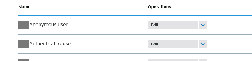
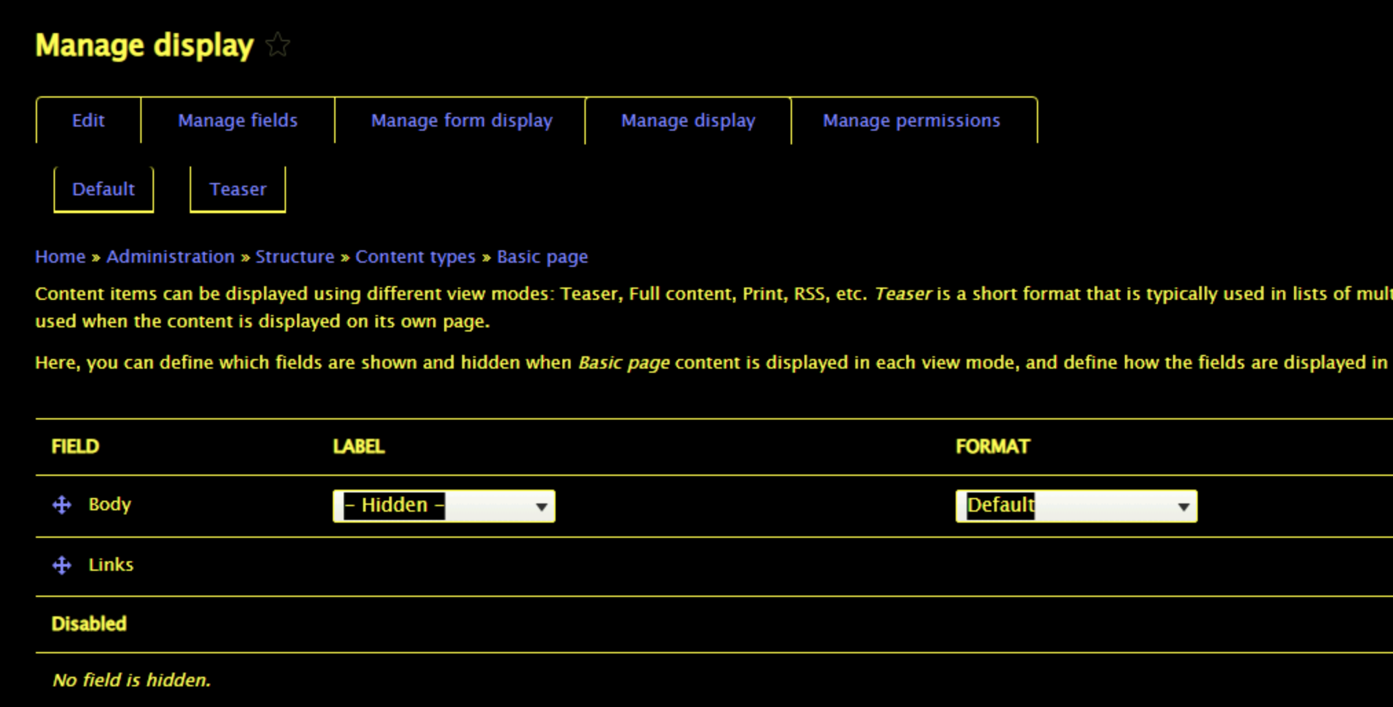
/admin/structure/types/manage/article/display. Note the tabledrag icons. - Change to a Windows High Contrast theme (go to Control Panel and search for "contrast"). Note that the icons do not have proper contrast.
Test the patch
- Apply the patch and clear the cache (to ensure any aggregated CSS is updated)
- View the same path in high contrast mode. Verify that the icons are now the same color as the text (meeting contrast criteria).
- Test this in Seven, Olivero, and Bartik. Note that this will not be fixed in Claro (which will be a followup issue).
- Switch into a non-high contrast theme.
- Ensure that the icons look correct.
- Test that the icons look correct in Chrome, Edge, Firefox, and Safari (in non-high-contrast) to ensure that there are no regressions.
Proposed resolution
Remaining tasks
User interface changes
API changes
Data model changes
Release notes snippet
Issue fork drupal-3227431
 Show commands
Start within a Git clone of the project using the version control instructions.
Or, if you do not have SSH keys set up on git.drupalcode.org:

Comments
Comment #2
kostyashupenkoMaybe better use real html symbol ⇵ for high contrast mode instead of bg-image? With this solution we will let browser to handle color automatically
Comment #3
mherchelI agree w you that we should use characters so it “just works.” Maybe use :before and :after pseudo elements with
⟷? We can stack em on top of each other, and then rotate one.Looking at https://unicode-table.com/en/sets/arrow-symbols/, there’s also some thicker versions, if needed
Comment #5
kostyashupenkoAdded initial commit.
Well, i tried to use two

⟷symbols and rotate one of them, but unfortunately this solution doesn't work well. Arrows are misaligned in every browser and if you will try to fix these arrows for your exact browser - then arrows will be misaligned in another browser. I tried different css for positioning of it, but the original issue of it are glyphs. For example looks at this image:The blue background here is a view box of the html symbol.
Red arrow is a unicode char
Green lines shows that arrow is not vertically centered.
So that means if i'll add one more same arrow and will rotate it 90 degrees - it's hard to control alignment of it crossbrowserly.
Instead, i decided to use these chars
⤩and⤧(this and this) and rotate both 45 deg, coz the bug described above will never happen, since chars has equal width and height of glyphs actually.This is current result in IE11 with enabled HCM:

This is MS Edge:

As you can see it's buggy a little bit now in MS Edge, i have added little

opacity: 0.5;to one of those arrows and i got:So as you can see for some reason in ME Edge one char hides another. I tried to google to understand why it happens, but didn't find solution how to solve it on css level.
Any other ideas?
Maybe we can embed a real svg and rework tabledrag handler completely? Not only for high contrast. I don't know
Comment #6
andy-blumIs there a strict requirement for the icon to be the four-way arrows? What if we used a different character for a handle like the mathematical identical to or strictly equivalent to and then use cursor: move on hover?
Comment #7
andy-blum- Updated the drag handle to use the `identical to` mathematical operator unicode character
- Added the modern (forced-colors: active) media query
Comment #8
mherchelComment #9
andrewmacpherson commentedPlease stop using Unicode symbols like this, and go back to SVG approaches.
Short version: using Unicode symbols like this is extremely fragile in situations where users specify their own fonts (in browser preferences, OS preferences, or user stylesheets). For detailed reasons, review the Slack conversation in #3223281-19: Olivero: Primary nav search icon invisible in forced-colors mode in MS Edge.
The forced-colors media feature can be used to override the CSS fill colour of an inline SVG. For an example, see commit c788d3f in #3223281: Olivero: Primary nav search icon invisible in forced-colors mode in MS Edge.
An alternative approach is to use SVG as CSS background images, and use the forced-colors media feature to replace it with a variant image using a system colour in the SVG fill attribute. See the Claro theme for some examples.
A further reason to avoid the use of Unicode characters in CSS
contentis they are conveyed as content to assistive technology. It might not be a disaster if you use a Unicode character with an appropriate meaning, but using a maths symbol like "identical to" just because it looks good is very inadvisable. I've stopped counting how many times I've heard a screen reader actually say "Trigram for Heaven, button, collapsed" in a mobile navigation design.It seems @mherchel had the idea of using Unicode for lots of icons sometime in early August, and went on a short spree of suggesting this in several issues, before the accessibility conversation we had in #3223281-19: Olivero: Primary nav search icon invisible in forced-colors mode in MS Edge. I'm still finding a few issues like this one where Unicode symbols are still the current proposal. Hey ho :-)
Comment #10
kostyashupenkoComment #12
mherchelI haven't had the chance to test out #10 yet, but an alternative path forward (doesn't support IE) is using the CSS
clip-pathproperty. I created a sample codepen at https://codepen.io/mherchel/pen/qBPaeEQ?editors=1100Comment #13
mherchelWe also need to discuss about having this code in the Olivero theme in general.
IMO this is a core issue that affects every theme, and should be addressed upstream directly within TableDrag. That would also fix the issues on custom themes that are created.
Comment #14
rootworkSince @mherchel suggested deciding whether to fix this in core or continue the work in Olivero I added a needs-a11y-review tag. Apologies if that was inappropriate; I wasn't sure if there was another "we need to discuss this and decide what to do"-style tag, but since there hadn't been any movement since the suggestion I thought this might move things along.
I came here because I wanted to help with #3219958: [META] Make Olivero the default theme and this is in the should-haves list, but now I'm not sure if the path forward is to fix it here or move the work to core TableDrag.
Comment #15
mherchelThe work in #10 is great. But when looking more into it, I don't believe this should be categorized under Olivero, as this is not an Olivero specific problem. It affects all the themes within Drupal (core and custom themes).
This needs to be fixed within the system module that provides the tabledrag CSS/JS, so it can be inherited by core themes and custom themes.
Comment #16
mherchelComment #17
mherchelAttached is a patch that modifies the core tabledrag.css file to use css mask-image (https://developer.mozilla.org/en-US/docs/Web/CSS/mask-image) to generate the icon.
We use a
forced-color: activemedia query to set the background toCanvasTextin forced colors mode.Notes:
mask-imageis not supported by IE11, so I made this a D10 patch.tableDragHandletheme function. This was causing a weird line in forced colors mode. Pretty sure this is a hold-over from IE6 or something.Comment #18
andy-blumCSS linting problems:
Comment #19
mherchelNew patch attached fixing the linting errors. No interdiff since the patch is pretty small.
I'm also uploading before/after screenshots.
Images showing before and after within Seven, Bartik, and Olivero. Note that Claro overrides the tabledrag library, so that will have to be handled in a followup.
Before
After
Comment #20
andy-blumCSpell failing on `canvastext`
Comment #21
andy-blumComment #22
mherchelGeez Louise.
Updated patch with canvastext added.
Comment #23
kristen polThanks for the update. Tagging for testing.
Comment #24
mherchelAdding testing instructions
Comment #25
xjmComment #26
kristen polI know this needs to be tested on Windows but I checked that the patch didn't affect contrast for Mac+Chrome for Bartik, Claro, Olivero, and Seven:
Accessibility "Invert Colors" Disabled:
Accessibility "Invert Colors" Enabled:
Comment #27
kristen polOh... the last 4 screenshots didn't reflect what I could see when the Accessibility
Invert Colorssetting was enabled. Anyway... things looked okay with that. Kind of like dark mode.This still needs testing on Windows.
Comment #28
mherchelNow that #3272035: Add "linktext" and "canvastext" to cspell dictionary. is committed, attached are patches for 9.4.x and 10.0.x
Note the that the 9.4.x patch does not support IE. We can open up a followup if needed.
Comment #29
cindytwilliams commentedCode looks good and patches apply cleanly. Attached are screenshots taken in both Windows high-contrast mode and regular mode using various browsers and themes. Table drag icons display correctly and there are no regressions. Marking RTBC.
Comment #30
alexpottI think we need a change record here because anything that is changing the image via a CSS override will need to update.
Comment #31
mherchelI'm going to refactor the patch a bit so it only does the CSS mask when in forced colors mode. Hopefully that will negate the need for a change record.
Comment #32
mherchelComment #33
cindytwilliams commentedAfter applying patch #32, the tabledrag icons display correctly for all three themes (Seven, Bartik, Olivero) in Windows high-contrast mode in Edge 11 and Firefox browsers. I don't see any regressions in non-high-contrast mode. Screenshots are attached. Marking RTBC.
Comment #35
alexpottI've got one question about #32 that I can't test quickly because I don't have access to a windows machine. I think #32 is losing the focus colour change from #787878 to #00000. And I wonder what that should look like in high contrast mode. I'm also not sure what
background: linktext;does. I looked on https://developer.mozilla.org/en-US/docs/Web/CSS/background and couldn't find anything.Comment #36
mherchelNote that you can test high contrast now in Chrome/Edge developer tools (see https://developer.chrome.com/blog/new-in-devtools-98/#forced-colors)!
It does lose the color change. However, I added an outline focus state:
LinkTextis a CSS system color. See https://drafts.csswg.org/css-color-4/#css-system-colorstl;dr: Forced colors will override your stylesheet's specified colors with CSS system colors. You have things like
Canvas, which is the background of the site,CanvasTextwhich is text on top of the background of the site,LinkText, which is links, etc etcThe CSS mask on top of the background allows the background to "shine through"... kinda like a 🎃. Since the background is
linktext, it will look proper when forced colors is enabled.Comment #37
andy-blumI just opened this up on my windows machine and can verify cindytwilliams's findings in #33, as well as Mike's assertion of a proper focus state.
The linktext keyword is defined as part of "System Colors" as part of a forced-colors color scheme and matches the text of non-active, non-visited links.
Moving back to RTBC
Comment #38
alexpottI looked at why we have the non-breaking space - according to #181066-95: Drag and drop of table rows (e.g. block admin) it was for Opera back in 2007. In 2013 Opera switched to a Chromium based engine so I think we're fine to remove it here.
This still has"Needs accessibility review" tag and I think that an accessibility maintainer should remove that - especially as @andrewmacpherson has already chimed in on the issue.
Comment #40
andrewmacpherson commentedalexpott asked on Slack for me to review this.
I'd like to take some time for manual testing. I am thinking up ways to break this!
I'm skeptical of the approach between #17 and #28, because forced colour modes aren't the only technology which users employ to adjust colours. Using background colour to paint a foreground design object is risky concept. I think it could be very fragile in the face of user-applied styles (such as user stylesheets, and some browser add-ons like Midnight Lizard).
However, the change in #31-32 might be the thing that saves this technique (despite being motivated by change records). If someone uses a forced colour mode at the OS- or browser-level, then fingers-crossed they aren't also messing with colours in a user stylesheet. Those would be famous last words...
I've updated the title. "Proper contrast" is kinda missing the point of forced colour modes, hence the name change when the media feature went into the CSS rec. Some users employ it to reduce the contrast, because white page backgrounds are too much.
I'm pondering the
linktextcolour. This thing doesn't behave as a hyperlink, despite having that role.Re. #28:
I'm not so keen on leaving IE support to a follow-up, because that's rewarding it's users with the slow-lane treatment. If we can improve it in this patch, that would be preferable.
Do you have an idea for MSIE? If so, let's capture it in this issue, at least as a comment. The legacy vendor media query is a sufficiently specific way to target IE (though it gets legacy Edge too), so we have a fairly free hand to use any technique which works. We could swap out a CSS background image for an alternative, like Claro did for the wastebasket node-delete icon. I heard that MS were intending to remove the legacy media query from Chromium-Edge, but I don't know when that's due to happen.
Comment #41
mherchelIf so, that seems out of the scope of this particular issue. The icon right now is rendered via a background image. I don't know of any way an assistive tech could consistently properly change background images properly.
The only thoughts I have is 1) an icon font 2) render the SVG inside the
<div>and use system colors to color it.Comment #45
dwwWe reviewed this issue at the accessibility office hours just now. Crediting attendees.
@mherchel demo'ed the approach and further explained the issue. The attendees of the call agreed with this formulation:
Writing as just me again. As with #2972776: [policy, no patch] Better scoping for bug fix test coverage, we need to reconsider if the desire to never commit anything that's imperfect, out of fear of introducing any new technical debt, is the right approach. The end result is often leaving huge swaths of technical debt unresolved while we strive for perfection on every attempt to improve or fix something.
Comment #47
mherchelSet back to NR since unrelated testing failure.
We brought this up at today's Core Accessibility Office Hours (Document here)
Also had a bit of discussion with @andrewmacpherson in Slack:
https://drupal.slack.com/archives/C2ANFUGGG/p1652965131464039
Some important parts:
I'll wait for Andrew to post in here.
Removing "Needs change record", "Needs release note tags" since they're not needed for the patch in #32, and removing "Needs manual testing" since #37
Comment #48
andrewmacpherson commentedTL;DR
As developers, we often focus on fixing the bug report at hand, but as testers, we also need to think about regressions in other situations. So when I'm reviewing an accessibility fix, it's not enough to think about who the patch helps; I like to think about who might be hindered by the new approach.
There are many ways for users to change colours, apart from Windows high-contrast mode. Most of them we can't detect/control, but we can at least anticipate them.
In comment #40, I speculated that the CSS mask technique would be fragile in the face of user stylesheets and browser add-ons which change background colours. So I wanted to do some manual testing to see if I could come up with ways to break things, or be sure this patch was robust enough.
Testing approach
I tested Drupal core 9.4.x with the patches from #28 and #32, and looked for improvements and regressions compared to the un-patched Drupal core.
I used MSIE 11, Firefox 100, and Edge 101 (all on Windows 10). I didn't test with the other Chromium-based browsers, because what I saw with Edge was enough.
We've seen many screenshots already, so I'm only adding ones which show the interesting situations I found.
I used the Olivero theme, because I noticed that Claro had alread proceeded with this approach, and I wanted to compare before/after.
Firefox v100 or Edge v101, with author-colours only
No user-specified colour overrides. Patches should not change any appearance here.
MSIE 11, with author-colours
No user-specified colour overrides. Patches should not change any appearance here.
The icon disappears, replaced by a grey rectangle (BAD). The CSS image mask isn't supported. Wasn't expecting this to work.
Firefox v100 or Edge v101, with Windows High Contrast
I used a custom user-specified Windows high-contrast theme, because I don't like to assume that one of the default black or white ones is being used. I have a pink text on a purple background, with blue buttons, and orange links.
MSIE 11, with Windows high-contrast
Firefox v102 or MSIE 11, with user stylesheet to override foreground and background colours
It's difficult to plan ahead for user-stylesheets, because (A) they could contain literally anything, and (B) they are private by nature, so web developers don't often get to see what a user-stylesheet contains.
Nonetheless, we can at least anticipate some typical use-cases. Changing colours is one such use-case. User stylesheets are supported by MSIE, Firefox, and some lesser-used browsers. They can also be applied using some browser extensions, or even Javascript bookmarklets.
Here, I'm testing with a very minimalist user-stylesheet which forcibly overrides the foreground and background colours. The effect is similar to using Windows high-contrast mode, but it doesn't require a Microsoft browser/OS, only changes the browser content, and leaves other applications alone.
The icon disappears (BAD, regression). The background colour for the icon now matches the page background. Confirms my speculation from comment #40.
Out of all the browsers we support, MSIE is the only one which offers an easy GUI for setting up a user stylesheet. To some users this is Internet Explorer's killer feature (not joking)! So I really want to avoid the disappearing icon problem here, for as long as D9 is around.
Firefox v100 or Edge v101, with Midnight Lizard
The Midnight Lizard browser extension allows users to apply a new colour scheme. It overrides foreground and background colours in a similar way to Windows high-contrast mode, but the browser cannot detect it with a CSS media query. It can also do some other cool things, like putting a translucent overlay over images so that vivid photos don't look overpowering.
The icon disappears (BAD, regression). Confirms my speculation from comment #40.
Colour-changing technology I deliberately didn't test
Greyscale, invert, white-point adjustment: these are done at the level of the operating system's window compositor (e.g. macOS Quartz). Most can't be detected by web browsers. Invert has a media query, but the tabledrag icon isn't something we need to use it for.
Also Overlays! app, ClaroView, ScreenRuler, or the tinted overlay features from some screen magnifiers packages. We can't detect or control these; instead, meeting WCAG's colour contrast success criteria helps to ensure content remains legible when these tools are used.
What system colour shall we use for the tabledrag icon?
In the forced-colors mode (Windows high-contrast) I noticed that patch #28 made the tabledrag icon use the CanvasText system colour. That doesn't seem ideal, because it doesn't give you any clue that it's an operable control.
Meanwhile, patch #32 doesn't explicitly declare a system colour, so the icon gets the link colour, because it's an
<a href>element. That's better, because it signifies that it's an operable control. However it's potentially confusing because it doesn't actually behave as a link.I reckon it might be better to use the button foreground/background system colours, but then that would disagree with the element's role. To fix that, we'd need a markup change, which we avoided here so far, and it would be good to make this issue just about CSS/appearance.
In any case, it's a minor issue. It can wait until later; tabledrag could do with a bigger overhaul in my view anyway. Let's stick with patch #32 for now.
Note that Claro has already gone with the link system colour.
Outcome
Patch #28 improves the situation with Windows high-contrast mode (
forced-colors, but leads to serious regressions with at least 2 other technologies which provide user-specified colours. I'd say that's sufficient to reject it.The change in patch #32 turns out to be crucial. It only targets
forced-colors: active, and does not lead to the regressions I found with patch #28. It's a far safer and more cautious approach.Recommendations
Let's proceed with the approach in patch #32, and restrict the CSS mask technique to
forced-colors: active. This way we can preserve the status quo in other situations.I'd still like to see if we can fix the icon in MSIE 11 with Windows high-contrast. I've been tinkering with this, but I'll come around to that in another comment. I'm happy to leave it to follow-up issue, but please actually create the issue before committing this one.
Comment #49
andrewmacpherson commentedIt's good from me. Anything else left to consider?
Comment #50
mherchelFollowup issue created at #3281601: Tabledrag icon doesn't adapt to forced-colors mode in IE11
Comment #53
lauriiiCommitted ebe52e3 and pushed to 10.0.x. Also committed to 9.5.x. Thanks!