Problem/Motivation
Drupal core themes make use of uppercase text in some parts of the design. Seven uses uppercase for table headers, details/summary headers, view UI configuration sections, and a few other places like the status report.
Uppercase can be more difficult to read than lowercase text. Users with dyslexia may be especially impacted by this, but it affects everyone to a degree. (Just think of what the message list looks like in your email spam folder....)
Proposed resolution
Stop using uppercase text in our core themes. The places were it is used typically have some other visual affordance to stress them, e.g.
- Config section headings in Views UI are large and bold, so they would still be prominent without uppercase.
- Table headers are identified by position, borders, and a slightly darker background
- Collapsible details/summary have borders, and a disclosure triangle icon.
- The summary tiles at the start of the status report page have big text, and icons.
- The long list on the status report page is divided into left-right regions; headers are on the left, details on the right. At small screen sizes, these are collapsible details.
Remaining tasks
Assess extent of all-caps text in UI.
Remove text-transform: uppercase from various stylesheets.
Patch
User interface changes
Minor design changes, intended to make some UI text easier to understand, especially for users with dyslexia.
API changes
None.
Data model changes
None.
Commit credits needed
This issue started as a discussion in the #accessibility Slack channel. Participants' Slack names:
ttamniwdoog, jhodgdon, donnabungard, cehfisher, mgifford, rachelolivero






Comments
Comment #2
andrewmacpherson commentedThere was a long discussion about this in the #accessibility Slack channel. Participants were ttamniwdoog, jhodgdon, donnabungard, cehfisher, mgifford, rachelolivero, and myself. They deserve commit credits if we proceed with this.
For accessibility, dyslexic users are likely the main group who will benefit from using lowercase. Users with other cognitive, learning, and visual impairments may benefit too, e.g. astigmatism. (The umbrella term "print disability" is sometimes used.)
It was noted that all-caps can be a problem for screen reader users, where some words are mis-identified as abbreviations (e.g. "CONTACT US" is sometimes read as "CONTACT U.S."). This seems to be of less concern than dyslexia though, because screen reader users get accustomed to it as a minor annoyance. It's also probably beyond our control.
Comment #3
andrewmacpherson commentedA quick survey of CSS files with
text-transform: uppercase...Affects most core themes, and views UI module code. We might break this out into issues for each theme.
Comment #4
andrewmacpherson commentedComment #5
andrewmacpherson commentedSome mockups of how things would look when
text-transform: uppercaseis turned off. No patch yet, I got these by fiddling in the browser dev tools.Seven's table headers:

Seven's details/summary elements:

Main tiles at start of Seven's status report page:

Main list of from Seven's status report page.

Views UI:

Comment #6
jhodgdonJust a note regarding
The triangle icon currently doesn't work in Firefox, due to long-standing and still unresolved issue, which I'm adding here as Related. But I would not think that making the summary ALL CAPS lends any usability to it. It could just be bolded.
Comment #7
andrewmacpherson commented@jhodgdon - I already knew about the firefox issue, Thanks for moving that one along.
Comment #8
andrewmacpherson commentedSome more reading around...
Use uppercase text judiciously. His main issue if with uppercased menus. He notes the screen reader problem too.
WebAIM: Evaluating Cognitive Web Accessibility and WebAIM: Fonts. Advice says to limit use of capitals, but not much guidance for how much is too much. "Overuse can result in the loss of differentiation" is an interesting way to explain the problem.
Plain English Campaign: Should you use text-transform: uppercase; in your style sheet?. This one actually cites research: "Experimental data has shown that lowercase text is read faster than uppercase text, by about 5-10%. Whilst there have been different explanations for why this should be, the effect was first reported by Woodworth[1] in 1938." Also bonus points for mentioning Drupal in the article - they take issue with CMS themes which force uppercase menus.
Web Style Guide 3rd Edition. Quite a lengthy description here, focusing on the word-shape aspect, with accompanying diagrams. This is the only article I found that is flat-out against it, without suggesting that it might be OK to use in any situation. "Capitalized text is one of the most common and least effective methods for adding typographical emphasis. [...] We recommend down-style typing (capitalize only the first word and any proper nouns) for your headlines, subheads, and text."
Many articles recommend using uppercase sparingly, but they don't say where they think it IS okay to use it.
A repeating complaint is about uppercase navigation menus. We don't have those, but I think our table headers, and sets of collapsed detail/summary groups, are similar scenarios.
Comment #9
jhodgdonRegarding #5, I have to say that I vastly prefer the non-caps versions to the all-caps versions. I don't have any known reading/sight limitations, but I find the non-caps versions to be less OF A SHOUT IN MY FACE and more soothing/welcoming to look at. Things are bold anyway. We really don't need them in all caps for them to stand out.
But, I'm also not a designer. :)
Comment #10
andrewmacpherson commentedFor the status report page:
I think the 3 tiles at the top would be an example of all-caps that could stay. They are short single words, from everyday English, and have a big icon next to them to aid understanding.
The details further down the page should not use all-caps in my view. They have a lot of techy words, and things like "DRUPAL CORE UPDATE STATUS" are getting on for sentence length.
Also for things like "GD LIBRARY PNG SUPPORT" - this would really benefit from lowercase because two of those terms are abbreviations which would normally be in uppercase, and they don't stand out like they could if it was "GD library PNG support"
Comment #11
samsone commentedI was under the impression that screen readers utilize the text in the document when dictating, not in the display - If this is correct, the only time letters should be interpreted as caps is if they are typed as such in the content. I know this doesn't solve the case for dyslexia, and I don't use a screen reader to verify this, I am going off of memory from attending CSUN 4 years ago.
Comment #12
jhodgdonRE #11, that is apparently not true. Some screen readers would, but some wouldn't. There was a discussion in the Accessibility slack channel a few days ago about this subject... some screen readers were tested, and they varied.
Comment #13
samsone commentedRE #12, I would see if those that don’t support use of the uppercase styling comprise a significant portion of screen readers in use before any major changes are made.
Comment #14
ckrinaAnd what about using
font-variant: small-caps;? https://www.w3schools.com/cssref/pr_font_font-variant.aspBecause reading this I understand the concern and we should totally avoid that, but it limits the design options and it is actually a really good resource for establishing&communicating hierarchy or importance. Maybe it doesn't applies on this specific case, but it is a useful resource in other situations.
Comment #15
jhodgdonHere are some edited excerpts from the Slack conversation, which happened in #accessibility on April 3rd:
ttamniwdoog [7:18 AM]
I have some designs where the top level nav links are spelled out using all CAPS. By default will most screen readers spell out a menu item like "F-A-Q" or will it try to pronounce "FAQ"?
[It was clarified that this meant these headings were to be using CSS text-transform: uppercase;]
[donnabungard said that a word that looked like DONNA would be read D-O-N-N-A in mac VoiceOver w Chrome]
[some links were added, but they are already in this issue in comment #8]
ttamniwdoog [9:16 AM]
@donnabungard This piece is exactly what I was worried about from your link above:
For example, a screen reader may read the uppercase text CONTACT US as "Contact U. S." because it interprets the uppercase "US" as being an acronym for "United States".
donnabungard [9:16 AM]
Exactly!
And I've been testing more and more w screen readers and have found it to be true in some cases
andrewmacpherson [9:38 AM]
I'd heard that some screen readers announce caps differently, but can't find much information on it.
Like, I've found lots of articles that mention this, without giving any details.
The clearest I've found is this, from the Chromium bug tracker: https://groups.google.com/a/chromium.org/forum/#!topic/chromium-accessib...
rachelolivero [9:39 AM]
Depends on user settings. Often by default there is an upward pitch shift. NVDA can be set to announce cap or play a beep when encountering a capital letter
andrewmacpherson [9:40 AM]
Yes, I've heard the upward pitch shift somewhere, (possibly ChromeVox?).
I found a juicy bit in that Chromium bug report:
Checked acc tree of Firefox and IE on windows. Firefox expresses as 'ADD', IE as 'add'
Which means the *browsers* are sending different info to the screen reader, based on the `text-transform: uppercase;`
andrewmacpherson [10:03 AM]
For the issue of a screen reader saying "Contact U.S." instead of "Contact Us" without an abbr tag, that's probably beyond our control I think.
rachelolivero [10:05 AM]
Which definitely happens. I agree though there is only so much you can do.
[at this point, Andrew filed this issue]
jhodgdon [10:14 AM]
But having a design that doesn't fool the screenreader into thinking that "Contact us" could be "CONTACT US" would be beneficial?
That is not difficult to accomplish: just don't use text-transform: uppercase
rachelolivero [10:22 AM]
Honestly, I think it's a minor annoyance when it does that. It is probably a bigger issue for new screen reader users, but in terms of where to spend time fixing accessibility issues, I wouldn't worry too much about this.
andrewmacpherson [10:33 AM]
sighted users with dyslexia would be the main group to benefit from avoiding uppercase.
Comment #16
jhodgdonSo, to summarize that Slack conversation:
- Various browsers send different information to screen readers when encountering CSS all-caps text.
- The screen readers may also react differently to this information.
- The upshot is that some people using screen readers will get confusing readouts from all-caps text, and especially things like "CONTACT US" may be read like "Contact U.S." (i.e., common abbreviations viewed in all-caps may be assumed to be abbreviations, even when the underlying text is lower-case and the upper-case is just coming from the CSS).
- People who regularly use screen readers are pretty much used to problems like this.
- But there is also a problem for people with dyslexia in reading text that is in all caps. It's not just the screen readers that are the problem.
Comment #17
andrewmacpherson commentedThanks for grabbing the Slack chat @jhodgdon.
Here's some more context on what the screen readers are doing. The experience can be a bit variable, depending on the combination of browser, screen reader, and how the caps are implemented.
Firstly, screen readers read whatever they are given by the browser, via the OS-level accessibility APIs. In this Chromium bug report, Steve Faulkner mentions that in some cases browsers have taken lowercase HTML, applied CSS
text-transform: uppercase, and passed the capitalized version to the screen reader. The screen reader has no idea that it was lowercase in the HTML source:.
Source: Chromium Accessibility: Honouring text-transform styles in the a11y tree?
Secondly, the screen reader's job is to read what's on the screen. If the browser passes capitals to the screen reader, because the stylesheet said to show capitals on screen, then I don't whether that should be called a bug. In the Chromium bug report quoted, Steve Faulkner goes on to advocate for browsers to pass an indication that the text has had an uppercase transform applied.
Thirdly, once they have the text, screen readers are using different speech engines, localizations, etc. Lots quirks happen here, for example "CONTACT US" is well known for being pronounced like "CONTACT U.S.". This is beyond our control, and I gather screen reader users grow accustomed to it - I certainly am, and I only use them for 20 minutes a day.
Comment #18
andrewmacpherson commentedI think the capitalized H3 sections in Views UI might be OK to keep. They're generally one word, a few have two words. Some longer phrases, like the "Edit view name/description" button are already lowercase.
Comment #19
andrewmacpherson commented@ckrina, #14 - I don't think I saw any discussion of small-caps when researching this. I suppose they have the same effect on word shape as all-caps - the ascenders and descenders are lost. The difference is that capitals at the start of sentences, names, and abbreviations will still get big-caps, right? So small-caps could be nicer for a phrase like "GD library PNG support".
In the articles I read, it's hard to find clear guidance. Most of them just advise that all-caps should be used sparingly, but don't say how to decide. When is it just-enough, or too-much?
WCAG doesn't say much about it. The only thing I found was an "additional, advisory" technique at level-AAA, in "Understanding SC 1.4.8 Visual Presentation", which says: "Using upper and lower case according to the spelling conventions of the text language (future link)".
But the success criteria in WCAG are supposed to be testable, so that's probably why WCAG doesn't cover this yet.
It's hard for us to make a strong argument about avoiding captitals, when there aren't any pass-or-fail rules. The styleguides and articles all agree that uppercase should not be over-used, so I hope we can use that to inform our designs.
There's a plan somewhere for some more rounds of usability testing. I wonder if we recruit some users with dyslexia to try the Seven theme for us.
Comment #20
miteshmapCreated patch for Drupal core seven theme.
Comment #21
punamshelkeCreated patch for core theme bartik
Comment #22
revathi.b commentedCreated patch for core theme stable
Comment #23
Neetika K commented@Revathi.B :
I am able to see so 17 text transform : Uppercase when I open it with sublime.Please confirm is it fine.
Comment #24
revathi.b commented@Neetika K
Yes it is fine. Already patch has been applied for seven and bartik themes. For reference check comment #20 and #21.
Thanks,
Revathi
Comment #25
imshivani commented@PunamShelke your patch is working fine for me for bartic theme.
Comment #27
andrewmacpherson commentedA similar discussion in the issue queue for a pattern library used by Human Made (a major Wordpress dev agency) - Are all-caps headings bad for accessibility?
Comment #28
andrewmacpherson commentedIn all the discussion so far, we've used English examples, and localization hasn't been mentioned. We might say that short words or single word phrases are low risk, but translated to other languages these may become much longer. Another consideration may be how accents are treated - these are largely absent in English. I'm presuming that accents affect word shape and are a factor in dyslexia, but I have no detailed knowledge of that.
There's a very brief mention of localization in WCAG, which I already said in #19: "Using upper and lower case according to the spelling conventions of the text language". Setting it in a theme would be more brute-force, not taking the page language into account.
So a safe upshot might be that all-caps present a further readability risk where localization is concerned, and is may be safer to avoid transforming them in themes?
Comment #30
thejimbirch commentedAttached is a patch that expands on the great work by @miteshmap, @Revathi.B and @PunamShelke in #20, #21 and #22 to include all core themes, and re-rolls for Drupal 8.8
To validate:
Apply the patch
Find or grep on
/core/themesfor the worduppercaseGet 0 results
Comment #31
cindytwilliams commentedPatch #30 applied cleanly. Using grep to search for the word
uppercasein/core/themesreturned 0 results (screenshot is attached). Marking RTBC.Comment #33
thejimbirch commentedUnrelated test failure. Setting back to RTBC.
Comment #34
catchThis could use screenshots for easier review of the visual changes.
Comment #35
andrewmacpherson commentedComment #36
volkswagenchickTagging for dcasheville19 DrupalCamp Asheville. This would be a good novice task for the mentored contrib WS
Comment #37
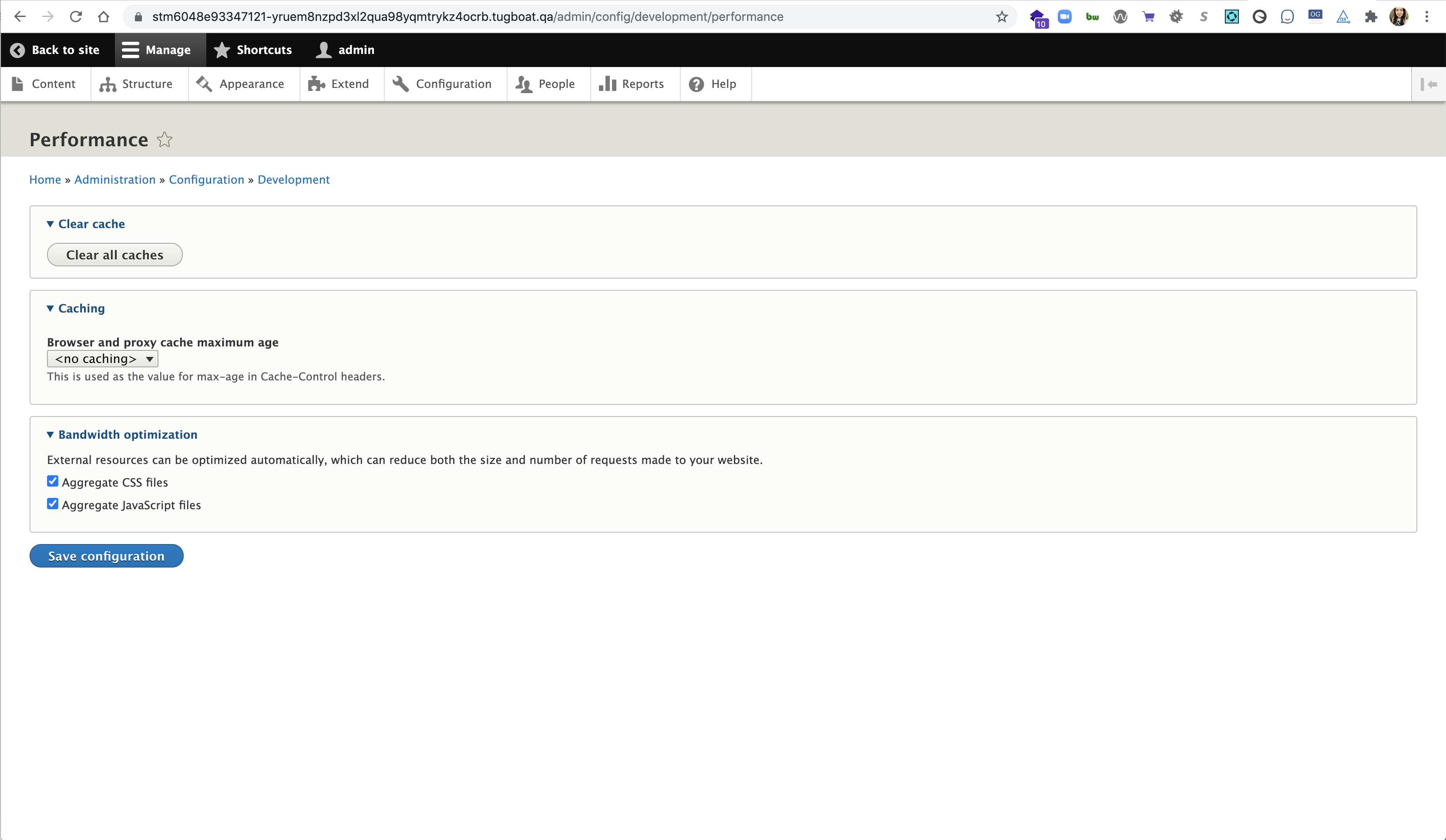
cindytwilliams commentedAttached are some screenshots after applying patch #30 to show that the config section headings, table headers, and summary titles are now displayed in lowercase.
Comment #38
cindytwilliams commentedScreenshots provided above. Marking RTBC, but others can weigh in.
Comment #39
lauriiiI think one of the biggest problems on using
text-transform: uppercaseis the fact that many scripts don't distinguish between upper and lowercase characters. Sometimes styling text in all-caps is used to communicate something and that gets lost on those languages that don't have letter cases.Example: I've seen a restaurant menu where the design used uppercase characters to highlight headings. This was later translated to a language that doesn't have upper- and lowercase characters. As a result, the translated menu was hard to read because the headings were using the same text size and weight as the list items.
I think these localization problems create a strong enough reason to reduce the usage of text-transform but I'm not sure if this is enough to justify removing all instances of text-transform.
As a next step, we should research what is the reason
text-transform: uppercasehas been used in these instances when they were initially designed. Are we not communicating something through the design that was communicated before if we remove the text-transform?Comment #40
avpadernoComment #41
truptidiwani commentedComment #42
truptidiwani commentedI have reviewed the patch and it works well and the screenshots are attached below.
Comment #43
truptidiwani commentedComment #44
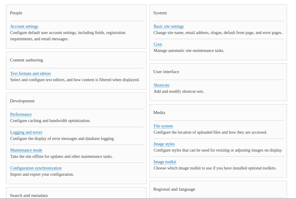
truptidiwani commentedI have reviewed the patch and it is working well and the screenshots are attached below.


Basic Page-
Block Layout Page
People Page
Configuration Page
Comment #45
truptidiwani commentedComment #46
truptidiwani commentedComment #47
thejimbirch commentedBased on the screenshots, I feel like the instances where all caps were used are not missing anything without the all caps to address @lauriii's concerns. Each instance has bold, or a background, or both and a down arrow to communicate structure correctly.
Comment #49
andrewmacpherson commented#39:
Wow! That's a really good point. I dimly recall hearing this a few years ago, but I'd forgotten it in the time since. Thanks for the menu translation example; that should help me to remember it.
Comment #50
avpadernoWith writing systems that don't have letter cases, it's not even possible to write all-capitals phrases. That is the wrong example, if you want to make the point that writing a phrase all in capital letters is necessary.
Comment #51
andrewmacpherson commented#50 - no, I wasn't making that point; quite the opposite. It's an additional argument to support a reduction in our use of text-transform: uppercase.
Since some scripts don't have the concept, then it can't be relied upon as the sole means to signify anything important. It's similar to the way we can't rely on colour alone.
Comment #52
lauriiiThis is the scenario that I'm concerned about is this:
Before this patch, the heading is clearly larger than the link:

After this patch, the heading is smaller than the link:

Since we are removing weight from these elements removing the uppercase rule, we should compensate that by increasing the font-size or weight.
Comment #53
avpaderno@andrewmacpherson I apologize: I totally misunderstood your previous comment.
Yes, using all capital letters to make a phrase more evident is a bad idea, considering there are languages written with a script without capital letters. Even in English, capitalizing a full phrase should be considered bad style, as doing so is probably considered equivalent of shouting.
Comment #55
sahal_va commentedThis issue has been fixed in core 9.1.x-dev version
Comment #56
alexpott@sahal_va the admin/config page in the Seven theme is still using all caps for the panel titles - so it's not fixed. And this is not rtbc either because #52 has not been addressed. The patch still applies but I wonder how some of the new is-the-css-in-sync tests fare. Plus what about Claro.
Comment #57
sahal_va commented@alexpott Increasing the font-size for panel-title would solve the issue in #52.
It is already sentence case in Claro.
Providing the patch considering the issue pointed in #52
Comment #59
komalk commentedIncrease the font-size for compensating heading and the link mentioned in #52.
Review the patch.
Comment #60
sahal_va commentedThis is fixed by patch #59 and looks good.
Attaching the screenshots herewith.
Comment #61
quietone commentedThere are many coding standard errors, https://www.drupal.org/pift-ci-job/1793482. Setting to NW for that.
Comment #63
santosh_verma commentedHi #quietone
This ticket was created for an uppercase issue,
I think coding standard errors are out of ticket scope so can I create a child ticket for that?
Comment #64
santosh_verma commentedI have fixed the maximum coding standard error few left like
1. Heading (h2, h3) should not be qualified ( on h2 there is not any class so for this we have to add a class over the tags)
2. Heading (h2, h3) has already been defined (for the same reason mention above)
3. background image was used multiple time ( in the CSS variable not qualified for linting)
4. Don't use IDs in selectors (some of the tag there is not any class so for this we have to add a class over the tags)
5. Expected ( | none) but found 'alpha(Opacity=35)' (we use filter alpha for IE older version as they did not support the opacity)
6.Use of !important (some of the place we have to use this )
Comment #65
santosh_verma commentedComment #66
avpadernoComment #67
paulocsIn my opinion we should not fix the code standard in this issue as it makes the patch much bigger and we need to do changes in places that the code were not edited in patch #59.
What do you think @quietone?
Comment #68
NitinLama commentedAgreed with @paulocs we should keep coding standard in check but not in this issue as this issue is more about fixing css and out of the scope of coding standard. Also, patch #64 works fine.
Comment #69
djsagar commentedHello all,
I applied patch no #64 and it's resolved all-caps but i found i new issue, when i go appearance and hover on Administration theme
for theme changes there is image repetition issue for the issue. and also there any why not to use !important in css.
Please check the attachment blow.
Thanks!
Comment #70
djsagar commentedI created patch for issue #69 please review.
Thanks!
Comment #71
djsagar commentedComment #72
djsagar commentedRolling up patch with interdiff.
Comment #73
abhijith s commentedPatch applied cleanly in 9.2.x.

Comment #74
bhumikavarshney commentedStill not able to apply #72 patch
Comment #75
bhumikavarshney commentedComment #76
djsagar commented@BhumikaVarshney it's seem your doing something wrong.
i also applied same patch check the attachment blow.
Comment #77
avpadernoThe only way to check if a patch applies to a Drupal version is re-running tests on that Drupal version. One of the first steps tests run is checking the patch applies.
There isn't any need to provide screenshots to show whether the patch applies or not; the tests will return an error, in the case it doesn't apply.
Comment #78
djsagar commented@kiamlaluno,
Thanks for your comment.
Comment #79
Madhu kumar commentedPatch #30 applied cleanly and it is working well.
Before applying the patch
After applying the patch
Comment #80
Madhu kumar commentedComment #81
cainaruTested the latest patch from #72 in Chrome 89.0.4389.82.
Looks good, but in some places of the Seven theme the font-size of table headers and details summary elements seem a bit tiny... but maybe that is just me?
My testing steps, in case anyone else wants to verify:
/admin/appearance/settings/bartik/admin/content/admin/config/development/performance/admin/reports/status/admin/structure/views/admin/structure/views/view/content/admin/config/node/add/pageScreenshot 1:

Screenshot 2:

Screenshot 3:

Screenshot 4:

Screenshot 5:

Screenshot 6:

Screenshot 7:

Screenshot 8:

Screenshot 9:

Screenshot 10:

Comment #83
spokjePlease do not ask the testbot to try again until #3207086: [HEAD BROKEN] Consistent failure in MonthDatePluginTest is fixed.
Comment #84
spokje#3207086: [HEAD BROKEN] Consistent failure in MonthDatePluginTest was committed. Ordered retest and put this issue back to RTBC per #80
Comment #87
catchRestoring status after HEAD was broken.
Comment #88
lauriiiTagging for UX review given how significant the impact of this change is
Comment #89
vikashsoni commented#30 patch applied successfully and looks good for me in drupal-9.3.x-dev
Thanks for the patch for ref sharing screenshots ....
Comment #93
nod_Seven is out of core and the issue is not as present in Claro. Should we leave it as that or try to track down all the remaining 'uppercase' from core css?
There are still some uppercase in some of the core css, but given everything has been about seven it's probably better to open a new issue.
Comment #95
mgiffordThat makes sense to me @nod_ I could only find references to Bartik & Seven.
May well be outstanding issues with D10/11 themes, but we're going to have to pick them out again.
Comment #96
quietone commented@mgifford, thanks for replying.
Based on that I am closing this issue as outdated. If anyone finds issues with the use of all-caps texts they should open a new issue.
Thanks everyone for working on this!