
 Come together with the global Drupal community in Rotterdam, 28 Sept – 1 Oct 2026. Sessions, contribution, connection, and Early Bird savings until 8 June.
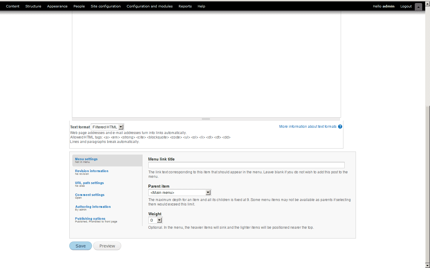
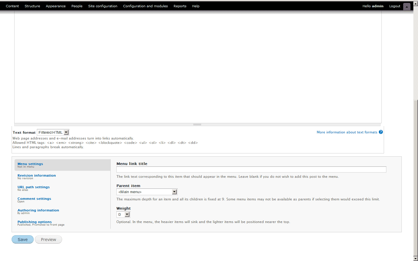
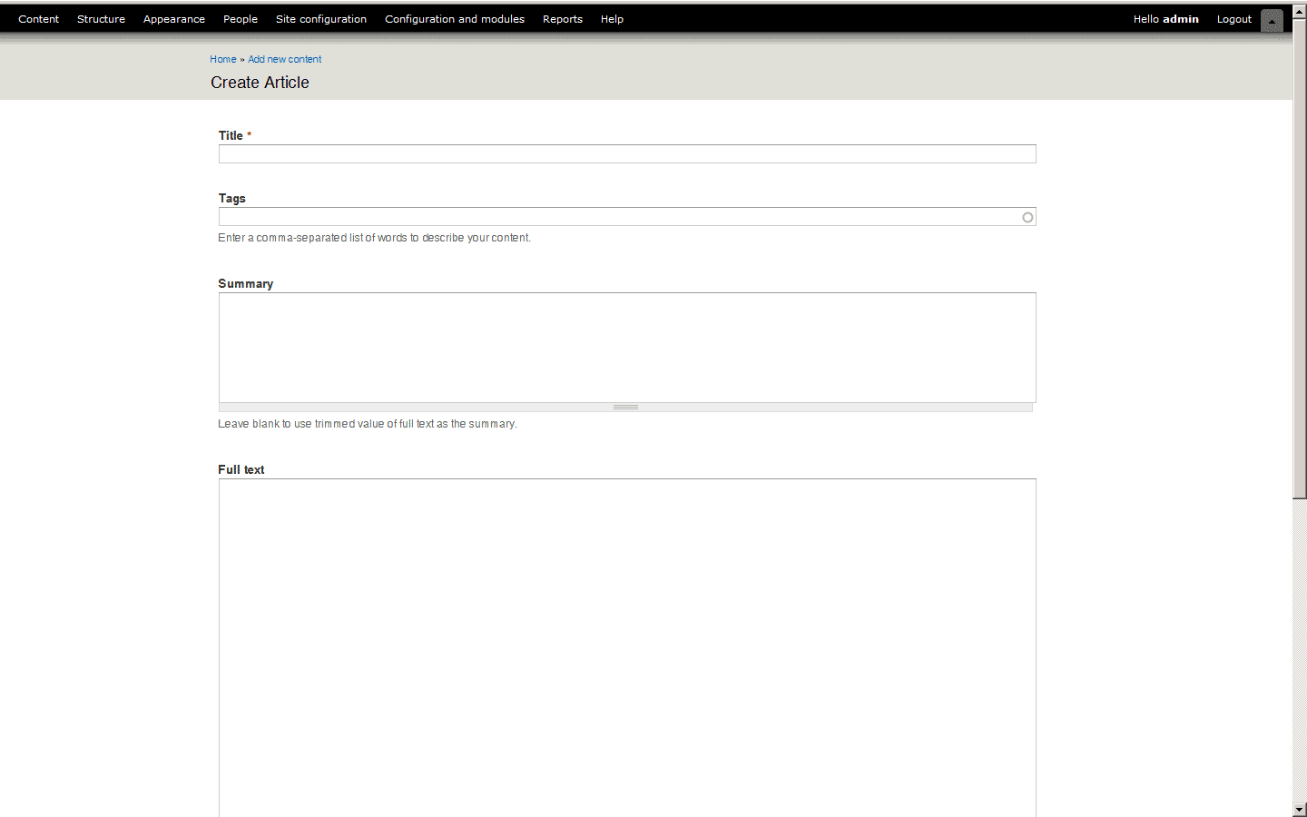
I know many people won't like this but please take a minute to read to the end and take a look at the screenshots before you make your decision.
In theory the liquid layout of Garland and now Seven give developers the possibility to throw in everything they like into $content they like. In reality this has quite a few disadvantages:
- It is harder to create design patterns that work for liquid layouts.
- Information gets splattered across the screen on big displays making data harder to read.
- developers don't know how things will look on someone else screen.
- Often the UI looks untidy.
- Navigation elements are out of first sight. (See http://drupal.org/node/549814 as well)
- Liquid Layouts make testing harder.
Really I like liquid layouts and I think in a perfect World everything would scale to one another but in this use case I think a fixed width or flexible layout would work better and therefore I suppose to make it default but leave the option to change to flexible for those who like.
Example for a Flexible layout with 1293px max-width: http://www.vivabit.com/
Another example: http://www.yaml.de/fileadmin/examples/08_special_interest/minmax_js.html
http://www.yaml.de/fileadmin/examples/06_layouts_advanced/flexible_grids...
| Comment | File | Size | Author |
|---|---|---|---|
| #33 | width.PNG | 15.68 KB | s.daniel |
| #25 | min-width.patch | 331 bytes | jbrown |
| #23 | seven-min-width.patch | 629 bytes | Jeff Burnz |
| #16 | curtail-seven-widths.patch | 2.16 KB | jbrown |
| #16 | Screenshot-Appearance | Drupal 7 - Mozilla Firefox.png | 162.25 KB | jbrown |

Comments
Comment #1
droplet commentedAgree with your points,
I would like to see Flexible layout with max-width.
and all inside elements width in percent %
Comment #2
s.daniel commentedProbably should also have a min-width. Try navigating through d.o with a browser window below 800x600.
Comment #3
amc commentedtagging
Comment #4
yoroy commentedAgreed on setting a max-width. But I don't think the use-case below 800x600 is something we should have to take into account here. The only page that might suffer from a max-width is the permissions page after you've created a couple of extra roles, but that's more a problem of the design of that page itself, not the theme.
Comment #5
mcrittenden commentedSubscribe.
Comment #6
s.daniel commentedyoroy I guess yu are refering to mobile internet divices? There would be the possibility to use the media type but since most mobile devices can't use this propperly that wouldn't be an alternative. I'm not an expert in this area and would suggest to invite some of those to this discussion or maybe open a seperate issue to talk about using drupal as an admin via mobile devices. However that might still be an edge case and not relevant for core?
Comment #7
yoroy commentedI'm mostly talking about *not* making the below-800*600 screens part of this discussion. There's no requirement for Seven to work on mobile devices either.
Comment #8
seutje commentedsubscribe
endless wrapping is friggin ugly
Comment #9
SeanBannister commentedI'm somewhat split on this issue but would like to see where it goes.
Comment #10
mattyoung commented.
Comment #11
yoroy commentedIt's quite obvious that always going for 100% width is not the best default to provide.
I propose we add a max-width of around 1200px (or whatever works best for 1280 width resolutions)
Anything wider makes pages quite hard to scan/read.
Also marked #672240: Seven and Garland should have tables that default to "width: auto;", not 100% a duplicate of this one.
Comment #12
yoroy commentedFor example:
http://skitch.com/yoroy/nphhk/config-fullwidth
and
http://skitch.com/yoroy/nphhe/config-max1200
Comment #13
mcrittenden commentedCould we make the gray header background extend the full width, even if max width is exceeded?
Comment #14
aspilicious commented+1 for last comment...
+ I agree seven is to wide on high screen res screens.
+ Dunno if everybody will be happy with this...
Comment #15
mcrittenden commentedComment #16
jbrown commentedOkay - I think I've found a nice solution.
This patch limits the width of the main content area (excluding padding / margins) to 1000px. Anything more than this just gets painful.
Gray header background extends to the full width, even if max-width is exceeded.
The content area is not centered, it is left kept to the left. I think this looks more professional, but the main reason is for when a table is too big to fit - it will just fill out the empty space to the right. See the permissions screenshot.
This patch also sets the min-width for the whole page to 400px.
Comment #17
icecreamyou commentedFirst of all, I'd like to give a big +1 to having a min-width. Just because we have no requirement to support mobile browsing doesn't mean we shouldn't add something like this which signficantly aids mobile browsing without affecting the experience of people with normal-sized monitors.
Having said that, I usually despise fixed-width themes, especially for admin themes. More is typically going on in the content area in the admin section than on normal content pages, and it looks dumb on a lot of large screens to have a website take up a tiny sliver of the area. If people don't want to look at a website in 2560 width, they're not going to have their browser window maximized on a monitor that large.
Let me go through a few points that were mentioned:
I take the philosophy that protecting developers from themselves is not a valid argument. If developers want to use a tool a certain way, we shouldn't restrict them from doing so. That would be like requiring people to use the overlay.
Anything that creates more work for the person developing something is not a valid argument against making things easier for the person who will be using the end result. If that were the case, we never would have developed the overlay.
This is the main question here. Do we know this for sure? Has this been studied, or is it just speculation based on personal experience? And is there really a significant advantage to requiring a maximum width versus letting people resize their browser window to a size that works the best for them?
The change proposed in this issue won't change that situation. Really the more significant problem there has to do with monitors showing colors differently IMO. But people will be able to resize their browsers between 1280 and 400px width with the current patch so developers still won't know what screen width they'll be dealing with.
See my response to "harder to read"
That issue seems to be more about the placement of tabs on the right (and being used to the "Modules" page not being a tab) than the fact that the the tabs are not immediately visible. Tabs usually are on the left.
See my response to "harder to create design patterns" -- but anyway that's more an argument for developing new themes than changing an existing, tested one.
I'd be fine with having fixed-width be the default if there was a checkbox somewhere in the theme settings that allowed switching to completely fluid-width. That's not in the current patch.
So here's the bottom line: I think this patch as-is reduces flexibility (hehe) without demonstrably improving usability.
However. I recognize that a page with not that much in the content area is going to look pretty stupid in a fluid-width theme on a 2560-px screen. So I'm not entirely against the use of max-width on the content area (by the way, I do approve of just setting it on the content area rather than the whole page [as long as we don't have header tabs floated right] although I'm not sure I like the page being on the left instead of centered). I just think that if we have a max-width, it should be significantly larger to accommodate people who legitimately want to use their screen real estate at larger resolutions. Large monitors are increasingly popular and I don't think we should basically say "your monitor is too big to be useful" to people whose monitors are larger than 1280px wide. 1600x1200 and 1920x1440 are very common resolutions on new laptops these days (in the U.S., anyway) and I have to imagine that people who are developers will typically be the ones using larger screen resolutions in the first place.
Comment #18
yoroy commentedI was in favor of setting a max width for seven but I have changed my position on this, I don't think it's needed and for core it actually is the better default. Seven is an admin theme, so the use case of a too stretched out content item doesn't apply. Also, I've been using it on quite high resolutions and haven't really found issues with it. We're not going to make it a setting either.
First of all, I'd like to give a big +1 to having a min-width. Just because we have no requirement to support mobile browsing doesn't mean we shouldn't add something like this which signficantly aids mobile browsing without affecting the experience of people with normal-sized monitors.
Question: how does a min-width help here?
Comment #19
seutje commentedit prevents things from breaking out of their container and overlapping each other, I can imagine pages like the dashboard only benefiting from it
Comment #20
Jeff Burnz commentedMy new laptop res is 1366x768 by default, I run Seven full width and have no real issues.
Agree with #18.
Comment #21
aspilicious commentedI use always a full HD resolution: 1920x1280 (or something like that :p) and I don't have any problems with the width of the seven theme. Certainly if u use the overlay like I do.
Comment #22
drupalshrek commentedI am against a fixed max-width. I work on a ridiculously wide screen, and so I do understand the problem, but I still prefer it if the website fills the window and let's me decide if that's what I want or not. If a window is maximised, let it be maximised! Let the user decide just how wide they want the window.
Sure, in practise I very often shrink the window to be a more reasonable width, but to "force" a more reasonable width for the sub-contents of the window is, I think, not at all the right approach. The examples in some of the pictures where the menu is full-width and the content is restricted-width is plain silly. Either go for a flexible (window) width, or go for a fixed width.
I read with interest the BBC website redesign logic to stick with a fixed width (albeit wider than the earlier version of their site):
http://www.bbc.co.uk/blogs/bbcinternet/2010/07/bbc_news_redesign_telling...
Comment #23
Jeff Burnz commentedLooks like we're mostly in agreement that a max-width is undesirable so this is boiling down to either 1) add a min-width or 2) do nothing.
yoroy asked whats a reasonable min-width, well IMO either 760 or 960.
Here's a patch that sets it at 720px (+ padding = 760), and overrides it when in the Overlay, since Overlay sets its own min-width.
Comment #24
jbrown commentedThe min-width needs to affect areas other than the main content area, e.g. the toolbar and #branding.
Comment #25
jbrown commentedThe way I originally implemented it in #16 works much better - the min-width attribute is applied to body.
It isn't really possible to limit the minimum width of the toolbar because it has a fixed position and can't be scrolled left to right. It gets a bit mangled if the window isn't wide enough, but it is still functional.
Comment #26
jbrown commentedComment #27
Jeff Burnz commentedLooks good, why go down to 600, the modules page will horizontal scroll at this width, at 760 everything is good that I looked at.
Comment #28
droplet commentedComment #29
kscheirer#25: min-width.patch queued for re-testing.
Comment #31
johnalbinWe're not going to put a min-width on Seven. We should aim to make the admin screens work reasonably well on mobile devices.
Comment #32
seutje commented@31: that's exactly why a min-width wouldn't be a bad thing. When you encounter a device that has a width that's under 240, it's rather impossible to make things usable without imposing a min-width of say... 240
600 seems way too high for a min-width. Then again, there's no way some of the backend tables will ever fit properly within 240px
Comment #33
s.daniel commentedWell seems this discussion is over but after D7 there will be D8.
However I wanted to mention that when looking at the screenshots again I don't really understand the points mentioned against setting a max-width. To me it is obvious that the user needs longer to understand the contents of a site if it is splattered across the screen. Simply because the eye needs longer to jump from one point to the other. If you know about speed reading techniques it is quite obvious that on a design where elements in one line, e.g. in a table, are relatively close to each other one can "see" and understand them with one look. On the other hand when elements are divided by lots of whitespace or lines the eye needs to jump from element to element. The result is that the experienced user needs more time to scan a page for settings while the inexperienced will have a harder time understanding the content of the page. Attached is a simple example: http://drupal.org/files/width.PNG
Btw. This is the same reason why vertical menus with strong lines between the items are harder to read/scan than one with e.g. bullet points.
Also how much text should be in one line for best reading comfort are well known since ages. Anyhow that is not the important point here.
Where am I suggesting to restrict a developer?
Yes it is. It is in the case when a method of doing things a certain way doesn't benefit the user. It would even be a valid argument when the user would suffer only that the argument of the user experience weights higher. User experience and developer experience are both valid goals and I am going for both.
There will definitely be personal experience involved in there but some also it has been studied. See http://baymard.com/blog/line-length-readability for example.
How does giving a window of what to expect instead of giving no information at all not change the situation?
Well the tabs _are_ on the right and this issue is not about that. If you look at the screenshots there is a lot of whitespace on some pages between the content and the related tabs. The result of the whitespace is that things are separated, that means there is no obvious connection between the content one is looking at and the options he/she might be looking for.
Sounds reasonable to me, that’s what I suggested.