
 Support for Drupal 7 is ending on 5 January 2025—it’s time to migrate to Drupal 10! Learn about the many benefits of Drupal 10 and find migration tools in our resource center.
Implement new design for checkbox elements (CSS3, backwards compatible)
Based on the design proposed in the Seven styleguide

Implement new design for radio button elements (CSS3, backwards compatible)


Comments
Comment #2
AaronChristian CreditAttribution: AaronChristian at Acro Commerce commentedComment #3
AaronChristian CreditAttribution: AaronChristian at Acro Commerce commentedHere's a first stab at this. There seems to be an issue with the bulk edit forms layout with the checkboxes.
Typically the input is outputted, and then it's children after (label, etc.), however it is backwards on the bulk edit forms.
@todo: need to rearrange the output so the label comes after the input element.
Comment #4
idebr CreditAttribution: idebr at iO commentedHey Aaron, thanks for working on this issue.
I found a few issues while testing your patch:
Comment #5
AaronChristian CreditAttribution: AaronChristian at Acro Commerce commentedAhhhh shoot, I forgot to include the background asset. I'll get that fixed in the next patch I submit.
Also the focus states are now border color changes, perhaps that's not obvious enough though. I can adjust that to the original accessible outline.
Thanks for testing @idebr
Comment #6
AaronChristian CreditAttribution: AaronChristian at Acro Commerce commentedAlright so this should fix up the issue with the assets as noted in #4. A problem still remains with the main content overview page which currently does not have a label element attached to it.
Comment #7
AaronChristian CreditAttribution: AaronChristian at Acro Commerce commentedComment #8
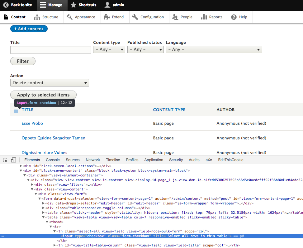
AaronChristian CreditAttribution: AaronChristian at Acro Commerce commentedAlright did some more work on this one. I believe I've captured all places in the seven theme which has checkboxes visible;
- Drupal's main install form
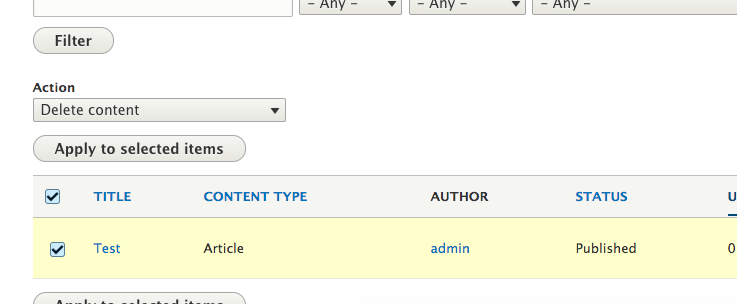
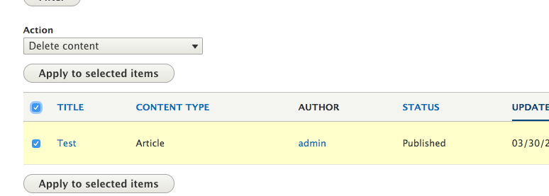
- Bulk Edit Forms (eg. Content, Comments, Users etc.)
- Content Create Forms (eg. Add Content -> Article)
- Form Display (eg. Content Type -> Manage form display)
- Theme settings forms
- Permissions Forms
- Modules Page
- Views
- Administration Pages (eg. A modules admin page)
Tested with;
Windows 10
- IE 9/10/11
- Firefox (Latest)
- Chrome (Latest)
Mac
- Safari 9/10
- Firefox (Latest)
- Chrome (Latest)
Comment #9
krina.addweb CreditAttribution: krina.addweb at AddWeb Solution Pvt. Ltd. commented@AaronChristian, Thanks for your contibution for patch, it works well for me i checked it over simplytest.me with Browser compatibility, resizing & responsive.
Thanks again.
Comment #10
krina.addweb CreditAttribution: krina.addweb at AddWeb Solution Pvt. Ltd. commentedComment #11
AaronChristian CreditAttribution: AaronChristian at Acro Commerce commentedAwesome thanks for testing @krina.addweb! Much appreciated :)
Comment #12
yoroy CreditAttribution: yoroy as a volunteer and at Roy Scholten commentedComment #13
yoroy CreditAttribution: yoroy as a volunteer and at Roy Scholten commentedComment #14
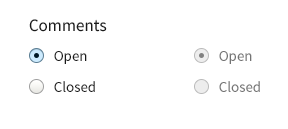
yoroy CreditAttribution: yoroy as a volunteer and at Roy Scholten commentedHmm, looking a bit closer I do wonder if the space between checkbox and label is maybe a bit too wide. That horizontal gap is (almost) the same size as the vertical spacing between lines. This just about makes the label and checkbox lose touch with eachother:
The example design from the style guide uses a taller line-height. Looks like that design was implemented to spec but the vertical spacing currently in Seven is less than in that example. I think we need to ensure that the horizontal spacing between label and checkbox is clearly less than the vertical spacing between lines.
Reducing the horizontal margin would be in scope of this issue. For increasing the vertical space there's #2487027: Fix the vertical rhythm.
Comment #15
ckrinaI totally agree with @yoroy, it'll be easier to relate checkboxes with their own labels if they are closer.
Comment #16
dmsmidtCould someone post a screenshot of how this looks with an error on a field with a checkbox?
See error styling on checkboxes issues:
#2687251-17: Radios / Checkboxes focus styling wrong when marked as having an error
[#222380-66
Comment #17
AaronChristian CreditAttribution: AaronChristian at Acro Commerce commented@yoroy, attached a new patch that resolves the horizontal spacing of the labels.
@dmsmidt, i've attached a few screenshots of the focus state.
Comment #18
AaronChristian CreditAttribution: AaronChristian at Acro Commerce commentedSorry forgot to attach error handling styles in the new patch. New patch and screenshot applied.
Comment #19
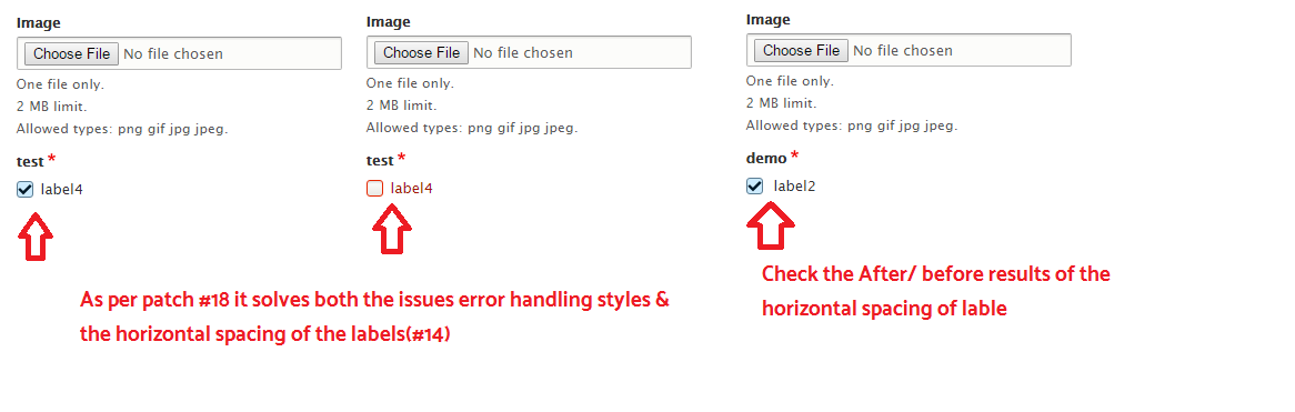
krina.addweb CreditAttribution: krina.addweb at AddWeb Solution Pvt. Ltd. commented@AaronChristian, I tested your patch #17 & #18 both over simplytest.me & it works for me, yes in #17 it didn't show error handling styles but it resolves the issue of horizontal spacing of the labels(#14).
For#18 it solves both the issues error handling styles & the horizontal spacing of the labels(#14).
PFA for the results of #17 & #18.
Thanks again..!!
Comment #21
AaronChristian CreditAttribution: AaronChristian at Acro Commerce commentedSwitching back to RTBC since the last failed patch was due to a CI error; https://www.drupal.org/pift-ci-job/638828
Thank you all for testing!
Comment #22
AaronChristian CreditAttribution: AaronChristian at Acro Commerce commentedComment #23
tstoecklerThis patches contains tab characters. Let's use spaces instead.
Comment #24
sudhanshug CreditAttribution: sudhanshug as a volunteer and at Google Summer of Code commentedReplaced tabs from #2856459-18: Seven Style Guide: Checkboxes & Radio Buttons with spaces.
Comment #25
tstoecklerThis is the interdiff, so re-RTBC-ing per #19. (I can't actually say anything meaningful about the patch itself...)
Comment #26
star-szrNice to see Seven style guide things happening, thank you everyone who has worked on this so far :)
Minor: Most of these comments are not necessary, and most don't follow our documentation coding standards:
Per https://www.drupal.org/docs/develop/coding-standards/api-documentation-a...
The "make the trigger area a bit bigger for mobile tap" comment might be useful.
Instead of a lot of these comments I'd recommend grouping similar selectors together visually per https://www.drupal.org/docs/develop/standards/css/css-formatting-guideli... (Blank lines).
Sorry if I missed this in the comments, but can we keep these as em units?
Comment #27
sudhanshug CreditAttribution: sudhanshug as a volunteer and at Google Summer of Code commentedChanged the patch in #2856459-24: Seven Style Guide: Checkboxes & Radio Buttons according to the guidelines provided in #2856459-26: Seven Style Guide: Checkboxes & Radio Buttons by @Cottser
Comment #28
AaronChristian CreditAttribution: AaronChristian at Acro Commerce commentedDiscussing with @laurri regarding the CSS changes;
Should be able to get working on this as soon as I have some down time this weekend. Thanks for all the work everyone!
Comment #29
AaronChristian CreditAttribution: AaronChristian at Acro Commerce commentedHopefully this should do the trick for finishing this one up.
Additions: Adding of a class to the label elements with the $element['#type'] for styling purposes.
Comment #31
AaronChristian CreditAttribution: AaronChristian at Acro Commerce commentedWhoops, must have been too late at night, made a crappy patch.
Tested this one, should apply cleanly.
Comment #32
AaronChristian CreditAttribution: AaronChristian at Acro Commerce commentedComment #34
AaronChristian CreditAttribution: AaronChristian at Acro Commerce commentedFixed up a few coding standards. The others seem to have been pulled right out of stable.
Comment #35
AaronChristian CreditAttribution: AaronChristian at Acro Commerce commentedComment #36
Gábor HojtsyJust reviewing the part of code I feel eligible to review, AKA code style and PHP. I also looked at whether RTL CSS is taken care of and that seems to be the case, so great :)
Should have newlines at end files :)
Make this a sentence IMHO.
We should have the regular boilerplate text here Implements hook_blabla... and the actual docs should go into the function body.
Also we don't do "now" and "we" in comments, just "Merge the form element type class from seven_preprocess_form_element() with the label's attributes." or somesuch.
Comment #37
AaronChristian CreditAttribution: AaronChristian at Acro Commerce commentedFixes for #36.
We need to use the "+" selector in some cases as we can't target the element without making extremely long selectors.
However I have added label classes which have cleaned up the selector roots quite a bit.
Comment #39
AaronChristian CreditAttribution: AaronChristian at Acro Commerce commentedWhoops! Looks like my core version was a bit out of date.
Here's an updated patch with the latest dev branch.
Comment #42
andrewmacpherson CreditAttribution: andrewmacpherson as a volunteer commentedJust spotted this on Slack. For accessibility QA - do the checkbox and radio designs have focus styles?
Update: I've seen this in the latest patch...
This looks like the focus indication might be a failure of WCAG 2.0 SC 1.4.1 Use of Color at level A. Is border colour the only thing that changes?
Comment #43
andrewmacpherson CreditAttribution: andrewmacpherson as a volunteer commentedComment #5 says the focus style is just a border colour change. Going by the screenshots in #17, focus isn't very easy to spot at all.
For users who rely on focus styles, subtle changes just don't work.
Going by what I've seen, the focus styles:
There's also a new "Non-text contrast" criterion in WCAG 2.1, which calls for focus states to have a 3:1 colour contrast compared to the non-focused state. WCAG 2.1 has just reached Proposed Recommendation stage, so is stable enough to use now. If we can satisfy this one, all the better.
A shape change is a much clearer focus indicator than a colour-only change. I recommend an offset border or outline around the input, with a colour contrast of 3:1 against the page background. Probably blue.
Comment #44
andrewmacpherson CreditAttribution: andrewmacpherson as a volunteer commentedThe error style in comment #19 screenshot also fails WCAG 2.0 Use of color.
Comment #45
lauriiiComment #54
longwave