

Closed (fixed)
Project:
Drupal core
Version:
8.2.x-dev
Component:
Bartik theme
Priority:
Normal
Category:
Bug report
Assigned:
Unassigned
Reporter:
Created:
25 Sep 2015 at 12:14 UTC
Updated:
27 May 2016 at 20:54 UTC
Jump to comment: Most recent, Most recent file







Comments
Comment #2
lucastockmann commentedChanged "Component".
Comment #3
lucastockmann commentedComment #4
dschenk commentedAre you going to work on this @lucastockmann? Else I'm going to try to fix this.
Comment #5
dschenk commentedWent ahead with this. Added 0.375em padding to the bottom of the region header. The same amount that is used as on the top. Did not see any regression of this change when smoke testing various pages.
Comment #6
dschenk commentedComment #7
dschenk commentedComment #8
dschenk commentedComment #9
ckrinaIt's working for me. I've updated Firefox and Chrome screenshots to show it.
Comment #10
ckrinaComment #11
sam152 commentedLooks good to me.
Comment #12
alexpottAssigning to @emma.maria for final sign-off as this is a deign change in Bartik.
Comment #13
lewisnymanComment #14
emma.mariaApologies for stalling this issue.
So the change is wonderful for mobile, anything added to the header now has a space below it and the bottom of the section. However the patch in #5 does adds a height change to the header for tablet and desktop widths.
Screenshots.
Tablet
Before
After
Desktop
Before
After
Can a media query + style be added for tablet and up layouts to negate the margin bottom on the region-header please.
Comment #15
zuhair_akAdded padding bottom to region header for only devices below 461px using media query.
Comment #16
zuhair_akComment #17
ckrinaNow the change only applies for small screens as @emma.maria said. I've tested it and the fix doesn't apply on bigger screens than 461px. Attaching screenshots:
Big
Tablet
Mobile
Comment #18
emma.mariaThanks @ckrina for the review! RTBC++
Suggested commit message:
Comment #19
star-szrI could be wrong but I think the max-width should be 460 here, not 461. Otherwise at exactly 461px it's inconsistent (a bit too much spacing I think).
For example from bartik.breakpoints.yml:
From css/components/primary-menu.css:
Comment #20
kostyashupenko@Cottser, checking
Comment #21
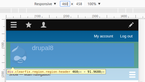
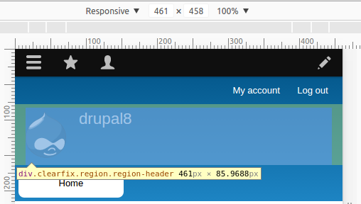
kostyashupenko@Cottser, you were right, there was unnecessary padding-bottom on 461px. It should be added on 460. Screens below after my patch
461px:


460px:
Comment #22
kostyashupenkoComment #23
emma.maria@kostyashupenko Thanks for investigating and creating a patch. I've unassigned you from the issue also to free it up for review :-)
Comment #24
edwdeapri commentedI am at mentor sprints here at DrupalCon NOLA and testing this issue.
Comment #25
BSpeel commentedConfirmed issue before patch and the fix afterwards on a few different pages with lowercase g, q and y in Safari, Chrome, and FireFox. +1 RTBC
Comment #26
tomgrandy commentedWe are going to be testing this after lunch.
Comment #27
tomgrandy commentedConfirm patch works in multiple browsers emulating mobile with lowercase g and y.
Comment #28
star-szrComment #29
templeman commentedWe are working on posting screenshots showing patch before & after for several browsers.
Comment #30
tomgrandy commentedAttached Images show patch applied to D8 with patch in Firefox showing before and after application of the patch.
Comment #31
tomgrandy commentedAttached Images show patch applied to D8 with patch in Chrome showing before and after application of the patch.
Comment #32
tomgrandy commentedComment #33
tomgrandy commentedComment #34
tomgrandy commentedComment #35
tomgrandy commentedComment #37
star-szrBumped to normal because it can be a readability/accessibility issue.
Committed d276bb4 and pushed to 8.2.x at DrupalCon New Orleans. Thanks!
Comment #38
tfhakala commentedWe tested this on a Galaxy S7 using Chrome, an iPhone 6S Plus using Safari, and two iPhone 6Ss using Safari and Chrome. The patch worked successfully on all browsers. Attached image is before and after patch on the iPhone 6S Plus and the after patch on the Galaxy S7.
Keithdoyle9, Kay_v, someone else at our table (Sorry I forgot your name!), and I were working on this before the live commit at DrupalCon NOLA 2016. I had issues getting the comment to submit before the live commit, but thought the comment was worth adding for the additional testing on mobile devices.