
This project is not covered by Drupal’s security advisory policy.
This module is a developer-oriented set of tools that help with front-end development on Bootstrap-based themes.
It provides implementations of common Bootstrap 5 components and patterns such as cards, tabs, buttons, etc... using Drupal techniques.
It was devised for and integrate specially well with Radix and Components! and has support for Styleguide and External-use Icons.
How to use
Directly on code
Each component is provided at least as a theme hook that you can use on your twig templates or as a render array. For example:
    $items['bootstrap_card'] = [
      '#theme' => 'bootstrap_card',
      '#card_content' => [
        'title' => [
          '#type' => 'html_tag',
          '#tag' => 'h3',
          '#value' => $this->generator->words(rand(3, 7)),
        ],
        'content' => $this->generator->paragraphs(1),
      ],
    ];
...or, if using twig and Components! (namespace is @bootstrap_components_toolkit):
    {% include "@bootstrap_components_toolkit/bootstrap-tabs.html.twig" with {
        nav_alignment: 'center',
        tabs_alignment: is_vertical ? 'vertical'
    } %}
As field formatters (atomic components)
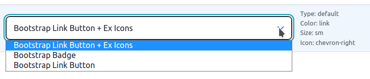
Simpler, atomic components like buttons or badges are also provided as Field Formatters.
This kind of components can be easily tied 1:1 to some field types (i.e, buttons to link or mail fields and badges to plain text fields).
Field formatters help easing development by making components directly accessible using the UI:
As View Styles
Some components can be used as View styles, especially those that can "wrap" other content, such as Accordions.
Support table
Below is a table indicating the currently supported Bootstrap components and their implementations.
| Component | Theme hook + twig template | Field formatter | Field types supported | Views style |
| Buttons | ✓ | ✓ | link, email, file | |
| Badge | ✓ | ✓ | link, string, list_string, string_long, entity_reference | |
| Dropdowns | ✓ | ✓ | link | |
| Figures | ✓ | |||
| Alert | ✓ | |||
| Card | ✓ | |||
| Nav | ✓ | |||
| Tabs | ✓ | |||
| Accordion | ✓ | ✓ | ||
| Accordion item | ✓ | ✓ |
Javascript
Each component will independently load its Javascript dependencies, if any. For example, the tabs component loads bootstrap's tab.js.
This means you don't need to load the whole Bootstrap bundle. This help improve performance by only loading the needed assets per page.
If using Radix, be sure to comment out the unneeded assets on /src/js/_bootstrap.js to avoid duplication.
Integrations
- Styleguide - Outputs a test of each component variation to the styleguide
- External-use Icons - Allows to introduce Icons on the Bootstrap Button field formatter
Supporting organizations:
Developed the module
| Attachment | Size |
|---|---|
| A Bootstrap Components Toolkit field formatter | 18.79 KB |
Project information
- Project categories: Site structure, Integrations, Developer tools
 4 sites report using this module
- Created by idiaz.roncero on , updated
 This project is not covered by the security advisory policy.
Use at your own risk! It may have publicly disclosed vulnerabilities.


