
As part of the upgrade of this module to work with Bootstrap 4, the current files need to be checked to ensure they still make sense and work correctly.
This issue is to deal with the file /screenshot.png only. It should be made from the background and font of the official Bootstrap website.
The expected contribution for this issue is either:
a. discussion,
b. a new file,
c. testing and confirmation of the file.
| Comment | File | Size | Author |
|---|---|---|---|
| #14 | screenshot-v5.svg_.txt | 11.94 KB | ressa |
| #14 | screenshot-v5-B.png | 47.89 KB | ressa |
| #13 | drupal-bootstrap-screenshot.png | 24.5 KB | markhalliwell |
| #13 | drupal-bootstrap-screenshot.psd | 752.79 KB | markhalliwell |
| #5 | 2.2-logo.png | 41.55 KB | ressa |


Comments
Comment #2
waverate CreditAttribution: waverate commentedComment #3
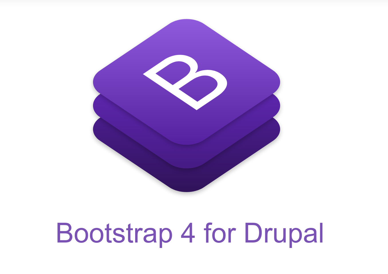
ressa CreditAttribution: ressa at Ardea commentedI first tried putting the text on the right side, but having the text below the logo seem to work better. What do you think?
Comment #4
markhalliwellI'd get rid of the version. Something that could, theoretically, work for both 3 and 4 (and 5+, etc.). This will make it less of a big deal to update in the future.
I'm also semi-partial to using "Drupal Bootstrap" as that is typically how this project is referred to in documentation.
Comment #5
ressa CreditAttribution: ressa at Ardea commentedThanks for the feedback @markcarver. Here is an updated version. I added the svg file as well (renamed to 2.1-logo.svg_.txt to allow uploading) for easier revising of the next version, should it be necessary.
I just learned that the recommended screenshot dimensions are actually 588 pixels wide and 438 pixels high in https://www.drupal.org/node/2349827#screenshot
Comment #6
markhalliwellI still think it should say "Drupal Bootstrap" below.
It'd be nice to maybe put an outline of the duplicon around the B on the stack as well.
There should be some distinction so it doesn't look like a straight-up copy from Bootstrap.
Comment #7
ressa CreditAttribution: ressa at Ardea commentedAll right. Changing the text is fairly simple. Your wish for an outline I'll leave for someone else to do.
Just a comment: An appreciative tone ("thanks", "looks good"), even if you don't mean it, makes all the difference in open source projects. Spending your free time on a project, and only getting critique back doesn't really motivate further work on a project.
Comment #8
markhalliwellI do appreciate that you've taken this issue on. Thank you :D
I'm sorry that I didn't say that before.
I've been extremely busy and, as you mentioned, this is FOSS. I often barely get enough time to provide feedback and, in my eyes, providing feedback in a timely manner is what's most important so people don't waste their time.
My terseness and direct response are often misinterpreted and taken personally. That is never my intent. I tend to simply focus on the issue at hand.
I will attempt to do better and preface my remarks with the appreciation all of us volunteers deserve :D
Comment #9
ressa CreditAttribution: ressa at Ardea commentedThank you for a fast response, and also just for working on Bootstrap. It is an amazing project that you are managing, and my go-to solution for sub-theming, which allows me to go from 0 to 100 really fast.
I do understand that you have a lot going on in the Bootstrap issue queue, and probably also working on projects for clients. Just getting the feedback out as fast as possible is important in itself, and something FOSS projects sometimes lack. But you manage to do that, and keep the issue queue alive, which is really awesome. And I don't mean that you should overdo the thanking, merely sprinkling the occasional "thanks" or "looking better" would probably be enough :)
Comment #10
ressa CreditAttribution: ressa commentedHere are three suggestions, based on the feedback.
#1:

#2:

#3:

Comment #11
ressa CreditAttribution: ressa at Ardea commentedComment #12
markhalliwellWow, I really like #1!
I'm certainly no artist, but let me see if I can do what I was imagining in #6.
Comment #13
markhalliwellOk, here's what I was originally thinking...
Not sure if I like it now though. Still like #10.1 a little better.
I'm also attaching the PSD file I used.
Comment #14
ressa CreditAttribution: ressa at Ardea commentedI like your vision of perspective! I have recreated it in Inkscape, so that it is vector-based, and learned a bit about Perspective Transforms in the process. I also attach my svg-file, with the different layers, but with
.txtextension, sincesvgfiles are blocked.I agree, the simplicity of #10.1 is not bad.
Here is #14.1:

Comment #15
waverate CreditAttribution: waverate commented+1 for 14.1
Thank you @ressa.
Comment #16
markhalliwellI really like #14 as well. It's a little cleaner looking.
I'm wondering if/should we translate some of this to
#3070116: File: favicon.ico and logo.svg
Comment #17
ressa CreditAttribution: ressa at Ardea commentedI added an attempt at a favicon design.
Comment #18
saxmeisterA major upvote for #14. Nice work!
Comment #19
markhalliwell