
Problem/Motivation
Breadcrumbs as a concept should mainly function as a means to navigate one or two levels up, and allow users to maintain awareness of their locations within the website, as originally intended and can be seen in its name "breadcrumb".
In my opinion, the breadcrumb link fonts are too big on drupal.org, since they push down the content, due to the large font size.
As an unintended consequence, documentation page titles might be kept a bit too short, to avoid the breadcrumb from ballooning, and taking over the screen. If that's the case, we should deal with the big fonts in the breadcrumb, if it leads to slightly truncated titles, for fear of the breadcrumb growing too big.
Current breadcrumb size

Suggested breadcrumb size, and <h1> padding-right removed

From https://www.drupal.org/about/core/policies/core-release-cycles/schedule.
Steps to reproduce
Visit the documentation page, and see that in may pages the breadcrumb breaks into multiple lines.
Proposed resolution
I tried reducing the breadcrumb font size to 1em, and it looks great:
.new-style .breadcrumb {
  font-size: 1em;
}
Also, there's a right margin in <h1> forcing titles to break over multiple lines. Perhaps it can be removed?
.node-type-guide h1, .node-type-documentation h1 {
  padding-right: 166px;
}
Remaining tasks
User interface changes
API changes
Data model changes
| Comment | File | Size | Author |
|---|---|---|---|
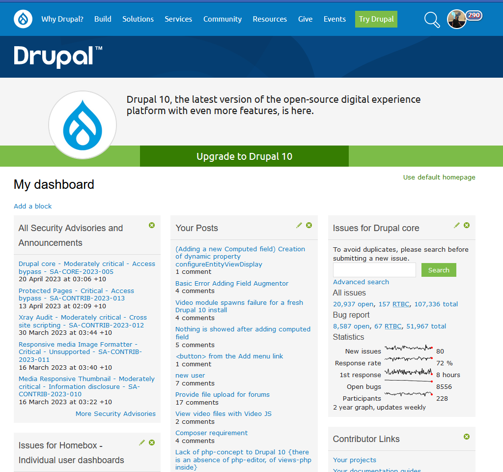
| #6 | My dashboard _ Drupal.org_.png | 108.06 KB | allexim |
| 1.2-updated-normal-size-breadcrumbs.png | 192.08 KB | ressa | |
| 1.1-current-large-breadcrumbs.png | 185.47 KB | ressa |


Comments
Comment #2
drummMoving to the theme used on Drupal.org.
Comment #4
drummI went ahead and reduced the breadcrumb size, this will be deployed the next time Drupal.org is deployed.
We may be able to simplify the breadcrumb markup in
bluecheese_breadcrumb()since all the styles on.new-style .breadcrumbare all contained within the nextspanselector.This is there to make room for the local tasks rendered as a dropdown menu. We would have to do something like scoping the selection with that rule to only match when a page has local tasks. Having 2 local task styles throughout the site is not ideal for maintenance. Before spending too much time on this, we should decide if we want the dropdown or links across the top everywhere.
Comment #5
ressa CreditAttribution: ressa at Ardea commentedNice, thanks @drumm, and for the great work you do on maintaining drupal.org, I very much appreciate it. Have a nice day.
Comment #6
allexim CreditAttribution: allexim as a volunteer commented@ressa, i was inspired by your idea to suggest something which could make the drupal website looking better.
My suggestion:
dashboard user menu badge - counter of watched topics and etc.
