
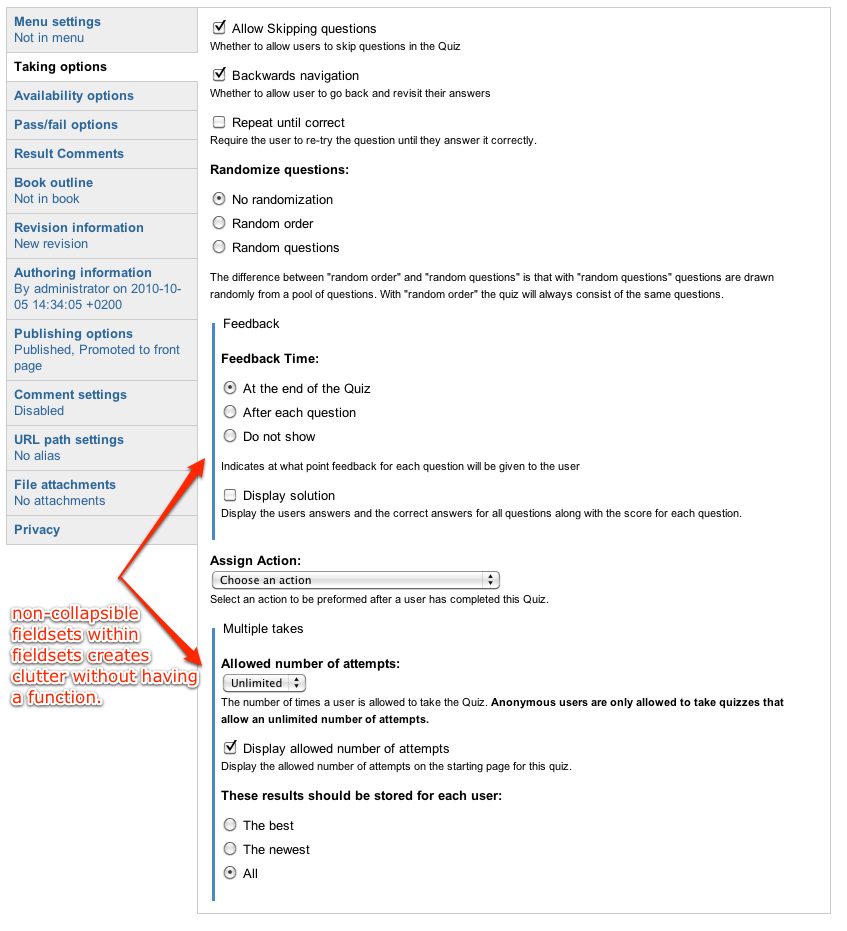
Found a few minor issues that should be easy to change, but would make Quiz look nicer and more consistent. A few places configuration options are placed within non-collapsible fieldsets within other fieldsets, which has two effects:
- They have no effect :) You can't collapse the fieldsets to save space, and you probably wouldn't want to do this either as they contain very few fields anyways.
- They clutter the UI with undesired visual effects: Fieldset headings does not look like the other headings, and some sections get a border around them while other don't..
I've found this in five places:
- Quiz node form, under "Taking options". First screenshot
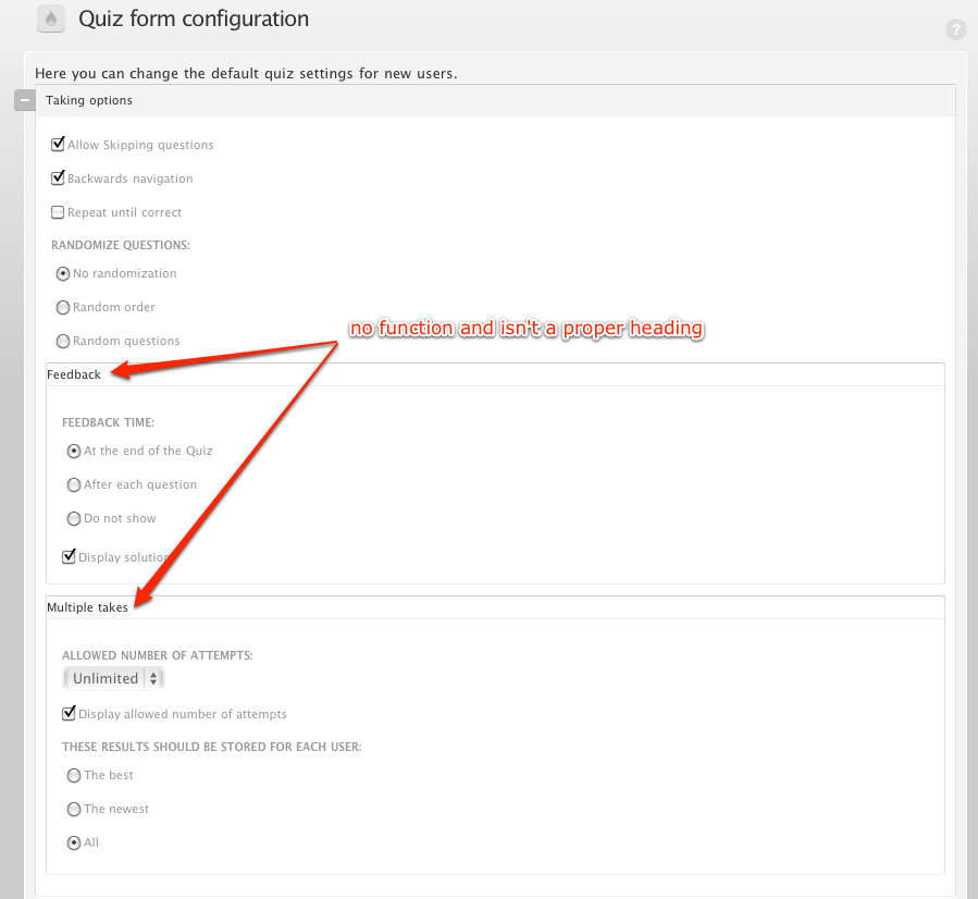
- Quiz configuration -> quiz settings -> Quiz form configuration. Second screenshot
- Quiz configuration -> quiz settings -> Quiz configuration -> Email settings. Third screenshot
- Quiz -> Manage questions -> Browse for questions to add. Fourth screenshot (should be made collapsible, and moved one level up)
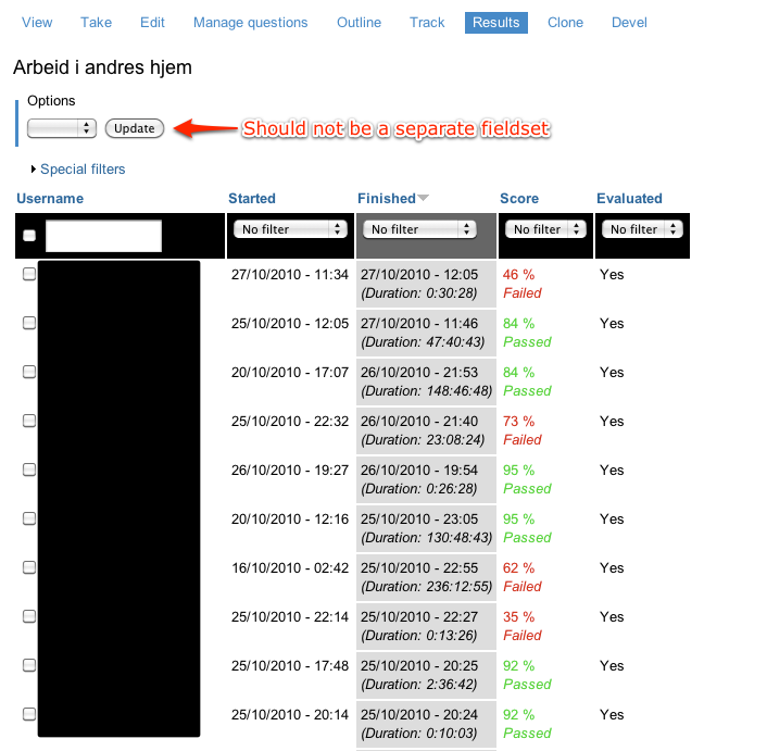
- Quiz -> Results. Fifth screenshot. Just one field here, should not be in a fieldset at all
The screenshots shows the effect in two different themes, one custom and the Rubik admin theme. All themes would display this in different ways, but the main issues would be the same.
| Comment | File | Size | Author |
|---|---|---|---|
| fieldset-in-fieldset5.png | 112.27 KB | vegardjo | |
| fieldset-in-fieldset4.png | 119.33 KB | vegardjo | |
| fieldset-in-fieldset3.png | 119.03 KB | vegardjo | |
| fieldset-in-fieldset2.png | 87.72 KB | vegardjo | |
| fieldset-in-fieldset1.png | 163.39 KB | vegardjo |


Comments
Comment #1
djdevinThis issue is being closed because it is filed against a version that is no longer supported.
Comment #2
djdevinThis issue is being closed because it is filed against a version that is no longer supported.
Comment #3
djdevinThis issue is being closed because it is filed against a version that is no longer supported.