
 Support for Drupal 7 is ending on 5 January 2025—it’s time to migrate to Drupal 10! Learn about the many benefits of Drupal 10 and find migration tools in our resource center.
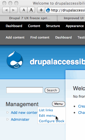
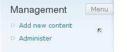
This is a "preemptive followup" to the issue at #473268: D7UX: Put edit links on everything.
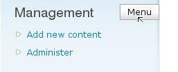
Currently, that patch requires an "edit mode" to be toggled on in order to see the links (such as edit links) that will be attached to page regions in Drupal 7. Currently, once the edit mode toggled on, the links appear on the page as icons, and hovering over them draws a prominent blue border around the region of the page that the link is associated with.
This issue is for figuring out possible improvements to this design, and then implementing them after #473268: D7UX: Put edit links on everything is (hopefully) committed.
Ideas discussed were:
- There should probably be another mode that provides something like "Views-like" behavior (subtle text links that appear when hoving over the page element). How do we support both modes?
- Should there be a mode in which appropriately-privileged users can see the edit links even without having to click a toggle button first? The Views-style links are much less intrusive and might make sense for this (the current blue-border method, although useful, is presumably too intrusive for normal site navigation, so that should probably remain a feature that only appears when the edit mode is toggled on).
In general, I've personally always felt a bit uneasy about the "edit mode" although I can see its usefulness; it seems like one of the main purposes of attaching configuration links to page regions is to make the links visible and reduce the amount of searching and clicks that are necessary to manage a Drupal site, so hiding them by default until you activate a "global edit mode" seems in some situations counterproductive.
| Comment | File | Size | Author |
|---|---|---|---|
| #169 | contextual-links-601150.patch | 1.5 KB | masagin |
| #165 | context_links_601150_165.patch | 672 bytes | seutje |
| #163 | contextual.patch | 2.04 KB | Frando |
| #158 | context_links_601150_7.patch | 4.37 KB | seutje |
| #152 | context_links_601150.patch | 4.57 KB | bleen |


Comments
Comment #1
David_Rothstein CreditAttribution: David_Rothstein commentedIn the other issue, Dries suggested this:
Comment #2
David_Rothstein CreditAttribution: David_Rothstein commentedTagging.
The description above is slightly out of date based on the actual patch that was committed, but in terms of the goals, not really out of date at all :)
Comment #3
David_Rothstein CreditAttribution: David_Rothstein commentedComment #4
Bojhan CreditAttribution: Bojhan commentedMaking this the working issue for, all the UI work on contextual links. We are definitly thinking in terms of hoverable interaction, however we really still have to figure out whether we dock the actions, when we show it, how it behaves upon hover, how we handle many contributed modules ect.
Comment #5
seutje CreditAttribution: seutje commentedsubscribe
Comment #6
mcrittenden CreditAttribution: mcrittenden commentedSubscribe.
Comment #7
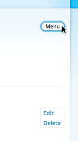
te-brian CreditAttribution: te-brian commentedThe way I have styled it in my dev theme, is to hide the links by default and show them when hovering the contextual div. I have also changed the links from being floated right to being positioned absolutely in the top right corner. This is a little awkward for skinny sidebar blocks but my CSS3-only solution is to make the links slightly transparent and put them inside a slightly transparent container box. A CSS2 solution could use a 1 pixel png, in theory. There is a screencast in the original "edit everywhere" thread if an example would help.
To be honest, however, the absolute position approach is probably not the best for core to take. Most my themes probably will, but I would imagine some themes might bring conflicts with absolute positioning.
Comment #8
David_Rothstein CreditAttribution: David_Rothstein commentedLet's definitely make sure to consolidate the UI work here - there are a bunch of issues floating around, and that's not good. Some relevant links:
Comment #9
yoroy CreditAttribution: yoroy commentedscreencast of the above: http://yoroy.com/elders/drupal/contextlinks2.mov
Gradient is too fancy / not clear enough, but some basic options for icon placement and behaviour. Missing title attributes for tooltips obviously. Etc.
Comment #10
Noyz CreditAttribution: Noyz commentedI just had a conversation with David regarding this issue, and here's my take on it...
In my design #602408: Adjust height of shortcut bar, I added the edit toggle solely to make an existing proposal by Mark work better. I purposely avoided thinking about the problem/solution from the ground up. If I were to think about this from the ground up, I think I'd net out as follows..
Problems with toggle in bar...
1. Exiting users are familiar with the model Views provides (on hover). Views is not going away. Thus, a button toggle is yet another interaction model on top of one that already works and won't be going away too soon
2. Users that choose to use the admin bar vs the d7 toolbar, are —at the moment— out of luck.
3. The toggle, was meant to edit content (nodes, or views). It was not meant to edit things in the administrative section like blocks, page orientation text (e.g., how to use the module page). Stuff in the admin section automatically have editing capabilities via the "put edit links on everything issue." These two solutions are not working together.
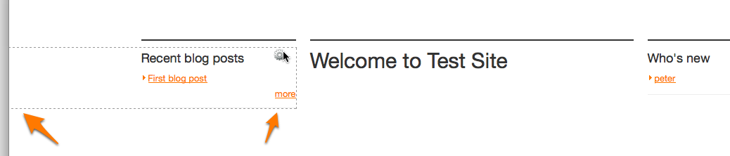
Given these problems, and the fact Views isn't likely to change, I believe I'm in favor of loosing the "edit page" toggle and going for more of a View's like interface. For example, if a user has edit rights, on hover, they would see a dashed box around the editable item with the ability to edit or delete (the dashed box helps to show the boundaries of what's being edited).
Another alternative might be to do both. Start with the Views model. If users want a button to toggle, make it a setting.
Comment #11
JacobSingh CreditAttribution: JacobSingh commentedOkay, here is a first stab @ contextual links:
Comment #12
JacobSingh CreditAttribution: JacobSingh commentedComment #13
JacobSingh CreditAttribution: JacobSingh commentedI like yoroy's shots, but can't see the screencast for some reason.
Also, I'm unsure what it is trying to show, without icons it's a little hard to make this a reality. For now, just made the links show on hover only.
Comment #14
sunSummary based on what I'm able to recall from recent discussions:
1) There can be up to 6 contextual links attached to an element. Technically, there could even be more, but more than 6 are not easily comprehensible/usable.
2) Multiple icons are out of the loop for D7. Especially, because we do not know yet, what kind of contextual links contributed modules will add to elements.
3) The most simple and flexible design approach would be the approach that Panels 3 is taking: Have only one icon that expands/shows a list of text links on hover or click (basically like in the first variant of yoroy's screenshot in #9, but more like a "fly-out" menu that's triggered by a single icon on top or next to it).
Comment #15
yoroy CreditAttribution: yoroy commentedAnimated prototypes:
1. http://www.yoroy.com/elders/drupal/contextuallinks-slideout.html
Works well for a limited number of links
2. http://www.yoroy.com/elders/drupal/contextuallinks-slideout2.html
Same as 1, but with background per link. These need a solution for wrapping over 2 lines.
3. http://www.yoroy.com/elders/drupal/contextuallinks-slideout3.html
Vertically stacked list, better suited for a larger list
Comment #16
sunIMHO, 3) is the way to go.
1 or 2 won't work in all themes, because they require very large regions/containers (in width).
Comment #17
mcrittenden CreditAttribution: mcrittenden commentedThanks for putting that together, yoroy. I'd agree with sun that #3 is the way to go just since it's the most reliable. However, I'd like the links to be right aligned instead of left so that they're flush with the box's boundary.
Comment #18
yoroy CreditAttribution: yoroy commentedAgree with number 3 being the option that scales best. But we won't align them to the right. We're still reading from left to right, and the list gets much harder to scan if the left side of the list is jagged. (And the other way around for right-to-left languages of course)
Comment #19
webchick#3 looks dead-sexy awesome. Let's get a patch!
However, I'm tagging as "needs accessibility review". We want to make sure we don't make it impossible to get to these links if you don't have a mouse.
Comment #20
mcrittenden CreditAttribution: mcrittenden commentedYeah, thinking about it more, you're right.
Comment #21
ksenzeeI can whip up a patch if nobody else is volunteering. I have no time for it, but the text links are driving me insane.
Re accessibility: We can add keybindings to take care of the mouse problem, but I don't know whether or not that's enough to address the entire accessibility issue. Hopefully someone will weigh in.
Comment #22
mgiffordPersonally I like this. Looking forward to Drupal blocks & edit features having this functionality.
Unfortunately, hover is pretty mouse specific. Is there a focus equivalent that we could use for jQuery? I don't think this feature will be at all accessible to people with most assistive technology at the moment.
Want to see this get into core though as it's pretty cool. Will try to think some more about this problem.
Comment #23
Everett Zufelt CreditAttribution: Everett Zufelt commentedAs I understand it the suggested solution is to have links fly out on hover of an icon. Is it not possible to make the fly out functionality (whether jQuery show(), or adding the links to the DOM) actionable both on hover and on click?
If I don't have the correct understanding of the suggested solution please let me know, the animated examples are not helpful to my understanding.
Comment #24
sunOf course, we can bind the fly-outs to both .hover() and .click(). Not a problem at all. If that solves the accessibility issue, we're in shape.
Comment #25
ksenzee@Everett, here's the play-by-play on the animated example: You hover over a block, and an icon appears in the top right-hand corner. You click on that icon, and a list of contextual links appears beneath the icon. If I understand correctly, you're suggesting this addition: You hover over a block or click on that block, and the icon appears. Click on the icon, and the list of links appears.
If that's correct, then sun's right, we're good to go.
Comment #26
sun1) Initial state of icon: .element-invisible (still visible for screen-readers)
2) Hover container: no longer .element-invisible
3) Hover or click icon: Link list appears
Comment #27
mgifford@sun This sounds like a good improvement, but it still doesn't sound like it will work for keyboard only users. Can we set the initial state of the icon so that you could tab to the icon? I think we should be able to get it to work like the Skip to Main Content link in the Garland theme.
Comment #28
Everett Zufelt CreditAttribution: Everett Zufelt commentedI think that the combined suggestions of Sun in 26 and mgifford in 27 should resolve this issue. I am assuming that the icon only appears if some setting is toggled on, and that the functionality from the links is there for convenience, and could be accessed through some other section of the admin UI.
Comment #29
webchickYay! Everett's back! :D
Yes, that's true. The contextual links are just exposing regular local tasks (tabs) in a more convenient fashion. For example, there is nothing about contextual links that prevents you from navigating to admin/structure/block and clicking the "configure" link in the table next to any of the blocks there. If there are any contextual links that expose actions not available anywhere else, we definitely need to treat that as a critical bug, but I don't immediately see how that's possible.
Comment #30
yoroy CreditAttribution: yoroy commentedAllright, we've got ourselves a plan, setting status accordingly.
Comment #31
webchickAlso tagging this as one of the issues I'd like to see focused on for UX freeze.
Comment #32
seutje CreditAttribution: seutje commentedI'd just like to point out that slapping a class on it that would hide it onload would break the functionality when js is turned off unless u make the hiding selector relative to html.js, which mean sun's 1) isn't a very good idea as elements with that class are hidden with or without js on
.hide() onload is also not a very good idea, as this makes it pop up onload but then disappear as soon as doc ready is called
Comment #33
te-brian CreditAttribution: te-brian commentedIs this a feature people without js would even want to use? I love the contextual links, but not when they clutter the page. Since this is an enhancement for administration, not a replacement, it does not HAVE to work in all situations... although I guess as a core feature it should work for most. Bah rambling.
Comment #34
sunI don't think that contextual links need to work without JS. Make 'em accessible, sure. But degrading for non-JS? No, that'll break almost every theme out there.
Comment #35
seutje CreditAttribution: seutje commentednot even a simple .container-class:hover so non-IE non-JS users still see it? bah
Comment #36
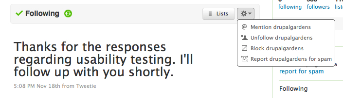
Dries CreditAttribution: Dries commentedI also like how Twitter does it.
And if you click the cog:
Comment #37
kika CreditAttribution: kika commentedAgreed, "gearbox" icon for preferences/settings seems to be moved away from Mac to wider consciousness. I was about to suggest the same.
Comment #38
Bojhan CreditAttribution: Bojhan commented@Dries Thats basically what we where suggesting in #15 number 3.
Comment #39
bleen CreditAttribution: bleen commentedSuperscribe
Comment #40
masagin CreditAttribution: masagin commentedI've made a proof of concept patch according to the 3rd yoroy's animation. I've used button instead of an icon for testing purposes. Screenshots included.
Comment #41
yoroy CreditAttribution: yoroy commentedtest bot?
Comment #42
mgiffordDoesn't seem that this patch touches on these suggestions here:
http://drupal.org/node/601150#comment-2276670
I'm also pasting up some screenshots from my Mac in FF 3.5.5
Comment #43
bowersox CreditAttribution: bowersox commented+1 for this concept.
In Safari 4 on Mac it works as desired and looks right (screenshot attached). The hover opacity and menu work fine, but this still needs keyboard support as @mgifford said, based on @sun's outline in #26.
Comment #44
masagin CreditAttribution: masagin commentedI have Safari 4.0.2 only so I can't debug this. Anyone?
New patch with .element-invisible class used, as suggested.
Comment #45
masagin CreditAttribution: masagin commentedAlso changed the button to link. It works better with the .element-invisible class and will be easy to change to an icon (image replacement).
Comment #46
masagin CreditAttribution: masagin commentedtest bot?
Comment #47
kika CreditAttribution: kika commentedTested last patch -- it seems the dotted border when hovering over block is not there any more?
Comment #48
masagin CreditAttribution: masagin commentedRight, I removed that because it seemed a little bit overwhelming when both outline and icon appeared on hover. But that's easily fixable detail in contextual_links.css on line 10. I'm leaving that for discussion.
Comment #49
masagin CreditAttribution: masagin commentedAs I've just heard that the outline was discussed thoroughly already, I've put it back.
Comment #50
mgiffordThanks for including element-invisible. The output is definitely an improvement:
The button changed to just a text link.
Is there anything presented under the menu links that couldn't be obtained by a number of other ways? This is just convenience, right?
Comment #51
mcrittenden CreditAttribution: mcrittenden commented@mgifford:
Yep.
@bganicky:
+ // wrap the contextual links with a helper divThose JS comments should be complete sentences (upper cased first word, ending punctuation).
.js .block ul.contextual-linksDon't have time to apply and test at the moment, but does this mean that the contextual links are only hidden by default on blocks? What about menus and nodes?
Otherwise, great job bganicky. Looking forward to this getting in there.
Comment #52
mcrittenden CreditAttribution: mcrittenden commentedWhoops.
Comment #53
masagin CreditAttribution: masagin commented@mcrittenden
Thanks for suggestions! I've fixed those comments and removed the ".block" from the selector. Also did a minor performance tweak with caching the region's jquery object. Here's another iteration.
Comment #54
mgiffordI'm removing the accessibility review at this stage. The use of element-invisible makes these links available to screen readers. I don't think that having no access will bother keyboard only users. Adding it may well reduce the accessibility for keyboard only users.
Thanks for the opportunity to review!
Comment #55
masagin CreditAttribution: masagin commentedI think I'm able to do this keyboard accessible pretty easily. Will send a patch later today...
Comment #56
yoroy CreditAttribution: yoroy commentedScreencast of the patch in #53:
http://vimeo.com/7801809
Working quite nice already! It's great to see designs come to life like this.
Review:
- Entering a block/node container highlights the 'menu' link (to become a gear icon) as desired.
- I expected the context links to become visible on *hover* of the menu. This is now a click. (I now realize this wasn't clear from the design spec or protoypes either. It may well be that click is better, but I'd like to feel how expand-on-hover works.
- Consequently, the "click-to-show" feels a bit at odds with the "roll-out to hide" interaction.
- The prototypes show each link seperately fading in, moving down. Here this is 1 block of links that fades in, which is less elegant. Can we see an animated fade that lets us treat each link individually?
- Links shown do not have hover effects etc. but that's up to us to design.
- This obviously should be tested on humans to see how it performs. In the meantime will ask Bojhan to drop by as well here.
Watch this thread if you wouldn't mind posting a little screencast of the next version of this.
Comment #57
sunPlease keep the animation effects minimal and speedy. This is usually only visible to admins, and, nifty but slow animations will hinder your administrative work. KISS, or, form follows function.
Comment #58
ivansf CreditAttribution: ivansf commentedI don't mind seeing an animation but as #57 mentions, it should be as fast as possible.
Comment #59
seutje CreditAttribution: seutje commentedthe menu link is really squished against the right border, maybe give it some space to breathe
and the menus are just begging for a border, overlapping stuff with the same background-color and no border are just weird to see
Comment #60
Bojhan CreditAttribution: Bojhan commentedSo reviewing what is in there so far.
- We need an icon, this to make the clear visual distinction that we need between Admin UI stuff and Theme layer stuff. This can for now simply be a gray box, as outlined in yoroy his sketches.
- I do feel its unlikely to hover this item, just randomly (although thats probably likely) - we should see how click vs hover works, before we make a decision here. Click to me is less favorable, as its an extra action.
- Apart from roll-out, we could also do a "pop-in" interaction? (Hard to explain) From the icon, the menu links grow. So they slowly become bigger, kind of like a balloon?
- We should stop using the dotted-line concept.
I think this concept was flawed from the start, it has admirable qualities but it tends to only bloat the screen and cause confusion - because they draw so much attention. The icon itself should already give enough scent over location.
Comment #61
sunNote that the outline provides a visual hint on the "target" of contextual links. There may be cases, in which there are contextual links for both a surrounding container (f.e. block) as well as the block's content (f.e. "rows"). An example for that may be a block that contains a view of node teasers. Hence, each row in the block will expose contextual links, but also the block itself. Without the outline, you won't immediately know to which thing a set of links belong, especially when considering the first row (node) in the block.
Comment #62
Bojhan CreditAttribution: Bojhan commented@sun I agree, but to that argument there are also many reasons not to do it :
- The lines going over a particular other line of a block
- Because of the inheriting, it will be fairly hard to see it either way.
So I agree on this point, but I do see the confusion it causes as just an important issue.
Comment #63
sun1) It's an outline, not a border. Outlines take no visual space in the browser rendering, so they always clash with other things, but they are also always rendered _above_ everything else.
2) Not sure which inheritance you mean. The outline of aforementioned block example will surround the entire block, containing all node teasers. The outline of the first node in the block will surround only the first node, the second only the second, etc.
Comment #64
Bojhan CreditAttribution: Bojhan commented@sun I mean the user confusion over the prominence of that particular highlight. I am not arguing the difficulty of seeing to which block the contextual action belongs, I am arguing the prominence of that use case in the visual design is to big right now.
Comment #65
sunAgreed on that. We can (and should) remove the color of the outline, i.e. instead of super-prominent blue, make it light-grey.
Comment #66
yched CreditAttribution: yched commentedI strongly support keeping a (lighter) outline. In D6 with a couple panels and views, context links can become quickly confusing.
We're designing this over simple pages, but without a border we'll be lost pretty quick.
Comment #67
masagin CreditAttribution: masagin commented@sun
It really IS a border. I suggest changing it to outline, even if that doesn't work in IE6 and IE7.
@bojhan
I tried it without the outline and it really didn't work well in "small block" scenarios (one line for example).
As for the icon, it's just a matter of image replacement. Gimme some icon and tell me where to put it in the Drupal file hierarchy. :)
Comment #68
JohnAlbinsubscribe
Comment #69
ivansf CreditAttribution: ivansf commentedI haven't created a patch in a long while but I made a small modification to make it work with hover instead of having to click the actual menu link.
Comment #70
JohnAlbinAnd if the block contains links that are displayed inline or right-aligned (and, thus, will be very close to the contextual links icon), then it becomes even harder to click on that content link if the contextual links keep expanding anytime the mouse gets too close to that icon. It will difficult enough to try to click the right spot (the content's link vs. contextual links), let's not make it harder. I think we should leave contextual links icon as needing a click to activate the expansion.
Comment #71
masagin CreditAttribution: masagin commented+1 on clicking only (and keyboard tabing)
Comment #72
mcrittenden CreditAttribution: mcrittenden commented@JohnAlbin: I don't understand. Why is clicking harder than hovering? Are you saying that if it activates on hover, then people will accidentally activate it when trying to get to close-by links?
Comment #73
yoroy CreditAttribution: yoroy commentedPlease don't *think* too much about these things people. Try the patches and experience it. It may well be that one or the other is obviously better, ony way to know is to actually use it.
Comment #74
bleen CreditAttribution: bleen commented@yoroy agreed...
So I tried out the patches last night from #53 & #69 and I think that hover is going to create problems in certain circumstances ... I vote for click
Comment #75
yoroy CreditAttribution: yoroy commentedHere's an icon to try out
Comment #76
seutje CreditAttribution: seutje commentedthe menu disapears on mouseleave, but if u click "menu" and mouseleave the block without moving over the actual menu, it won't disappear
this could easily be solved by using ye olde
otherwise, I'm afraid u'll have to do some nasty fake mouseleave/mouseenter stuff
Comment #77
masagin CreditAttribution: masagin commented@seutje
what patch you were trying?
Comment #78
seutje CreditAttribution: seutje commentedboth 53 and 69 behave the same way as far as this bug goes
Comment #79
sunThere is absolutely no need to make this work without JS.
Revamped implementation, started from scratch.
Comment #80
Dries CreditAttribution: Dries commentedI tested both approaches and I prefer the 'click' approach (over the hover approach) myself. This also seems consistent with what other (web) applications do; e.g. http://twitter.com and others.
Comment #81
sunConverted to click. Next to some more neat styling, also needs some UX tweaks (e.g. arrow/trigger should not vanish when links are visible).
Comment #82
eojthebraveFixed the problem with trigger link vanishing when links are visible.
Took a stab at adding some fancy styles. Open to suggestions.
Also, used the cog image provided by yoroy in #75, modified to provide an on/off state. To get the full effect of the patch you'll need to grab the attached cog-select.png and place it into misc/cog-select.png
Comment #83
seutje CreditAttribution: seutje commentedthat background-position causes the image to disappear when hovering the the trigger itself
that's a bit of a nasty way to hide text, offset to the left instead of to the right so u don't have to use overflow:hidden
the display:none; causes it not to take any space, when hovering it will suddenly start taking space and might trigger a wrapping in the block, see this screenshot (before hover) and this screenshot (after hovering) and notice how the search button is bumped down one line all of a sudden
javascript:void(0);is ew, use href="#" and return false plz likeor even
and then just return false in the toggle functions
so the list of links fades, but the cog background appears right away? this looks rather odd, can we just drop the fade and work consistently on both with a class that instantly shows it?
but if we're dead set on using a fade animation, we should rly kill all animations on it before initiating one using .stop() before the fadeIn() or fadeOut() calls, this might not occur a lot with a duration of 100ms, but I can imagine this causing weirdness when clicking it rapidly like a deranged maniac
aside from these quirks, I kinda like how it looks, even if it's a pattern used nowhere else in core
there's some other weird css stuff going on here, but I'll have a looksie at that later, running kinda late for work now q.q
Comment #84
yoroy CreditAttribution: yoroy commentedThe triangle in the icon should be visible from the start, it's a commonly used indicator for "more than 1 choice behind this". Needs work as per seutjes review
Comment #85
eojthebrave@seutje, thanks for the feedback. Attached patch should address all the issues. I switched the display of the contextual links icon and menu to use absolute positioning and a z-index so that it does not interrupt the flow of content on the page. However, this causes a bit of an issue when the icon appears over the top right corner of the search block submit button. One possible solution would be to position the icon just outside the top right corner of the block, though that would cause problems if the block was flush with the top of the browser.
@yoroy, new patch uses your icon from #75 verbatim. I still think it would be nice to have a :hover state for the icon but not essential and agree that leaving the triangle visible from the start is the right choice.
Comment #86
eojthebraveul.contextual-links was displaying list-style-images in IE still. Fixed.
Also worth noting, you'll need to grab the cog-select.png image from #75 and place it in misc/cog-select.png
Comment #88
eojthebraveOops. Bad paths.
Comment #89
pwolanin CreditAttribution: pwolanin commentedPatch generally seems to work fine for me, though I was a little confused at first that the only border shows up when hovering over the icon.
Also, I think there is an issue with putting the things way off to the left in how the border appears. At least for me - the border always continues past the left edge of the window.
Comment #90
pwolanin CreditAttribution: pwolanin commentedSee screen shots for the problem caused by
text-indent: -999em;Comment #91
yoroy CreditAttribution: yoroy commented- Finding it weird that you have to click again to close, and that expanding another one doesn't collapse the previous one.
- Seem to remember from previous versions that the whole width of the top was sensitive to show the icon/outline on hover and clickable to expand, was this a deliberate change?
- Designwise I'm surprised to see a whole other visual direction introduced without any supporting arguments. Except for the icon place holder, the prototypes in #15 above were very much designed already. Overall I think it's too heavy handed and too Seven specific, this functionality is exposed in the front end, I'd prefer it to styled lighter than this.
- Would still prefer to see a version that replicates the exact animation effect as demo'd in #15, where each item fades/drops in individually.
Comment #92
seutje CreditAttribution: seutje commenteduh-oh, looks like we uncovered yet another bug that only occurs in FF, doesn't occur in webkit or IE
it seems to be related to block-level elements with negative text-indent that reside within a wrapper with an outline, it causes the outline to wrap around the hidden text (which is all the way to the left), possible fix:
overflow:auto; also works to fix the issue, but I don't think that's a good idea in this case
isolated testcase and the sauce
attached patch tries to fix this and changes this
to this
seems cleaner that way
Comment #93
seutje CreditAttribution: seutje commentedafter a chat with sun on IRC, it seems better to just stick with the right offset of 34px
Comment #94
pwolanin CreditAttribution: pwolanin commentedI agree with yoroy that the links staying expanded is a bit odd.
This now seems to work more as expected on FF3.5
Comment #95
Dries CreditAttribution: Dries commented1. Somehow the border and the cog are not showing up simultaneously. I can have the cog show up but not the border. That looks like a bug to me?
2. The placement of the arrow seems to be a bit too close to the cog and also too low. Can't we style it like Twitter does; see #36?
PS: I'm using FF on the Mac.
Comment #96
pwolanin CreditAttribution: pwolanin commented@Dries - I only see the border when hovering over the cog
Comment #97
eojthebrave@Dries, with regards to "styling it like Twitter" are you referring to just the cog icon and using yoroy's styles from #15, or the entire menu like Twitter's?
Comment #98
sunOnly the icon. The menu styling is ugly.
Comment #99
eojthebraveAttached patch makes it so the dashed border appears whenever your cursor is over a .contextual-links-region. It also makes it so that moving your mouse out of a region will close the menu for that region. No longer requires click to close menu.
Attached cog-select.png should go into misc/cog-select.png - this is a slightly modified version of the one in #75 with the arrow placed higher and slightly further away from the cog.
Finally, there's a screenshot with a couple of different menu styling ideas. The one implemented in this patch is #1, and is modeled after yoroy's earlier suggestions. I personally like the ones that define the space that the menu contains a little more. Especially when the menu appears over a white background it can be a little unclear what is going on.
Comment #100
seutje CreditAttribution: seutje commentedI didn't see any rounded corners in the original design, personally, I think it'll be hard to make this somewhat fit in with any theme, how's this? -> http://gyazo.com/ceb9c337ac075bfd6aa6c43bffbe7fb9.png
Comment #101
Dries CreditAttribution: Dries commentedI committed the patch in #99 but I think we need to work on better styling. The current styling (i.e. styling 1 in the screenshot) is not my favorite so let's follow up with more styling patches. Good progress nonetheless -- let's just make it look prettier now. Not changing the status.
Comment #102
eojthebraveOh. I like the mock up in #100.
Couple things to keep in mind while thinking about this.
1. Since the majority of people/themes are unlikely to change the design of this we want to make sure that menus are going to look decent and be useful in as many situations as possible. They should be simple and unobtrusive.
2. The menu will be expanded over any number of different background colors and needs to be legible in all situations. What will it look like over a black background, a white one, a hot pink one?
3. It may be worthwhile to have a background color behind the cog icon when hovering over a region but not having clicked on the icon yet. In some cases the icon could be layered over the top of another element on the page and could easily get lost.
Comment #103
David_Rothstein CreditAttribution: David_Rothstein commentedThis is great stuff.
This was fixed via the patch in #99, but I assume the original behavior was actually somewhat intentional? The rationale for showing only the cog when you hover on the region (and then showing the border when you hover on the cog), is to keep this from being too intrusive. See, for example, the screencast by @te-brian (http://screenr.com/XcN) for how it is designed to work that way.
The issue is that since we don't seem to be going in the direction of a "global edit mode" (in core), the contextual links show all the time for people who have permission to see them. So there is then a tradeoff - always showing the borders is definitely more clear, but with this patch, I now see a border almost any place I put my mouse, even while I'm just browsing my site and not thinking about editing anything. (The fact that the border is no longer bright blue definitely helps, but still a bit intrusive.) What is the ultimate behavior we want here?
Comment #104
te-brian CreditAttribution: te-brian commentedI agree with this assessment but its a tricky point. For a truly novice user, showing the border anytime the cog is visible is probably the most clear. However, after some minimal familiarity with how contextual links work, and where and why they appear, the less intrusive they are the better. As David said, we as admins and even lower level users such as editors and contributors should be able to browse their own websites with reasonable comfort. If distracting borders and lists are popping up when I am just trying to catch up on comments on my blog, then I think we have over-engineered the feature.
Comment #105
Dries CreditAttribution: Dries commentedIf distracting borders and lists are popping up when I am just trying to catch up on comments on my blog, then I think we have over-engineered the feature.
Well, that is why the original design had a toggle ...
Comment #106
eojthebraveSo, just so I'm clear. The intent is to add a "toggle" switch that puts a page into editing mode. As per the design in #602408: Adjust height of shortcut bar. When a user first comes to a page editing mode is disabled. Clicking the toggle places the page into editing mode at which point placing your cursor over an editable region causes the region to get outlined and the cog icon to be displayed.
If we do go down this route is there any reason to not just display all the edit icons on the page immediately when someone toggles editing mode? This makes it easier to discover which regions are actually editable since you'll have a visual indicator without having to first move your cursor over the region.
When editing mode is toggled should it persist from page to page?
What else does toggling editing mode do other than make the contextual links available if anything?
Sorry for all the questions, I'm coming into this one a little late and just want to make sure I'm on the same page as everyone else.
Comment #107
sunAnd that's why it should be a module. @!§&$)§!%)(
Discussion about an editing-toggle-mode or whatever does not belong into this issue.
Comment #108
Dries CreditAttribution: Dries commentedMy comment was on topic and a reply to the previous comment. Discussion about making this a module doesn't belong in this issue either. Please control your emotions.
Comment #109
eojthebraveDiscussion of wether or not we need/want a toggle for editing mode: #648370: Implement a toggle for display of contextual links
If so, discussion of what that should look like: #602408: Adjust height of shortcut bar
And, lets continue brainstorming what we want the contextual links menu itself to look like in this thread.
Comment #110
seutje CreditAttribution: seutje commentedThe current styling looks like something went wrong or some styles didn't get applied or something
I'm more than willing to work on this, but I have no clue what it should look like so I'm kinda sitting on my hands
Comment #111
yoroy CreditAttribution: yoroy commentedeojthebrave et all: discussion of conctextual kill switch is already going on in #616618: Allow contextual links to be disabled
Comment #112
eigentor CreditAttribution: eigentor commentedwasn't there an issue on toggling the contextual links? Personally was a fan of the behaviour of #88 because it is less obtrusive.
A nice "wanna get rid of silly borders? Click here" would be handy :P
So how about getting this in the game again #616618: Allow contextual links to be disabled
Comment #113
David_Rothstein CreditAttribution: David_Rothstein commentedLet's do the following:
1. Use this issue for continuing to implement a contextual links design assuming the "always-on" behavior, since that's what's in core now.
2. Use #648370: Implement a toggle for display of contextual links (which I reopened, since it's more focused than the other meta-issue) for possibly implementing a UI for "toggle-able" contextual links.
We don't have to even completely decide yet whether one, the other, or both belongs in core - both modes have their use cases, and anything that doesn't wind up in core could easily become a contrib module, so the work in either issue won't go to waste.
Comment #114
joachim CreditAttribution: joachim commentedI really don't like the cog icon.
In general, could we not put little icons on everything? They are fiddly, hard to understand (I don't even know why a cog means 'edit'?), and look a bit lame. Drupal core has managed to avoid little icons by and large; this is a good thing, let's keep it that way.
Comment #115
mcrittenden CreditAttribution: mcrittenden commented@joachim: The icon's added via a CSS background image, so it's trivial to change it out with a different image or remove it altogether. In general, I'm against putting little icons all over the place, but this is one of those situations where it really makes sense, IMHO. Otherwise, you're stuck with links that say "Configure" all over the place, and we all know that most themers are going to be too lazy to change stuff like that.
That said, the styling is still up for discussion so feel free to pitch in with other ideas.
Comment #116
yoroy CreditAttribution: yoroy commentedI admit I went a bit over the top with that first icon. This is a smaller, less blingy one with dedicated up and hover states.
What I didn't manage to do but needs changing is to show the dashed outline on hovering the cog not on hovering the block area. It will take away much of the restlessness when mousing over the page.
Comment #119
eojthebraveProbably needs to be re-rolled for this #626286: Make contextual links a module
Comment #120
drifter CreditAttribution: drifter commented#116 rerolled for "contextual" module, put the icon attached to #116 into modules/contextual/images.
Comment #121
bleen CreditAttribution: bleen commentedthe latest build from HEAD seems to be missing misc/contextual_links.css
Comment #122
kika CreditAttribution: kika commentedHere's some nice styling. http://guzzle.it/ Use case is almost the same as for us.
Comment #123
webchickI like the less blingy icon, I like the styling from guzzle.it, and I really like the idea of the outline only showing up when you hover over the gear and not over the region. Keep it up. :)
Comment #124
joachim CreditAttribution: joachim commentedYup, the less blingy line art style icon on http://www.cyclestreets.net/ is better.
I'm still not sure why a gear should mean 'edit' but if it's used elsewhere I guess it's on its way to becoming a defacto standard.
Comment #125
webchickWell. The gear doesn't mean just edit though. It means any arbitrary local task that's exposed as a contextual link. For blocks, that might be "configure", for nodes that might be "edit, delete, put into moderation queue" etc.
I think a gear is a good icon for "There's administrative-y things you can do here."
Comment #126
sunbtw, this "thing" is more commonly known as "gear". No clue who came up with "cog", but I had to look up my favorite English dictionary what that means.
I vote for renaming the image filename while being there.
EDIT: Also not sure WTF that "-select" suffix in the filename is for.
Comment #127
kika CreditAttribution: kika commentedRemember mechanical clock -- shiny dynamic time visualization in front side, flip it around and you will get the gears and other mechanisms to tinker. "Under the hood" is similar parallel in car world.
Because of this nature it seems a better fit to "widgety" things in Web rather than "documenty" things where "edit" is more natural flipside action. But this is just a feeling.
It's no way universally grokable icon, but it seems it's usage as symbol has hit critical mass so it is not understandable because it is intuitive, but because you have probably seen it elsewhere.
BTW, any change to user test this?
Comment #128
eigentor CreditAttribution: eigentor commented+1 for only showing borders when hovering the cog. Who is a good guy, a better coder than me and can reroll it with this behaviour?
Comment #129
yoroy CreditAttribution: yoroy commentedsun: Just because you don't understand it doesn't automatically make it a WTF. Could you please keep the conversation a bit more polite, it's getting obnoxious at times. Thanks.
Comment #130
yoroy CreditAttribution: yoroy commentedAlso, would you believe it, Mark Boulton has designed us a gear already: http://www.flickr.com/photos/mboulton/3748580107/sizes/o/
I extracted it, added the triangle and made it a sprite with two states.

Comment #131
yoroy CreditAttribution: yoroy commentedPartial patch, should make it look like this:

To do:
- show the outline on hover of the gear, not the region. I don't know how to do this, I'm pretty sure it's something sowmwhere in contextual.js though :)
- bordered box around the gear, connecting it with the links below it. This only needs to be on expanded state, not on:hover
Comment #132
bleen CreditAttribution: bleen commentedEDIT: Ignore this patch (it combines 2 patches) and use the one in #133
Comment #133
bleen CreditAttribution: bleen commentedThis patch expands on #131 and includes the two @todos ... only test on Mac (FF3.5, Safari4 & Chrome)
...I think we're really close
Comment #134
bleen CreditAttribution: bleen commented...and here is the patch from #133 without whitespace
Comment #135
seutje CreditAttribution: seutje commentedRemoved border-radius-topright of the
<ul>and added border-radius-topright and border-radius-topleft to the<a>before & after
also, this seems a bit repetitive, any way we can shorten it or reuse some parts?
Comment #137
seutje CreditAttribution: seutje commentedheh, how did I manage to screw that up? o.O
let's try this again, shall we?
Comment #138
bleen CreditAttribution: bleen commentedcouldn't this be
Not a big deal .. but its a bit less code.
As for the repetitive code in the js (#135) I tried simplifying it when writing the original patch but was having scope issues. Anyone want to take a swing?
Comment #140
seutje CreditAttribution: seutje commentedI seriously don't get why it fails to apply o.O
@138: I considered this but it feels a lot like yet another override and it's within the same bit, but I have no objections to it
for the repetitive bit, I was thinking something like
or even
but I guess that might make it a lil hard to read, and I seem to fail miserably at rolling a patch anyway
Comment #141
bleen CreditAttribution: bleen commentedLets give this a whirl ... it removes the rounded corner topright and it uses option A from #140. Option B was working weird for some reason.
No wammies, no wammies, no wammies ...... STOP!
Comment #142
bleen CreditAttribution: bleen commentedwhite space - BLAAAARG!
I think textmate hates me
(same as #141 w/o white space)
Comment #143
seutje CreditAttribution: seutje commentedteach me your CVS-fu!
seriously, I dunno what I'm doing wrong
but uhm
eh?
Comment #144
ksenzeeThat's just because there's no newline at the end of the file. :) Add a newline and that hunk should go away.
Comment #145
sunAnd the patch even tells you. ;)
This review is powered by Dreditor.
Comment #146
bleen CreditAttribution: bleen commentedhere we go ... no silly hunk
Comment #147
seutje CreditAttribution: seutje commentedups, didn't mean to change it to needs work... nothing seems to cooperate with me today :(
Comment #148
ksenzeeNow that the code is looking good I tried it out. It's lovely--so much less intrusive. I've been quite sure all along that contextual links would be a killer feature, but this is the first time they've actually *felt* like a killer feature.
Comment #149
suntransparent will add a white border.
px is superfluous here.
This either needs to specify an image, too, or use background-color instead.
Missing space after anonymous function.
toggleClass() is not reliable in this context.
.find + .end + further chaining should be wrapped on multiple lines, so that it is clear where the selector of .find starts and ends, and where a new begins.
This is inconsistent now. The idea of abstracting those out was to allow themes to easily override the hover behavior only. It's possible that this was a nonsense idea, but perhaps not.
I'm on crack. Are you, too?
Comment #150
bleen CreditAttribution: bleen commentedI rerolled with most of Suns suggestions (didnt know that about transparent borders ... hmph) from #149
The only two I didnt change are:
How come? I don't see why this would ever fail unless someone has used js to remove .contextual-links-region ... but that seems silly
I dont think this is necessary at all, but if others disagree that's fine. Not sure how we'd make this patch work in that case though....
Thoughts?
Comment #151
sunre: toggleClass() - because you assign it to multiple elements. Hence, depending on user interaction but also the site's theme, the events of both elements can be triggered subsequently. In effect, your logic will be reversed.
The first one is more commonly used.
Now we are doing two times the same. You can do this instead:
$wrapper.prepend($trigger);
$trigger.add($wrapper).bind(...
Wrong indentation here. Would be more visible, if .find() would be on its own line.
This hover tries to call a function that is removed.
I'm on crack. Are you, too?
Comment #152
bleen CreditAttribution: bleen commentedI reworked a good chunk of the js so the code is (a) cleaner and (b) functions better. Now the links close when you roll off the links and/or when you roll out of the whole region.
There is one weird case: click on the gear and move your mouse horizontally to the left w/o rolling over the list of links. Note the links don't close.
If I add the behavior that rolling off the gear closes the links, then the links would close every time you try to click one (because you have just rolled off the gear). Make sense?
The natural use would be to click the gear and then move the mouse down to the links. In the case where users *do* move their mouse according to the weird use case, the links will disappear as soon as the mouse leaves the block anyway.
Comment #153
sunerrr. Why not simply $wrapper? ;)
I'm on crack. Are you, too?
Comment #154
bleen CreditAttribution: bleen commentedI said exactly the same thing to myself, but when I change $links to $wrapper, the gear stops showing up entirely. This way it works peachy.
Comment #155
eigentor CreditAttribution: eigentor commented+1 for the way it is now usage-wise. Much less intrusive.
Some comments:
#152 uses the image "gear-select.png" instead of cog-select, but the image is not renamed. So I had no image showing up when applying the patch.
When hovering the gear, the gear and the arrow vanish. This is sure not intended.
It has been talked a lot about blingyness of the icon: personally I'd go for one that has no gradient at all. Or if a gradient, a softer one. In the current icon the gradient is so heavy I have a hard time distinguishing the shape of the thingy. It could be smaller and have less contrast to the background - but sure, in this case one has to think of Themes that can have all kinds of background colors, so an outline in a contrasting color to the fill is a must to make sure it is visible on all backgrounds.
Still this is a decision when http://drupal.org/node/606490 gets to something...
Comment #156
bleen CreditAttribution: bleen commented@eigentor ... see #130 for the correct image "gear-select". This should also fix your vanishing issue
Comment #157
eigentor CreditAttribution: eigentor commentedOh yes...
Now this is what I call a beauty.
Three-Level-activation-status. Wow.
I think it is for one of the core maintainers to update that image, since it has been committed...
So every other newcomer to this thread can be exposed to the full extent of genius :)
Comment #158
seutje CreditAttribution: seutje commentedfixed
-webkit-border-top-right-radius: 0;to-webkit-border-radius-topright: 0;and added topleft and topright border radius to the trigger*crossing fingers*
Comment #159
seutje CreditAttribution: seutje commentedthis is causing the menu to disappear when you first click the trigger and then move the mouse inside the menu, and then move the mouse back onto the trigger, because at this time mouseout is called on the menu
so:
Comment #160
bleen CreditAttribution: bleen commented@seujte ... not sure what to do about this. I can make this:
but then the only way to close the menu would be on mouseout of the whole block (region) ...
Thoughts?
Comment #161
Dries CreditAttribution: Dries commentedI committed the patch in #158 because it is a vast improvement already. I'm not marking this 'fixed' yet, because more follow-up work might be required. However, this interim commit is harmless and probably helps us make progress. It also allows us to lower the priority from 'critical' to 'normal' IMO. Keep up the great work, folks!
Comment #162
Dries CreditAttribution: Dries commentedBy the way, it feels like the drop-down is a bit cramped. It could benefit from some extra whitespace/padding/margin. Compare what we have in core with http://guzzle.it/.
Comment #163
Frando CreditAttribution: Frando commentedWow, this looks amazing. Attached patch adds a little more whitespace and makes the links only disappear when clicking the gear again or when leaving the region, not already when leaving the links. It's much more comfortable IMO this way.
Comment #164
Dries CreditAttribution: Dries commentedNice, thanks Frando. Committed your patch in #163.
Comment #165
seutje CreditAttribution: seutje commentedexperiencing some weird behavior when spam-clicking the trigger, allowing me to get results like this
I guess this is sort of a nitpick, but simply sliding in a
.stop(true, true)call before the slideToggle should fix that, attached patch does just thatComment #166
bleen CreditAttribution: bleen commentedre: patch in #165
A) works well
B) taught me a technique I hadn't thought of before.
10 points to Griffindore!
Comment #167
xmacinfoThe new UI for contextual links are very good. It makes these links very professional, but they look too much like what is found on http://guzzle.it/.
I would suggest to:
1) Make the collapsed state arrow (next to the gear) point to the right. -> UX improvement
2) Remove the 1px border. -> To differenciate from guzzle.
3) Add a CSS shadow -> To differenciate from guzzle.
Comment #168
Dries CreditAttribution: Dries commentedCommitted the patch from seutje in #165. Marking this 'fixed' now. Thanks! Just re-open if there is a new patch.
Comment #169
masagin CreditAttribution: masagin commentedHi all, I've just made a few tweaks in contextual.js:
1. no need to traverse for ul.contextual-links again, we already have the selector cached in $links;
2. using $wrapper directly:
3. we already have region in $(this):
Comment #170
yoroy CreditAttribution: yoroy commentedstatus.
Comment #171
sunLooks good. Didn't test though.
Comment #173
Dave ReidMy bad.
Comment #175
sunComment #176
sunComment #177
cosmicdreams CreditAttribution: cosmicdreams commentedpatch still applies and the contextual menus still work great afterwards.
+ 1 RTBC
Comment #178
Dries CreditAttribution: Dries commentedCommitted to CVS HEAD. Thanks.