

Closed (fixed)
Project:
Project Browser
Version:
1.0.x-dev
Component:
User experience
Priority:
Normal
Category:
Task
Assigned:
Unassigned
Issue tags:
Reporter:
Created:
1 Oct 2021 at 18:10 UTC
Updated:
18 Mar 2022 at 01:14 UTC
Jump to comment: Most recent, Most recent file
 Show commands
 changes


Comments
Comment #2
mandclu commentedA project can have multiple images, so I assume that the card would only show the first one.
On a similar vein, many projects currently have more than one category. It may be less straightforward for categories to selectively show only a subset, since the current input doesn't allow a project maintainer to rank the categories, so it may require some discussion to determine the best way to show only one category.
Comment #3
sundharWe need another 2 filters (Development status & Maintenance status). This 2 filters useful for know about projecet current status
Comment #4
rlnorthcuttAgreed.
Excellent point! I think we should only show a limited number of categories, and we should work with DA to limit the "category stuffing" trend (and limit the total number that a project can have). My suggestion is 3. In fact, I suggest we only show 3 categories at all - even on the full listing. This may help us to get those folks to self select the categories they *really* want.
I think we certainly should be able to filter by these, but I'm not sure if we need to display them on the card itself. My concern is that it may be confusing for a newbie or a non-technical person. However, I would defer to the site-builder folks on this one.
Otherwise, I think the proposed resolution sounds great. Enough info to tell me what I need, but not too much that I am overwhelmed.
Comment #5
bostonjillian commentedAgreed. This is the design I was thinking for the individual module pages. You can see the example of what no icon would look like, but screenshots/images being available. There are a few options: if there is no icon (or logo), then maybe the first image is what appears? Or perhaps an empty state as seen below:
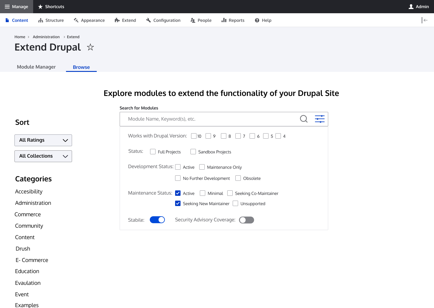
I've added advanced filtering option to the designs. Default would be a simple search with the option to click the filter icon, which would drop down the menu in the design image below. Users who know what they are looking for can use the simple search. Users who are looking for options can used the advanced filters to reduce the number of modules that show up in their search. These advanced filters are what is currently listed on the modules page on Drupal.org.
Comment #6
sundharHi @bostonjillian
I think we couldn't support project browser for Drupal 4, 5, 6, 7
we only can support projects browser for Drupal 8, 9 and coming Drupal 10.
But Otherwise filter looks awesome.
Comment #8
chrisfromredfinI want to encourage this issue to stay on the topic of just the "card" view, as pulled from the Figma designs (see attached).
So, if we truly believe the six fields above are the right ones, then we are:
- getting rid of stars
- getting rid of the "By UFKU"
- getting rid of "Community Pick" (which was a future enhancement anyway)
Just trying to get to an MVP version of this card view. The other discussions are all relevant, but perhaps belong in different issues. :)
Comment #9
chrisfromredfinOne showing the download icon rather than the "Community Pick":

Comment #10
leslieg commentedOnce we agree on the MVP version of the "card" we should update the Figma and then hand off for development changes to Matt's prototype
Comment #11
mandclu commentedPersonally I'd prefer to see the download icon stand out a little more, assuming that this is the primary action for a site builder using the interface. Could it look a little more like a button?
Also, this version has also dropped the security shield. Could the shield be on its own in the middle of the bottom row, and maybe a site builder could click/tap on it to see the explanation if they didn't know what it was for?
Comment #12
chrisfromredfinAgree on both counts, I think looking at the second card above, it makes sense to remove the stars and put the shield there, and then make it more "buttony" like [Download <>] (with the icon in the <> spot).
Comment #15
hooroomooThere are still some minor CSS changes that need to be add for the seven theme but would appreciate feedback on what I have so far on the Claro theme.
Comment #17
volkswagenchickI am not sure this is the right issue to comment in.
I am a bit concerned with the Advanced filter icon after the standard search icon. I did not know what that was... will others?
Accessibility is also spelled incorrectly.
Thanks for all this work
Comment #18
chrisfromredfin@volkswagenchick - could you please open a new issue for the spelling error (I'm not sure why we're not pulling these names from d.o actually; I looked and it's spelled right there). And, other comments outside of card can be put on #3239865 please and thank you! :)
Comment #19
starshapedRon mentioned above that it might be a good idea to only allow 3 categories, so only 3 categories would show on the card too, correct? I think that would allow for more room in the card if we know there’d only ever be 3.
Also, what does the badge with the wrench inside it do? It’s not clear to me what that does or represents, so maybe that needs to be made clearer to the user.
The card looks great so far and I’m excited to see this move forward!
Comment #21
bnjmnmRebased with the current 1.0.x and positioning/overlap issue are addressed. Not 100% sure if it's ready for commit, but it's in a good place for someone to take over - I think the headache inducing stuff is taken care of so the remaining steps are just making it nice.
(note: the filter checkboxes aren't so great on narrow screens... that is arguable headache inducing but not in the scope of this issue 🙂)
Comment #22
tim.plunkett#19, these categories are chosen by the module authors on d.o, and they currently could select every single one if they wanted. If we want to limit that, we'd need to do so on the module edit page, and then also figure out what to do about existing modules that have selected more than 3.
#21, you mean the sidebar that was added in #3241358: Filter by multiple categories? Yeah, new issue needed I guess
Comment #23
chrisfromredfinI agree that the wrench icon is not very obvious that it represents "actively maintained," but probably less so that wrench == maintenance, but more that 'actively maintained' is kind of a Drupalism. Newcomers may not get it.
We have an intention to allow a max of three categories on the Drupal.org side, but that's it's own sub-initiative coming in Phase II. For now, I like the idea of a "+ x more" tag. A 'detail' page would allow space to show all of them, if necessary (or the d.o page as we are doing for MVP). We can show the first three that we get back and +more the others. Maintainers might be able to re-order the categories on d.o if they want a different three to be the visible ones.
(Also, yes - some maintainers in fact HAVE checked every box. :) )
Comment #24
grienauercan we please also have an example here with no logo (how it should look like if no module logo is available at the project?!
This would help to visualise it and keep it in mind that we do not want to have a default logo.
At least in my opinion if there is no logo uploaded, no image should be shown and the space should be empty (space does not need to be kept, text should move up, just no element is visible instead of a logo)
it would be also great if the figma file can be pinned in the slack channel or in the project overview, so people can find it again :P
Thank you very much. really looking forward for this!
like the design an progress very much!
Comment #26
chrisfromredfinThis was a wonderful contribution and first-time contribution for hooroomoo! Thank you so much!
This was such a radical improvement over what we had that I reviewed and merged it in. As I see it there are still two outstanding issues to be discussed, and I will open them as separate issues: (1) the wrench icon is not intuitive as-is (2) a fix for when there's more than 3 categories. Someday we'll only allow a max of three categories on the d.o side, but until then we need a designed solution.
1. https://www.drupal.org/project/project_browser/issues/3267678
2. https://www.drupal.org/project/project_browser/issues/3267685