

Closed (fixed)
Project:
Drupal core
Version:
9.4.x-dev
Component:
Claro theme
Priority:
Normal
Category:
Task
Assigned:
Unassigned
Issue tags:
Reporter:
Created:
25 Nov 2020 at 01:30 UTC
Updated:
19 Dec 2024 at 16:12 UTC
Jump to comment: Most recent, Most recent file


 Show commands
 changes





Comments
Comment #2
mstrelan commentedComment #3
gábor hojtsyI raised the same problem in #3158854-33: Node form: address chasm between main form and meta but this was considered an improvement rather than a problem. I think more eyes are useful to discuss wether this intended improvement is an improvement.
Comment #4
bnjmnmI'm the one who created #3158854: Node form: address chasm between main form and meta, and I'll +1 @mstrelan. When I evaluated the solution that got committed I was on a very small display + it looked good to me in the screenshots. Now that I'm actually working with it day-to-day and on a wider display, I have similar concerns to those in the issue summary. I'd prefer a solution that addresses the chasm, but I think reverting #3158854 would also be acceptable provided there was a followup to find something that better addresses the chasm.
Comment #5
bnjmnmCheck out #3181964: Horizontal field groups content too narrow and paragraphs break out of node edit form to see how limiting the width looks with nested paragraphs, it isn't too user friendly. TBH a little bit of chasm seems preferable to that.
Comment #6
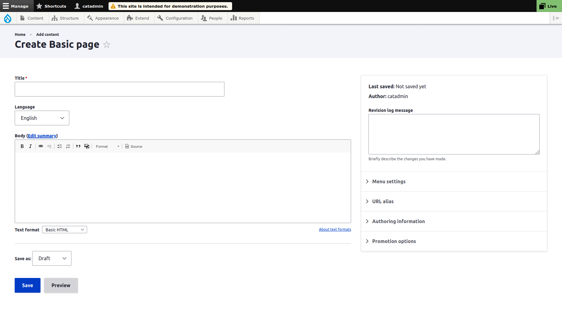
phjouI don't really get why the content has been limited to:
max-width: 52.5rem;
It sounds like a terrible idea to me. I just added a custom css library to remove that rule on my website.
Comment #7
ckrinaThis is a middle step towards the changes we want to introduce on the layout solution that should be able to accommodate more complex UIs: #3076820: [META] Layout redesign. There are several reasons behind limiting form elements width, but the most important is readability. Longer element widths end up having longer line length, which decreases legibility by making it difficult to gauge where the line starts and ends. A typical consequence of this is that it can be difficult to continue onto the correct line line as @lauriii pointed here: https://www.drupal.org/project/drupal/issues/3181964#comment-13924075.
Before introducing this change there was the discussion about letting the text area with WYSIWYG take more horizontal space when you want to compose more complex content, but it can be easily solved by adding the built-in button on CKEditor to expand to the full page. So I agree on the need to have wider space for some composing elements, but not to content-text creation elements. And to give that space we should plan and find good solutions, but giving all the space to all elements just in case there is something that might need more space instead of thinking why this space is needed doesn't feel correct.
As a last note, the reason behind centering the content instead of leaving it aligned on the left is that it ends up too far away from the right sidebar.
Comment #8
larowlanIf someone is looking for an undo patch for clients, here's one
Comment #10
larowlanCrediting kvantstudio who filed a duplicate and added a patch
Comment #11
bnjmnmThe fact that @kvantstudio created a separate issue for this: #3191427: Problem with node-add.css in Claro theme is additional evidence that users interpret the current implementation a problem/bug and not a readability improvement with minor tradeoffs. It's the third issue filed in the past 2 months, and multiple users within those issues are experiencing similar problems. The concerns that resulted in #3158854: Node form: address chasm between main form and meta are ones that can mitigated pretty easily by resizing the browser window or CKEditor. The problems created by that same issue can't be mitigated as easily, and I think rolling back is the best course of action.
I do think , but in the meantime I think the changes in #3158854: Node form: address chasm between main form and meta should be rolled back with the approach used in #8.
the concerns expressed in #7 should still be addressed, so I tagged this with "needs followup" to create an issue for those concerns. That issue summary should reference the prior attempts to fix it in #3158854: Node form: address chasm between main form and meta.
Someone create that followup and I'll review this a little more carefully and probably RTBC.
Comment #12
kvantstudio commentedWhen using a 4K monitor, your restrictions and centering the text placement area do not lead to anything good. Therefore, I considered this a rather serious problem that prevents from fully using the editor.
A narrow area on the right for placing meta information is also a bad solution. It can accommodate various blocks with nested content and strictly limiting the width leads to the fact that it is also inconvenient to use the editor.
Comment #13
mirom commented+1 for reverting using #8, yesterday was too late.
Comment #14
bnjmnmI see a good amount of interest in making this happen! I'm sure those interested would love to participate in pushing this forward, so this is what is needed next:
When those steps are completed (and assistance is available for anyone unsure how to proceed), I can review and potentially RTBC.
Comment #15
mirom commentedAdding working patch on 9.2.x.
Comment #16
mirom commentedAnd one more for 9.1.x
Comment #17
mirom commentedI would suggest that https://www.drupal.org/project/drupal/issues/3181964 is a follow-up because it describes the issue, laurii is already involved in the discussion there.
Comment #18
vikashsoni commentedApplied patch #15 and it works fine. Adding screenshots bellow.
Comment #19
djsagar commentedHi @mirom,
You patch for drupal9.2 is applied but it's creating same view for all screen.
Can we do something witch is not changed normal view of Basic page.
for more detail please see the attachment below.
Thanks!
Comment #20
lauriiiCopied a proposed resolution from the issue that was closed as a duplicate #3181964-13: Horizontal field groups content too narrow and paragraphs break out of node edit form.
Discussed this at length with @ckrina and @saschaeggi to come up with a short term solution to the bugs documented here because #3076820: [META] Layout redesign could take a while.
What we thought would be the right steps for solving the problems here:
On this issue:
Open follow-ups for:
Comment #22
trackleft2I am working on this issue.
Comment #23
sakthivel m commented#23 I have provided the patch please verify if it is working or not
Comment #24
sakthivel m commented#23 Patch Custom Commands Failed,
Re created patch #24
Comment #25
sakthivel m commented#24 Patch Custom Commands Failed,
Re created patch #25
Comment #26
sakthivel m commented#25 Patch Custom Commands Failed,
Re created patch #26
Comment #27
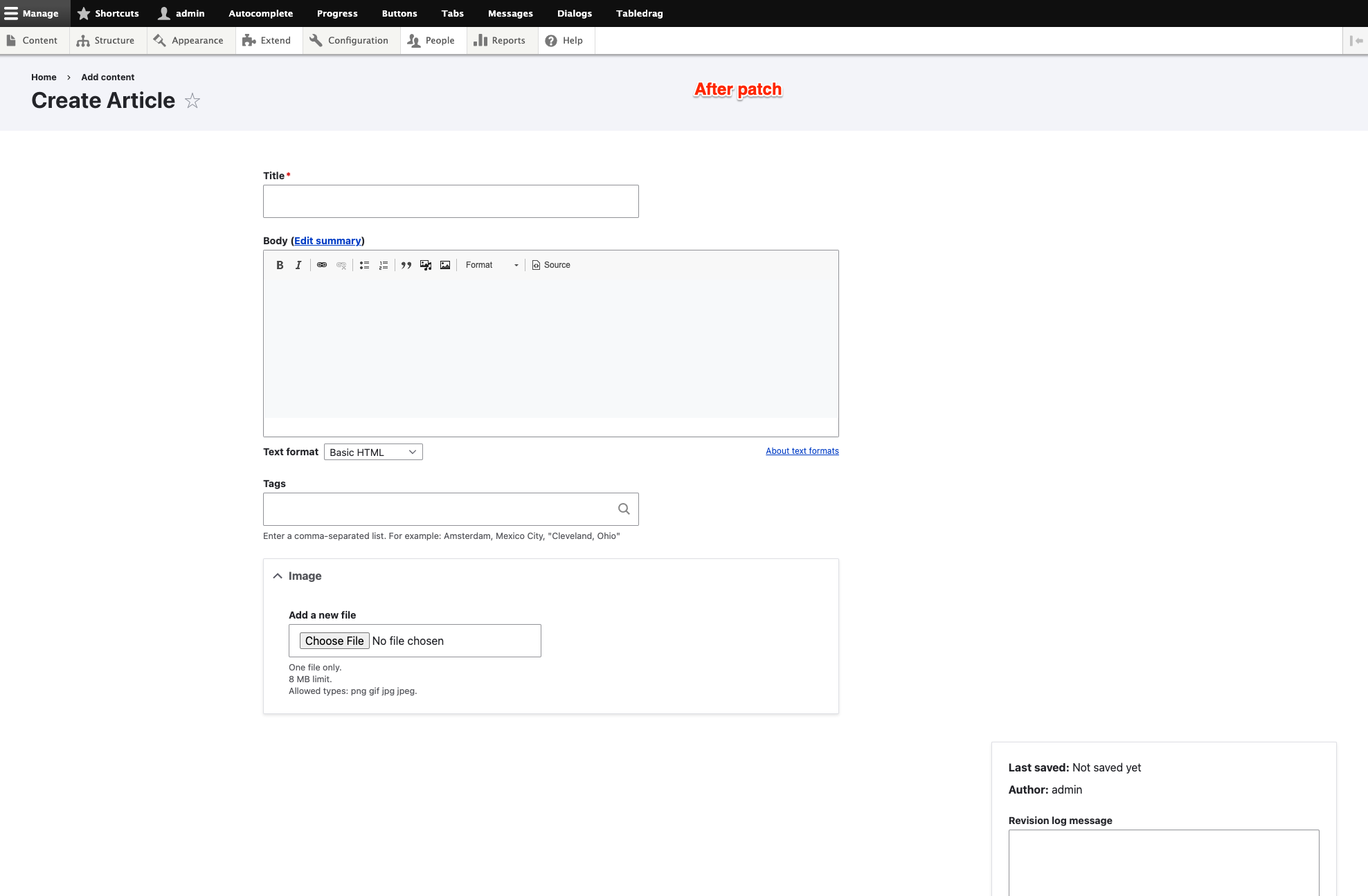
gauravvvv commentedI have added before and after patch screenshots for reference. The width is now covering full-screen size.
Moving to RTBC.
Comment #28
gauravvvv commentedComment #29
bnjmnmI notice the
--is changed to a single-in several places. This isn't needed to address the issue, and breaks Drupal Core's use of BEM CSS standards http://getbem.com/introduction/.This should be refactored so the classnames are unchanged.
Comment #30
spokjeComment #31
spokjeUsed patch #26 as base in the MR.
Comment #33
spokjeComment #35
kim.pepperComment #36
lukusI can confirm this is working with 9.2.2
Comment #37
dave reidPatch file from the latest MR changes.
Comment #38
rikki_iki commentedNeither the MR or patches reflect what lauriii suggested in #20...
Whilst I accept is was quite a drastic change, I'm not sure simply reverting it is helpful, there are legitimate reasons for it.
The comment in #20 seems like a fair middle ground. I also think adding a new breakpoint for those of us with really wide screens, where it's most obvious, will help this issue in particular.
This patch (which is mostly for discussion, I didn't want to go changing the MR just yet) does the following:
Screenshots of the effected breakpoints attached.
Keen to see what everyone thinks!
Comment #39
heikkiy commentedAt least in my tests it seems that the patch from #38 works quite nicely. Only issue I seem to have with it, is that it sets the left and right margin to auto for the content main and footer area. This makes the node edit area area not aligned with the page title on the left side. Changing the margins to be initial aligns the page correctly to my eyes.
I changed the following styles:
I didn't find any side effects from making that change for mobile, tablet or large table screen.
Comment #40
heikkiy commentedAttached are two screenshots which shows how the margin auto and initial change the edit page top part where the node title and edit form are not aligned. This was tested with core 9.2.5.
Comment #41
rikki_iki commentedThe auto margin was the proposed solution for https://www.drupal.org/project/drupal/issues/3158854#comment-13793472, to address the "chasm" between the sidebar. My understanding is this is just a short term solution, until a more complete design is done, and the mis-alignment with title is an acceptable compromise.
Comment #42
drennvin commentedI found that the new narrow form doesn't work with the field_layout module.
I think that the gin admin theme did a better job for this and it would be nice to take it as an example 😅
example with actual version of claro :

same example with Gin :

(work perfectly even with the left sidebar)
Comment #43
pbone3b commented#38 Worked Great, thx
Comment #45
damienmckennaI ran into this and reported it as #3256817; given that a lot of people use wider screens than were in use ten years ago, I think the 48rem limitation is too restrictive and wasteful of screen space.
One question about the patch/MR - should the class renaming be doing in a separate issue so this one can be focused on the width issues?
Comment #46
ranjith_kumar_k_u commentedFixed CS errors.
Comment #47
ckrinaThanks @rikki_iki for all the work done implementing changes based on what was suggested in #20.
You changed 976px for a 86rem/1.376px. While I totally understand the reason behind it, most of the content editors using laptops (a huge part of them use the laptop as main screen) would end up working with the mobile version. As a reference, a13 inches lapatop without high definition screen is 1280px wide. That is not a desired experience, specially if at 976 you can still have a reasonable usable experience with 2 columns:

Another option would be to do that change at 1024px, but that would mean that at 1023px you could end up with really long lines on descriptions (see screenshot below). Long story short, I wouldn’t change that breakpoint for now. Maybe in the future with an improved design :)

I really like this change, but only for the sidebar. The problem with the main region ends up being the same: really long lines of text without a limit. See descriptions for example:
Agreed on increasing the column max width as the way forward (specially to ease the situations the current max-width is causing), but maybe 66rem is a little bit too much. We’ve discussed it on the #admin-ui-design channel and a good value would be 52rem.
If we’re already keeping 52 as the max-width for the whole column, we can keep it for the text areas too. It’s not too wide and we can avoid having to define it individually to other elements (like the ..filter-wrapper) below the text area taking more width than the text area itself if the column wrapper is wider)

As a summary, I’ve just left the change of the value from 48rem to 52rem and the improvement to increase the sidebar width in larger screens. The margin: auto; is also needed to get to the future steps to improve this page (see Gin implementation in #42 as a reference to where Claro is slowly going).
With all that said, I understand this max-width is causing issues in some specific UIs that need wider space. But we can’t define all forms experience based on some specific node configurations. Ideally, the experience should be customized for those with wider width and better designs (improve the components Paragraphs & co use). The reason behind this is the plan to change the layout in future iterations: #3076820: [META] Layout redesign. This max-width is a first and needed step to modernize the overall layout for the administration UI.
Comment #48
mherchelThere seems to be a whole lotta backstory to this issue that I tried to digest.
The fix in #47 looks good except at very wide widths (above 1790 viewport width). Screenshots attached. I'm going to try to dig in a bit and see if its an easy fix.
Comment #49
mherchelWas a pretty straightforward fix. Patch and interdiff attached.
Comment #50
rikki_iki commentedWoot! I'm happy with those changes @ckrina. The patch in #49 applies and resolves the issue in #48. Before/after screenshots attached. Marking RTBC
Comment #51
kim.pepperMissing the 'after' screenshot @rikki_iki?
Comment #52
rikki_iki commentedOops, forgot to press upload on the after screenshot :)
Comment #53
lauriiiCan we also have a Drupal 10 patch for this issue?
Comment #54
heni_deepak commentedApply patch #49
1. Browser Chrome
2. System Resolution 1920 X 1080 (16:9)
Comment #55
damienmckennaHere's a version of #49 for D10.
Comment #56
mherchelThanks for the patch @DamienMcKenna! Looks perfect. Drupal 10 version is also RTBC IMHO.
Comment #59
lauriiiCommitted e2d3a3e and pushed to 10.0.x. Also committed the 9.x patch to 9.4.x. Thanks!
Comment #60
saschaeggiYay! 👏
Comment #62
ainsofs commentedCant get any patches to work on 9.4.5 and php 8.0. #38 works fine in 9.3.21.
For now I cannot upgrade to 9.4.5 unless I remove this patch.
Comment #63
pyrello commented@ainsofs. It looks like this patch was committed to 9.4.x, so that makes sense.
Comment #64
trackleft2@ainsofs We fix this with a custom module FYI
In the custom module we have 4 files
my_module.module
my_module.info
css/claro-node-form-overrides.css
my_module.libraries.yml
In my_module.module
In my_module.info
In css/claro-node-form-overrides.css
In my_module.libraries.yml
Since there is no factual basis for this:
Comment #65
martinb14 commentedIn order for any admin theme to succeed it must at least honor the screen real estate of the user.
For websites with advanced elements, vertical tabs are a must.
Often the fancy side bar on the right hand must even be moved down as a horizontal element, because horizontal real estate is extremely important for certain elements.
Since Drupal is so much more than just a Title-Image-Body CMS, any serious admin theme must make use of the horizontal space for larger screen.
We know that responsive design and editing via mobile is also important, but this must not interfere with the correct and ergonomic editing via larger screens.
The important difficult case to have in mind for advanced websites are nested entities. The whole reason to use Drupal instead of lightweight alternatives, is the excellent way of handling nested, translatable, revisionable entities.
For example for an admin theme to excel, it must for large screens display Nested Inline Entities (https://www.drupal.org/project/inline_entity_form) and also Inline Entity Form Table View Mode(https://www.drupal.org/project/ief_table_view_mode) in a reasonable way.
This entails that vertical tabs must work and 100% of the remaining width must be available for any kind of advanced element requiring horizontal space.
For sure, regular text fields and text areas can be limited in width, in order to preserve readability. But this must be a per-field type width limit.
From a pure design point of view, "centering" the whole admin area below the left-aligned full width top admin tool bar and a right aligned side box -is just incorrect. That layout is objectively invalid.
Kudos however to the rest of the theme. It is a pleasurable improvement over Seven indeed:)
Comment #66
saschaeggi@martinb14 you might be interested in using the Gin Admin Theme which will offer a lot of customization options depending on your usecase.
Comment #67
martinb14 commented@saschaeggi, Gin does look promising.
It seems however that also for this theme we may need to inherit and remove the max width from
In general I guess this should just be in the theme settings, even though in my personal opinion, one should never have this max width in the first place:)
Comment #68
codefactory commentedIf the node form contains veritcal tabs (e.g. using https://www.drupal.org/project/field_group) then the form is pretty much unusable.
Also there is no obvious way to disable the right sidebar (or move it bellow the form) if not needed and reclaim the extra space. Even if "Authored by" and "Authored on" are disabled in "Manage form display" they still appear in the sidebar. #64 was a helpful temporary workaround.
Comment #69
nchase commentedWit its width limit it is more or less unusable for content creation - especially when using paragraphs. With paragraphs and especially layout paragraphs it becomes a content creation nightmare.
Comment #70
nchase commentedok, I have to look into howto create patches. The only viable solution is to remove the max-width entirely. Everything else doesn't work.
Comment #71
lindsay.wils commentedHave to chime in here and say this max width makes this theme totally unusable. We setup all our node edit pages with vertical tabs to make the editing process simpler for users, keeping things in sensible groups. This destroys all that, along with using Paragraphs. Will be going back to Seven until this issue is resolved.
Comment #72
pyrello commentedIt seems like maybe the solution here is to make this configurable? I can understand the desire to have this feature for new sites and better OOTB experience, but it is certainly not workable for a lot of setups using vertical tabs and/or Paragraphs.
Comment #73
bnjmnmSeems like there are many legitimate objections to the changes here! However, there's unfortunately zero chance of getting it addressed by commenting on an issue that was closed almost a year ago. Fortunately, if this same info is included in a new issue this moves from "zero chance" to "quite likely" that someone will work on addressing the problems reported.
Comment #74
crutch commentedThe open one is marked as duplicate and there is a link chain to here after upgrading to D10 with Claro. Using vertical tabs. For D9 we overrode max-width in css. Now the thin column is back without max-width but width: min().
We use a custom block for inline css overrides for claro admin theme for ease of adjustments.
Used this in D9
It changed for D10
We can't make it 100% of the area without pushing the admin tabs off canvas. 75rem seems to be okay.
Before in D9 it flexed well with the admin tabs at max-width 100%;
---
This seems to work similarly as before for our users.
Comment #75
alphex commentedCrutch check out this module : https://www.drupal.org/project/asset_injector to do CSS better then a custom block, the way you're doing it.
Comment #76
crutch commentedThanks alphex! Installed and using.
Comment #77
crutch commentedNote that classes changed for 10.3.1 and had to add additional classes