Originally submitted on Github with significant input from Andrew MacPherson and @laurii
Problem/Motivation
Recent interviews and research exposed pain points around Drupal's admin experience of looking and feeling dated, especially compared to our competitors, and universally cited that choosing a more modern-looking admin theme instantly led to Drupal being better-perceived by said users.
There was an amazing community effort to Create a Style Guide For Seven that vastly improved its look + feel compared to the original, but Design best practices and Drupal functionality have moved on since then.
Proposed resolution
Implement new button styles to create a favorable first impression of Drupal for evaluators and a better user experience for site authors. No functional differences.
Specification
Quick overview
This image is just a quick overview for buttons specs. Please use the Figma link to full specification as the main resource for specifications.
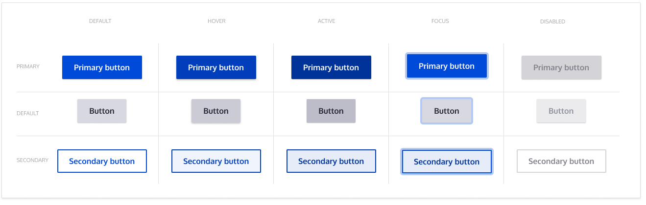
Full specification
FIGMA: https://www.figma.com/file/OqWgzAluHtsOd5uwm1lubFeH/Design-system?node-i...
This link is anchored to the board with the full specification. As an anonymous user you can see the design, but to actually be able to pick colors and sizes please login on Figma.
General specs
Color palette
Typography
Remaining tasks
- Update
- patch styling to include time inputs
- Accessibility review
- RTL review (Right to Left)
User interface changes
All button styles will be changed, no functional differences.
Test Pages
- /admin/content
- /node/add/article (also image upload button)
- /admin/content/files
- /node/add/page
- /admin/content/comment
- /admin/structure/views/view/comment?destination=/admin/structure/views
- /admin/people
- /admin/people/create





Comments
Comment #2
antonellasevero commentedComment #3
antonellasevero commentedComment #4
antonellasev commentedComment #5
saschaeggiComment #6
lauriiiWorking on this
Comment #7
lauriiiComment #9
modulist commentedThe outline color for the focus and hover states are too close to the primary button color to be easily visible.
Recommendation: use a color in a different hue, like Drupal's lime green (#7cbc48) as the outline color for the primary color.
Comment #10
modulist commentedComment #11
lauriiiComment #12
ckrinaThanks @modulist for all the accessibility comments&suggestions, here and in the other issues! :D
I'll work on a better design for this to try to solve it, and I'll review some suggestions @andrewmacpherson gave in the original Github issue.
Comment #13
ckrinaI made this variation based in @andrewmacpherson 's feedback on Github. Would something like this (separated from the background) work?
Comment #14
saschaeggi@ckrina didn't we had this version before already? Looks also better visually to me.
Comment #15
ckrina@saschaeggi Nope, we talked about it in a weekly meeting but it never got accessibility sign-off , so I'm not sure it's the correct approach . I guess that's why we didn't change the specs. :)
Comment #16
modulist commented@ckrina #13 a clever way to get around having to change the outline color for a primary button. The real test is to look at a page that has this style and be able to tell immediately where the focus is.
If there's no obvious color difference with the button color, I'm afraid most of us would only see the focus when it changes. We humans are like animals that can't see their prey unless it's moving.
Comment #17
saschaeggi@ckrina we can go ahead with this version, see @andrewmacpherson answer to this on github:
Old Github issue
Comment #18
andrewmacpherson commented#9:
I think this is mixing up Claro with Drupal.org's bluecheese theme.
#7cbc48 only provides 2.29:1 contrast against white, so it won't satisfy WCAG 1.4.11 Non-text Contrast as a focus style.
https://contrast-ratio.com/#%237cbc48-on-white
It's a WCAG failure on Drupal.org, should file an issue about that.
Comment #19
andrewmacpherson commentedre #13:
The white line offset separating the button from the focus outline could benefit from being thicker. In the screenshot it's a hairline, and a thicker offset would be more obvious.
For example, instead of a 3px outline with a 1px outline-offset, it could be a 2px outli.e with a 2px offset.
Twitter.com has a button focus style very similar to this in the compose-tweet dialogue IIRC.
Comment #20
saschaeggi@andrewmacpherson how about this? 3px outline with a 2px outline-offset:

Comment #21
saschaeggiComment #22
andrewmacpherson commented#20 is the sort of thing I meant, yes. The larger negative-space white offset contributes to a more distinct shape diffence. The focus ring feels more like a separate object that moves around the screen. The thicker offset also gives a more obvious striped appearance, for the blue button especially.
Thinking more about the colour idea that @modulist mentioned... one way to make focus styles really clear is to use a colour for the focus ring that isn't used anywhere else. The UK Virgin Media set-top box UI has an elegant example of this. Most of the UI is white text on plum and black backgrounds, but the thing that has focus gets (a) a red background, (b) a bright red border, (c) bigger, so it overspills the container, and (d) sometimes has an extra ">". Focus always uses this red style, and _nothing else_ uses red in the whole UI. (Except, some logos have red in them, but they aren't focusable.) A caveat is that this UI has no forms. Note that it doesn't rely on the red colour alone; the border and size change are other focus affordances.
If we wanted to do something similar, we'd need a distinct colour that wasn't used for anything else. Since we're using blue for links, and red for errors, so that broadly speaking leaves green. We're using yellow/amber and celadon green for messages, but there won't be many of those of the page. Maybe a more striking green could be used for focus like @modulist says.
The idea of using one colour for all focus styles, and only for focus styles, applies beyond just buttons though. It would mean a green focus ring on textfields, details/summary, selects, etc.
Comment #23
andrewmacpherson commentedWhat colour is the blue focus ring used here?
There's an error in the palette at #3017785: Designs for a new admin theme. There's a pale blue called "focus" which claims to be #00339a, but that's the code of "active" blue next to it.
WIth an eyedropper, I make the "focus" blue out as #A9CAF7. This only provides 1.68:1 contrast against white, so it doesn't satifsy WCAG 1.4.11 Non-text Contrast. The focus ring needs 3:1 contrast.
The focus rings in #20 aren't the same blue. The focus ring around the grey button is #3558cf2 which has contrast 3.27:1 against white, so that passes.
The focus ring around the blue button in #20 is #7da5f1, which has contrast 2.46 against white, not strong enough for WCAG.
Comment #24
saschaeggi@andrewmacpherson the blue focus would be #5a8bed (3.31:1 contrast)
Comment #25
saschaeggi@andrewmacpherson we'll work on a new version for the focus until end of the week.
Comment #26
andrewmacpherson commentedFWIW, I'm kind-of sitting on the fence about the @modulist's approach of a green (or whatever) focus colour. It's definitely a valid approach, if used in combination with size/shape changes like the offset outline. It can be a useful affordance for users with colour perception; follow-the-colour may well be the principle cue as @modulist says. But in terms of robustness for all sighted (and partially sighted) users, the non-colour aspects of focus style are the more important ones to put in place.
Comment #28
ckrinaHuge thanks for your suggestions @andrewmacpherson and @modulist ! We've been working with @saschaeggi and @Dennis Cohn because it's an issue that blocks for several components and it can be a huge improvement. So we've opened this one to discuss focus state in a broader way with other elements with examples: #3028099 and we'd love to know what do you think.
Comment #29
dennis cohn commentedIn the issue Element focus: accessibility review we suggested a new focus color for all elements.
If this color is approved, we can update this issue with new screenshots!
Comment #30
Kami Amiga commentedComment #31
Kami Amiga commentedWIP state : buttons active states and --secondary styles are not done yet. But at this state, I'd like to have your advice about the CSS file architecture I did. I used the :not for default button styles to avoid possible conflicts with the other styles. But maybe there's a better way to manage this...
Comment #33
Kami Amiga commentedComment #34
nod_I would check if we can increase specificity instead:
Using :not means we know all possible types of buttons, and we have no way of knowing the full list of button types.
Comment #35
dennis cohn commentedI agree with @nod_
We should avoid using the :not selector. Also overrides the :not styles is only possible with !important and that's a propertie that we don't want to use
Comment #36
dennis cohn commentedCan we use a variable for this? If we want to change the border-radius for a reason, we only have to change the variable
avoid :not selector like @nod_ is saying
Comment #37
nod_Comment #38
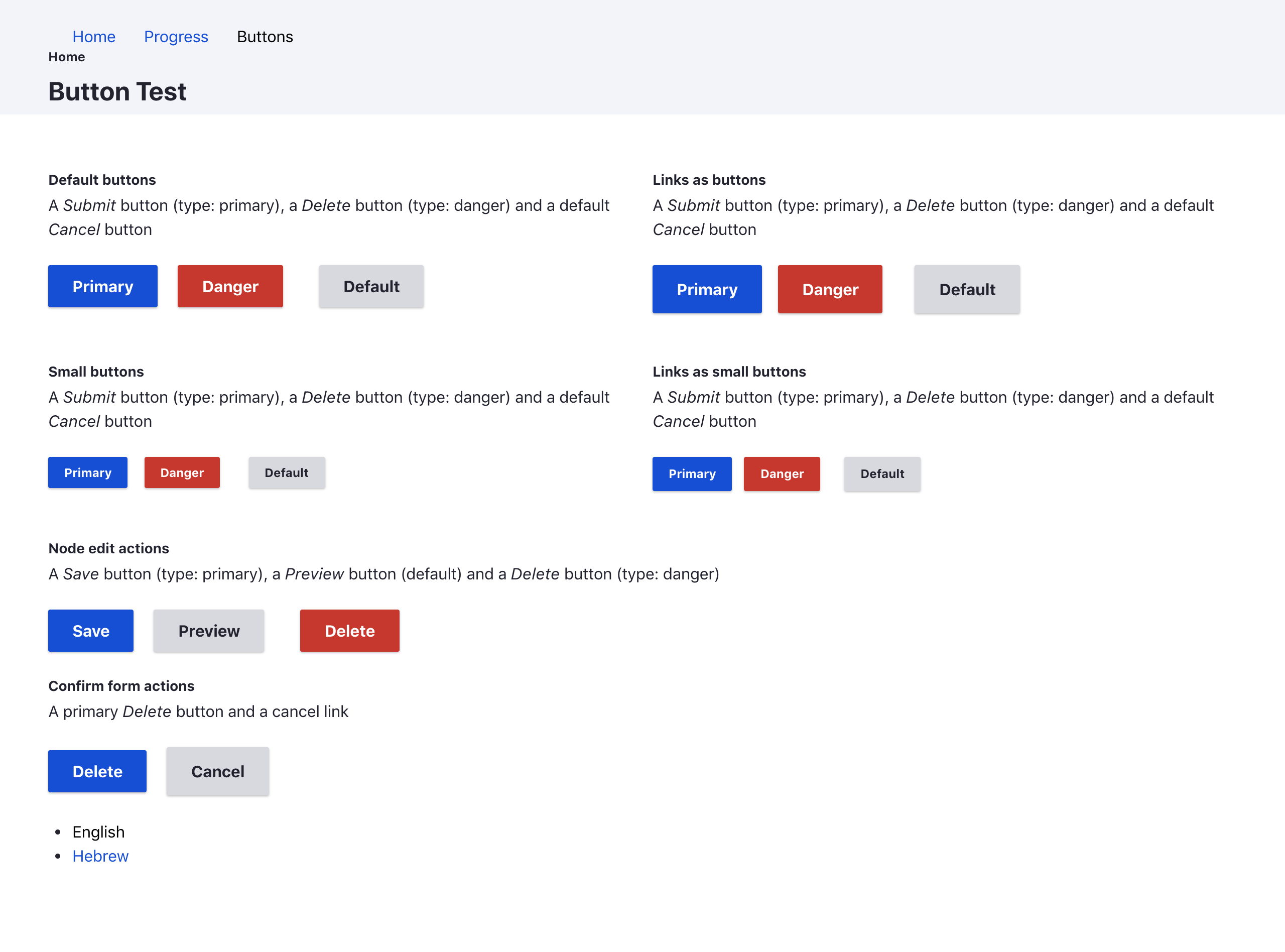
huzookaMy (mostly visual) feedback for the patch in #31
<a class="button ..."/>) are higher than input buttons (<input type="submit" class="button ..."/>). Check out a confirm form, e.g. a node delete confirm..form-actions .buttonthan.form-actions inputChrome screeshots with patch #31 — LTR:


Comment #39
Kami Amiga commentedStill WIP. Thanks for the review. @huzooka : I'll handle the changes you mentionned for the next .patch ;)
Comment #40
nod_Is that possible? to me disabled element can't have focus/active.
Comment #41
lauriii#38.1: We probably don't have to support link elements that have button class attached to them since they will be all deleted soon.
What do we need these overrides for?
Selectors targeting modifiers shouldn't include the block element class in the selector. Therefore this could be just
.button--primary:hoverComment #42
Kami Amiga commented@nod : from what I understand here -> https://developer.mozilla.org/en-US/docs/Web/CSS/:disabled it seems so, yes ! I've seen it was present in the seven buttons styles, does someone knows if there's a reason for this ?
@lauriii : the .link styles and the comment about overrides come from the original file. I don't know if they should stay ^^' About the inclusion of the block element class in the selector, it was to increase the specificity of the styles for "specific" button, as it seems we don't have a .button--default class available to distinguish the styles of the grey button from the others.
Comment #43
Kami Amiga commentedUpdate with spaces variables.
Comment #44
lauriiiWhy do we have to increase the specificity for the variations? Wouldn't it be enough to rely that the overriding styles are placed later than the default styles?
Comment #45
nod_I know Kami won't have time short term
Comment #46
lauriiiNext iteration. The previous patch didn't apply anymore so there's no interdiff. I added a global focus style based on the latest designs, as well as remove some of the old CSS.
Comment #47
huzookaWe have a nightwatch 'test' for generating screenshots. I'll get them and upload here in an hour.
Comment #48
huzookaJust a really quick review:
<a class="button">and<button class="button">are still higher than<input class="button">elements (edited) – 42px vs 48px for default size, 31px vs 34px for small sizeBack to NW.
Comment #49
lauriiiIn my opinion, we should support
buttonclass being added toaelement, so I didn't fix those bugs.Comment #50
lauriiiThis makes the height consistent.
Comment #51
huzookaRe #50:
input)Shots attached.
Comment #52
lauriiiThis should address #51
Comment #53
lauriiiThis is the correct version of the patch.
Comment #54
huzookaGenerally, this is fine, but (Windows) high-contrast mode fails for IE11 and Edge – focus indication is completely missing in these browsers (for buttons).
Firefox adds a light-cyan background for focused
<input type="submit" />, and draws border for the primary and danger version (no borders for links with thebuttonCSS class).IE11 does nothing.
Edge does nothing.
High-contrast screenshots attached (excluding Chrome)
Comment #55
huzookaComment #56
ckrinaJust FYI, we updated the styles for focus after #3028099 accessibility feedback and defined the vertical margins in Figma as @lauriii asked. These margins are just default and they should be easily overridden in specific situations.
Comment #57
huzooka.button:focushad anoutline: none;. I removed it.1px dottedwasn't too visible. It's2px dottednow.--ms-high-contrastthat ie or edge handles)..form-actions.appearances since it's managed by PostCSS..page-wrapper *:focus, at the end ofelements.css) in a standalone patch instead of smuggling it in in a component's feature.Screenshots attached.
Comment #58
ckrinaFYI main colors blue and grey for buttons have been changed in this issue: #3038948: Changing colors
Sorry to fix that in another issue, but it was a great opportunity to have a novice one.
Comment #59
lauriiiComment #60
kostyashupenkoComment #61
kostyashupenkoIt needs to be updated, accordance to #58 comment
Comment #62
kostyashupenkoComment #63
huzooka@kostyashupenko, could you please provide an interdiff between #57 and #62? Its hard to check what changed there.
Comment #64
kostyashupenkoOnly colours were updated.
Comment #65
huzooka@kostyashupenko, thanks for your help!
RTBC.
Comment #66
lauriiiI can't reproduce this problem. Could someone try to reproduce this and post screenshot with the exact steps it takes to reproduce it?
Buttons don't really look like buttons in high contrast mode without a border. How about we set this to
border: 1px solid transparent;?The design system doesn't describe this behavior. It actually doesn't describe that the first button shouldn't have margin left as well so maybe its the design system that needs an update?
Comment #67
huzookaWont change anything, but answering #66.
Comment #68
huzookaRe #66:
Comment #69
lauriiiI added a border to the button in high contrast mode since it makes buttons more usable. I don't think we should block this issue on the high contrast mode not looking pretty. There's plenty of more serious problems in the high contrast mode we should focus on first.
I also removed the margin reset from the last button since it doesn't lead into consistent behavior. We should reconsider how we want to handle the left and right margins in a separate issue and make changes globally.
Comment #70
huzookaRe #69:
!importantflag back to the button border property. That's required to make Firefox hc look nice instead of looking like on screenshot I provided in #68.2P.s: Please follow patch naming convention.
Comment #71
imalabyaPatch doesn't apply anymore. Adding a Reroll tag.
Comment #72
imalabyaAdded a rerolled patch.
Comment #73
imalabyaAdded a patch to reduce the border to 0px which makes the height of the buttons 32px for small and 48px for normal.
Replaced the px with rem.
Comment #74
lauriiiThe patch doesn't apply
Comment #75
lauriiiRemoved the form action mobile styles since those are not part of the Claro styleguide. Also changed margins to follow the styleguide and made some documentation improvements.
Comment #76
huzookaRe #75:
This should be
2pxaccording our current standards.Let's modify this to
calc(var(--space-m) - 1px) calc(var(--space-l) - 1px)to keep button height follow the design (see #3).Since we want borders for buttons in high contrast mode, we should use
1pxhere instead of0, but with an!importantflag. Important is necessary to override the3px(transparent) border in high-contrast Firefox (check the attached screenshots).Same as #2:
calc(var(--space-xs) - 1px) calc(var(--space-m) - 1px).We're almost there! :)
Comment #77
mandclu commentedTo me the default button looks like it's disabled. Is the idea that buttons will, in most cases, use either the primary or secondary styling? As a general UX principal, it's best practice to have a single colour for all interactive elements, and use it on all interactive elements. I get why we're straying from that principle for the danger buttons, but why not make the default style more like the secondary styling in the summary?
Comment #78
lauriii@mandclu thank you for your feedback! I forwarded the feedback to the design team ✌️
This should address #76. 🥳
Comment #79
huzookaGenerating the screenshots...
Comment #80
ckrinaRe to #77:
First, thank you for your feedback @mandclu!
I could agree with this. Although we worked on that to move from the disabled appearance (it's an old known issue on the design team), it could potentially be perceived as disabled. The main reason it's not darker is to be more accessible for Color blindness (specifically Monochromacy).
Color is not what needs to be used in a UI where almost everything is an actionable element. Things like hierarchy would be totally lost. :-)
But you are right on that actionable/interactive elements need to be recognizable as actionable/interactive. It's just that we have other things like shadows, borders, and other useful styles and patterns usually more accessible than just color to communicate this possible interaction.
So, wrapping this up, I'd suggest to move forward with this issue to not block a key component as buttons and open a follow up for the default grey button to refine the current solution (note that it's not the primary button, since we may have tens of actions in the same page and only one of them the primary).
Comment #81
ckrinaComment #82
lauriiiThis makes spacing between form elements more consistent. I also made some changes to the action links to make them look closer to the mockups. I know that the actions links will still change before the final product, but I thought it would be nice to match the current designs until we have the final design for the component.
Comment #83
huzookaComment #84
huzookaFrom Slack by Ckrina:
Comment #85
huzookaRe #82:
I've separated the action-link-related mods into a standalone patch and added to the right issue #3036732: Action link component.
I think we shouldn't touch action links, they have their own issue, they aren't ruined by this issue and I'm sure that we don't want to add something that's worse than a previous commit:
Patch that addresses that we discussed on Slack (and summarised in #84) attached.
Screenshots attached.
Comment #86
lauriiiGreat! This works for me!
Comment #87
lauriiiUpdating issue credits.
Comment #89
huzooka