
 Support for Drupal 7 is ending on 5 January 2025—it’s time to migrate to Drupal 10! Learn about the many benefits of Drupal 10 and find migration tools in our resource center.
Background
Building a new admin theme is part of the Admin UI and JS modernization initiative. We’re proposing to update the administration look and feel through a new design system for the Drupal administration UI. A design system consists of visual and behavioural components and patterns that can be combined into user-friendly user interfaces.
This Drupal admin design system is a project with its own deliverables (examples, documentation, tools, and resources). This will get applied in multiple projects:
- New admin theme: an updated visual treatment within the technical constraints of the existing Seven theme (this issue introduces it)
- A new JavaScript driven admin UI based on work done in the JavaScript Modernization Initiative.
Problem/motivation
The need for an updated Drupal admin design is clear. Drupal admin UI has looked the same for a long time. We have also seen only relatively small extensions to the available user interface behavior patterns.
We are working on creating a completely new dynamic administration UI, but since building a completely new UI will take some time, we’re looking for a short-term improvement for the current UI changing Seven styles based on the new design system.
The scope of the first iteration will be limited to visual changes only. We will limit the first iteration to changes that are possible to achieve in a short timeline. Later on, we will iterate on the visuals and add improvements to the functionality. Our goal is to ship the refreshed design system as a new experimental theme in Drupal 8.8.0.
The designs
Drupal Admin Design System
Our goal is to create a Design System that defines a complete set of principles, patterns, and tools for building a coherent and user-friendly Drupal administrative user interface. It will be defined by some standards (goals, principles and visual design language) and a visual interface library (components, patterns and animation).
The new admin theme
The first application of the design system is the new admin theme, for as much as pragmatically possible within the constraints of an existing theme. It means that some of the improvements such as the file field upload will be left for following iterations.
On this issue, we have listed the components and examples that should be reviewed by the community.
Basic principles
The design principles are based on Drupal’s Values & Principles and we are adapting the original Seven’s style guide visual principles:
- powerful: confident, precise shapes and strong contrast, especially for user-controllable elements.
- empathetic, responsive: give emphasis to what matters; use hierarchy to explain the relation between elements; use predictable patterns; elements adapt and react to inputs.
- clear, clean, concise: define crisp lines and spaces, decisive shapes; avoid texture and ornamentation; each element should serve a clear purpose; make measured use of whitespace: room to breathe, but avoid sterility and emptiness.
- accessible, transparent: appeal to the greatest possible number of people; choose a legible typeface; set text for optimal readability; emphasize what matters; use consistent visual clues for affordances.
- natural: neutral tones; define continuity between spaces.
- friendly, collaborative, democratic, respectful: choose cheerful colours; avoid high contrast at large scales (too bold/aggressive); prefer well-known design patterns, iconography and affordances; avoid visual indulgence, ensure visual style is extensible and flexible.
Accessibility
Complying with the latest accessibility standards is important. The designs have been built with previous feedback in mind and we have had several experts giving us feedback since the beginning of the project. If you are interested in providing us with some more accessibility feedback, we have an issue for that here.
Base
Typography
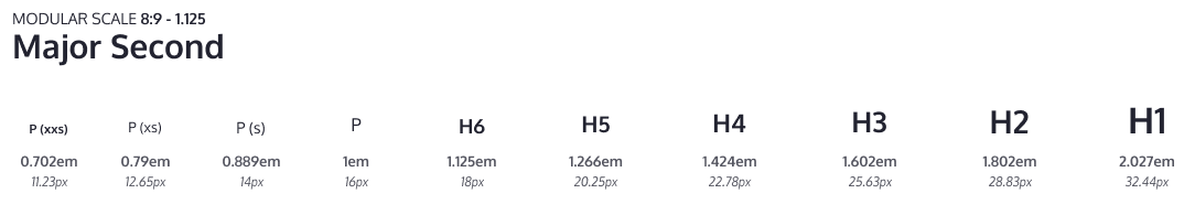
The base font size used on the style guide is 16px. For other font sizes, a modular scale is used to keep a good rhythm across the UI texts, but a small one that let us have enough font-size variations and hold hierarchy.
This style guide is designed to use system fonts which comes with various benefits, including improved performance and better support for various writing systems. Using system fonts will also make the UI feel like more familiar to the user since the look and feel will be closer to the users' environment.
Mockup of the interface with text written using Devanagari writing system rendered using system fonts on macOS.

Mockup of the interface on Linux, KDE (Oxygen) and Mac OS (San Francisco).
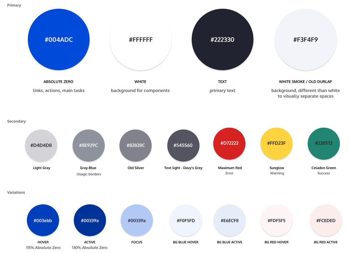
Color palette
This style guide is using a light color palette where the blue is vivid and greys are more neutral. The goal is to get a visually simple UI where important things like primary buttons stand out. This proposal evolves the 4 primary colors currently in Seven, and adds a wider range of greys.
Iconography
Icons should be reduced to its minimal form, expressing essential characteristics to be interpreted. Avoid outlined versions of icons to keep the UI clean and simple. Icons with a packed or swamped interface with too many lines should be avoided also.
To preserve the hierarchy and proportions several standard sizes have been defined.

Layers and surfaces
Spaces and elements will emulate physical qualities like depth and shadows to recreate an environment easier to understand and perceive.

Spacing and sizing
Spaces and sizes like paddings, margins or icon sizes will be tied to the modular scale defined by the typography to help us shape the interface with a proper rhythm and balance to make layouts more predictable and scannable.


Individual Components
Buttons and Dropdowns
The main goal for buttons is to be easily identified as elements that can be clicked and interacted with. Several size variations also have been created to use in places with reduced space like tables.


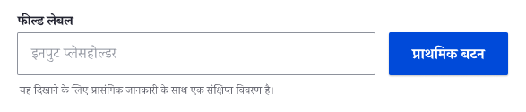
Form fields
Basic text field works as a base for the styles used in all form elements. The main goal is to keep the form elements simple with the minimal graphic elements needed to keep them discoverable, usable and accessible. Font size is being incremented for labels to 14px and to 16px for values following the modular scale.
Field design also takes into account different elements that can be placed on it such as counters, icons or errors. These are included in the style guide for future support.


Selects
The select default style has been customized to fit in with the new design system and improve UX. We are aware this change could affect accessibility so that’s why we’ll make sure its implementation will keep selects accessible.

Basic Form Controls
Form elements like checkboxes and radios follow the same visual guidelines as other form elements to keep the design consistent.
The style guide contains designs for each possible variation to keep accessibility in mind, even they may not be widely used.

Tables
Tables have been designed to have high row height to accommodate large text sizes and adapt the color palette. The design uses icons for indicating when a column is sortable or sorted.

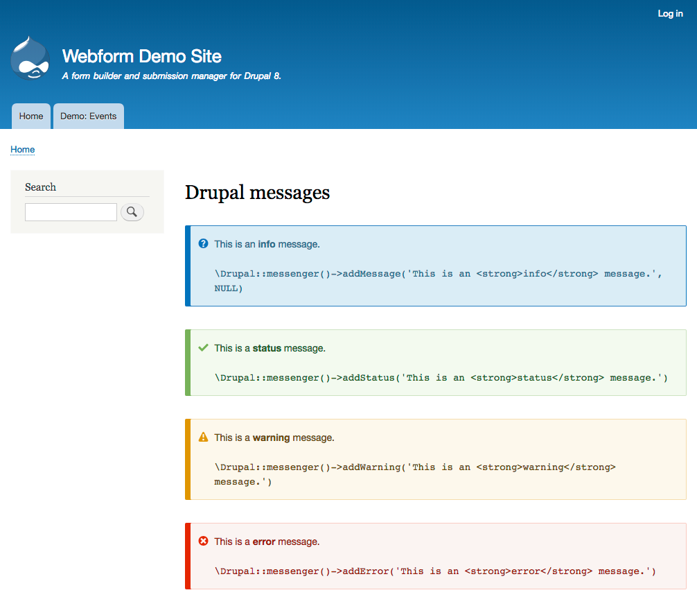
Messages
The goal for the messages design is to reduce the amount of colors used and make sure there’s good color contrast by using the same styles the regular text has (link color, bold…). To do so, the color bridge has been widened to have enough color space to represent the warning level and to accommodate the icon. This solution works well for both small and long error messages.

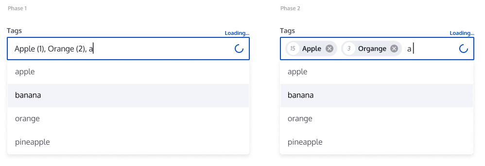
Tags or Entity reference
The implementation for this component is planned to have 2 phases. The first one will refresh the current field with the new field styles and will add a new throbber. A second phase will introduce a new component to represent entities inside fields.
Breadcrumb and page title
The combination of the page title and the breadcrumb, together with the shortcut link, results in the header. The breadcrumb has been placed over the title to make it easier to find the current location in the application.

Navigation list
The navigation pages on the admin UI has been designed with an emphasis on readability, and reusability of existing styles from other components.

Details and accordions
This specific component will have several variations defined together with the main goal to unify all the related implementations by using similar properties and behaviors. For example, different implementations can be the html details, the accordion in the sidebar in a node form or the toolbar when it’s placed vertically.
All the variations will use the same directions for arrows (pointing right when collapsed, pointing bottom when opened) and the label for details is going to be 16px.

Pages
To help you review and give feedback on the proposed visual styles in-use, we’ve prepared several pages with the new designs implemented.
Node edit form
As explained in previous sections, the changes on this first iteration will remain on a CSS level. In this page the perception change relies on the text size increment, the increased spacing, the element simplification and the lighter colors. This way, the content will get more relevance because only the focused, active or clickable elements are highlighted.

Content list
This page works as an example to see the proposed design for tables. The text size increment, the row minimum height increment and the color palette keep the focus on the actionable or clickable elements on content on a busy UI. In this page the pager component is visible to see it working together with the table. Also, 2 different button sizes have been used.

Admin forms
The 4 forms pages attached demonstrate several implementations of the designed components, using tables, details, tabs or fields. A component introduced here is the vertical tables in the Configure block. You can find attached the Block Layout, the Configure Layout, Text formats and editors and Cron forms.
Source files
The tool we are using to create the designs is Figma because it allows several people to interact at the same time, leave comments and share links online. The source for the designs of the components we’ll share in this issue can be found here and the source for the pages here, where some more examples can be found.
Your feedback
Feedback is vital for our next steps. The designs have been produced iteratively and the process we are keen to follow remains iterative. We want this project to succeed in achieving its goals and for that reason, it is important that a review of the designs happens now to take into account the feedback from the community members in the process.
We are particularly seeking feedback from community members familiar with "selling" Drupal to confirm this design helps Drupal be up to standard with its competitors, as well as contributed and custom module authors who utilize and extend core's UI patterns to ensure we're covering all bases, accessibility experts to detect areas to improve in this early phase and designers that can suggest ways to enrich next phases.
The feedback is timeboxed to end at 7th of January 2019. We expect to keep most of the conversation and feedback on this issue. If you are interested in getting involved you can join the Slack channel #admin-ui.
Contributors to this proposal: Cristina Chumillas, Sascha Eggenberger, Archita Arora and Dennis Cohn with priceless help from Antonella Severo, Roy Scholten, Lewis Nyman, Lauri Eskola, Ricardo Marcelino and Balazs Kantor.
| Comment | File | Size | Author |
|---|---|---|---|
| #63 | 01-left-tab-menu.png | 207.74 KB | sirtet |
| #54 | action-link.png | 13.03 KB | ckrina |
| #35 | message-example.png | 107.63 KB | jrockowitz |
| #5 | field3.png | 30.1 KB | Dennis Cohn |
| page--node-edit.jpg | 150.71 KB | ckrina |


Comments
Comment #2
ckrinaComment #3
saschaeggiComment #4
saschaeggiComment #5
Dennis Cohn CreditAttribution: Dennis Cohn commentedComment #6
Dennis Cohn CreditAttribution: Dennis Cohn commentedComment #7
rachel_norfolkI'm really happy to see that the work here explicitly references back to the Project's Values and Principles. They absolutely should be at the heart of everything we do - thank you!
oh - and I corrected the link in the Issue Summary ;-)
Comment #8
danthorneReally liking the refresh and cant wait for it to replace all my Adminimal installs. Could I ask how the colour palette was chosen? Was it an accessibility choice? I just think the blue looks a bit like the default browser link. I personally think the lighter blue used on d.o is a little more appealing.
Comment #9
antonellasevero CreditAttribution: antonellasevero commentedComment #10
mherchelWow! Such an improvement!
Comment #11
perandre CreditAttribution: perandre at Frontkom commentedWell done! High contrast and modern look.
Comment #12
askibinski CreditAttribution: askibinski as a volunteer and at ezCompany commentedGreat work! One thing which seems a bit odd in the node edit screen is the delete button. This is the only button in the design which has a chevron in front (Save and Publish do not) and seems a bit off.
Also a question regarding the 2 designs under "Tags or Entity reference": wat does the number beside the reference in these cases exactly mean? And is this clear for users?
Comment #13
Iztok CreditAttribution: Iztok commentedLooks very nice! I agree with askibinski about the "delete" button.
Comment #14
rachel_norfolkFor askibinski's benefit in #12, the number beside an entity reference is the ID of the entity referenced. That it is confusing is indeed a UX issue - and one that has confused many, many people before. Changing it is probably not in scope of a new theme, though.
Comment #15
askibinski CreditAttribution: askibinski as a volunteer and at iO commentedYeah, kinda figured it was the entity ID, just wanted to make sure. It has been a technical/UX issue for a long time (#2520416: Autocomplete node ID numbers are confusing, only display when required and #2881892: UX: Hide entity ID in autocomplete widget) so I guess it is out of scope regarding this design update.
Comment #16
Kami Amiga CreditAttribution: Kami Amiga commentedHello,
Nice things to see and to read here :)
I noticed that the link to Figma was broken so I've changed it. Also : the 2 following links to the source files lead to the same page. Is it wanted ?
Comment #17
Dennis Cohn CreditAttribution: Dennis Cohn commented@askibinski, this is mainly because the delete action is a link on this page and not a button.
Therefor you can't style it like a button accessibility-wise.. Perhaps we should reconsider this element. Thanks for the feedback so far!
Comment #18
cosmicdreams CreditAttribution: cosmicdreams at Nerdery commentedThere something about the select fields that I don't understand:
It appears that the select field's description and client-side error description occupy the same space. Do they stack if you have both?
Also, have the colors been checked for color blindness? The red and the blue seem to share the same brightness.
Comment #19
ckrinaComment #20
aburrows CreditAttribution: aburrows commentedBeautiful work!
Comment #21
Dennis Cohn CreditAttribution: Dennis Cohn commented@cosmicdreams, the field's description and client-side error description will stack when you've got both.
It's not clear in this image, I agree! We should update this.
The error won't replace the field's description like this image is showing.
We also add an extra check for color blindness to the design process, thanks for the feedback.
For now we only checked the contrast of all colors I thought...
Comment #22
anthorn305 CreditAttribution: anthorn305 commentedThis looks very nice. As someone who spends his days staring at a computer screen, I choose to enable the darkest theme possible for all of my applications, software, and now my OS with OSX Mojave's dark theme. The reason is black on a computer screen is a light turned off. The fewer lights shining in my eyes the better.
Might I suggest a dark mode for this theme? This would be beneficial to the health of developers and editors who spend large quantities of time viewing this interface.
Comment #23
ckrina@askibinski Thanks for the feedback! As Dennis mentioned, it's related to button appearance and that we shouldn't fake it because right now is a link. And on an accessibility point of view, if it's not a button it shouldn't look like that. But it's actually a something we're trying to figure out and you can see further discussion here (and participate):
https://github.com/drupalux/claro/issues/8#issuecomment-440707662
@askibinski as Rachel says, as a first step we’re just proposing a version with no changes to not block the implementation. But we’re attaching this “improved” version with a new component similar to the one existing in Material UI called chips (https://material.io/design/components/chips.html) to showcase that we’re taking into account future improvements too :). But +1 to a future or parallel discussion to figure out that.
@anthorn305 I’d love a dark mode! But probably we won’t be able to have something like this at least until the next gen admin ui (JS or phase 2). And even then, available resources might make us consider if it makes more sense to have it in core or in a contrib. That’s a good discussion to have in the future though! :)
@Kami Amiga Thanks! I’ve fixed the links.
Comment #24
rlnorthcuttYes! This is awesome! I've been watching this initiative for a while, and I'm super excited to see it getting closer to fruition. This has been a long time coming, and it paves the way for the JS initiative.
One suggestion I would like to make is color module integration. In addition to making it possible for us to provide presets (like a dark theme as @anthorn305 requests), it also makes it easier to customize the theme without creating a subtheme.
My day job is building demos to help sell Drupal (selling free software is a challenge). We are currently using the material_admin theme for this, but we have patched it to provide color module integration. The result is that not only can we easily ship our demos with a specific variation that matches our company's branding, we can also easily modify the admin theme to match the customer's branding. This is super powerful - especially with an optional logo (usually in the right side of the header)
We already have color module integration for bartik, which is handy... and it was always strange to me that we never had it for Seven. I think this provides more value to the community, and it enables more people to easily use the default admin theme with their own custom colors. More users means more testers, more reporters, more patchers, and more involvement.
Given the relatively small investment of time and the large amount of value, it seems like a worthy addition.
Comment #25
BramDriesenThis is a very good start! But to my feeling it's a bit... "gallant" (don't know the correct english word for the dutch word "braaf"). To my feeling it's sticking too closely to what we have now. I think it would be good do to some real disruptive changes to improve the UI in general. The Drupal UI compared to Wordpress is still too technical and those things will not change by replacing buttons, colours, fonts etc.
Looking at it in the sense of modernisation this is really great!
Comment #26
saschaeggi@anthorn305 as a dark mode user myself I can confirm that we already discussed a dark mode but it will be out of scope for the admin refresh. But it might appear in the new admin UI. If it's an overkill it might pop up as an contrib theme, let's see ;-)
@BramDriesen We're working on that too, but this is out of scope for this proposal. This proposal is just the current admin UI refreshed with the new design system. This is an intermediate step forward. The next (big) step will be to create a whole new user experience for the admin UI.
Comment #27
andrewmacpherson CreditAttribution: andrewmacpherson as a volunteer and at Annertech commentedComment #28
andrewmacpherson CreditAttribution: andrewmacpherson as a volunteer and at Annertech commentedIt's great to see this presented on drupal.org now. Thanks for all the great work so far everyone!
Some comments here address accessibility, so I'll say a few things about those. Firstly, the accessibility review is ongoing, and the team have been addressing issues well. I'll continue to encourage more contributors to get involved in a11y review, the more eyes we have the better. If accessibility issues are discovered after the feedback timebox ends on 7th January 2019, they will still be eligible for design adjustments per our accessibility gate requirements. I've encouraged the team to target WCAG 2.1, as our accessibility gate will eventually be updated for that.
Colour blindness, and WCAG Use of color
@cosmicdreams, #18:
This actually goes beyond the colour blindness scenario. The relevant WCAG success criterion is "Use of color". It's not just a case of "Can the red and blue be distinguished?" - rather, the questions are "Does anything rely on colour alone? Can the UI be understood even if a user can't tell the blue and red apart? How about when someone uses macOS greyscale, or a Windows high contrast theme, or inverted colours, or a low quality monitor, or is hot-desking near a window, ... ?".
It would be good to assess the contrast of all colours by people with various colour vision impairments - but it's more about ensuring that both red and blue have sufficient contrast against the page background, rather than against each other. There are tools like the Paciello Colour Contrast Analyzer which can help us with this. But the difference between red and blue isn't the main issue here - it's whether things can be understood without any colour at all. The greyscale display setting in macOS is a good tool for assessing this.
There is an issue to explain the intended use of red and blue for checkboxes and radios, noted in this github comment - https://github.com/drupalux/claro/issues/62#issuecomment-437924542
Buttons vs. Links
@askibinski, #12 - The difference between buttons and links is one of the hardest things to address IMO, and it has had much discussion as Dennis and ckrina say. For sighted pointer users, the difference seems moot - they're both just "things to be clicked", right? Yet to assistive tech users, the semantics are enormously important, so it's a good general idea to make buttons look like buttons, and links look like links. It's further complicated by AJAX behaviours where a link behaves as a link when JS is disabled, and behaves like a button when JS is on. I don't expect we'll manage to get this perfect, but we're trying to get as much consistency as we can.
Tags/entity reference widget
As noted, there are two phases here. The fancy widget is a great aspiration, but needs to be accessible to lots of input/output devices. We've looked into Chosen, Select2, and Material-UI.com - all are seriously lacking in accessibility at the present time (in fact I've never encountered such a widget that I considered accessible enough for Drupal core). We may have to implement our own, or contribute upstream to a suitable library. Whichever we do, it warrants it's own time frame and project separate to the theme refresh, so it won't be a blocker for the new theme. The design phases here anticipate that we will get it working eventually.
Color module support
If we consider doing this, then ALL preset variants we supply would need to satisfy WCAG 2.1 AA contrast levels. The problem here is that site builders choose the colour scheme, and it applies to all users. If only some of our preset schemes satisfied WCAG, then there's a significant danger that a site builder will pick an inaccessible colour scheme on a whim, and every user is saddled with this. I think that would be a big disservice to users. Of course color module also permits a site builder to assign any colours they choose in a custom scheme, and that's beyond our control. Overall, I'm not so keen on supporting color module.
Dark mode support
I'm much more in favour of this, assuming we implement it using the new CSS
prefers-color-schememedia query. Ideally we would wait for the W3C standard to mature, with implementations on all platforms. I'm against rushing to support macOS users however, until we have a clearer idea of how it will work for Windows, Android, and various browsers. Investing effort in supportingprefers-color-schemeandprefers-contrastwill be much more valuable than supporting color module IMO, because all choices rest with individual users, rather than the site builder.Inline form errors
@cosmicdreams, #18:
That's a very good observation. That needs to be addressed for sure. I see Dennis answered in #21 already.
Comment #29
cosmicdreams CreditAttribution: cosmicdreams at Nerdery commentedThank you @andrewmacpherson for such a well thought out response. In regard to Tags/entity reference widget, is there documentation on what requirements need to met in order for such a widget to be appropriately accessible?
This is such an information dense topic that it's hard to search and find this answer.
I'd like to explore the question: What if we built our own tags/entity reference widget and made it properly accessible?
Seems like we haven't found something we can use to handle that so maybe something can be built to handle our needs.
Comment #30
rlnorthcuttWhy would every color preset have to WCAG compliant? As long as the default option is, then we should be fine. There is nothing stopping any admin from creating or using any theme for the admin, regardless of compliance.
Of course we want Drupal to be compliant OOTB - thats incredibly important! But adding additional functionality on top of that default setting should not be a problem. We shouldn't let perfect be the enemy of good, especially since the default WILL be compliant.
We could easily note that only the default color scheme is compliant. Additionally, we might see more contributions over time of compliant preset schemes... which provides more options and a greater testbed for different schemes that could provide a faster feedback cycle for optional color schemes (like dark).
Comment #31
andrewmacpherson CreditAttribution: andrewmacpherson as a volunteer and at Annertech commented@cosmicdreams, #29:
No, not that I'm aware of. I have been using various libraries (Chosen, Select2, and material-ui.com) to see what they manage to achieve. All are lacking. However from what I learned, I could take a credible stab at writing a spec for the behaviour and markup for this widget. My overall impression is that many haven't considered accessibility at all, and those that do have made largely unsuccessful attempts to retrofit it. Essentially I've been doing an informal gap analysis on them, which I really ought to get down in writing.
Most likely the fancy tags/entityref field can be explored in a follow-up issue. I had a very useful conversation about it with Jacob Rockowitz (the webform module maintainer) in the #ux drupal slack channel today.
@rlnorthcutt, #30:
I think I explained my main reason clearly. My experience (anecdotal, admittedly) is that site builders often choose a color scheme (or a replacement admin theme) to suit themselves, and then dozens/hundreds of intranet users end up just having to put up with it. It's not about "perfect being the enemy of good", it's about the actual users who have no say in which colour scheme they have to use. It's why I'm much more in favour of the new CSS media queries which reflect the choices of individual users, not their admin.
Comment #32
ckrinaComment #33
ckrina@rlnorthcutt thanks for the suggestion! I'm sure this "customizable palette" functionality can add a lot of value for Drupal evaluators, but also will need a deeper discussion as we're seeing (resources, accessibility, design variations...). As @saschaeggi mentioned, we already discussed palette variations (if a dark mode comes, others can follow for sure!) but it's out of scope in this first implementation for the Seven refresh, which currently has a single proposed palette. So I'd suggest to jump into this discussion once we're technically able to implement.
Comment #34
saschaeggi+1 on what @ckrina said
Comment #35
jrockowitz CreditAttribution: jrockowitz as a volunteer and at The Big Blue House commentedI think the designs look great.
My one thought/question is…
Drupal core does support an undocumented info message via…
\Drupal::messenger()->addMessage(t('This is an info message'), NULL);Core does not provide a style for this default 'info' message. The Webform module provides custom CSS to style the info message and there is now a contrib module which provides support for info message.
I know this is a much larger discussion but similar to the Select2/Chosen discussion, do we want to just include a blue info message in the style guide as a phase 2 idea.
Bootstrap and Foundation includes support for info messages.
Below are some of the related core discussions.
Comment #36
BramDriesenI think #35 is a really good idea actually! I also share the same feeling that there is a need for an additional message type (info) next to the ones we have now. But indeed as you pointed out, it's probably something for phase 2.
Comment #37
ckrina@jrockowitz @BramDriesen great suggestion! It makes a lot of sense so we've just started to work on the designs for 'info' messages to see how we integrate this even it's developed in phase 2. Thanks!
Comment #38
saschaeggi@jrockowitz @BramDriesen @ckrina +1 on an idea of something which is truly missing today. But also +1 for Phase 2 ;-)
Comment #39
PQ CreditAttribution: PQ commented@andrewmacpherson and @rlnorthcutt - Regarding non WCAG-compliant color schemes... What if each scheme could be visibly flagged as being compliant or not (other forms of classification could be added as well). This could either display in the list of available schemes or on selecting a scheme but prior to saving the preference. The scheme selector could also include filtering / sorting by compliance or other factors.
Comment #40
saschaeggi@PQ this is a great idea. I'll keep that in mind for the new Admin UI, thanks!
Comment #41
chaoticbastian CreditAttribution: chaoticbastian commentedWould love to see a WordPress esque style design for the admin area it is easy to use and navigate, it doesn't take up much space as far as menus and everything from labeling to naming is easy to understand
Comment #42
mherchel@chaoticbastian see https://www.drupal.org/project/credit_due
Comment #43
lauriiiWhat is the planned scope of the new styleguide? For example, are you planning to include Settings Tray and administrative UI's in the frontend, such as Contextual, Quickedit, and Layout Builder in the styleguide?
Comment #44
ndf CreditAttribution: ndf at Dx Experts commentedLove the styleguide! It's fresh and clear.
Just checked out https://github.com/drupalux/claro
Good that is uses PostCSS instead of plain CSS. IMO we should have used a CSS-preprocessor like PostCSS/SASS already when developing Seven.
Besides a superior themer-experience over CSS this gives us an additional benefit;
It will make it fairly simple to subtheme Claro and then create an admin-ui that is adjusted to the design of a client's project.
A practical thing while developing the admin-theme, what options do we have to creating and validating a 'living' style guide?
Few things that come to my mind:
- Add static html to the Claro theme.
- Create a Drupal-module that renders the styleguide.
- Create a preconfigured Drupal-application and distribute the composer.json, its database and files.
I would love to see an additional step that republishes html/css/screens back to https://www.figma.com/ . As stated in the issue summary "because it allows several people to interact at the same time, leave comments and share links online".
Comment #45
andypostStyle guide is tricky - you could use a lot of nodefbased generators but as I know only http://dgo.to/styleguide works for d8
Comment #46
saschaeggi@lauriii good question. Toolbar is included as of now but we didn't discuss yet about Quickedit, Contextual and layout builder for now. As of now it's out of scope for the first release but could be included in a future update.
@ndf true story, better late than never I guess ;-) As this is just a part of the whole New admin UI project, a living styleguide will most probably make sense later down the road. As @andypost wrote for now the styleguide D8 module could be used.
Comment #47
markconroy CreditAttribution: markconroy as a volunteer and at Annertech commentedThis is fantastic. Top class work from everyone.
Congratulations.
Comment #48
tassos CreditAttribution: tassos commentedThis is very nice, congratulations!
Comment #49
saschaeggi@tassos @markconroy feedback is always welcomed, thanks
Comment #50
saschaeggiComment #51
andrewmacpherson CreditAttribution: andrewmacpherson as a volunteer and at Annertech commented@PQ, re: #39
No, it doesn't help much. Sure it helps a responsible site builder to choose an accessible colour scheme. But it doesn't do anything about the real problem, which is when an irresponsible site builder doesn't choose the accessible one, and every other user has to live with this.
If we were to include a bunch of colour schemes, but only one of these was accessible, who benefits from that? @rlnorthcutt's motivation in #24 is to make Drupal easier to sell. "Provides a choice of 5 admin colour schemes... cool!" But if only one of those is accessible, then it isn't a choice at all. When installing Drupal for an environment with multiple admin users, you have to use the accessible colour scheme so all the staff can do their job. What sounded good in the brochure is actually a non-feature. It's fine for a personal blog with a single user, but that's all.
If individual users can pick their own colour scheme (like Slack and GitLab) then it's a different matter. That's not how colour module works at present though.
Comment #52
daften CreditAttribution: daften at Dropsolid commentedWhich size variant is used on the block layout page for the Place block button? Because the whitespacing seems to be smaller (top/bottom padding) than with any other button.
For the delete link, I agree about both point, but IMO there should be a variant defined for links like this. Now there's no section about links, maybe adding that would make things more clear?
Comment #53
webchickOn alternate colour schemes, I don't think the idea is that core itself would be providing any non-accessible colour schemes—both the "light" and "dark" variation that seem to be popular here would need to pass the accessibility gate—but that by providing Colour module integration at all, it would allow people with use cases like Ron's to build custom schemes off that integration for the purposes of, say, putting together a custom Drupal demo in a given organization's standard corporate colour scheme. It's not an unreasonable request, I don't think, and doesn't necessarily open the door for widely-spread inaccessibility (integrating additional colour schemes still requires a developer to do work, so you kinda need to go out of your way to provide inaccessible colours to others). It's fine to say it's out of scope for iteration one, however.
Comment #54
ckrina/file/OqWgzAluHtsOd5uwm1lubFeH/Design-system?node-id=2832%3A273)" title="Default defined spacings in Figma">ones
, but it’s a work in progress. :)Thanks all for the feedback!
Comment #55
bond708 CreditAttribution: bond708 commentedGreat to see this progress, looking forward to work with it.
Will all the used colors be at WCAG2.1 AA proof? The disabled select box doesn't look that way but that is a minor detail.
Comment #56
saschaeggi@bond708 we try to be as much WCAG2.0/2.1 AA compliant as possible.
Comment #57
saschaeggi@andrewmacpherson does the disabled state of select boxes/inputs in general need to have a higher contrast as it is now or is it fine as it is currently in the proposal?
Comment #58
andrewmacpherson CreditAttribution: andrewmacpherson as a volunteer and at Annertech commented@bond708 - I've encouraged the design team to aim for WCAG 2.1, because we eventually intend to raise our accessibility QA gate to the new version. For more information, see #2864791-18: Implement new Success Criteria from WCAG 2.1 (comment #18 has my thoughts on how/when we raise our standard formally).
Colours are one of the easiest things to assess on a pass/fail basis; it's one of the few parts of WCAG that actually involves quantitative measurement. So yes, we must get all of those over the line.
@saschaeggi - For disabled inputs, WCAG provides some exemptions. There is no pass/fail threshold for these situations:
That said, I think we should avoid using styles for disabled inputs if the contrast is very low (#ddd on white would be way too crappy). We might adopt our own threshold for this, say 3:1? But WCAG doesn't require it.
Now, what about the text labels which are adjacent to disabled inputs, distinct from the inputs themselves? I'm not clear if they qualify for the WCAG exemption ("part of an inactive user interface component"). The disabled text boxes and select shown in the issue summary here have a paler label than the enabled versions. IMO it could be worth giving the labels good contrast, so you know what the disabled inputs are for, even though they are currently unavailable. But I don't know if WCAG requires that. I'll try to get a second opinion on this from the a11y community.
Disabled buttons are an awkward case, because the disabled control and it's label are the same element. I don't know where I stand on that, but disabled buttons have lots of other problems apart from contrast. See Disabled buttons suck and Disabled buttons don’t have to suck.
Comment #59
andrewmacpherson CreditAttribution: andrewmacpherson as a volunteer and at Annertech commented@saschaeggi, #57
Sorry, I realized I didn't answer this part.
I notice that the labels are bold text, which means that regardless of whether they qualify for the "inactive component" exemption, they DO qualify for the "large text" compromise of 3:1 contrast.
Which exact colour does the label use for a disabled input? The light grey (#d4d4d8) only has a contrast of 1.48:1, but the gray-blue and old-silver both provide just over 3:1 against white. These would be a good choice for labelling disabled inputs, assuming the labels are always bold.
Comment #60
saschaeggi@andrewmacpherson thanks for the feedback – the contrast for the disabled state is currently 3.4:1. The label of the disabled state has an contrast of 3.8:1 (Color old-silver, #82828C).
Which I double checked with our local a11y community and they said that should be okay like this. But yes let me know if that's good or if we need any kind of improvement here.
Comment #61
andrewmacpherson CreditAttribution: andrewmacpherson as a volunteer and at Annertech commented@saschaeggi - I asked the a11y-slackers, and got a couple of answers, which both took the view that the adjacent labels don't get the "inactive controls" contrast exemption. My question is publicly archived at https://gitter.im/w3c/a11ySlackers?at=5c3f7f7c32a8370605e0c8b4
It has also been asked in the w3c/wcag GitHub issues, and they're looking into clarifying this in the "Understanding WCAG" document. See Do user interface control labels count as part of the control for the purposes of Contrast Requirement exemptions for disabled controls? No consensus answer there yet though.
Since we have bold text for these labels, and a contrast of over 3:1, then I concur that the current version here is good.
Comment #62
saschaeggi@andrewmacpherson alright. thanks for the further explanation.
Comment #63
sirtetAccording to the issue summary, the time for Feedback is over as of jan. 7th?
What's the best way to get in touch now?
Is there info somewhere about the roadmap of next steps and how-to/not-to get involved at the current stage?
Is there a way to see the latest state of the redesign in action, on simplytest.me or so? Or a repo that can be pulled?
I just found out about the initiative via this blog post:
https://evolvingweb.ca/blog/insights-new-design-drupal-admin-ui
The work there looks great, as do the examples here.

One aspect i am curions about are the arrows for opening/closing the navigation. They are not shown here but in the blog post:
Less focus on the icons by removing the color is great, but why change the arrow orientation for closed-state?
The new arrows seem to try follow the logic of the arrows for accordionsin the content area. But as is standard in menus, being placed right vs. left.


This takes some meaning out of the right-pointing closed-state arrow i think, because it points away from the box, giving some "forward", or "go somewhere" notion, as it is present in the Navigation-PAGES:
Sometimes designs use up-down arrows, sometimes down-up arrows, so there's quite some inconsistency, non-standardness on how to use arrows.
Why did you dismiss the logic from before?
Did you also considerk the + - (or + x)scheme? Seems this has less ambiguity and more logic to it (increase/decrease no. of menu items).
The other thing about the menu is the splitting of menu items: Text and icon having different effects on interaction.
Same as written by the NN Group, i think this split is something to get rid of:
https://www.nngroup.com/articles/split-buttons-navigation/
Did you consider to change that?
Comment #64
andrewmacpherson CreditAttribution: andrewmacpherson as a volunteer and at Annertech commentedHi @sirtet. The feedback window was mainly about gathering community views on the overall direction of the new theme.
Implementation is currently underway in the Claro contrib project, which will eventually be brought into core. There are issues there for individual components, and smaller design bugs could still be addressed there.
The arrows on the admin menu groups point down when they are closed, but Seven's details/summary arrows point horizontally when closed, so there was already an inconsistency there in Seven. Feel free to bring it up in the Claro issue queue; I honestly don't know if it's been discussed yet, but the initiative leads are more likely to know.
Comment #65
JurriaanRoelofs CreditAttribution: JurriaanRoelofs commented@ckrina love the design! I'm creating a futuristic image to go with blog post, can I use your Claro content listing image as a mockup (in a monitor) in my blog image? It will be a nice sneak preview for your theme.
Comment #66
saschaeggi@JurriaanRoelofs some of the screenshots used in this ticket might be already a bit outdated, so you can find our newest iteration of the Admin UI redesign over here: Claro
Cheers
Comment #67
ckrina@JurriaanRoelofs thanks for the nice words! Although it’s not just my design, it’s a team effort :)
And as Sascha points, the proposal has been evolving this past weeks and it can be found in the Claro project issues as components. But probably there isn’t any updated shot for the full listing page, so feel free to use anything in this issue.
Comment #68
ckrinaThe work on the design system has moved forward since we posted this issue and we've included as much feedback as it's been possible. You can see the progress on Figma or also its implementation on Claro.
But we're very few designers working on this with a limited amount of time available and we need more help. So we would like to make a call for volunteers.
What would be needed? Mainly, designers that have some hours every week to invest in this. Ideally, during a continued space of time because the design keeps evolving and getting into it again might take some time.
If you know of any company interested in contributing with their designers or any volunteers who would like to get involved on this, please join the #admin-ui-design Drupal Slack channel and let us know, or contact me.
Comment #69
rachel_norfolkWould be happy to use some of the DA channels to publicise this if you can let me know what you want us to say
Comment #70
ckrinaThat would be great, thanks @rachel_norfolk! I guess we clearly need to communicate it's volunteer work, that we need designers and that it'll need more than 1 hour per week if we want it moving forward. What I don't know is the best way to communicate it. :)
Comment #71
Gábor HojtsyPosted: https://twitter.com/d8initiatives/status/1107666089369128961
Comment #72
Ambient.ImpactI'm really loving the overall design and can't wait to see this included in core. It's a big step in the right direction.
I'm wondering where it would be appropriate to bring up concerns I have? Would opening an issue in the Claro issue queue be best? I searched but couldn't find anything specifically about the use of arrows/chevrons, as #63 noted, which I very much agree with that the use of them seems really inconsistent and like it could be really confusing for new users - I've been developing in Drupal for over a decade and even I've had to stop and check that the node/add list didn't now contain accordians, for example.
Comment #73
saschaeggi@Ambient.Impact yes you can create an issue in the issue queue for claro.
Comment #74
sirtet@Ambient.Impact
i created 2 issues with my comments in #63:
https://www.drupal.org/project/claro/issues/3057773
https://www.drupal.org/project/claro/issues/3057772
Comment #75
saschaeggi@sirtet thanks a lot for your input, we'll have a look :-)
Comment #76
fhaeberleIn case of consistency and actuality, a few screens from the issue summary could be updated from the Figma final section (messages, more focus states ...).
Comment #77
DamienMcKennaComment #78
btriest CreditAttribution: btriest as a volunteer commented@saschaeggi Just watched the video concerning new design proposals.(drupalcon amsterdam: https://youtu.be/bmO4FYmj6uI) and liked the idea. In contrib exists seeds toolbar (https://www.drupal.org/project/seeds_toolbar) and root (https://www.drupal.org/project/root) that already uses certain concepts. Maybe reach out ?
Comment #79
nod_It's already in core and in the process of getting stabilized, the idea part of this work is done no?
Comment #80
saschaeggiAdding credit for andrewmacpherson