
On this page
- Preview 1: Bar chart with some color logic
- Preview 2: Line chart created with the views UI
- Preview 3: Pie charts created with 2 different libraries
- Preview 4: Area chart created with the views UI
- Preview 5: Multiple Series and Combo Charts
- Preview 6: Line chart with multiple series
- Preview 7: Delivered Charts API example
Charts previews
This is documentation for Drupal 7, which is no longer supported. Learn more and find resources for Drupal 7 sites
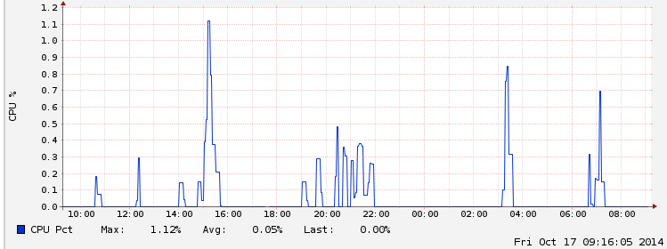
This documentation page contains some previews (screenshots) of all sorts of charts created with the Charts module.
Feel free to correct / extend / refine this community documentation where appropriate.
Preview 1: Bar chart with some color logic
 A bar chart with red columns for negative values, and blue colors for positive values. It was created using the Charts API, the PHP script to actually do so also included some colors related logic (red for negative values, blue for positive values). Nice, no?
Preview 2: Line chart created with the views UI
 A (rather basic) line chart that shows the amount of members added to an organic group per month, which was created using views (with the views style provided by the charts module).
Preview 3: Pie charts created with 2 different libraries
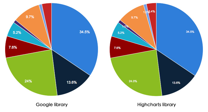 2 pie charts created with either library supported by Charts, i.e. Google Charts and Highcharts
Can you tell the differences? Such as the data labels shown for tiny slices?
Preview 4: Area chart created with the views UI
 Some tabular data near the top, followed by an area chart that is shown as a views attachment.
Here the chart was positioned after the table, it could also have been in front of it as an alternative.
Preview 5: Multiple Series and Combo Charts
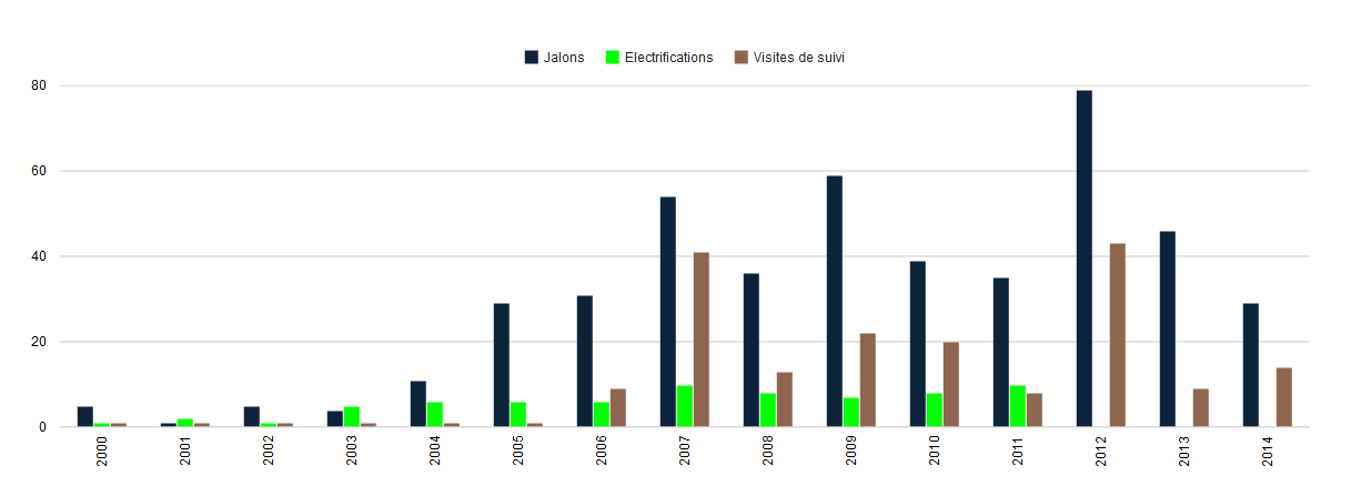 When creating charts using Views, multiple charts can be combined on top of each other.
The "parent" chart provides the global information, such as the height, width, title, and other properties.
Charts that are "children" provide only data and (optionally) a secondary axis. After you've assembled the first series of data in your chart, add a new display to the same view of the type "Chart Add-on". The "Chart Add-on" type is added the same way you would add a new page or block display, from the "+ Add" menu at the top of the view configuration.
Preview 6: Line chart with multiple series
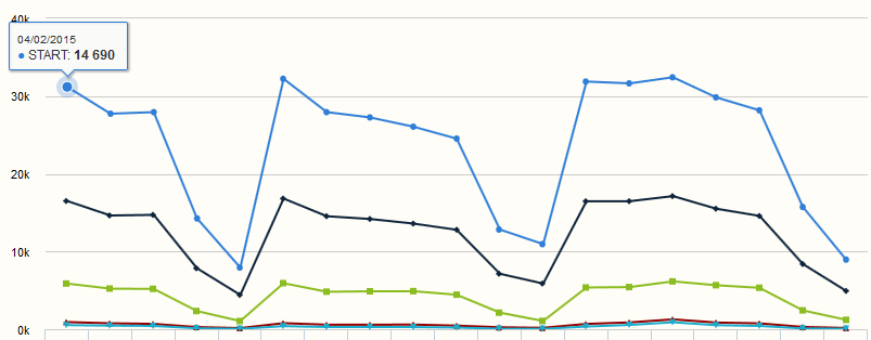 Another line chart but this time with multiple series, and some extra data shown as tooltip.
Be aware however that it also seems to illustrate a small bug, i.e. the values of the yaxis ... 'nobody is perfect', right?
Preview 7: Delivered Charts API example
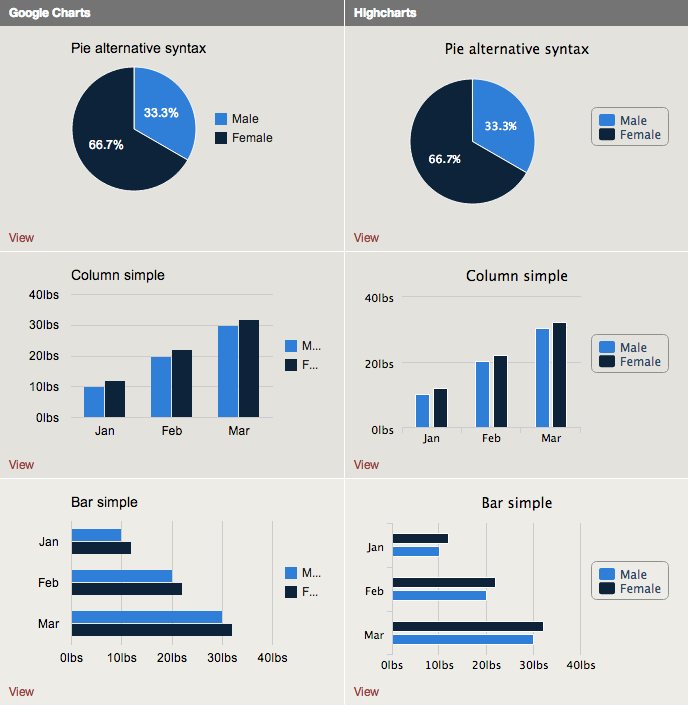 A preview of the out-of-the box charts examples that you should get after installing the charts module
They are created using the Charts API ... 'eat your own dogfood', right?
Note that there are 2 columns shown here, but you'll only see those columns corresponding to the charting libraries that have enabled correctly. That's something the chart module verifies while creating these example charts ... And if Google Charts is enabled, but no charts are included in the column for it, it's probably because there is no working internet connection (or airplane mode?), maybe a firewall issue? What would happen if google is down?
Help improve this page
You can:
- Log in, click Edit, and edit this page
- Log in, click Discuss, update the Page status value, and suggest an improvement
- Log in and create a Documentation issue with your suggestion
