
Fancy Grid - Developer Documentation
You are browsing documentation for an older version of Drupal, which is not supported any longer, and the information may not be correct. See current documentation for Contributed modules
This is the developer documentation of Fancy Grid.
The css class generation of Fancy Grid:
General classes:
.grid-element - Declares the div as a Fancy Grid element
.grid-container - Will remove the gutter, useful for nesting of elements.
.grid-wrapper - The outer wrapper of the Grid. (Usually has a percent width and margin: 0 auto;)
.grid-region - Helper class for clearfixes.
.grid-linebreak - Helper class for linebreaks
Generated classes:
.grid-[layout]-c[column]r[range] - Aligns the element on the grid.
.grid-[layout]-c[column]r[range]c[context] - Aligns the element on the grid in awareness of the parent grid element.
.grid-[layout]-linebreak - Forces a linebreak for a specific layout.
[layout] -> The machine name of your layout.
[column] -> Starting column of the element.
[range] -> Width of the element.
[context] -> Width of the parent grid element.
What is the Fancy Grid context?
Basically thats equal to the contexts of Singularitgs. Fancy Grid will handle the generation of the class attribute and will ensure that the correct classes are added to the element. Read more about grid contexts in the Singularitygs wiki.
This topic confuses many people, the following description may help you to understand it:
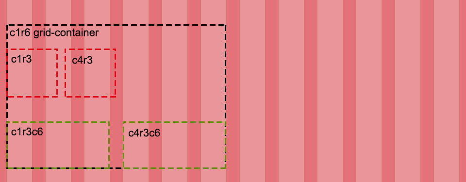
Usually your grid columns have a percent width, not one with pixels. If you nest grid elements, they would become smaller as expected. For this case, the Fancy Grid context was introduced. Basically you just append a "c" and the width of the parent grid element to the class. This ensures the element will have the expected width.
As you can see in the image, the red elements are 50% smaller because of the missing context. The addition of c6 fixes the problem.
Manually align elements to the grid in your own SASS code:
Here you can use any technique which is supported by Singularitygs. Read more about in their wiki.
Example without context:
// Mobile
@include grid-span($r, $c);
// Tablet
@include breakpoint($breakpoint-tablet) {
    @include grid-span($r, $c);
}
// Desktop
@include breakpoint($breakpoint-desktop) {
    @include grid-span($r, $c);
}
Example with grid context:
// Mobile
@include grid-span($r, $c, $context);
// Tablet
@include breakpoint($breakpoint-tablet) {
    @include grid-span($r, $c, $context);
}
// Desktop
@include breakpoint($breakpoint-desktop) {
    @include grid-span($r, $c, $context);
}
Help improve this page
You can:
- Log in, click Edit, and edit this page
- Log in, click Discuss, update the Page status value, and suggest an improvement
- Log in and create a Documentation issue with your suggestion
