
The configure block form UX is a little odd. I think this is an easy thing to fix, but I don't know all of the history here so I am looking for opinions on how to proceed. I have looked at numerous issues about this, but this issue seems different and I think it warrants a new issue:
#1795268: Block metadata should use the standard "name" and "description" fields; follow content type form layout as the model
#202837: Make it easier to customize a block title
#1875260: Make the block title required and allow it to be hidden
#1875252: [META] Make the block plugin UI shippable
#2231551: Clarify block cache settings configuration form
#2089613: Apply machine name ui pattern in the Place Block form
#1925024: Block plugin machine name UX is flawed
#2062715: [META] Many UI/UX issues with custom blocks.
#2361921: Re-order the 'place/configure block' form so it's focused on the task at hand.
I believe the current form is a bit unclear:

It looks like the corrent title pattern was there in this version: https://drupal.org/node/2089613#comment-8156647 but something happened to it. Separately, it seems that the form would be simpler if the order were as follows: title, items per block, cache settings, region, visibility settings.
| Comment | File | Size | Author |
|---|---|---|---|
| #49 | 2269881-block-configuration-form-variations.png | 66.1 KB | yoroy |
| #46 | 1997692-contact-form.png | 85.12 KB | yoroy |
| #40 | block-conditions.gif | 62.91 KB | EclipseGc |
| #31 | block-config.gif | 41.05 KB | EclipseGc |
| #22 | 2269881-Configure-menu-block-after-3.png | 83.17 KB | yoroy |


Comments
Comment #1
tim.plunkettThis is technically a duplicate of #2089613: Apply machine name ui pattern in the Place Block form, but contains more up to date info. I've asked on the other issue if we should mark that as a dupe.
Comment #2
xjmComment #3
xjmAlso see #2062715: [META] Many UI/UX issues with custom blocks..
Comment #4
sqndr CreditAttribution: sqndr commentedI'd like to add that not all block configuration forms look like the one from above. Some have a "cleaner" UX. Sometimes. Here are some improvements I'd like to add.
Issue #1: Block configuration modal layout changes when opening another block configuration modal
Description:
Page:
admin/structure/block- In the right column, under Place blocks click on + Search form under Forms.
- The modal that opens now has the following layout: http://grab.by/x6rU
- Close that modal.
- Next, click on + Administration under Menus
- The modal that opens has a different UI, the following one: http://grab.by/x6s6. Suddenly the machine-readable name field is at a different location, and it's expanded.
- Close that modal.
- Alright, at least out first modal looked good ... Let's have a look at it again (follow the first 2 steps again).
- Wait ... what? The UI has changed, without us configuring everything. We've just been opening modals ... http://grab.by/x6se
Note: This issue also occurs if you just open the same modal twice.
Proposed solution:
- Make sure the block configuration form does not change when just opening another modal (or open the same modal again).
Issue #2: Reorder fields in a way that makes sense.
Description:
Page:
admin/structure/block- In the right column, under Place blocks click on + Recent comments under Lists (views).
- The following modal opens: http://grab.by/x6sQ
Title: Block titleProposed solution:
- Clean up this form.
Comment #5
andypostCurrently form looks like:

Suppose better to move region back to top
Comment #6
sqndr CreditAttribution: sqndr commentedFor the blocks from the views module, the issue still occurs. By default the form looks likes the screenshot from #Issue 1.
Comment #7
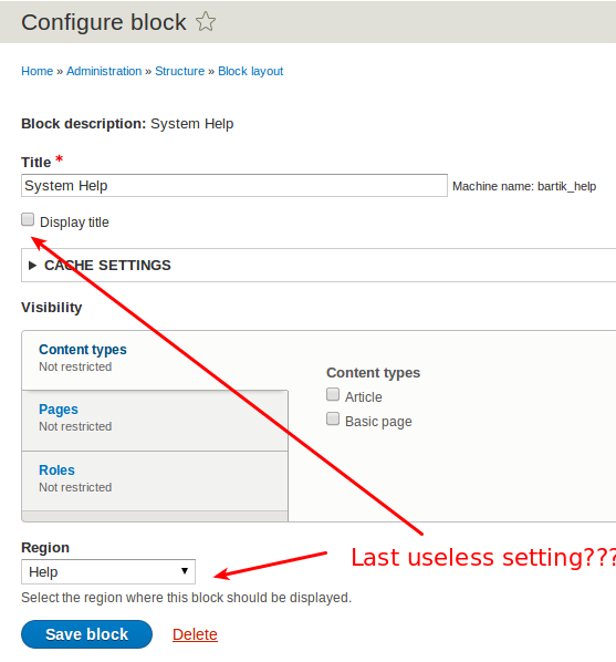
RainbowArrayWhy would the display title and region settings be useless?
It's often useful to not display a title for a block, and it's handy when you create a block to be able to place it in a region, rather than creating a block, going to the block layout page, finding a block, then moving it to a region.
Comment #8
Bojhan CreditAttribution: Bojhan commentedRegion cannot be removed, we have this for many reasons - it is more usable than drag and drop on your mobile phone but also for accessibility.
Comment #9
sqndr CreditAttribution: sqndr commented@mdrummond: The issue is the blocks modals are inconsistent, not that they are useless.
Comment #10
RainbowArray@sqndr: The screenshot used the word useless, which is why I asked. I'm all for consistency.
Comment #11
andypostAt least block description better move to title
Comment #12
andypostPatch #11 moves block description to title.
The problem with the form that settings form from plugin injected into the main form
$form['settings'] = $entity->getPlugin()->buildConfigurationForm(array(), $form_state);And machine name "id" actually lives at different level of form array.
Also there's an issue with machine name when block placed first time
1) click "edit" machine name
2) expected to see input under title but actually it's moved below plugin settings
Comment #14
andypostFix test
Comment #15
tim.plunkettI don't know why removing that text is "improving" the UX.
It was explicitly added in #1956448: Use the block instance title on the block admin listing
Comment #16
yoroy CreditAttribution: yoroy commentedI went through all blocks in standard install and got this set of options:
I see three main buckets for these:
I don't think we have to make these 3 groups explicit in the UI, but it can be a useful format for ordering the items in the UI:
Ingredients
Visibility
Caching
Comment #17
whiplashomega CreditAttribution: whiplashomega commentedI'm not sure if this should be a separate issue but, as a site creator looking into Drupal 8, I found the fact that the 'configure block' form did not contain any sort of link to edit my custom blocks highly confusing. It took me a couple hours to figure out that I had to go to the custom block library to edit my custom blocks. Just adding a button that goes to the 'edit block' form from within the configuration form would be immensely helpful.
Comment #18
webchickI don't want to necessarily block release on it (yet), but the way the block form is currently laid out is reaaaallly sub-optimal and represents a regression from D7.
Comment #19
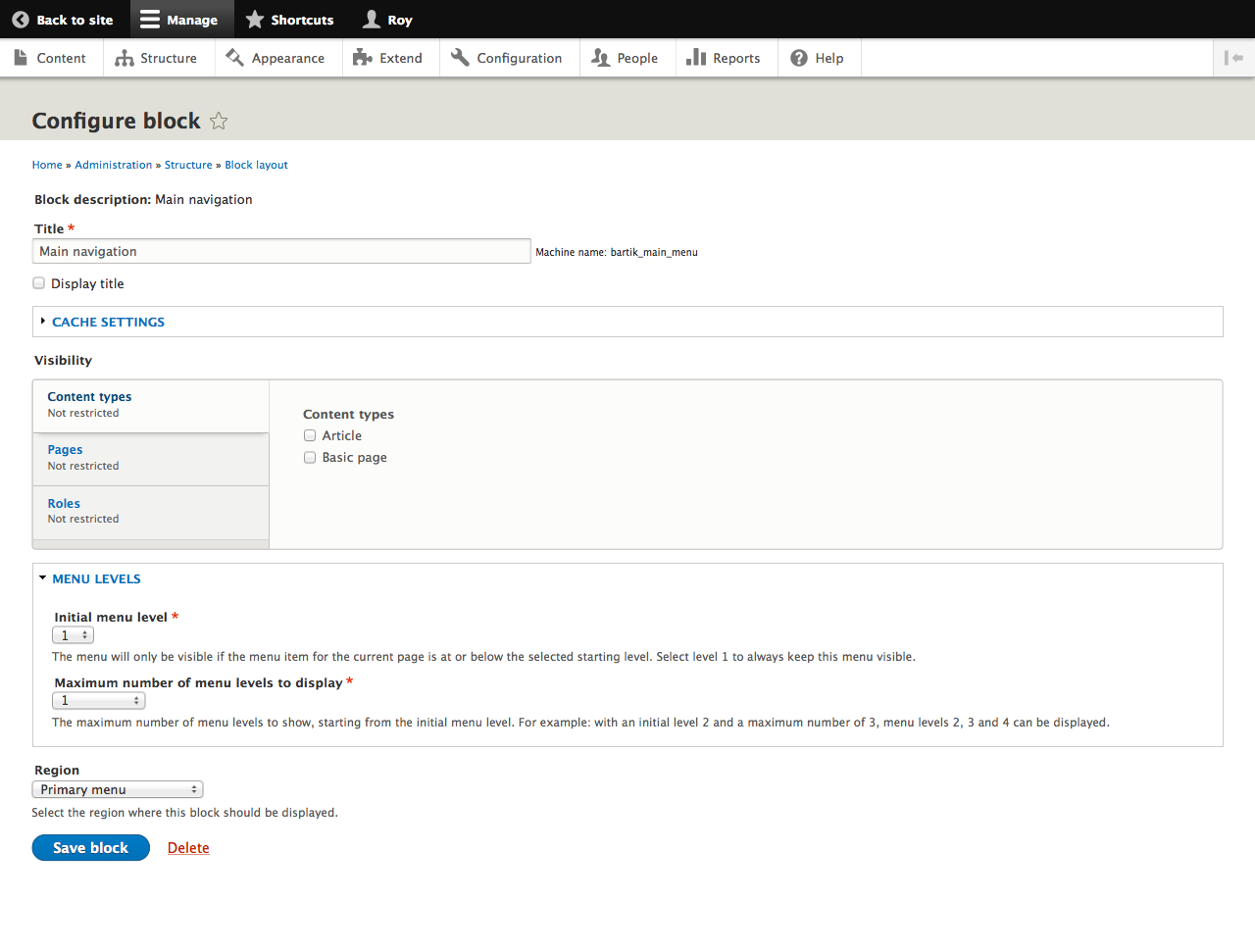
yoroy CreditAttribution: yoroy commentedAs an example, here's the Main navigation block config form reordered as suggested in #16:
Before:
After
The "Block description: Main navigation" part is a bit of a loose end. And I feel like adding the 'Cache settings' fieldset to the 'Visibility' vertical tabs, but then of course the 'Visibility' label wouldn't be right anymore.
But, looks to me that only reordering what's there will help a lot already.
Comment #20
webchickWell that's approximately 800,000% better, as long as "Menu levels" is collapsed by default (which I think it is).
There is a patch in this issue, but it's not doing that, so setting back to active.
Comment #21
Bojhan CreditAttribution: Bojhan commented@Roy I am wondering - why do we not just add more things to the vertical tabs? Its normally for "anything" meta. Right now we seem to be limiting it only to visibility settings.
Comment #22
yoroy CreditAttribution: yoroy commented@Webchick: Menu levels fieldset seems to be expanded by default, which I don't really mind. It's semi-advanced stuff but at the same time directly applies to the "menu-ness" of the menu. If we collapse it by default then it might as well be a vertical tab.
@Bojhan, yup. Some of the existing tab labels need rewording then and we'll either have to find a very generic label for the whole v-tabs collection or come up with something more specific per block when/if possible.
Mockup with only the cache settings in vertical tabs
Mockup with both cache settings and menu levels in vertical tabs
Comment #23
webchickNow we're talking! (Image #2) That makes it super easy to focus on the most important thing (actually placing the block :))!
I would reorder them slightly though, and put visibility first (this is the most common setting, and affects all blocks regardless of module), then I guess cache settings, then whatever block-specific config (in this case, menu stuff). Maybe. I'm trying to figure out how to make it obvious there are module-specific settings when there are some; this way "special" settings would always be just above the save button. It might be the only way to accomplish that is image #1 though, although that's less ideal since it's putting a ~10% use case setting above a 90% use case setting.
Comment #24
webchickLet's re-scope this issue down to just the current direction. We could always pursue other improvements in separate, individually actionable issues.
Comment #25
EclipseGc CreditAttribution: EclipseGc commentedErrr, uh please no?
You cannot just start throwing stuff into the visibility condition tabs, this has HUGE implications. Let me break this down a bit.
As core stands right now, EVERY available condition will be put into that list as a v-tab. Go instal D8 version of rules and watch that blowup. Any module adding condition plugins will explode these v-tabs dramatically. This UI doesn't scale, and needs to be torn out in favor of a UI that is opt-in. I'm having to do some pretty horrendous things in #2339151: Conditions / context system does not allow for multiple configurable contexts, eg. language types to deduce whether or not the user actually interacted with the visibility settings as they stand currently. This has larger implications already, and conflating non-visibility related things with visibility in the form is sure to cause further problems when what we should be doing is tearing out visibility completely from this form (or radically rethinking it).
As a second point, this UI is working against placing a menu block, so exposing the block's actual configuration and not hiding it in a vtab somewhere seems as logical as placing a node's fields somewhere visible. We wouldn't hide those in a vtab ever. As far as cache goes, I need to look at that a bit more closely, but I believe this has sane defaults, and would be better served by a separate configuration form. It's an uncommon task and can be progressively disclosed to the user through another mechanism.
In short, I'm really against putting everything into v-tabs. If I can't convince you to not do that, then at least don't put it into the same v-tab set as the visibility rules. That will complicate really necessary visibility UI refactoring that NEEDS to happen.
Eclipse
Comment #26
Bojhan CreditAttribution: Bojhan commentedI don't think us putting 3 more things in something, that from your calculation would have hundreds of things is really the problem from a UX perspective. Rules should probably be implementing a new UI (as it does for many other parts). The fact that you can't deduce what changed and what hasn't changed, to me is just an API flaw not a UI flaw. I know you feel differently about that, but I guess we have to agree to disagree on that part :)
You have a major task, which doesn't seem to have any feedback from committers whether we need to also treat the UI as a major problem. At this point of the release, I think its good for that other issue to get clear guidance how critical it is for release. Because its hard if we have a dependancy on every major task, [#339151#comment-9209057] asked for comitter feedback - lets make sure we get that. Because building a UI thats scalable for all those usecases, is one hairy problem - not really suited for this point in the release.
So again I suggest you coordinate a little bit more, as I suggested at Drupalcon. Since #2284687: Redesign UI for better management of block visibility is kind of blue-sky dreaming, rather than a real build able UI in this part of the release cycle. Perhaps make a new issue or clearly outline the scope and limitations. I cannot make sense from the story above.
Comment #27
EclipseGc CreditAttribution: EclipseGc commentedNo, we don't have to agree to disagree. I'm speaking in very literal terms about how Drupal works. You submit form elements, you get form values. This is that simple.
As for Rules, you have said this before, and it make no sense. Rules isn't using THIS UI. This UI and rules both use the same condition component. Rules adds conditions (to use it its UI) and those conditions will display their forms here because of how this UI is completely insane and assumes users are too dumb to uncover possible visibility conditions as needed. Rule's conditions should absolutely be usable for block visibility, but they should not be automatically applied to all blocks, and that's what this UI does. Due to all the form elements you're going to get (re: my first paragraph) this UI makes all sorts of havoc for determining visibility of blocks. It's completely inadequate technically, and will not scale from a UX perspective with any mildly complex Drupal 8 install (that includes likely contrib). We (fago and myself) collaborated on Condition plugins with the intent of reusing them in core and various contrib. This isn't an accident, we wanted a single standard. Legacy block UI leverages them badly because it makes completely false assumptions based upon a pre-8.0.x world view.
The other issue I cited is NOT rewriting the UI (currently) it is just trying to organize the existing code flow into something more sane, but all the issues I stated above are true whether that issue gets committed or not. That issue just ensures that panels and display suite don't also inherit this awful problem.
If what I'm saying doesn't make sense, maybe try talking to dawehner and he'll tell you the same thing. Code-wise, this UI cripples developers trying to do more and better things with it. If I'm not communicating clearly about the problem, I don't know what else to say. Probably refer back to my first paragraph in this post. It's not a thing we just see differently, this is a technical problem that is exacerbated by the existing legacy UI, so please, stop trying to say that we just see it differently. It's not a thing that's open to interpretation. (This UI also actually limits things we'd probably like to do like ANDing together two of the same condition.)
Eclipse
Comment #28
EclipseGc CreditAttribution: EclipseGc commentedAlso, fwiw #19:after is 100% acceptable to me. It's the stuff after that that gets super iffy.
Eclipse
Comment #29
Bojhan CreditAttribution: Bojhan commentedI still feel like we need to work on a new issue for what you are mentioning - I don't see how these VT's could scale to what you try to explain.
I look forward to a comment from a committer how to proceed with this one, if that means we can't pursue #22. Thats understandable. Just surprised to see, how fragile our VT's are.
@EclispeGc Sorry, but your tone is not respectful. Please consider our code of conduct. I think I am taking adequate time to understand your concerns, but it seems like this is a one-way street here.
Comment #30
EclipseGc CreditAttribution: EclipseGc commentedYeah, i won't engage in a dcoc discussion in the issue queue. If you want to discuss this, IRC ftw.
Eclipse
Comment #31
EclipseGc CreditAttribution: EclipseGc commentedWhat if we could do this? Anyone interested in that?
Eclipse
Comment #32
EclipseGc CreditAttribution: EclipseGc commentedSo, if we're interested in #31, that'd need to be a separate issue. I'm going to say this again really really clearly, #19:After is a perfect illustration of what I think core should do in its current state. Can we agree to pursue that?
Eclipse
Comment #33
andypostMaybe it's time to apply "wizarded" approach for block placement that we have for fields already?
Field visibility/access is pita too!
The same as "configure menu levels" fields have #552604: Adding new fields leads to a confusing "Field settings" form for 5 years...
So splitting the issue into parts should help here.
1. Changing title/machine name for block at the time of placement is not the first thing to do for end user
2. Configure block settings if there any should be first form
3. Then visibility as less used
4. And finally caching and machine name
Also combining admin-title with machine name would be more useful for devs, I think they are more coupled.
EDIT field access is not solved in core at all, that's related to visibility of the piece of information bounded to bigger entity (page display for blocks)
Comment #34
dawehnerFirst, let's stop talking about block visiblity, this is not in scope of that issue at all, here is a dedicated issue: Either #2284687: Redesign UI for better management of block visibility or a different one which has much simpler ideas, without solving everything with new patters, like some proposals in that other issue.
After talking with bojhan and eclipsegc in IRC there are basically two main ideas.
bojhan:
His main point is to "connect the dots", to not decouple things until its a nightmare for users, because they need so many different places,
that they will not finish the task. This could be caused by simply misunderstanding, or just distraction.
eclipsegc:
He wants to ensure that we have decoupled concepts: Different mental ideas should be separated somehow (he refers to panels doing it in different pages),
but as far as I understand this is an implementation detail. It would be enough for him, to clearly communicate that in the current one-screen thing.
Let's please not merge things into the visibility settings in order to safe space. The mind models here should be different and communicating
that is a really important thing if you ask me.
After talking a while with bojhan here is a simple addition on top of the proposal of #19, before things got crazy.
#19 solved the reordering problem of the main elements by rearranging them in a more sane way (no cache is not the first thing you do ;))
In order to tell people a bit about the mind model I propose to add some label for the "content" setting (what is displayed inside the block).
Another addition to the mind model would be to had a label "visibility/cache". (bohjan talked about .fieldgroup)
This adds the following small details:
We, as a community, have to be aware of the following fact. We always have to adapt to existing "features", both the simplicity of the blocks UI
and of the feature richness of the panels UI. No group can ignore the other one, because Drupal is primarily successfull because of its
flexibility, not because of simple design (UI or code).
Comment #35
webchickI still do not understand how simply putting things in a bulleted list (that's all vertical tabs are from a markup perspective) breaks the ability for contrib to do anything (worst-case, hook_form_alter() ftw). #19 is still a tremendous step up from where we currently are (the only "required" setting on the form is literally the very last thing after a bunch of scary-sounding stuff like "cache" and "menu depth"), so I don't really oppose falling back to that per se, but would feel better about falling back if I better understood what is so tremendously awful and limiting about #22.
I don't use Panels and I don't use Rules. I need some screenshots or something to make sense of EclipseGc's arguments.
Comment #36
EclipseGc CreditAttribution: EclipseGc commented++ to these notions, would like to see a screen mock.
Eclipse
Comment #37
RainbowArrayI'm not unclear on all the implications of the visibility tabs discussion. However, I do like the general changes in #19. When I was working on the menu levels/depths additions to the menu block, it felt really weird that this was jammed at the bottom of the block configuration when that's a pretty important configuration setting for a block dedicated to menus. Because it is crucial to this type of block rather than other types of blocks, I don't think it makes sense to put menu level/depth into a vertical tab.
It's also important to note that by default the menu level/depth settings are collapsed. This particular example is for the main navigation block which has settings that differ from the default settings: in that case, the settings are not collapsed. So if you create a new menu block, the settings are collapsed. But once you make a change to those settings, the settings are not collapsed.
Just wanted to clear that up.
Nice work on rearranging things. #19 looks a lot cleaner than what we currently have.
Comment #38
dawehnerFirst, let's us try to be friends but still be kinda rational.
First, here are some screenshots. Panels just puts everything into its own modal page.
Panels
Add block
Configure title + specific settings for a block (menu levels on a menu block, items per page on a views block etc.)
Once you are done you can select in the main overview page, which additional stuff you want to configure (cache, visiblity etc.),
To be fair, panels has the advantage that visibility rules are less important, because you already have "implicit" visibility rules given
by the panel and its URL itself.
These are the screens for the visibility
Rules
Rules is kinda similar, you do everything in extra screens, see the additional pictures (https://www.drupal.org/files/issues/picture6.png https://www.drupal.org/files/issues/picture7.png https://www.drupal.org/files/issues/picture8.png https://www.drupal.org/files/issues/picture9.png)
Talking about using the VT UI patterns: While it certainly looks nice, it has scalability problems once it comes to actual site-building. You
will easily have like 20 contrib modules, each providing one condition and your UI starts to be unusable.
Comment #39
andypost+100500 to #37
in #11-#13 I'm trying to show that "admin_title" (block description) is useless inside form (moving to page title)
in #33 + #37 - block (plugin) settings is a first thing to configure and then other by priority (usage)
I'm on the side to decouple at least "advanced settings" cache that have mostly never changing because they have sane defaults.
SO maybe better make block_add form to configure block settings (simple) first and block_edit to configure visibility first?
Comment #40
EclipseGc CreditAttribution: EclipseGc commented@daniel,
all your pictures are broken or wrong :-(
@angie,
Conditions are a generic API anyone needing true/false returns can leverage. Rules does this, Page_manager does this, core block visibility does this. Installing any contrib that provides a condition plugin will add to the existing block visibility rules automatically. We can't avoid that w/o rewriting the UI to not automatically expand all condition forms. I'd ultimately like to avoid nonsense that look like this (just imagine that each Role vtab is a different condition plugin):
Since we are currently parsing all conditions together, adding all the form elements to the same vtab group would mean knowing whether we're dealing with conditions or not during validation and submission. Also, my patch in #2339151: Conditions / context system does not allow for multiple configurable contexts, eg. language types is actively moving where those form elements reside in code and updating all the tests accordingly. Trust me when I say it's been a bit of a pain. I also totally object to the vtabs for the block configuration just in terms of it being bad UI in general. That's a central element of what you're doing in this UI and putting it in a vtab actively demotes how important it is to this UI and sets it up for contrib potentially hiding it on accident.
Hope that explains my position.
Eclipse
Comment #41
yoroy CreditAttribution: yoroy commentedFor the next mockup I first need to understand what this suggestion means for the ui:
1. What is the "content" part of this UI? Everything up till the vtabs?
2. Is this a wrapper around visibility vtabs + the cache fieldset? Do we expect anything else besides cache settings in this section?
Comment #42
EclipseGc CreditAttribution: EclipseGc commentedyoroy,
There are 4 different things acting on this screen:
This is immediately complicated by the fact that the Block Plugin's form returns it's own settings, the visibility conditions and the cache settings. Visibility isn't even something it should care about (which I'm trying to fix in #2339151: Conditions / context system does not allow for multiple configurable contexts, eg. language types) and cache is something it HAS to care about. All of the data collected here is stored ON the block entity, but some of it is passed to the block plugin, some of it is passed to condition plugins and some of it is used by the block entity directly.
Block Entity
Visibility Conditions
Block Plugin
I'm not sure I support trying to communicate any of this to the end user. They're going to choose a block placement method (core or otherwise) and it's going to have block placement forms... That's probably good enough. Core's specific needs vs panels or display suite seems unnecessary to communicate in this way to me.
Eclipse
Comment #43
yoroy CreditAttribution: yoroy commentedThanks, but not sure how that answers my question :-) Maybe it'd be good to get some more examples of 'everything else' in the 'Block Plugin' section there? Some things in core are:
- Menu depth settings
- Items per block
- Toggle branding elements
- …?
Comment #44
andypost@yoroy Yes, each plugin could have a settings, your list is right, but contrib modules could have more settings for their blocks
Comment #45
EclipseGc CreditAttribution: EclipseGc commentedThey could make just about any form you can imagine as configuration for their block.
Eclipse
Comment #46
yoroy CreditAttribution: yoroy commentedStill, concrete examples would help. While 'anything' may be the technical reality, it's not very helpful for defining the different sections and prioritizing them for this UI. I suspect the examples in core are relatively simple, found another one for the contact form patch in #1997692:
Here you'd want the draggable links to be above the visibility settings as well.
Too bad dawehners links in #38 are broken, I think there would be some examples there. At this point I'm leaning towards still wanting to single caching out and put that in a vtab, and put all the other configuration items provided by Block Plugins above the vtabs.
Comment #47
EclipseGc CreditAttribution: EclipseGc commentedIt's a lot easier to define what WON'T be plugin settings:
Title, Machine Name, Title Visibility, Region, Theme (when available), Visibility V-Tabs & Cache Settings. Anything else is Block Plugin Settings.
Hope that's helpful.
Eclipse
Comment #48
yoroy CreditAttribution: yoroy commentedHmm, "anything else" still doesn't give me examples though and I'm focussing on those because it looks like it's from that section that we can expect the most UI noise. I'm less worried about a small or larger amount of items in the vtabs. 20 similar (Visibility) items is an easier UI problem to solve than 5 different settings forms coming from Plugins.
I'm attaching some high-level explorations for ways to have two seperate buckets for Plugin and Visibility items. I'm not sure any of these are feasible or actually helpful here, but maybe it helps think things through.
We could still start patching towards the mockup in #19 and see if that helps us enough to move away from the 'major' status of this issue.
Comment #49
yoroy CreditAttribution: yoroy commentedNon-transparent png…
Comment #50
jibran+1 for two sets of vertical tabs.
Comment #51
EclipseGc CreditAttribution: EclipseGc commentedI still worry about the two sets of vertical tabs. Perhaps if it were: Settings & Cache in one v-tab and "visibility" in the other, but that would be just two vertical tabs in the first one always. The reason I worry about this is because everything in the Plugin "Settings" is essential to the task at hand. I totally agree, it can run the range from literally nothing (powered by) to... maybe even the whole views UI. Breaking that form, whatever it might be, into multiple v-tabs just seems like it would hide essential tasks the user has to perform. Just my 2 cents.
Eclipse
Comment #52
webchickYeah, I worry that while this discussion is useful in the broader sense of how we want to structure this UI to account for all of the various use cases, #19 is completely fine to solve the "majorness" of this issue (probably is even a novice issue, really).
Given all of the comments here that are getting into the "meat" of the problem, how about I split off this issue title + #19 mocks into a sub-issue so we can get that in quickly, and then let this discussion take its time? Thoughts?
Comment #53
yoroy CreditAttribution: yoroy commentedSounds good! Thanks.
Comment #54
EclipseGc CreditAttribution: EclipseGc commentedI am 100% ++ to that notion.
Comment #55
webchickDone: #2361921: Re-order the 'place/configure block' form so it's focused on the task at hand.
Made an attempt at re-titling this one appropriately, but I'm not sure I got it right. Feel free to adjust.
Also, we will definitely need an updated issue summary here.
Comment #56
catchComment #58
joachim CreditAttribution: joachim as a volunteer commentedThe way the block machine name jumps down in the form when you edit it, as mentioned in https://www.drupal.org/node/2269881#comment-8900009, seems to have dropped off the title of this issue -- should a separate issue be opened for it?
Comment #59
hampercm CreditAttribution: hampercm as a volunteer and at Acquia commentedSee #2361921: Re-order the 'place/configure block' form so it's focused on the task at hand. for a fix for the machine name jump and region form element ordering.
Comment #65
andypostComment #67
andypost