Problem/Motivation
Drupal has several buttons or links where the text is visibly hidden and replaced with a small icons. This poses challenges to speech recognition users because they don't know what to say to trigger those commands. For buttons or links where the text is visible (e.g., "Home" or "Menu") speech rec users can simply say "Click Home" or "Click Menu". For icons without text, they can guess if the names of the controls are intuitive, but in Drupal's case they aren't.
Steps to reproduce
Proposed resolution
- Add a title attribute to each control in order to reveal the text for that control to users when they hover. They'll need to use mouse commands at least once to discover the text, but subsequently they can use that text in a voice commands, which will be much more efficient.
- Consider using more intuitive text. For example, rather than "Vertical orientation" and "Horizontal orientation" consider using "Move menu to left" and "Move menu to top"
- Use larger icons so they're easier targets
Remaining tasks
Open up follow up tickets in quickedit and ckeditor4 modules
Reroll for toolbar
Review
Commit
User interface changes
NA
API changes
NA
Data model changes
NA
Release notes snippet
NA
Original Post
Problem/Motivation
Drupal 8 has several buttons or links where the text is visibly hidden and replaced with a small icons. This poses challenges to speech recognition users because they don't know what to say to trigger those commands. For buttons or links where the text is visible (e.g., "Home" or "Menu") speech rec users can simply say "Click Home" or "Click Menu". For icons without text, they can guess if the names of the controls are intuitive, but in Drupal's case they aren't.
Alternatively they can operate their mouse by voice (mouse left, mouse up, faster, faster, faster, stop, mouse down, mouse right, stop, click) but this is very cumbersome and if targets are small (which many are in Drupal) it's hard to stop at precisely the right position.
Proposed resolution
- Add a title attribute to each control in order to reveal the text for that control to users when they hover. They'll need to use mouse commands at least once to discover the text, but subsequently they can use that text in a voice commands, which will be much more efficient.
- Consider using more intuitive text. For example, rather than "Vertical orientation" and "Horizontal orientation" consider using "Move menu to left" and "Move menu to top"
- Use larger icons so they're easier targets
Examples of icons that require fixing:
Top left corner, pencil icon: <button aria-pressed="false" role="button" class="icon icon-edit">Edit</button>
Secondary pencil icons such as:
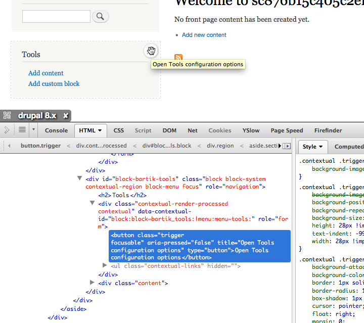
<button type="button" class="trigger focusable" aria-pressed="false">open configuration options</button>
And this one, next to search:
<button type="button" class="trigger focusable" aria-pressed="false">open Search configuration options</button>
The small "X" at top right corner of overlay:
<a aria-controls="overlay-content" role="button" class="overlay-close" href="#" id="overlay-close">
  <span class="visually-hidden">Close overlay</span>
</a>
The icons for swapping vertical and horizontal orientation of the secondary toolbar menu:
<button type="button" class="icon icon-toggle-vertical" value="vertical">Vertical orientation</button>
And:
<button type="button" class="icon icon-toggle-horizontal" value="horizontal">Horizontal orientation</button>
The Small + or - icon (shortcut.png) that appears next to the main heading on various admin pages is unique in that it has accompanying text, which seems to be serving a function similar to having a title attribute:
<span class="icon">Add or remove shortcut</span>
<span class="text">Add to <em class="Placeholder">Default</em> shortcuts</span>
The text in the second span appears visible on hover. Why is this technique used for this icon only? I think it's ok, and speech rec users can use either text in their voice command (i.e., "Click add or remove shortcut" and "Click add to Default shortcuts" both work). However, it might be confusing if the text in the second span is always changing. Since that's the text that's visibly exposed users will discover that in one context, but if it changes dynamically the same command they've learned in one context might not work in another context.


Comments
Comment #1
bowersox commentedFeedback on the three proposed resolutions:
It might be best to start with the first one and try to get that into D8.
@terrill, thanks for writing this up so well!
Comment #2
jessebeach commentedComment #3
mgifford@terrill - This has been amazing. We've really had very little input on how to make Drupal better for Dragon Naturally Speaking Users.
Thanks for adding these issues!
Comment #4
falcon03 commentedNo patch to work on yet, so set status to active :-)
Let's make sure that adding the "title" attribute does not make the screen reader users experience worse saying both the invisible text and the title attribute value at the same time, making them hear the same thing two times.
Comment #5
mgiffordThis gets back to #1919940: Build API to Replace Links using Title Attributes with Proper Accessible, Themable Tooltips, tooltips.
Providing a visual way to provide context in a way that doesn't mess up screen readers.
I thought the list of commands would be useful to see:
http://www.nuance.com/ucmprod/groups/dragon/@web/documents/collateral/nc...
Definitely want a solution that doesn't pit one user base against another.
Comment #6
mgiffordWould be good to post this question http://www.knowbrainer.com/forums/forum/categories.cfm?catid=4
Comment #7
mgiffordAdding related links.
Comment #8
mgiffordOk, I tried to add them above, but hopefully this works.
On Dragon KnowBrainer forum
Testing sandbox http://simplytest.me/project/drupal/8.x
Comment #9
mcjim commentedDoes anyone know what JAWS needs for these buttons?
I've tried title, aria-label and an actual label tag with JAWS 15, but to no avail.
VoiceOver is happy with the element text, title or aria-label.
Comment #10
mcjim commentedDid some more testing: it may be my setup, I don't know, but the buttons are fine (as they are) with JAWS and FireFox or Chrome.
However, if I add a title attribute, that is read out in addition to the text within the element (JAWS with either FF or Chrome).
e.g. "Open my article configuration options button", immediately followed by whatever I put in the title, which isn't what we want to happen.
(JAWS and Internet Explorer I'm having problems with. It doesn't seem to like anything on the page. Could be my setup, I have no idea.
This is Windows 8.1, IE 11 and JAWS 15.)
Comment #11
mgiffordJAWS is highly configurable. Titles often present a problem as screen readers tend to read them out even if they are identical to the alternative text.
There are many times with accessibility issues where it is impossible to meet everyone's needs.
Comment #12
mgiffordI wanted to provide a good clear example an introduction of a button for evaluation for accessibility. Right now this is the button code for the pencil used for the inline editing:
<button class="trigger focusable visually-hidden" type="button" aria-pressed="false">Open configuration options</button>I'm not sure if it is too small for people to focus on. I think that would depend on user testing.
The issue is whether to add a title attribute so that a Dragon user will know what to call that button after hovering over it. I just added this directly to the source using Firebug for this demo:
Comment #13
mgiffordI do think we could really benefit from some Dragon users... But here's a patch to see if we're leaning the right direction.
Comment #16
mgiffordRerolling the above patch.
Comment #18
andrewmacpherson commentedA relevant post about how WordPress are approaching Dragon etc, including responses form users testing it.
https://make.wordpress.org/accessibility/2016/05/13/20th-wordpress-acces...
Comment #19
mgiffordIt's great that WP is taking this on. Lots to learn from this approach.
Comment #30
smustgrave commentedCkeditor and quickedit have been removed in D10 so separate tickets should be opened in the contrib project for those.
Then this ticket can be rerolled for just toolbar. Also should include IS update
Comment #31
smustgrave commentedComment #32
gaurav-mathur commentedApplied patch #31 successfully on drupal version 10.1.x and working fine.
Thank you
Comment #33
mgiffordAdding WCAG 4.1.2
Comment #34
duaelfrLooks good. Fixes the issue.
Given the length of the remaining fix, I don't have much more to say ;)
Thansk!
Comment #35
lauriiiThis was proposed almost 10 years ago. I think it would be great if someone could check if this is still what we should be doing. 😇
Comment #36
lauriiiWait, I looked at the patch and I'm confused. Maybe what we actually need is a title + brief issue summary update? It totally makes sense that the button should have text, but that's not what I was expecting based on the title. 🤯
Comment #37
smustgrave commentedThink this does need some more thinking out.
At first I was actually wonder if it's needed now. I see the button has text in it so it should be fine.
But I installed the examples module which adds a tab to the toolbar. And that has an empty button for switching between vertical/horizontal..