Problem/Motivation
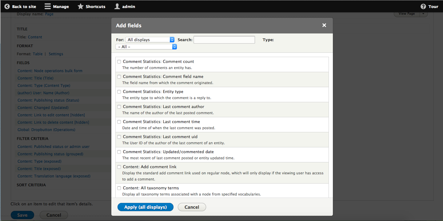
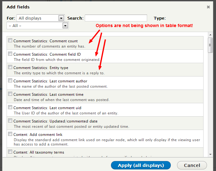
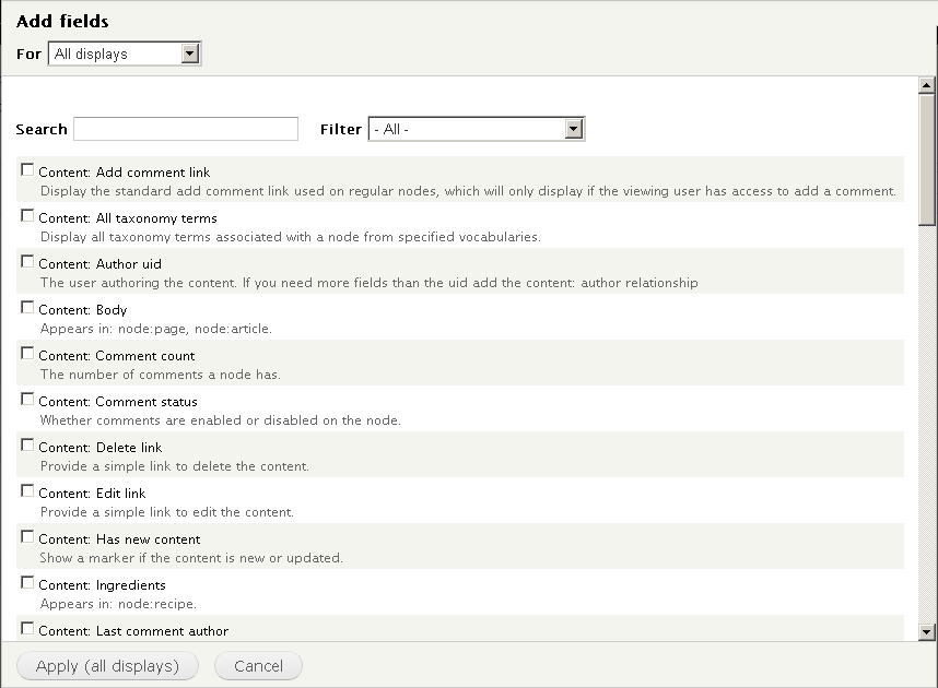
Too many options under configuration options for fields/ filters/contextual filters/ relationships: Participants feel “overwhelmed” when they see the long scrolling list of options. The problem gets worse because the participants do not necessarily see the “Search” option. This has multiple causes:
- The description text makes it significantly harder to scan, this because it visually creates two lines and creates highly variable rows.
- The description text often adds no additional information.
- The design has insufficient spacing, also decreasing readability - because its not a standard table design.
- The filter/search is awkwardly placed, causing them to be often missed.
The criticality of this issue is determined by the fact that this completely overwhelms users, to the point that they either start pogo-sticking or looking elsewhere. The overwhelming effect of Views has many parts, this is one of the very important contributors.
Proposed resolution
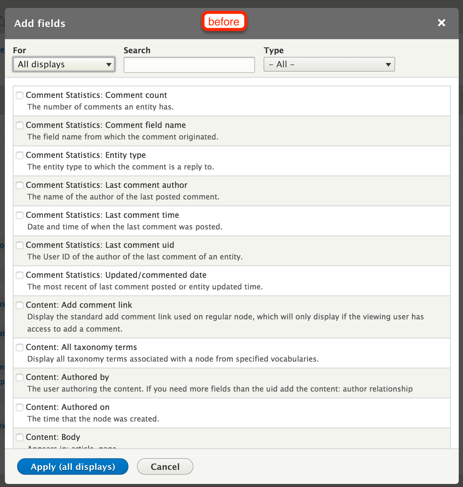
The solution is relatively meta, its attacking this problem on multiple axes. The most important issue, that this issue intends to solve is the fact that by not using tables and grouping information we are largely creating that overwhelming effect.
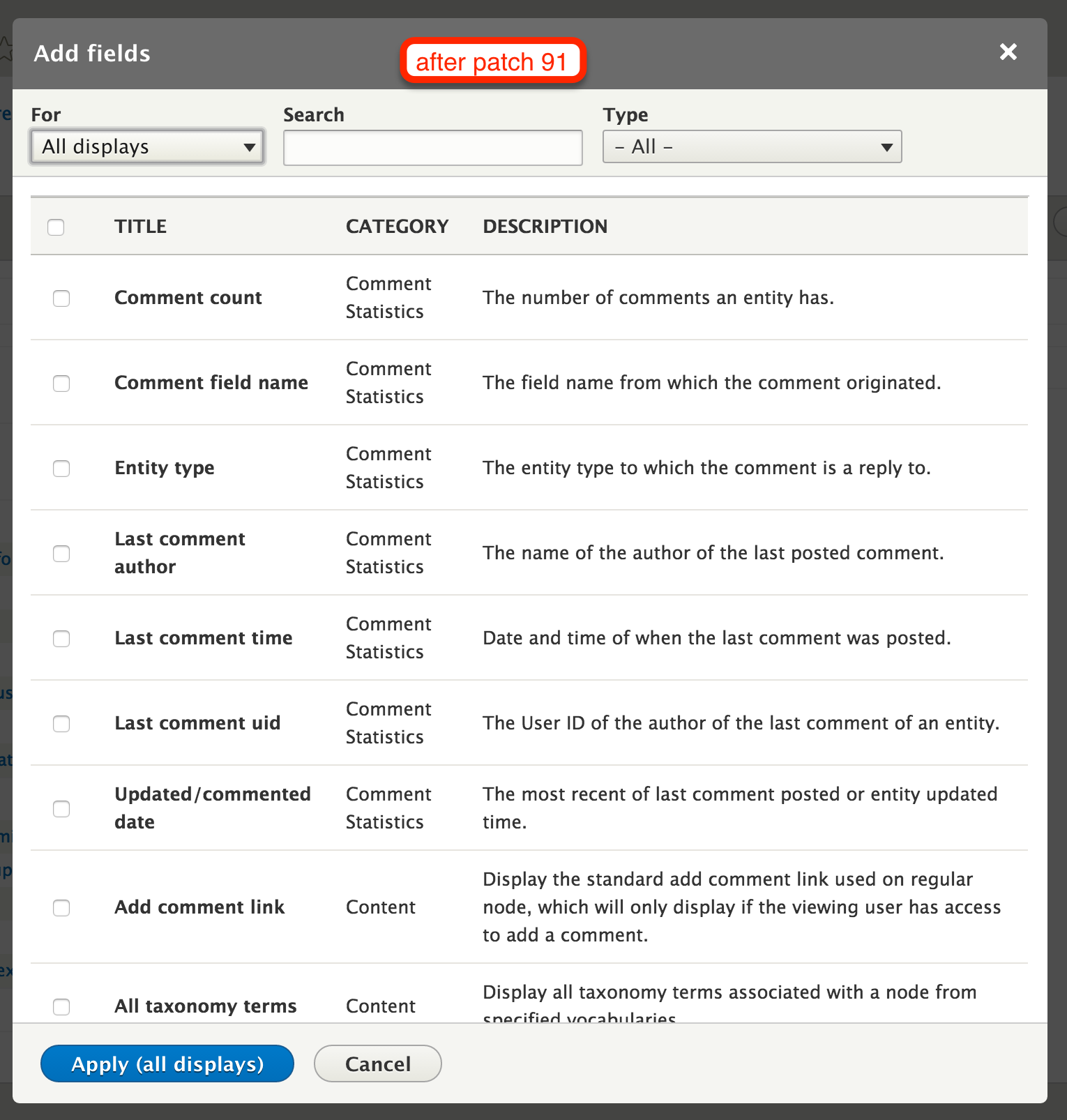
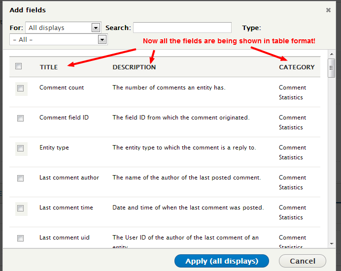
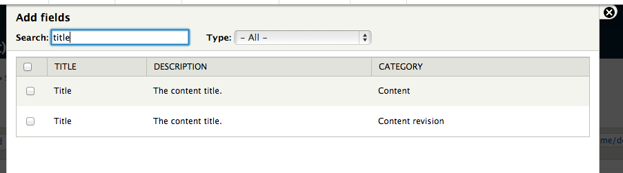
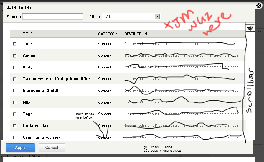
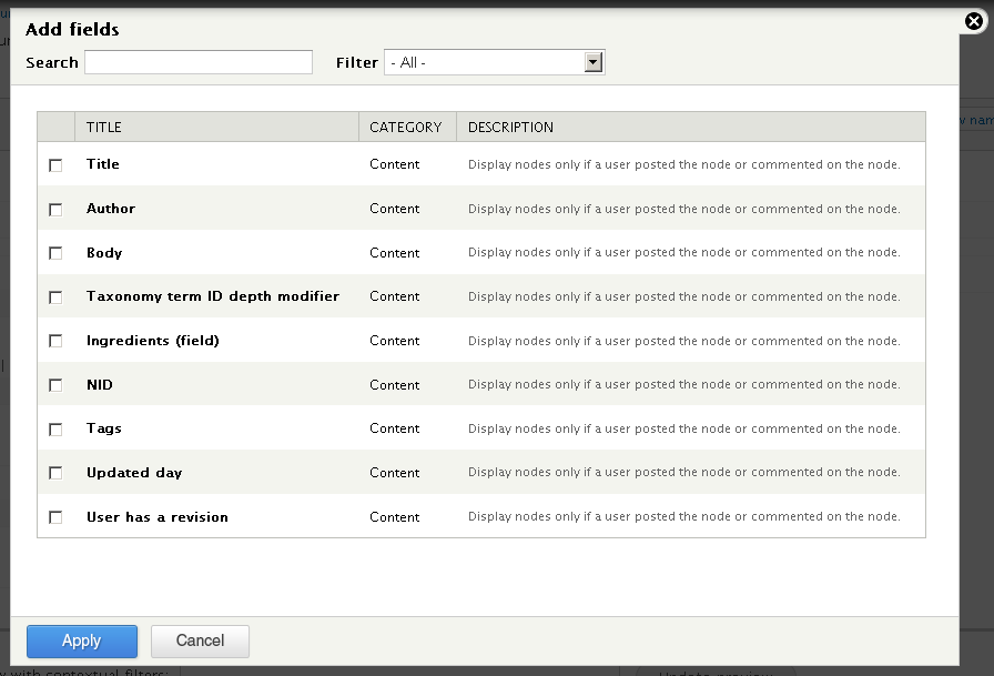
The main proposal is to turn it into a table and group the information:
Remaining tasks
Contributor tasks needed
| Task |
Novice task? |
Contributor instructions |
Complete? |
| Manually test the patch |
Novice |
Instructions |
|
| Embed before and after screenshots in the issue summary *for current 8.0.x head* and *for the most recent patch* |
Novice |
Instructions |
|
| Review patch to ensure that it fixes the issue, stays within scope, is properly documented, and follows coding standards |
|
Instructions |
|
User interface changes
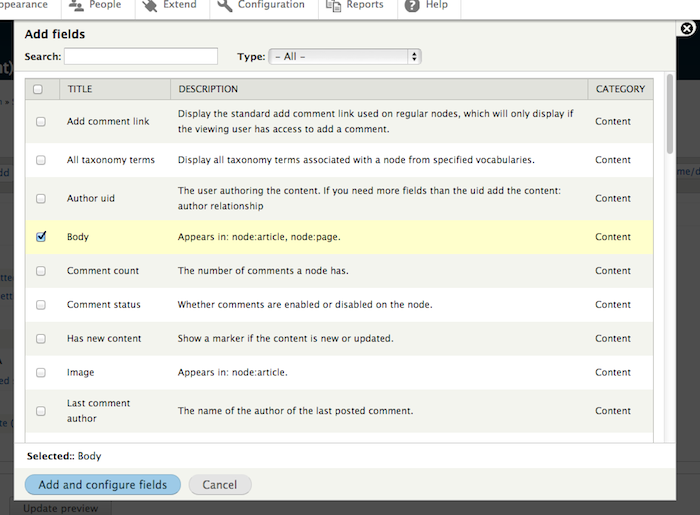
- Changes div listing into table.
- Moves the search box into the top
before
after patch #91
Beta phase evaluation





Comments
Comment #0.0
Bojhan commentedlalalala
Comment #1
yoroy commentedI did a quick review of the current labels and descriptions. It's pretty clear we won't get away with not having any descriptions for most of the items. So the idea of having a table for this seems good. I wonder if 'Category shouldn't be the last column, as there will be a lot of redundant 'Content' cells. But that's a detail.
Comment #2
lisarex commented+1 to making column the last column. It's by far the least useful.
Comment #3
tim.plunkett@lisarex, er, which column is that? :)
I assume you meant category.
Comment #4
tim.plunkettWell, this won't work 100% right now because the filters rely on #states, which don't work on table rows.
Comment #6
dawehnerIt could be that #991454: Add element #type table (with tableselect and tabledrag support) would give us the feature automatically to use #states for tables.
Comment #7
drupalshrek commentedWhen I look at the proposed solution picture I see the filter set to "All" but the table showing only Category content fields. If the filter is set to all, shouldn't we see all the fields? Or do I misunderstand how the proposal is going to work?
Comment #8
lisarex commented@drupalshrek the vast majority are in the Content category and Content items are listed first by default (as the categories are sorted alphabetically) so I can see how that would be confusing, but that's how it would look :)
Comment #9
xjmYeah, the screenshot is just a mockup, not actual output. If "All" were selected, the table would continue to scroll below that, listing many other options
Comment #10
drupalshrek commentedOK, fair enough, but I would suggest that the mockup look correct, i.e. either show "Content" in the filter, or show entries from multiple categories and scroll bars.
Comment #11
tim.plunkettThe mockup is not canonical. The implementation will be correct, it will not be skewed by a reasonably accurate mockup.
Comment #12
xjmAnd we'll add a screenshot of the real thing once the real thing exists. ;)
Comment #13
xjm@drupalshrek, here you go.
Comment #14
dawehnerSo for a short momenent I thought it could work out, to use '#type' => 'tableselect' but the result wasn't really 100% successfull, so look at this patch just as an academical research :)
Comment #15
sunI do not understand why the proposal is to make the category column last, or why you believe that it is least important.
When I look at the screenshots of the proposed solution, then I see this:
Thing | Context | Yada
Thing | Context | Yada
Thing | Context | Yada
Thing | Context | Yada
Thing | Context | Yada
Whereas:
Consequently, the "Category" context is the most important data that is presented to me here:
Category | Title | Description
Comment #16
dawehnerTo be concrete I think an example could be "Node: Edit link" and "User: Edit link" so we have the same title in both contexts.
The question though is, whether the context is really the major point here.
Just think about the users, which just want to configure a simple view. They probably just know that they want to display the title, so the
maybe not look for content and then for title, but sure, talking about how a user things without real data is often pointless.
Comment #17
yoroy commentedI agree about the yada yada parts :-)
But name or title always comes first. The screenshot in #13 shows why the Category isn't that helpful: most of the items in the list are of the same category, so it doesn't really help you tell one from the other. Also, most rows would start with the same word, making it more work to tell items apart from each other.
I'm happy to break the consistency rule when useful, but this is not a place to do that.
Would be good to move this forward, it would really clean up some critical screens in the views UX and #1875252: [META] Make the block plugin UI shippable might benefit from this as well.
Comment #18
hass commentedRe 16#: These bad strings no longer exists in D8. See #1779658: Translatable strings not self-explanatory / not context-independent.
Comment #19
Bojhan commentedI agree with @yoroy on this thing here, although @sun is right that Context is one of the most important things, its not the primary differentiator which is the title. Lets see if we can make them close.
I'd like to get this issue moving though, this is such a major improvement already. Could this get a working roll? I'd be great to get this in.
Comment #20
yoroy commentedSo, next patch should build on the one in #4?
Comment #21
jerdavisReroll of #4 against head
Comment #22
jerdavisNoticing that the filter drop down isn't triggering a change. Running out of time to look at it tonight, but the patch should at least apply for further work.
Comment #23
jerdavisStarted on another option for rendering this that may work better with #states, if I or someone else can sort it out.
Comment #24
hass commentedComment #26
Bojhan commentedComment #27
jerdavisThis patch is a bit more refined. Switched the table to use the #table Form API type and tableselect pattern. This is working for adding items, and the item search works, however #states is still not getting processed on the table row. I'm having trouble tracking down exactly why as I'm not as familiar with some of this stuff.
Comment #28
yoroy commentedtriggering testbot
Comment #29
dawehnerYeah that has been the points we identified before. Maybe putting in a screenshot of the current status would be cool.
Comment #30
jerdavisHere's a screenshot.
Comment #31
jerdavisI do think there is potentially a usability concern with the column arrangement and the removal of the context from the grouping, take this for example:
Is the context of which one you want to choose too far away? I could see how this might be confusing.
Comment #32
dawehnerIf we would rearrange the category to be the first one, we would not run into that problem.
Comment #33
jerdavisI understand why we don't want to have the category be the first column, I think the points mentioned on this above make sense. But I'd advocate moving it to the second column potentially, or injecting the category below the title, or in the description string.
Comment #34
xjmYeah, #33 makes sense. So back to
Title | Category | Description?Comment #35
yoroy commentedBut how often will this happen? I'm still worried this is optimizing for relative edge cases. How much of a problem is it that in those cases you have to rely on the information in the last column? Also, most of the screenshots I've seen so far have 'Content' as the category, which would mean promoting a column with very repetitive content over more specific descriptions.
To me, the screenshot in #31 shows a problem with the labeling for 'Title' itself, (and/or with the description), for which reordering the columns would not be not the right fix.
Comment #36
jerdavisRe-roll to make group second column.
Comment #37
jerdavisSeem to have lost the file somewhere over Montana. Let's try that again.
Comment #38
jerdavis@yoroy I do agree, particularly with the sentiment that the problem is the label of title, rather than the placement of the group column. Would it be too repetitive to include the group information as subtext for the title?
Comment #39
jerdavisWhat about something like this
Comment #40
yoroy commentedYes that'd be too much because with that, we'd be moving back to the current design, which is the *problem* :-)
Comment #41
jerdavisFair enough, leading with the title I think helps a bit but you're right it's pretty close.
Comment #42
tstoecklerThe duplicity problem could also be fixed by simply re-wording the description in the "Content revision" group to read "The title of the content revision." or something. A duplicate description is pretty strange to begin with.
Comment #43
dawehner@tstoeckler
I'm not sure whether this helps if you have several fields on different entity types with relationships connected.
Comment #44
tstoecklerWell, then I think the Relationship label should be displayed, IMO. The purpose of descriptions is to make things clear in case the title isn't clear enough on its own. That is completely lost here, though. In that specific case the descriptions make the interface *more* confusing because they distract from the fact that two different things are in fact different.
Just my two cents, though, carry on. :-)
Comment #45
dawehnerSo, you would suggest to show the same fields multiple times? That's certainly out of scope of this issue, but interesting to discuss in another issue.
Comment #46
dawehnerIt would be cool to have before/after screenshots of the current approach.
Comment #47
klonosI tried the patch from #37 over simplytest.me in order to get before/after screenies, but both installations with and without the patch appear the same. Was something committed in the meantime?
Comment #48
klonos#27: vdc-1832862-27.patch queued for re-testing.
Trying the patch gave a "An error occurred while patching the project." error. Let's see what the testbot thinks...
Comment #49
klonos#37: vdc-1832862-35.patch queued for re-testing.
Comment #51
Bojhan commentedI dont know why we are trying to solve this the hard way, I still think that the proposal in the issue opener works fine. We should not go for any solution that requires two lines, and I honestly think we are overdoing the optimisation a little
Comment #51.0
Bojhan commentedyes
Comment #52
klonos...child issues moved to the new issue relations metadata section (actually this issue was set as a parent of both because we currently cannot add children/follow-ups from the parent issue node: #2130889: Allow adding child/follow-up issues directly from the parent issue and converting related issues to children.)
Comment #53
Bojhan commentedSo we discussed this at Vienna, and we concluded to continue with the proposed solution. All other solutions require two lines and with that make it harder to scan.
We do wish to change the label of Filter to Category.
Comment #54
Bojhan commentedComment #55
royal121 commentedHere is a new patch!
Comment #56
royal121 commentedThat last one applies but doesn't work. Hope this on works well.
Comment #57
royal121 commentedComment #58
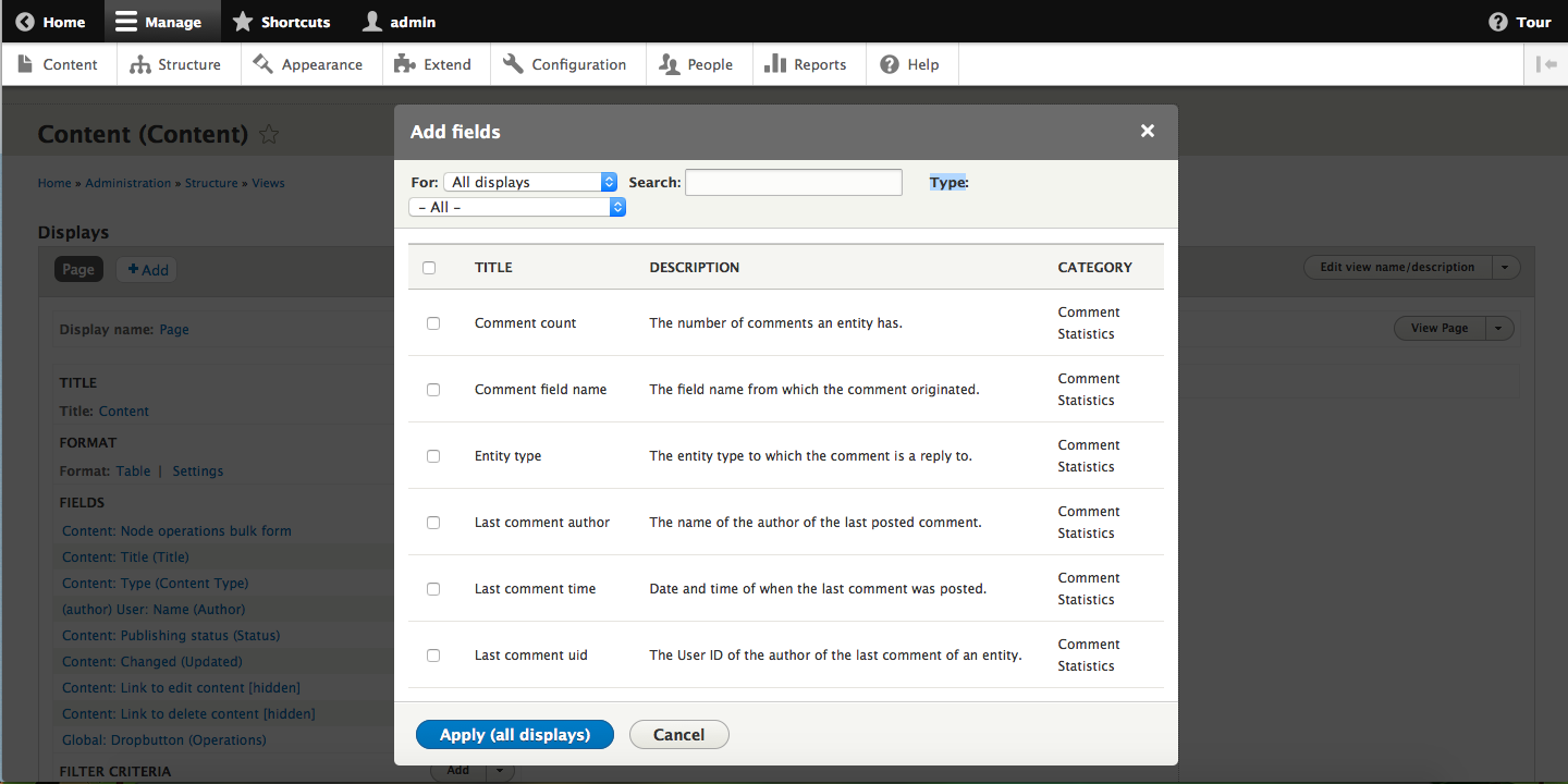
royal121 commentedHere is the screenshot before applying the latest patch:

Here is the screenshot after applying the patch:

Comment #59
Bojhan commented@royal Thanks for this update, I think category was supposed to be next to the title column though.
Comment #60
odegard commentedIn addition to type "- All -", would it make sense to add another category "- Popular -" or "- Commonly used -" where we put the most used fields?
It would help new users building simple views, and it might also help more advanced users to save clicking and scrolling. Even advanced views may contain the "popular" fields.
I would also suggest we have a default value different than "- All -". On some larger sites I work on just opening the add field dialog takes many seconds, especially since the content is loaded before the window is resized and content is rerendered. Having a smaller set in the default listing would make things much faster.
Comment #61
xjm56: 1832862-56.patch queued for re-testing.
Comment #63
damiankloip commentedHere is a reroll of that with a couple of minor changes thrown in. I guess the main thing we need to work out is the usage of states in the table rows.
Comment #64
dawehnerThis seems to be certainly better than before
Comment #66
yoroy commentedWe were so close! :-)
Comment #67
dawehnerSo let's reroll it first.
Comment #68
tadityar commentedRe-rolled. Wow this is from 2 years ago..
Comment #69
eidoscomIt seems ok!
Comment #70
tim.plunkettCan we get some updated screenshots first? Thanks!
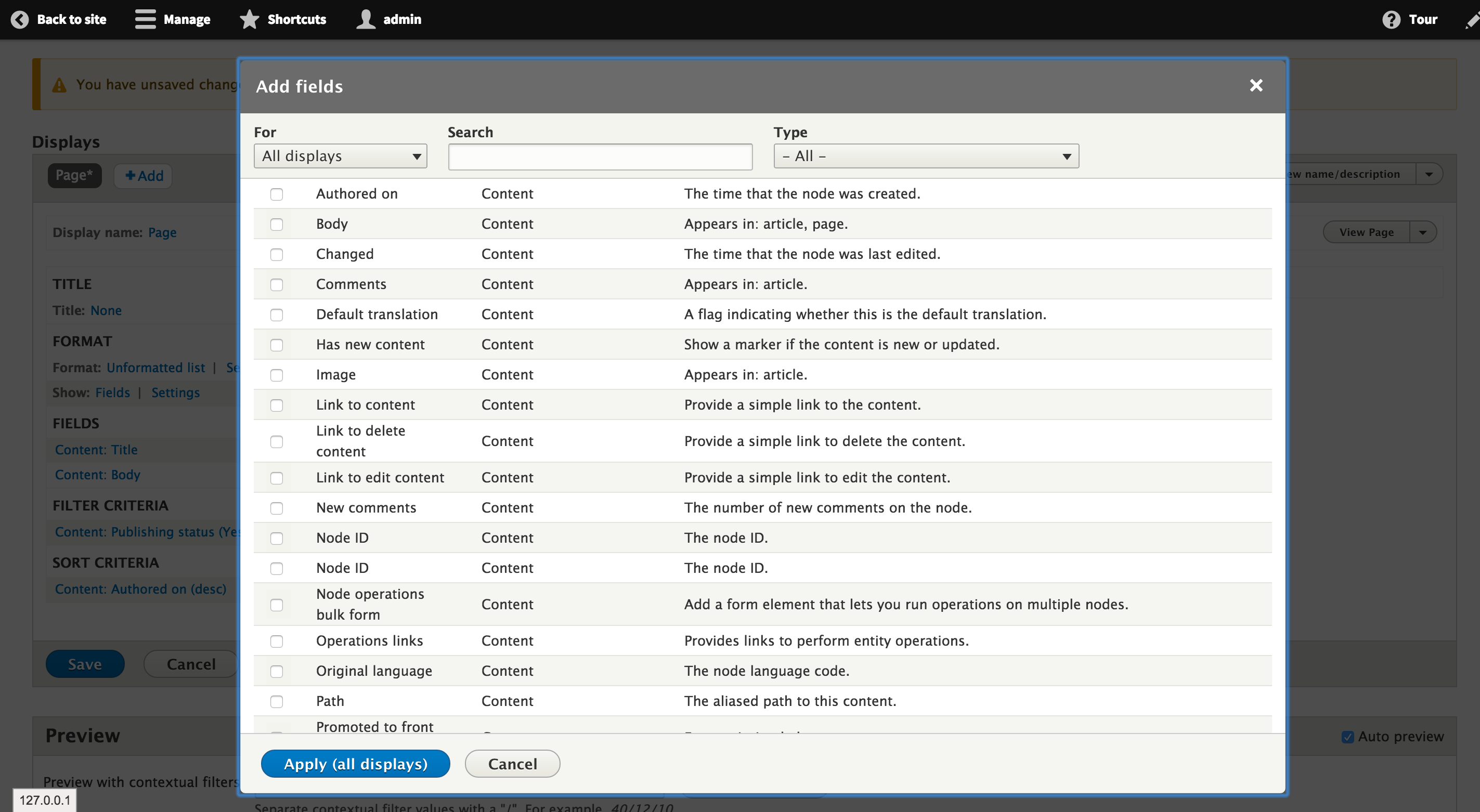
Comment #71
tadityar commentedBefore-After screenshot

Before :
After :) :

Comment #72
tim.plunkettThis can be
$this->t().Random new line
Finally, I manually tested the "Type" filter, and it is broken now.
Comment #73
tim.plunkettComment #74
yoroy commentedAnd per #33, #34 and #59 we'd still like to order the columns as Title | Category | Description
Comment #75
lendudeIssue in #72 is due to Types selection using #states and the layout now uses #type => 'table', which doesn't seem to support #states on a per-row basis.
Tried using #type => 'tableselect', but no joy there either for #states per row.
Comment #77
nlisgo commentedI have addressed some of the issues in this patch.
I have addressed points 1 and 2 in #72 and issue in #74.
Remaining issue is to get the 'Type' filter working again see comments #72 and #75.
Comment #78
nlisgo commentedThis fixes an issue with the searchText and makes the targeting of the label and description a little less fragile.
'Type' filter is still broken.
I left in some debugging code by mistake. I will resupply a patch.
Comment #79
nlisgo commentedRemoved the console.log
Comment #81
nlisgo commentedNeeds work.
Type filter is broken since the switch to a table. I need to step away from this for now. Might get around to it early next week if there is no activity before then.
Comment #82
dajjenThe patch #79 no longer apply using latest D8. I'm looking in to it maybe tomorrow.
Comment #83
nlisgo commentedRe-roll. I will switch back to 'Needs work' regardless of the outcome of the test run. I just want to trigger the testbot.
Comment #84
dajjenWhat about making the view dialog window a little more wide (70%) and also make the list a little more compact?

Comment #85
disasm commentedThis needs a reroll again.
Comment #86
metzlerd commentedIssue was understandable, but needed retitling to better reflect problem being solved.
Summary was up to date,
It was reproducible.
No duplicates found.
Priority is appropriate.
Added Beta evaluation
.
Comment #87
b_manBased on comments #85 and #86 this issue needs a reroll, I am going to attempt that now.
Comment #88
b_manI was able to get this to apply cleanly (i think).
Comment #89
tim.plunkettThanks for the reroll @B_man!
Comment #90
Bojhan commentedThanks!
The title column should be bold. The width can be optimised, but lets leave that for a followup where we can explore some more.
Comment #91
ohthehugemanatee commentedPatch applied cleanly for me. Attaching a minor update that adds a "title" class which gets bolded.
Comment #92
yesct commented@ohthehugemanatee Thanks for fixing that.
Often reviewers have reviewed previous versions of a patch, and adding an interdiff that shows just the changes between a patch will yield faster re-reviews.
Instructions for doing an interdiff https://drupal.org/documentation/git/interdiff
Here is one for the diff from comment 88 to 91.
------------
Updating the remaining tasks in the issue summary to include current 8.0.x head before and after most-recent-patch screenshots, leaving the novice tag for that.
Comment #93
yesct commentedscreenshots updated and put in issue summary.
next, manual testing, per @tim.plunkett in #73
Comment #94
yesct commentedoops. really took out the out-of-date before screenshot this time.
Comment #95
Bojhan commentedJust wondering whats happening with the table header styling. Doesn't seem to match the styling we have for normal listings (e.g. admin/content). There seems to be a double top border.
Comment #96
yesct commentedopened #2490352: Make views dialog window wider (See #84 and #90)
Comment #97
yesct commenteddid manual testing.
the search filter works with the patch,
but
the type dropdown filter does NOT filter the results.
so marking it needs.
we cannot have a test for this because we do not have front end javascript tests.
Comment #98
yoroy commentedComment #99
xjm(Saving proposed issue credit for discussion and triage participants at LA, as well as other reviewers/testers/etc.)
Comment #100
dawehnerWhat can we do in order to move forward here?
Comment #101
lendudeI think the remaining issue is the 'type' filter select not working because of its dependence on #states.
So options I see:
Since the text search is custom javascript too, looks to me like extending that to include type filtering would make the most sense in this case (plus the other options sound really bad :-).
Any other options to consider?
Comment #102
Bojhan commentedComment #103
Maouna commentedComment #104
zekvyrin commentedRe-rolling the patch for current drupal-dev (to share it)
Comment #105
Maouna commentedHaving a look at this issue with veronicanerak and Zekvyrin, we found some more open tasks.
The checkbox for (de)selecting all is added via tableselect.js, but is not working as intended yet.
1) When the list is filtered, this checkbox should only act on the visible table rows.
2) The display of the selected items is not updated, which can lead to confusing output.
I will keep working on that.
Comment #106
zekvyrin commentedJust an update from the previous patch.
What we've also found is that there are (up to) 3 issues to be resolved:
1) Firstly, Group filter is still not working. I'm still working in this one.
2) We've discovered 2 bugs from the "select all" checkbox in tableselect (the ones Maouna mentions in her post above)
I also want to add that one possible solution to make patch shippable is to remove the "select all functionality" by adding on the tableselect:
'#js_select' => FALSEI have included that in the patch (for now).
I have also made some progress for the first issue and I will post an updated patch later. I'm trying to add custom javascript to filter by group (& I have removed states).
Comment #107
zekvyrin commentedWell, another -incomplete- update.
I've managed to filter by group, but each filter doesn't actually takes into account the other filter, which is bad.
I need more time to "merge" these, but for now I'm posting an updated patch with my progress so far.
I've also included a css fix for odd/even table rows
Comment #108
Maouna commentedHere are two interdiffs, so it is easier to follow the progress.
@Zekvyrin: you can assign this issue to yourself.
Comment #109
Maouna commentedI merged the two filters into one. Lets see what the tests say.
Comment #110
Maouna commentedUpdated the patch so that problem 2) of #105 is fixed.
Comment #111
Maouna commentedComment #112
zekvyrin commentedGj Maouna. Thanks for the updates.
I've checked & tested both patches and here are my notes:
First of all, patch #109 is shippable in my opinion and it can be committed by itself. That is exactly what I would do as well.
It doesn't include the "Select All" checkbox which still has some issues, and we can create a separate issue to fix those (several people in Friday sprints recommended it). As this issue is considered "Major" I would vote to commit it and create a new issue to include the "select all functionality". so +1 RTBC for this.
About Patch #110 and the "Select All" functionality:
1) One issue still stands : When you have filtered the table, if you click the "Select all" checkbox, it will select all the items (including the hidden ones).
2) I tested the patch and the approach, and it wasn't what I expected (removing everything from "selected" list below) but it can be considered a solution (and I'm not a UX/UI expert, so I'd leave it to someone else to check on this).
If we keep this solution I have one question/notice: What should happen if we check "select all" when the list is filtered (if the previous issue has been fixed)? I think it should show the "selected list".
3) Finally, a small coding standards notice:
handleCheckAll 's comments need a small fix (a space between "//" & the comment, and I'm not sure about the inline comment next to "if"):
Also, I'd like to make another comment about css:
By using tableselect, I've noticed that when the checkbox is selected, the whole line gets highlighted (by tableselect's css).
This characteristic wasn't happening before including tableselect and it isn't happening at odd rows because our css code was overwriting it (to create odd/even zebra rows):
.views-filterable-options .filterable-option.odd tdI've updated #109 patch by including the same row which overwrites even lines as well, although I'm not 100% sure that's the correct solution.
Also, by seeing all these I think that this task is not such a "Novice" Task... (so I think tag should be removed by that's minor:) ).
Comment #113
penyaskitoI've tested #112 and worked successfully, both search filter and type filtering. After playing a bit with it, the only thing I missed was the ability to remove a hidden selected item after being selected when I filter further, but that is an issue too with current HEAD.
Also, when clicking on the title, the checkbox is not switching its state, which is a feature we may not want to lose.
Comment #114
zekvyrin commented@penyaskito:
About the first one, do you mean that we should add a mark or something to "selected" list below?
Because the other way I can think of (removing checked automatically when filtered) is not something I would prefer and I think it's intentional not to remove them.
Personally I have searched & added many items at the same time by searching for each one, and I wouldn't like it.
About the second (clicking on title makes the checkbox checked), yes indeed it was present previously because title was checkbox's label.
If we need to implement it, should we add some js code to replicate it or is there any other way with tableselect? (I couldn't find one)
Comment #115
dawehnerHonestly, I think its 100% pointless to have a select all functionality.
For a normal site builder there is no usecase in having that, so ideally this could be dropped?
Comment #116
Bojhan commentedYup, lets drop it.
Comment #117
penyaskito@Zekvyrin That's it, a way to quickly remove them. However, that should not derail this issue.
IMHO, we just need to figure out what to do with clicking on title for checking/unchecking. If we can live without it, let's get this committed.
In any case, this is a lovely improvement. Thanks all who worked on this :))
Rename to handleFilter?
Comment #118
lendudePer the D8 fapi documentation, both removing the 'check all' and adding a label should be supported by tableselect out of the box
So both things should be possible to add fairly quickly.
Added javascript tag because of the javascript changes that are made.
Comment #119
lendudeNevermind on #118, #js_select is already FALSE in the current patch, so that option doesn't show, so that's good per #115.
Tried to get the 'title' => array( 'data' => array(#title => 'mytitle'))) thing to work.
- Switched to tableselect element (currently using table with tableselect => TRUE, not sure why)
- Switched the #options around a bit to get it to work with tableselect element
- Added the 'title' => array( 'data' => array(#title => 'mytitle'))) notation
- It only adds a usability label to the checkbox, not to the first column like I was hoping (but on reading the documentation more carefully, I does what it says)
This is not what I was hoping it would do, but would say still a usability increase over #112
Also fixed #117
Comment #120
zekvyrin commented@penyaskito: you are right about handleFilter and thanks @Lendude for fixing it.
1) I don't know why we were using table with tableselect TRUE. That's how the previous patch was working, and I didn't question the choice.
2) I also saw that in Form API when searching earlier but I read that it only adds a invisible label to the checkbox. Has some uses, but still doesn't do what penyaskito said about label. But is it something we 100% need to commit it?
3) About select/check all, well it may not have many use cases, but some might like it if it selects all filtered (for example selecting all node's fields) so it might be a possible addition for the future. For now, what I see is that it creates more trouble than what it is solving & it's definitely not blocking so that's why I think we can open another issue when this is committed.
Comment #121
dawehner@Zekvyrin What about adding a new issue to discuss the additional of a select all checkbox? For now most people seem to not have a usecase for it,
so let's try to get it in as most people expect it to be like.
Comment #122
catchYes please open a follow-up for select-all - we should not add that here.
Comment #124
zekvyrin commentedFollow-up issue opened: #2579171: Enable "Select All" Checkbox on Views UI's add fields new layout
So now we can focus on fixing it without the "select all" functionality.
#119 is working and could be RTBC as it is now.
The only question is if we want to "keep" the ability to check the checkbox by clicking the title.
Previously title was checkbox' label, but now it is in a different table cell. So if we want to keep it we probably need to remake the functionality using custom js (unless there is another way with tableselect but I haven't found any).
Comment #125
dawehnerReally good question!
I can't speak for all people, but at least personally I got really used to that nice behaviour.
Comment #126
nod_Clean-up incoming, stand by.
Comment #127
nod_Removed the striping of the table (per style guide), lewis confirmed we should remove it.
Refactored the code to make it nicer to read.
Fixed the click on title checks the box (not very pretty but it works, anyone with better solution is welcome).
Added the description class since searching on description terms didn't work before.
Comment #128
nod_For all those search fields we have a dedicated event that triggers a sane amount of time (not every keypress): formUpdated. It was made for this use case so used that one instead of keyup/change.
Think I'm done here, carry on.
Comment #129
dawehnerManually tested the patch. I think in a follow up we could make the entire row clickable but for now the title is certainly enough.
It indeed looks much better now.
Comment #130
Bojhan commentedWhoo :)
Comment #131
zekvyrin commentedManually tested it and it's working fine to me as well.
I also noticed a difference/small delay in filter between before 128 & after: indeed the event triggers less frequently than before.
Now the form needs ~half a second to be updated.
Well, to be honest as a user I'd prefer it like it was before as the time to filter the form is noticeable, but I don't think this should "block" the commit. And as a developer I understand the reasoning behind formUpdated event, so I'm not against it.
Comment #132
nod_It's 300ms actually :)
Comment #133
xjmReviewing this.
Comment #134
xjmThank you very, very much for carrying this issue for three years. I just tested it manually. It's so much nicer. It works beautifully.
Committed and pushed to 8.0.x.
Comment #137
gábor hojtsyThanks, removing from UX sprint now.
Comment #138
gábor hojtsyFix version, now that 8.0.x does not exist.
Comment #139
quietone commentedComment #140
penyaskito