
 Come together with the global Drupal community in Rotterdam, 28 Sept – 1 Oct 2026. Sessions, contribution, connection, and Early Bird savings until 8 June.
How would I create a graph of node input over time?
In other words, I want to show a line graph that covers, say, a month of data from an integer cck field in one of my content types. Thing is, i can't figure out how to make the Y-axis a date, so it shows everything evenly placed throughout the graph.
| Comment | File | Size | Author |
|---|---|---|---|
| #46 | Screen Shot 2018-08-22 at 1.24.48 PM.png | 45.71 KB | rickharington |
| #46 | Screen Shot 2018-08-22 at 1.24.24 PM.png | 44.03 KB | rickharington |
| #46 | Screen Shot 2018-08-22 at 1.24.08 PM.png | 110.6 KB | rickharington |
| #46 | Screen Shot 2018-08-22 at 1.23.41 PM.png | 42.44 KB | rickharington |
| #42 | Screen Shot 2015-09-26 at 12.17.35 AM.png | 15.86 KB | djween |

Comments
Comment #1
quicksketchThe D6 version of the module is no longer being updated. If this problem exists in the 7.x-2.x branch of the module please reopen.
Comment #2
skyredwangI was wondering the same thing and have tried many methods. For example, how could we make a chart shows the number of content created daily for the past month?
FYI: Commerce Sales report achieves this kind of reports using custom aggregated fields.
Comment #3
quicksketchThe trouble here is that neither Views nor Date modules provide aggregation options for date-based fields. There is a feature request for handling date fields here: #1774130: Add granularity control to views date field handler aggregation settings
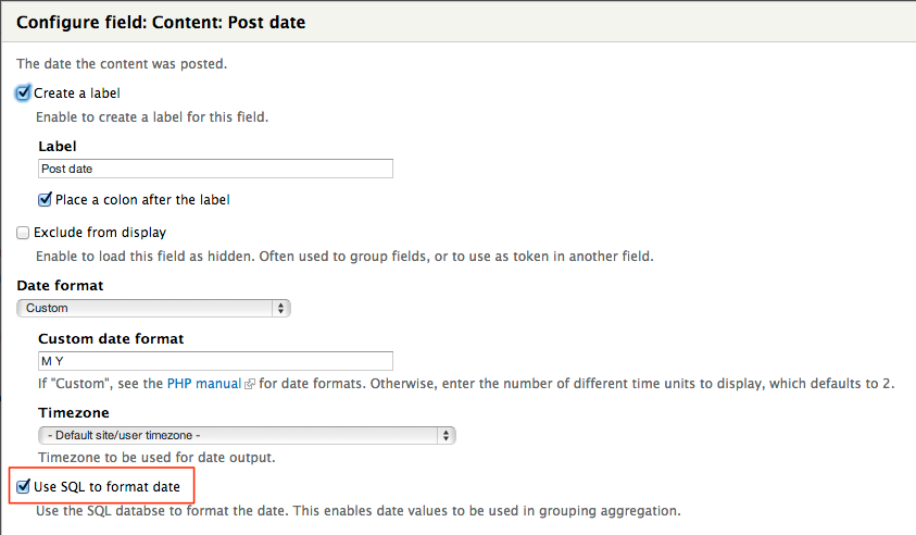
If you're doing grouping by node post date or other built-in fields however, this problem can be solved by using the Views Date Format SQL module. It adds a nice little checkbox that allows you to group dates by a custom formatted string. In this screenshot, I set the custom date to by "M Y" (which translates to Oct 2012 for example), then checked the box for "Use SQL to format Date".
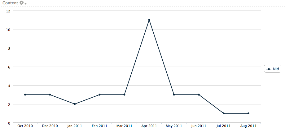
Then you end up with a nice "nodes-per-month" chart like this:
Comment #4
quicksketchActually even though the general problem is able to be solved through Views Date Format SQL, I think we should make this broader feature request to support date formatting on the X-axis. Right now if you set a chart to use "No label" on the x-axis, it turns the chart into a "continuous" axis instead of having explicit labels. Right now we only support integer/float values in our continuous axis, but most charting libraries also support doing a continuous axis with dates. Our API already supports this also through the #date_format property (though we have TODO in the Google integration). Let's get that integration polished up and then expose it to the user in the Views integration.
Comment #5
skyredwangMaybe I didn't get your point on Views Date Format SQL module. Date module already supports custom formatting, and I did try custom date to by "M Y" before, but still no luck for me.
Could you export your views above?
Comment #6
quicksketchYes, but it formats it AFTER the SQL query has already been done. In order to do a COUNT() query on nodes, you need to be able to use an aggregated query that groups results together by their date. Enable aggregation on your view, format the date however you would like to split your entries (by hour, day, week, month, year, etc.), then add a field for NID and set the aggregation option to COUNT. THen you end up with a view as shown in the screenshot (e.g. 11 nodes created in April, 3 in May, 1 in Aug, etc.) If you format the date after the query has been run, then you just end up with every individual row separately, since every node was created at a different time.
Comment #7
skyredwangThanks for the explanation. Date module has granularity support on Views Sorter, and Charts has add-on support. Therefore, without Views Date Format SQL module, I can achieve the same things: 1st chart just for generating X-axis (select Distinct Day/Month), 2nd chart for plotting, using aggregation on Views Date Sorter with granularity support.
With or without external Date granularity support, there is still one problem remaining:
For example, in your case, July 2011, you only had 1 node created. If that number is 0, which means that there was no content created in that month, then "July 2011" would totally disappear on the X-axis(, no?) Instead, we would want to the X-axis is continuous, and the point on July 2011 was at zero.
Am I making sense?
Comment #8
quicksketchThat's strange, I can't find any way to use both aggregation and granularity on the date fields while sorting. Actually I can't find any sort handlers in the Date Views module at all.
Yep, you're right. One of the reasons why this needs to be a continuous axis and not a discrete one.
Comment #9
skyredwangHere is a better hack. Only need the Date module, and one Chart Display
1: Enable Views aggregation
2: Sort the node Post Date, and make granularity to month
3: Add the Post Date field, and use "Y-m" format, make sure to use MIN as the aggregation type
4: Add nid field, and count it
In chart setting, use Post Date as X and Count as Y.
Regarding to continuous axis, Google says
https://developers.google.com/chart/interactive/docs/customizing_axes#Di...
Is this feature supported? If not yet, then we make this issue the feature request for that.
Comment #10
quicksketchNo it's not supported, that's why I retitled this issue in #4:
The Google integration requires work because you have to manually format input date by creating Date() objects out of the input. Highcharts will do this automatically if you set the axis to be a datetime axis. Additionally we have a problem that Google uses a different format (ICU) than PHP's strtotime() (which is used by Highcharts and obviously Drupal too), so we'll need to figure out a way to convert that.
Comment #11
bennos commentedI looked at the gchart and not found a way to solve this.
Anyway, how can I solve this with highcharts?
Comment #12
rooby commentedI'll see if I can do a patch for this as I need it.
[Edit] Actually, I'll try #3 first.
Comment #13
quicksketchThanks @rooby, I'd be happy to hear the result of whichever approach you try.
Comment #14
rooby commented#3 does not suit my use case unfortunately.
I have started on a patch to handle the datetime type but I've been interrupted by other things.
I should be able to get back to it in the next day or so.
Comment #15
zephirus commentedI don't know if this is the right place but... how can I change the way the x-axis shows? If I have many values, the text gets all on top of each other. See here:
http://img849.imageshack.us/img849/5171/k26i.png
Comment #16
user654 commented.
Comment #17
quicksketch@zephirus: That's pretty much exactly what this issue is for, to solve that problem. The only option you have for the time being is to group together the values so that each point represents multiple days instead of a single day.
Comment #18
voskuh commentedI did some work on creating a patch to support a continuous axis, also for dates. The attached patch creates some checkboxes on the horizontal axis settings. For highcharts both continuous axis and continuous date axis work as expected (as far as I can see). Dealing with google charts is a little bit more difficult. Continous axis works as expected. To support a continous date axis, there is still some more work to do. I think it needs some work in the charts_google.js file to change the column type to date or datetime.
Please review the attached patch.
edit: highcharts expects the date to be in miliseconds since the Unix Epoch, so using U000 as a custom date format does the trick.
Comment #19
quicksketchThanks @voskuh! There are a couple issues with this patch I think:
Aren't continuous axes either "continuous" OR a "continuous date"? Why have two checkboxes? I don't know what would happen if I were to check "Continuous date" but not "Continuous" (or if it would be any different from checking both). It seems like this should be a set of radio buttons with the values:
I think with both Highcharts and Google charts, when handling date formatting we should do our best to accept any data format (whether a UNIX timestamp or a human-readable date) rather than requiring users to manually reformat data that is suitable for the library.
I think you're right that a little bit of finessing is going to be needed on the JS side for Google, per https://developers.google.com/chart/interactive/docs/customizing_axes#Di...
Comment #20
quicksketchI revised this patch (partially) that makes this a single option instead of two separate ones. Some additional concerns I had while rerolling:
- This patch (and the previous one) did not work with the X/Y pair data format used in scatter charts. I made an example chart to demonstrate the continuous axis, but it resulted in several PHP notices. They can be seen at charts/examples after applying this patch.
- Does showing this option for continuous axis make sense for all chart types? Should it be hidden unless displaying a line/scatter chart? I'm not sure this makes sense for things like a bar/column chart.
Unlike #18, this patch probably doesn't work, it's just stubbing out the options and properties.
Comment #21
sata commentedBoth 18 and 20 break my date x-axis. I'm using order:create-date for my x-axis. When I use the continuous option, the date value turns into "0". In patch 18, that's translated in 1 Jan, 1970. In patch 20, it shows as "0".
What I'm really looking for is a chart that shows the zero data (y-axis) values when there are no sales activity for that date. This thread is the closest I've seen so far to addressing that feature.
Nice work on charts BTW! I've tried chart but it was foo-barred. Tried the highchart module, but it would take a week to configure it. Way too many options... I like that charts implements both google and highcharts with relatively simple administrative tasks.
One thing I did notice, when trying to aggregate the amount values... if you use the formatter in the field to supply a prefix, it breaks the grouping. Rather, use the Horizontal options in the charts | settings configuration to adjust the output.
Comment #22
voskuh commented@quicksketch
I created a new patch based on yours. Some remarks:
- the notices are solved bij checking if the labels for the x-axis are set (when not using views for highcharts, x-values are not set as labels on the x-axis and don't need to be moved to the data array.)
- discrete axis is not working on the example page on both google charts and highcharts. Because a discrete axis expects the data values to be a string, I think. Maybe the horizontal values need to be converted to strings when using a discrete axis in the module. On the other hand users can input their data (the column that's set the horizontal) as strings, but then it doesn't make sense to set the axis data type option to discrete on the settings page.
- continuous date axis on google charts is work in progress
In my opinion continuous axis for bar and column charts should be supported. For example the chart in comment #3 can also be displayed as a column chart. The months where no nodes were created, should be displayed too. So in that case we need a column chart with a continuous date axis as well.
@Sata
I think we are close to a solution that solves your issue with the hidden dates caused by your zero y-values.
Comment #23
quicksketchExcellent, thanks @voskuh. In future patches, could you reconfigure your text editor to use spaces for tabs? You can see in your patch files that some lines are using spaces and other tabs, making a mess of the code formatting.
Overall, I think we're getting pretty close here.
Comment #24
voskuh commentedPlease review the attached patch. Continuous axis and continuous date axis works with highcharts and google charts. The patch will need a clean up though.
I chose to display a discrete axis only when #continuous is set to 0. As a result existing charts will not change.
There is a minor issue with discrete axis using google charts, only when not using views and when #continuous is set to 0. Now, two different lines are displayed after each other (see the example page). I think this can be solved by changing the data input (in charts.examples.inc) and using both data columns in one array and not split them up in two different arrays.
Comment #25
richardmetzger commented@voskuh, thanks a lot - this works great. Even if you want to plot data measured at different times of the day - you just have to make sure that the supplied string includes a valid date like in
'#data' => array(array("2013-01-01 00:32:05",7), array("2013-01-01 02:33:04",44), array("2013-01-01 02:54:22",66),array("2013-01-01 06:12:54",88),array("2013-01-01 18:40:30",33), array("2013-01-01 22:00:32",100.5) ) ,May I suggest a small modification though? As you create the DateTime object with an UTC timezone, you'd get an offshift of a few hours for the above data, depending on the timezone you're (or your server is) in. Creating it without the DateTimeZone parameter seems to take the server's timezone as default - at least the plot looks like I expected it.
Comment #26
quicksketchThanks @voskuh! This is looking good. One thing that needs work is this magic bit to convert #labels into #data.
There shouldn't be any special code for handling Views-provided charts. Rather, the Views integration should adjust the query-provided input and format the data appropriately using #data alone and not providing anything in #labels for a continuous axis chart.
Comment #27
voskuh commented@richardmetzger, you are right. By setting the timezone to UTC a timeshift can occur. I will create a new patch without setting the timezone.
@quicksketch, thanks for your comment. I added some special code for handling views-provided charts in highcharts because the views plugin provides the data as labels in the old situation. In charts_google.inc the labels are converted to a data array as well.
The patch build upon the current data/label handling of the module. It's fine with me to rewrite the views plugin and put the data for the x-axis in the data array. But maybe, for highcharts, it's necessary to add some code to convert the data array to labels in charts_highcharts.inc (at least for some chart types). So in either way some differences between google charts and highcharts need to be covered in the specific inc files. What's your opinion about that?
Comment #28
quicksketchMaybe I'm missing something, but I wouldn't think continuous charts would have labels at all? For both numeric and date continuous charts, I would expect the labels to be generated automatically at specific intervals, though they might be formatted in some way. My expectation is that if you're building a continuous charts, the #labels property shouldn't be used for anything, and everything would go into #data in the first place. That's why I find the special-casing of converting things from #labels into #data so odd.
Comment #29
voskuh commentedYou're correct, it doesn't make sense to convert values from #labels to #data. Continuous axes don't use labels at all.
But that's how the module works at this moment, without the patch. At this moment all values for x-axis are saved in #labels in charts_plugin_style_chart.inc and not in #data.
For highcharts this is okay. It uses labels (or categories) in bar charts, column charts, and also in line charts with a discrete axis. Google charts expects all data, both x values as y values, in #data. The module converts #label to #data when using google charts, as I stated in the code in my previous comment.
I agree that it makes more sense to store all information to #data and only use #labels when needed. So I will change the views integration and create a new patch.
Comment #30
Roensby commentedIn the meantime, I'm pretty sure I have a temporary solution: https://drupal.org/node/1774130#comment-8847409
I've tested it with the Charts module, and it works.
Comment #31
Anonymous (not verified) commentedHi,
I just wanted to share my solution integrating the workaround mentioned in #30:
I'm using my default Article content type, and a chart (line graph) to show the amount of posts created, per month.
Add a computed field to your content type with the following:
$entity_field[0]['value'] =date("F Y",$entity->created);Select 'Store value in the database'.
You will then need to mass update your nodes, or if you are just fooling around, use Devel module to generate a bunch of new articles.
In your view:
Fields:
Choose your computed field, aggregation on 'Group results together', group column on 'Value'.
Choose NID, aggregation on COUNT.
Sort criteria:
Add your content's post date and set the granularity to 'Month'
In the chart settings:
I use Highcharts
Set your computed field to 'Provides labels'.
Set your NID to 'Provides data'
My methods are probably not very creative and I may be making some stupid errors, but I really hope that this can help someone!
Comment #32
mattbk commentedWhat @Sata (#21) describes is what I am looking for. Does this issue cover the use case of needing to "fill in" dates that have zero values?
Comment #33
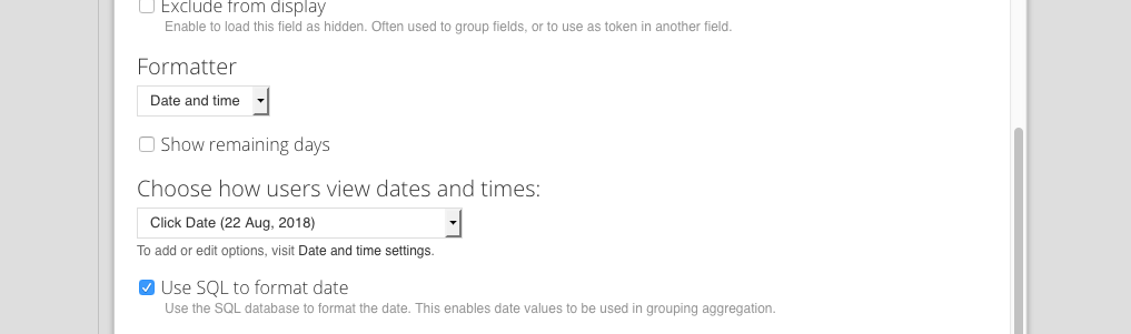
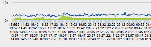
yngens2 commentedI am trying to group all minutes of custom date field into hours using the method described in #3, so in my case I thought it would be H:i instead of M Y, however unfortunately nothing is happening after checking "Use SQL to format date" option and my graph disappears.
Could anyone consult me on how I could group too frequent hours and minutes rendered over x-axis (as shown in the attachment) into hours at least?
Comment #34
bsarchive commentedpatch #24 seems to be working for me but I have no date labels in the x-axis - just "...". Any ideas?
Comment #35
kenorb commentedComment #36
dbassendine commentedI tested the patch in #24 and it worked well for me, in Views, with the X continuous datetime axis data set as labels.
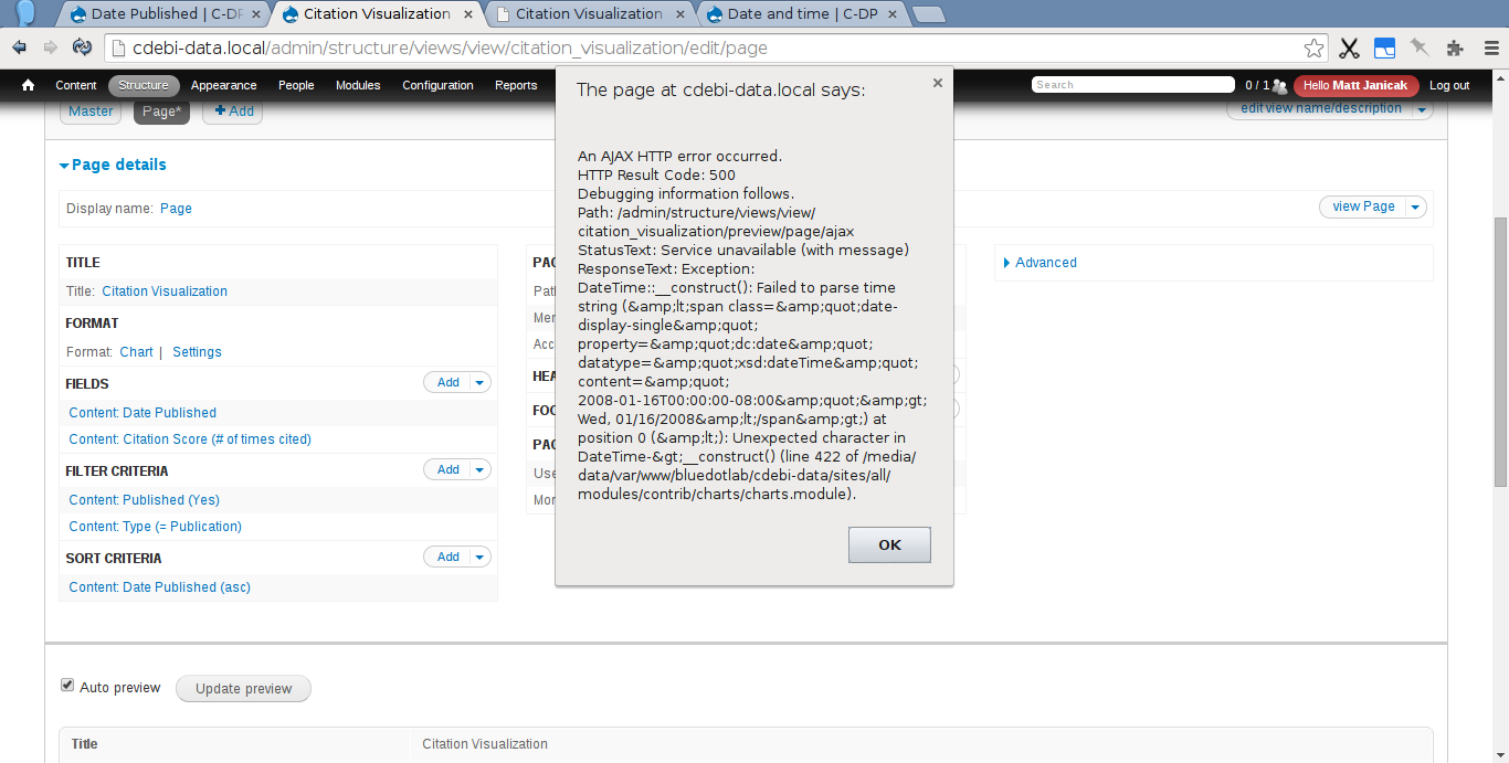
However, I did find that sometimes Views throws an AJAX 500 error and does not render the chart at all (see screenshot). This happens if I'm using a date field for the X axis, and the field formatter is set to "date and time" (whatever the format). If I change the formatter to "plain" the error goes away.
The error message is something like:
Thanks for the patch!
Comment #37
mattbk commentedConfirm that the patch in #24 works for my use case. Thanks @voskuh!
Comment #38
Pierre.Vriens commentedYet another interesting issue! Merci (=thank you) @voskuh for the patch in #24!
I'd like to get this issue in status fixed ... the only remaining questions I have are:
Because of the #25, #26, #34, #36 and #37, I believe this is (way more) then just RTBC ... However, for now I'm (temporary) changing the status as I do here. After my remaining answers get resolved, I'm going to move ahead and commit the patch.
PS: anybody interested in reusing the valuable docu in #3 to get it inserted in the (new) charts docu (where there is a link to this #3 for now on page Related Modules)?
Comment #39
sgdev commentedI've reviewed this patch, and suggesting for it to be marked as "Needs work." If you want to move it back to Postponed, certainly do so.
In my investigation, I've found this patch does not work with creating multiple series and combo charts in Views. At a minimum, something would need to be added to the patch to inform users the continuous date axis capabilities are only supported on single data charts. The problem is related to the "fill-in" for zero values as described in #21 and #32.
This issue has to do with how the
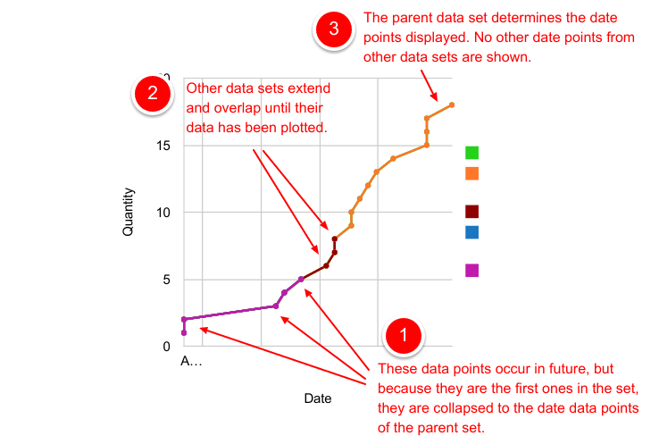
$series_dataarray is built. The entire chart has one x-axis definition. This is based on the parent chart, and used to build the data arrays. When the$series_datais generated for chart add-ons, the first data point is placed in the[0]position of the array, which in many cases is incorrect.For example, say we have a chart showing t-shirts sold over time. The parent chart shows all t-shirts, and each add-on shows t-shirts of different colors. The problem is rather than plotting the first data point of "blue t-shirts" at the date the first blue t-shirt is sold, the code builds the array with the first blue t-shirt being sold on the first day any t-shirt is sold.
The effect is seen in the attached image, where lines overlap each other. Even though items are tallied at future dates, they are being shown at the first date any item occurred.
Comment #40
cmonnow commentedJust a note about patch #24 as well. Sometimes it may be desired to have no time portion in the date when showing up in a tooltip, for example.
'datetime' can be changed to simply 'date' for these exceptions but I haven't looked into the best way to configure or generalise it.
Comment #41
TygrLili commentedFor those still searching for a solution to this: I've been struggling to find anything to help with my problem, which was that my add-on charts were improperly displaying due to the indexes, as explained by @ron_s in comment #39 in this issue. However I did some more research and found another issue, in which there was a patch (#12) that solved the problem for me: https://www.drupal.org/node/2052429#comment-8512211
However -- note that comment #13 in that issue mentions a reference to this issue, and states that there may be a conflict between the patch and this issue's eventual resolution.
Hope this helps!
Comment #42
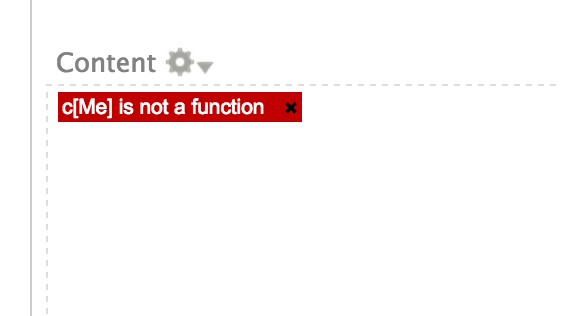
djween commentedUsing patch from #24 doesn't work for me when I select 'Continuous date' in my view.

Preview only shows:
Also, the example views give me ajax error similar to #36 and just can't get this to work.
Comment #43
petednz commentedEDIT: my bad - i skim read and spotted a comment saying "i'm going to commit the patch" but it was preceded by a conditional statement!
------
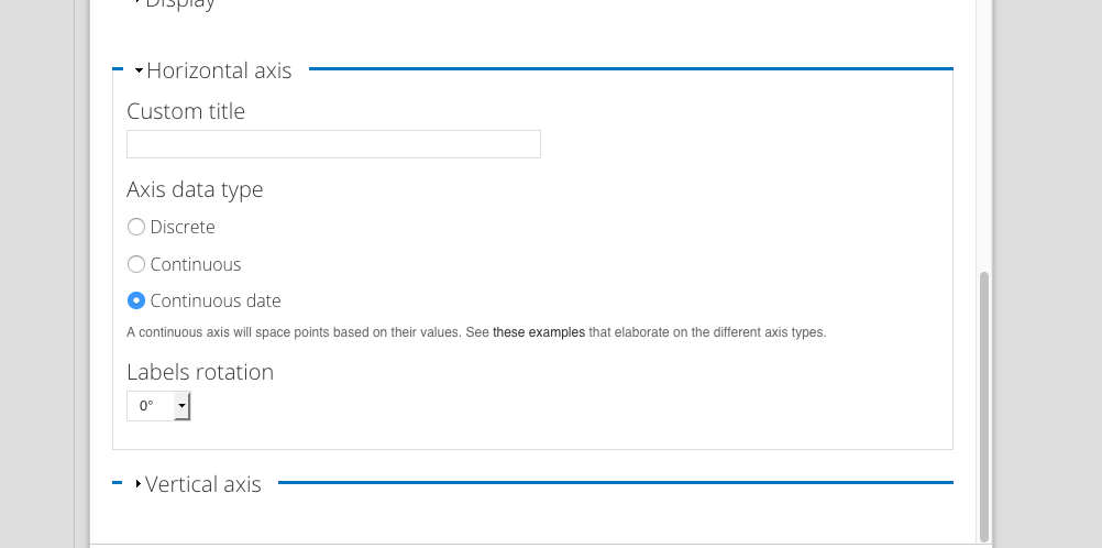
sorry if i am missing something obvious - but having downloaded latest dev, should I be expecting to see options such as
Axis data display:
(•) Discrete
( ) Continuous
( ) Continuous date
My goal is to show for example Feb when I only have data for Jan and March and April etc
I am using aggregation on an 'amount' field so we shold be showing the total amount donated eg
Jan= 100 + 50 = 150
Feb = 0
Mar = 100
Apr = 100 + 50 +100 = 250
Using HighCharts - which is working fine.
I am only mapping a single field of data.
My label field would be coming from 'received date' which is set to M Y and aggregatin setting is to MIN and Sort is set to order by Month. All looks good except i only see columns for months I have data.
Comment #44
kanyan.ror@gmail.com commentedViews Date Format SQL works for me. Thanks quicksketch #3 :)
Comment #45
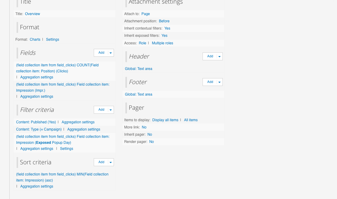
rickharington commentedUpdated
Comment #46
rickharington commentedHi guys, was the hole in data issue ever resolved? Is the patch supposed to resolved the hole issue? I've applied the patch and I see the option of continuous date, but i'm not seeing the continues x axis. Might just be doing something wrong in settings.
Screenshots attached
Comment #47
mattbk commentedPatch in #24 still applies to latest dev version, but no chart is showing.
Comment #48
andileco commentedThanks for bumping this, @mattbk. Did you also apply the code from #26? Did you test on both Google and Highcharts?
Comment #49
bluegeek9 commentedThank you for your contributions to this issue. As Drupal 7 has reached its End of Life and is no longer supported, we are closing this issue. We encourage you to upgrade to a supported version of Drupal.