
Follow-up to #2582911: Styling of buttons breaks in Blocks UI whilst using Bartik as an administration theme
Problem/Motivation
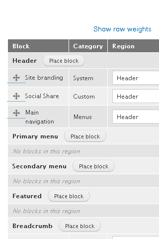
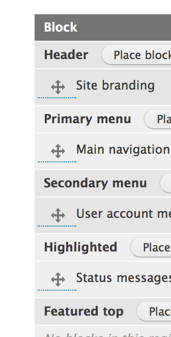
Styling of draghandles break while using Bartik as admin theme (or anywhere draghandles are used, actually). Please have a look at the dotted line attached screenhots and note exists outside the table (overflows). It shouldn’t even be displayed.
Proposed resolution
User interface changes
css change to correctly render draghandles.
API changes
none.
Data model changes
none - just css.
===========================================
SOLUTION
BEFORE

AFTER Chrome

AFTER Firefox

| Comment | File | Size | Author |
|---|---|---|---|
| #71 | 2683433-71-hover-chrome.png | 23.13 KB | ccjjmartin |
| #71 | 2683433-71-no-hover-chrome.png | 23.29 KB | ccjjmartin |
| #70 | interdiff-67-70.txt | 387 bytes | gnuget |
| #70 | table_drag_handle_icons-2683433-70.patch | 451 bytes | gnuget |
| #69 | 2683433-69.png | 9.91 KB | star-szr |


Comments
Comment #2
rachel_norfolkComment #3
kostyashupenkoFixed styles for draggable dots. Check styles for ltr & rtl on screens
Comment #4
kostyashupenkoSorry, removed unnecessary lines
Comment #5
rachel_norfolkThe css change does indeed correct the issue of the dotted line overflowing. See
The css is reasonably constrained to the area concerned, too.
Looks good to me.
Comment #6
rachel_norfolkBeen thinking a little about this and, really, the dotted line shouldn’t be appearing at all, should it? It is there because the draghandle is a link and the Bartik theme applies a dotted border-bottom to all links.
So, we need to do something similar to the seven theme and override the tabledrag.module.css in bartik.info.yml and provide our own, adapted to the special way Bartik styles things (I think - not tried that before!).
Comment #7
Manjit.Singh@Emma @rachel I was thinking that why we are aligned this dragholder line n all , I mean, Is there any requirement to do this in Bartik ? Can't we remove the underline from dragholders from all tables ?
I have checked the Seven theme there is no underline in Draggable element.
Here is the screenshot that what i want to say.
Comment #8
kostyashupenkoSo please, let's make it correct. Do we need this border or what? Describe a task, what should we do?
Comment #9
kostyashupenkoMaybe needs design?
Comment #10
emma.mariaBartik is supposed to be a front-end theme with support for adding/editing content (which is an overriding option in the Administration theme settings and also within user permissions).
If we need to override styles within the theme itself to make it serve more than the purpose it is supposed to have, it is too much.
I'm going to postpone this issue and a few other admin type ones, based on wanting to explore this issue further #550102: Allow a theme to set itself as an admin or frontend theme exclusively.
Comment #11
star-szrMy only reservation is table drag seems like a UI that for better or for worse would also be exposed sometimes to front-facing users, or at least to users with less permissions (such as access admin theme).
But I do agree we probably shouldn't go too far in this direction in general.
Getting rid of a redundant "theme" in the title.
Comment #12
Manjit.SinghAgree with the Feedbacks on #10 and #11.
But Is there any possibility that there would not a major structure breaking frontend issues, Otherwise it's good.
Comment #13
emma.mariaAs the crosshair is visible on the node add /edit pages (which we should visually support for Bartik), I'm opening this issue back up.

The patch in #4 only focuses on margin and I would like to have the underline removed from crosshairs please.
Please try and follow the Drupal CSS standards for choosing good CSS selectors here https://www.drupal.org/coding-standards/css/architecture#goals .
I also want to stress again that Bartik should *not* be supported as a full admin theme, but I very much appreciate the attention to visual detail that people pay towards Bartik.
Thanks everyone!
Comment #14
emma.mariaComment #15
kostyashupenkoComment #16
kostyashupenkoRemoved border for handle icons in Bartik theme
Comment #17
kostyashupenkoComment #18
Manjit.SinghLooks good in Chrome.
but this is still visible in Firefox.
Comment #19
rachel_norfolkKind of entertaining how that particular dotty line is a text decoration, not a bottom border…
Anyway - patch:
Comment #20
rachel_norfolkComment #21
emma.mariaThere are a few improvements that need to be made to the patch.
<abbr>tag and the padding change on thetabledragare out of scope for this issue, we should only be removing the border bottom on thetabledragcomponent.Referenced from CSS Architecture - Best practices
Therefore we should be using the class on the
<a>for the tabledrag icon.Thanks
Comment #22
idebr CreditAttribution: idebr at One Shoe commentedThanks for the patch, Rachel. I did a review on 8.1.x:
This line has no visual effect on the tabledrag component and can be removed.
The selector can be simplified to
.tabledrag-handleThis margin adds indentation to the drag handle, which removed the vertical alignment with the row header. This change seems unnecessary to me, I would like to suggest we follow Seven and align the tabledrag handle with the row header.
By using
border-bottom-width: 0;the border is effectively removed.This statement can be removed if the
margin-leftabove is removed.This selector can be simplified to
abbr.tabledrag-changedin line with Seven.Comment #23
emma.maria@idebr! It's so good to see you!
I agree with all of #22 apart from the
tr.draggable abbr.tabledrag-changed {styles are out of scope for this issue, the abbreviated text on the end of a block title has nothing to do with the tabledrag icon itself. So these changes can be removed please :-)Comment #24
NitinSP CreditAttribution: NitinSP at Clarion Technologies commentedComment #25
rachel_norfolkare you still doing something with this, NitinSP, or do you want to un-assign yourself?
Comment #26
NitinSP CreditAttribution: NitinSP at Clarion Technologies commentedHi Rachel,
This underline issue in firefox is resolved and as well as do the changes as per comment #22, please review the patch.
Comment #27
NitinSP CreditAttribution: NitinSP at Clarion Technologies commentedAs per comment number #18 resolved this dotted underline issue in firefox.
Comment #28
NitinSP CreditAttribution: NitinSP at Clarion Technologies commentedComment #29
NitinSP CreditAttribution: NitinSP at Clarion Technologies commentedComment #30
rachel_norfolkRemoving the out-of-scope change, as per #23.
Looks good apart from that, NitinSP!
Comment #31
NitinSP CreditAttribution: NitinSP at Clarion Technologies commentedComment #32
NitinSP CreditAttribution: NitinSP at Clarion Technologies commentedComment #33
emma.mariaHi @NitinSP, thanks for the updated patch.
The dotted underline on the abbreviation is out of scope for this issue. We are only focussing on the tabledrag icon itself.
I have stated this clearly in #21 and #23.
The following code needs to be removed.
Thanks!
Comment #34
emma.mariaComment #35
emma.mariaAh! I had this issue open for a long time and didn't see the updated patch from @rachel_norfolk. Putting back to "Needs review".
Comment #36
emallove CreditAttribution: emallove commentedComment #37
emallove CreditAttribution: emallove commentedComment #38
emallove CreditAttribution: emallove commentedComment #39
emallove CreditAttribution: emallove commentedComment #40
emallove CreditAttribution: emallove commentedComment #41
davidmcgee CreditAttribution: davidmcgee as a volunteer and commentedDrupalcon NOLA 2016 Reviewed and tested. It is working
Comment #42
armyguyinfl CreditAttribution: armyguyinfl commentedComment #43
armyguyinfl CreditAttribution: armyguyinfl commentedComment #44
armyguyinfl CreditAttribution: armyguyinfl commentedComment #45
armyguyinfl CreditAttribution: armyguyinfl commentedComment #46
davidmcgee CreditAttribution: davidmcgee as a volunteer and commentedThis is reviewed and tested successfully.
Comment #47
rachel_norfolkHi davidmcgee - can you create and attach screenshots, using the browsers affected by the issue, from before and after the patch is applied, please?
Thanks
And thanks to you all for working on this!
Rachel
Comment #48
radioflyer CreditAttribution: radioflyer as a volunteer commentedI have attached screenshots of the fix in Chrome and FireFox.
Comment #49
akalata CreditAttribution: akalata commentedHI radioflyer,
Having "before" screenshots, in addition to the "after", would be helpful. The before screenshots earlier in this issue are of a different interface, with makes it difficult to compare.
Also, I noticed in the screenshots that the bottom arrow of the icon is being cut off. This should be addressed.
Comment #50
nathanc CreditAttribution: nathanc commentednathanc is working with edutrul on this issue at drupalcon 2016
we are going to upload the before and after screenshots within the correct interface
Comment #51
nathanc CreditAttribution: nathanc commentedThese are the before and after applying the patch images...
BEFORE

AFTER

This is for RTBC
Comment #52
edutrul CreditAttribution: edutrul as a volunteer commentedComment #53
edutrul CreditAttribution: edutrul as a volunteer commentedComment #54
star-szrComment #55
aburrows CreditAttribution: aburrows as a volunteer commentedThis is emallove first patch to Drupal 8 core, I mentored him on getting this in.
Comment #56
Manjit.Singhpatch https://www.drupal.org/node/2683433#comment-11187379 working fine for me :)
RTBC++
Comment #57
aburrows CreditAttribution: aburrows as a volunteer commentedRTBC++
Comment #58
aburrows CreditAttribution: aburrows as a volunteer commentedComment #59
emma.mariaI need to point out something.
The patch in #37 (which was also duplicate posted in #38 and #39) has none of the same content as the patch that was 99% close to RTBC in #30.
The code in #37 does not meet CSS coding standards
(we shouldn't have an element in the selector and this code does not belong in elements.css either that file is for raw HTML element styling only).
The patch that should have always been considered for commit is in #30.
Unfortunately there is nothing to suggest that the recent screenshots are for the patch in #30.
Can someone please create review screenshots for the patch in #30 and specify that you have tested that specific patch please?
The CSS is all correct and has been thoroughly reviewed above it, we just need some final screenshots.
Thanks all!
Comment #60
Vidushi Mehta CreditAttribution: Vidushi Mehta commented@emma.maria I have reviewed the patch #30 and its working fine for me on my windows machine in Chrome and Firefox.
I have added a after screenshots. Please find the attached files.
Comment #61
gnugetOk, I just hide all these outdated patches and just left #30.
Also I put the images of #60 in the description of the issue so we can see how this look with #30.
So I think this RTBC but I will wait for emma.maria in case she wants to give this one final review.
Great work, thanks!
Comment #62
gnugetComment #63
Vidushi Mehta CreditAttribution: Vidushi Mehta commentedChecked on IE and Safari as well.No issue found in that after applying the #30 patch. Added two more screenshots for more clarity.
Comment #64
Manjit.SinghI am mentoring vidushi and I have tested it with her. RTBC++ for #30
Comment #65
Vidushi Mehta CreditAttribution: Vidushi Mehta at gai Technologies Pvt Ltd commentedComment #66
star-szrHas RTL testing been done? We are adding LTR comments (which is great!) but not adding RTL rules in #30.
Comment #67
rachel_norfolkSorry to be a pain, but…
In #66, Cottser has brought to my attention that the patch was looking at things outside the scope of the issue; namely, the drag handles habit of hanging around outside of its container. We already have a referenced issue above for that problem - this issue is only for the underlining.
I have updated #30 to simply meet the scope of the issue. It’s a *much* shorter patch than maybe people were expecting!
If someone can review and create screenshots on this 67 patch, I think we are there.
Comment #68
emma.mariaComment #69
star-szrNice, I like keeping this focused. Thanks @rachel_norfolk!
The hover state looks like it needs a bit of work. The text jumps up and there is a solid 3px border on the bottom. Well these are definitely related of course :)
Hover state in block UI
Edit: @rachel_norfolk can you please add the related issue you mentioned as a related issue here? I looked quickly but didn't find it referenced here.
Comment #70
gnugetOk, In this patch I just fixed the problem exposed at #69
Comment #71
ccjjmartin CreditAttribution: ccjjmartin as a volunteer commented#70 Looks good to me.
I functionally tested on El Capitan running the latest versions of the following browsers:
Chrome
Firefox
Safari
They all look similar to this when not hovering:
They all look similar to this when hovering:
Comment #72
gnugetHi ccjjmartin!
This one seems ready to go, Can you RTBC this patch, please?
Thanks!
Comment #73
Manjit.SinghI am working on this during DevDaysMilan,
I have tested it manually on local, Looks good to me :) moving it to RTBC.
Comment #74
alexpottCommitted 0fb2352 and pushed to 8.2.x. Thanks!
As a CSS fix for Bartik, committing to 8.2.x only.
Comment #77
Vidushi Mehta CreditAttribution: Vidushi Mehta as a volunteer and at gai Technologies Pvt Ltd for gai Technologies Pvt Ltd commented